Some colors feel different the moment they catch daylight: they can make a familiar hand look softer, sharper, warmer, or unexpectedly more awake. That small change is part of the pleasure. It is not about chasing a shade because it is everywhere right now; it is about noticing what kind of energy you want to carry into ordinary moments, when you are not posing or trying to make an impression.
Choose color the way you choose a song for a walk: for the mood it creates before you have explained it to yourself. A quieter choice can still feel deliberate, and a bold one can still feel natural when it belongs to your own rhythm. Once that instinct is clear, it becomes much easier to stop second-guessing the details and enjoy the result as something expressive rather than merely seasonal.
Neon Yellow and Orange With Black Edges
Neon yellow, orange, lavender, and nude appear together, but the black stitched and web-like outlines keep the long almond set from floating into pure color chaos. The bright yellow drip and orange panels are strongest because they are contained by darker edges. Nude sections provide visual pauses between the more saturated Halloween-inspired details.
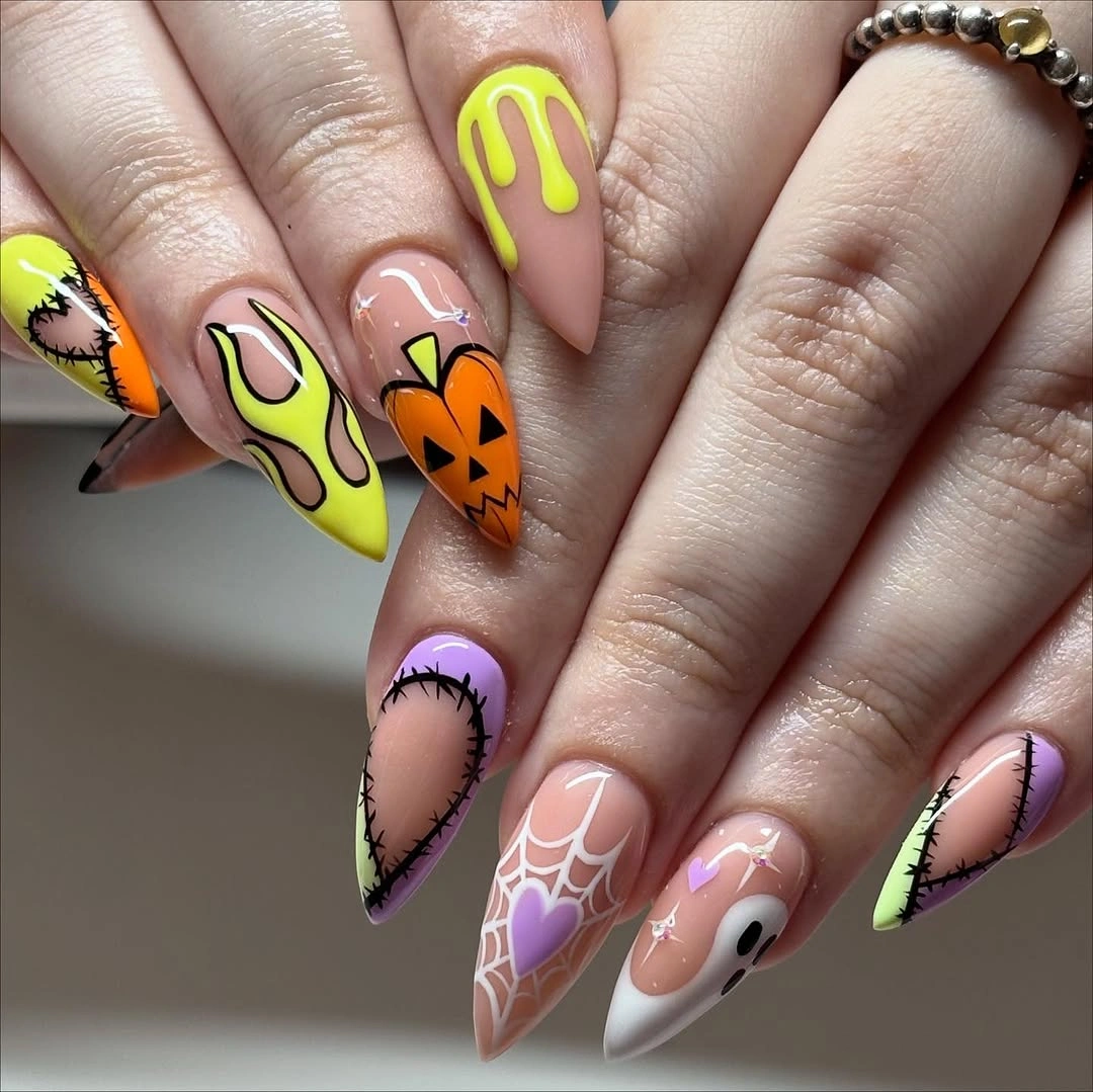
To use this palette without copying every motif, pair one neon color with orange and let black do the framing. Keep at least two nails mostly nude so the highlighter tones do not cover the whole hand. A short version would benefit from fewer panels and broader line work, since tiny web details need room to stay clear.
These colors are energetic enough to act like an accessory, so adding several rings or a bold patterned sleeve can make the overall effect busier. If you want a quieter October nail color idea, keep the yellow on a single accent nail and use orange only at the tips. The dark outline is the element that makes the palette feel intentional rather than random.
White Ombre With a Tiny Web Detail
Milky white ombre tips fade into a sheer pink base, giving the long square shape a clean and airy start. A small black web and ghost face become easy to see because the background is almost empty. The light color is doing as much seasonal work as the dark drawing, since it keeps the art from feeling heavy.
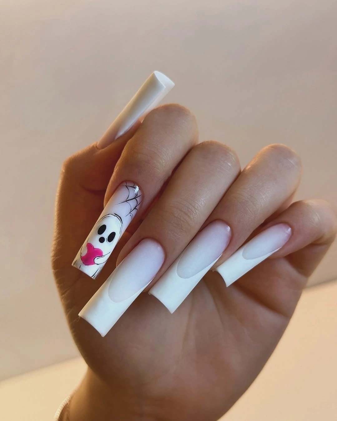
A white ombre base is a useful alternative when you want Halloween detail but do not want every nail to be orange or black. Place one small drawing on an accent finger and leave the rest of the tips soft and translucent. That approach also makes the manicure easier to pair with different clothes because the color remains neutral first and themed second.
Fine black marks can show grow-out or uneven placement more quickly against pale white, so keeping the art compact is practical. If you prefer more color, add one muted gray or plum nail rather than disrupting the ombre on every finger. The clean white space should remain the main visual field, otherwise the tiny web loses its lightness.
Deep Red-Black Light Across Almond Tips
The dark burgundy-black color has a reflective red streak that gives medium almond nails depth without needing an illustrated motif. Each nail shifts between near-black and wine red depending on the light, making the manicure feel dimensional rather than flat. The glossy surface reinforces that moving color effect and keeps the deep palette polished.
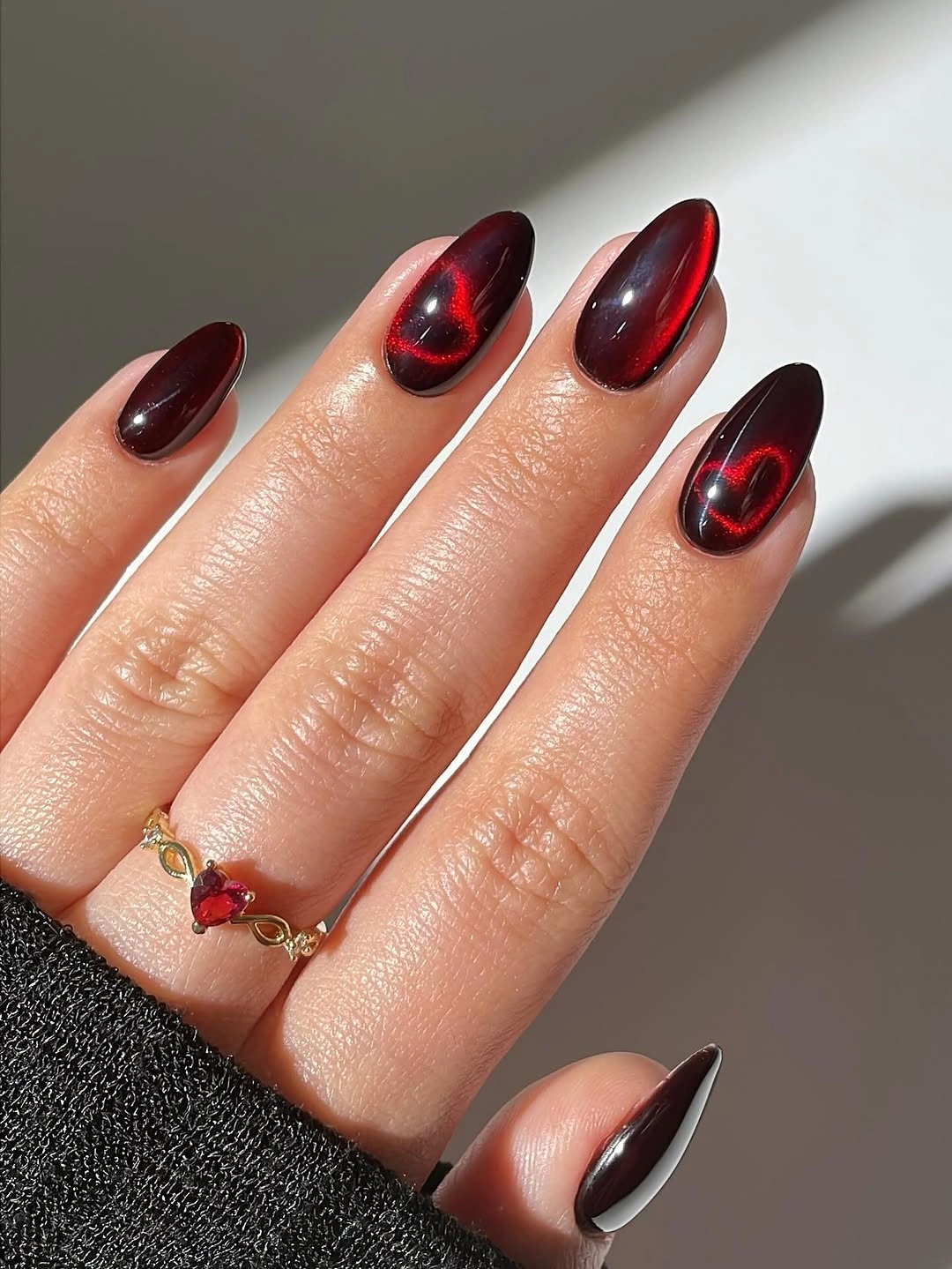
For a dramatic October color, use a dark red that still carries a visible warm highlight instead of a completely opaque black. That gives the nails more life in daylight and keeps the shape readable from a distance. It is also a strong companion to maroon fall nail ideas when you want color depth rather than extra drawings.
Very dark glossy shades make chips and grow-out contrast more visible, so a tidy almond shape matters as much as the color itself. A shorter version can feel equally refined if the red highlight is kept near the center of the nail. The appeal comes from the changing burgundy depth, not from piling on glitter or character accents.
Purple and Orange in Solid Color Blocks
One hand in glossy purple and the other in vivid orange turns color contrast into the entire manicure design. The medium almond shape is consistent across both colors, which prevents the pairing from looking like two unrelated sets. With no extra art to distract from it, the classic October contrast reads cleanly and confidently.
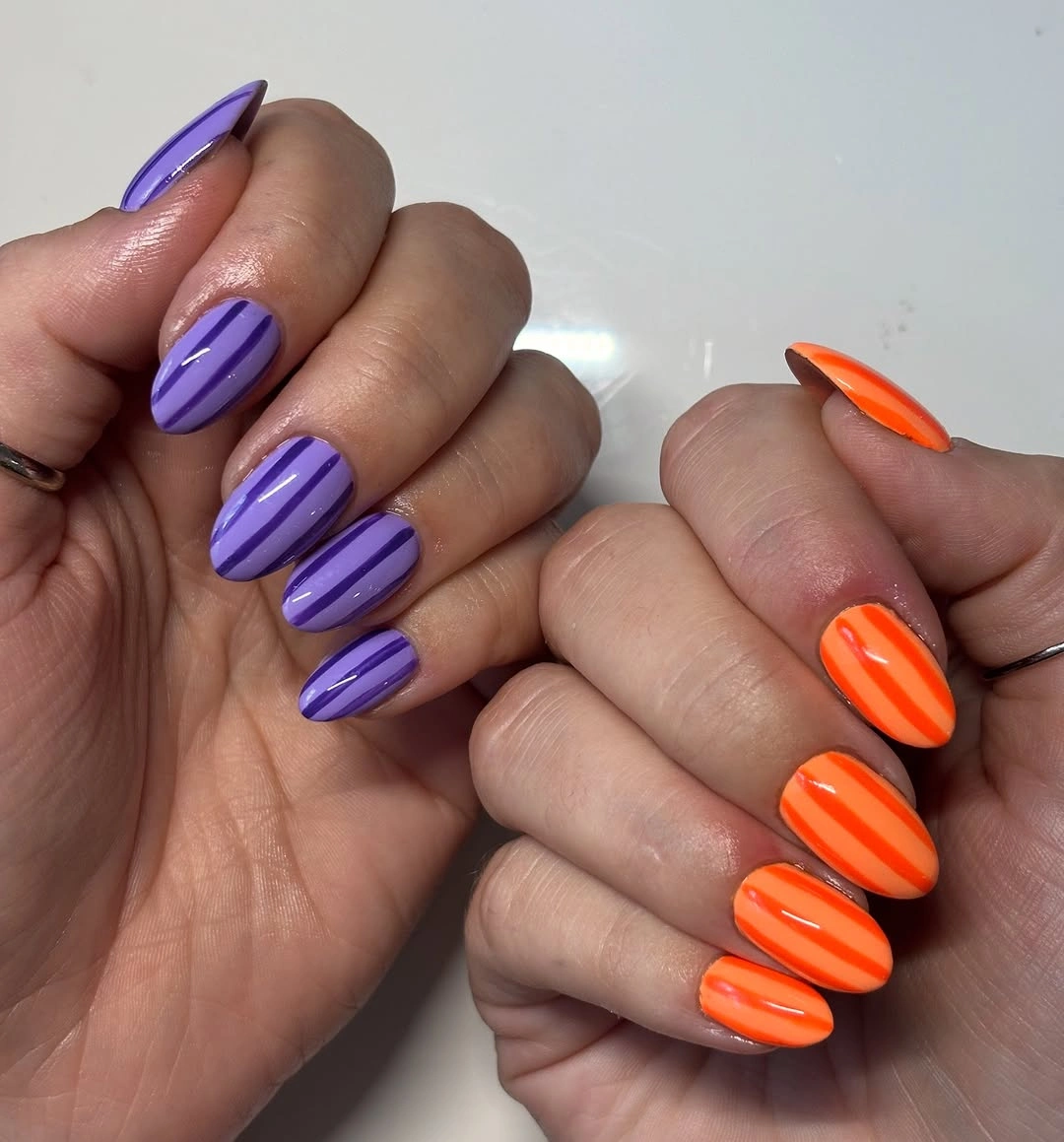
Keeping each hand solid is the useful styling decision here. Purple and orange already create a strong visual conversation, so mixing them nail by nail would make the palette much louder. Choose shades with similar brightness for a playful version, or use a deep plum and burnt orange if you want the contrast to feel more autumnal and less costume-like.
The bolder the orange, the more the manicure becomes a focal accessory, which may not suit someone who prefers subtle color. A calmer adaptation could use orange only on two nails and keep the rest purple, but avoid adding a third hue. The balance comes from the simple division of color and the repeated almond silhouette.
White Squares With Black and Orange Illustration
Long white square nails create a crisp base for black spirals, a skull-like face, and orange-striped illustrated panels. The black lines stay readable because the white background provides full contrast, while the orange gives the set a clear October signal. Each drawing has room to stand alone instead of becoming a tiny crowded mark.
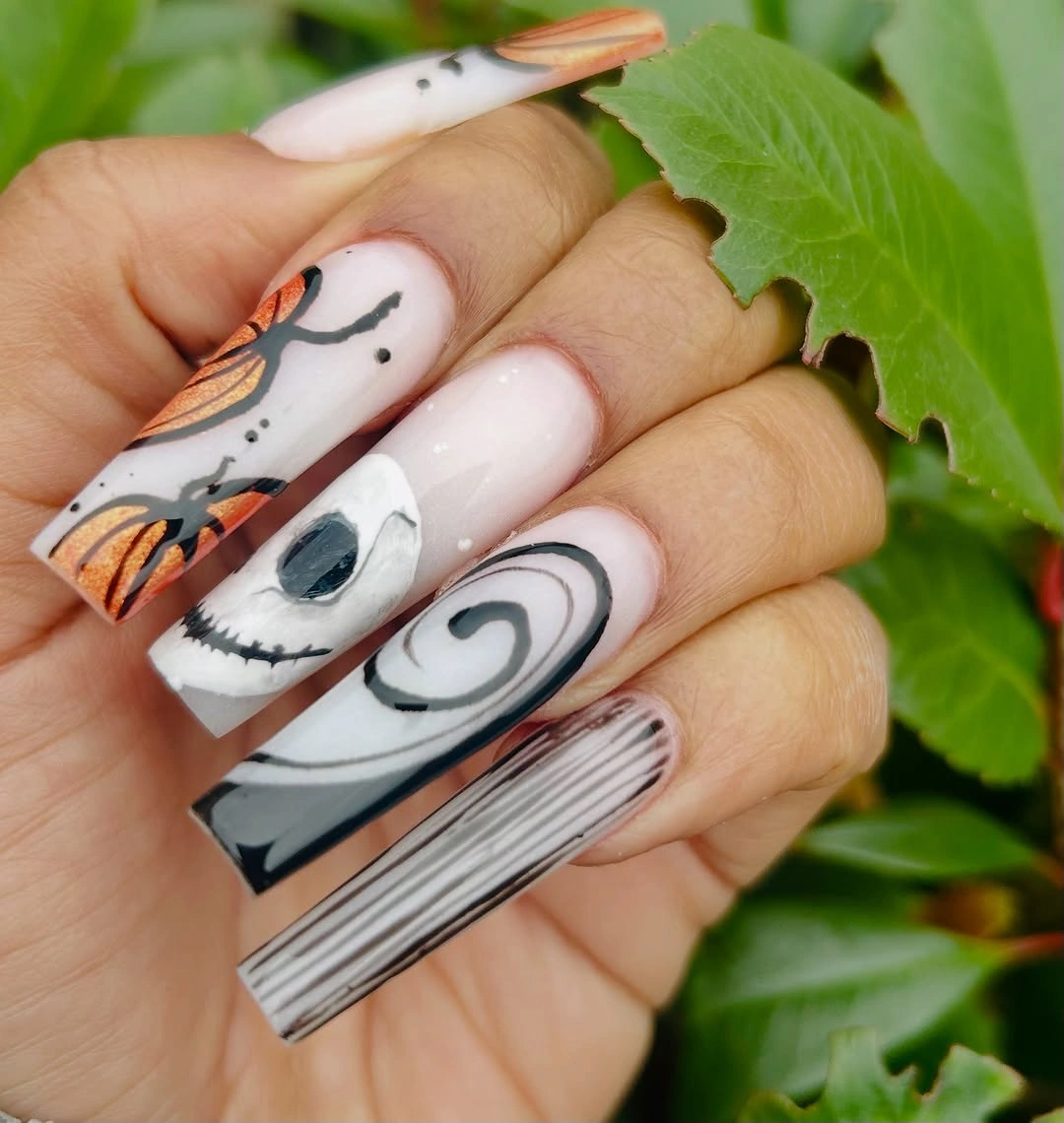
For colorful illustration, use a light base and repeat one outline color across every detailed nail. That gives orange and black an organized relationship even when the individual panels show different characters or symbols. A simpler alternative would use one black spiral accent and one orange tip, leaving the remaining nails white and glossy.
Large panels need long tips and precise placement, so this is more elaborate than an everyday color-only manicure. If you choose a shorter square shape, reduce the artwork to one face or one stripe pattern rather than shrinking every illustration. The white ground needs to stay visible, because it is what keeps the black and orange from merging into a dark block.
Reflective Purple With Soft Pink Transitions
Purple shimmer travels into pink areas across medium almond nails, producing a reflective gradient that feels softer than a solid dark plum. The cool color family remains close enough to look harmonious, while the shine keeps the blend lively. This is an October color route for someone who wants seasonal depth without a literal web, pumpkin, or leaf.
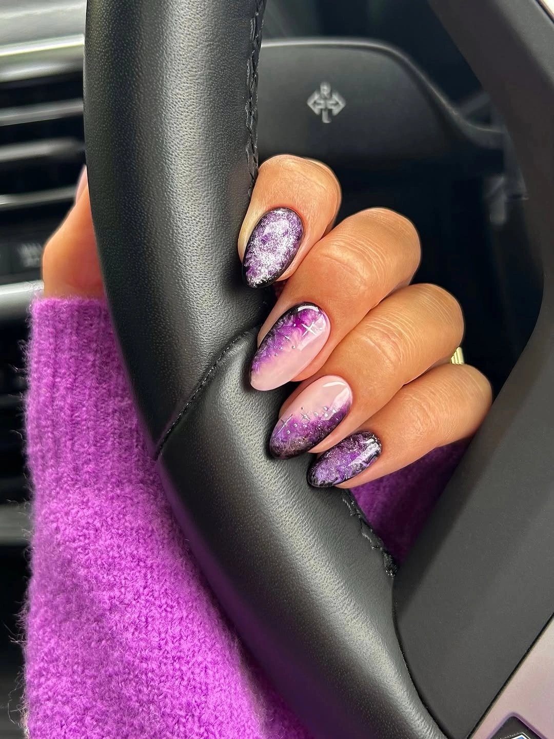
Use neighboring shades such as violet, berry pink, and lavender when you want movement without harsh color blocks. Let the darker purple concentrate near one end and give the lighter pink room through the center, so the transition looks intentional. A little shimmer is enough to catch light; additional drawings would distract from the color flow.
The gradient needs a clean blend or it can look like a random stripe across the nail. On shorter nails, pick only two close shades and allow the pink to dominate, which keeps the effect softer and easier to maintain. The strength lies in the reflective shift, not in adding more competing autumn colors.
Olive Gold With Pastel Ghost Accents
A yellow-green, almost olive-gold base gives the pastel blue and mint ghost shapes an unusual but warm October setting. Black dots and small stars add contrast without overpowering the color, while the almond form gives each little face enough room. The combination feels playful because the pale motifs stay small against the deeper reflective ground.
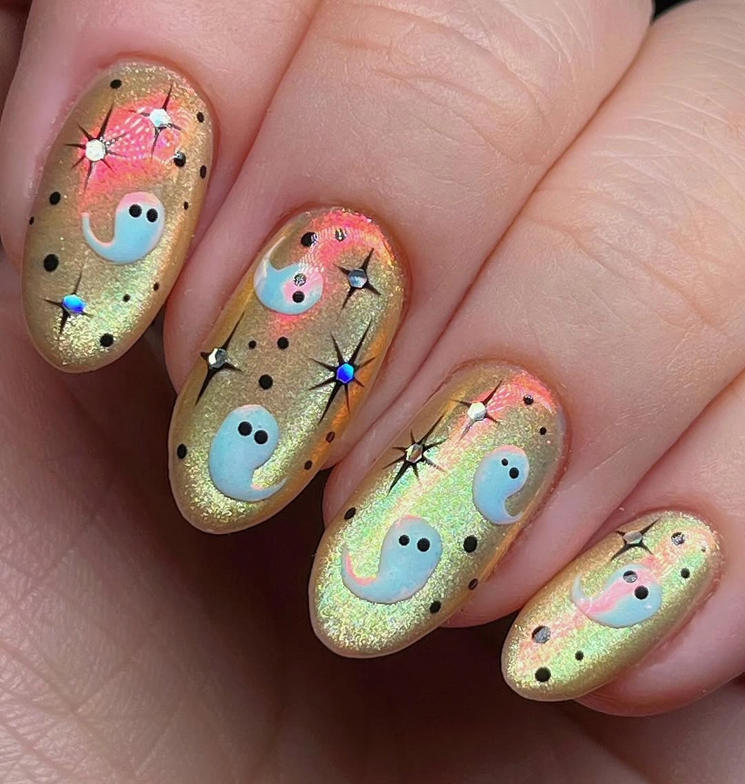
If you want ghost art that does not rely on black nails, choose an earthy shimmer base and reserve black for tiny dots or outlines. That makes the pastel figures look more surprising and keeps the design from becoming visually flat. One or two ghost accents are enough; the olive-gold color should still have plenty of visible space around them.
Several small marks can become confusing if they are all the same scale, so let the ghosts be the largest details and keep stars minimal. A muted sage base would make this more subdued, while a brighter yellow-green moves the result toward a bolder statement. The palette works because the warm base gives the cool pastel shapes a clear contrast.
Smoky Tips and Speckles on a Nude Base
Peach-nude short nails end in smoky black-brown tips with small stars and tiny teal or red speckles floating above the darker edge. The design feels atmospheric rather than fully themed because the base remains visible through most of each nail. The short rounded shape makes the dark color practical and keeps the details from becoming too theatrical.
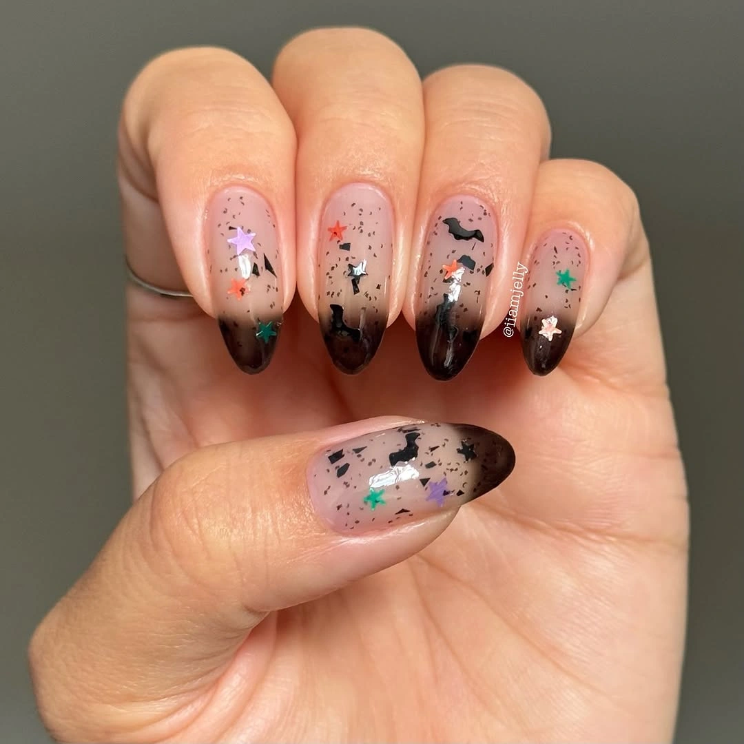
A smoky tip is a useful way to wear a dark October color without committing to a full black manicure. Let the dark edge fade or vary slightly, then add only a few colored speckles so the finish remains the main visual idea. This would work well as a short nail color option because the art stays close to the tip instead of filling the whole plate.
Too many speckles could make the neutral base look messy, so keep them sparse and use colors that are small but distinct. If you prefer a more classic result, remove the stars and retain only the smoky edge. The open nude area is essential because it gives the darker tips their soft, shadowy quality.
Pink and Black Cartoon Color Contrast
Pink base sections soften black tips, yellow flame-like marks, blue graphics, and a colorful character accent in this medium almond Halloween mix. The palette is lively, but black repeats often enough to act as the anchor. That repetition prevents the pink and yellow from looking disconnected from the darker illustrated elements.
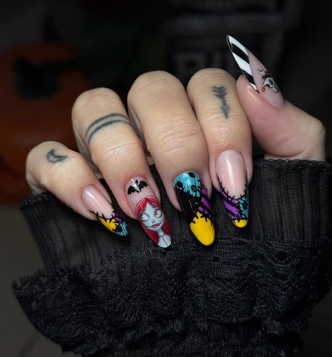
When a set uses several bright accents, choose one dark color to appear on more than one nail. Here, black gives the other colors a shared outline and keeps the character detail from becoming the only focal point. A reduced version could keep pink, black, and yellow while dropping the blue, which would make the contrast simpler at a glance.
Cartoon panels need enough space to be legible, so they can feel less practical on very short nails. If you want the same color idea at a smaller scale, use black French tips with one yellow flame accent instead. The color story survives because pink provides softness and black provides structure throughout the manicure.
Short White Nails With Tiny Bright Icons
Milky white short square nails carry small green, orange, and black Halloween-style icons that stand out clearly against the pale ground. The drawings stay compact and uncomplicated, which suits the limited surface area of the shape. White remains the dominant color, so the manicure feels fresh even though the accent colors are seasonal and playful.
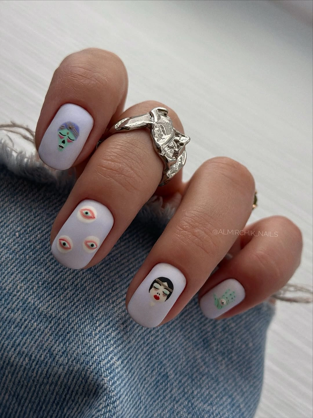
Use simple outline-based icons on short nails instead of detailed scenes. One small green face, an orange eye, or a black silhouette can communicate the theme while leaving surrounding nails mostly white. That spacing is especially helpful if you like color but want a manicure that still looks clean and easy to wear during ordinary days.
Fine icon work can lose definition over time, so avoid placing every motif close to the cuticle where grow-out becomes obvious. A single accent finger per hand would make this even more low-maintenance while preserving the bright palette. The white base does the heavy lifting here, giving each small color mark a crisp place to sit.
Pink Flames With Clear-Edge Contrast
Pink panels and black flame-like graphics sit over long square nails with translucent or reflective edges, so the bold contrast never becomes one solid dark block. The clear-looking areas lighten the length and give the black shapes room to read individually. Small reflective details add another point of light without replacing the pink-black color relationship.
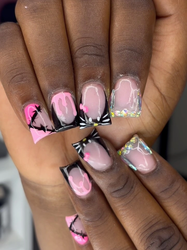
Clear edges are useful on very long square nails because they create visual breathing room around a high-contrast design. Keep the black graphic work concentrated on a few panels, then allow pink and transparency to share the remaining surface. That makes the flames look chosen rather than repeated simply to fill every finger.
Long square shapes already have a strong presence, so adding more colors would pull attention away from the pink and black contrast. A medium-length adaptation could use only black outlines on pink tips and retain one clear accent. The point is to let the transparent sections reduce visual weight while the dark flames provide the seasonal edge.
Purple Pumpkin Art With White Ghosts
Deep purple long square nails become a moody backdrop for orange jack-o-lantern faces and small white ghost drawings. Purple gives the orange more contrast than a typical nude base, while the white figures brighten the darker color without flattening it. The repeated square length helps the illustrated panels feel part of one deliberate set.
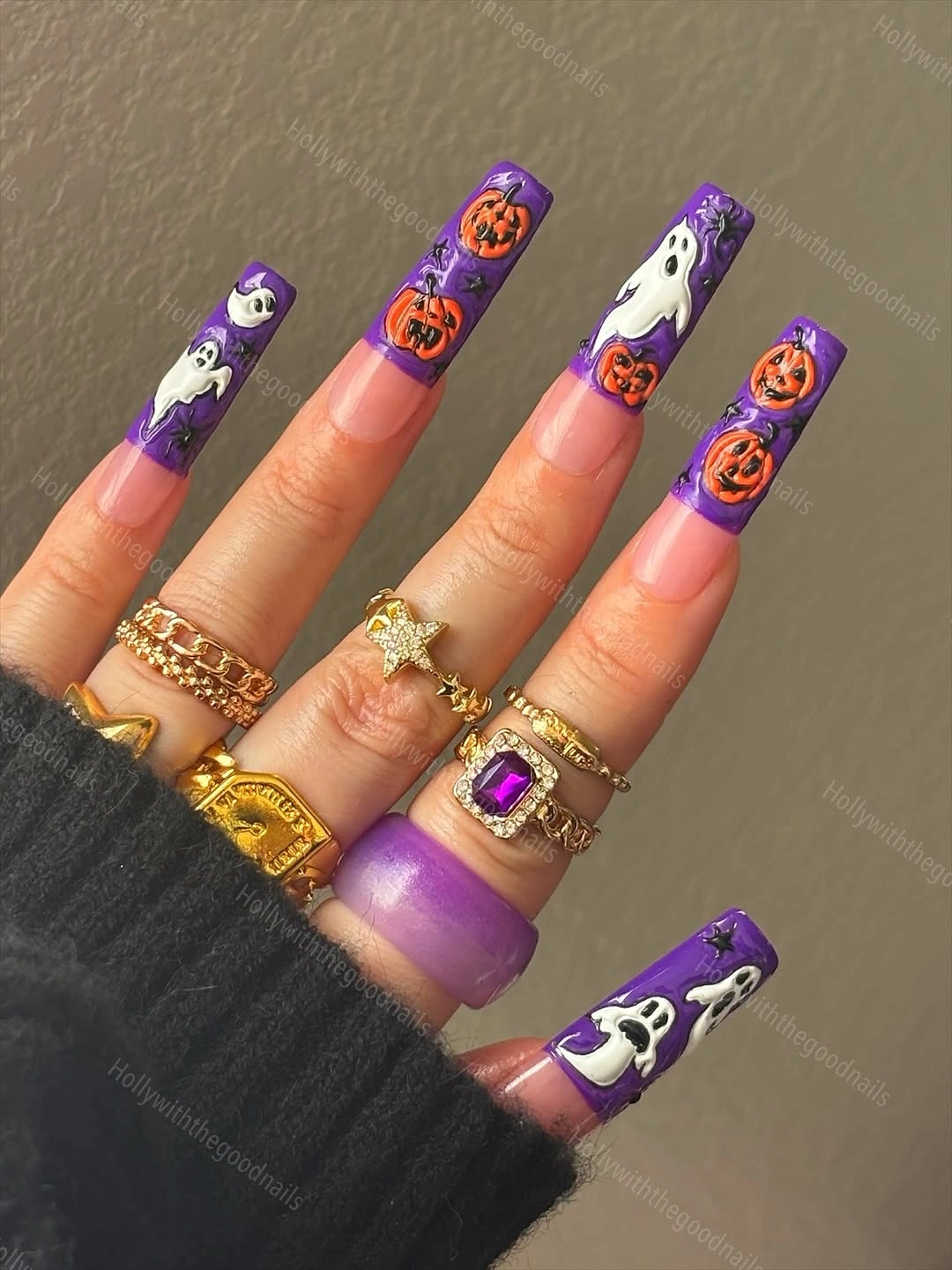
Pairing orange with purple is a strong October color combination when you want something darker than orange alone but brighter than black. Use white only for small ghost details and let purple remain visible around every drawing. That keeps the palette balanced and lets the pumpkin faces read as accents rather than becoming a continuous character theme.
The long tips give artwork room, but they also make it more obvious and potentially less convenient for daily tasks. A medium square version could keep one orange pumpkin and two plain purple nails on each hand. The design is most convincing when purple stays the main field and orange appears in controlled, bright bursts.
Black Anchors a Wide Spooky Palette
Black glossy nails sit beside nude, pale blue, yellow, pink, and illustrated character panels, making the broad palette feel more organized than it first appears. A white spiral and fine black line work repeat the darkest color through the lighter accents. The long almond shape gives every color enough territory without forcing all the details into one crowded tip.
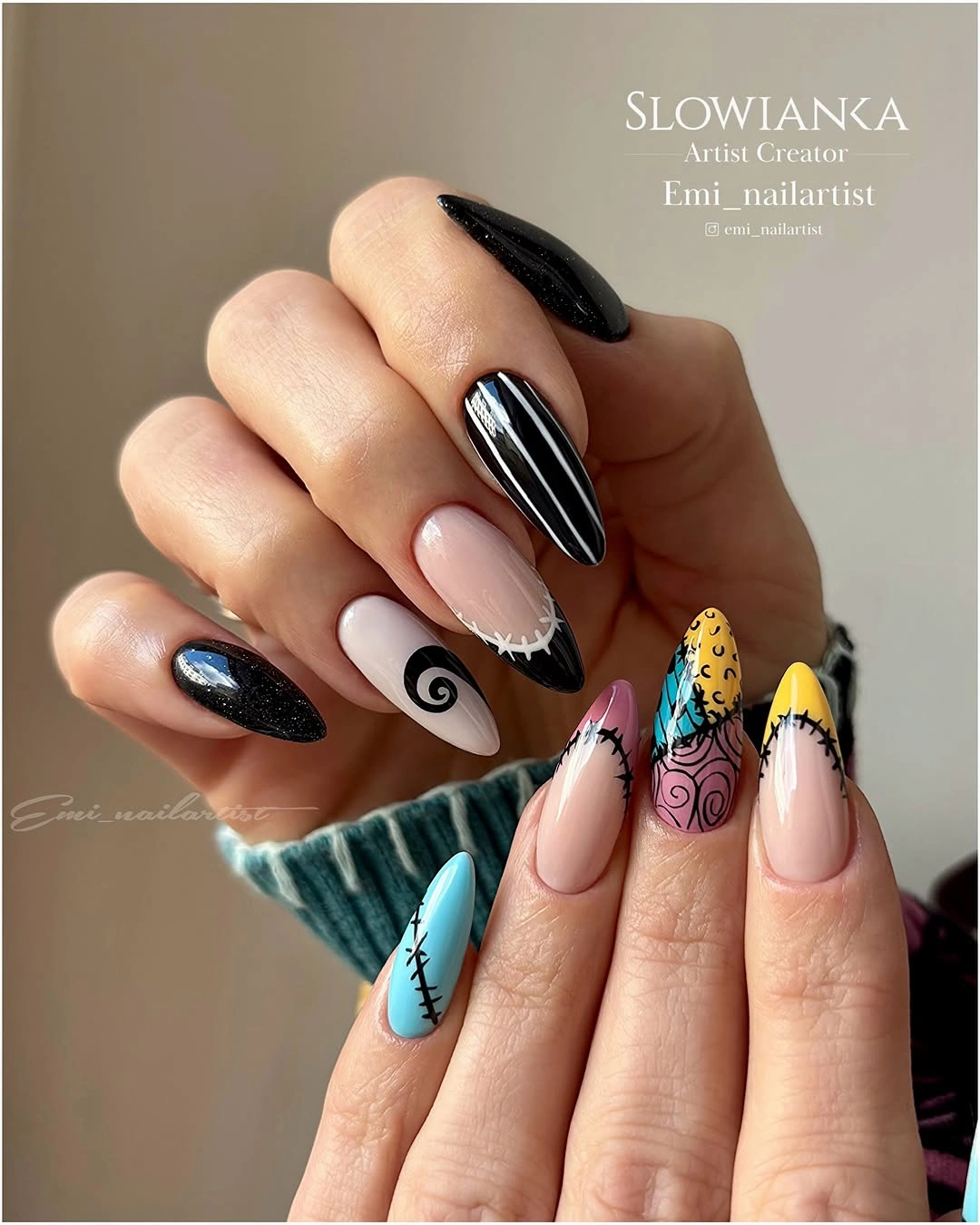
For a multi-color Halloween set, use black as the repeated anchor instead of asking every shade to match. It can appear as a solid nail, an outline, a tip, or a small spiral, giving the palette a shared visual rule. The lighter colors should stay in separate panels so the dark line work has room to define them.
Many accents need a clear hierarchy, otherwise the character art and color blocks can compete equally for attention. Keep black on at least two nails and choose just one illustrated focal point if you want a less maximal version. The color variety works because the darkest shade keeps returning to steady the lighter, more playful pieces.
Orange Botanical Lines With Silver Edges
Bright orange-red oval nails feature fine black botanical or leaf-like lines, while a small silver edge near the cuticle catches light without taking over the design. The warm orange gives the line art a clearly seasonal background, and the silver adds a polished finishing note. The medium length keeps the detailed marks visible yet still reasonably wearable.
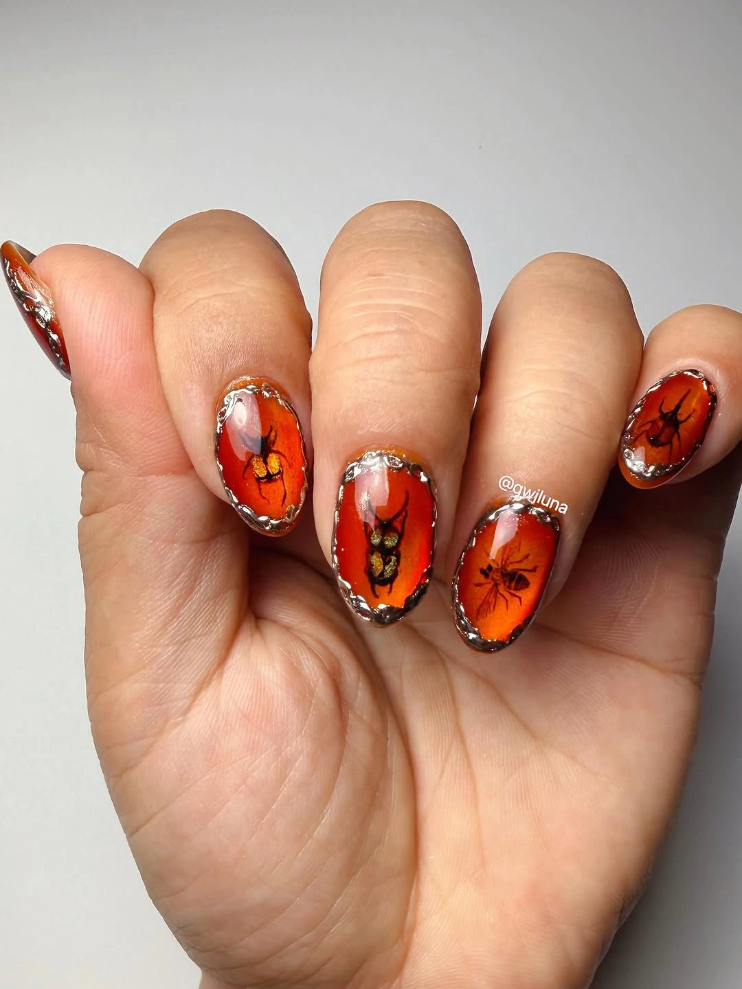
Black fine line work is an effective way to make orange nails feel more considered than a solid color alone. Keep the drawing sparse and let the silver remain close to the base, so neither accent competes with the orange field. For more texture-led inspiration, matte fall nail designs show how one finish can carry a seasonal color.
Fine lines require neat placement and may be harder to maintain than a simple glossy orange manicure. If you want the same palette with less detail, use one black leaf on an accent nail and retain silver only as a tiny dot. The strongest contrast is still orange against black, while the silver should merely brighten the edge.
Lime Green Tips Over Soft Pink
Soft pale pink nails end in lime green French or flame-like tips, creating a high-contrast color story that feels fresh rather than traditionally autumnal. The short-to-medium almond shape keeps the green edges playful and visible. Small black marks add a little definition, but they do not interfere with the bright pink-green relationship.
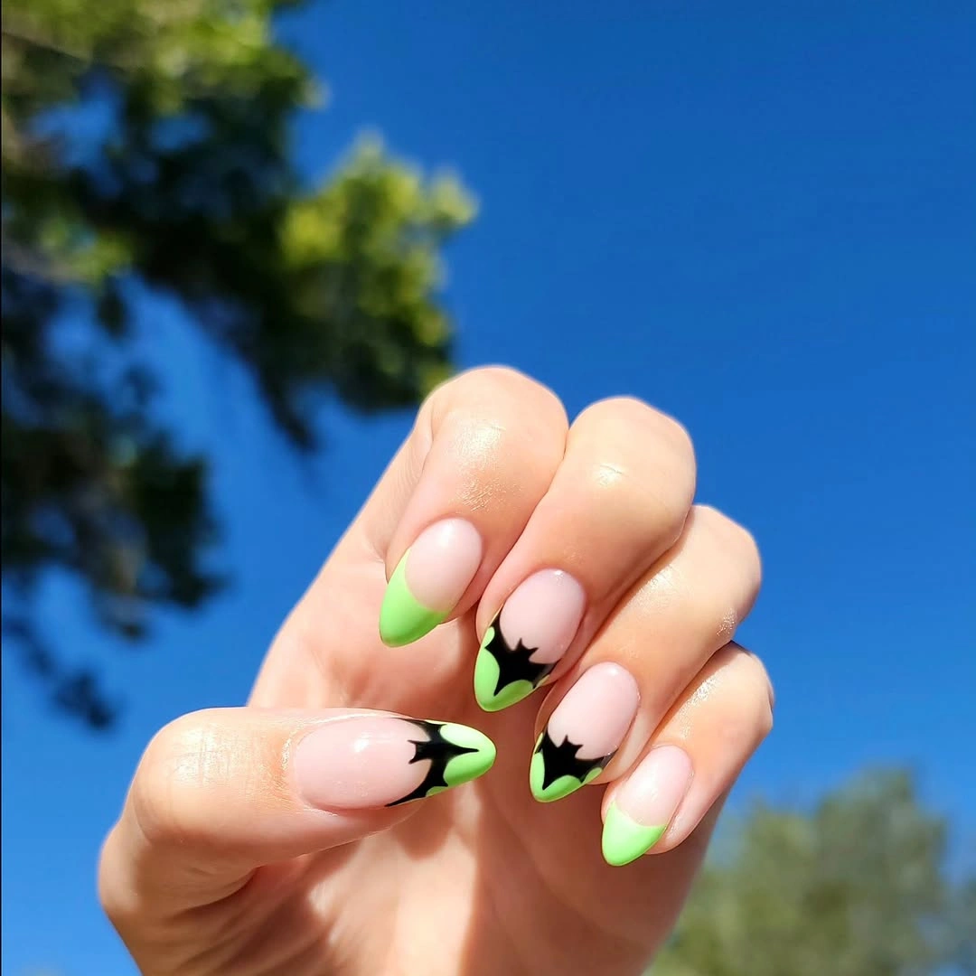
Lime green is a useful choice when you want an October nail colour that feels unexpected and lively. Keep the base pale and the green concentrated at the free edge, which gives the brighter shade enough contrast without covering the entire nail. A muted chartreuse version would make the palette softer while preserving the same two-color idea.
The green tip shows placement mistakes quickly, so the curve should be consistent across the set. On a very short nail, use a thin French line instead of a larger flame shape to retain negative space. The appeal comes from the clean shock of lime against pink, so extra glitter or several additional colors would be unnecessary.
Four Autumn Colors on Nude Stiletto Tips
Long stiletto nails leave the center nude while orange, burgundy, green, and black form pointed panels near the tips, separated by fine web-like lines. The clear base prevents four dark autumn colors from merging into a single heavy design. Each sharp point becomes its own color moment, but the shared nude space keeps the set coherent.
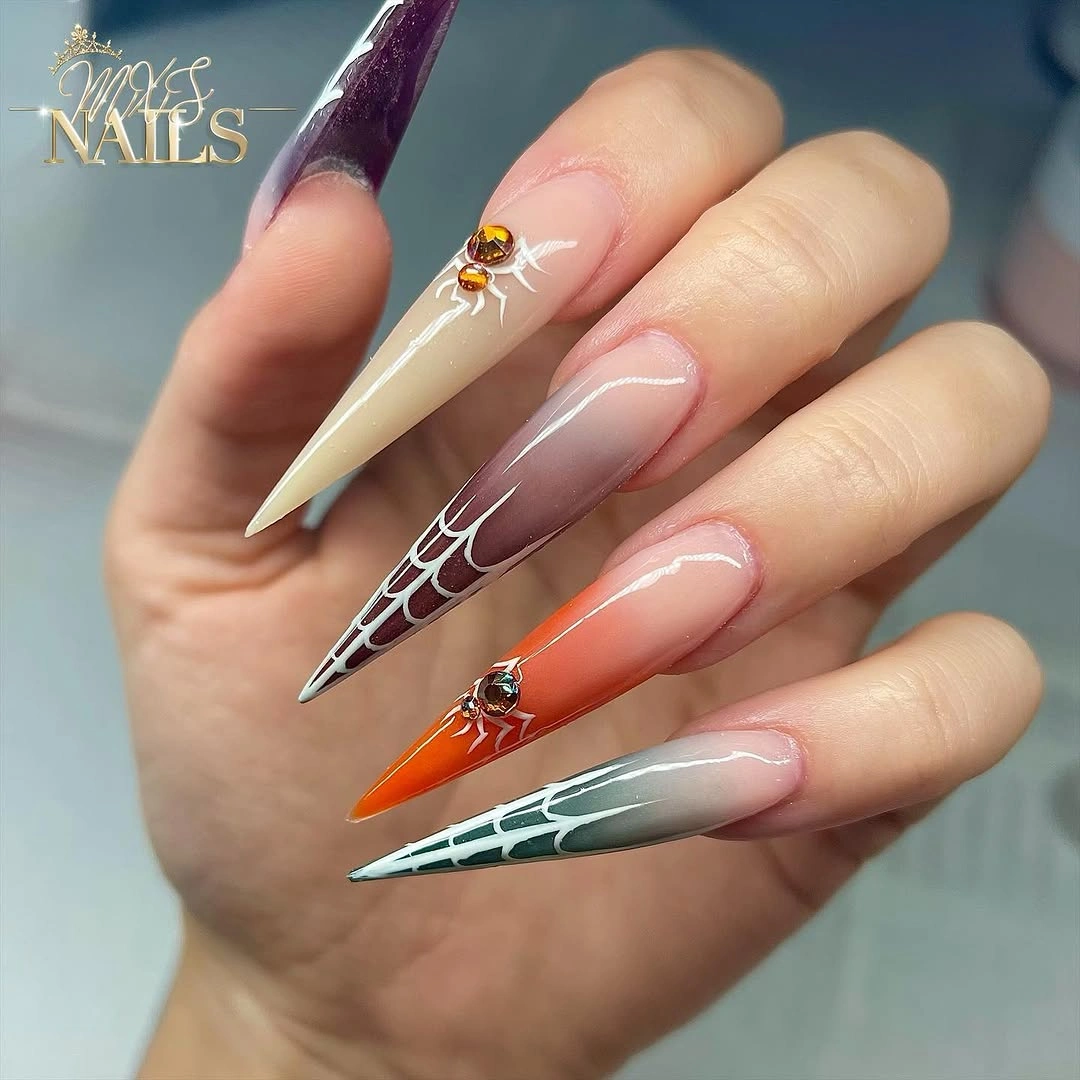
When using several dark shades, a nude base is the easiest way to give each color a border and maintain visual lightness. Assign one color per tip or panel instead of mixing all four on every nail, then repeat black only as a thin outline. That structure lets orange and green feel like accents rather than competing fields of color.
Extreme length makes this a statement manicure and gives the panels room to work, but it is less convenient for someone who needs low-profile nails. A medium almond version could use only two colors per hand and skip the finest web lines. The nude center is the non-negotiable element because it keeps the rich palette from becoming visually dense.
Soft Nude With a Tiny Gold Accent
Sheer pink-nude almond nails stay almost entirely simple, with one small gold and dark decorative accent providing the seasonal reference. The restrained palette makes the shape and clean glossy finish the main features, which is why the tiny embellishment does not look lost. It is a quiet contrast to the more illustrated orange and black options in this color family.
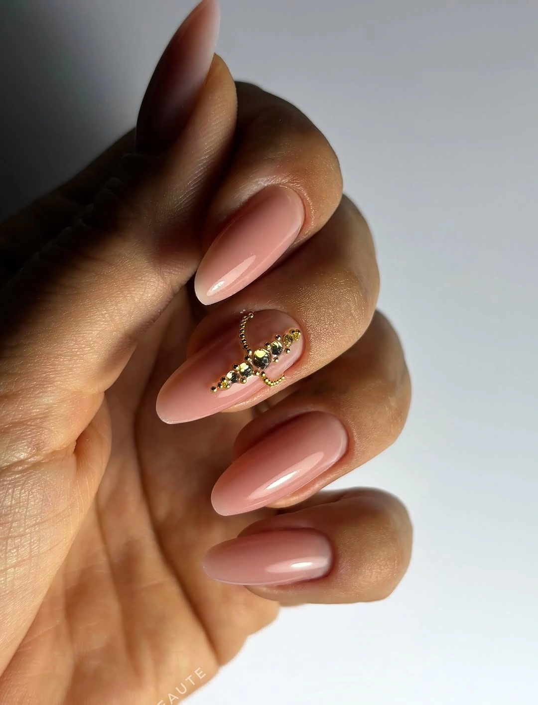
A neutral manicure can join October styling through one precise accent rather than a full set of themed drawings. Choose a small gold-toned detail near one nail and keep the remaining fingers nude, allowing the soft pink undertone to stay visible. This works well when you want color that feels polished in many settings but still has a personal point of interest.
The small motif may not be obvious from a distance, so it suits someone who prefers a private detail over a bold statement. If you want more visibility, repeat the gold on one additional nail but keep the design otherwise nude. The calm base is what makes the accent feel special, so covering more of the set would weaken the idea.
Sage Beige and Green Botanical Nails
Sage, beige, and deep green appear on short rounded nails with fine brown leaf line art, creating a botanical October palette that feels calm and grounded. The lighter beige accent nails give the drawings enough contrast, while the darker green solids prevent the set from feeling too pale. The shorter shape makes the color story practical and easy to read.
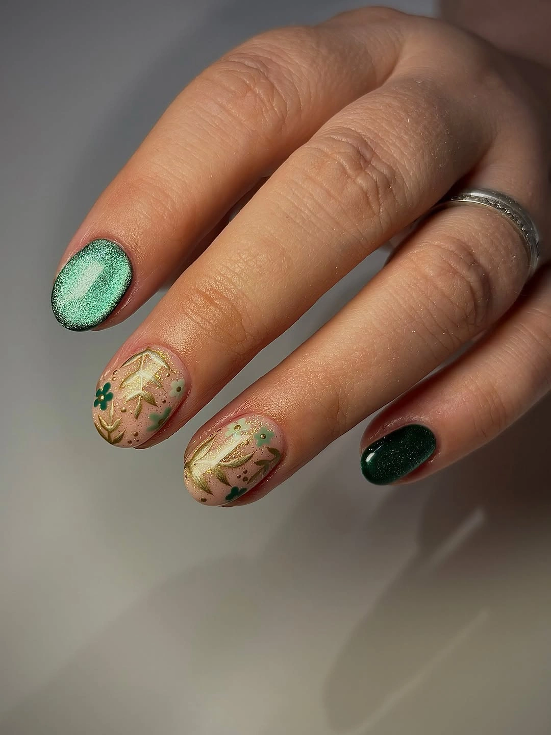
Use beige as the drawing base when you want leafy line art to stay visible without the starkness of white. Sage and dark green can then appear as solids, making the palette feel cohesive rather than overly patterned. For a softer approach to polka dot fall nails, keep decorative marks small and let color blocking do most of the work.
Fine leaves can become difficult to see if the brown is too close to the beige base, so a little contrast is important. A simple alternative would keep just one botanical accent and make the rest sage and green solids. The charm of this manicure is its quiet natural palette, not an overload of seasonal symbols.
Warm Solid Shades Across Long Almond Nails
Magenta, brown, burgundy, orange, and black appear as individual solid colors across long almond nails, proving that a mixed palette can be expressive without any artwork. The shades share warmth and depth even though they are not identical, and the glossy finish gives them a common surface. The pink sweater nearby also highlights how the colors can work with a simple outfit.
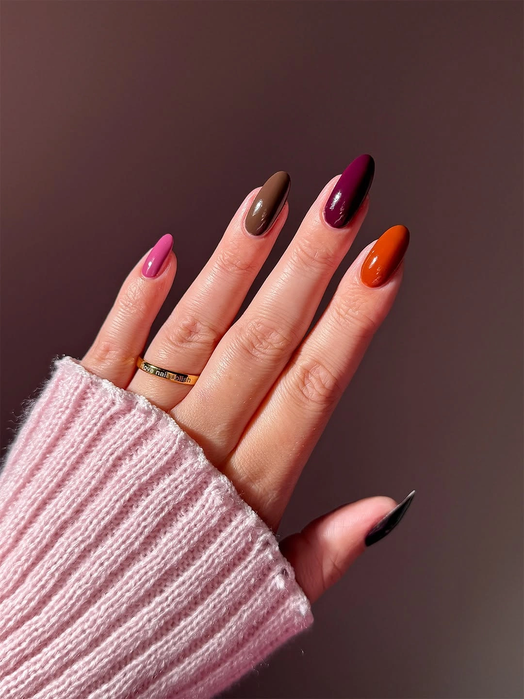
Solid color placement is a practical choice when you love several October shades but do not want intricate upkeep. Choose colors with similar richness, then distribute the darkest black and burgundy so they do not sit together in one heavy cluster. Orange can act as the bright spark, while pink or magenta keeps the palette from becoming too earthy.
Five colors are already enough visual information, so avoid adding glitter, patterns, or character art to this formula. A more restrained version could use three shades – burgundy, brown, and orange – while maintaining the same warm sequence. The shared almond shape and glossy finish are what allow the varied colors to read as one manicure.
Gold Glitter Tips With a Character Accent
Pale nude almond nails use gold glitter at the tips and one small white-and-brown dog illustration as a personal focal point. The glitter gives the neutral base a festive light-catching edge, while the character stays contained to one nail instead of being repeated. That keeps the manicure warm and decorative without losing its otherwise soft color balance.
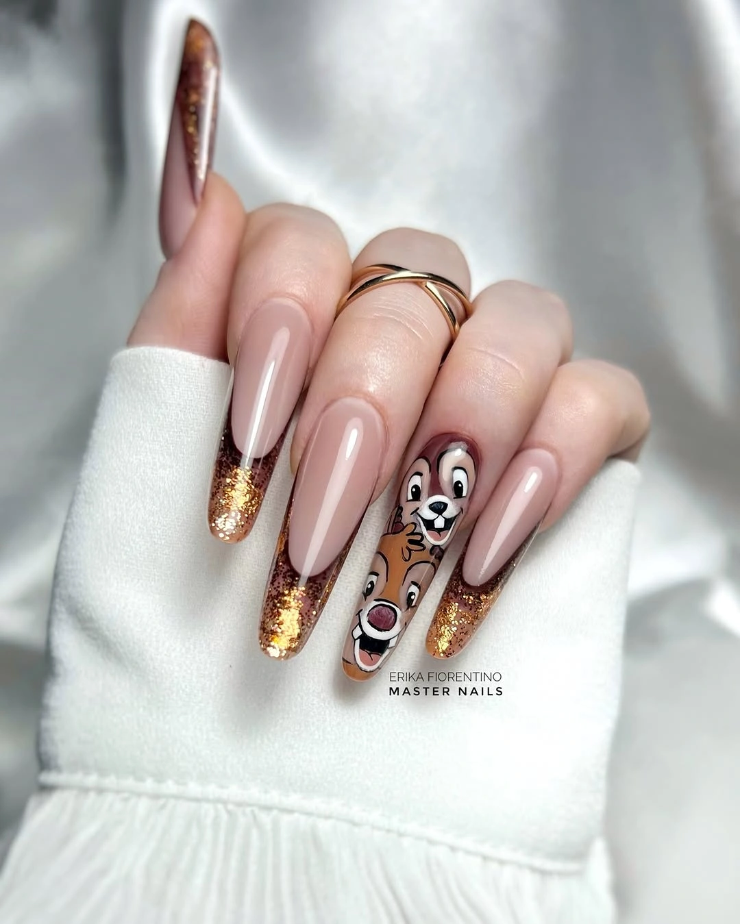
Gold glitter works well with a nude base because it adds brightness without forcing a strong seasonal shade across every finger. Keep the character art to one accent nail, then allow the surrounding tips to stay simple and sparkling. A silver glitter version would feel cooler, while gold supports the warmer October palette more naturally.
Glitter at the free edge can show wear differently than a plain nude tip, so a finer distribution usually looks more forgiving as the manicure grows out. If the illustrated accent feels too personal, replace it with a small gold star or leaf and keep the rest unchanged. The contrast between quiet pink nude and warm gold is enough to carry the design.
Cobalt Blue With Pumpkin and Ghost Art
Matte-looking cobalt blue square nails create an unexpectedly strong ground for orange jack-o-lantern art and a small white ghost panel. The blue is cool and solid, so the orange reads bright without falling into the usual black-and-orange Halloween pairing. A few transparent-looking illustrated areas keep the short shape from feeling like one uninterrupted block of saturated color.
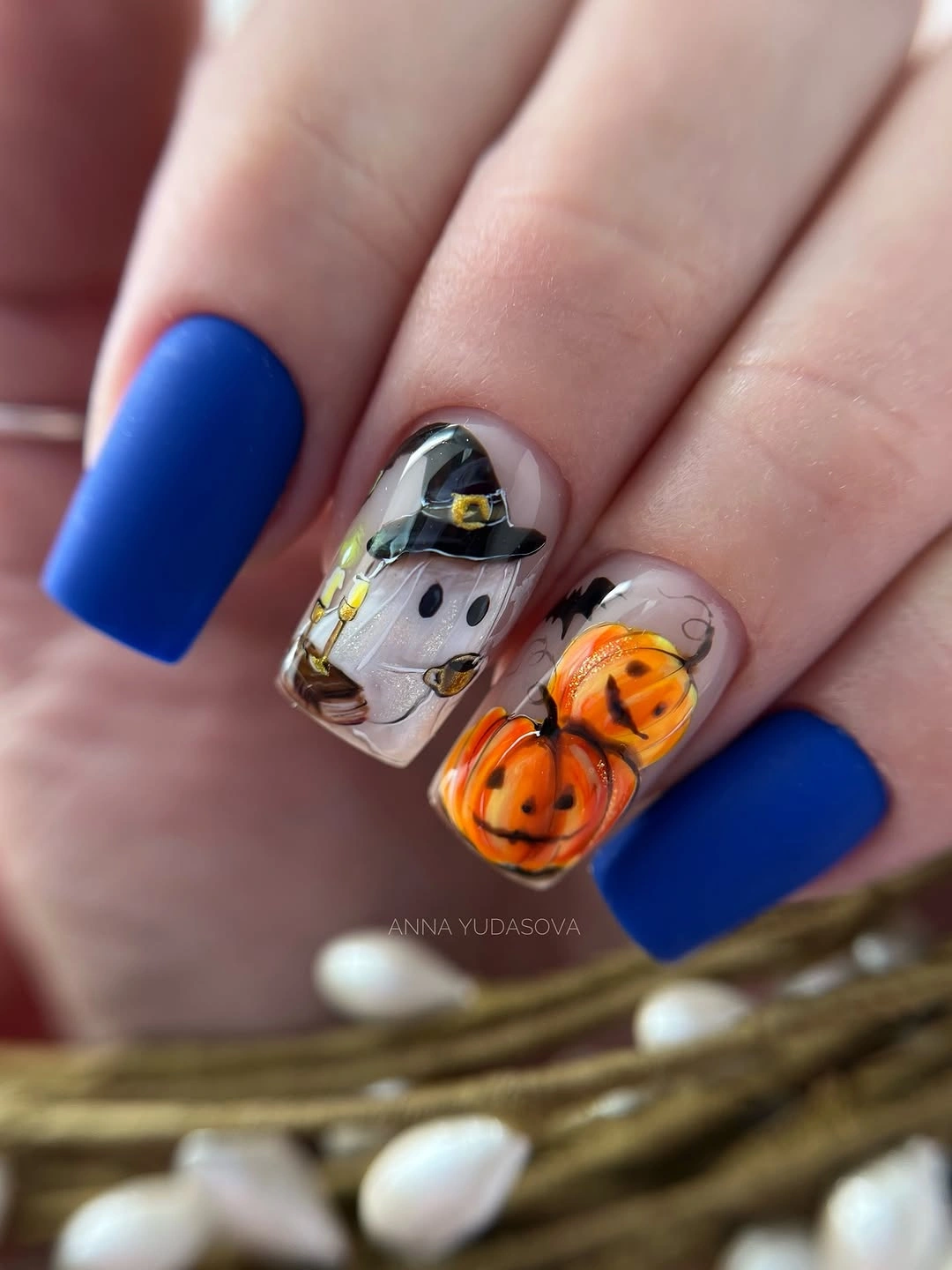
Cobalt is a useful October nail colour when you want contrast that feels graphic rather than traditionally autumnal. Keep the blue as the dominant solid shade, then reserve orange and white for one or two clearly outlined accents. That placement lets the small drawings stay readable and makes the colour combination look deliberate instead of like a random mix of seasonal symbols.
Because blue and orange sit so far apart visually, imperfect outlines or too many extra motifs would become noticeable quickly. A lower-maintenance adaptation could use one pumpkin accent with plain blue nails around it, keeping the same energy while reducing the detailed work. The key is the unusual blue backdrop, which gives the warm orange character a clean, high-contrast place to land.