Maroon is most convincing when its depth is given contrast to work against: bare-looking nude space, a pale knit, a sparkle that catches only at one angle, or a second red that changes its temperature. A considered fall almond nail direction is less about choosing the deepest wine and more about deciding how much visual weight that wine should carry on each finger.
Before committing to a burgundy design, compare the dark color with the surrounding neutral and notice whether the eye returns to the tip, the center, or an accent nail. Value contrast gives a manicure legibility, while repeated maroon notes make mixed details feel related; this principle is especially helpful when narrowing down brown fall nail color ideas for a longer shape.
Maroon Tips With a Small Heart Detail
The slim deep-maroon French tips concentrate the darkest color at the outer edge of nude almond nails, while a tiny heart near the center keeps the set from becoming purely classic. The nude-to-wine contrast is high enough to lengthen the almond shape, but the narrow tips leave the hand looking lighter than a full maroon manicure would.
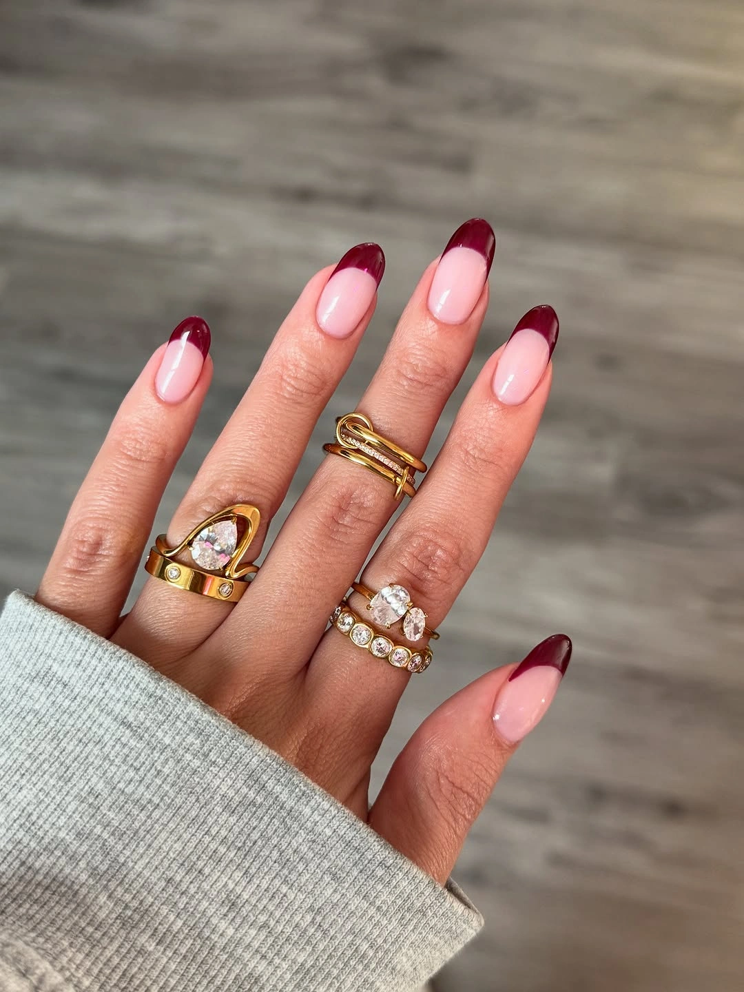
The small heart works because it is not repeated at the same scale across every nail, allowing the French line to remain the main color decision. A shorter version could omit the heart and retain the slim tip, or place one heart on an accent finger; enlarging it would shift the balance from elegant edge work to obvious decoration.
Maroon appears warmer against the pale pink-nude base than it would against a cool gray, which makes the combination read especially autumnal without relying on orange. If a softer result is wanted, choose a muted berry tip; a fall almond nail direction should preserve the light center against a controlled dark perimeter, not the exact red tone.
Sculptural Maroon Starburst French Tips
These long nude almond nails use maroon starburst tips that flare beyond a normal French curve, giving the dark color a sharply shaped role. The repeated points create more energy than a smooth line, yet the nude centers remain large enough to keep the design airy despite the dramatic length and saturated accent color.
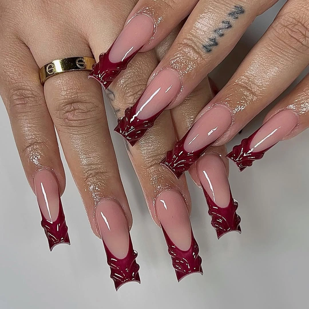
The visual effect depends on the points staying close to the tip rather than traveling too far toward the cuticle. On a medium almond shape, a shallower starburst would keep the same directional feeling; using the full length of the nail for every point would make the pattern feel crowded and visually shorten the nude space.
Maroon becomes more intense when it is framed by a neutral with a pink undertone, as it is here, because the pale base heightens the red’s depth. A cool beige would make the set look more restrained, while a warmer beige would make the maroon appear richer, but either version needs the light center to preserve the contrast.
Maroon Ombres, Metallics, and Gold Frames
The display set explores several maroon relationships at once: soft ombre, saturated metallic-looking panels, pink-to-wine transitions, and gold-framed accents. The range stays coherent because every variation returns to the same red family, so the gold reads as a small warm highlight rather than a fifth independent color competing for attention.
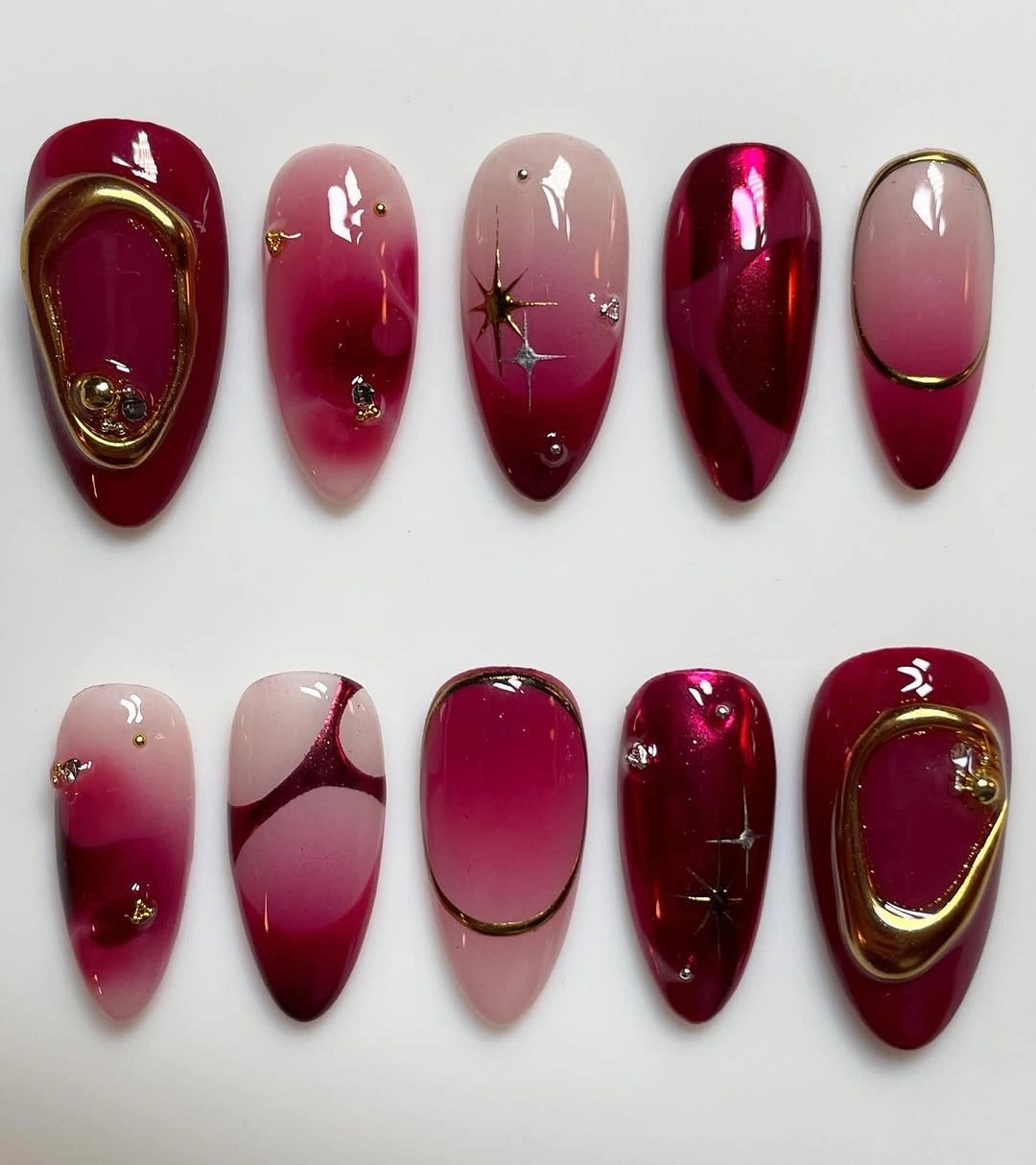
A mixed set like this needs a single controlling variable, and the repeated maroon value provides it even when the finishes differ. For a wearable edit, select one gradient, one solid wine nail, and one narrow gold outline; bringing every visible treatment into one manicure would make the color story more impressive but less easy to read.
The strongest color lesson is that maroon can move between deep and bright without losing identity when its neighbors are pale pink, gold, or transparent-looking nude. Keeping the red family consistent matters more than matching every finish, because value changes provide variety while the shared hue keeps the composition from fragmenting into unrelated samples.
Wine Gloss With One Dense Glitter Accent
Short rounded nails in glossy burgundy are interrupted by one accent packed with fine wine-toned glitter, a contrast of texture rather than a change of palette. Because the glitter shares the dominant color, it catches light without breaking the set into separate shades, and the compact shape keeps the rich finish from feeling overly formal.
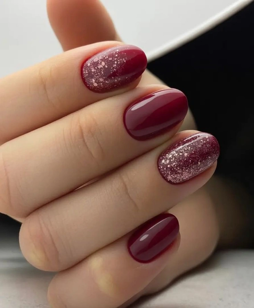
One glitter nail is enough to shift the whole surface story, especially when the remaining nails are a smooth dark cream. A person who prefers less sparkle could place a fine glitter gradient only near one tip, while adding glitter to every nail would flatten the difference between the accent and the solid burgundy field.
The dark red looks slightly brighter where the reflective particles appear, which is why the accent gives the manicure dimension without needing another color. Preserving that tonal match is the useful rule: silver glitter would cool the design and gold would warm it, but wine glitter keeps the transition nearly seamless and more subdued.
Maroon Patterns Across Nude Long Nails
Long nude nails become a canvas for maroon stripes, dots, curved panels, and a leopard-print accent, so the deep red is distributed in several visual densities. The repeated wine tone keeps the mix understandable, while the nude gaps prevent the many marks from merging into one dark, overloaded surface across the hand.
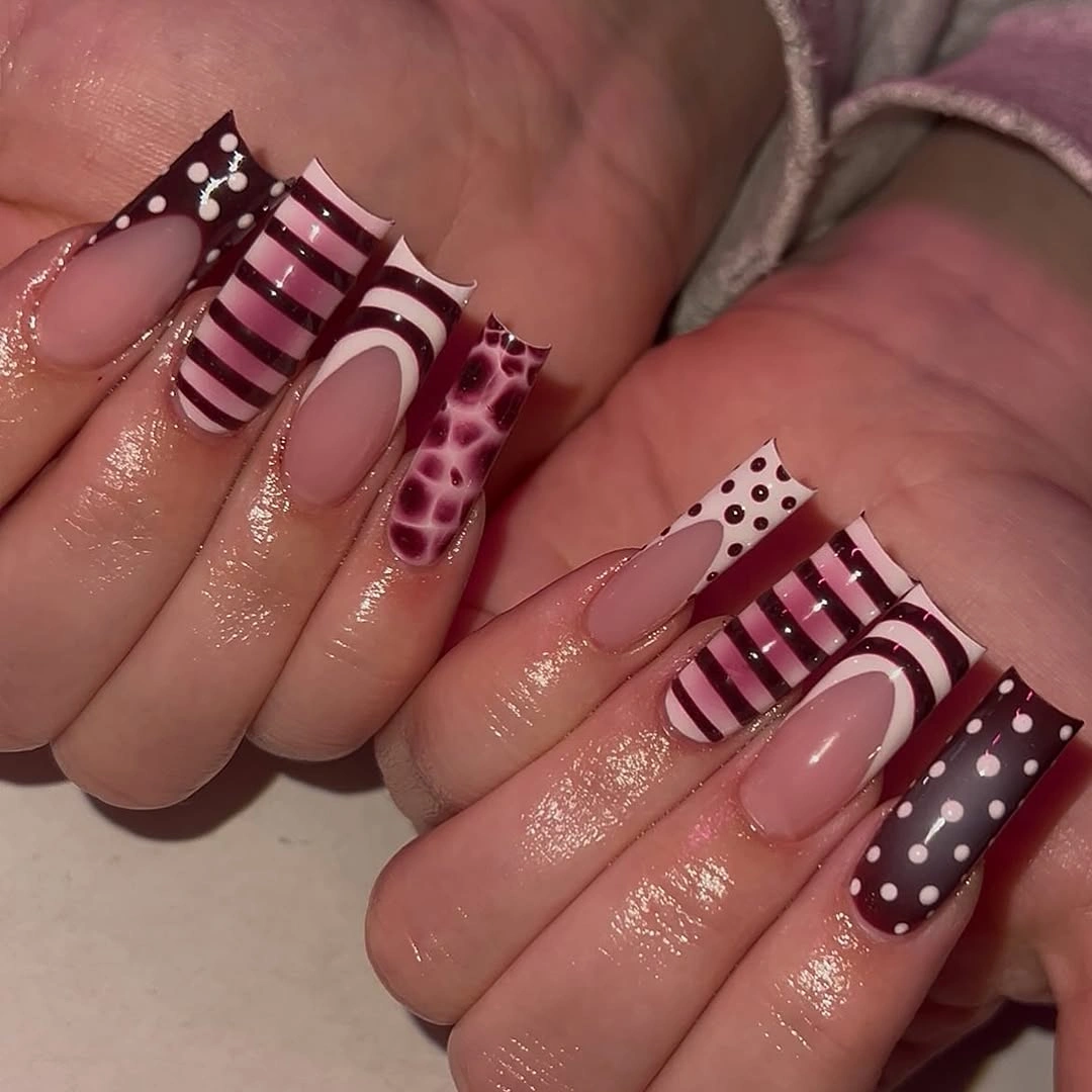
Each pattern has a different amount of coverage, and that variation gives the set its playful rhythm, but it also makes editing essential. For a more controlled version, pair the striped nail with the leopard accent and leave the rest in solid maroon; removing competing motifs would make the contrast easier to follow without losing personality.
The nude base is not merely background here, because it separates warm maroon shapes and makes the pattern changes visible at a glance. A darker beige would lower the contrast and feel softer, while a pale pink nude would make every red mark appear crisper; the choice should follow whether the goal is subtle texture or graphic definition.
Maroon Almonds Against a Soft Beige Knit
Long glossy maroon almond nails are shown against a thick beige sweater, and that neutral fabric makes the red appear deeper and more polished. The color relationship works because beige softens the intensity without turning the manicure dull, while the almond taper keeps the solid maroon from feeling like a heavy block at the ends of the fingers.
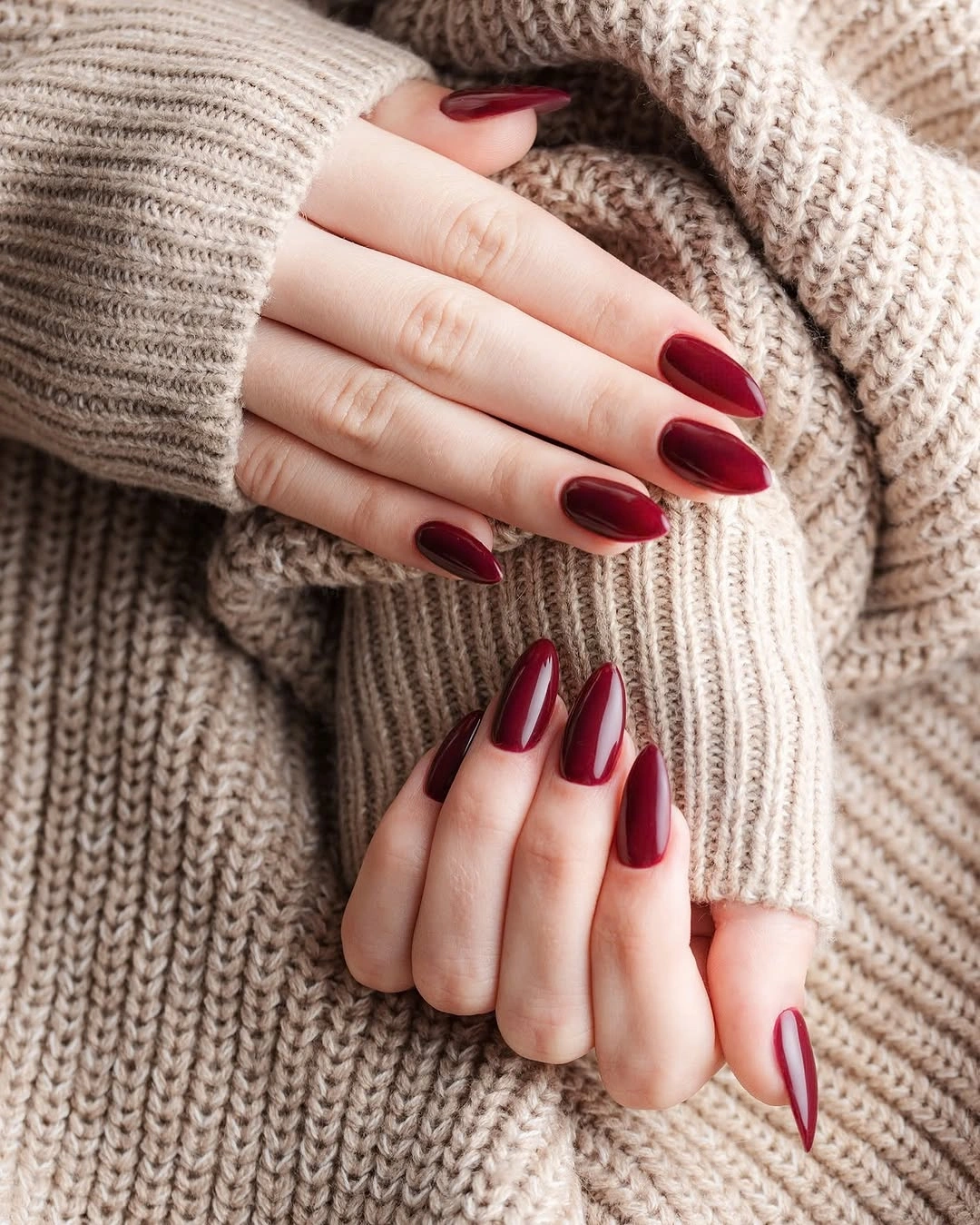
With a single-color manicure, shape carries much of the variation, so the consistent almond point is doing important visual work. A shorter length could keep the same wine color but use a soft oval to preserve warmth; a wide square would make the dark polish feel more assertive and slightly more casual than this elongated version.
The sweater offers a helpful styling clue: brown fall nail colors can make maroon feel especially balanced beside creamy and camel neutrals. Pairing it with a vivid saturated red would make the hand more dramatic, while quiet warm neutrals let the dark tone remain the focal point and give the glossy surface room to show its subtle changes in light.
Shimmering Maroon Tips on Long Almonds
Fine multicolor shimmer concentrates over long maroon almond nails, adding a cool flash to an otherwise warm wine base. The particles are most visible near the pointed tips, which draws the eye outward and makes the shape feel even longer, while the dark red beneath keeps the sparkle from becoming light or sugary.
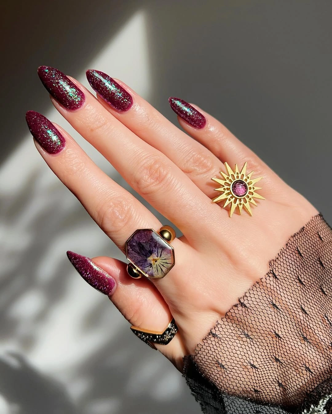
The concentrated shimmer is more effective than a uniform glitter coat because it creates a shift in value along the length of each nail. To reduce the drama, keep the shimmer on two nails per hand or use it only at the outer third; spreading it evenly would make the dark base less visible and weaken the gradient effect.
This design shows that a maroon palette can tolerate a cooler reflective note when the underlying red remains dominant. Gold flecks would make the set warmer and more holiday-leaning, while the visible blue-green flash introduces contrast; the key is maintaining enough wine area that the shimmer remains an accent rather than a replacement color.
Dark Wine Squares With Blush Accents
Short squared nails pair deep wine solids with two blush accents outlined in the same dark red, creating a measured alternation of value. The pale nails are not decorative leftovers: they lighten the center of the hand and make the burgundy nails appear more saturated by comparison, even though every element stays within a narrow color family.
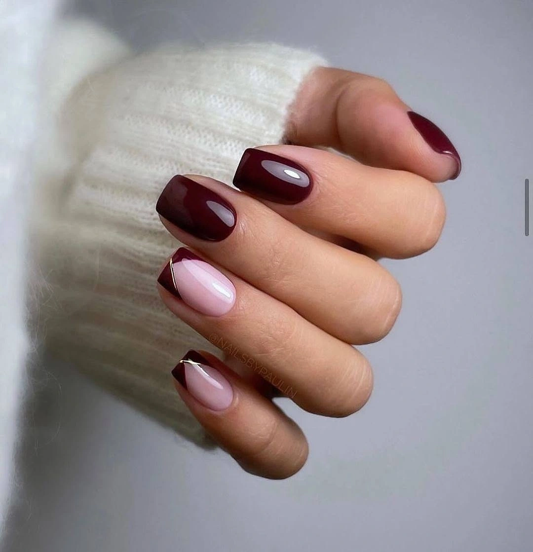
The outline on the blush nails matters because it visually returns the maroon to the lighter part of the pattern. Without that repeat, the pale accents could look disconnected from the dark squares; with it, the set reads as a conversation between a full dark color and a reduced, framed version of the same color.
A practical variation is to choose one blush accent instead of two when the nail length is very short, leaving more room for the wine solids. The underlying color logic should remain unchanged: strong value contrast gives the design clarity, while the shared maroon outline prevents the nude or blush areas from becoming too separate from the rest.
Rhinestone Line on Glossy Burgundy Squares
Glossy burgundy square nails use one narrow rhinestone line near the base to interrupt the solid dark surface with a precise reflective strip. The small stones sit against the wine color like a focused highlight, and their limited placement keeps the squared length looking clean instead of turning it into a heavily embellished statement.
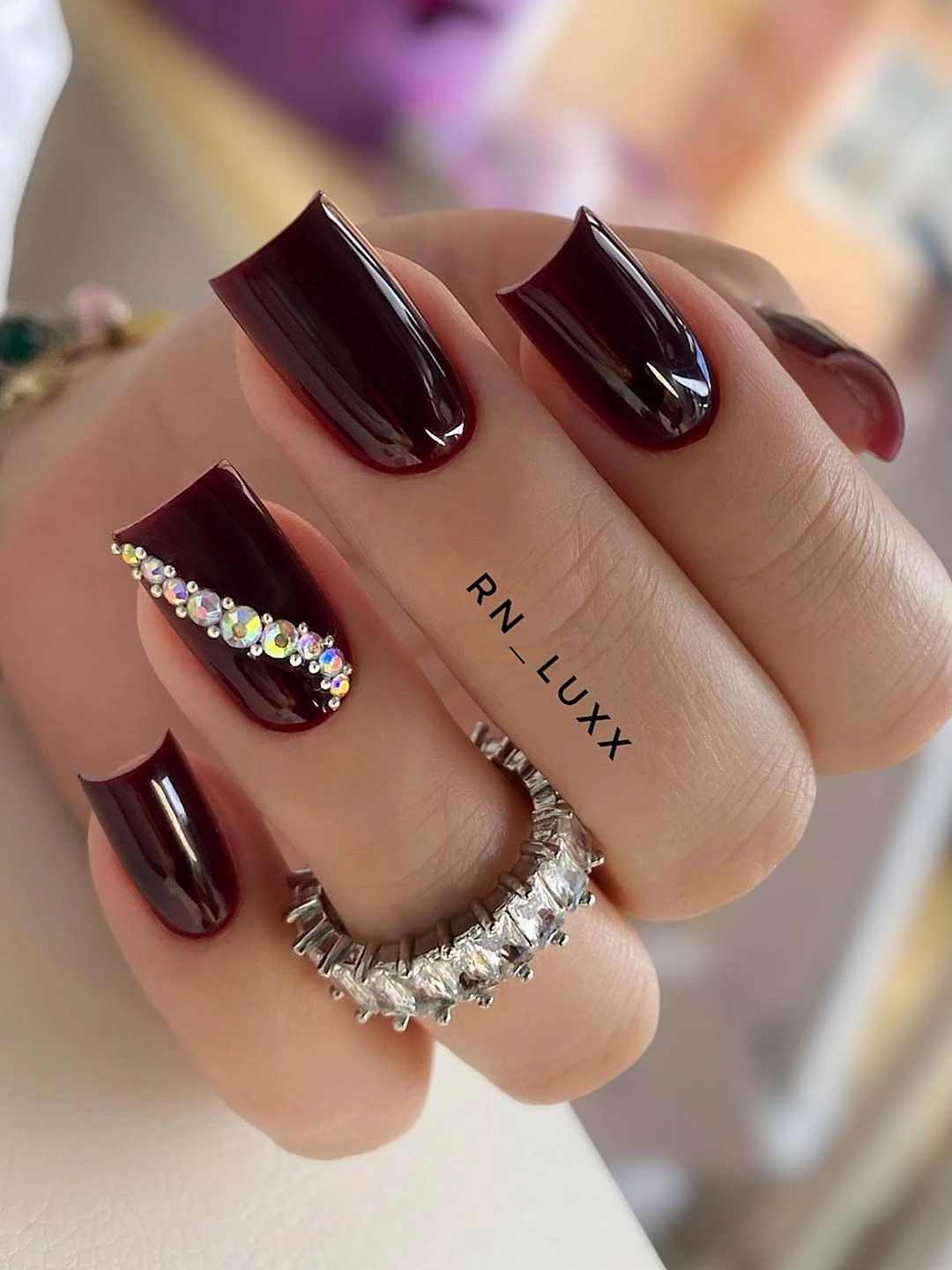
The line works because it is horizontal and compact, offering contrast without competing with the shiny polish across the tips. A shorter nail could use fewer stones or a single small cluster, but scattering them over several nails would remove the hierarchy that makes this detail feel intentional and would make the deep red lose its calm surface.
Clear sparkle has a cooling effect against maroon, so the result reads slightly sharper than a gold accent would. That is a useful choice for someone who wants dark burgundy to feel modern rather than overtly warm; gold would make it richer and more traditional, while the clear line preserves the red’s depth with minimal color interference.
Pure Dark Burgundy on Rounded Short Nails
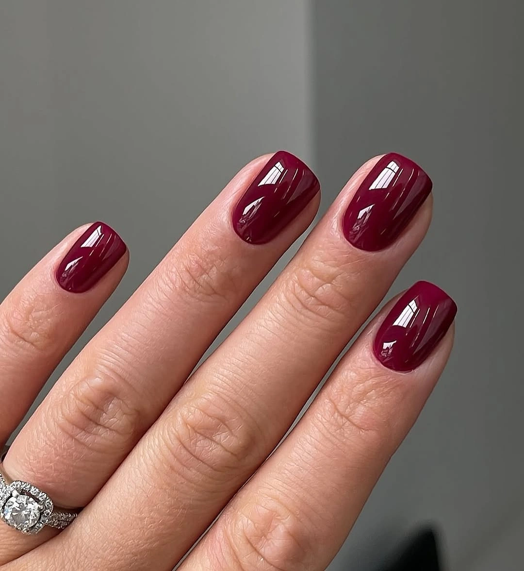
These short rounded nails depend on a single deep burgundy color and a smooth glossy surface, with soft lighting showing subtle changes from almost black to wine red. The rounded shape reduces the severity of the dark value, making the solid color feel approachable rather than overly dramatic for a compact everyday manicure.
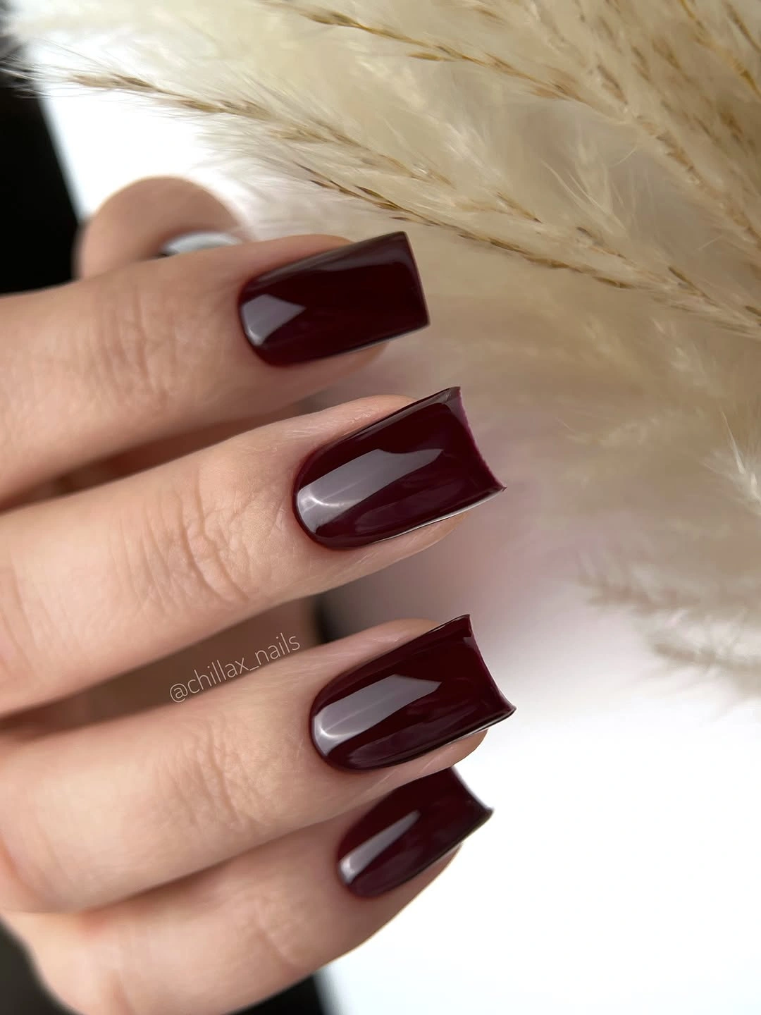
When no accent is present, the consistency of color becomes the design, so one mismatched nail would disrupt the entire effect. A matte top layer could make the burgundy look softer and more muted, but the gloss here is what reveals the red undertone; removing it would create a quieter mood with less visible depth.
This is the clearest option for someone deciding whether maroon suits them before adding patterns or contrasting neutrals. The color’s versatility comes from value rather than decoration: it can appear nearly neutral in shade, then show its red character in direct light, which is enough movement for readers who prefer a minimal, low-detail finish.
Nude Almonds With Burgundy and Rhinestones
Pale nude almond nails carry burgundy French tips and a few small clear rhinestones, combining a warm dark edge with pinpoint light reflection. The rhinestones sit near the neutral sections instead of covering the tips, which keeps the maroon line legible and lets the delicate additions feel like accents rather than a competing surface treatment.
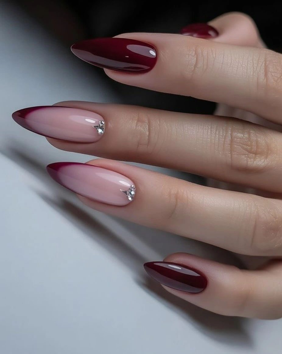
The color contrast is already strong, so the stones need to stay sparse to avoid making every nail fight for attention. A lower-maintenance version could use the burgundy tips alone, while a more decorative one might place stones on two accent nails only; repeating them at every tip would blur the clean boundary between nude and wine.
Because clear stones do not introduce a new hue, they let the pink-nude and maroon relationship remain the main color lesson. This is more controlled than mixing gold and silver accents together, and it gives the design a flexible dressy note; the visual rule worth keeping is dark at the edge, light near the center.
Wine Squovals With a Curved Highlight
Short squoval nails are mainly a solid wine red, but one glossy maroon accent catches a lighter curved reflection that changes the apparent depth of the color. The softened square shape keeps the palette modern and practical, while the single altered surface stops the otherwise uniform set from looking flat or overly predictable.
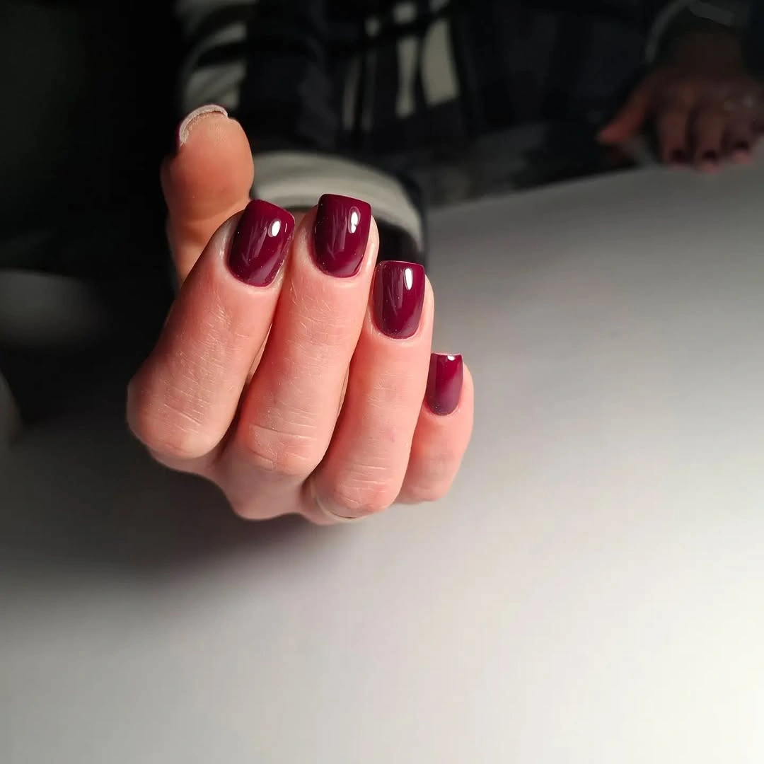
The accent succeeds because it remains close to the same value as the surrounding wine rather than creating a sharp color interruption. For an understated variation, use a faint translucent curve over one nail and keep the rest solid; changing the accent to pale pink would create more contrast, but would also make the manicure less tonal and more obviously patterned.
Tonal variation is useful when someone wants detail without adding a new shade, particularly on shorter nails that can become busy quickly. The viewer notices the surface shift only after seeing the dark red base, which gives the design a quieter reward than a glitter or rhinestone accent and preserves the strong, simple maroon story.
Maroon Leaf Silhouettes on Nude Accents
Dark maroon almond nails are broken by nude accents carrying small leaf-like silhouettes and fine glitter lines, using pale space to make the botanical details readable. The darker solids anchor the design, while the printed nails introduce an autumn reference without requiring every finger to hold a full illustration or a separate color.
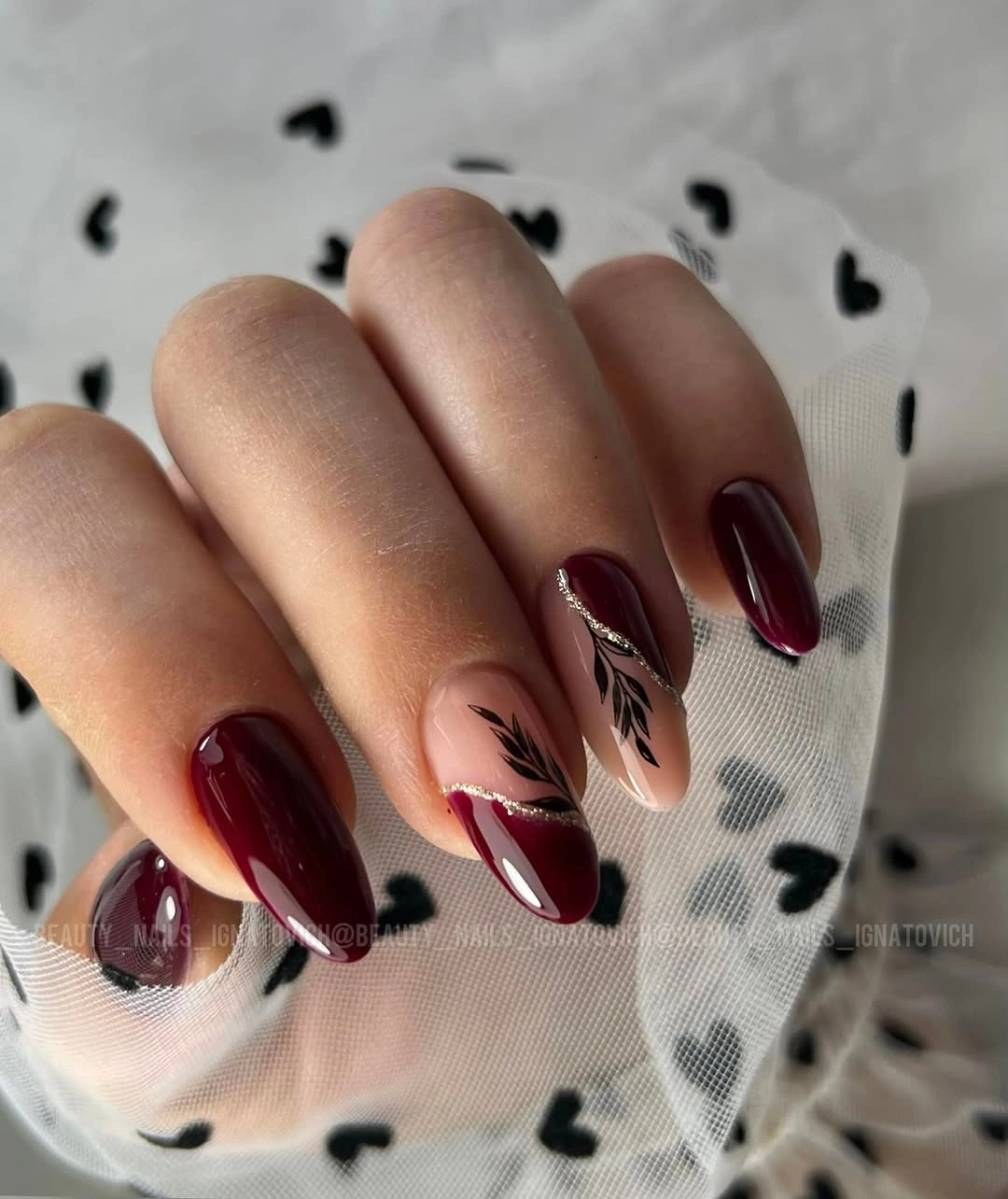
The leaf silhouettes are most effective because they remain dark and narrow against the nude, matching the surrounding maroon instead of adding a new green or orange. A simpler edit could use one botanical accent per hand; increasing the number of patterned nails would lower the contrast between solid and illustrated areas and make the set less composed.
The glitter lines create a small shift in surface value, but the maroon is still the element that ties the manicure together. Preserving that limited palette is more important than copying each leaf exactly, since the visual strength comes from dark botanical marks floating within a pale neutral field rather than from a dense seasonal scene.
Dark Plaid Over Short Burgundy Squares
Short square burgundy nails use a dark plaid pattern that layers thin crossing lines over the wine base, producing depth without moving far from the original color family. The pattern is visible because the lines vary in value against the maroon, yet the close tones keep the surface from becoming as loud as a high-contrast tartan would.
Grid patterns need even spacing to look calm on a small surface, so this is a better choice for one or two nails than for every finger on a short set. If the pattern feels too dense, use a single vertical and horizontal line over solid maroon; that preserves the plaid suggestion without creating a hard-to-read mesh near the tip.
The close-value plaid feels more autumnal than a bright red-and-white version because it lets the wine color remain dominant. Adding a thin beige line would raise the contrast and make the grid more obvious, while staying within burgundy and plum creates a quieter texture that rewards a closer look rather than announcing itself immediately.
Wine Nails With Delicate Dark Linework
Short rounded wine nails keep their saturated color while one nail carries a subtle darker line motif and a small floral-like mark. The decorative detail is quieter than a pale accent would be, which lets the manicure stay tonal and means the eye reads the overall burgundy first, then notices the fine drawing as a secondary layer.
This kind of low-contrast art is suited to someone who wants detail that does not interrupt a solid color wardrobe choice. The motif should remain small and dark; making it white or metallic would immediately increase contrast and change the set from a nuanced tonal manicure to one where the accent nail becomes the clear focal point.
The rounded length helps the burgundy feel soft even when the color is nearly black in shade. A matte finish would further mute the difference between art and base, while the visible gloss makes the linework easier to detect; the decision depends on whether the reader wants a hidden detail or a subtle but readable pattern.
Red Outlines Around Translucent Square Centers
Long square nails use translucent nude centers surrounded by dark red outlined French tips, creating a strong frame without filling the broad free edge. The red appears more graphic because it sits on the perimeter, while the open middle prevents the square shape from looking too dense and adds lightness to an otherwise saturated color choice.
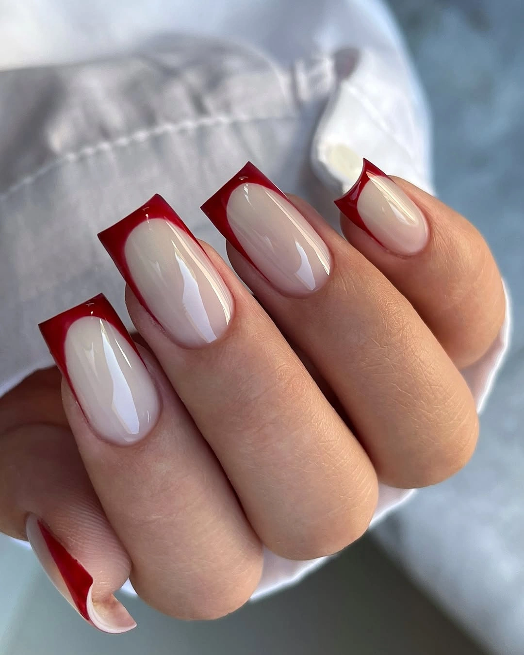
The outlined structure is what makes the design transferable to another palette: a warm brown or deep plum could take the red’s place without changing the visual logic. On shorter squares, make the outline thinner and stop it higher at the corners, since a wide frame would consume the nude center and reduce the negative-space effect.
Maroon and nude create a more sophisticated contrast than full opaque red because the eye can move from frame to center without encountering a solid block. The drawback is that the clean outline becomes highly visible if it is uneven, so the design favors precise edges and a deliberate square shape rather than an intentionally soft or casual finish.
Glossy Maroon Almonds in a Single Hue
Long almond nails in a uniform glossy maroon show how much depth one dark red can produce when the shape is tapered and the light catches each curve. There are no accent nails to interrupt the color, so the subtle shifts between deep wine and brighter red reflections become the entire visual experience of the manicure.
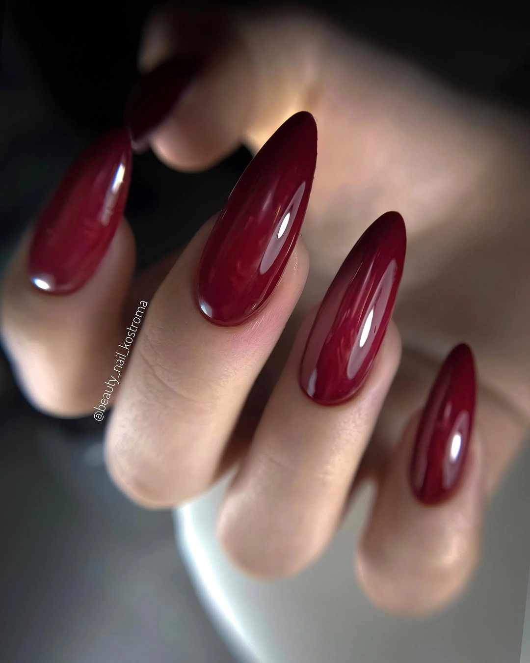
The decision to keep every nail the same makes the length look intentional and continuous, rather than fragmented by a pattern. A reader who wants the same color with less intensity could shorten the almond or choose a squoval shape; adding a pale accent would change the principle from tonal continuity to contrast, which is a different mood entirely.
Gloss allows the maroon to show multiple values in light, making the color feel richer than a flat dark surface. That effect is worth preserving if depth is the goal, while a matte version would look more muted and editorial; neither is better, but the glossy finish here is responsible for the subtle red movement across the long shape.
Smoky Maroon Marble on Square Tips
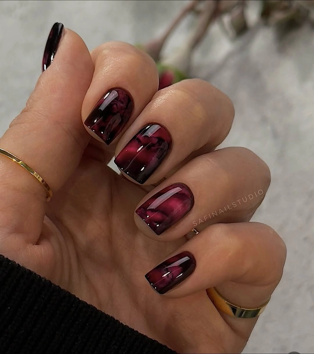
Short square nails carry a smoky maroon pattern with pink reflective streaks, so the dark base appears layered instead of uniformly opaque. The marbling is strongest where the lighter tones move through the wine red, creating visual depth while the nearby solid nails keep the design anchored and prevent every surface from becoming equally busy.
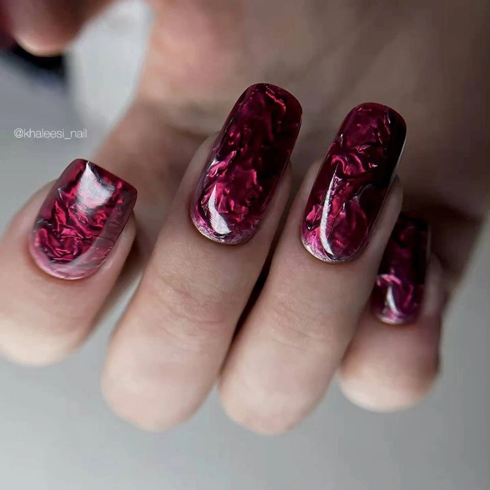
The patterned nails should stay limited because the marble already contains several values within one color family. A simpler version could keep one marbled accent and leave the rest dark burgundy, while adding more light streaks across all nails would make the pale pink marks dominate and reduce the moody, deep quality of the maroon background.
Pink reflections warm the wine color and make the pattern look more luminous than black or gray marbling would. A cooler lilac streak would shift the balance in a different direction, but the important relationship is a small amount of lighter color moving through a large dark field, which gives depth without sacrificing the manicure’s dark overall value.
Wine Glitter on a Short Square Set
Short square wine nails use a restrained glitter sheen, with one slightly deeper plum accent adding a second dark note instead of a pale contrast. The close values make the set cohesive, while the reflective particles add enough surface variation to keep the otherwise minimal shape from reading as a completely flat block of burgundy.
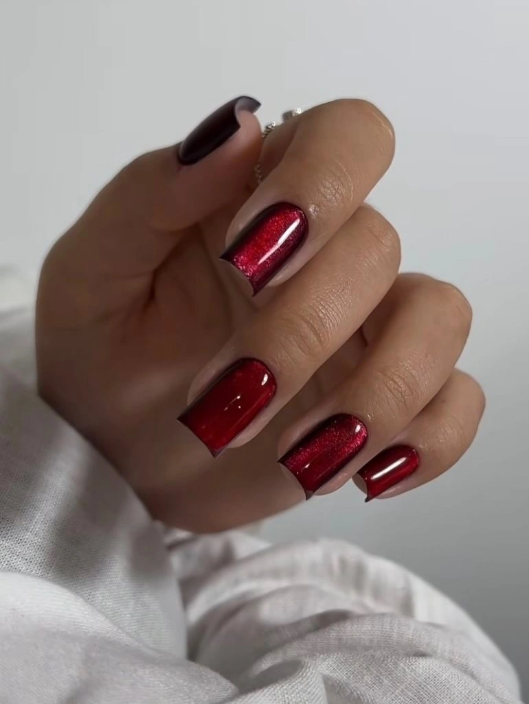
The deeper plum accent is subtle because it sits near the same value as the wine nails, and that is exactly why it works. Replacing it with a bright cream accent would create a more obvious pattern, but preserving the dark-on-dark shift gives a reader a quieter option that remains compatible with the low-contrast glitter texture.
For a fall manicure, this is a useful route when a full glossy solid feels too plain but strong art feels excessive. The glitter provides a tonal lift rather than a new color, and the plum creates a small shadow note; keeping both within the same deep range is what stops the square set from appearing fragmented or overly embellished.
Bright Red Waves Over a Sheer Base
Short nails combine saturated red solids with sheer pink nails marked by flowing red wave lines, creating a much brighter interpretation of a maroon-adjacent palette. The transparent-looking areas make the red lines seem lighter and more animated, while the solid red nails provide enough density that the pattern does not float away from the color story.
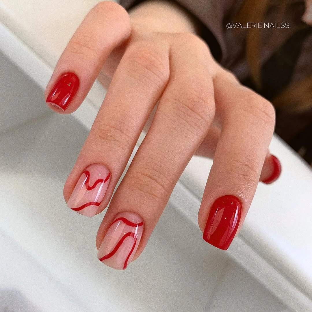
The waves should remain narrow and irregular to preserve their movement, especially on short nails where a wide red band would look like a blunt block. A wine-red version would make the design more muted, but the key contrast would remain: translucent pink needs a saturated red line nearby to keep the pattern readable and purposeful.
This option is less dark than the surrounding maroon designs, yet it still belongs in the family because red is organized through solid versus sheer value changes. Someone who prefers a calmer result could reduce the number of wave nails, but should keep at least one solid red nail per hand so the pale base does not make the entire manicure look too delicate.
Glossy Burgundy Sculptures Over Nude Centers
Long nude almond nails end in thick glossy burgundy shapes that rise in a sculptural, almost folded French placement. The dark tips have more volume than a thin line, but the exposed nude centers remain large enough to create contrast, making the result feel intentional and dramatic rather than simply like a full dark manicure with missing color.
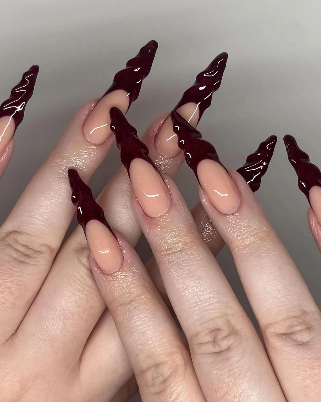
The tip volume needs the nude center to stay clear, because that empty area gives the irregular burgundy edges room to read as a distinct shape. On a shorter nail, reduce the height of the dark placement but preserve its asymmetry; a uniform wide French tip would lose the sculptural character and look considerably more conventional.
The glossy surface makes the burgundy appear almost liquid against the matte-looking nude center, increasing the contrast without adding another hue. A muted brown-red would soften the drama, but retaining a deep wine value is important; the visible relationship to preserve is saturated reflective color surrounding a calm, understated neutral interior.
Mixed Maroon French Shapes on Nude Squares
Medium nude square nails use different maroon French-tip shapes, while one pink accent carries an abstract maroon curve, creating variation through placement rather than a broad palette. The recurring wine red acts as a visual thread across the hand, and the pale centers prevent the changed tips from becoming a confusing set of unrelated graphic marks.
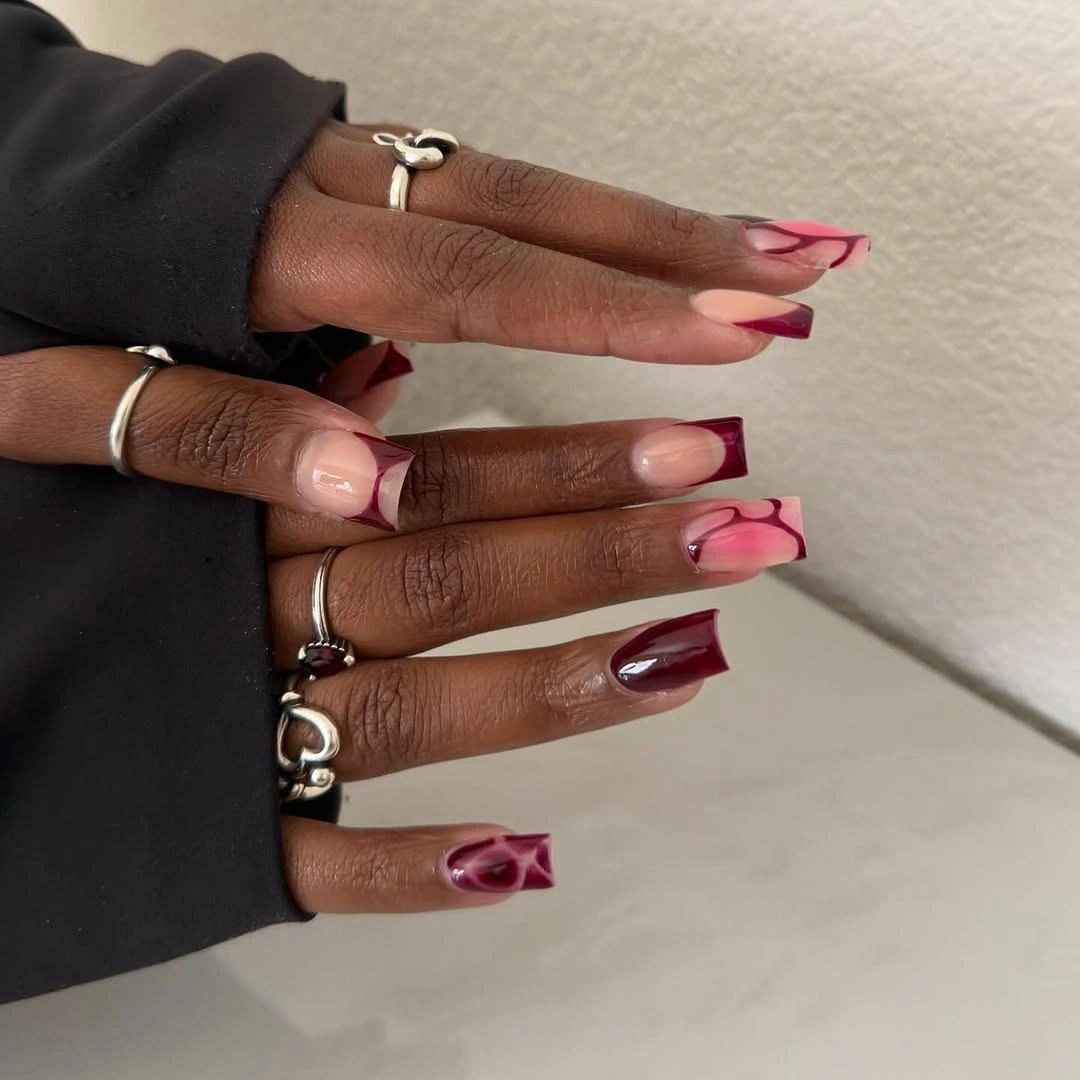
Varying tip shapes is most successful when the colors remain identical, as they do here, because the eye can focus on direction rather than trying to decode extra hues. A more restrained edit would repeat two tip forms instead of several; too many different silhouettes on a shorter square could make the manicure feel less composed and more like a test board.
The pink accent is warmer and lighter than the nude base, so it adds a gentle change in value without competing with the dark maroon. Keeping that accent to one nail preserves the hierarchy: maroon defines the set, nude provides space, and the pink curve offers a small interruption that makes the repeated red placements feel less rigid.