Polka dots become more useful when they control the empty space around them, rather than simply covering a nail with a familiar pattern. A dark dot on a sheer base, a white dot on burgundy, or a dot that sits inside a French tip can shift the mood from soft to sharp with almost no change in the basic motif.
For a fall version of polka dot nails, look first at the base value and then at the dot scale: contrast creates the atmosphere, while spacing decides whether the result feels tailored or busy. That same decision can connect autumn nail color ideas to a graphic pattern without forcing every set into a dark palette or a full all-over print.
Sage Green Tips With Black Dots
Long sheer nude almond nails use sage green French tips as a muted border, then scatter small black dots through the open surface. The dark marks are widely spaced enough to remain individual, while the green keeps the manicure grounded; together they create a calm, slightly graphic contrast that does not overwhelm the elongated shape.
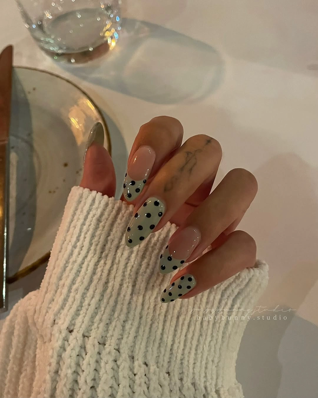
The dots work because they extend beyond the tips without filling the nude center, giving the eye a path from green edge to black detail. On a shorter set, use fewer dots and a thinner sage line; keeping too many black marks on less visible space would make the pattern denser and erase the quiet negative space.
Sage is soft enough to behave like a neutral, but the black dots keep it from looking overly delicate or plain. A warmer olive would make the design feel deeper for fall, while a cooler gray-green would feel more restrained; the relationship worth preserving is an earthy tip offset by small, deliberate dark points.
Smoky Lavender Chrome With Tiny Dots
Long pointed nails show a smoky lavender gradient with a reflective, chrome-like cast, interrupted by a few tiny black dots near the surface. The cool shimmer makes the pointed silhouette feel sleek, while the sparse dark marks stop the reflected color from becoming a smooth, featureless haze across every nail.
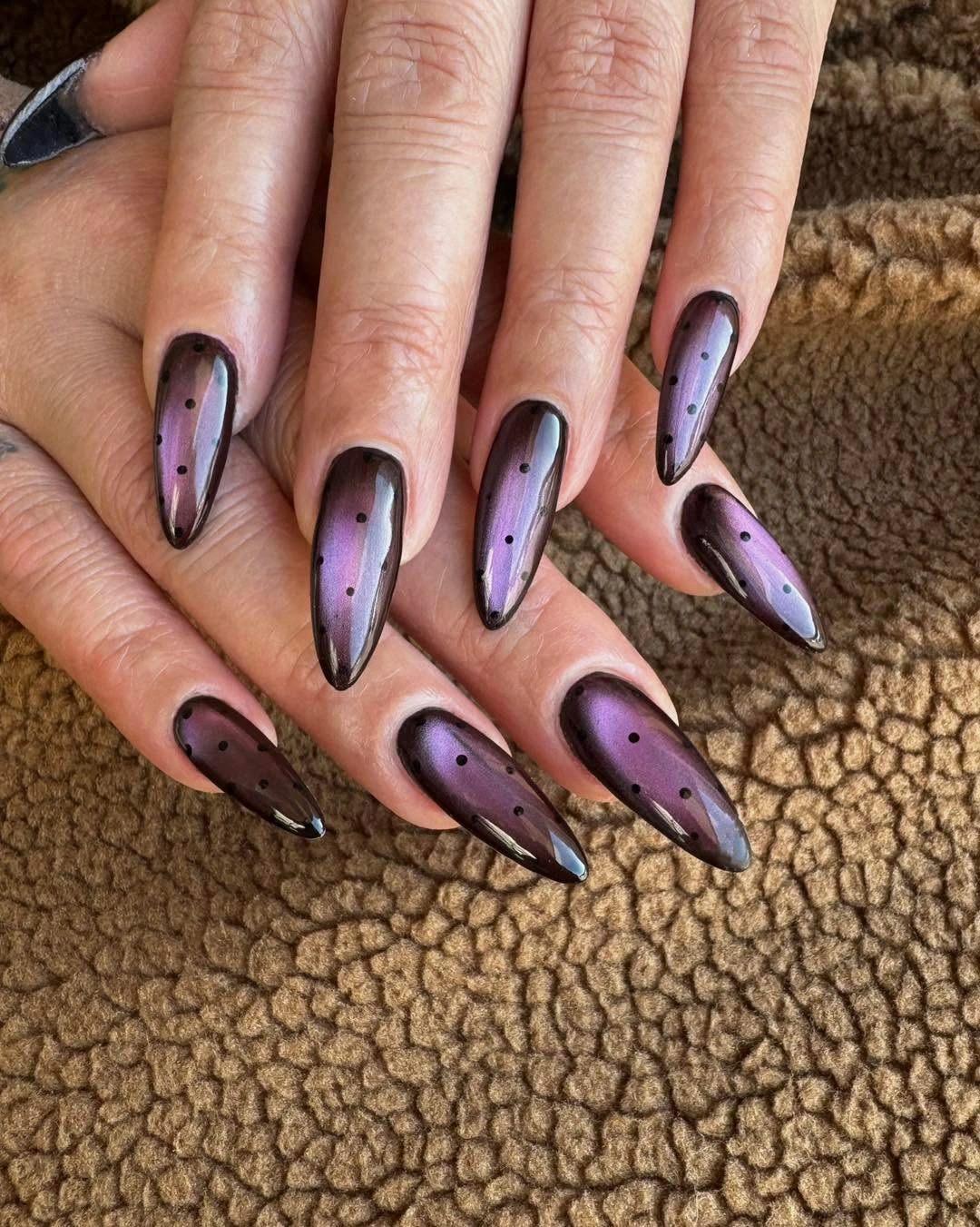
The dots need to remain almost incidental because the shifting lavender surface already has enough visual movement. A softer version could omit them on half the nails and keep the smoky gradient, but making the dots large or numerous would pull the eye away from the reflective depth that gives this design its strongest atmosphere.
Lavender is not an obvious autumn neutral, yet the gray shadow within it keeps the color from reading sugary or overly bright. Pairing it with black rather than white makes the contrast sharper and more after-dark, while a silver dot would merge too closely with the reflection and lose the clear punctuation seen here.
Soft Pink Nails With Irregular Black Dots
Short rounded pale pink nails are covered with irregular black spots, turning a very soft base into a graphic pattern without changing the underlying color mood. The dot sizes are not perfectly matched, which keeps the print lively; the short rounded shape also makes the contrast feel friendly rather than severe or overly formal.
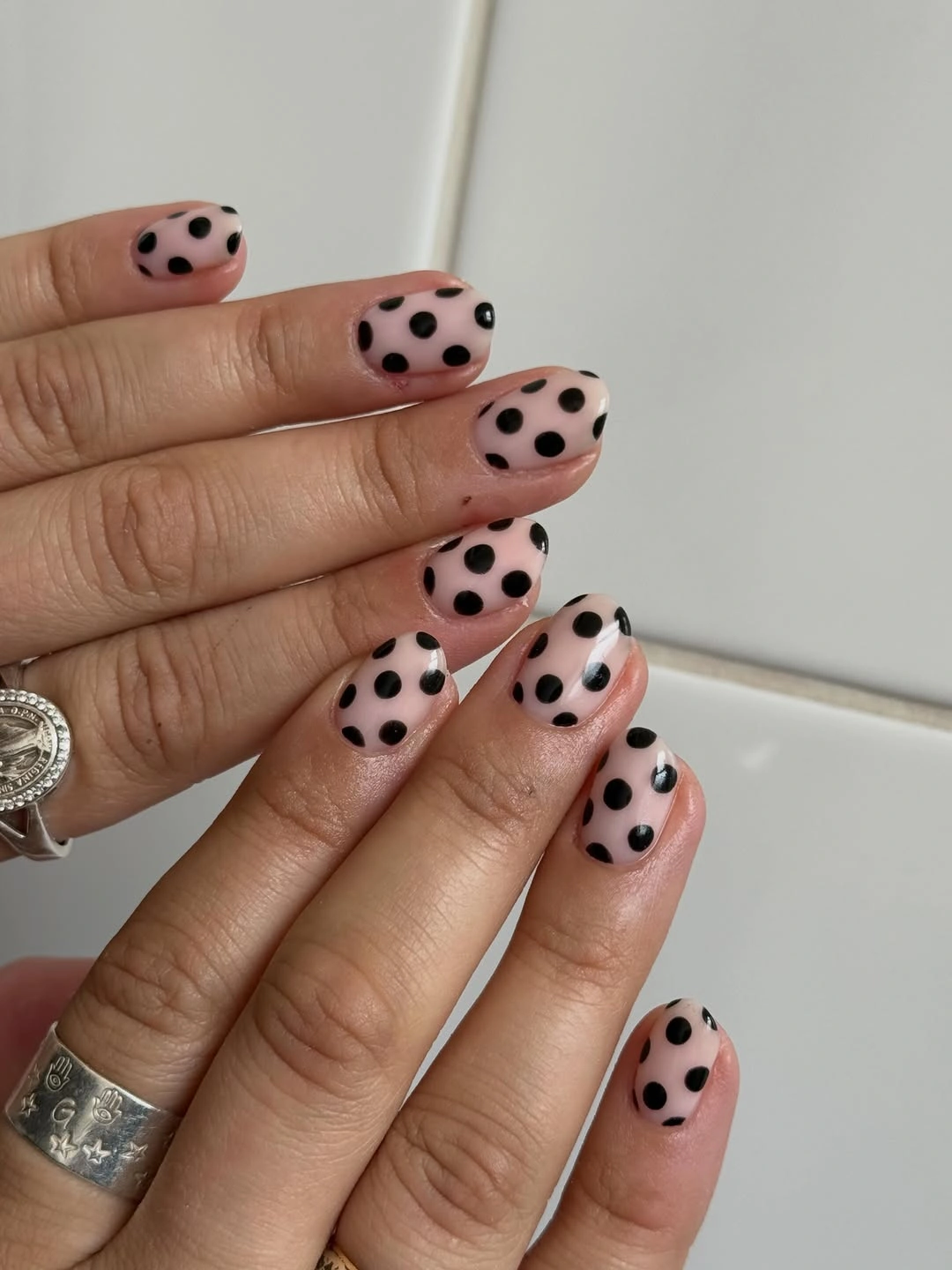
Uneven dot scale is the detail that gives this set personality, but it should still leave visible pink between each mark. On very short nails, use just three or four dots per nail and avoid placing them in a strict grid; too much regularity would make the surface look heavy and remove the loose rhythm that suits the shape.
Black against pale pink provides a high-value contrast that reads clearly in both shade and light, making it a dependable starting point for polka dots. A nude beige base would mute the pattern, while a deeper mauve would make it more dramatic; keeping the dots black preserves the crisp, direct visual statement regardless of base color.
Burgundy Almonds With Small White Dots
Deep burgundy almond nails use small white dots placed at measured intervals, allowing the dark glossy-looking base to stay dominant while the contrast catches light. The dots feel sharper against wine red than against pink, so the pattern gains a nighttime polish without becoming dense, especially because the almond tips retain so much uninterrupted color.
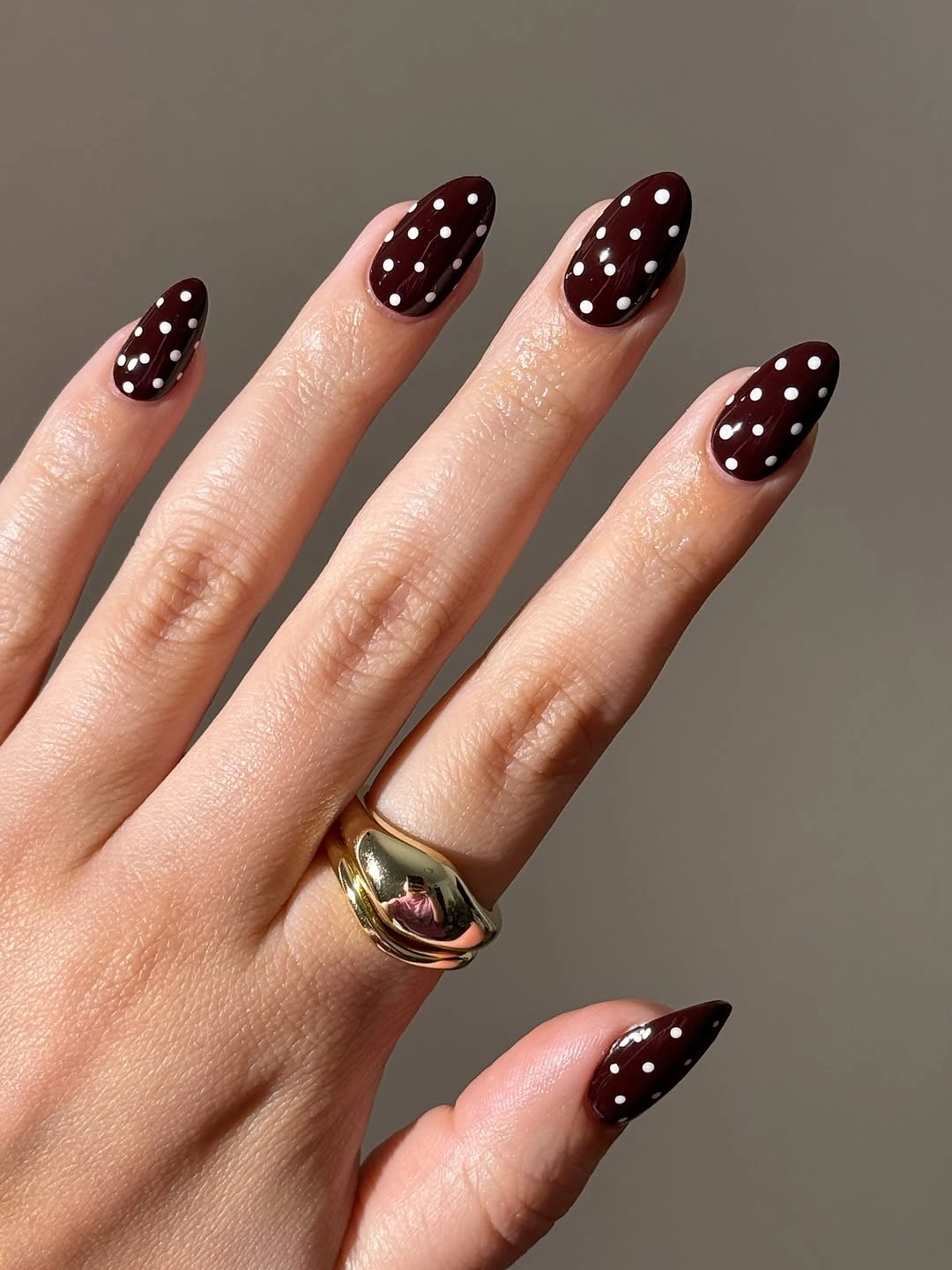
The white marks should remain small and clearly separated, otherwise they would turn the burgundy surface into a bright spotted field and weaken its depth. A shortened version could concentrate dots near the cuticle or along one side, keeping the same controlled contrast while leaving the tip dark enough to preserve the long, tapered visual line.
This is a useful answer for someone who likes polka dot nail inspiration but wants more than a plain solid. White dots add light without introducing a competing hue, while gold dots would warm the set and black dots would disappear; the clean white contrast is what keeps dark burgundy readable and polished.
Olive Short Nails With Fine White Dots
Short muted olive nails carry tiny white dots in a neat, grid-like spread, creating a quiet pattern over a low-saturation base. The olive gives the dots a softer background than black or burgundy would, and the compact length keeps the repeated marks from feeling like a large-scale print stretched too far across the hand.
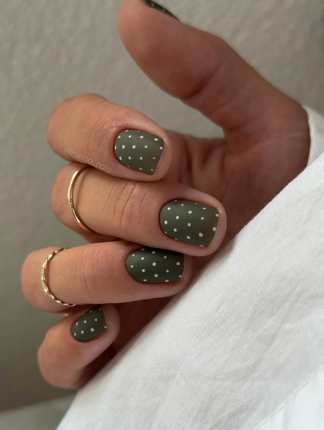
The restrained dot size is important because the olive base has a calm, almost earthy value that can be easily overwhelmed by a bolder motif. If using a square shape, keep the dots closer to the center and reduce their count; broad corners plus oversized white marks would make the soft color look more blunt and less refined.
Olive and white create contrast without the hard graphic tension of black and white, making this a good low-drama fall choice. For September nail color ideas, a richer moss tone would make the dots appear brighter, while a grayer green would reduce their impact; neither change requires a new pattern, only a decision about how much the white should stand forward.
Hot Pink Outlines Around Black Dots
Short nude oval nails pair black dot clusters with vivid pink outlined French arcs, combining two very different contrasts on one compact shape. The black provides depth and the pink creates an electric perimeter, while the visible nude center gives both details room to register instead of letting the nail become a continuous field of competing color.
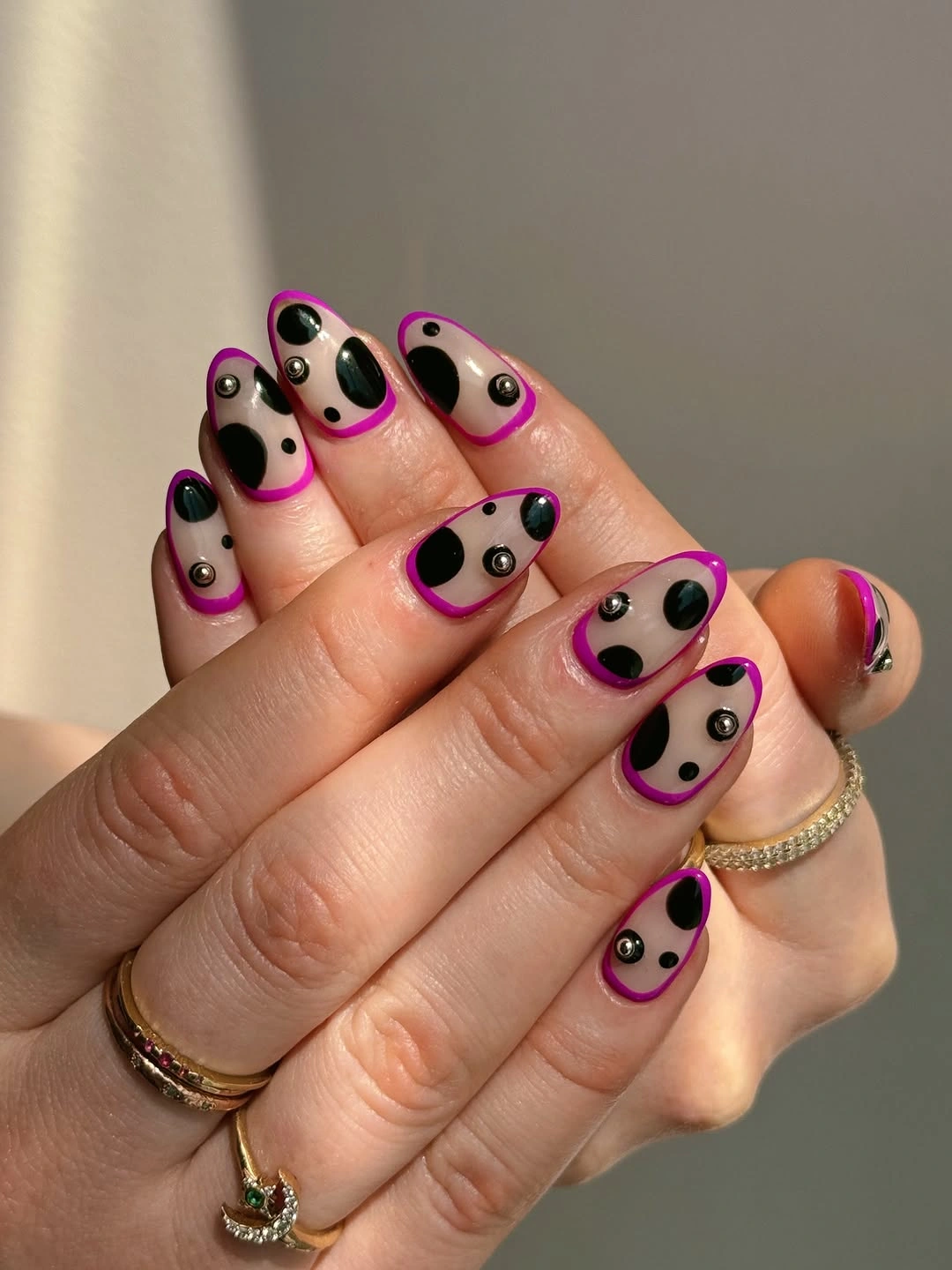
The pink outline is doing more work than a full bright tip would because it frames the upper edge without filling it. For a calmer adaptation, keep the black dots and switch the outline to burgundy or olive; the dots will still add graphic tension, but the color change will shift the manicure from high energy toward a more autumnal balance.
Because the pink and black are both visually strong, spacing is essential: the dots cannot crowd the outline or each element loses its separate role. Leaving a narrow nude buffer between them creates the design’s depth, whereas overlapping the dots into the pink would make the surface look busier and substantially reduce the clean silhouette of the oval nails.
Off-White Almonds With Fine Black Specks
Long off-white almond nails use very fine black dots scattered across a pale field, producing a restrained speckled effect rather than a bold polka dot statement. The dots are small enough to feel like texture from a distance, while the warm light base keeps the pointed shape soft and gives the black marks a clean but not overly stark contrast.
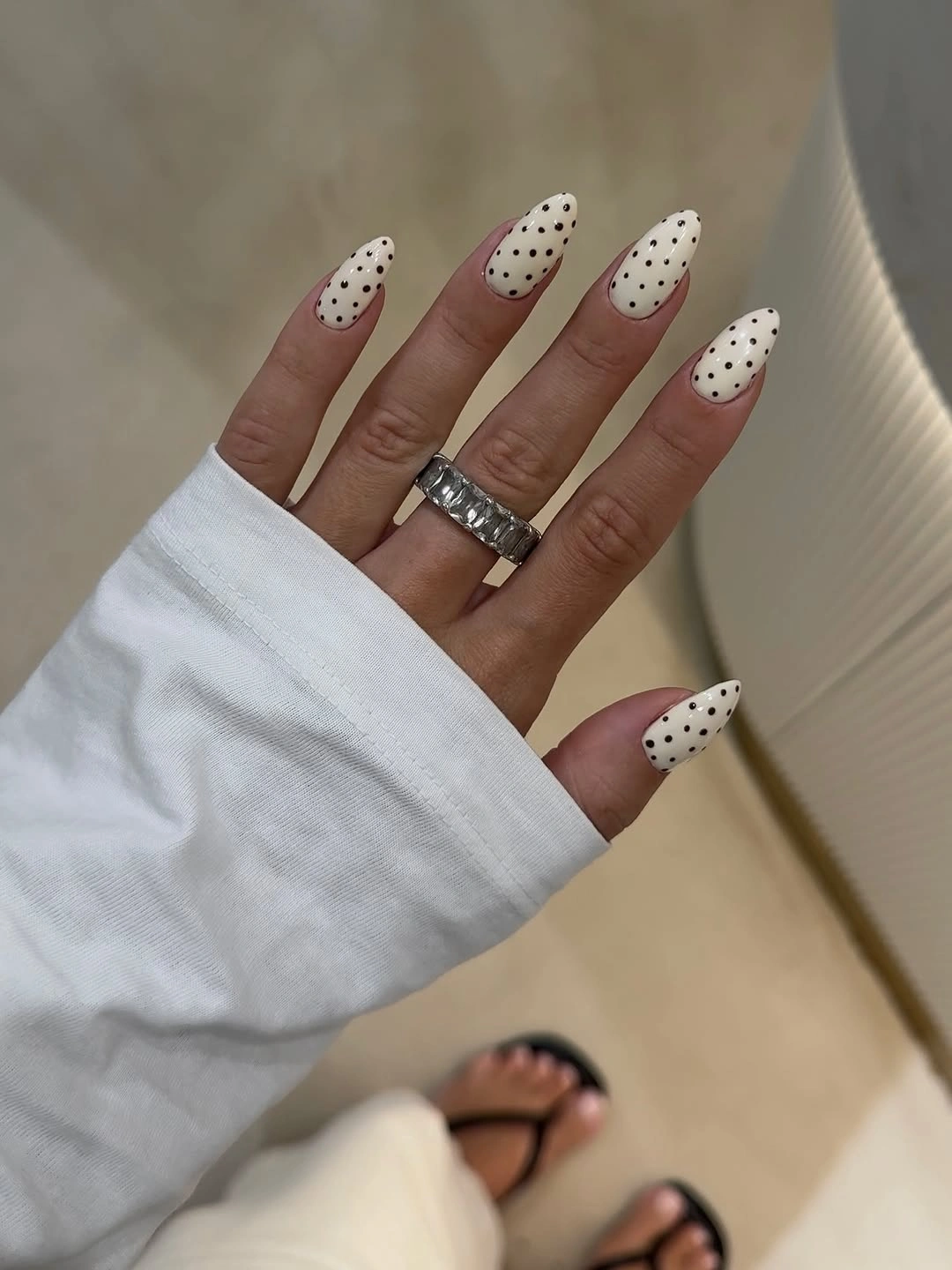
The pattern feels calm because the black specks do not form a strict rhythm, so each nail has a slightly different distribution. A person who wants a sharper result could enlarge dots on just two accent nails, but covering the whole set with larger circles would remove the delicate surface quality and turn the light almond shape much more graphic.
Off-white makes a practical bridge between beige and true white, which is why it supports black detail without the cold glare of a bright white base. Switching to cream would warm the manicure further, while a pale gray would make it feel cooler; the visual rule to keep is sparse black contrast against a soft, luminous neutral.
Black French Corners With White Dots
Square nude nails use black French corners rather than a continuous tip, then place small white dots inside the dark areas to create a compact frame. The corner placement leaves much of the nude center open, and the white dots flash against the black like small lights, giving the design depth without extending the dark color too far down the nail.
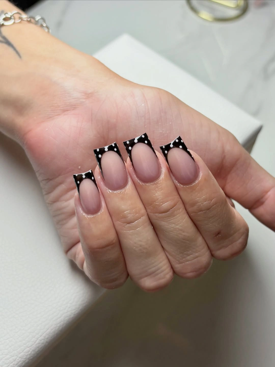
The broken French line is more flexible than a full black tip because it can be scaled down for a shorter nail without losing its structure. Keep the white dots inside the black corners and resist adding them over the nude space; that containment is what makes the pattern feel designed rather than scattered without a clear boundary.
Black and white can feel very severe on their own, but the nude center softens the contrast and makes the square silhouette less heavy. A burgundy corner would create a warmer fall edit, yet the black version has a sharper cinematic quality; the open center must remain wide enough for that darkness to look intentional rather than dominant.
Burgundy Almonds With Edge Dots
Long burgundy almond nails carry small white dots mostly near their edges, allowing the deep wine base to remain a continuous field through the center. That choice makes the pattern feel more like a border than a full print, and the placement follows the tapered shape rather than interrupting it with a crowded cluster in the middle.
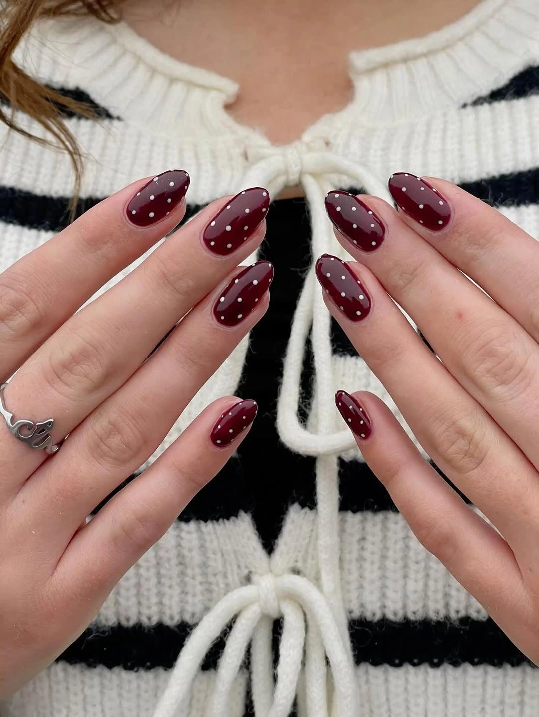
Edge placement is useful when a reader wants polka dots but does not want to hide a saturated dark color. On a shorter almond, one row of dots along a single side would be enough; mirroring dense rows on both sides could close in the center and make the nail look narrower than the clean shape allows.
The wine-and-white contrast is still strong, but it feels more controlled than an all-over dot pattern because the dark center stays uninterrupted. Swapping white for soft pink would lower the drama, while keeping the dots bright white maintains the crisp detail that helps the burgundy surface remain readable in low, changing light.
Black Geometric Tips With Tiny Dots
Short pale pink nails use black geometric French tips with small white dots across the dark sections, creating a compact composition of corner angles and pinpoint highlights. The pale base acts as visual relief, while the black shapes provide the strongest value, so the dots can remain small and still feel distinctly visible rather than decorative clutter.
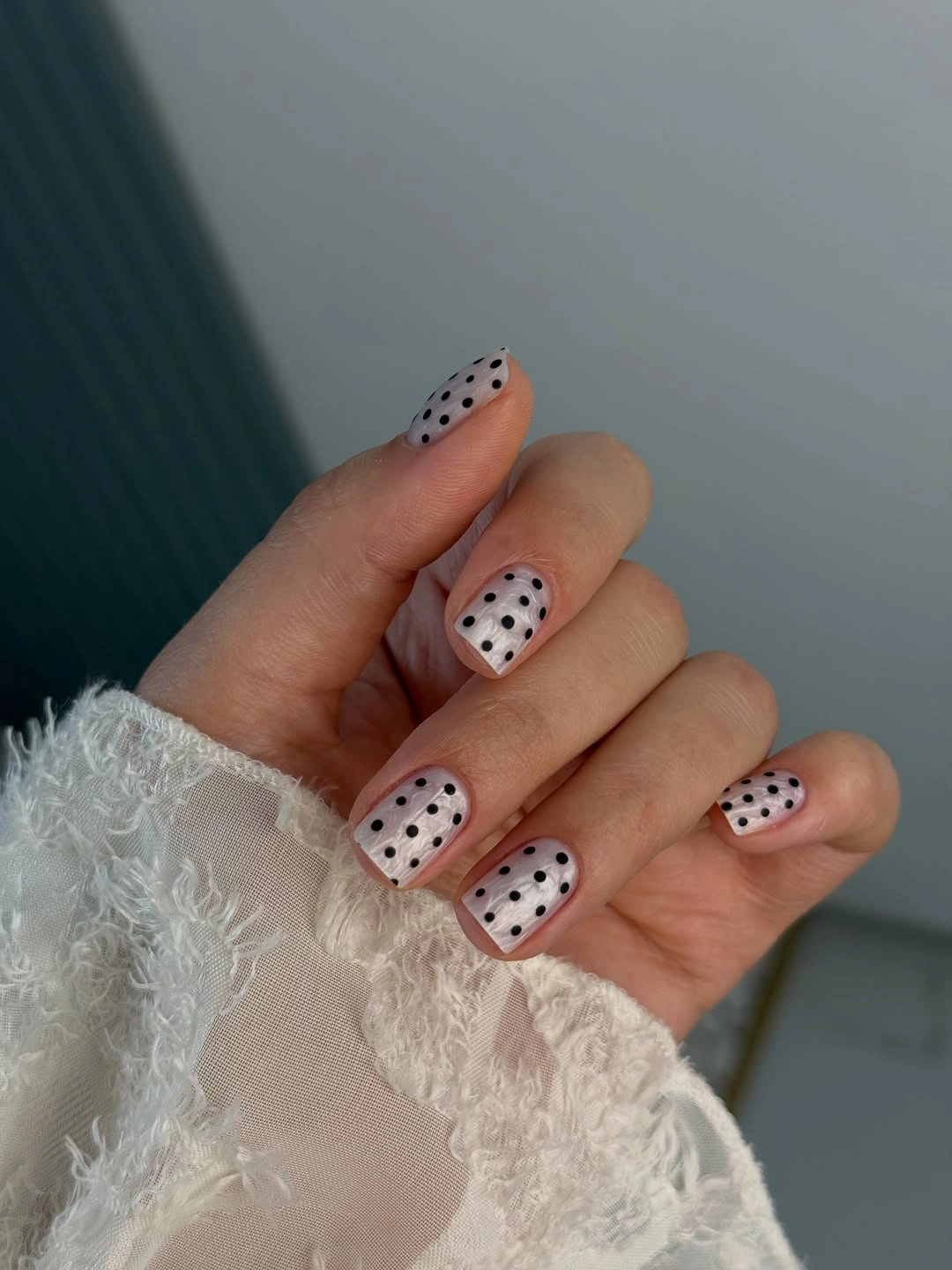
The geometric tips should stay near the free edge, where their straight lines sharpen the otherwise soft pink surface without overwhelming it. For a less bold option, use one black corner per nail instead of a full split tip; shrinking the dark area keeps the same structure and makes more room for the small white dots to breathe.
There is a useful tension between the rounded pink area and the hard black angles, which gives the short nails more presence than a simple dot print. If a fall palette is preferred, replace pink with sheer beige and retain the black-and-white layout; the contrast, not the exact base hue, is the essential part of this design.
Sheer Pink and Burgundy Dot Contrast
Sheer pink nails alternate between burgundy dots and solid burgundy nails covered with raised-looking white dots, building contrast through both base value and dot color. The mix feels layered because the eye moves from pale transparent-looking pink to deep wine, then from dark dots to bright dots, rather than reading one repeated surface treatment.
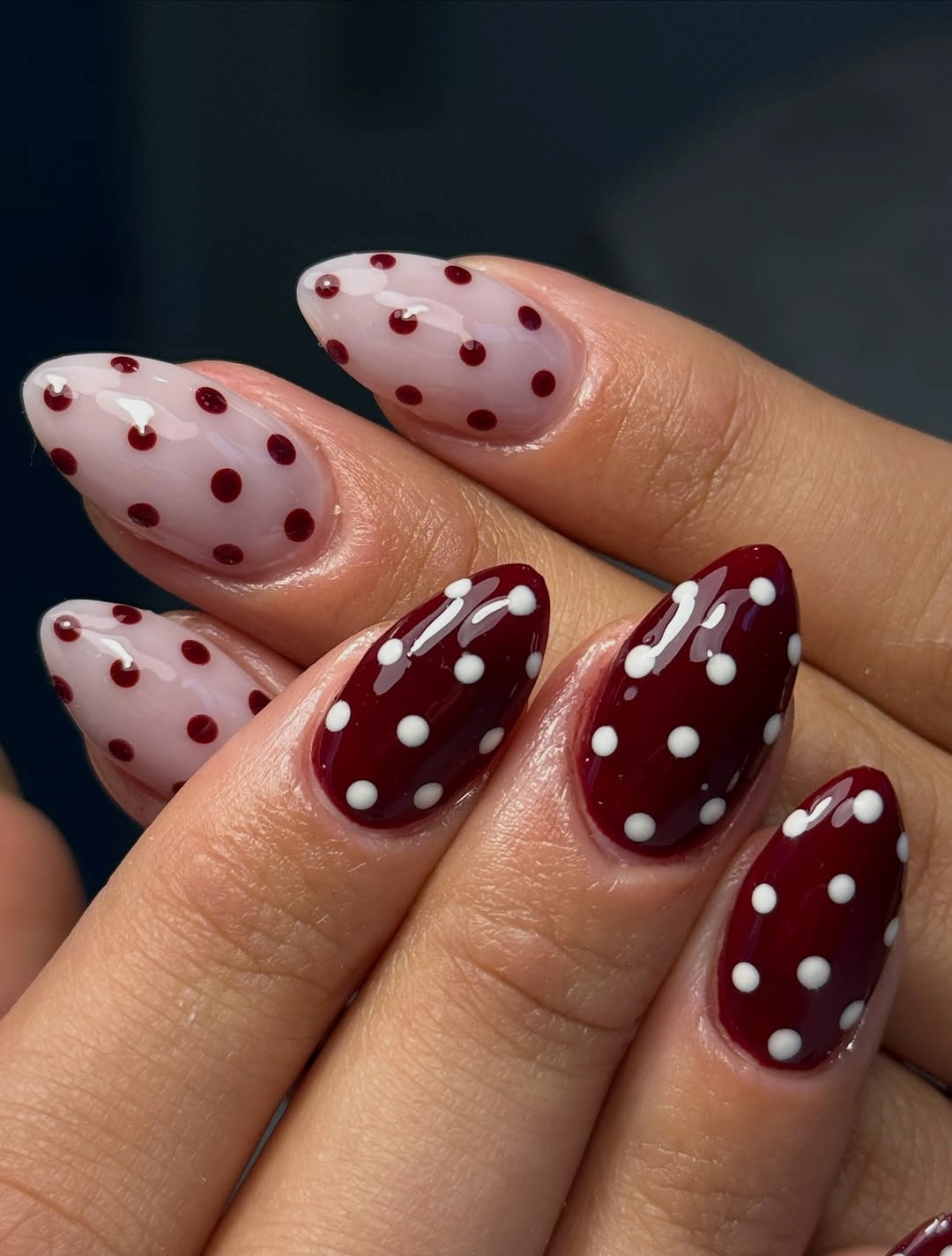
Alternation works here because the two dot treatments are opposites, yet both return to the same burgundy-and-pink palette. To simplify it, choose either pink nails with wine dots or wine nails with white dots, but do not remove all solid burgundy; that dark anchor is what gives the softer sheer nails enough contrast to feel deliberate.
This is a more complex color story than standard polka dots, but its pieces remain readable because each nail has a clear role. Adding another bright hue would disturb the balance, while changing the dot size could be useful if one side needs more emphasis; the safest principle is to let one dark field and one pale field face each other.
Dusty Gray-Lilac Nails With Black Dots
Short oval nails in a muted gray-lilac shade carry evenly spaced black dots, a cool pairing that feels softer than black on white and darker than black on pink. The base has enough gray to create a moody fall direction, while the simple dot spacing keeps the compact nails from needing additional lines, glitter, or accent colors.
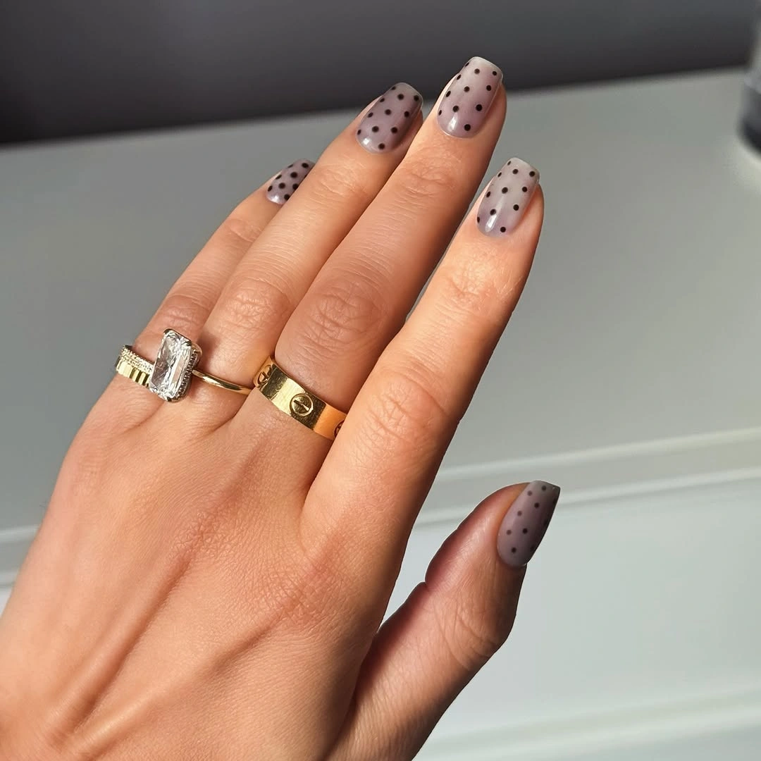
The regular spacing suits this subdued base because it gives the pattern a tailored quality rather than a playful, uneven one. A reader wanting more movement could vary only two dots near the edge, but a full random scatter would fight the calm gray-lilac tone; the quiet color benefits from a repeat that feels composed and predictable.
Gray within the lilac lowers the sweetness of purple and lets black look crisp without becoming harsh. A deeper plum base would move the design into stronger contrast, while a pale lavender would make it lighter and more spring-like; the muted value is what keeps the dots connected to a fall manicure rather than a bright seasonal novelty.
Red Curves With White Dot Clusters
Nude oval nails use flowing red French curves and small white dot clusters, a layout that makes the pattern feel more directional than an all-over spotted print. The red follows the edge and creates warmth, while the white dots sit against it as bright interruptions, keeping the curved placement from reading like a standard solid French tip.
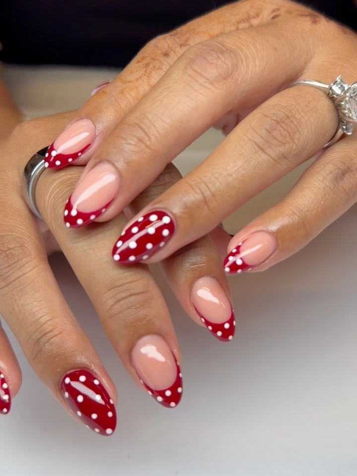
The dots work best where they stay close to the red but do not cover its entire surface, so both the curve and the pattern remain visible. On a shorter oval, use one red sweep with two or three white dots instead of repeating every mark; reducing the count will preserve the airy nude space that makes this design feel fluid.
Red and white create a clearer, brighter contrast than burgundy and white, which gives the set a more playful temperature even against nude. A wine-red curve would make it darker and less immediate, but the point to preserve is the moving edge: the curved red line guides the eye before the dots arrive as a smaller, crisp counterpoint.
Pink Squares With Black Dotted Frames
Long pink square nails are framed by black outlined French tips and fine black dots, making the pale centers feel deliberately enclosed rather than bare. The dark outline repeats the geometry of the square free edge, while the dots soften its rigidity just enough to prevent the pattern from becoming a purely linear black-and-pink graphic design.
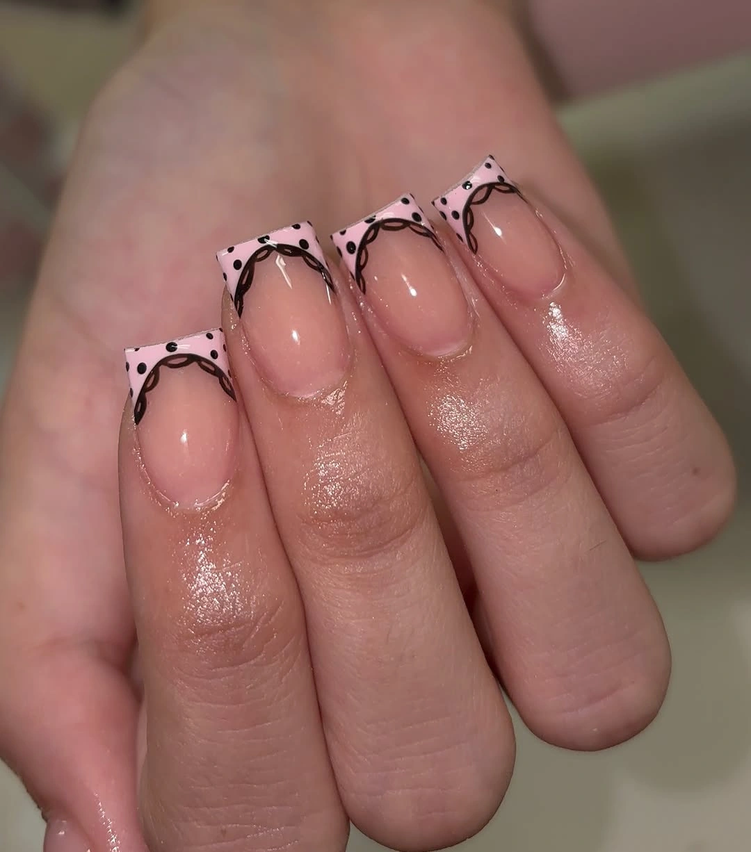
The outline should remain thin because its role is to define the edge, not replace the pink surface with a heavy black panel. For a more subtle approach, keep the black frame on two nails and use dots alone on the others; the negative space must stay visible for the long square shape to retain its crisp, open structure.
Pink gives the black a warmer context than nude or white, so the result looks less severe even though the contrast remains high. A muted mauve base would pull the design toward autumn, while a cooler blush would make it feel cleaner; the stable rule is a light broad center held in place by a narrow dark boundary.
Pale Pink Almonds With Beaded Dots
Pale pink almond nails carry thin black dots and a few tiny metallic-looking bead accents, using small changes in reflection to enrich a gentle base. The dots remain more visible than the beads, but the reflective details create a second texture close to the surface, so the manicure feels layered without moving beyond a restrained pink, black, and neutral palette.
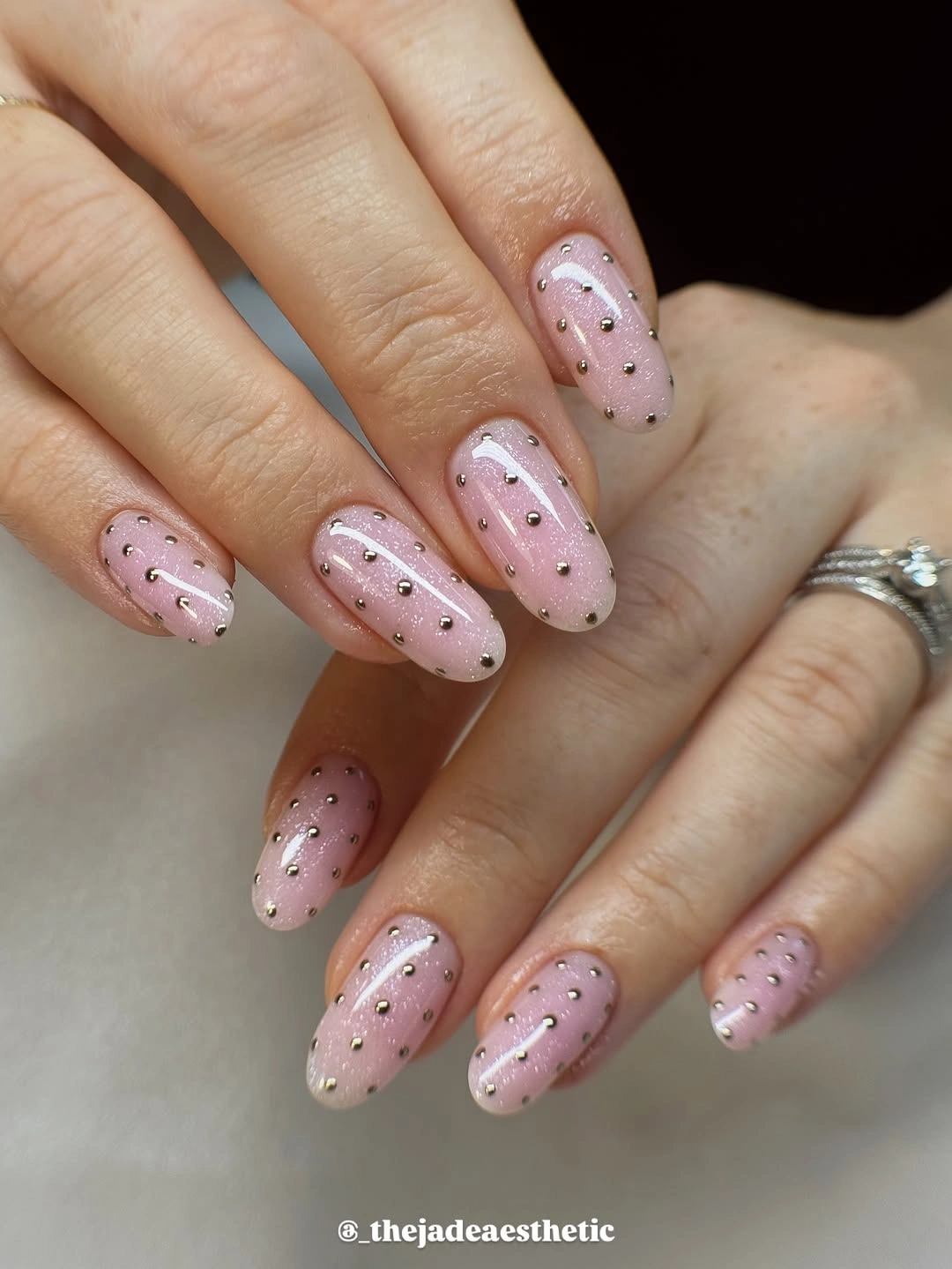
The beaded accents need to stay sparse because they are more dimensional than the drawn dots and can quickly become the focal point. A lower-detail variation could omit the beads and keep the black pattern, while a dressier one could add one bead near the cuticle on an accent nail; repeating them everywhere would reduce the set’s quietness.
Pink and black supply the necessary contrast, while the small reflective marks change how the light moves across the almond shape. Gold-toned beads would make the palette warmer, whereas clear ones would recede; either choice should remain secondary to the dots, since the pattern’s clean scale is what keeps the design readable from a distance.
White Spotted French Tips on Stilettos
Long nude stiletto nails end in white French tips with black spots, placing the entire polka dot pattern at the pointed edge instead of over the base. The nude centers make the sharp length feel lighter, while the spotted white tips provide a crisp finish that remains visible without covering the full nail in a dense high-contrast print.
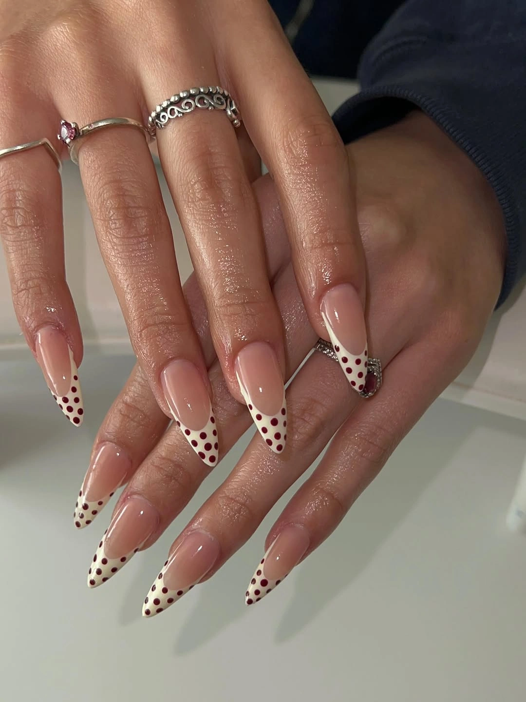
Confining the dots to the tips is a practical way to use a bold pattern on a very long shape, because it preserves the visual path from cuticle to point. On medium length nails, make the white tip narrower and reduce dot size; a deep broad tip would make the silhouette look shorter and overpower the nude base.
The white-and-black tip has more sharpness than a burgundy dot version, but the exposed nude middle keeps it from becoming too stark. A cream tip would soften the contrast for fall, while true white has a cleaner, more graphic tension; the defining element is the spotted edge against open neutral space, not the exact shade of white.
Pastel French Tips With Black Dots
Long nude stiletto nails mix pastel blue, yellow, and pink French ends with small black dots, plus one bow detail, producing a playful composition that still has a clear structure. The nude centers keep the many colors from consuming the length, while the repeating black dots give the separate pastel tips a shared dark note and visual continuity.
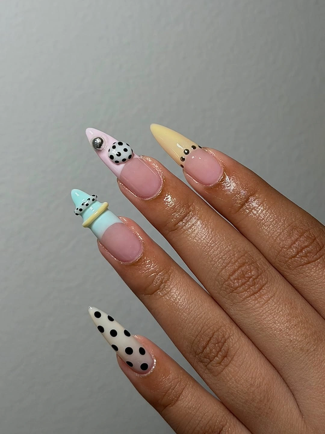
The bow is an isolated accent, which is important because the multicolor tips and dots already create several focal points. A more wearable edit would choose two pastel colors and remove the bow, but should retain a small black repeat; without it, the tips would feel like unrelated color samples rather than parts of one connected manicure.
Pastels can still work with fall styling when the surrounding neutral space and black details keep them from reading overly light or sweet. Replacing yellow with muted ochre and blue with gray-blue would deepen the mood, but the balance to preserve is simple: soft colors gain definition when a few tiny dark marks repeat across the hand.
Soft Pink Squares With Vertical Dot Rows
Short soft-pink square nails use very small dark dots arranged in vertical rows, letting the pattern echo the nail’s straight sidewalls. The result is more orderly than a scattered polka dot design, and the pale base keeps the repeated lines from appearing too strict, giving the compact square a neat and lightly textured finish.
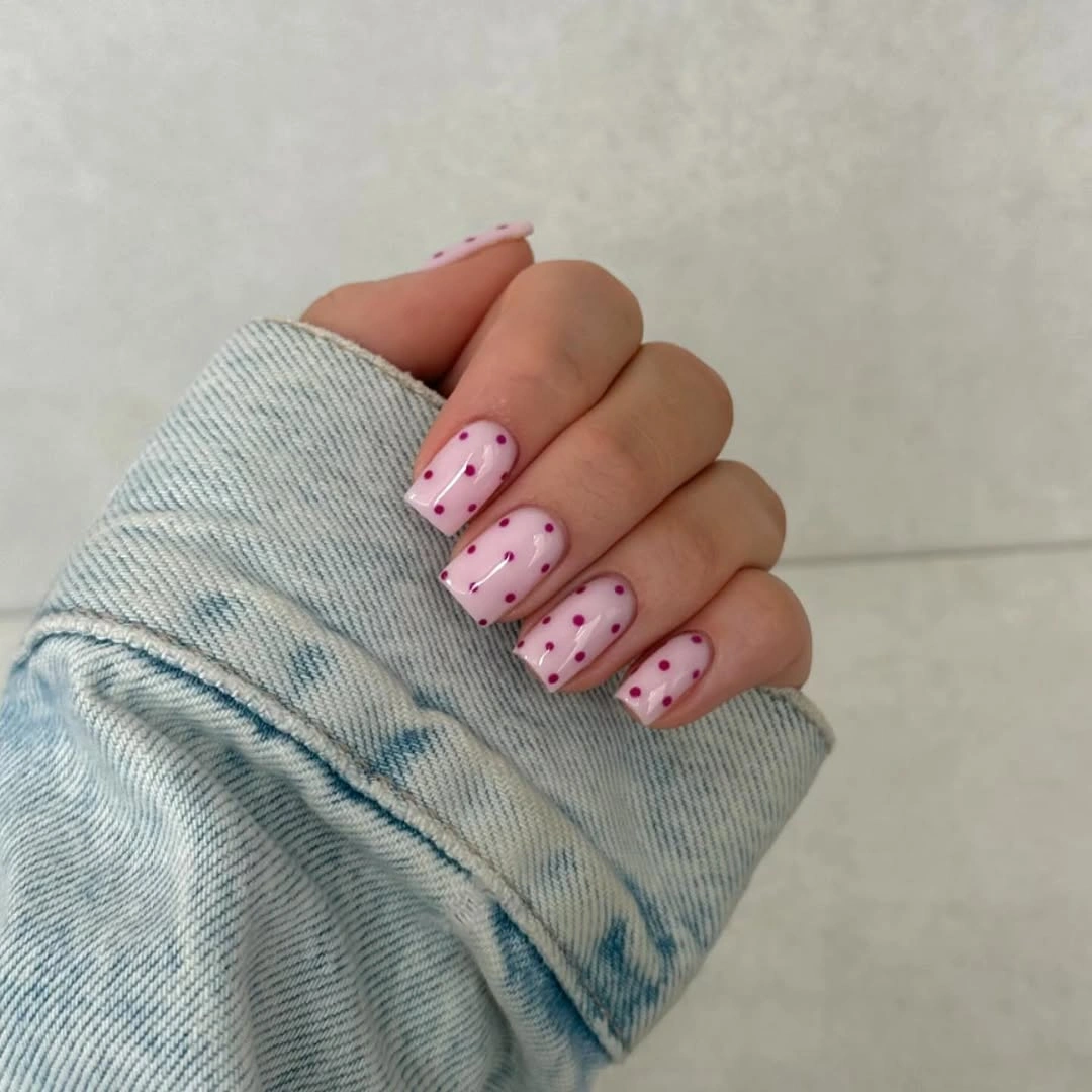
Vertical rows are particularly useful on a short square because they add direction without widening the shape. A denser grid would look more graphic, but it could also make the pale pink surface feel busy; leaving spaces between the rows retains the airy quality and lets each small dot appear like a detail rather than a full pattern block.
The low contrast between soft pink and small dark dots makes this set more restrained than black French corners or burgundy nails with white dots. A deeper mauve base would strengthen the fall note, while a clear blush would keep it gentle; the important part is the vertical rhythm, which gives the dots their tailored, almost fabric-like effect.
Mixed Color Blocks With Spotted Panels
Long square nails mix blue, green, pink, brown, cream, and translucent tortoiseshell-like dotted panels, creating a collage of different fall-friendly values and surfaces. The spotted sections act as a repeated visual device across the varied colors, so even though the palette is wide, the eye can find a familiar pattern element within the changing blocks.
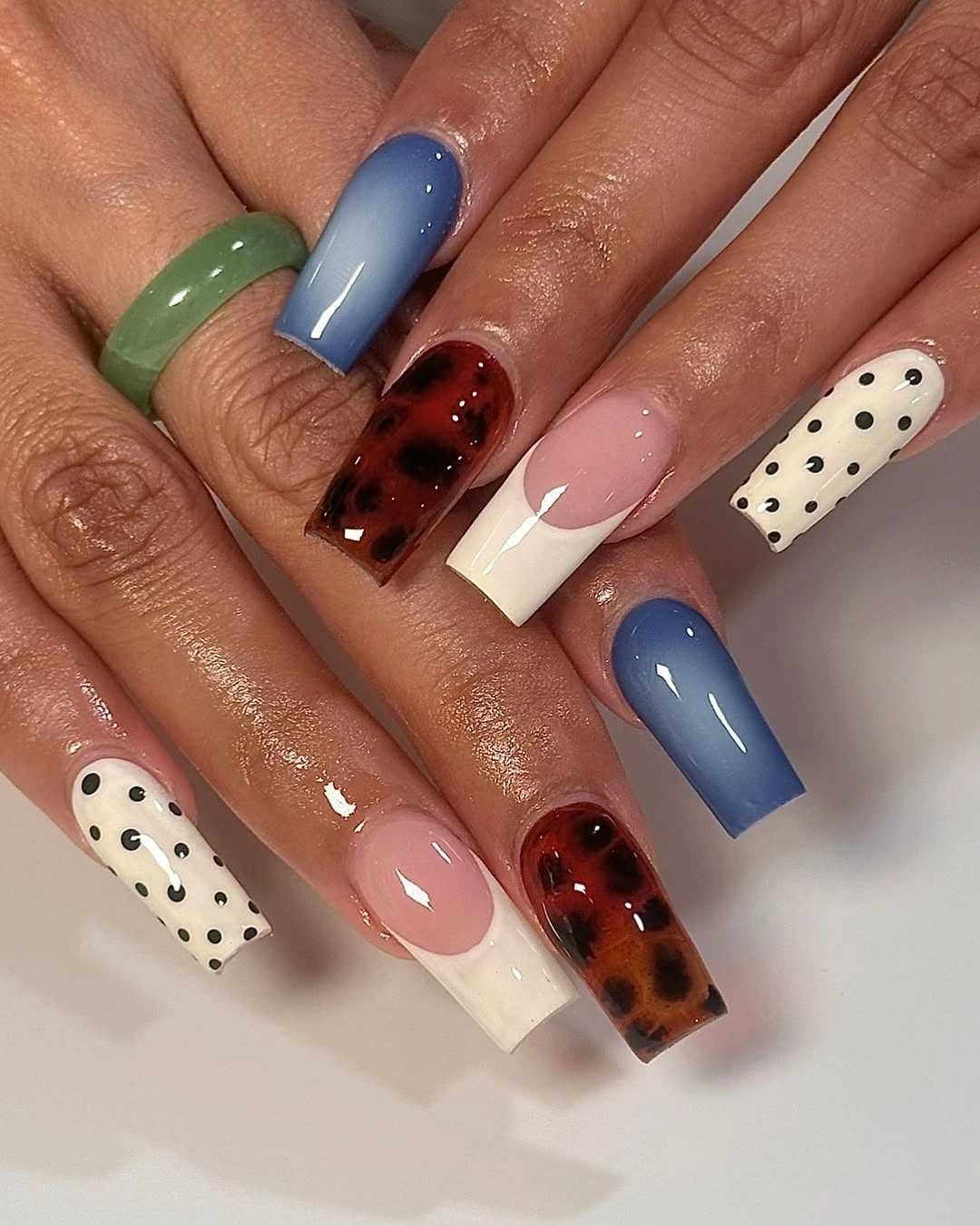
The design needs the solid color areas to give the dotted panels relief, otherwise the many shades would feel equally noisy. For a simpler adaptation, choose brown, cream, and one blue or green, then use dots on only one panel per hand; reducing the palette keeps the collage effect but makes its color hierarchy easier to follow.
Brown and cream make the brighter blue and pink feel more grounded, while the spotted areas introduce depth through contrast rather than a single matching finish. This is not a minimalist choice, but it remains coherent because repetition appears in the dots and the blocks; removing both would leave only a loose assortment of unrelated colors.
Black and Pink Dots With Small Bows
Long square nails alternate black and pink polka-dot panels with translucent nude sections and raised bow ornaments, turning a familiar pattern into a strongly textured statement. The darkest black panels establish the deepest visual note, while the pale pink and nude areas provide contrast that keeps the length readable despite the many dots and dimensional details.
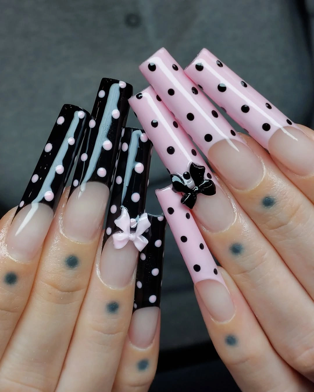
The bows are the most dominant detail, so they need the quieter nude and pink panels around them to avoid competing with every dot. A toned-down version could keep one bow per hand and use dots only on the black tips; taking away some ornament would retain the dramatic color contrast while making the long square shape easier to wear visually.
Black and pale pink create a sharper mood than brown and cream, with the bows adding a playful counterpoint to the dark panels. The tension remains readable because the palette stays limited; adding another bright color would weaken the contrast, whereas preserving black, pink, and nude keeps the different textures tied to one controlled story.
Even Black Dots Across Pale Pink Almonds
Medium pale pink almond nails are covered with small black dots distributed evenly over every nail, a direct pattern that lets the soft base remain visible between the marks. The uniform spacing gives the set a calm repeat, while the almond taper prevents the all-over print from feeling flat or too symmetrical across the hand.
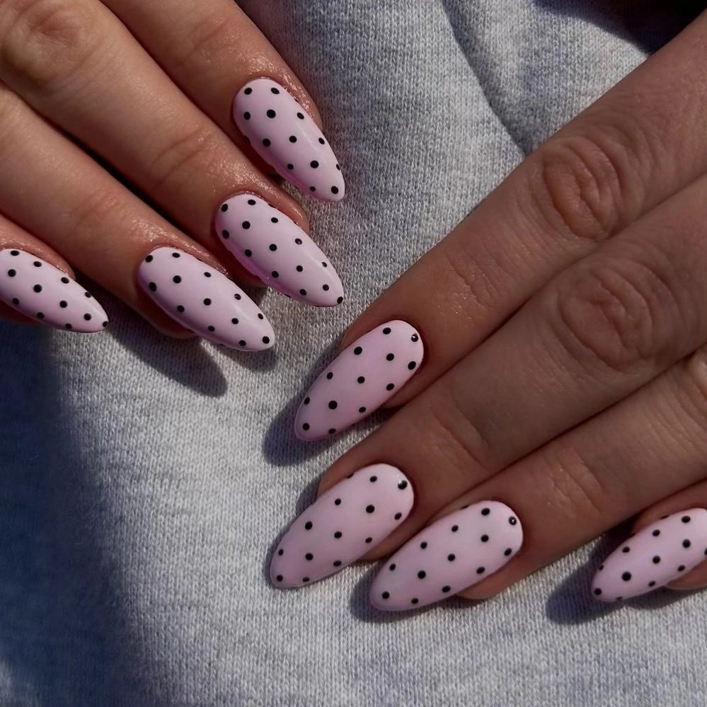
Because every nail carries the same motif, dot size needs to stay modest and the pink gaps need to remain generous. A reader who wants a quieter version could leave two nails solid pink, but should keep the same dot scale on the patterned fingers; changing it drastically would make the remaining accents feel disconnected from the original clean repeat.
This is a dependable polka dot formula because it depends on contrast and spacing rather than a complex motif or unusual finish. Choosing a dusty rose instead of pale pink would make it more muted for fall, while a white base would make the black dots more stark; the repeating small scale is the part that keeps the result controlled.
White Spotted Tips Over Soft Pink Squares
Soft pink square nails end in white French tips filled with small black polka dots, layering three values in a clear order from pale base to bright tip to dark detail. The white edge creates a crisp frame, while the dots keep it from reading like a traditional French manicure and give the otherwise light palette a graphic finish.
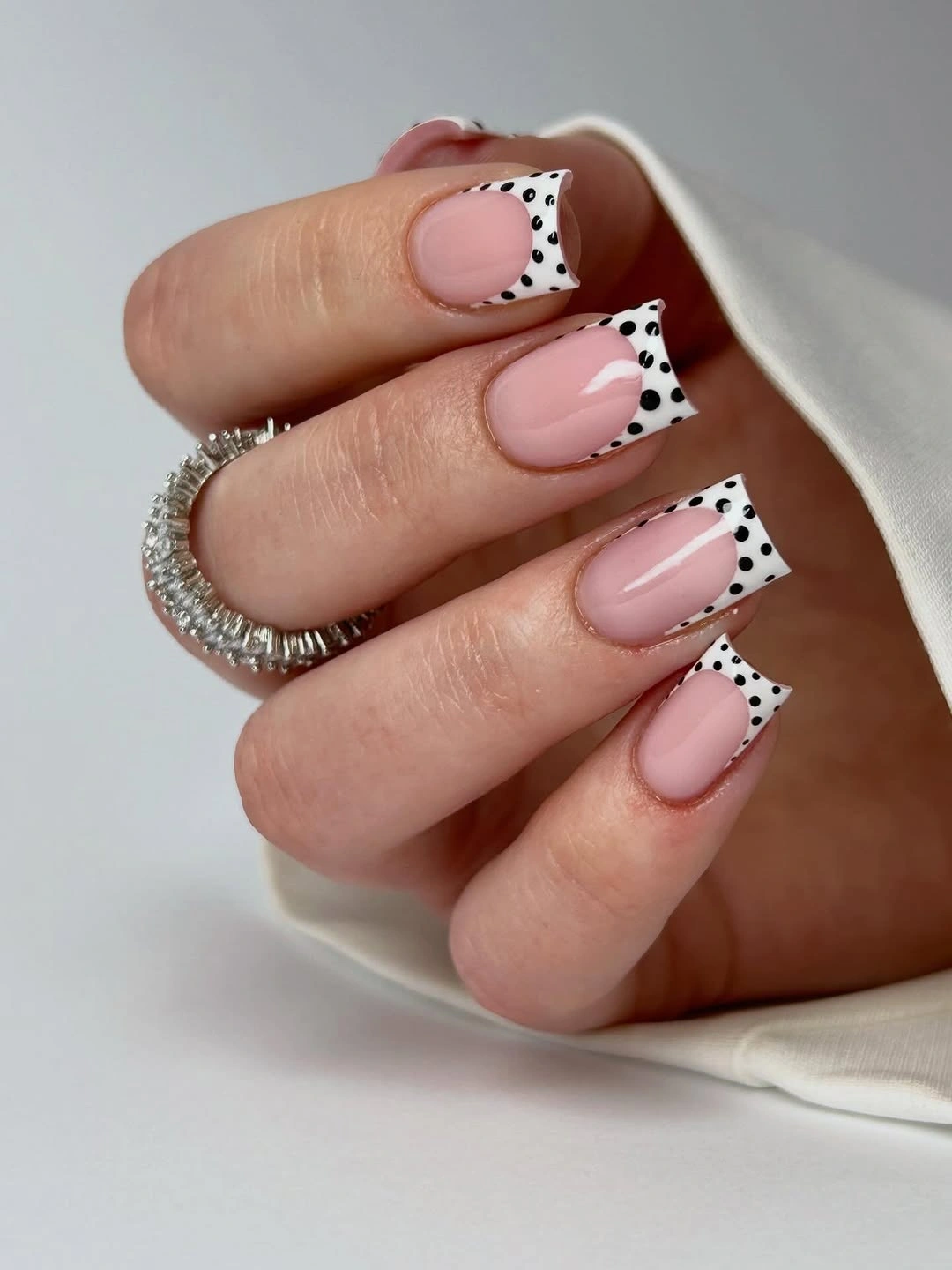
The dotted tips stay balanced because their depth is limited, leaving most of the pink surface open and calm. For a shorter square, make the white tip slimmer and reduce the dot count, since a wide spotted band would move too much contrast to the edge and make the nail look more segmented than the simple shape needs.
White, black, and pink can feel clean rather than cold when the pink base remains the largest visible area. A cream tip would soften the effect and a burgundy dot would warm it for fall, but the structure should remain unchanged: one light tip, a few dark points, and enough soft pink underneath to make the contrast feel precise instead of loud.