A matte finish earns its place when it changes the way color sits on the hand, not when it merely removes shine. The most persuasive fall matte nail ideas use a quiet surface to make one edge, motif, or tonal shift carry the visual weight, so the manicure reads as considered even from arm’s length.
For an autumn manicure that stays interesting in ordinary light, judge the relationship between the base and its smallest contrast before judging the color itself. A restrained brown, gray, or pink can become much more directional when the outline is crisp, while a busy palette needs one repeated rule to keep it from feeling scattered; that balance is the useful starting point for autumn nail color choices.
Chocolate Diagonals on Taupe Coffin Nails
The long taupe coffin shape is kept calm by a neutral, matte-looking field, while narrow chocolate diagonals cut across the tips with a much sharper shine. That change in surface makes the brown read like a deliberate edge rather than a full French tip, and it gives the length a graphic direction without making every nail identical.
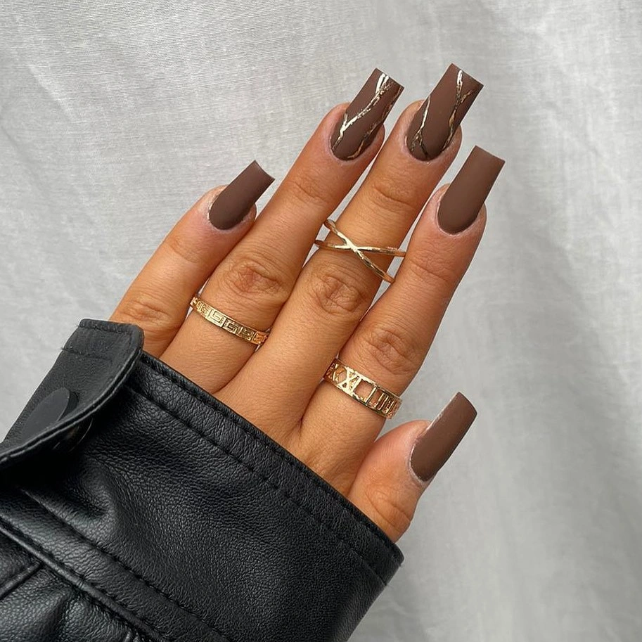
A similar layout works best when the darker line stays slim enough to leave the taupe visible near the center of each nail. Widening those diagonals would make the design heavier and reduce the clean contrast that makes the shape feel long, so a shorter version should use the same angle with even less dark color.
The useful detail here is the uneven meeting of soft and reflective brown, which gives a familiar neutral palette more movement than a solid manicure. Anyone who prefers a short fall nail variation but does not want an all-over dark finish could keep the taupe base and change only the tip direction for a quieter result.
Purple Points With Black Glossy Slashes
These pointed purple nails rely on a soft-looking violet surface, then interrupt it with glossy black diagonals and tiny pale dots near the upper area. The dark slashes narrow the visual center of each almond shape, which is why the saturated purple remains dramatic without becoming a single unbroken block of color.
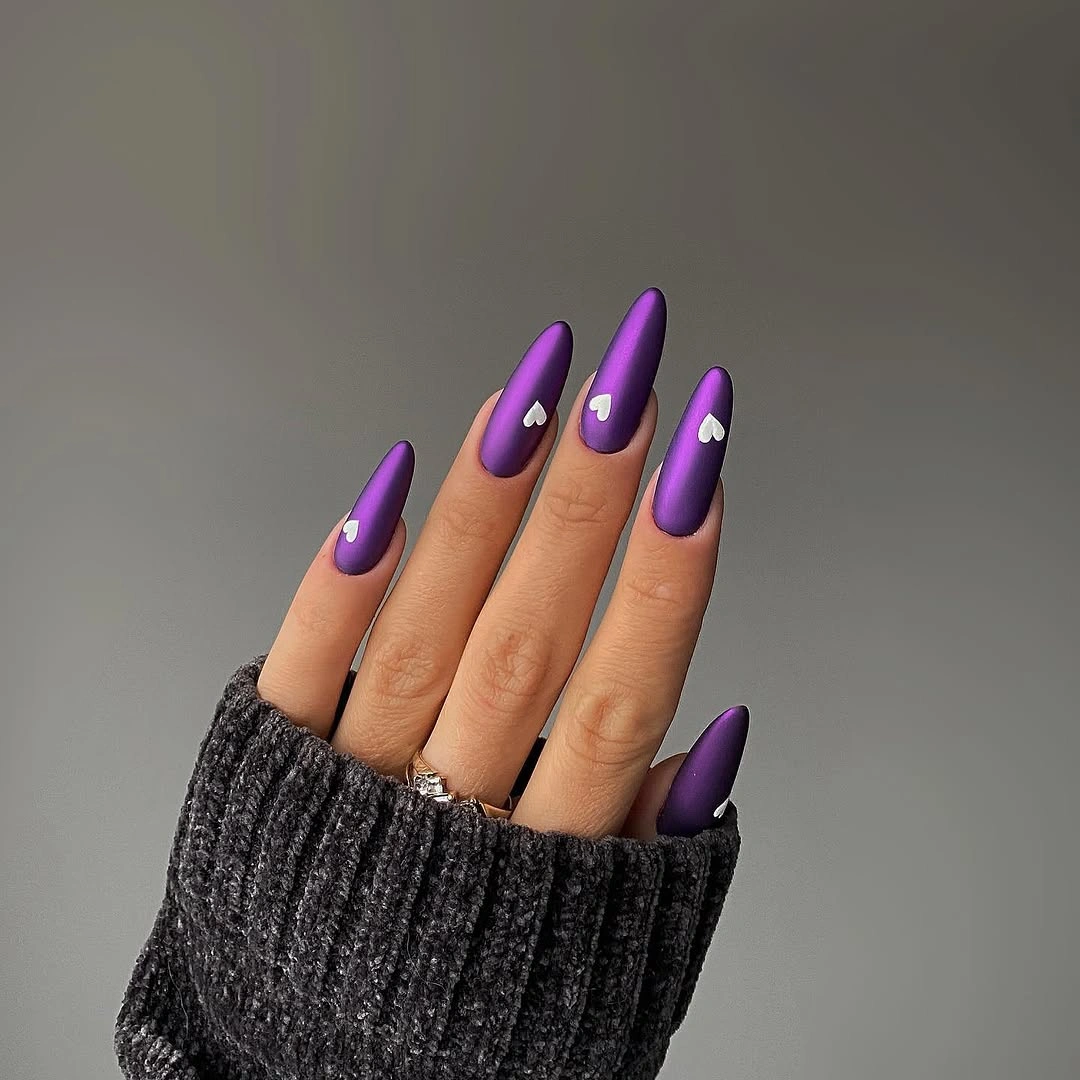
The white dots matter because they puncture the dark placement and stop the black from reading as a blunt stripe. On a shorter almond shape, one dot or a thinner diagonal would preserve that same rhythm; copying every small detail onto less space would make the design look crowded rather than sharply edited.
There is a useful tension between the muted-looking purple and the black shine, with each finish making the other easier to notice. Keeping the purple slightly dusty rather than intensely bright would suit a fall palette, while a glossier violet base would flatten the contrast that gives the black edge its authority.
Soft Pink Nails With Cow Print
The pale pink rounded nails keep the black-and-white spots from feeling harsh because the base has enough warmth to soften the pattern. Spot sizes vary across the set, and that irregularity gives the print a hand-drawn character rather than the stiff repeat of identical dots placed at equal distances.
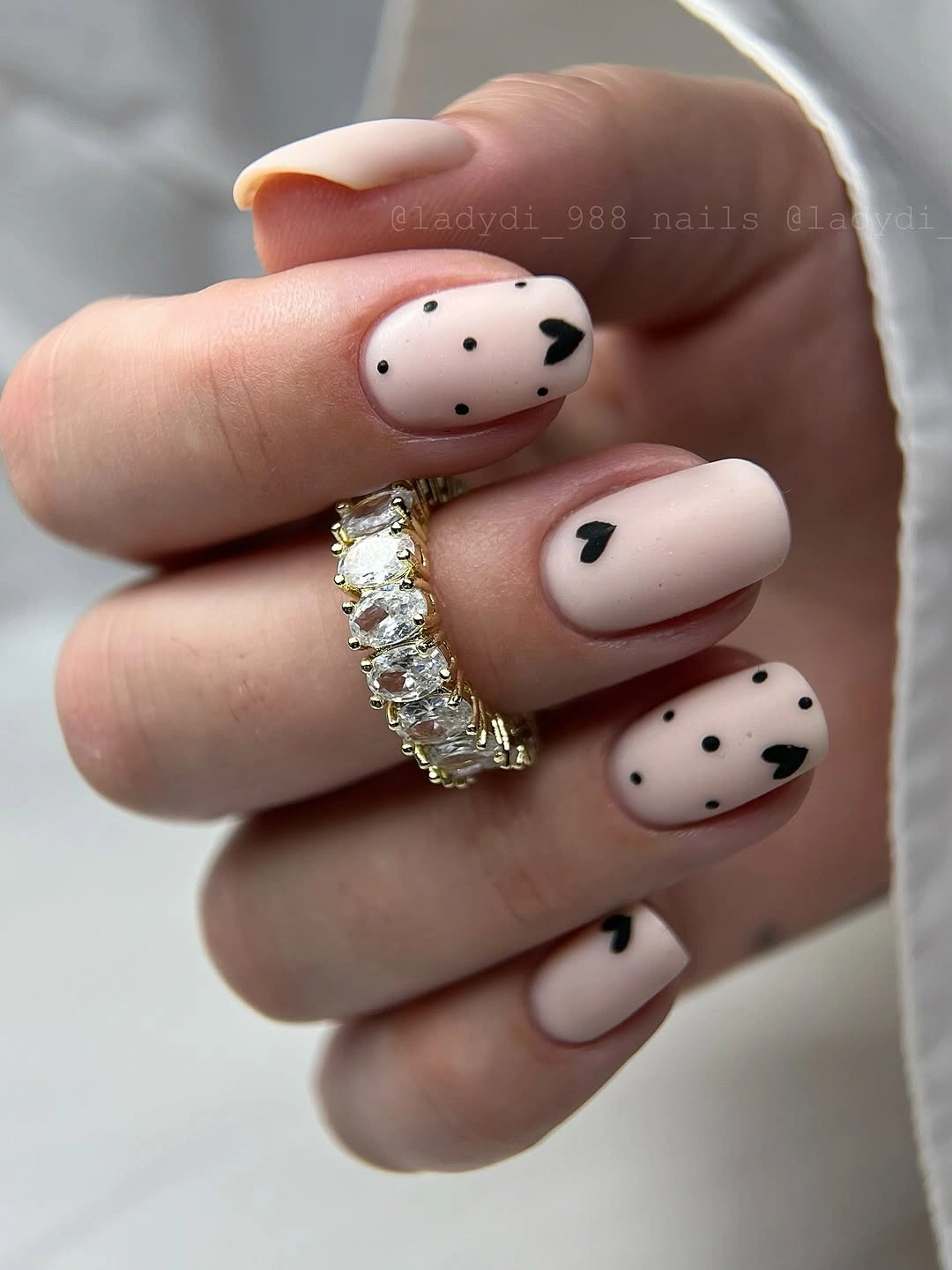
What makes this design wearable is the amount of uncovered pink around each patch, especially near the cuticle. A full pattern on every nail would turn the print into the only idea, whereas these spaced marks let the short rounded shape remain visible and make the color pairing feel less costume-like.
For a calmer adaptation, keep black spots on just two or three nails and let the rest stay pale pink with a matte top layer. The tradeoff is clear: fewer printed nails will feel more polished for daily wear, while covering the entire set produces a stronger graphic effect that asks for simpler clothes and accessories.
Hot Pink Matte Nails With Tiny Florals
The matte hot-pink base is intentionally direct, so the small blue and purple flower clusters have to remain compact to avoid competing with it. Their placement near the lower half of selected nails gives the design a small point of focus, leaving enough uninterrupted pink for the almond shape to keep its clean outline.

Floral accents become more useful when they are treated as punctuation instead of a full decorative layer. Here, the dots and petals are small enough to read as texture at a distance, which means the manicure could be simplified further by repeating one flower color rather than adding more motifs or larger blooms.
The lively pink is not especially muted, but the velvety-looking finish lowers its glare and gives the blue details a clearer edge. Anyone wanting a fall-leaning variation could shift the pink toward berry while keeping the flower scale exactly this restrained; changing the scale would affect the balance more than changing the hue.
Black Panels and Circular Negative Space
Long black square nails create a strong frame before the glossy panels and circular cutouts enter the composition. The repeated round openings soften what could otherwise become an all-angle silhouette, while the different surface reflections separate the panels from the darker base without relying on a second color.
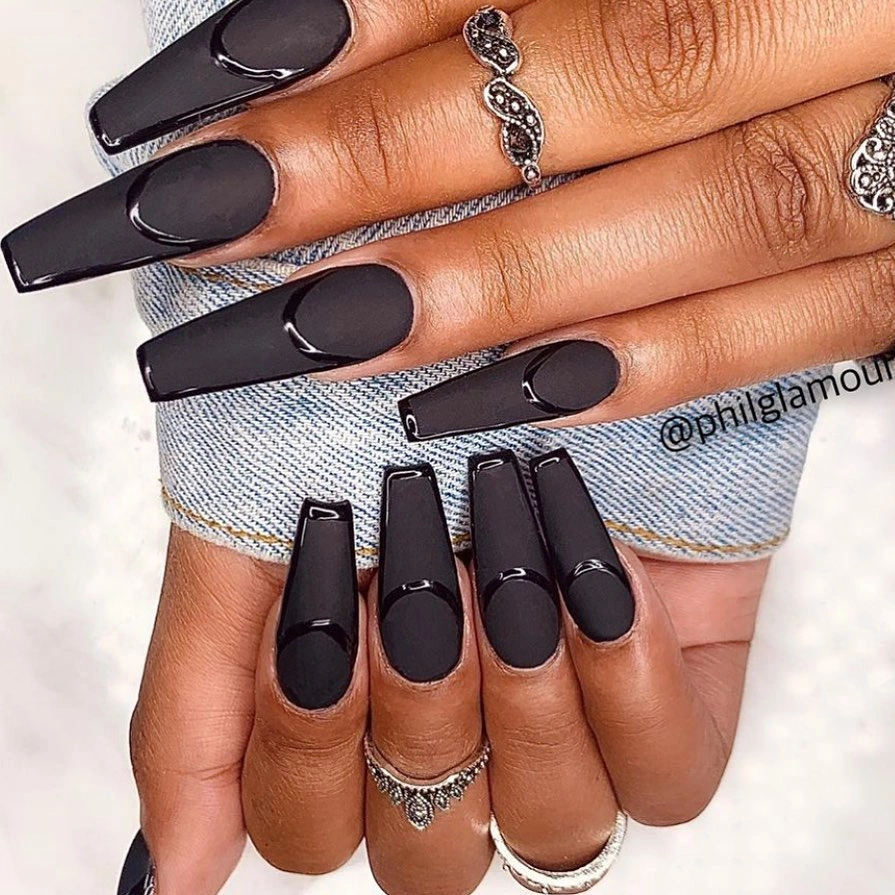
The circles are the consequential detail because they interrupt the large black areas at predictable points along the nail. If the square length feels too bold for everyday wear, a shorter version should preserve one glossy panel and one cutout per hand rather than compressing every element onto every nail.
Black manicure ideas often lean on extra hardware or sparkle, but this set gets its depth from placement and finish alone. That makes the design easier to adjust through shape: a soft square would make the panels feel calmer, while a sharply squared free edge will keep the graphic quality that gives the pattern its bite.
Cocoa Leaves Across Cream Square Nails
The alternating cocoa and cream squares build a warm fall palette without making the leaf art compete for attention. On the light nails, fine brown botanical linework follows the length of the nail, so the motifs add movement while the solid cocoa nails give the eye a place to rest between the illustrated accents.
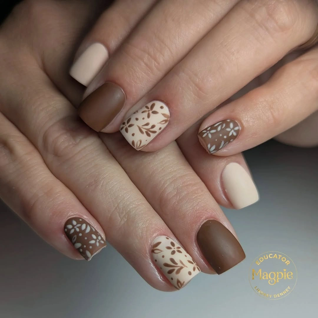
That alternation is more effective than placing leaf art on every nail because it gives the pattern a measured repeat. Someone with shorter nails could use the cream base on only one accent finger per hand and keep the leaves vertical, since a horizontal branch would visually shorten an already compact square shape.
The design is strongest when the brown used for the linework stays close to the solid cocoa shade, creating continuity without an exact match. Introducing several unrelated leaf colors would weaken the spare rhythm, whereas a deeper espresso detail would make the cream accents feel more defined for late-season styling.
Orange Solids With Sheer Floral Accents
Opaque orange nails sit beside sheer nude accents scattered with small red, orange, and white flowers, creating a split between color field and delicate drawing. The rounded short length helps the floral nails stay light, because there is not enough extra space for the tiny marks to turn into a dense wallpaper effect.
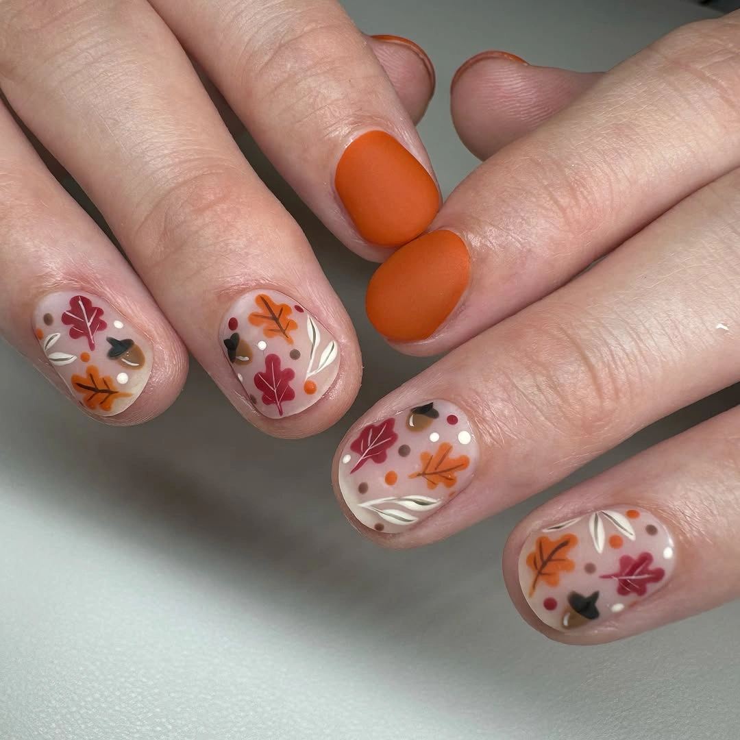
The best adjustment would be to decide whether orange or the floral accents should lead, then keep the other side of the contrast secondary. On a less colorful wardrobe, two orange nails per hand could be enough; adding more solid orange would make the flowers feel like decoration instead of an equally important part of the composition.
There is a pleasant mismatch between the opaque color and translucent-looking background, which keeps the manicure from becoming predictably seasonal and gives it an early fall nail color direction. The fine flowers will demand a cleaner visual read than the solid nails, so a person who prefers low-detail maintenance may want to replace them with one small botanical mark rather than several clusters.
Mustard Blocks With a Black Botanical Accent
The yellow, blush, and black squares use color blocking to establish a warm, slightly retro rhythm before the leafy botanical accent appears. A single black band across a pale nail repeats the dark note elsewhere in the set, which prevents the mustard from feeling isolated and makes the varied colors seem intentionally connected.
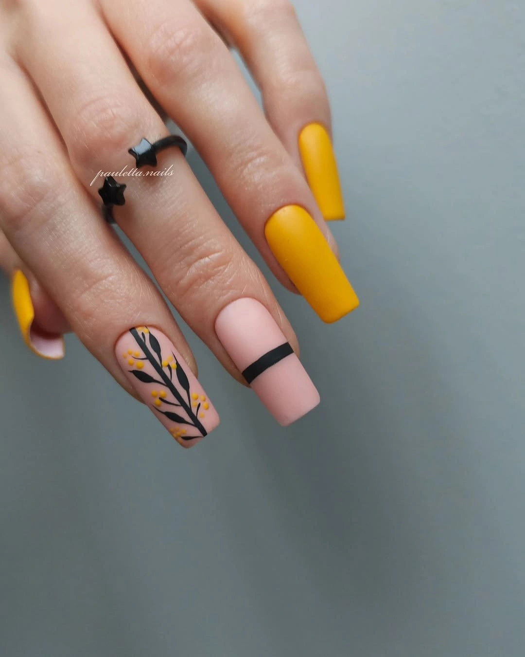
The leaf motif is small enough to support the color-blocking rather than replace it as the main feature. For a simplified version, keep the mustard and blush but move the black to a thin French edge; that would retain the same contrast while leaving more open space for the medium square shape to look less segmented.
This approach is useful for anyone who likes several fall colors but wants a rule stronger than simply alternating shades. The black line provides that rule, and removing it would make the palette more cheerful but less grounded; keeping it very thin lets the warm colors stay in front without losing the design’s structure.
Jewel Tones With Fine Gold Leaves
Orange, deep teal, mustard, and burgundy appear on separate almond nails, but the small gold leaf-like marks make the mix read as one palette rather than four unrelated colors. Because the accents are fine and placed near the surface rather than covering the whole nail, the strong tones still have room to look saturated and distinct.
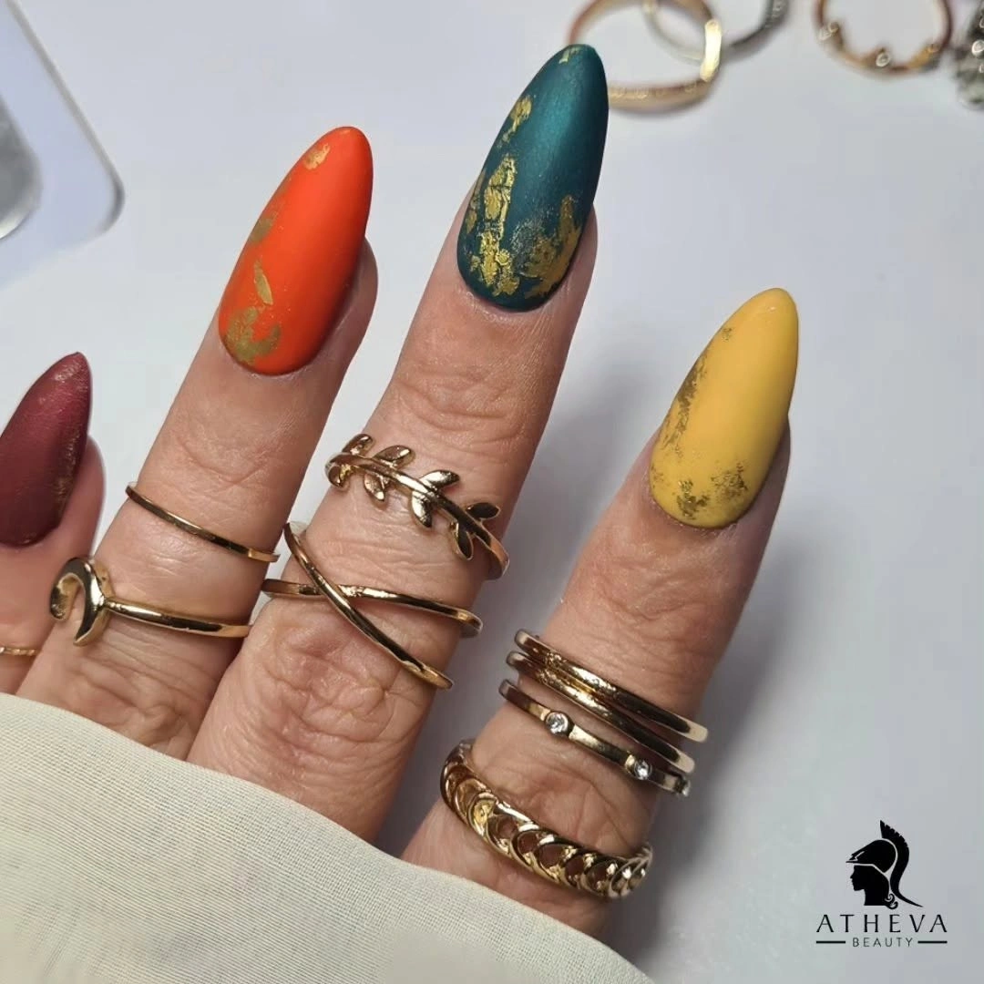
The key is that the gold repeats without being identical on every nail, so it acts as a visual thread instead of a border. A shorter version could keep just two jewel tones and one gold-marked accent, since packing the full palette onto less length would reduce the elegant spacing that makes the colors feel intentional.
There is more drama here than in a two-color manicure, yet the restrained accent scale stops the set from feeling overloaded. Anyone sensitive to bright combinations could substitute muted olive and wine for the teal and orange, but should keep the same narrow gold placement to preserve the small, linking detail that holds the scheme together.
Muted Blue-Gray Almonds Without Extra Detail
The blue-gray almond nails make their case through a single even, muted matte finish, with no printed accent to distract from the silhouette. That simplicity puts pressure on the color choice: the gray cast keeps the blue from reading playful, while the almond taper adds enough shape to stop the manicure from looking flat or overly practical.
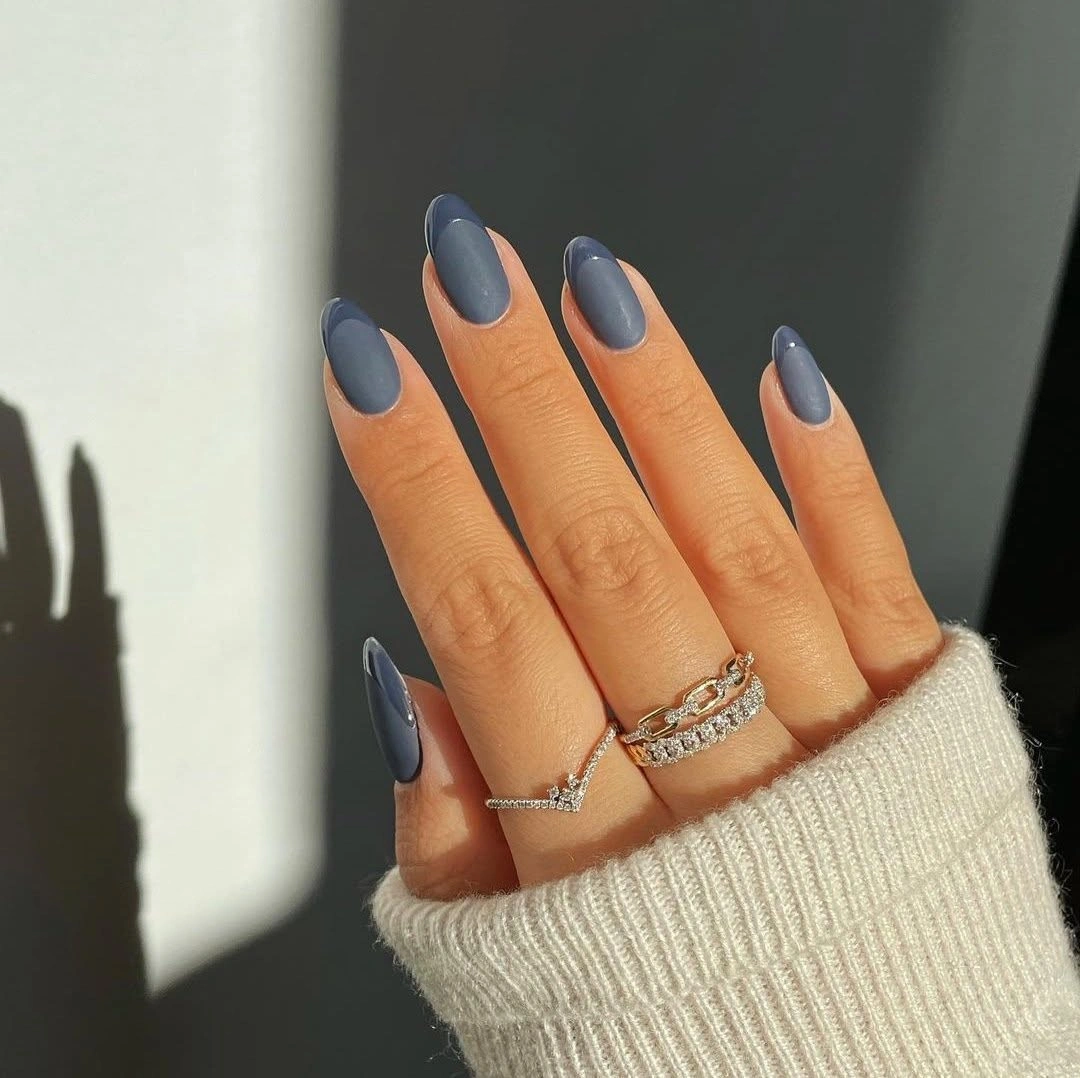
A one-color set like this benefits from consistency, so changing one nail to a gloss or adding a decorative mark would alter the whole premise. If the same hue is used on shorter nails, a soft square could make it feel more tailored, while an oval would keep the quiet, rounded quality seen in this longer version.
The limitation is that a plain matte surface shows uneven edges more readily than a busy design does, which makes careful shaping important. In return, it works with matte fall nail ideas that pair easily with brown, charcoal, and cream clothing, while still giving the hand more presence than beige or bare pink.
White Squares With Fine Autumn Sprigs
Clean white square nails offer a bright background for the fine brown and olive sprigs placed along the length of the nails. The linework is deliberately narrow, allowing the white to remain dominant; that contrast makes the botanical marks feel more like drawn details than a full painted scene across the set.
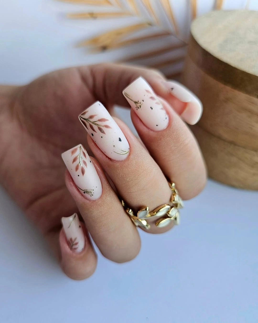
The vertical direction is doing practical work here because it follows the square nail’s long axis and keeps the small motifs from widening the shape. A person who wants a softer result could place the sprig on only two white nails and use a pale cream on the others, retaining the botanical idea without such a crisp white contrast.
These accents are most effective when the surrounding hand styling remains simple, since the pale base already creates a strong visual pause. The design would lose some of its delicate quality if the sprigs became thicker or more colorful; their restraint is exactly what lets an obvious seasonal symbol feel clean rather than overly literal.
Pale Blue Matte Squares With Clean Length
The pale blue square nails have a smooth, velvety-looking finish that gives the long length a softer visual edge. Without an accent color, the blue must carry both the mood and the structure, and its lightness does that by making the straight free edge seem airy instead of severe or heavy against the hand.
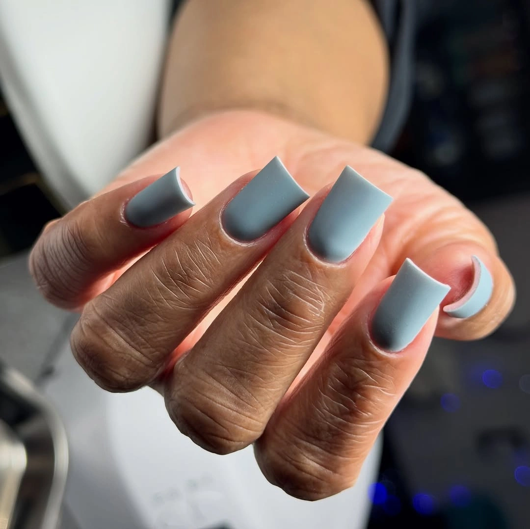
Keeping the surface uninterrupted is a smart choice because any dark line or large charm would immediately become the dominant feature. On a shorter set, the same blue would still work, but narrowing the square into a gentle squoval would protect the quiet look; a blunt broad edge can make a light matte shade seem chalkier.
The visual payoff comes from precision rather than decoration, which is why this type of manicure suits someone who notices shape before motif. Its tradeoff is that there is little camouflage for chips or uneven growth at the tip, so the pared-back finish rewards tidy upkeep more than a patterned or high-contrast design would.
Plum Matte Nails and Petite Floral Veils
Deep plum almonds bring a dense matte-looking color beside sheer beige accents dotted with tiny purple floral motifs. The difference between the opaque dark nails and the lighter patterned ones creates depth, while the small flower scale keeps the accents connected to the plum instead of turning them into a separate pastel idea.
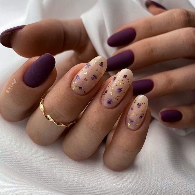
The useful decision is to let the plum occupy most of the visual mass and treat the beige nails as relief. Adding the floral pattern everywhere would weaken the color’s gravity, so anyone adapting it for a shorter length should keep one or two veiled accents and allow the solid plum to do the heavier work.
There is enough detail in the tiny marks to make the manicure feel personal, yet the overall palette stays controlled because every accent returns to purple and beige. A warmer nude base could make the plum appear richer, while a cooler beige would make the floral dots look crisper but slightly less soft against the skin.
Peach Matte Almonds With a Black Branch
The soft peach almond nails are mostly quiet, which makes the small black leafy branch on one accent nail feel precise rather than decorative for its own sake. The branch curves with the nail instead of cutting across it, so the dark detail lengthens the silhouette and gives the pale base a little seasonal definition.
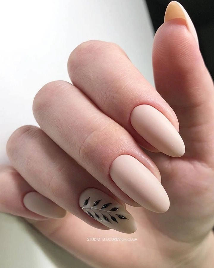
One accent is enough because the black is visually much stronger than the peach, and repeating it on every nail would change the balance immediately. For a more subtle version, a brown branch would soften the contrast, but the visible black line is what gives this manicure its clean editorial quality and clear focal point.
The design also shows how a single motif can feel fall-aware without relying on a dense leaf pattern or dark palette. Keeping the branch narrow matters more than adding additional leaves; a thicker black shape would look graphic and bold, while this fine placement lets the matte peach remain the leading impression.
Neutral Squares With Two Leopard Accents
Long neutral square nails form a calm base for two leopard-print accents in muted brown and cream, keeping the pattern contained rather than spreading it across the whole hand. The color relationship is intentionally close, so the spots add texture and variation without breaking the low-contrast, matte-friendly mood of the surrounding solid nails.
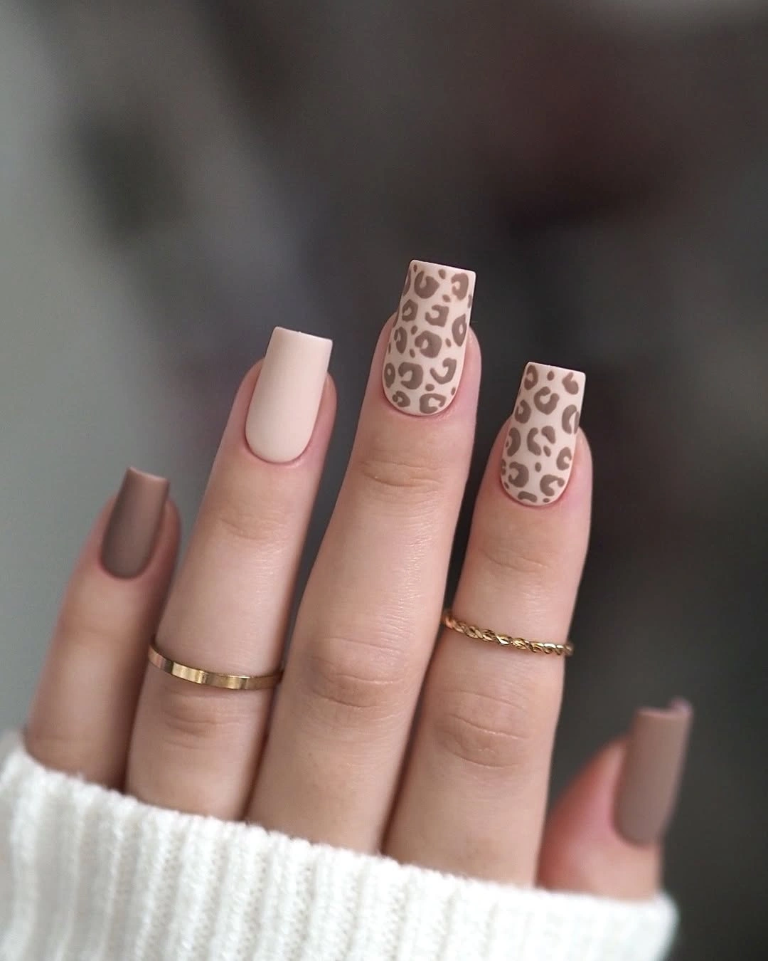
Limiting the print to two nails is the choice that makes the set feel balanced, especially with this much length. A more decorative version could add a thin brown tip to one solid nail, but repeating full leopard panels would erase the negative space that lets the pattern read as an accent instead of a uniform.
The muted palette is practical for someone who likes animal print but finds black-and-tan contrasts too loud for daily wear. There is still a tradeoff: the low contrast makes the spots less immediately visible from a distance, so sharper contrast would be the better choice if the goal is a bolder statement rather than quiet texture.
Bright French Arcs With Fine Gold Borders
Sheer nude nails carry bright pink, orange, purple, and green French arcs, each traced by a fine gold edge that separates the color from the bare-looking center. The curves are placed high enough to preserve negative space, and the thin metallic line prevents the many colors from blending into a loose, unstructured rainbow effect.
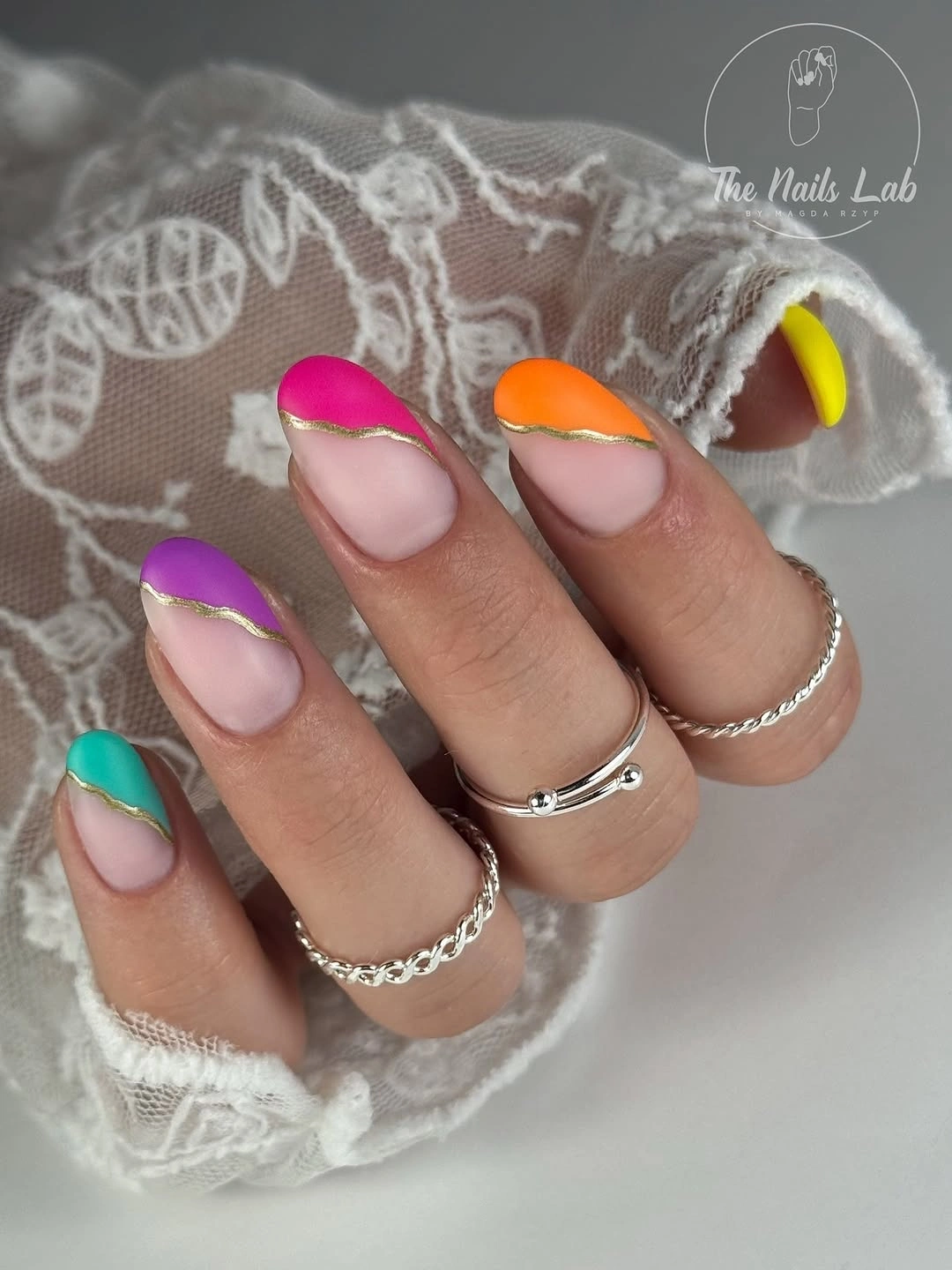
The gold border is the detail doing most of the editing here, because it gives every different hue the same finish and visual rule. On shorter nails, choose two or three colors rather than all four; the arcs need enough exposed nude space to read as curved tips rather than broad blocks across the nail.
This is a more playful direction than a typical matte fall palette, but its negative space keeps the brightness from becoming dense. If the colors feel too lively, wine, burnt orange, and olive could replace the neon-like tones, while the gold line should remain fine so it still acts as a separator rather than jewelry.
Pastel Waves Across Short Almond Tips
Short almond nails use individual wavy French tips in blue, yellow, red, and white, so the color shifts from finger to finger without relying on one repeated block. The waves follow the upper edge loosely, which softens the contrast and makes the compact length feel more animated than a straight French line would.
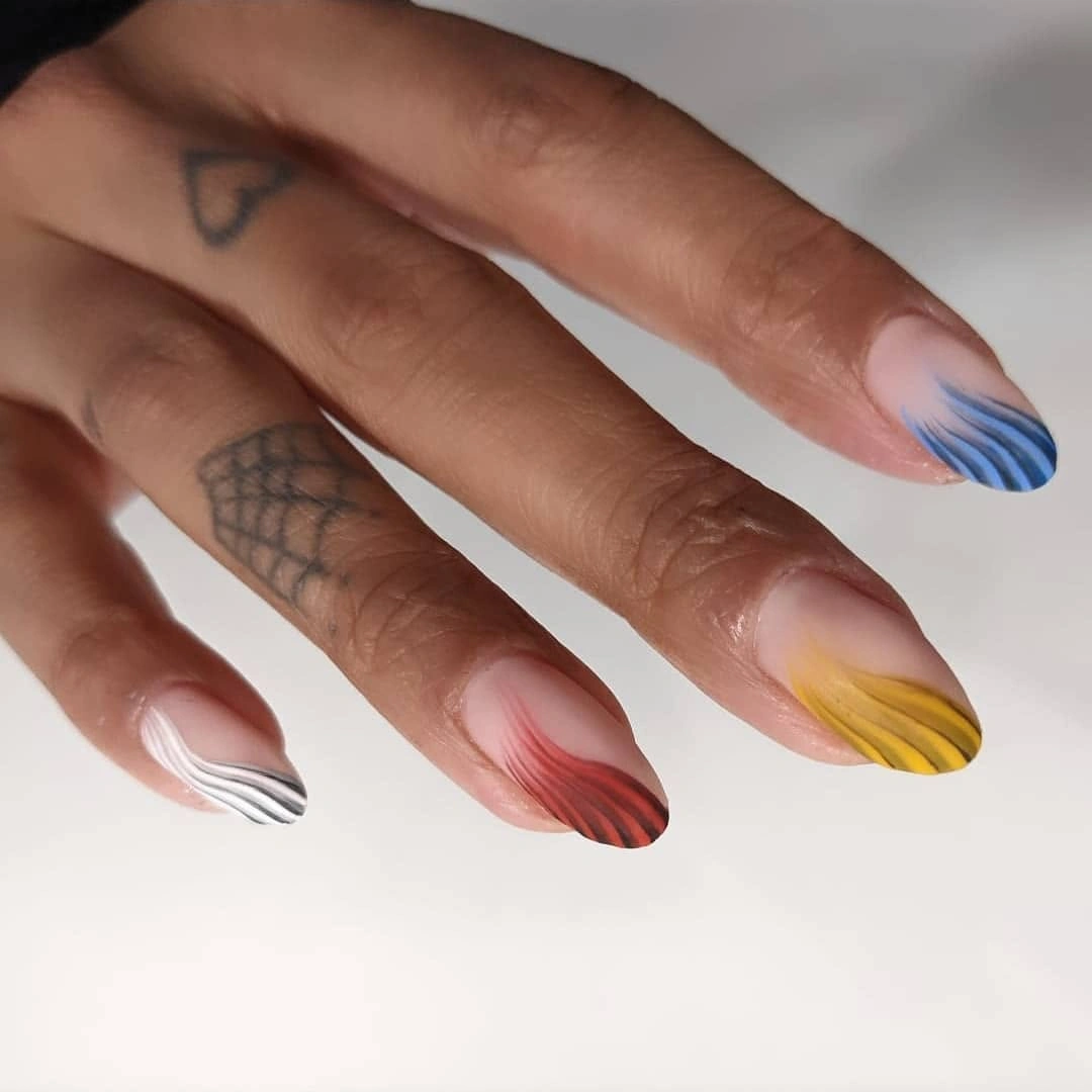
Each tip has enough blank or pale space beneath it to keep the design readable, and that restraint is important on a shorter almond. A simpler adaptation could repeat only one cool and one warm shade, but should retain the wavy edge; a standard straight tip would lose the gentle movement that makes the palette feel connected.
The several colors are not inherently seasonal, yet the muted treatment and small scale keep them from looking summery or overly sweet. The practical limitation is that mismatched tip colors demand a clear plan, so choosing shades with similar softness is safer than combining a very bright hue with several dusty ones that cannot hold equal visual weight.
Metallic Stars on a Nude Almond Base
Nude almond nails become much more dimensional through raised-looking metallic stars and fine lines that catch light in several colors. The pale base stays visible between those marks, which is crucial: it gives the metallic details room to sparkle individually instead of merging into a single busy chrome surface across the hand.
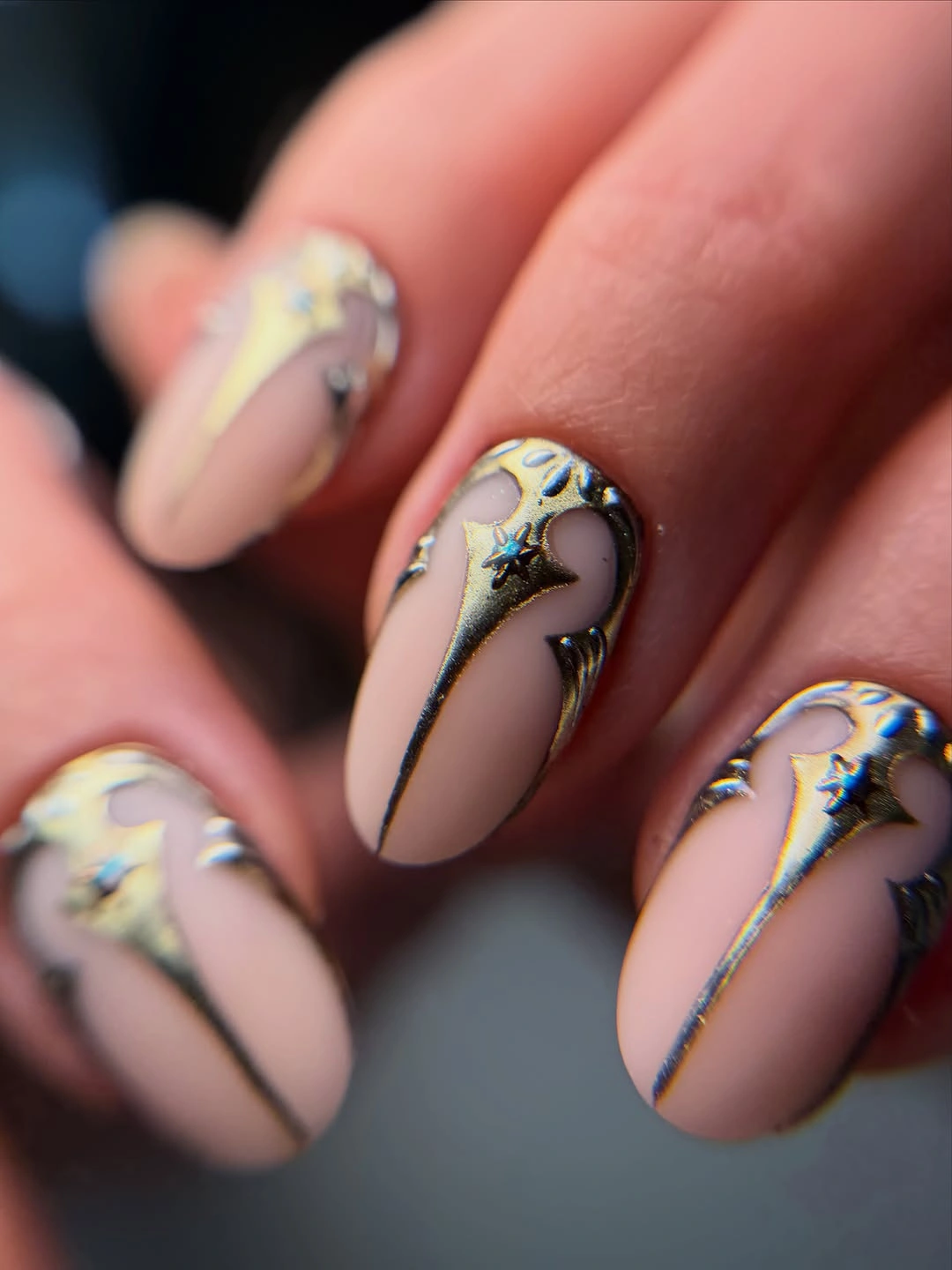
The stars are scattered rather than arranged in a strict grid, giving the design an uneven, celestial rhythm that suits the tapered shape. On a shorter length, one star and one narrow line per accent nail would be enough; duplicating all of the visible metalwork would likely make the details look compressed and difficult to distinguish.
Because the metallic accents are the most reflective element, the rest of the manicure needs to stay almost bare to maintain the contrast. A deeper nude could make the stars appear sharper, while a pale blush base would make the overall result gentler, but either option should keep the linework sparse enough for each small mark to register.
Black and White Waves Over Nude Length
Long nude almond nails carry bold black-and-white waves that flow from the sides and tips, creating a cow-pattern reference without using scattered spots. The high contrast is distributed in broad curves, and those curves follow the taper of the nail, which makes the graphic pattern feel elongated instead of sitting flat across the surface.
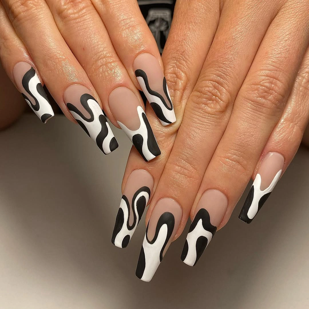
The visible nude center gives the waves their impact, so covering more of the nail with black or white would make the set substantially heavier. For a wearable variation, place the wavy print on two accent nails and leave the rest nude with thin black edges; that preserves the motif while reducing the amount of contrast on the hand.
This is a good example of pattern scale changing the mood more than the color pair itself. Small spots would read playful and scattered, whereas these flowing shapes feel more graphic and deliberate; the tradeoff is that broad waves show placement inconsistencies quickly, so the edges need to remain notably clean to keep the design convincing.
Blush Squares With Fine Black Outlines
Short blush square nails use black outlines, small linear symbols, and a dark mauve accent to turn a soft base into something more graphic. The individual marks are not large, but their crisp dark edges create enough contrast to organize the different nails and keep the design from drifting into a vague mix of pink details.
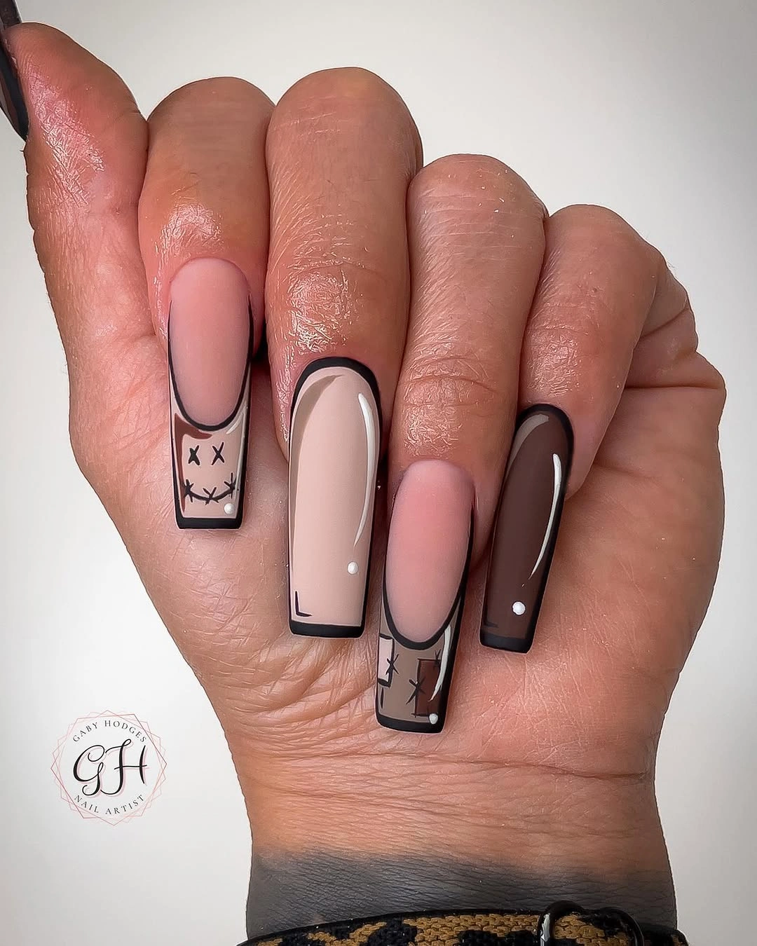
The most adaptable part is the outlined placement, which could frame only the tip or one side of a nail on a shorter manicure. Adding every visible symbol to every finger would make the set busier than the square shape can comfortably carry, so a better edit is to keep the mauve nail solid and let the black marks vary on two accents.
There is a slightly sketch-like character to the linework, but the blush and mauve pairing prevents it from looking too severe. If a matte finish is preferred, it would soften the pink field while leaving the black lines clear; gloss would make the same design feel sharper and more polished, with less of the quiet contrast seen here.
Burgundy Chevron Tips Framing Nude Space
The nude almond base remains central because the glossy burgundy chevron tips rise along both sidewalls rather than filling the entire end of each nail. That open center creates a pointed negative-space frame, making the dark color appear more architectural and allowing the length to feel refined instead of fully saturated with wine red.
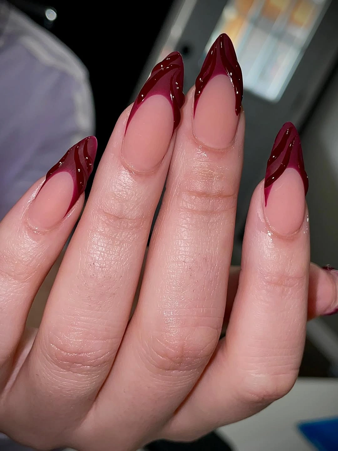
The chevron placement is more consequential than the burgundy itself, since a straight French tip would read much more conventional on this shape. A shorter version should make the V shallower and keep its sides narrow; a deep, wide chevron on less length could push the negative space too low and make the nail look visually divided.
The reflective burgundy adds a dressier note against the nude center, while the large exposed area keeps the manicure useful beyond a formal setting. Someone choosing a matte fall alternative could leave the base glossy and make only the burgundy velvety, but that would soften the sharp edge that currently gives the design its strongest visual point.
Gray Almonds With Lime Edges and Droplets
Gray almond nails mix with nude and lime French details, black outlines, and rounded raised droplets, creating several small textures without relying on one large motif. The lime appears only at the edges, which lets it energize the muted gray rather than taking over the palette, while the black lines give the varied placements a common boundary.
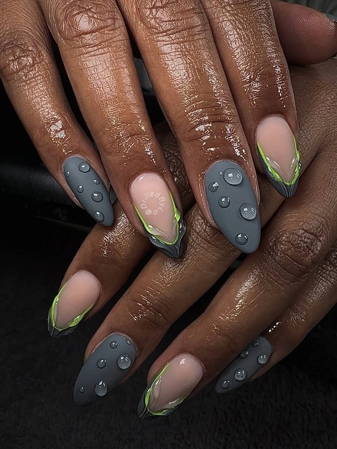
The droplets add the most unusual surface change, so they should remain limited if the design is adapted for daily wear. Removing one or two would leave the gray-and-lime contrast intact, while adding them across every nail could obscure the French shape and make the manicure feel heavier than its narrow colored edges suggest.
This set works because each detail has a separate job: gray provides calm, lime provides a lift, black provides definition, and the rounded accents add depth. The risk is over-collecting those ideas in one version, so preserving the empty nude areas is important; they give the eye relief and stop the design from turning into a dense collage.