Fall nails for pale skin do not need to avoid dark color; the more useful question is where the darkness sits and what keeps it readable. A black tip, a plum solid, or a brown panel gains dimension when a nude interval, a reflective surface, or a warm accent breaks the shadow. The strongest designs treat contrast as a controlled scene, leaving enough light around the deepest detail for the hand to remain part of the composition.
Start by choosing one source of drama: silhouette, color depth, or graphic line. Long points can carry dense patterning because the shape provides distance between details, while short nails benefit from a single concentrated accent or a glossy finish. Pale skin can make saturated color appear especially clear, so edit the palette before adding more ornament and allow one quiet nail to create relief when the rest of the set is expressive.
Black Points With Orange Botanical Panels
Very long pointed nails combine inky black with nude panels, bright orange botanical-style marks, and small gold-toned accents. The dark points create a sharp frame, while the orange artwork cuts through that depth like a warm light source rather than a separate cheerful theme. Nude areas are essential here because they keep the length from becoming an uninterrupted black silhouette against pale skin.
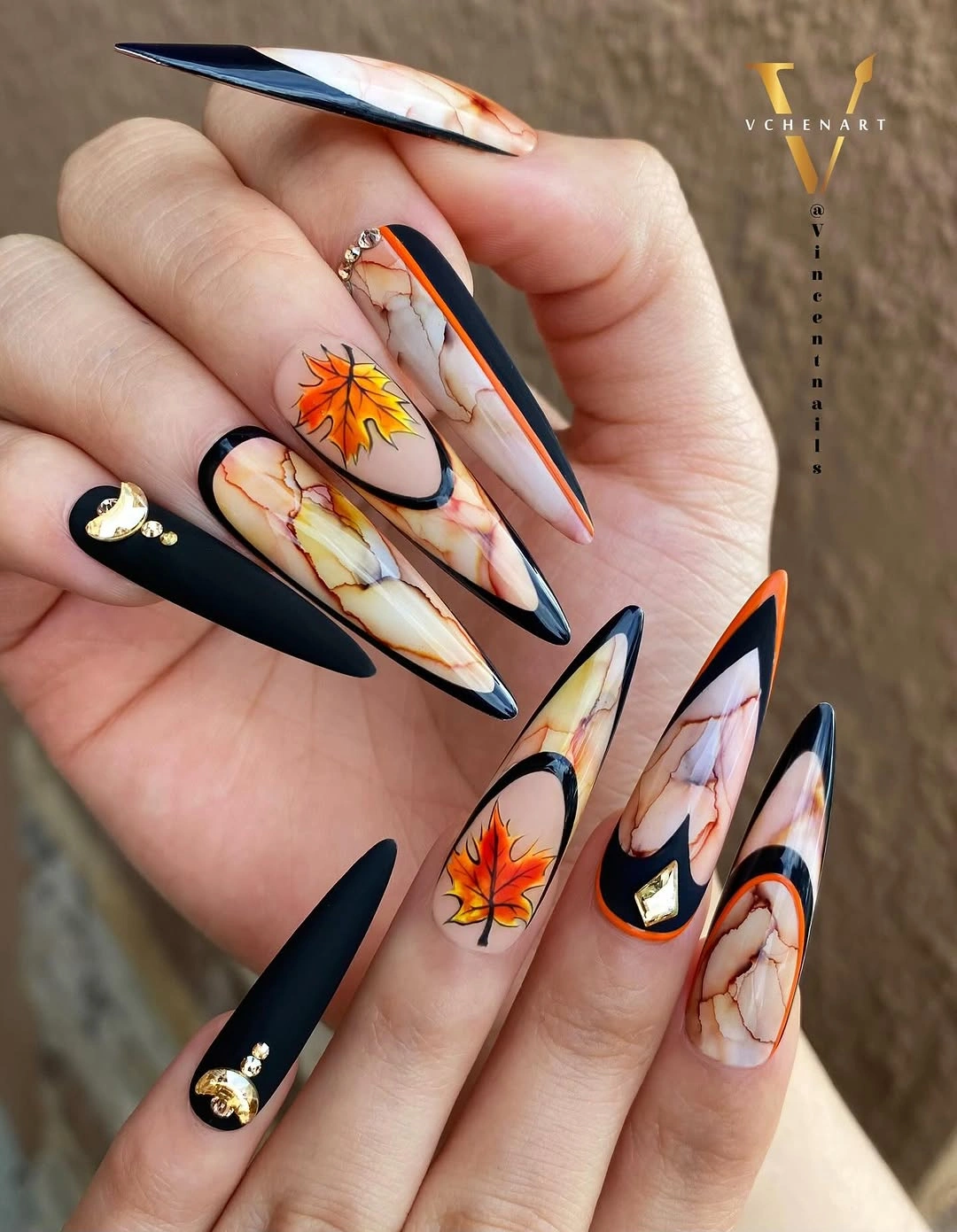
A more wearable version can keep one black pointed nail and place orange marks on a nude almond accent instead of extending them over every finger. Dark fall nail ideas can help compare how much black a dramatic shape can carry before the warmer panel loses its outline. Shorter nails need fewer panels with wider spacing, otherwise the botanical marks become less visible.
The tension comes from black holding the perimeter while orange occupies the center. Replacing black with espresso would soften the scene, but it would also reduce the crisp silhouette that gives the set its after-dark energy. Keep a generous nude interval if your goal is contrast that feels deliberate rather than costume-like, particularly when the shape is as long and pointed as this one.
Soft Pink Nails With Orange Edges
Medium almond nails in nude, dark brown, and soft pink use small orange French-tip accents to create warmth at the edge. The deeper brown occupies limited space, which lets pale skin remain visually connected to the pink and nude areas instead of being overwhelmed by a dark field. Orange appears like a clean spark, bright enough to shift the palette toward fall without making it look heavy.
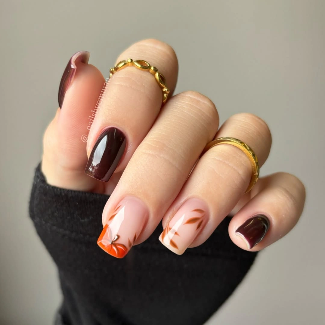
For a quieter interpretation, use pink on most nails and add orange to only one curved tip, with brown reserved for a single solid accent. An almond outline makes the edge color look fluid, but a short oval can carry a small side tip just as well. Leave the lower third clear so the manicure stays light as it grows and the color remains focused near the free edge.
Brown gives the pink more depth than black would, while orange keeps the dark note from becoming too serious. This is a useful palette when you want autumn warmth but prefer a brighter overall hand. If you remove the orange, the design becomes a gentle brown-and-blush neutral. Keeping it produces a more distinct seasonal flash without changing the soft character of the base colors.
Glossy Mauve-Taupe in Full Shadow
Long almond nails in uniform muted mauve-taupe use high gloss to turn a restrained color into something more atmospheric. The shade sits between brown and purple, so it has depth without reading as black or wine. On pale skin, the smooth reflection creates a clear boundary around every finger, keeping the color visible even though the palette itself remains quiet and close to a neutral range.
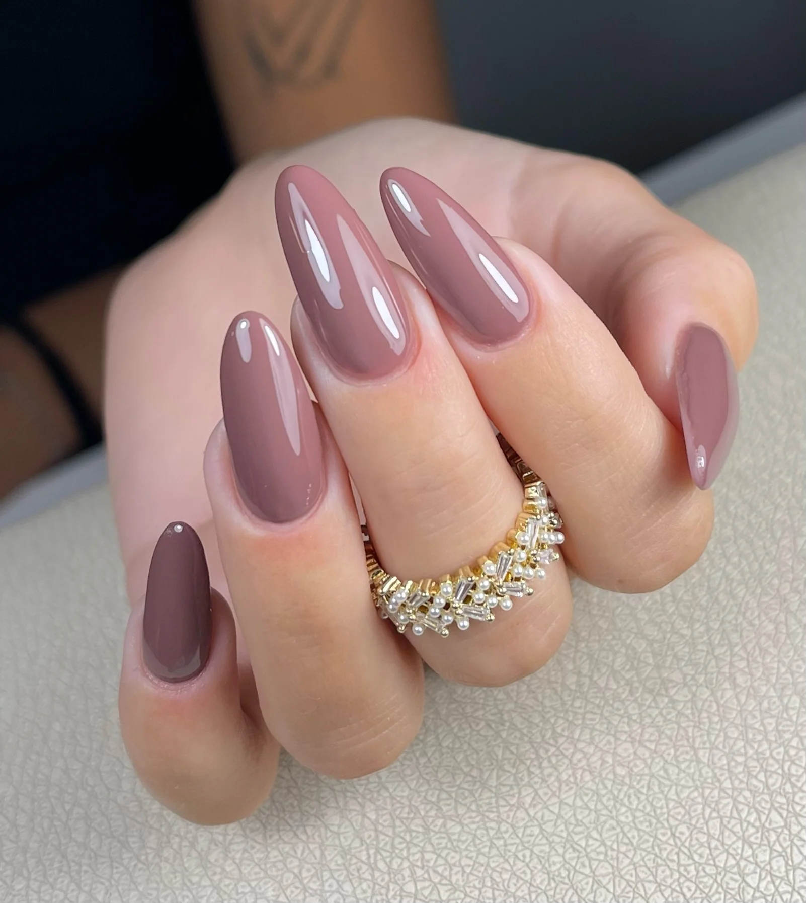
Shorter nails can keep the same color direction with an oval shape and a very even surface. A mauve-taupe needs no art when the finish is polished, because the reflected light supplies the movement that a pattern might otherwise provide. Choose a slightly browner version for more autumn warmth or a cooler gray-mauve if you want the manicure to feel more restrained and shadowed.
The beauty of this option is its controlled darkness. It has the depth of a fall neutral but none of the visual pressure of a near-black shade. A matte surface would make the color more velvety and subdued, while the gloss shown here keeps it alive in changing light. That distinction matters when pale skin creates a strong contrast with even modestly dark pigment.
Burgundy Dots Across a Nude Almond
Burgundy and pale nude alternate on medium almond nails, with small burgundy dots adding a concentrated graphic detail to the lighter areas. The dots feel intentional because they are allowed to remain small against plenty of nude space. Dark nails give the set its autumn anchor, while the pale accents stop the hand from reading as a continuous block of wine color.
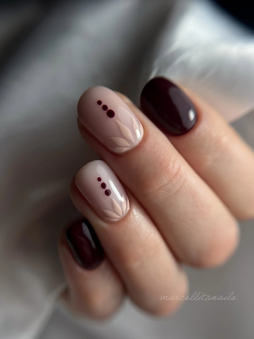
To make the design easier to maintain, place the dots in one compact grouping rather than scattering them near several tips. A nude nail can carry two or three dark marks and still feel open, especially when the almond shape has a soft taper. Burgundy fall nail designs can help compare a red-brown alternative that lowers the contrast against pale skin.
Here, the small dots create a rhythm that mirrors the solid burgundy without repeating it as another full nail. That restraint gives the manicure a graphic edge but keeps it readable in ordinary light. Adding white would make the dots more decorative; leaving the palette to nude and burgundy lets the design stay moody and concise. The open background is what makes the dark punctuation effective.
Cream, Taupe, and Sparse Speckled Squares
Short squared nails mix taupe, cream, and white, with sparse dark speckles appearing on selected pale surfaces. The pale colors brighten the hand, while taupe introduces an autumn shadow that remains softer than deep brown. Small marks keep the design from becoming plain, but they do not cover enough area to compete with the clean blocks of cream and the compact squared silhouette.
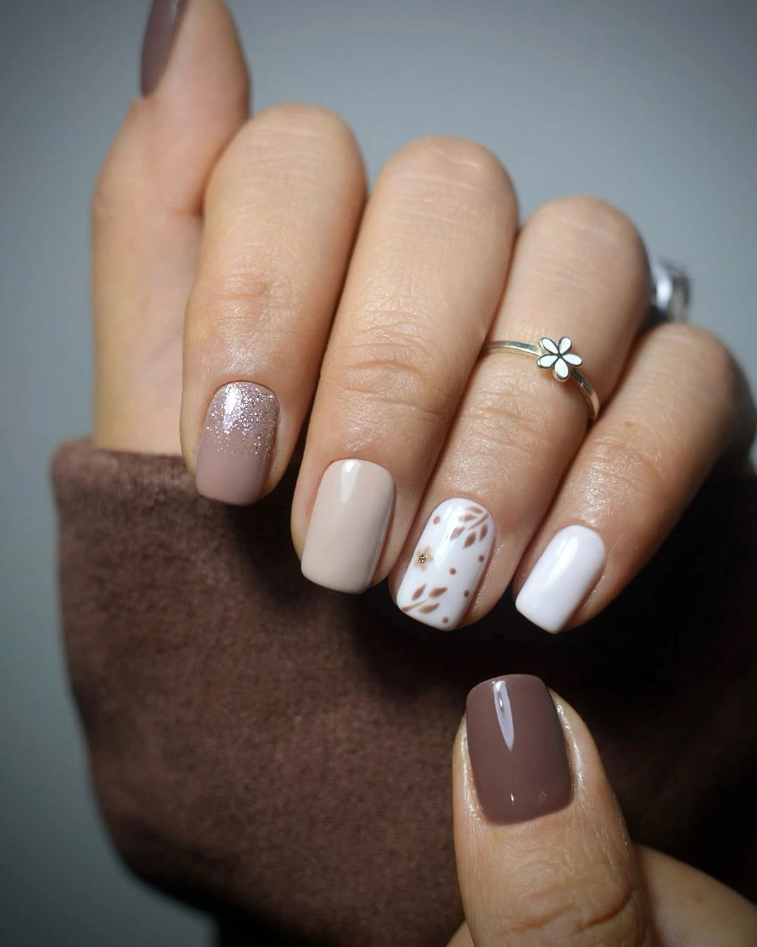
A warm beige can replace white if pure contrast feels too crisp on pale skin. Keep the speckles rare and uneven so they read as texture, not as a repeated print. The squared shape already provides a clear structure, so only one or two nails need the tiny dark detail. On a very short length, use fewer larger marks rather than attempting a dense field of miniature dots.
The design stays light because taupe is the deepest color and it appears beside generous cream intervals. That makes it a useful option for someone who wants a fall mood without committing to burgundy or black. The speckles add a little interruption, yet the quiet color blocks remain the main visual event. Remove the dots entirely for a more minimal, clean-lined version of the same palette.
Deep Burgundy With Warm Linear Sparks
Short rounded nails in deep burgundy use small warm yellow and fine linear accents to bring a flicker of light into the darker color. The burgundy dominates the composition, but the small bright details prevent it from becoming a single heavy surface. Pale skin makes the red depth especially clear, while the compact rounded outline keeps the manicure smooth rather than severe.
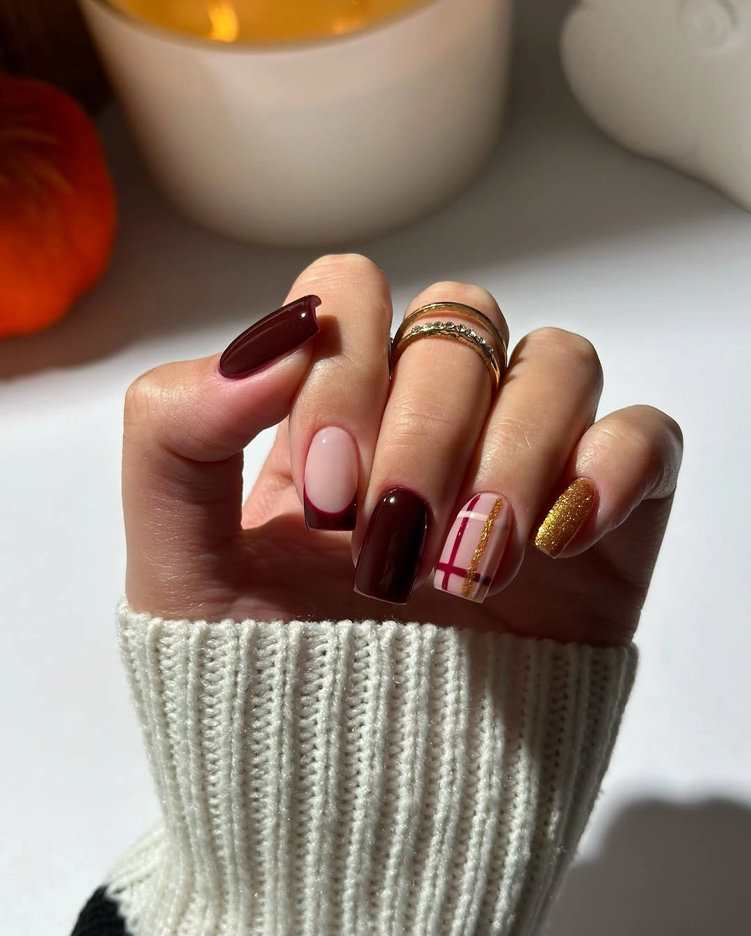
For a less decorative version, keep the burgundy solid on most nails and place one thin warm line on a single accent finger. The contrast should feel like a small flash, not a wide stripe that divides the nail in half. A short rounded shape is practical for this idea because the curve softens the dark shade and leaves the tiny bright accent looking intentionally contained.
Warm yellow works differently from gold here: it feels graphic rather than reflective and pulls a little light from the wine-dark base. If you prefer a quieter result, swap it for cream or a muted caramel. The important choice is keeping the bright note limited. Too many lines would flatten the dark background, while one controlled accent lets the burgundy retain its rich, shadowed presence.
Fuchsia Texture Through a Burgundy Palette
Medium almond nails move between burgundy, fuchsia, and pale nude, with raised-looking curved texture patterns creating a stronger surface story on selected fingers. The fuchsia catches attention first, but burgundy gives it a darker frame that keeps the palette connected to fall. Nude areas provide relief, making the textural-looking marks feel concentrated instead of spread across the entire manicure.
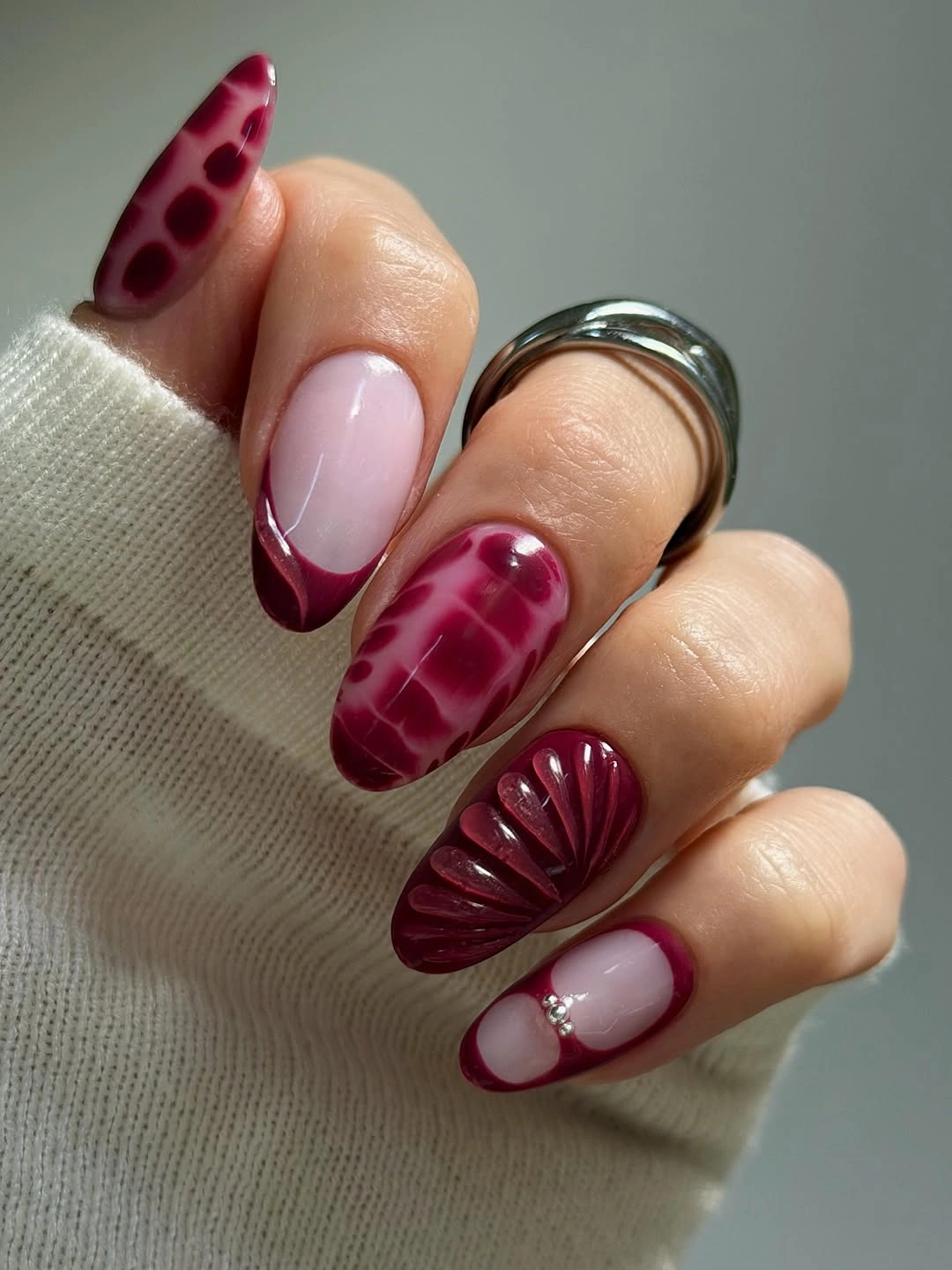
To reduce the intensity, choose fuchsia for one accent nail and let burgundy remain the main dark color. Curved texture should have enough surrounding bare space to remain readable, so it is better placed on a longer almond than squeezed onto every short nail. A plain nude neighbor is especially helpful because it gives the richer shades a pause and makes the raised-looking pattern seem more deliberate.
The palette has cinematic contrast because fuchsia behaves like a bright color under a deep red shadow. Removing the pale nude would make the set much denser, while adding more fuchsia would move it away from a fall feeling. The current balance works by letting one vivid tone lead briefly, then returning the eye to burgundy and softer skin-adjacent space before the next accent appears.
Magenta Leaves on a Bright White Base
Magenta almond nails sit beside white and multicolor botanical-style accent art, creating a bright moment within an otherwise darker seasonal direction. The white surfaces act like a small spotlight for the colored marks, while magenta supplies a saturated counterpart that remains warm enough for fall. The almond shape gives the leaf-like details room to follow the nail instead of crowding the sidewalls.
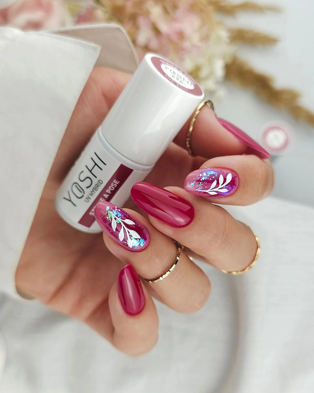
A calmer version can use one magenta nail and one white accent with just a single colored leaf-like mark. Keep the remaining nails a soft blush or neutral nude if you want the design to sit more gently against pale skin. The decorative art should remain focused toward one side or the tip, leaving an open zone so it still looks airy when the nails are viewed from a distance.
White increases the contrast of every nearby color, which is why it makes the magenta feel brighter rather than darker. If you prefer less intensity, choose cream in place of white and reduce the multicolor detail to two tones. The current version has a lively, graphic quality, but its most successful feature is the clear framing: saturated color is always given a pale field against which to appear.
Black Squares With Cow-Print-Style Blocks
Short squared nails use black, orange, yellow, and white in cow-print-like and graphic blocks that create a compact, high-contrast scene. Black gives the layout depth, while orange and yellow provide warm sharp points that keep the dark nails from feeling flat. White patterned sections offer enough brightness that the design remains legible rather than turning into a dense patchwork on pale skin.
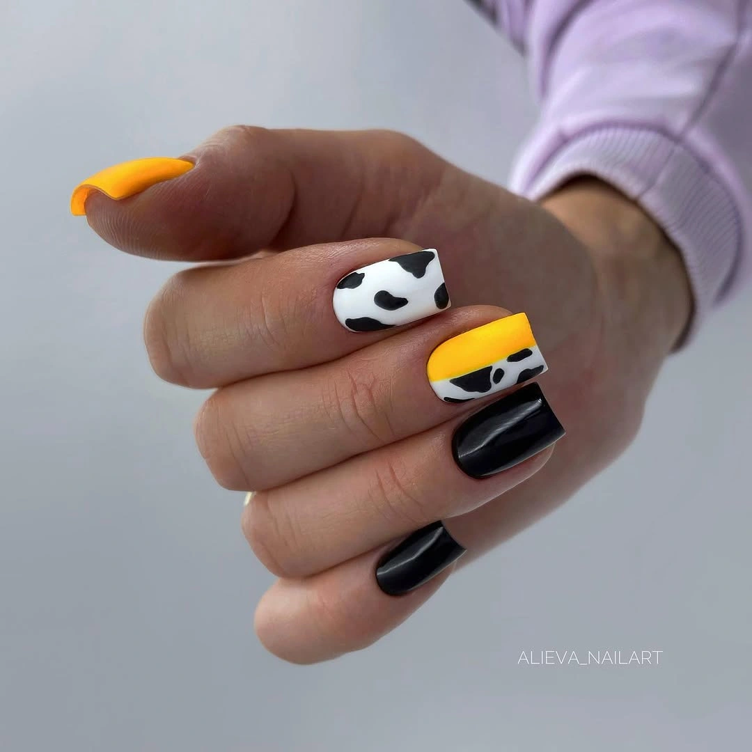
For a lower-key version, choose black and white as the main pair, then add orange to one nail only. The squared shape supports blocky patterning, but each nail needs a simpler arrangement than the next so the whole hand does not become visually noisy. Keep yellow in a small area if you use it, since its brightness can become the focal point faster than the deeper black or orange.
The appeal here is graphic tension, not subtle blending. Black establishes the shadow, white makes the pattern readable, and the warm colors create brief jolts of light. A pale skin tone gives all three colors clear separation, which is helpful but also means editing matters. Leaving one nail mostly solid is the easiest way to stop the print-like sections from competing with one another.
Pastel Lilac With Gold-Toned Florals
Soft lilac, pale pink, cream, and small gold-toned floral-like accents create a gentler contrast on long almond nails. The colors are light, yet their different temperatures keep the manicure from fading into one pale surface. Gold-toned marks appear as tiny points of reflection, adding just enough depth to make the soft palette feel deliberate against pale skin rather than merely neutral.
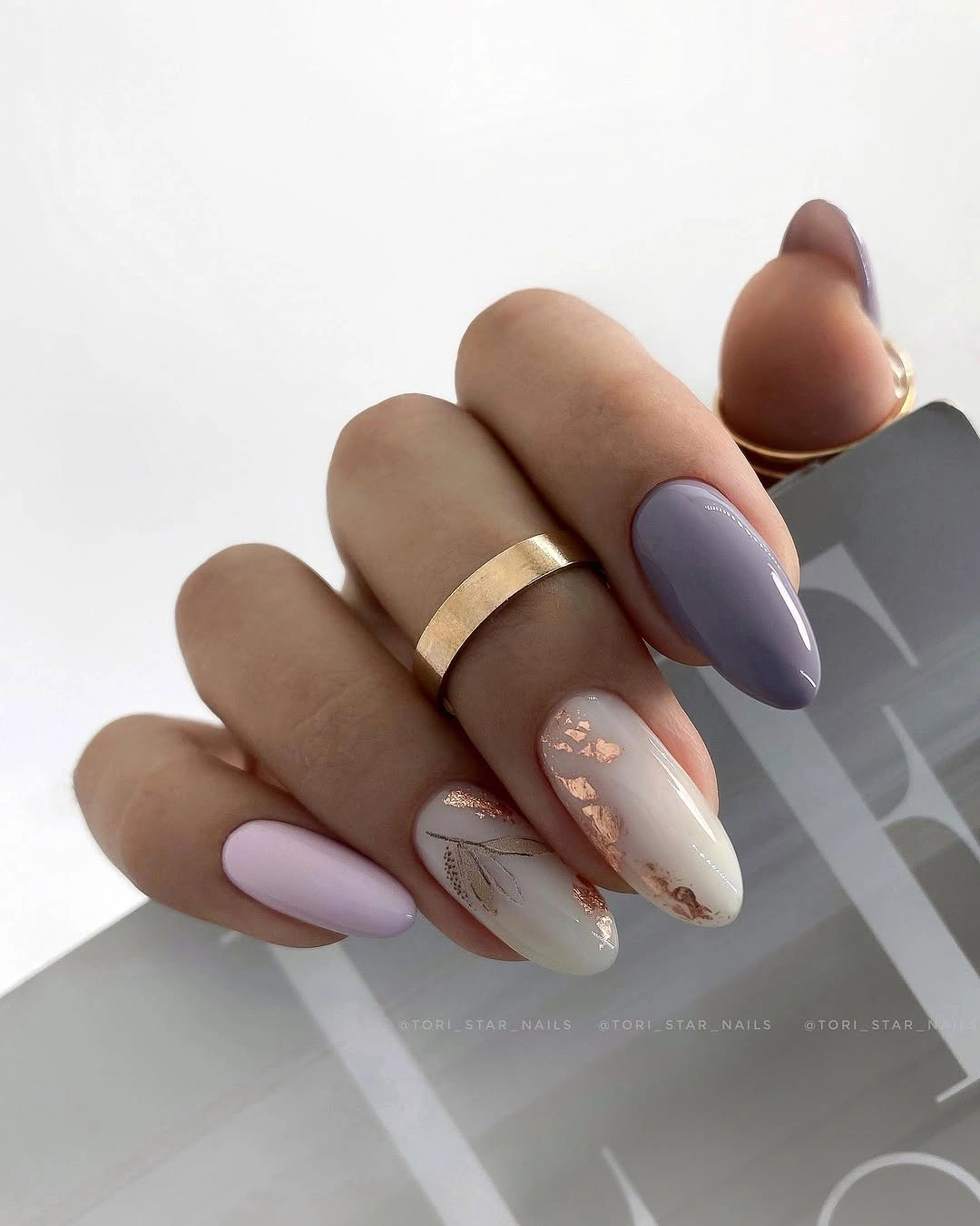
To maintain the airy quality on a shorter length, use lilac as the only full color and reserve the floral-like marks for one cream nail. Keep the gold-toned detail scattered rather than building a heavy border near the tip. A pale manicure still needs a focal point, but it should be small enough that the open fields of pink and cream remain the dominant impression.
The contrast is low in pigment but high in placement. Lilac provides a cool shadow, pink lends warmth, and cream opens the visual space between them. Adding a deep brown nail would transform the mood completely, so stay with fine gold-toned accents if you want depth without darkness. The result is soft, but the small reflective marks stop it from feeling indistinct or washed out.
Black Plaid Points With Pink Light
Very long pointed nails combine black and deep pink with plaid-like panels and black bow motifs, making the silhouette itself part of the drama. The inky areas provide the strongest shadow, while pink inserts light and prevents the set from becoming one continuous gothic-looking field. The long points give the small graphic features enough room to remain separate, even when several dark elements appear in the same manicure.
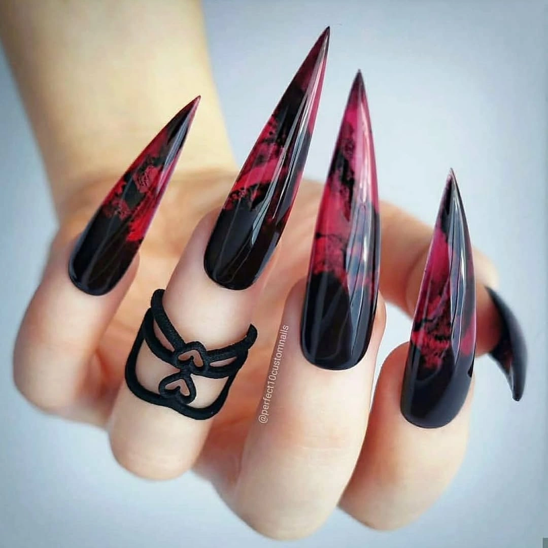
A more practical adaptation can keep one black pointed accent and use a pink-and-black plaid panel on only one neighboring nail. Bows or other miniature motifs need a broad enough surface to stay readable, so a medium almond calls for one motif rather than several. Use a muted berry pink if you want the contrast to feel less vivid while preserving the dark-light relationship.
The set feels dramatic because black is allowed to occupy large areas, yet the pink prevents the silhouette from becoming visually blank. Removing the bow motifs would make the nails more editorial and less playful. Keeping one provides a focal point, but repeating it would dilute its effect. On pale skin, this kind of dense black looks clearest when a colored panel interrupts the darkness at regular intervals.
Blush Nails With Substantial White Tips
Medium squoval nails in blush nude use substantial white French-style edges that create a bright, clean contrast without relying on a dark autumn shade. The white tips are broad enough to be part of the design rather than a fine line, while the pink base keeps the transition gentle beside pale skin. The squoval outline softens the crisp edge and gives the look a balanced, modern structure.
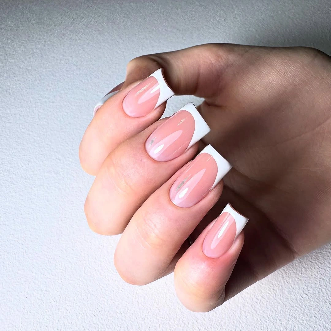
For a softer version, replace bright white with cream and reduce the depth of the tip by a few millimeters. The broad edge is most flattering when the base remains translucent-looking or warm, because stark white over a very cool nude can create a much harder contrast. A short squared nail can use the same idea, but a narrower white band will help it preserve visual length.
The white tip is the source of drama here, which makes this a useful choice for someone who prefers pale color but still wants a visible manicure. A warmer blush base keeps the design connected to fall, especially with brown or berry accessories. Fall nail inspiration can help compare different tip depths and shapes without changing the soft blush foundation.
Red Negative-Space Curves Over Nude
Pale nude, white, and red create flowing negative-space curves across medium squared nails, allowing the stronger red to look light rather than solid. The shape gives the curves a clean frame, while the pale base reflects enough light to keep the red marks from dominating pale skin. Each arc seems to move through the nail instead of stopping at the tip, producing a graphic but controlled rhythm.
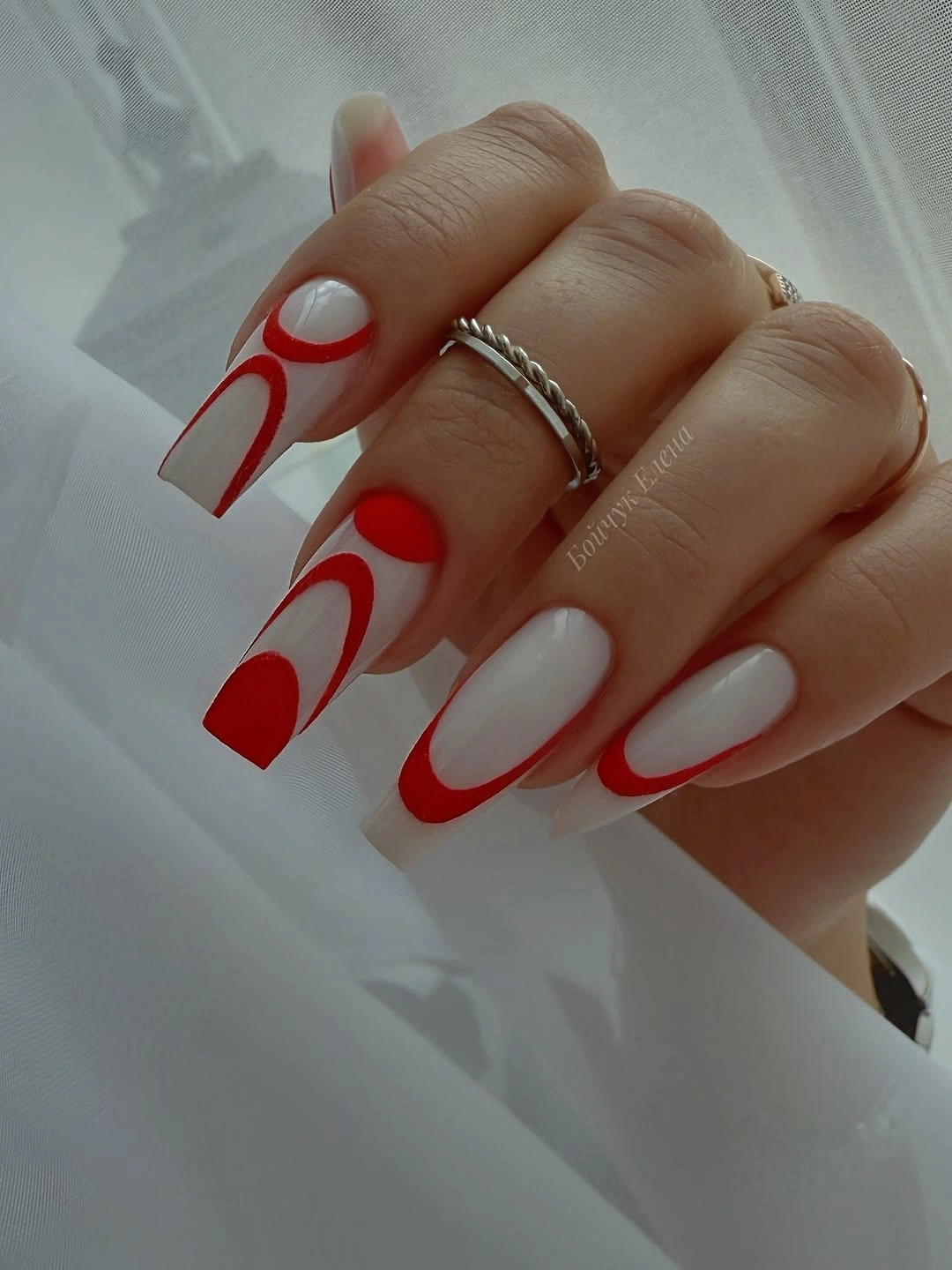
To simplify the idea, use red on one or two nails and let white act as the only companion line. A negative-space curve needs a clear open field around it, so avoid filling every section with another color. On a shorter squared nail, make the red arc broader and reduce the number of turns; a single confident sweep reads more elegantly than several compressed loops.
The drama comes from red being interrupted, not from its intensity alone. White brightens the composition, but the nude base is what makes the curves feel spacious. Replacing red with burgundy would darken the scene and make it more autumnal, while a warmer scarlet keeps the graphic quality fresh. The design benefits from a consistent curve direction even when the exact placement changes from nail to nail.
Cyan Leopard Marks and Pink Framing
Cyan blue, hot pink, and black form a vivid pattern on short nails, with leopard-like marks and a bold outlined accent providing the main graphic tension. The palette is bright, but black gives the colors a controlled edge and keeps the pattern from looking too sweet. Pale skin creates a clear backdrop for the saturated blue and pink, making the contrast feel intentional and visibly sharp.
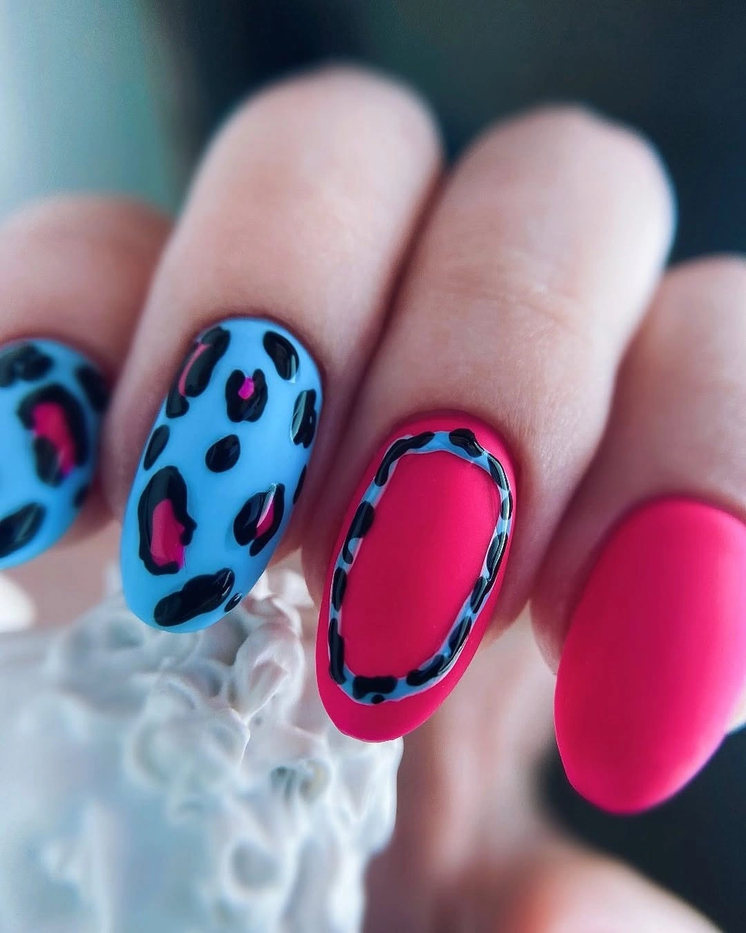
A restrained version can use cyan on one nail, pink on another, and black only as a small outline or dot. The leopard-like pattern should stay on a single accent nail so the marks remain a focal point instead of becoming wallpaper. Short nails need bold, separated spots; tiny crowded marks would blur and weaken the clean contrast between the cool blue and warm pink.
This is not a quiet fall palette, but it works when the dark outline is treated as structure rather than decoration. Cyan brings a cool flash, pink warms it, and black supplies the shadow that makes both colors readable. If you want a more seasonal alternative, replace cyan with deep teal or berry. Keeping the current blue preserves the playful, high-contrast editorial effect.
Espresso Nails With Warm Orange Details
Dark brown, warm orange, and metallic-looking diagonal detail work appear on medium almond nails with a rich, compact mood. Espresso brown gives the hand a deep base, while orange adds a brighter focal point that feels autumnal rather than overly dark. Diagonal reflective elements draw the eye along the nail length, helping the shorter color blocks feel connected to the almond silhouette.
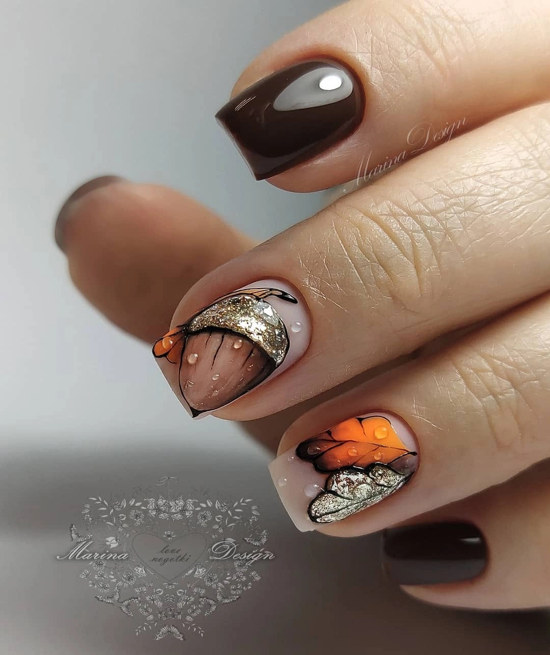
For a toned-down version, keep the espresso solid and use orange on only one nail with a narrow diagonal strip. The metallic-looking detail should be placed where it can follow the curve of the nail, not chopped into several unrelated fragments. A warm nude accent can also lighten the arrangement if brown and orange alone feel too dense against your pale skin tone.
Brown and orange work because they share warmth but differ clearly in depth. The diagonal detail acts as a flash between them, much like light moving across a dark surface. Replacing orange with rust would create a quieter effect, while a brighter pumpkin shade makes the manicure more expressive. The darkest color should remain the anchor, otherwise the reflective lines will have nothing to sharpen against.
Translucent Nude With White Lace-Like Tips
Long tapered square nails use a translucent-looking nude ground with white lace-like tips and small sparkle accents, creating a bright design that still has visual depth. The nude base lets pale skin remain part of the composition, while the white at the edge provides a defined finish. Tiny reflective points add texture without interrupting the long clean route from cuticle to squared tip.

On a shorter nail, use a simplified white edge with one or two small decorative marks instead of a full lace-like pattern. The negative space is what makes this layout feel refined, so resist the urge to fill the nude area with additional color. A warm nude keeps the white from looking too icy, while a cooler pink base would make the contrast more delicate and bridal in mood.
The design has lightness, but its structure is precise: a sheer-looking center, a more opaque edge, and small points of reflection. If the white tips become too deep, they can shorten the nail visually, especially on a square shape. Keep the detail concentrated along the edge and let the naked-looking center remain broad. That proportion preserves the airy, lengthened effect that makes the manicure work.
Painterly Flecks Over a Warm Nude
Medium rounded nude nails carry abstract red, yellow, and burgundy painterly flecks that feel like small concentrated color studies rather than full patterns. The warm base keeps the accents from floating too far from pale skin, while the red and burgundy provide seasonal depth. Yellow appears in brief touches, adding a light source that breaks up the darker marks without becoming the dominant shade.
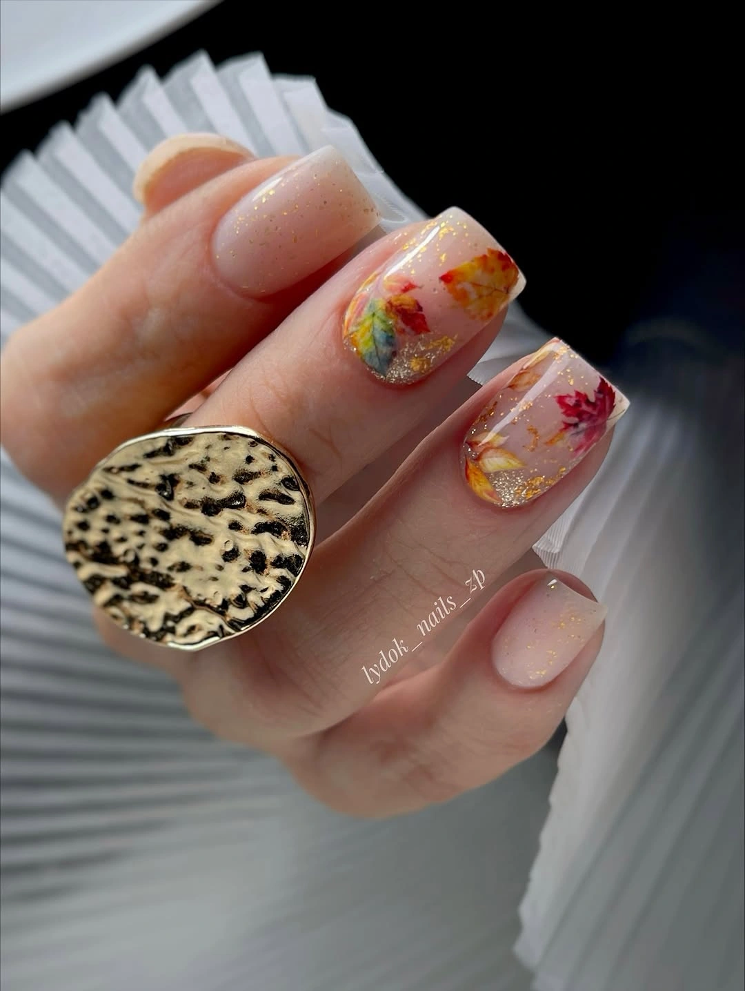
A minimal version can use one burgundy fleck and one muted yellow mark on a single accent nail, leaving the rest warm nude. Painterly placement works best when it looks uneven and intentional, so avoid making every mark the same size or direction. The rounded outline is helpful because it softens the abstract color and keeps the little strokes from feeling too hard-edged.
The strongest quality is its restraint of scale. Each color has room to appear without turning the nail into a miniature canvas crowded with detail. A darker brown fleck would make the palette more muted, while a brighter orange would move it toward a bolder harvest direction. Keep the base warm and open if you want the small marks to remain the point of attention rather than a busy surface treatment.
Greige Nails With Tiny Gold-Toned Dots
Short rounded nails in greige use tiny gold-toned dots to bring a quiet reflective detail into an otherwise shadowed neutral. The gray-brown base has enough depth to show clearly against pale skin, but it remains softer than espresso or burgundy. Small dots are placed with space around them, turning the reflection into a subtle punctuation mark instead of a broad decorative border.
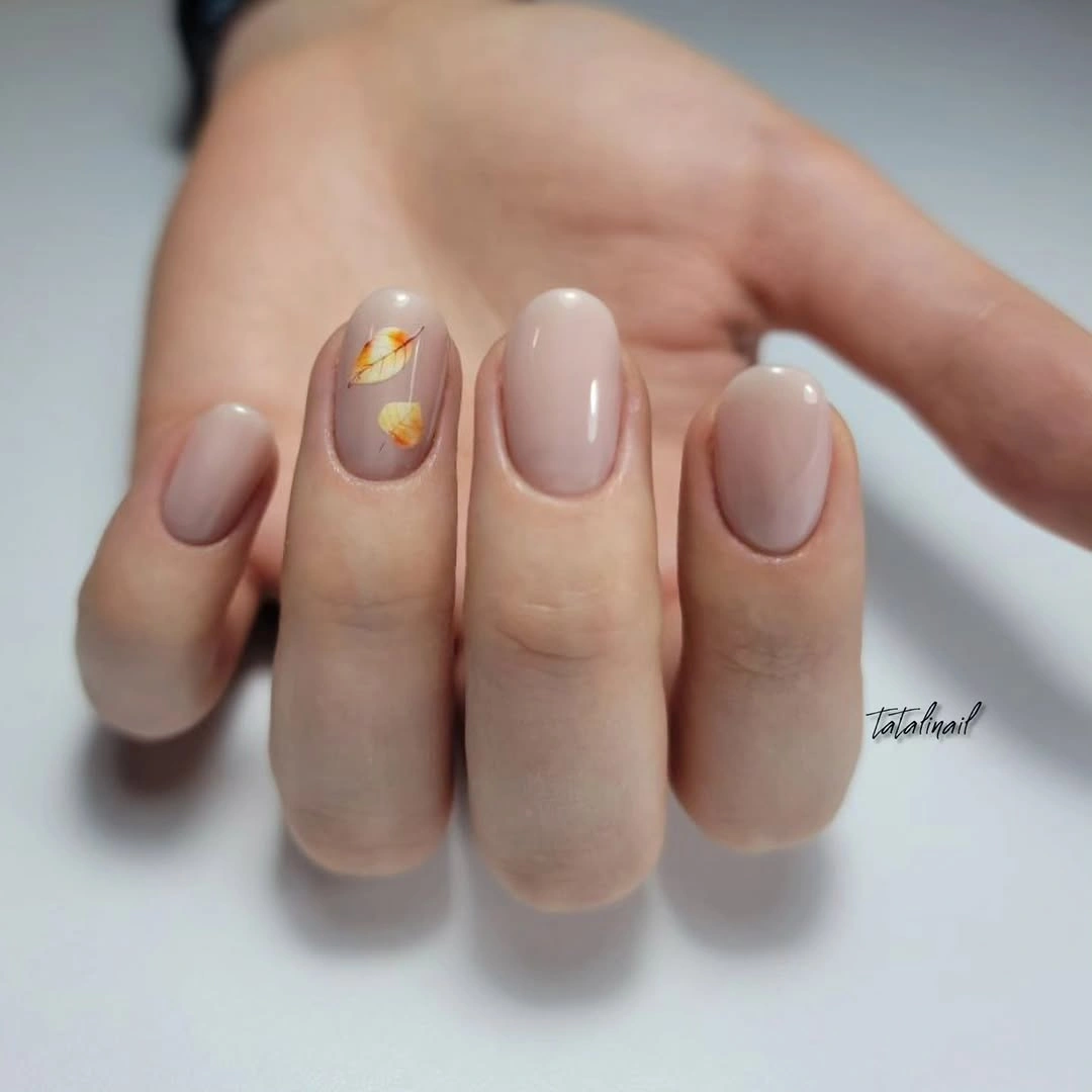
If you want the color to feel warmer, choose mushroom taupe rather than a cooler gray. The dots should remain few and slightly off-center, because a row of identical accents can make the manicure look more formal than the soft rounded shape suggests. A single dot on two nails will often create more polish than scattered metallic marks across every surface.
Greige is useful when a pale manicure feels too light and a dark brown feels too heavy. It creates a middle shadow, while the gold-toned points keep that shadow from becoming flat. Remove the dots for a highly minimal finish, or replace them with a thin cream line for less reflection. The current design works because the shimmer never competes with the neutral foundation.
Bright Green Squares With Fine Metallic Flecks
Long squared nails in saturated bright green use tiny scattered metallic-looking flecks to make the color feel electric without adding another major pigment. The green stands sharply against pale skin, and the flat tip gives the vivid shade a confident, graphic outline. Small reflective points create variation across the surface, helping the solid color hold attention from different angles rather than reading as a single flat field.
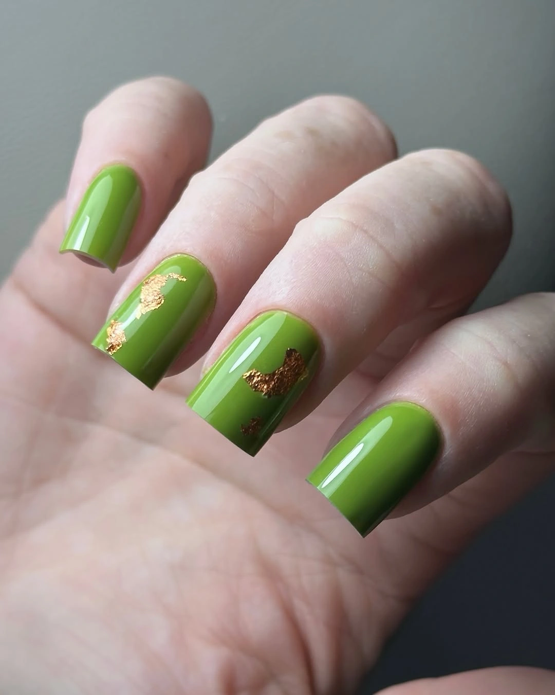
A more controlled version can use the bright green on two nails and choose a deep olive or warm nude for the rest. Keep the flecks fine; larger reflective pieces would shift the manicure toward a heavier statement and distract from the clean green blocks. If your nails are shorter, a medium square or squoval will preserve the graphic effect without requiring the same dramatic length.
The color is the source of drama, so the flecks should only amplify its movement. Bright green can feel unexpected for fall, but paired with brown, black, or cream clothing it reads as a vivid botanical note. Replacing it with moss would soften the contrast, while retaining this saturated green creates a sharper editorial look. The clear squared silhouette prevents the bold pigment from becoming visually loose.
Pale Nude With Clean White Curves
Medium short nails in pale blush nude use clean white French-style curves to create a final note of brightness without introducing a dark color. The white lines remain narrow and controlled, following the rounded edge instead of cutting the nail into a heavy block. Against pale skin, the blush base keeps the contrast gentle, while the crisp curves provide enough definition for the manicure to look finished and intentional.
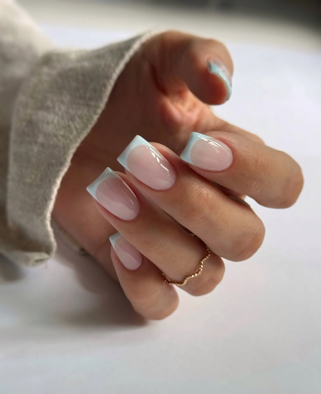
For a softer effect, choose cream instead of white or make the curve shallower near the sidewalls. The design works best when the base stays warm and the tip follows the actual shape of the nail, not a perfectly straight line. Fall square nail designs offer a useful geometric comparison before you decide how much edge contrast you want.
The quiet finish is a useful counterpoint after darker, more graphic fall options. White provides the light, blush nude maintains softness, and the curved edge gives the manicure a clear structure without needing an accent nail. A deeper berry base would change the whole mood, but the pale version succeeds precisely because it keeps the drama in the outline rather than in heavy pigment or dense decoration.