Deep red is not automatically dramatic. It becomes dramatic when the eye has nowhere to rest – when a dark edge meets another dark edge, or when a long pointed shape carries color without a break. Give the same shade a pale margin, a clean boundary, or a change in surface, and its character shifts before the color itself does.
That is the useful way to choose a burgundy manicure: decide where you want the contrast to happen, not how much decoration you can add. A single interruption can make a solid set feel deliberate, while too many small accents flatten the hierarchy. Protect the strongest edge or empty space, then simplify everything that competes with it.
Tonal Swirls Give Burgundy a Moving Edge
The opening manicure uses long, sharply tapered burgundy nails with darker and lighter curved lines moving through the glossy surface. The color stays within a deep wine family, so the design feels layered without introducing a separate bright shade. Length and point create the first impression, but the small tonal shifts along the nail keep the solid color from looking static.
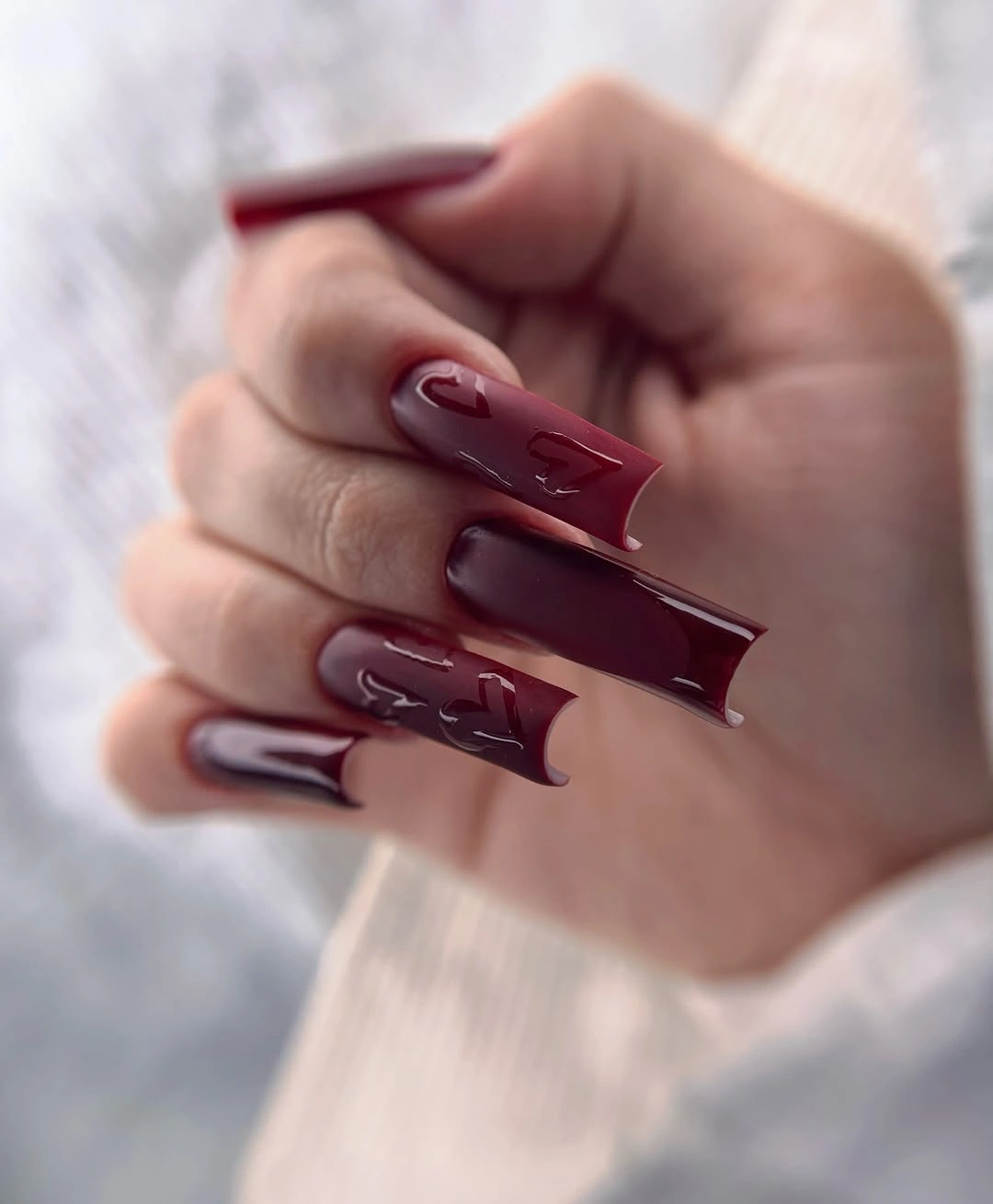
The swirls carry disproportionate visual weight because they follow the length of the nail. Their curves echo the stiletto taper and guide the eye toward the pointed edge, while the burgundy base keeps the movement cohesive. This is a useful way to add design to a dark red set without breaking its depth: change the value or reflection, not the entire palette.
On a shorter shape, keep one curved accent near the tip and use a single burgundy shade on the remaining nails. Compressing every tonal line onto a small canvas would remove the separation that makes the reference readable. The practical tradeoff is clear – the long point creates drama and needs more upkeep, while a shorter almond can keep the curved emphasis with a calmer consequence.
One Small Accent Keeps Dark Red Under Control
Most nails here are solid glossy burgundy, while one or two fingers carry a small brown-black wavy or animal-like line accent on a lighter or burgundy field. The medium length and repeated dark color keep the set focused, so the little motif has room to register without becoming a second theme. The design is restrained because the decorative decision is isolated.
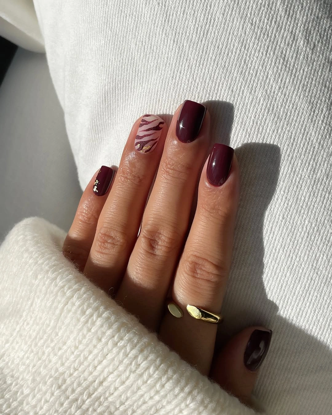
The accent works as a change in texture and rhythm rather than a new color story. Solid burgundy provides continuity from finger to finger, and the small irregular line adds a pause that rewards attention. This is a reliable structure for fall burgundy nails with design: let the shade do most of the work, then give one visible detail enough space to feel intentional.
Use the motif on one nail if you want the set to remain practical and easy to coordinate. A small pattern can lose definition when repeated too densely, especially on a shorter surface, while a single accent will stay legible beside the solid color. The result will feel quieter than a full animal print, but that restraint is exactly what keeps the burgundy from becoming visually heavy.
Fine Flowers and Grids Share a Plum Palette
This medium tapered manicure mixes dark plum-burgundy nails with translucent sections, small floral-like details, thin plaid or grid marks, and a few reflective accents. Several ideas appear across the set, yet the deep plum family repeats enough to keep them connected. The shape gives the details room to separate, and the palette prevents the delicate art from feeling like a collection of unrelated samples.
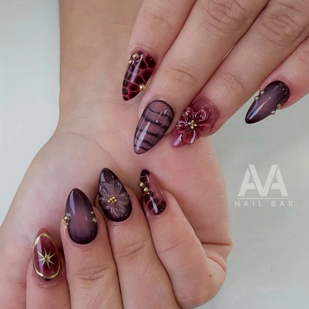
The smallest details change the balance here. A fine grid adds structure, a flower-like mark creates a softer focal point, and the darker solid nails provide relief between the decorated fingers. That alternation matters more than copying every motif; the manicure feels considered because busy and quiet areas are placed beside each other instead of distributed evenly.
For a shorter adaptation, choose either the fine grid or the floral accent and keep the rest glossy plum. Both motifs need a little clear surface to remain distinct, and placing them together on every nail would quickly erase the negative space. Keep the deep shade as the repeated anchor, then let one small detail carry the design role on each accent finger.
Fine Burgundy Shimmer Changes the Solid Read
A close view of rounded burgundy nails shows a dense red metallic or glitter-like shimmer under a smooth reflective finish. There is no separate painted motif, so the interest comes from the way the particles deepen the wine color and brighten it where the light lands. The compact outline makes the finish study feel more wearable than a long decorated shape.
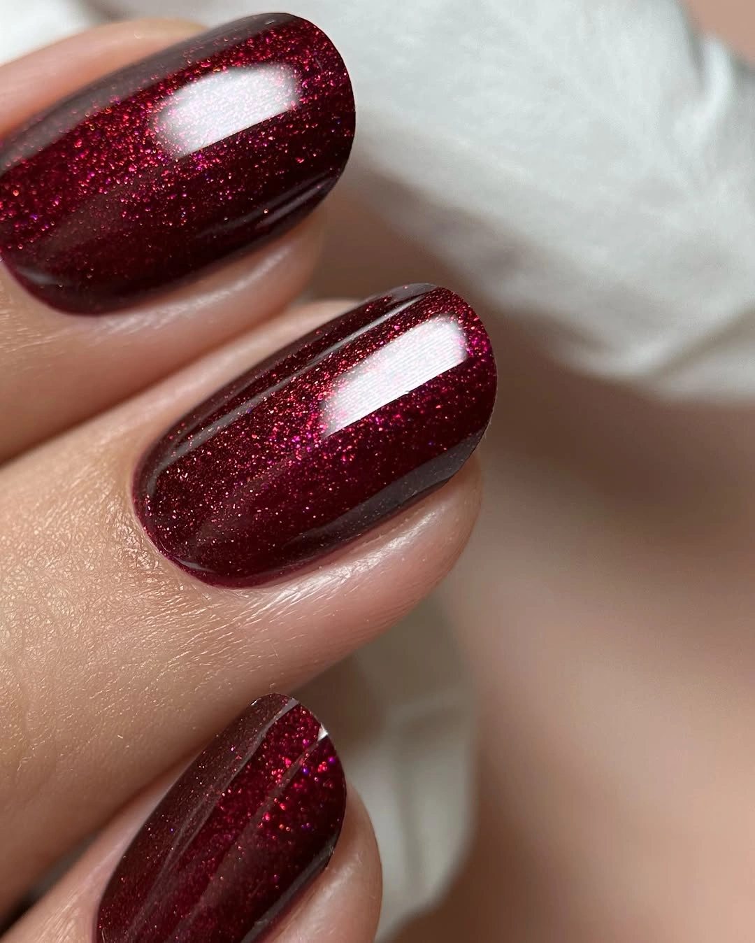
Shimmer gives a solid manicure more visual movement without adding line placement to maintain. Dark red can sometimes look flat when the surface is completely even, but fine reflective particles create depth while keeping the palette controlled. This is a useful reference for an evening-leaning burgundy set that still wants a clean silhouette and no obvious graphic art.
Keep the particles fine if you want the color to remain the main statement. A chunky glitter texture would change the proportion and could make short nails look more crowded, while a fine shimmer stays close to the surface and catches light quietly. The practical limit is finish consistency; uneven reflective coverage will show more clearly when there is no contrasting design to distract the eye.
Glossy Burgundy Lets a Square Edge Lead
This manicure uses a uniform deep red-burgundy across medium square nails with a glossy surface. No motif interrupts the color, so the squared outline and the reflective finish become the two visible decisions. The denim and gold ring in the surrounding setting are secondary; the nail design remains a direct solid statement with enough depth to feel seasonal without extra decoration.
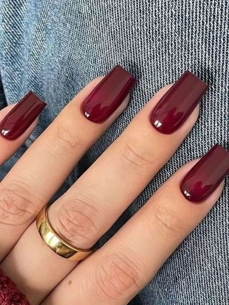
A clean solid is valuable inside a design-heavy collection because it shows what the shade can do on its own. The glossy surface sharpens the square edge, and the deep burgundy gives the short-to-medium length a visual anchor without needing a long point. It is a straightforward option when a decorated set would compete with clothing, jewelry, or the occasion.
If you want the same color with a more practical proportion, shorten the square slightly rather than adding art to replace the lost length. The look depends on even coverage and a crisp edge, so the main maintenance note is keeping the burgundy boundary clean. Its strength is also its limit: without a motif, any uneven placement becomes easier to notice.
Matte Plum Softens a Deep Burgundy Mood
All visible nails in this example are a muted plum-burgundy with a matte surface and a short rounded outline. The color is dark, but the lack of shine makes it appear softer and less formal than the glossy solids around it. There is no contrasting art, which lets finish rather than motif change the emotional weight of the same general red family.
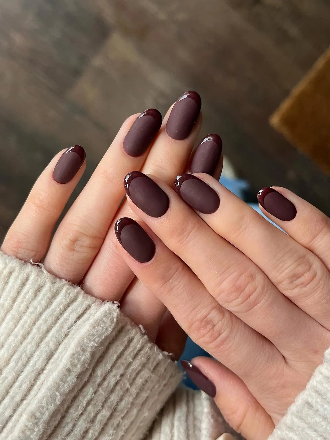
Matte finish lowers the visual intensity of a deep shade by removing bright reflection. The compact rounded shape adds to that softer effect, so the manicure feels grounded instead of sharp or theatrical. This is a good example of how a small surface decision can change fall burgundy nails with design even when the visible design is technically just one color.
A matte top layer can make surface texture more noticeable than gloss, so keeping the color placement even matters. If you prefer a little more light, use the same plum on most nails and add a glossy accent finger rather than switching the whole set. The contrast between matte and shine will then become the detail, while the dark palette remains cohesive and controlled.
Leopard-Like Detail Has Room Beside Burgundy
Most nails here are glossy burgundy in a medium coffin shape, while one accent finger carries a small spotted, animal-like pattern over a lighter field. Gold jewelry appears nearby, but the nail design stays centered on the relationship between the repeated dark red and one textural accent. The squared length gives the patterned nail enough space to remain readable without filling the whole set.
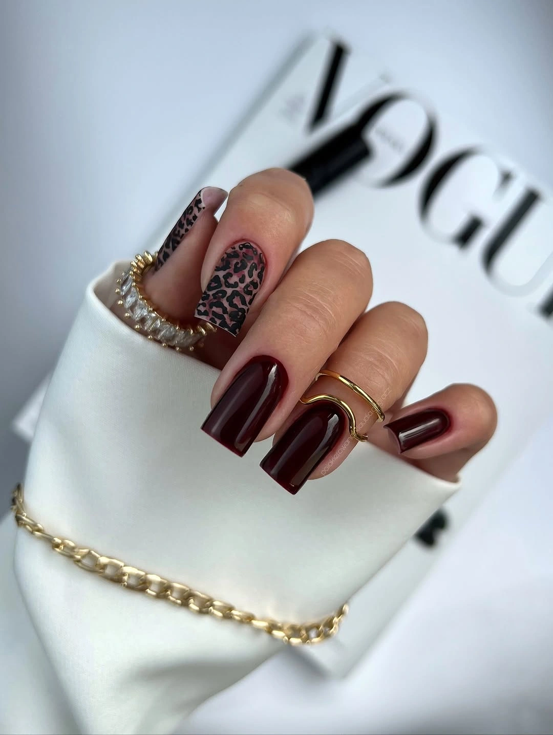
The animal-like detail works because the burgundy repeats across the surrounding nails. It becomes a controlled interruption rather than a separate print trend, and the warm dark palette keeps the contrast close to the season. This structure also demonstrates how one accent can give a solid manicure a clear design identity without making every finger carry a different pattern.
Keep the spotted accent to one nail when adapting the idea to a shorter set. A small pattern needs open space around each mark, and repeating it across all fingers could make the manicure feel louder than the reference. Let the solid burgundy remain the majority, then use the lighter accent as the place where the eye changes direction.
Pale Bands Break Up a Dark French Base
These short squared nails use a dark burgundy base with pale white or pink double bands near the tips. The finish is glossy, and the bands follow a French-like curve without turning into a wide light tip. That narrow contrast gives the deep color a clear edge and keeps the compact shape from reading as one uninterrupted block.
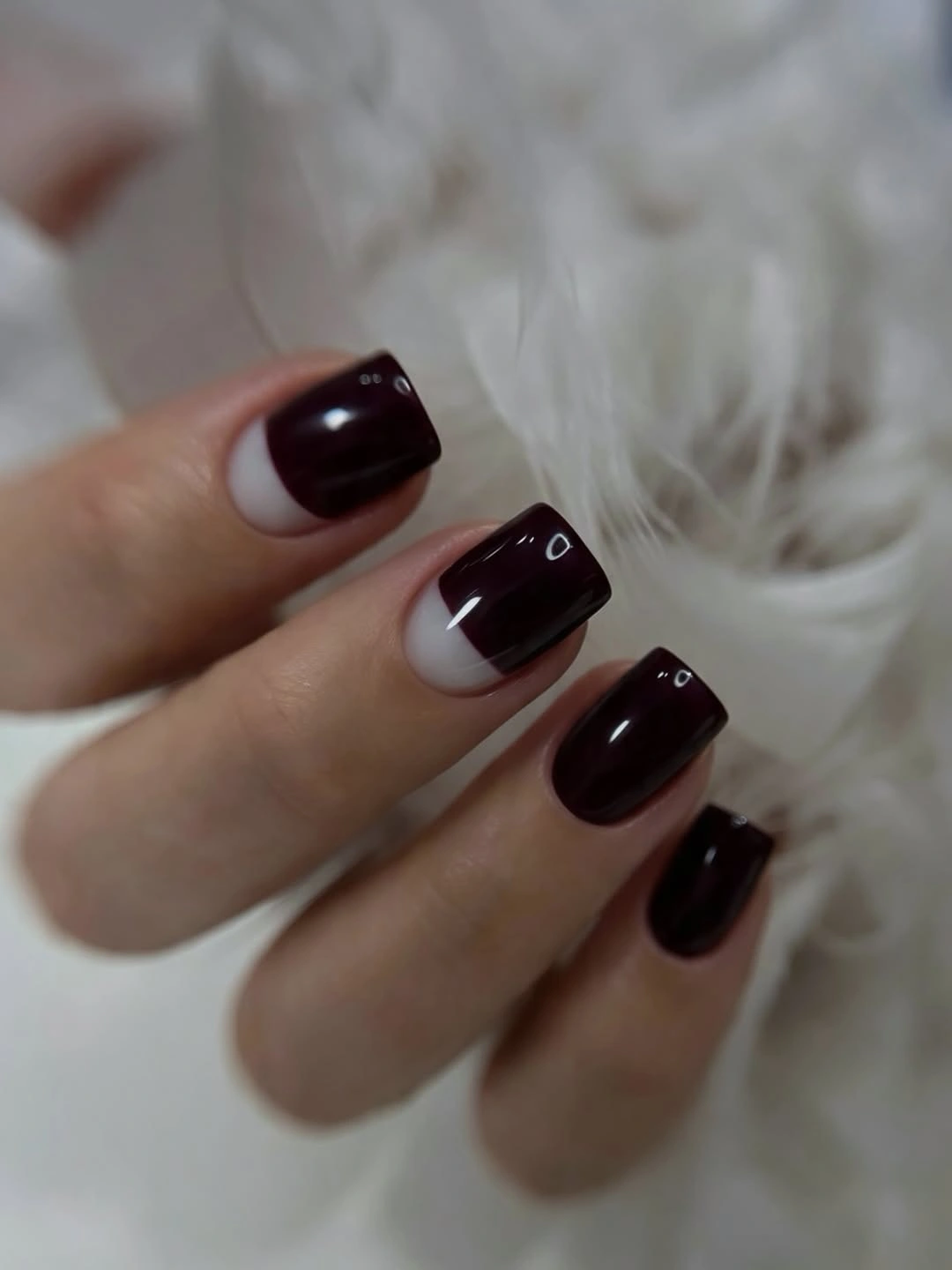
The bands do two jobs at once: they introduce a light detail and show the boundary of the nail’s curve. Because they stay slim, the manicure remains centered on burgundy rather than shifting into a pale set of fall French nails with red accents. This is an efficient design decision for short nails, where a small line can change the entire read without needing a large motif.
Keep the bands thin and evenly spaced when adapting the idea. A wide pale tip may visually shorten the nail, especially against a dark base, while a narrow double line leaves more burgundy visible and preserves the graphic contrast. If two bands feel too detailed, one pale curve can carry the same edge-led concept with less maintenance.
Wine Red Looks Polished in a Clean Square
A saturated wine or cherry-burgundy covers these short square nails in a smooth glossy finish. The shade is brighter and redder than the muted plum example, but the design remains completely solid, so the clean outline is still the first structural cue. The manicure is simple in construction, yet the reflective surface gives the color enough depth to avoid looking plain.
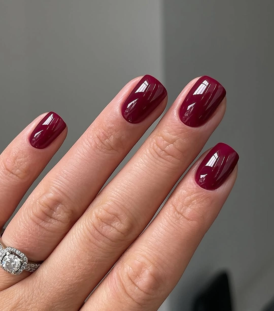
The square outline keeps the bright wine shade from feeling too delicate or overly ornamental. Reflection along the flat edge makes the manicure appear crisp, while the lack of a motif leaves it flexible beside different clothing or jewelry. This is a practical reminder that a strong fall color can be the whole design when the surface and shape are handled consistently.
Choose this kind of solid when you want a decorated burgundy mood elsewhere but need one easy option for daily wear. Shorter nails will keep the color statement focused, although glossy red makes chips or uneven edges easy to see. The best adjustment is careful placement and a clean boundary, not extra art added to distract from the finish.
Nude Panels Make Tiny Burgundy Hearts Read
This set alternates glossy burgundy nails with nude or sheer panels and small burgundy marks, including tiny heart-like shapes on selected fingers. The short rounded outline prevents the romantic details from becoming overly elaborate, while the nude areas lighten the depth of the red. The design stays connected because the same burgundy appears as both the main color and the small accent.
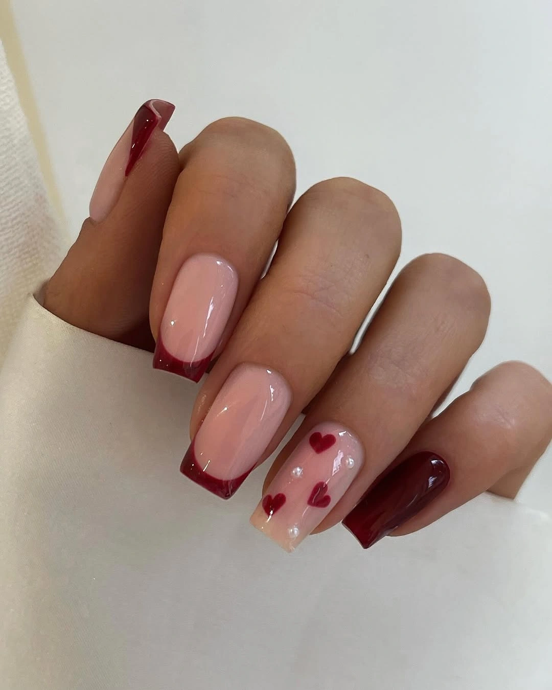
Negative space gives the small marks room to register. A tiny heart-like shape can disappear when placed on an equally dark background, but the pale panel creates enough contrast for it to act as a focal point. At the same time, the solid burgundy nails provide relief, so the set does not become a repeated collection of miniature symbols.
For a quieter adaptation, use one nude accent nail with a single burgundy mark and keep the rest glossy solid. The short surface will show the relationship more clearly when the decoration is not repeated too often, and the negative space will remain the visual pause. The design loses some of its romantic density when simplified, but it gains an easier, more everyday balance.
Warm Sunlight Reveals Burgundy Undertone
In this outdoor example, medium square nails wear a uniform deep burgundy with a glossy surface. Warm sunlight brings out the red undertone more clearly than a cool indoor setting might, while the woven bag and rings stay in the background. For anyone choosing fall red nails, the visible design question is how the color changes with light.

A solid deep red can look plum, brown, or cherry depending on the surrounding light, and this example shows why that shift matters. The glossy surface catches the warmth and makes the color feel richer without adding shimmer or a separate motif. For anyone choosing fall burgundy nails, the undertone is a more useful point of comparison than a vague label such as dark red.
Check a candidate shade in natural light before committing if you want this warm balance. A cooler room may make the same color look more purple, while warm light can bring the red forward. The practical design remains simple: keep the square edge clean and let the lighting reveal the character, rather than adding art to compensate for an undertone you have not tested.
Gold Starbursts Lighten Burgundy French Tips
Short square nails here use burgundy tips and side sections over nude bases, with small gold starburst-like details on selected fingers. The deep red remains the strongest color, but the nude center creates an open field and the gold adds a precise point of light. The design is decorative without being dense because the metallic detail is isolated and the burgundy follows the edge.
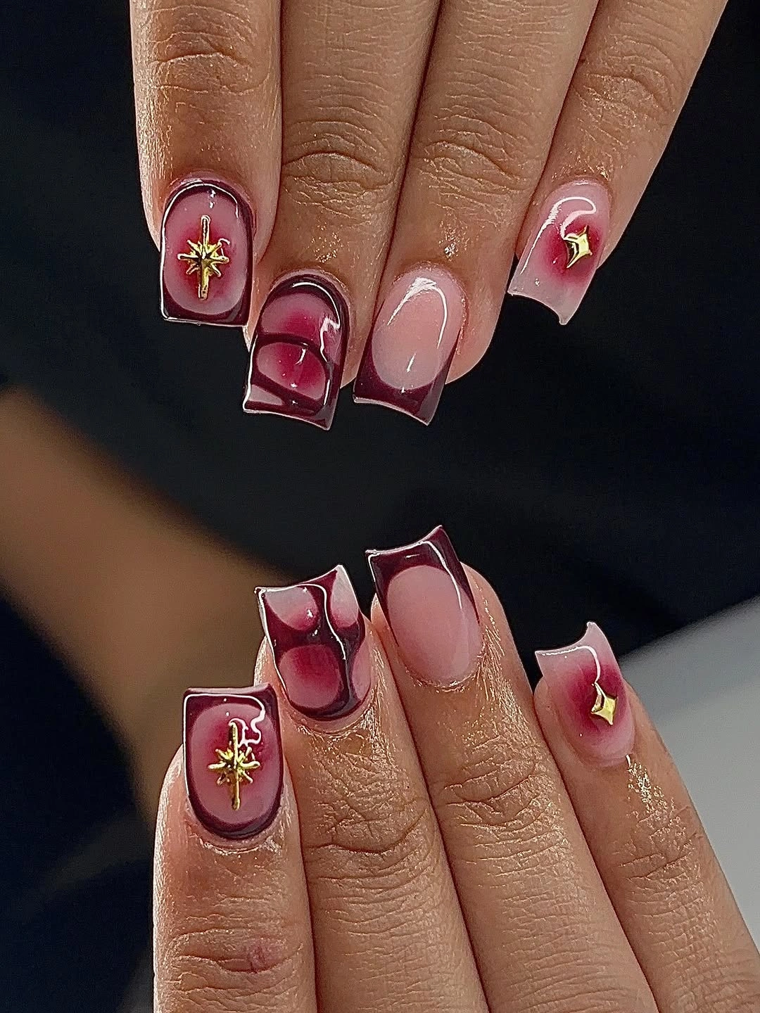
The balance comes from three controlled areas: nude space in the middle, burgundy at the perimeter, and gold as a small focal mark. That order keeps the manicure readable on a short shape and stops the metallic accent from taking over. It is a clear example of how a fall burgundy design can feel special while still leaving much of the nail visually quiet.
Keep the gold starburst on one or two nails and make the remaining tips plain. A small metallic mark needs contrast and room around it, while adding it everywhere would turn the set into a dense repeat. If the nails are shorter, narrow the burgundy tip as well; the open nude center is what protects the compact proportion.
Soft Nude Offers a Quiet Break in the Palette
This understated example uses a pale nude-beige on short rounded nails with little visible decoration or dark contrast. It arrives inside a burgundy collection as a deliberate pause, showing how the same fall mood can be suggested through warmth and restraint rather than depth. The simple shape and pale surface make the manicure easy to read, even though it asks the least visual attention.
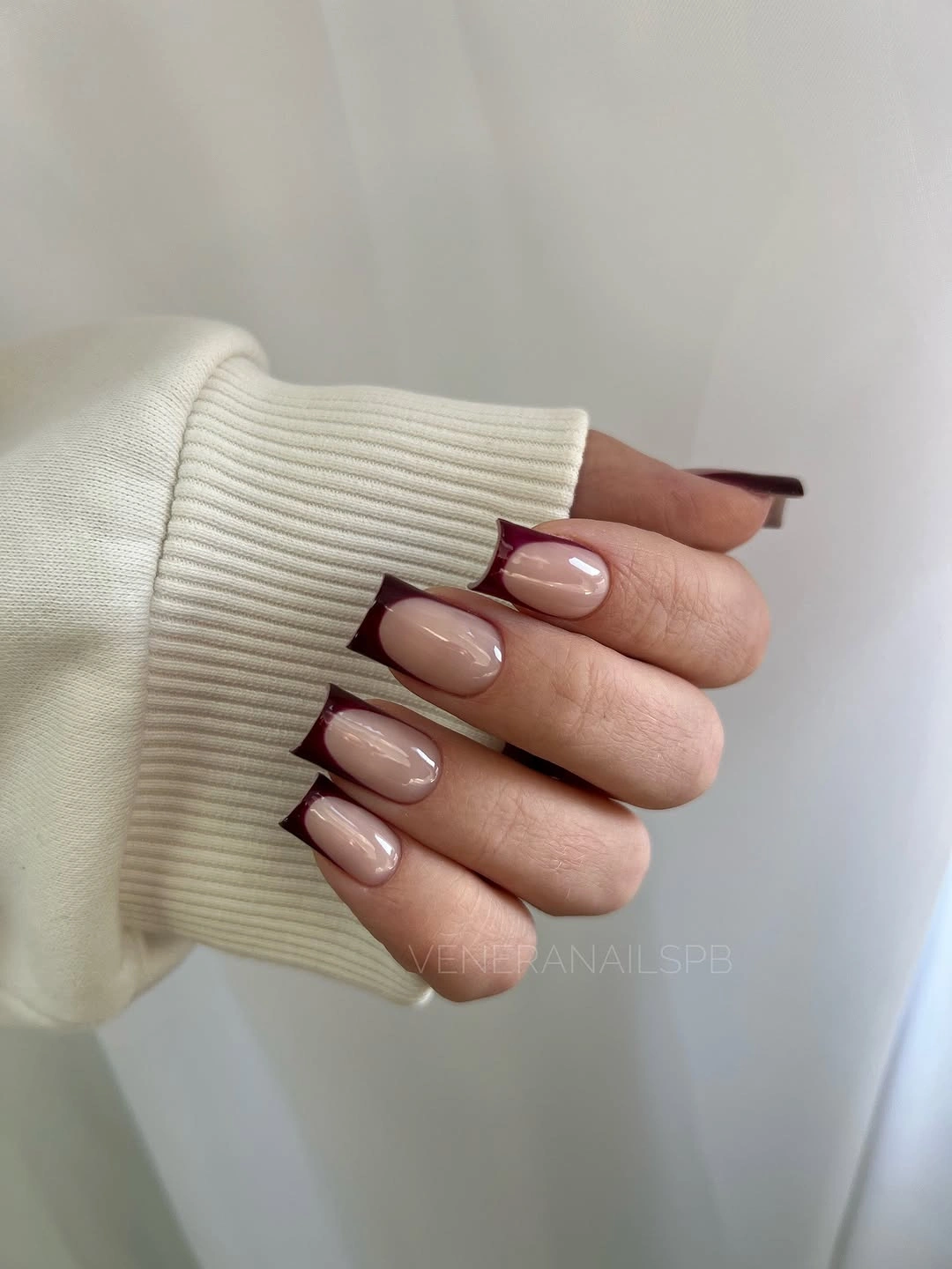
The quiet base works as a palette bridge. It can sit beside burgundy without competing with it, and its low contrast leaves room for clothing, jewelry, or a stronger accent nail elsewhere. This is useful when planning a mixed set: not every finger needs to carry the main color for the collection to feel cohesive, provided the undertone remains related.
Add a thin burgundy tip or side line if you want a stronger seasonal link without covering the whole nail. The pale base will keep the design light, but the edge detail will give the short shape more definition. The limitation is subtlety; this manicure will not deliver the same immediate drama as the dark examples, and that difference is exactly why it can create visual relief.
Long Burgundy Tips Meet Gold and Nude Space
This long tapered manicure combines burgundy sections, nude negative space, pale decorative tips, and small gold embellishments. The silhouette is visibly more elaborate than the short sets, but alternating dark and light areas gives the length a clear structure. Gold repeats across selected nails as a small unifying detail, while the nude sections prevent the burgundy from becoming one continuous block.
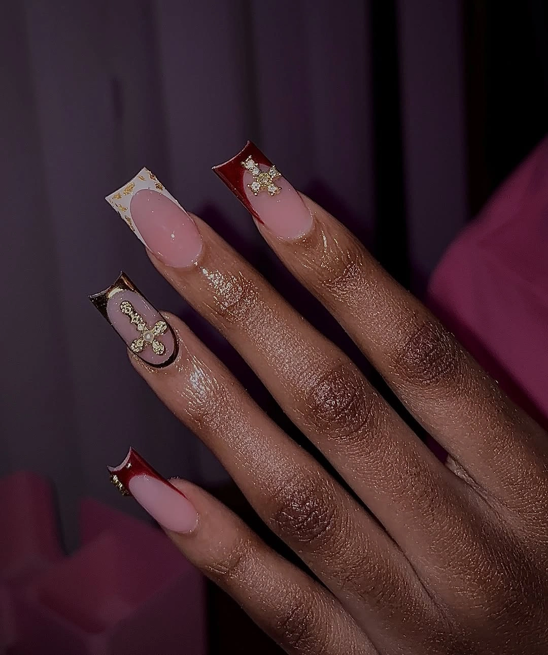
The design depends on contrast placed along the length. Burgundy provides depth, nude creates a pause, and pale tips make the taper easier to follow; gold then acts as a small point of emphasis rather than a new main color. This layered relationship is why the manicure feels ornate but still organized, with each detail assigned a different visual job.
For a shorter version, keep the nude center and burgundy tip while moving the gold to one accent nail. Long tips have room for multiple changes in direction, but a compact surface needs fewer transitions to remain clear. The adaptation will be less ornate, yet it will preserve the strongest idea: a rich red edge balanced by open space and one measured metallic note.
Fine Burgundy Outlines Keep Nude Panels Compact
Here solid burgundy rounded nails alternate with nude nails traced by thin burgundy or red curved outlines. The manicure is compact and the palette stays close, so the design reads as a controlled variation on a solid set rather than a collection of separate patterns. The outline follows the existing nail shape, which makes the short proportion feel intentional instead of visually interrupted.

The repeated outline color connects the pale and dark fingers. Nude creates the open field, burgundy supplies the edge and the solid anchor, and the curved line lets both treatments share one visual language. This is a small-scale design with a clear consequence: the nail looks decorated, but the decoration never needs to occupy the center or rely on a large motif.
Keep the outline fine and use the solid burgundy on only a few nails when adapting the idea. Thick borders would make the nude panels look smaller, while a thin curve will preserve the contrast and allow the short shape to show through. The practical advantage is that the design follows the nail rather than demanding perfect internal artwork, so simplification can remain faithful.
White and Burgundy Flowers Use Negative Space
Long almond nails in this example alternate white and nude bases with deep burgundy tips and small burgundy petal-like details. The light backgrounds give the floral marks room to show, while the repeated dark tips provide a clear edge across the long silhouette. The design feels delicate because the burgundy is concentrated at the tip and in small marks instead of covering every surface.
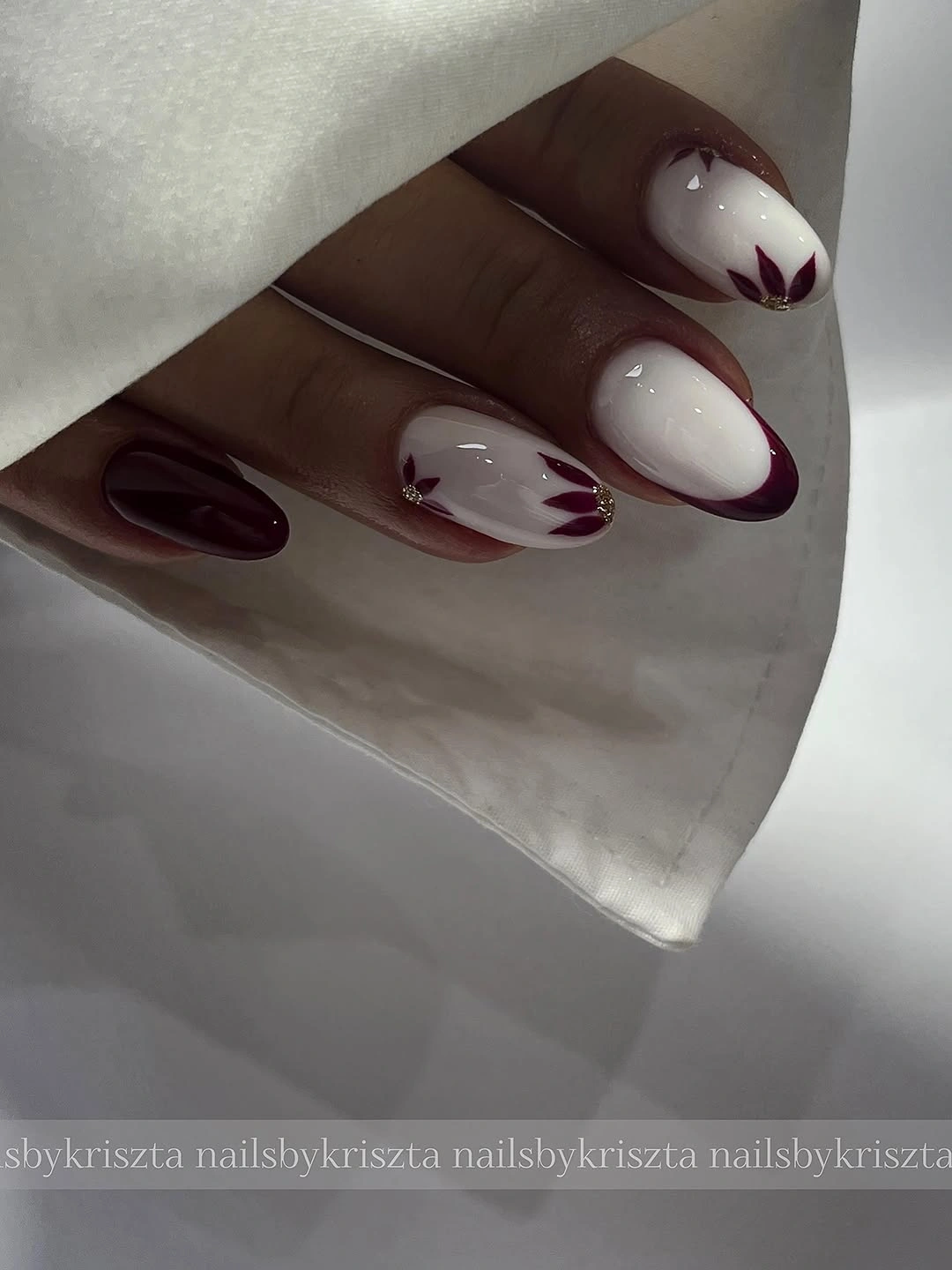
The floral details work through placement rather than size. A small petal near a pale area can carry more visual weight than a large pattern placed on a dark field, because the contrast is clearer and the surrounding space stays open. The burgundy tips then repeat the color at the edge, keeping the varied bases connected across the set.
Use two accent nails for the floral marks and keep the rest nude with a thin burgundy tip if you want a shorter, calmer version. A small square or almond canvas cannot hold several petals and a wide tip without losing separation. Preserve the pale base and the edge contrast first; the flower is the detail that can be reduced most safely.
Floral Burgundy Tips Suit a Long Coffin Shape
This long coffin manicure uses pale pink nude bases, deep burgundy tips, and small floral-like marks near the center or tip. The repeated burgundy edge gives the long squared silhouette a strong boundary, while the light base keeps the floral details visible. The look is related to the previous almond example, but the flatter tip changes the way the burgundy line meets the nail.
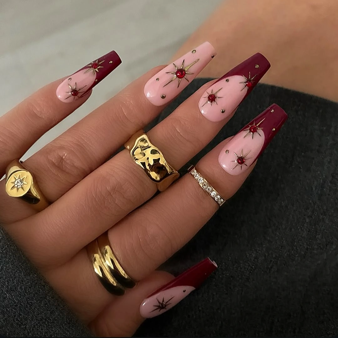
The coffin outline makes the tip feel more graphic than soft. Burgundy creates a firm horizontal or angled ending, and the small flowers interrupt the pale area without filling it. That balance lets the manicure read as both decorated and structured, a useful distinction when a floral design might otherwise become too delicate or diffuse against a long nail.
On a shorter coffin shape, narrow the burgundy tip and keep the floral mark close to one accent finger. If the flower is enlarged to compensate for lost length, it may dominate the nail and erase the clean nude space. The most faithful adaptation protects the relationship between pale base, dark edge, and small detail, even if the number of flowers is reduced.
One Pale Marble Accent Breaks Solid Burgundy
Most nails in this medium almond set are glossy dark burgundy, while one accent shows a pale pink base with a burgundy or mauve marbled curve. The repeated solid color gives the manicure a strong anchor, and the light accent interrupts it without introducing a bright unrelated shade. The almond outline softens the depth of the burgundy and makes the contrast feel balanced.
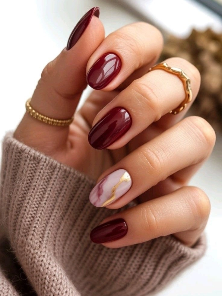
The single light nail is effective because it is not merely another pattern among many. It creates a clear change in value, giving the eye a place to pause before returning to the solid burgundy fingers. A curved marbled accent also repeats the main color in a looser form, so the contrast feels like a variation within the palette rather than a break from it.
Use the pale marble on the thumb or ring finger and keep the remaining nails solid if you want an easy adaptation. A shorter almond will still support the contrast, but the marbled line should stay broad enough to remain visible and soft enough not to look crowded. The design loses some of its gallery-like variety when simplified, yet the one-accent structure remains strong.
Deep Burgundy Stiletto Shape Does the Work
Long, narrow, pointed nails in this example are a deep burgundy with dark reflective depth and little visible decoration. The color shifts slightly in the shadows, but the surface remains mostly solid, so the sharp silhouette becomes the main design decision. It is a darker, more severe option for dark fall nails, built from outline and depth rather than painted motif.
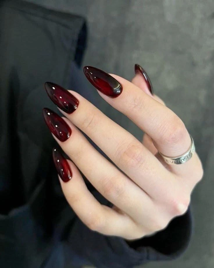
The pointed shape lengthens the color visually and gives the dark red a more dramatic consequence. Reflection along the curved surface prevents the burgundy from disappearing into the black clothing, while the lack of art leaves the taper completely visible. This is a reminder that a solid manicure can be highly designed when the outline makes a deliberate commitment.
A medium almond can keep the sharp mood with less length-dependent upkeep. Shortening the point changes the drama, but it does not require adding decoration; the deep shade and reflective finish already provide enough focus. The practical limitation is the silhouette itself, so choose a safer length if you want the same burgundy depth without maintaining an especially narrow tip.
A Medium Almond Makes Red Feel More Wearable
This uniform deep red-burgundy set uses a medium almond outline and a smooth glossy finish. The color is strong, but the balanced taper softens it compared with the long stiletto and coffin references, and a gray sleeve keeps the setting neutral. There is no motif to compete with the shape, so the manicure reads as a wearable solid built around proportion.
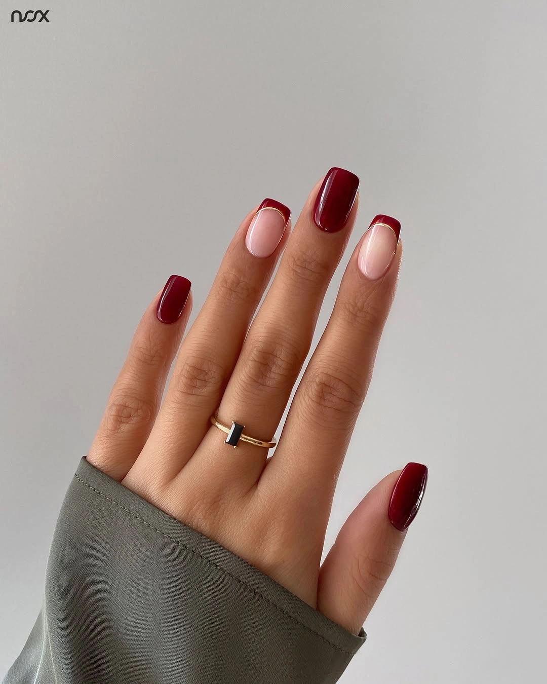
The almond shape changes how the same general color family sits on the hand. A curved edge makes the red feel less blocky than a square, while medium length retains enough presence for the shade to remain the first thing noticed. This is a practical center point in the collection: it carries fall depth without demanding the visual commitment of a long pointed design.
Keep the color solid and shorten the almond slightly if you want an everyday version. Adding small art would move the focus away from the clean proportion that makes this example useful, and a glossy surface will already provide enough variation under light. The design’s limitation is simple but honest: its success depends on a consistent outline, because there is nowhere for uneven edges to hide.
Metallic Burgundy Shimmer Rewards a Dark Background
These long pointed nails combine deep burgundy with a strong metallic shimmer, while one or more pale or nude areas create a small break in the dark set. The black background makes the reflective particles more visible, so the color looks lighter where the light strikes and deeper in shadow. Length and shimmer work together to create the collection’s most overtly evening-focused finish.
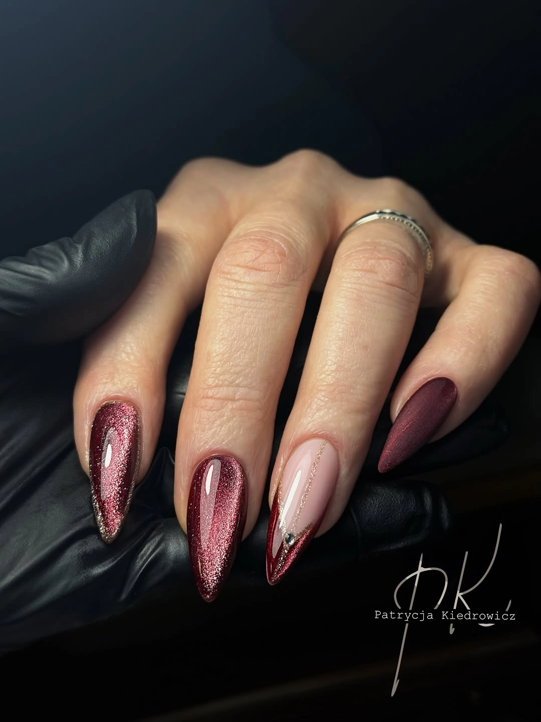
The shimmer is the defining detail because it changes the surface without changing the burgundy family. It gives the pointed silhouette another route for light to travel, making the nails appear dimensional even when the visible art is limited. A pale accent then prevents the metallic red from becoming one uninterrupted field and gives the eye a deliberate stopping point.
Use shimmer on two accent nails and plain burgundy on the rest if you want a more manageable adaptation. Full metallic coverage can show uneven texture or grow-out more clearly, while a smaller number of reflective nails keeps the statement controlled. The long point is also a real commitment; a medium almond can carry the shimmer, but the result will feel less theatrical and more balanced.
Nude Centers and Burgundy Tips Close Strong
The final manicure returns to medium almond nails with pale pink nude centers and rich burgundy French tips. A few tips show extra curved or doubled edge detail, but the overall structure remains clean and glossy. The nude center keeps the design open, while the burgundy edge delivers the fall color in a controlled way that feels more wearable than a full deep-red set.
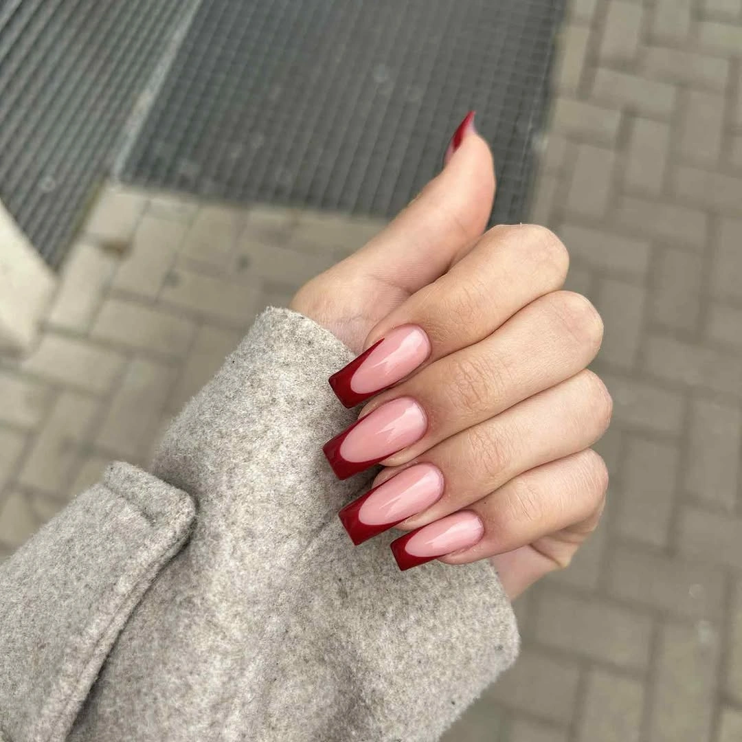
The strength of this design is its balance between clear color and visible breathing room. Burgundy defines the outer edge, nude lets the almond shape remain legible, and the occasional extra curve adds interest without making the set dense. It gathers several ideas from the collection – negative space, a focused edge, and a rich shade – into one comparatively easy structure.
For shorter nails, use a very thin burgundy French line and keep the center mostly sheer pink. That preserves the outline and avoids a wide dark band that could visually shorten the nail, while the color relationship remains unmistakable. The detail that deserves to stay is the clean contrast at the edge; everything else can be simplified without losing the quiet conclusion of the palette.