Fall nails for olive skin tone become far more convincing when the color decision is not treated as a single shade problem. A deep green, a wine red, or a softly warmed nude can all sit comfortably beside olive undertones when the finish and the amount of contrast are considered at the same time. The small choices at the edge of a nail often do more than a dramatic color change, especially when the hand needs the manicure to look intentional in ordinary daylight.
A useful way to choose an autumn palette is to decide whether the depth should come from pigment, a graphic accent, or a reflective surface. Dense shades make the hand read quieter and more grounded, while lighter bases need a dark line, a warm detail, or a concentrated accent to stay connected to the season. Keep the clearest visual decision on only a few nails when you want a look that remains easy to wear after the first close-up.
Olive, White, and Wine on a Short Shape
The short rounded shape gives the olive green, wine red, and soft white an almost collected quality rather than a busy one. White nails carry tiny green leaf-like marks, while the fuller colors are spaced around them instead of pushed onto every finger. That distribution matters because the green does not have to compete with the red; each shade has a small area in which to read clearly against the warm hand.
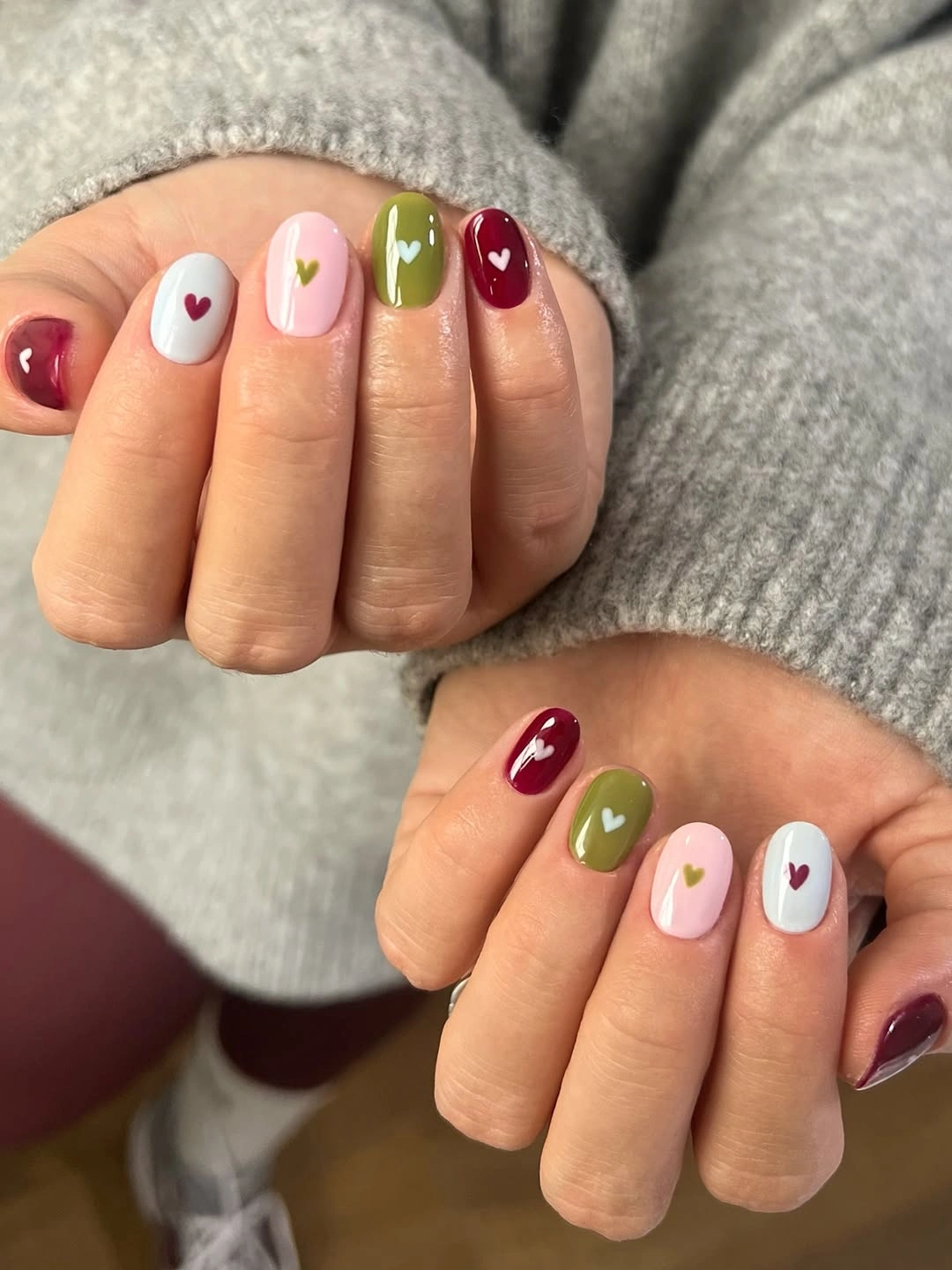
For a shorter version, keep the white accent on one or two nails and let the remaining nails use only the two deeper colors. A rounded outline is helpful here because it softens the contrast between the leaf-like marks and the solid blocks of color. If the tiny green details begin close to the cuticle, leave enough open white around them so the design still looks deliberate as the nail grows out.
The appealing part is the restrained rhythm: green appears as both a full color and a small drawing, which ties the manicure together without matching every nail. More white would make the result crisper but also less autumnal, while more wine would make it heavier. Keeping the tiny motif limited lets the color contrast carry the mood and makes the look feel suitable for daily wear rather than only a seasonal event.
Espresso and Cream With Amber Accents
Creamy white and espresso brown create the clearest frame in this medium almond manicure, while the amber-brown patterned details interrupt the solid colors with warmth. The pointed oval silhouette gives the darker shade enough length to feel sleek instead of dense. Because the patterned areas sit among calm blocks of brown and cream, the eye lands on their warm movement without losing the overall palette.
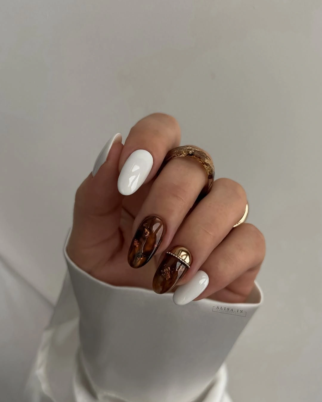
A softer take could replace the deepest espresso with a medium cocoa and keep the warm patterned accent on just one nail per hand. The cream is useful as a visual pause, particularly if your nails are not as long, because it stops the brown from becoming one uninterrupted mass. Readers weighing that depth can compare brown fall nail ideas before choosing how much dark color to keep at the free edge.
The contrast here is about temperature as much as darkness. Cool white could make the amber tones look sharper, whereas a creamy off-white keeps the transition gentler and closer to an autumn palette. Anyone who prefers low-detail manicures can retain the brown-and-cream pairing alone, but the warm patterned nail is what prevents the palette from reading as a simple neutral set.
Graphic Orange and Olive Pointed Nails
Long pointed nails make room for the orange, olive, tan, and black panels to behave like separate graphic fields. Fine outlined accents keep the stronger colors from merging into one loud surface, and the individual placement changes from nail to nail. The result has energy, yet the repeated dark edging gives the varied palette a boundary that makes the design feel considered rather than random.
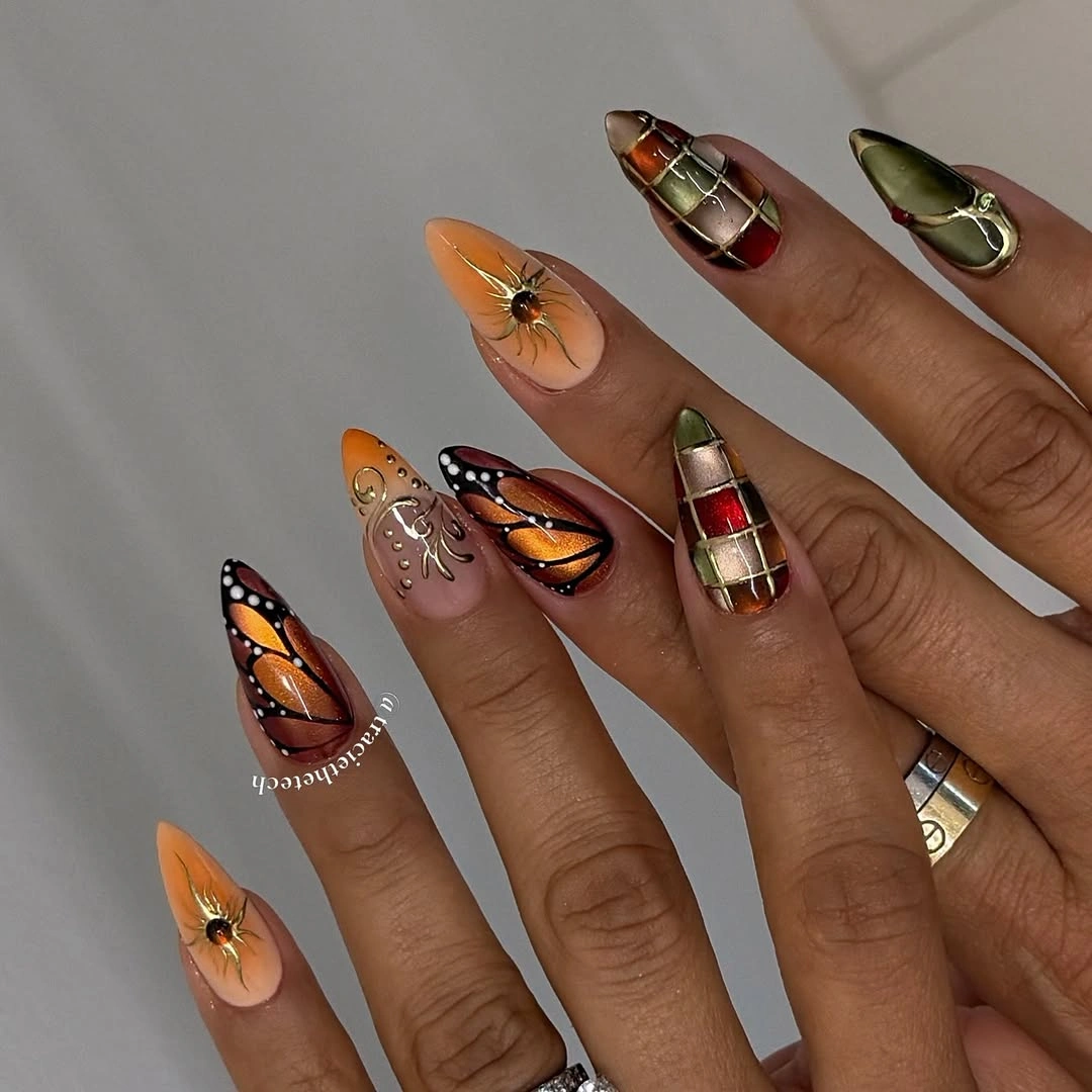
If that amount of contrast feels too assertive, preserve the orange and olive but move the black to a narrow line or one accent nail. A shorter almond shape can still carry the idea when the graphic area is concentrated near the tip instead of stretched across the entire nail. Leave the tan sections broad and plain, since they provide the resting space that allows the brighter colors to stay readable.
This is a good example of why placement can matter more than adding another shade. Orange sits brighter when it is separated from olive by a dark contour, while olive appears richer beside tan than beside white. The tradeoff is detail density: every small outlined panel asks for visual attention, so simplifying one or two nails will make the overall manicure easier to live with between appointments.
Plum Curves on a Muted Nude Base
Muted nude and plum establish a calm base here, then thin white curves and tiny gold-toned dots bring focus to selected short almond nails. The marks do not cover the full surface; they travel in narrow arcs that leave the surrounding color visible. That restraint is what makes the plum feel polished rather than severe, especially beside a hand with warmer olive undertones.
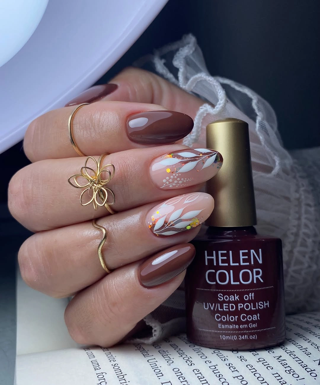
To adapt the look for a more minimal routine, keep the plum as the only full-color nail and use one white curve without the dots on a nude neighbor. The small metallic-looking accents are best placed away from the tip, where a tiny element can remain a detail instead of becoming the first thing the eye notices. On very short nails, one curve per hand is enough to keep the composition open.
The most useful lesson is that a pale base does not need to be cool to create contrast. The nude has enough warmth to sit beside plum without turning the design chalky, and the white lines simply sharpen the transition. Removing the gold-toned dots would make the manicure quieter, but retaining a few keeps the curved motif from feeling too flat or overly symmetrical.
Glossy Forest Green in a Clean Oval
A uniform deep forest green on a short oval shape shows how much finish can do when there is no art or accent placement to distract from it. The glossy surface catches light along the rounded edges, so the color reads dark without becoming visually closed off. Against olive skin, that green feels grounded because its depth comes from a botanical direction rather than a blue-black cast.
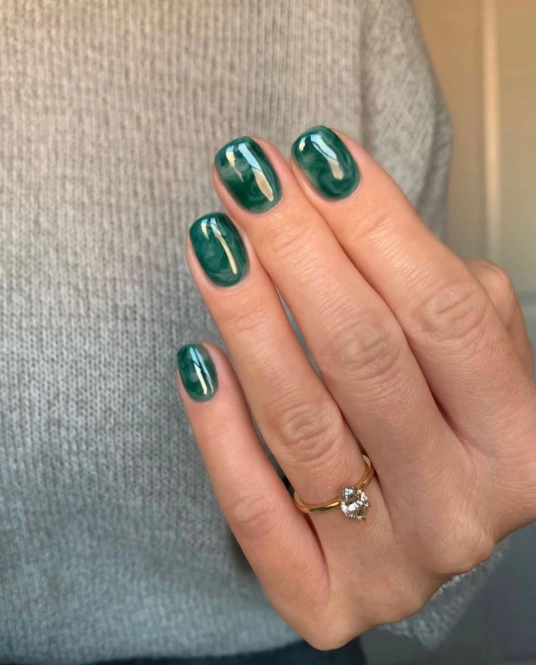
Choose this approach when you want autumn color with very little visual upkeep. A slightly shorter oval will preserve the same softness, while a squared edge would make the green appear more graphic and a touch more formal. Because the whole manicure relies on a single shade, pay attention to the shape and sidewalls; uneven edges are more noticeable when every nail carries the same dark reflective color.
Forest green is especially effective when clothing already includes warm brown, cream, or rust, since it acts as a cool counterweight without looking detached. The limitation is that a very dark green can hide at a distance, so a reflective finish is useful for keeping the manicure visible. If you want more variation, add one narrow cream edge rather than disrupting the clean color story with several unrelated accents.
Nude Tips With Warm Patterned Details
Nude nails with narrow white and dark tips create the structure here, while warm brown patterned zones make the medium oval shape feel less predictable. The lighter base keeps the tip work crisp, and the darker marks appear as small interruptions rather than full coverage. That balance allows the manicure to carry several ideas without making the hand look crowded from a normal viewing distance.
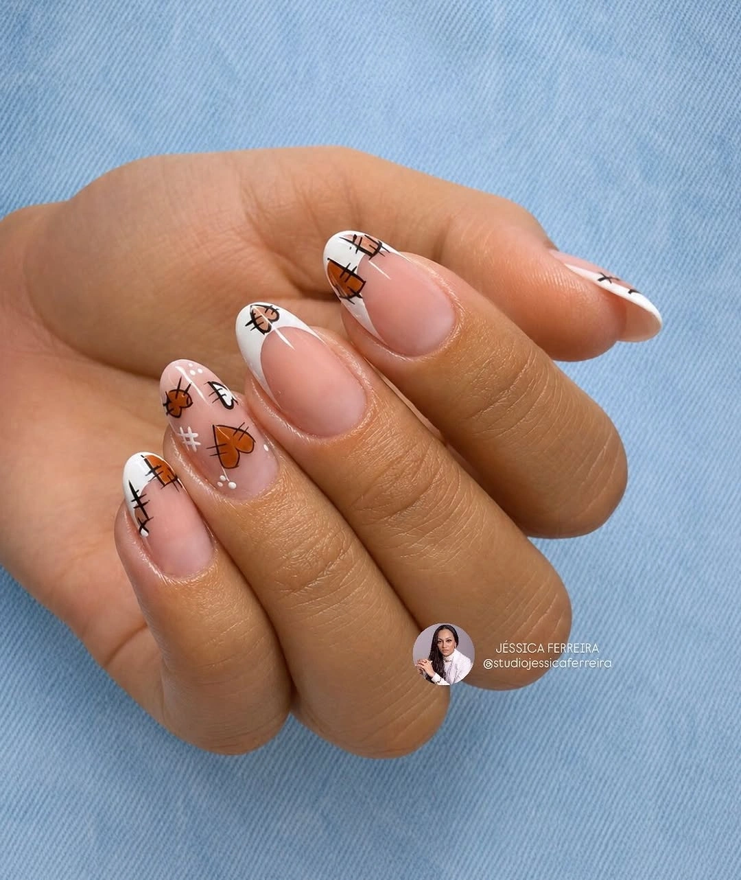
For a more wearable adaptation, repeat one tip style across most nails and reserve the warm pattern for a single accent. A thin tip works better than a deep block on a modest length because the nail bed remains visible and the shape stays light. Consider placing the pattern away from the free edge if you prefer a design that does not make tip growth immediately obvious.
The success of this layout comes from alternating crisp and irregular details. White and dark tips bring order, while the brown pattern loosens the rhythm with a more organic texture. If every nail carried both treatments, the effect would be much harder to read. Keeping one element stable gives the eye a way through the manicure; fall French nail ideas are useful for comparing a cleaner edge-led approach.
Cocoa Blocks With Fine White Swirls
Short rounded nails alternate cocoa brown, blush nude, white curves, and small brown dots in a way that feels playful but contained. The darker blocks give the palette autumn weight, while the pale areas stop it from becoming too heavy near the cuticle. Fine swirls add movement without requiring a full illustrated motif, which is why the design still works on a compact nail length.
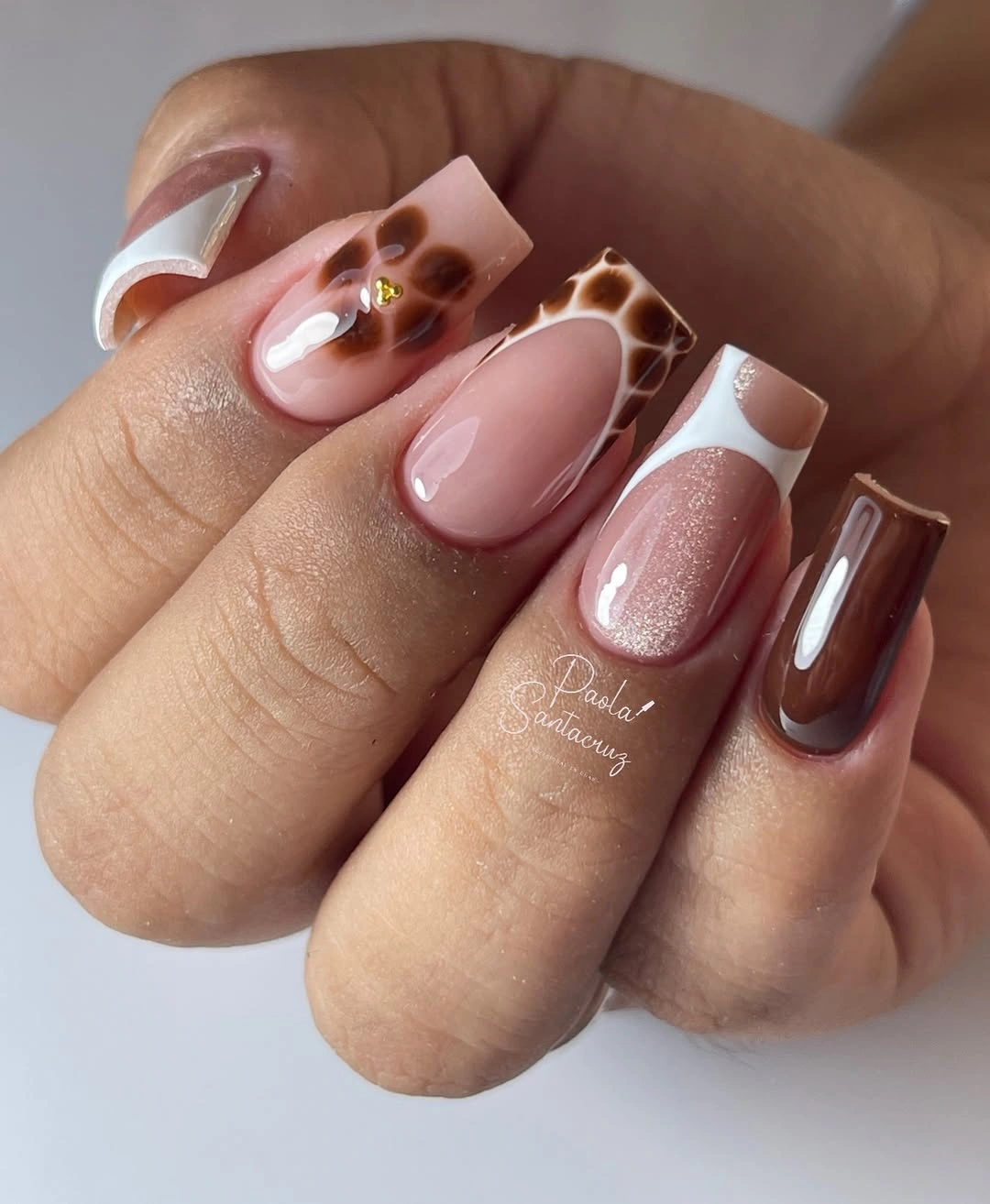
Try reducing the set to cocoa, nude, and one white swirl if you prefer less contrast. The dot accents can be moved closer together on one nail, creating a small cluster instead of scattering tiny marks across several fingers. That adjustment keeps the graphic idea intact while making the grow-out zone look calmer, particularly if you usually choose a bare or sheer area around the cuticle.
Brown acts as the anchor, but the white linework is what gives the manicure its lift. A warmer blush nude makes the design gentler on olive skin than a pale beige would, because it does not flatten the transition between brown and white. The tradeoff is scale: very fine swirls need breathing room, so shortening the nail may call for fewer lines rather than thinner and thinner ones.
Deep Burgundy With No Extra Decoration
Short oval nails in a single dark burgundy shade demonstrate the value of a color that holds its own without a graphic accent. The gloss catches at the center of each nail and gives the nearly wine-dark color a visible dimension. On olive skin, burgundy often looks warmer than black and more intentional than a generic dark neutral, particularly when the shape stays softly rounded.
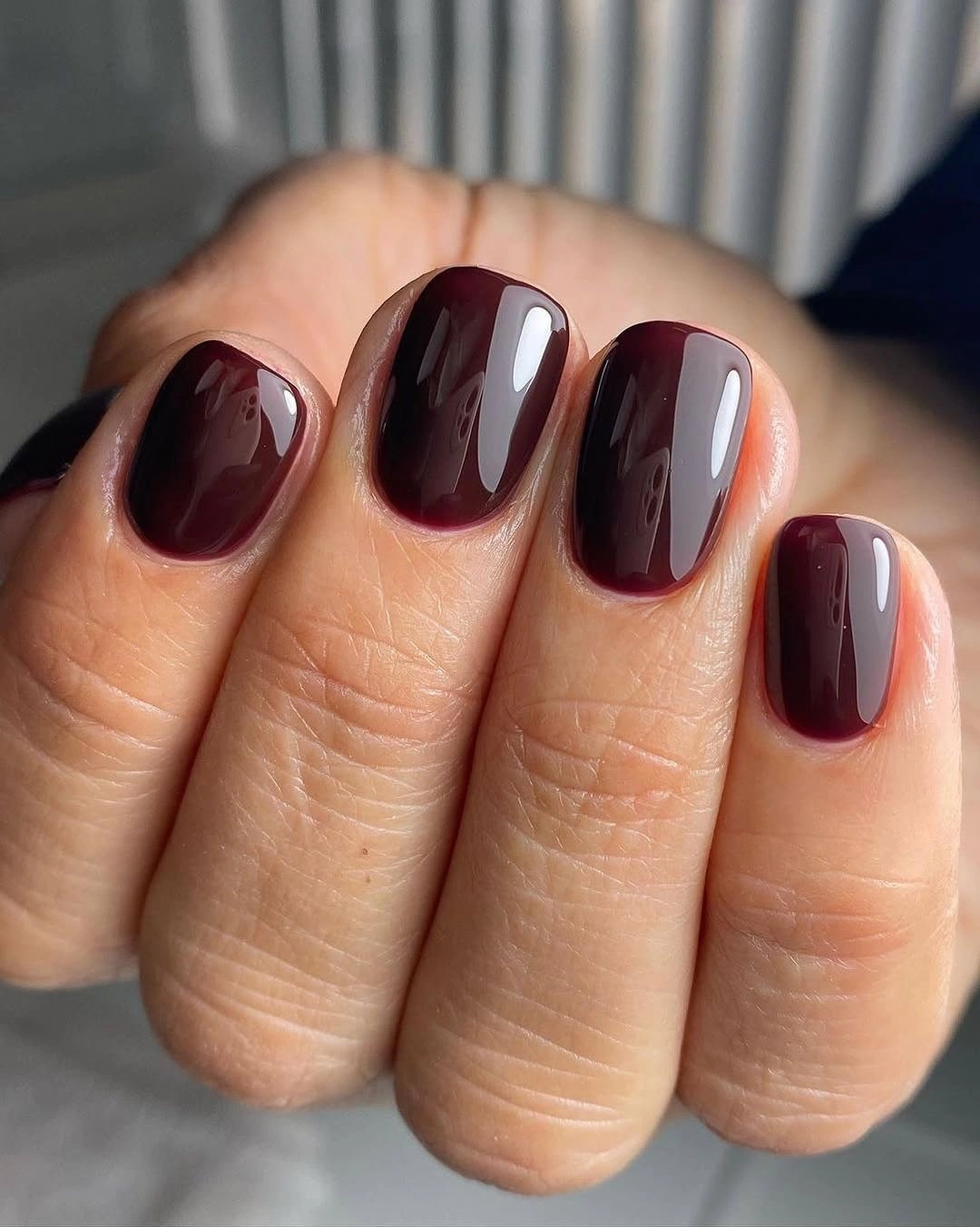
A medium burgundy can provide the same direction if you want the color to show more clearly indoors, while a darker version gives a quieter, almost lacquered impression. Keep the length practical and the curve consistent, because a one-color manicure puts all of its emphasis on the relationship between pigment, reflection, and outline. A narrow oval is gentler than a sharp almond when the shade is this deep.
The limitation is not color compatibility but visibility: dark burgundy can appear nearly brown or black under low light. That is part of its appeal if you enjoy subtlety, though it may disappoint someone seeking a bright seasonal statement. Add a glossy top surface rather than extra art if the goal is simply to preserve depth and keep the color from looking matte or opaque at a glance.
Blush and Tortoiseshell-Style Almond Contrast
Blush nude and brown keep this medium almond manicure calm, while amber-and-black tortoiseshell-style accents provide the main visual shift. The patterned nails are surrounded by solid color rather than duplicated across every finger, so the warmth feels concentrated. That placement is especially effective for olive undertones because the amber notes echo warmth without asking the base color to become orange.
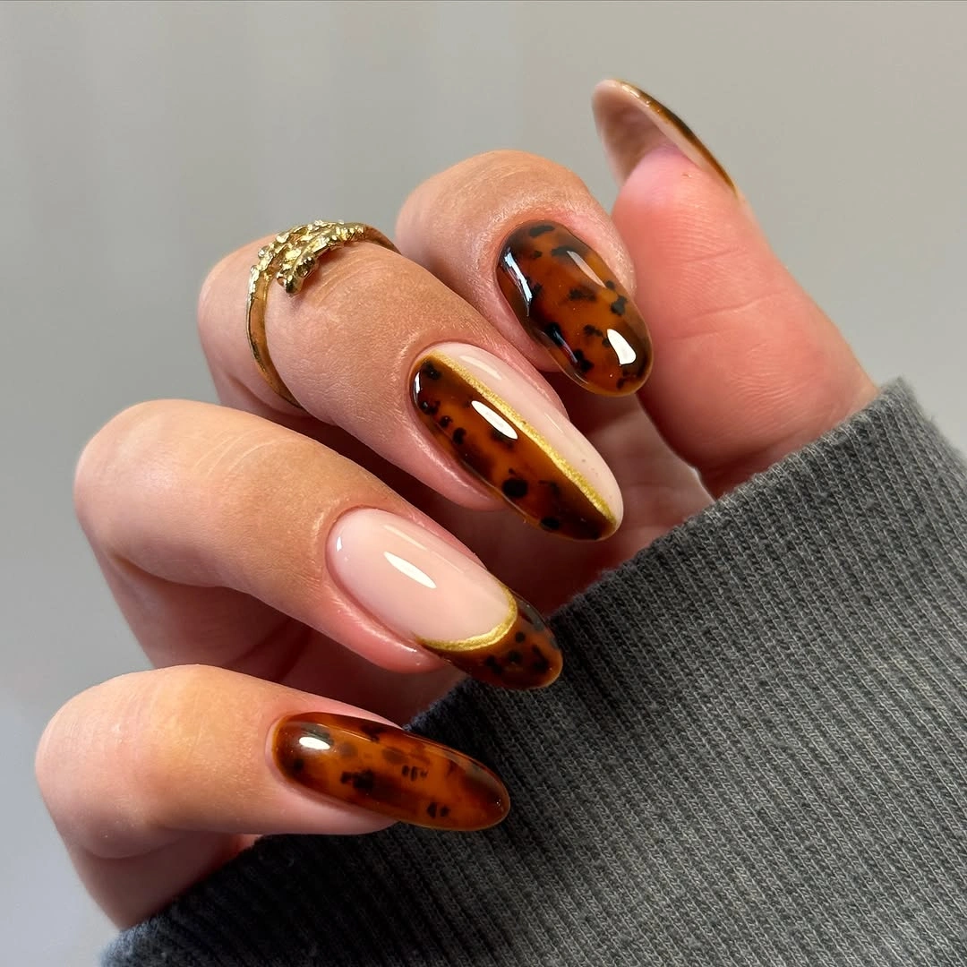
A pared-back version can use one patterned nail and two solid browns, leaving the blush nude on the remaining fingers. The almond shape gives the irregular pattern enough vertical room, but a shorter oval can carry it if the brown marks are larger and fewer. Avoid covering the whole nail with tiny spots on a small surface; a simpler pattern keeps the amber variation from becoming visually muddy.
What makes the palette wearable is the quiet blush between the richer tones. It opens the hand visually and makes the darker brown look intentional instead of simply heavy. Choosing a creamier nude would make the contrast softer, while a pinker nude would push the set in a more playful direction. The patterned accent remains the focal point, so the solids should stay deliberately uncomplicated.
Burnt Orange With a Reflective Surface
Solid burnt orange on a medium almond silhouette feels direct, but the reflective surface stops the color from looking flat. The warm orange follows the length of each nail cleanly, with no competing motif or edge treatment. That simplicity lets the hue do its job: it brings a clear autumn note to olive skin without relying on a pale base or a darker outline for contrast.
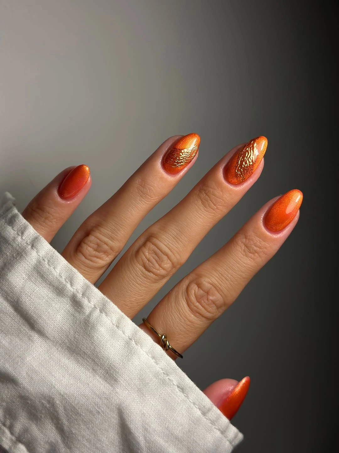
For an everyday version, choose a slightly muted pumpkin or terracotta direction and keep the nail a little shorter. Orange can look more deliberate when the finish is even and the shape has a smooth taper, because patchy reflection makes a solid bold color appear less controlled. Autumn nail color ideas can help compare the warmth of a single brown accent before adding art that competes with the clean orange statement.
The decision here is confidence through restraint. On olive skin, a burnt orange can echo warmth while still standing apart from the hand, especially beside neutral clothing. Its practical tradeoff is seasonal specificity: it reads immediately autumnal, so it may feel less flexible than burgundy or forest green. That is easily offset by keeping the outline simple and the glossy surface well maintained.
High-Contrast Orange and Lime Pointed Details
Very long pointed nails use bright orange, lime yellow, metallic-looking gold, and thin white linework with unapologetic contrast. Each color occupies a separate area, which keeps the strong palette from collapsing into one blended impression. The elongated shape gives the white lines room to travel, while the gold-toned accents create small flashes that connect the warmer orange to the sharper lime.
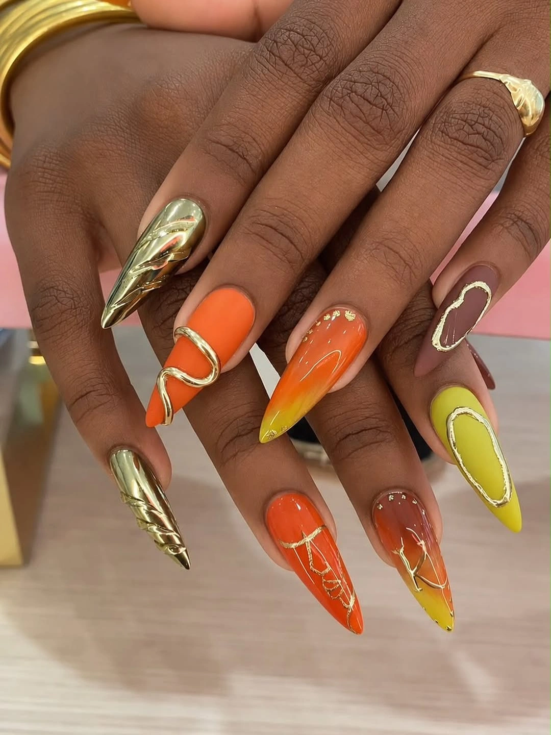
To translate the idea to a less dramatic length, choose orange as the main color and use lime only on a single tip or small side panel. Fine white linework should be simplified rather than squeezed onto a short surface, because its role is to define the color borders. A rounded almond shape will soften the contrast, while a pointed outline keeps the palette looking graphic and deliberately high energy.
The visual tension comes from pairing warm orange with a much cooler yellow-green note, then using gold as a bridge between them. That is not a quiet combination, so the rest of the hand benefits from clear negative space and a limited number of details per nail. Removing one bright color would make the set easier to style; keeping all four preserves the bold, sharply segmented character.
Abstract Lines Over a Pink Nude Ground
Long squared nails begin with a pink nude ground, then add black, brown, and cream abstract line motifs that shift from finger to finger. The flat tip gives those narrow graphics a steadier architecture than a pointed shape would. Because the lines stay separated by pale space, the darker colors register as drawn elements rather than broad blocks, which keeps the manicure visually open.
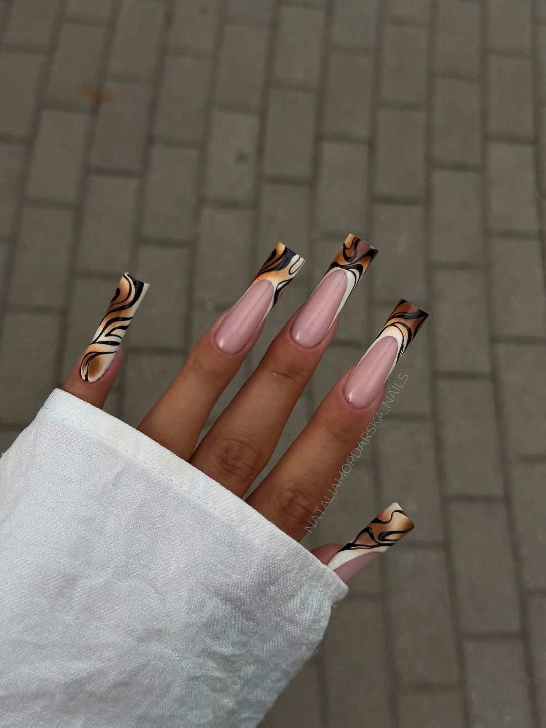
A shorter squared nail can use one bold curve per hand instead of a different composition on every finger. Keep the nude area dominant, since it gives the black and brown marks a place to breathe and makes the design easier to adapt to clothing with warm autumn colors. When the lines reach the tip, a slightly thicker stroke reads more clearly than several very fine competing marks.
The strongest feature is the contrast between the controlled square outline and the looser graphic movement inside it. Brown keeps the black from feeling too stark, while cream prevents the pattern from becoming visually dense. The maintenance consideration is edge placement: designs concentrated at the tip will change character as the nail grows, so a center-focused curve is more forgiving for someone who stretches appointments.
Forest Green Beside Soft Nude Curves
Pale nude and deep forest green alternate on short rounded nails, with a white curving detail giving selected fingers a small directional lift. The green is solid and grounded, while the lighter nails provide contrast without turning bright or cool. This arrangement lets the color feel autumnal yet light enough for a compact shape, because not every nail carries the same visual weight.
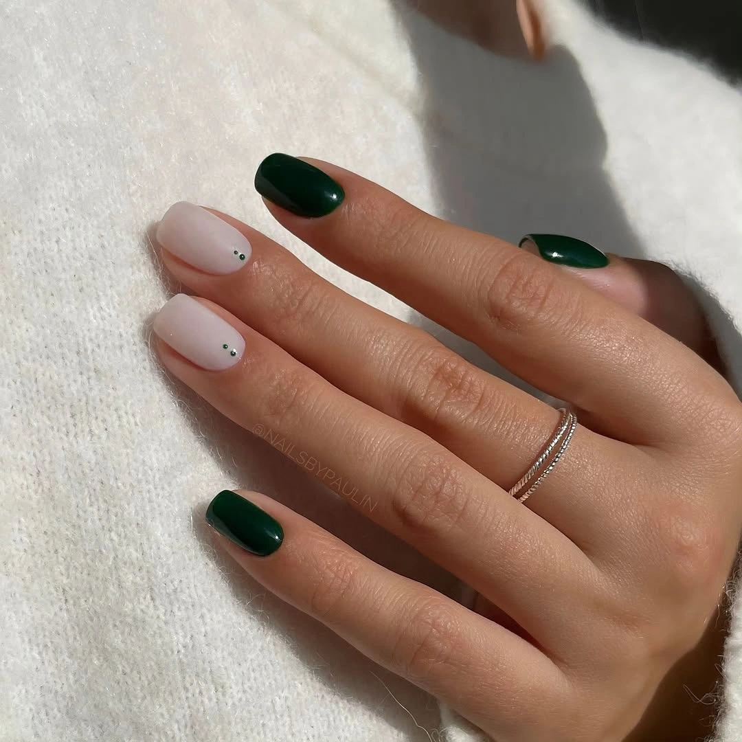
One way to make the look even quieter is to use green on only two nails and keep the white curve on one nude nail. The rounded silhouette supports the soft line better than a severe square edge, and the nude area near the cuticle makes the design feel less abrupt over time. If you choose a darker green, keep the white mark broad enough that it remains visible beside it.
The color relationship is more interesting than a standard green-and-white pairing because the nude acts as a warm middle ground. It prevents the forest shade from looking isolated on olive skin and gives the white curve a softer landing. Adding more detail would not necessarily improve it; the point is the measured exchange between a dense solid color and a light, almost airy line.
Taupe, Cream, and a Fine Linear Accent
Taupe, cream, and brown create a restrained base on medium almond nails, then one fine multitone linear accent introduces a different texture of attention. The solids are not identical in value, so the manicure has depth before the linework even appears. That makes the decorative nail feel like a precise interruption rather than a separate theme pasted onto an otherwise neutral color story.
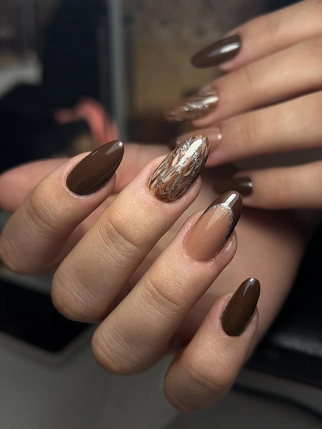
For a shorter length, use the linear detail on one central nail and let the surrounding shades follow a simple dark-to-light order. A cream nail is useful when taupe and brown sit close together, because it keeps the palette from looking too uniform in artificial light. Place the detailed element closer to the middle of the nail if you want its composition to stay readable as the free edge advances.
Olive undertones can support this kind of muted brown family well, but the contrast needs to be built through value rather than saturation. A dark taupe next to cream creates more clarity than three similar beige shades would. The tradeoff is subtlety: this will not announce itself from across a room, yet the small linear accent rewards a closer look and keeps the neutrals from becoming anonymous.
Pale Pink With Tiny Floral-Like Marks
Long almond pale pink nails use small white floral-like marks and scattered gold-toned flecks to keep the surface delicate rather than empty. The base is light, but the tiny accents are placed sparingly enough that they do not turn the nail into a full illustrated panel. That scale makes the result more balanced on a longer shape, where too much ornament could easily overwhelm the soft pink ground.
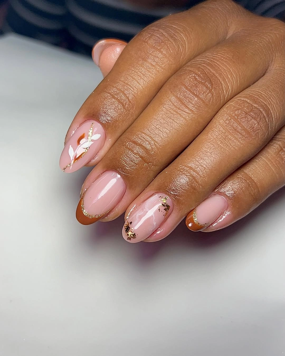
Anyone who wants less upkeep can keep the pale pink and place the small white marks only toward the outer half of one or two nails. Gold-toned flecks should remain scattered rather than arranged in a heavy border, because their job is to catch light, not to create another outline. A shorter almond version benefits from fewer marks with slightly clearer spacing, especially when the base color is very light.
The gentle contrast works because white and gold do different jobs: white describes the little shapes, while the reflective flecks prevent the pale base from feeling blank. A warmer pink will sit more naturally beside olive skin than an icy pastel, although both can work with adjusted accents. The limitation is detail scale; miniature motifs lose their charm when every finger repeats the exact same placement.
Plum and Lilac With Reflective Interruptions
Long almond nails move between plum, lilac, white, silver, and reflective-looking accents, creating a cooler version of an autumn manicure without abandoning depth. The darker plum anchors the hand, while lilac and white lift the visual temperature of neighboring nails. Shiny details appear as interruptions rather than full coverage, so the mix remains legible even though several finishes and values are present.
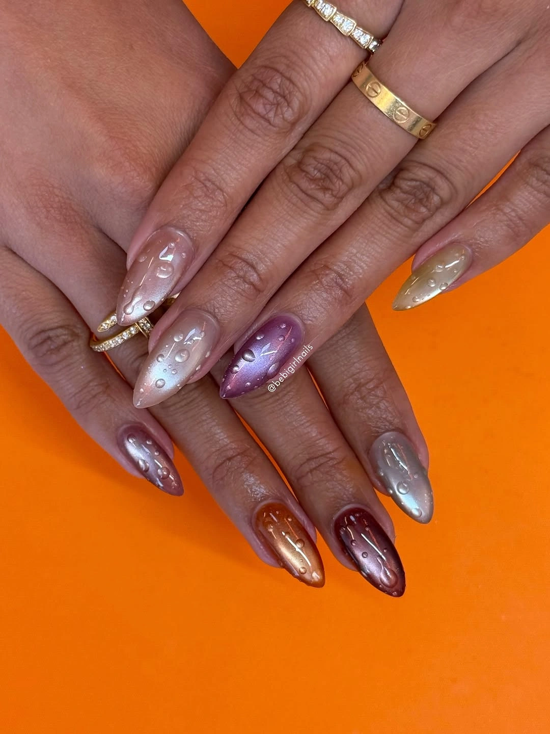
To simplify the composition, choose plum and lilac as the primary pair, then use one reflective accent instead of several different light elements. Long nails can accommodate the contrast because each color has room to sit alone; on a shorter length, two solids and one detail will usually look more cohesive. Keep the reflective area small if you want the darker plum to remain the visual anchor.
The unusual strength of this palette is that it treats autumn depth as something other than brown or orange. Plum supplies the necessary darkness, and lilac introduces a soft contrast that makes the set feel more personal. A full silver nail would make the manicure much sharper, while the smaller reflective touches preserve a calmer rhythm and let the color transitions remain the central story.
Olive Swirls With Chocolate Contrast
Olive green, dark chocolate, and nude are arranged across medium almond nails with swirled graphic patterns that shift in scale from finger to finger. The palette stays grounded because the strongest colors are both earthy, even when the lines become more playful. Nude space separates the swirls and gives the graphic elements a calmer background, which is essential when several nails carry different placements.
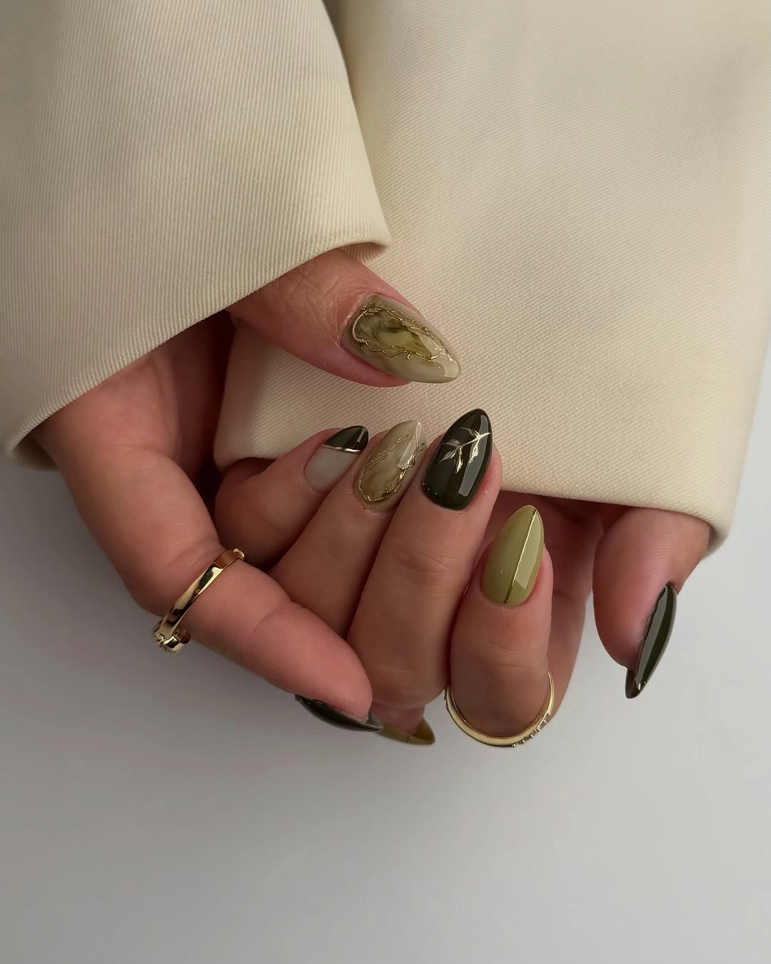
A more restrained version can use olive as the primary solid and place a single chocolate swirl over nude on one accent nail. Fall almond nail ideas can help compare how a curve follows this shape without becoming a tangle. Consider leaving the cuticle area uncluttered, since that open space helps the design look fresher as the nails grow.
Olive and chocolate work well together because neither steals the warmth from the other; the contrast comes from depth and placement rather than from a cool-versus-warm clash. This combination can become heavy if every nail is dark, so the nude panels are not optional filler. They are the visual relief that makes the swirls feel purposeful and keeps the manicure from reading as one continuous brown-green surface.
Moss Green With a Luminous Surface
Long almond nails in moss green have a luminous, metallic-looking glow that changes the way the earthy color reads. The green appears deeper in the shadowed areas and brighter along the curved center, which gives a single shade more movement than a plain cream finish would show. On an olive-toned hand, that shifting surface keeps the palette related to the skin without disappearing into it.
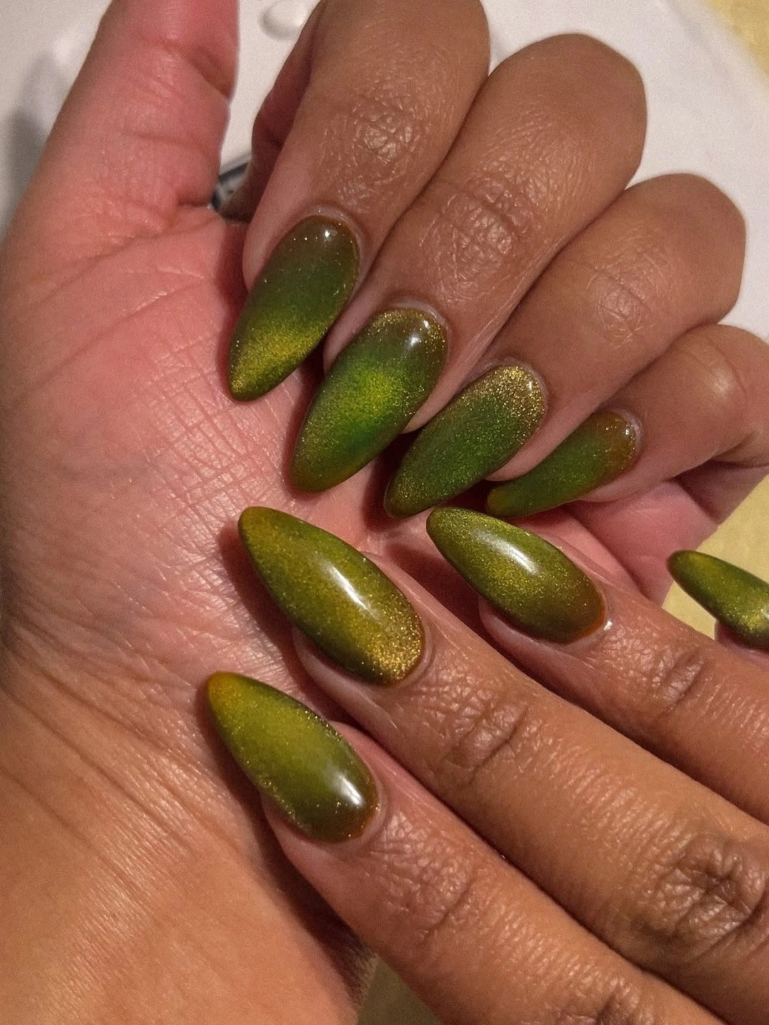
For a practical translation, keep the moss tone but reduce the length and use a simple oval so the reflective highlight stays smooth. The visual effect is strongest when the nail surface is even and the center line of light can travel cleanly from cuticle to tip. If a highly reflective finish feels too noticeable for workdays, choose a softer green with only a slight sheen and retain the same deep color direction.
The advantage of moss over a brighter emerald is its muted warmth; it feels seasonal without demanding a contrasting accent color. Its limitation is that it can look different under varied lighting, ranging from olive to more yellow-green depending on reflection. That variation is part of the appeal, provided you enjoy a manicure where finish plays as large a role as pigment in the final impression.
Warm Taupe With Fine Shimmer
Short almond nails in one warm taupe shade rely on a subtle fine shimmer to keep the neutral from looking inert. The color sits between brown and beige, while the reflective particles appear mostly when light reaches the curved surface. That is a useful direction for olive skin because the manicure stays close to the hand in warmth but still has enough movement to avoid reading as a blank nude.
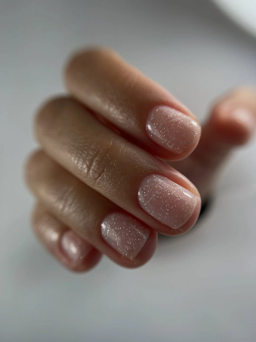
Choose a slightly deeper taupe if you want more separation from your natural skin tone, or a lighter mushroom shade for an almost tonal effect. The short almond outline gives this neutral a soft polish, whereas a sharp square would make it look more graphic and less diffused. A single-color shimmer set is relatively low effort visually, but clean shaping remains important because there is no accent to redirect attention.
The shimmer is strongest when it is treated as texture instead of sparkle. Large glitter would change the mood completely, while the fine reflection keeps the taupe grown-up and quiet. This option works best for someone who wants autumn depth without a literal leaf, flame, or French tip. It may feel understated in photographs, but close up the surface has enough variation to reward a second look.
Playful Pink With Dots and Bright Accents
Blush pink, white, yellow, burgundy, and small black dots appear across medium almond nails with deliberately uneven placement. The palette is more playful than the darker sets, yet the repeated pink base keeps it from becoming disconnected. Small marks and color pops are allowed to behave differently on each finger, which gives the manicure a handmade rhythm instead of a row of matching mini designs.
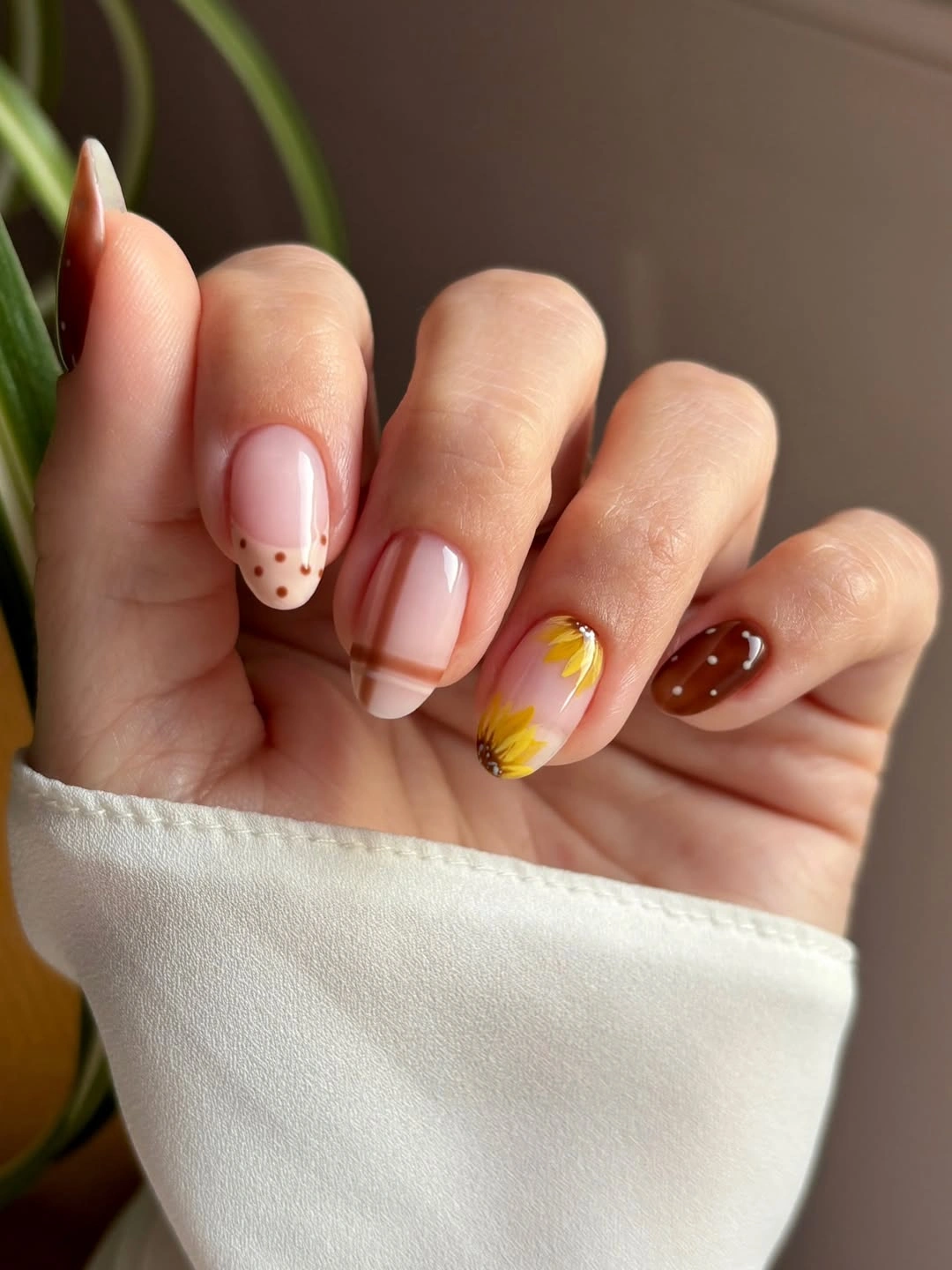
To make the idea easier to wear, retain the pink base and select only one bright accent color plus the black dots. Yellow is especially effective in a small dose because it makes the pink feel warmer, but it does not need to appear on multiple nails. Keep the dots clustered or aligned on a single nail rather than spreading them evenly, otherwise the playful detail can start to look like visual noise.
The key is asymmetry with limits. Pink provides continuity, burgundy adds weight, and the small black dots act as punctuation rather than decoration for its own sake. A cleaner version could drop the white entirely, while a bolder version could enlarge the color blocks instead of adding more motifs. The current balance succeeds because the accents remain small enough that the soft pink still controls the overall reading.
Jewel-Toned Accents in Mixed Placement
Orange, green, deep red, and gold-toned textured accents are mixed across medium nails with different placements on each finger. The palette has a jewel-like warmth, but it does not rely on one repeated motif to feel related. Instead, the shared depth of the colors creates the link, while the varied accents give every nail a slightly different role in the overall composition.
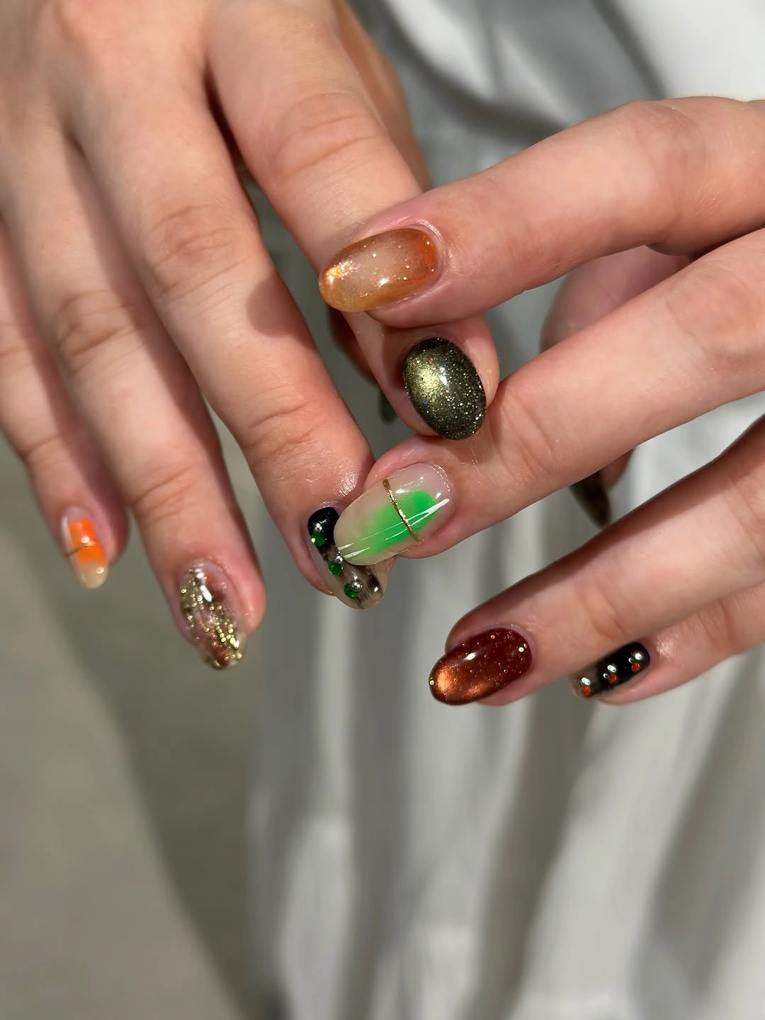
A calmer adaptation would choose either orange and green or red and gold, then use the remaining colors only as very small details. Mixed placement works best when one shade appears as the most consistent element, so decide which color should carry the set before adding texture. If the nails are short, concentrate the decorative accents on one or two fingers and let the other surfaces stay solid and easy to read.
What keeps this mix from feeling accidental is the shared autumn depth: none of the colors is pastel, and the gold-toned detail acts as a bridge between the warmer and cooler notes. The tradeoff is coordination with outfits, since a four-color manicure becomes a visible accessory in its own right. Reducing the number of accent colors will make it more flexible, while retaining them preserves the expressive, collected energy.