Matte color can make a bright shade feel quieter, but only when the shape gives it somewhere to breathe. The interesting question is not whether a color is “fall” enough; it is what happens when a soft surface changes the way the eye reads saturation, contrast, and length. A small bright decision can feel more intentional than a whole hand of predictable dark polish when its visual volume is controlled.
Before choosing a shade, decide where you want the eye to stop. A dark block creates weight, a pale gap creates relief, and a narrow accent gives color direction without asking the entire manicure to perform. If the base, shape, and finish are doing the same job, the result gets muddy; give each one a different job and even a playful choice stays easy to wear.
Sheer blush nails with mint French tips
The translucent blush center makes these long almond nails feel almost weightless, while the bright mint edge gives them a crisp jolt of color. A narrow tip is doing more work than a full neon base would, because the eye reads the green as a clean outline around the shape. The tiny dark edging on some tips adds definition without turning the manicure into a busy pattern.
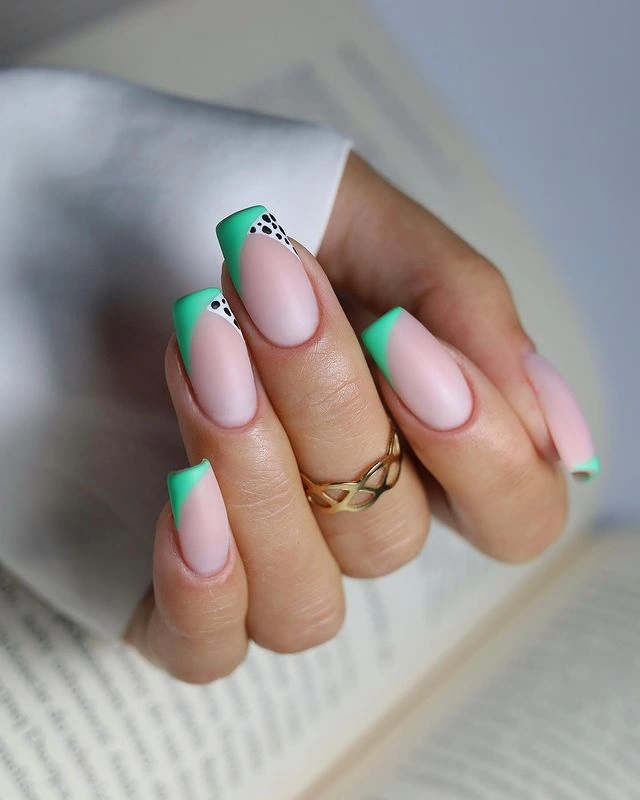
If you want the same idea to feel less dramatic, shorten the almond length before changing the color. A medium almond can keep the mint visible while reducing the amount of colored surface, and a softer sage or dusty aqua would make the contrast easier to wear with warm fall clothing. The key is preserving the pale center so the tip remains the intentional focal point.
This is also a useful example of how a bright shade can fit a fall palette without becoming traditionally dark. Keep the tip narrow, repeat the same green on every nail, and let the clean outline provide the rhythm instead of adding glitter or extra motifs. That restraint will make the manicure look considered as it grows out, even though the vivid edge will still draw attention to the free edge.
Black-and-white spots over a blush base
The irregular black spots on the pale panels give this long tapered manicure a playful animal-print energy, but the blush sections keep it from reading as a full black-and-white block. Spot placement changes from nail to nail, so the set feels lively rather than mechanically repeated. The length amplifies the print, which is why the soft pink background matters so much to the overall balance.
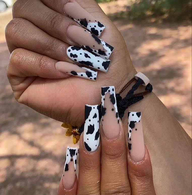
For a more wearable version, leave the pale pink on most nails and move the spots to two accent fingers. Shorter square or almond nails will make the marks look more compact, and a warm cream base can soften the contrast if stark white feels too sharp. Keep the spots uneven rather than arranging them in identical rows, because the relaxed spacing is what makes the print feel intentional; readers who prefer compact shapes can compare more fall short nails for the same scale decision.
The dark bow visible near the hand is not part of the manicure, so the nail design itself should carry the visual story. That works because the black spots are the only strong pattern and the rest of the palette stays restrained. If you like the idea but want a calmer fall direction, replace the black with deep brown and keep one small patterned accent instead of covering every long panel.
Long red points with tonal texture
These vivid red stiletto nails rely on one saturated color, but an accent nail introduces lighter red texture so the set does not look flat. The pointed silhouette already creates a strong gesture, and repeating the red family keeps the textured detail connected to the solids. It is a bold look without a second dominant hue, which makes the shape and surface variation easy to notice.
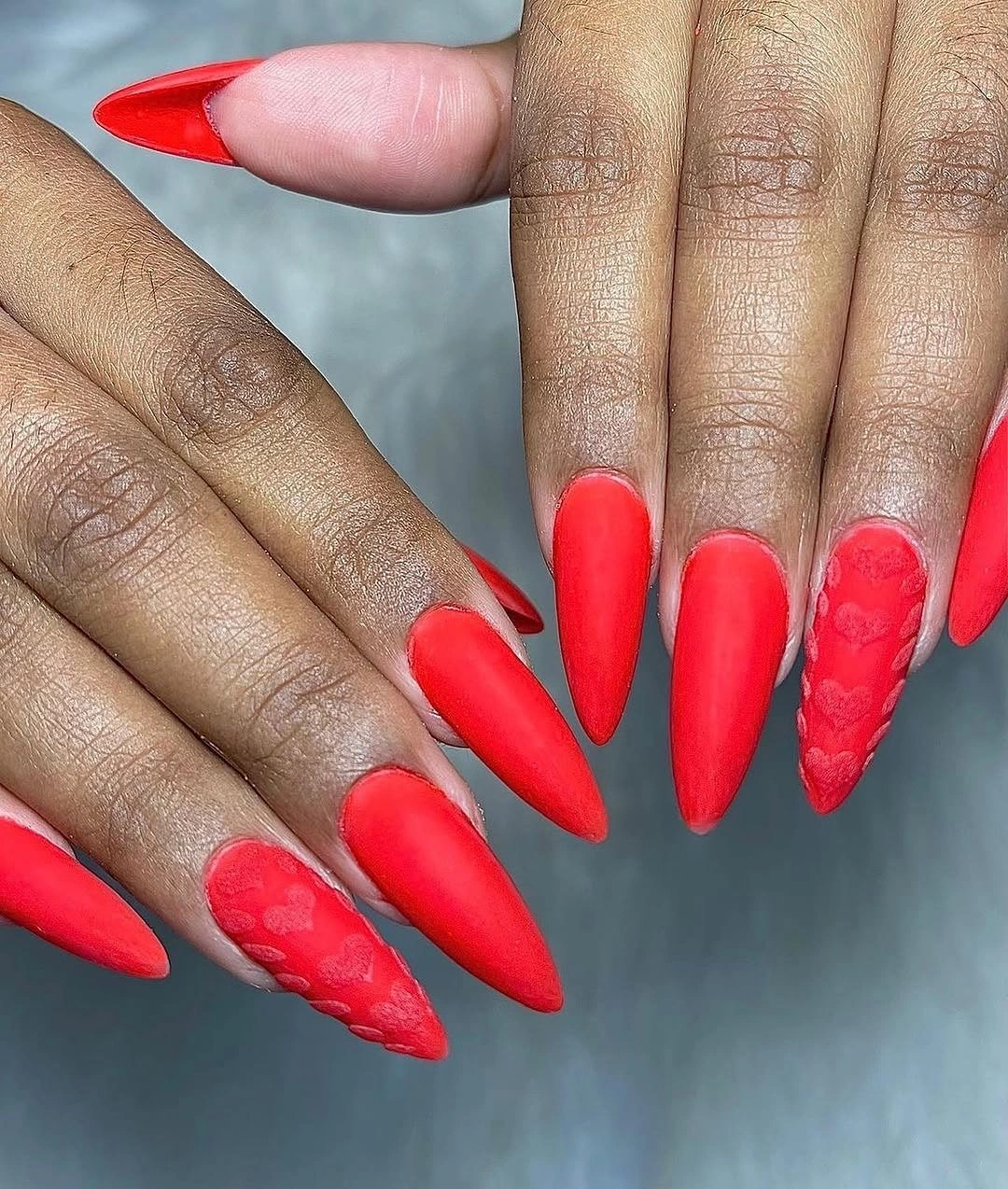
The practical adjustment is to keep the color and change the length. On a short almond, the red will feel more compact and the textured accent can stay on one nail without competing with a dramatic point. If a full bright red feels too intense, a brick or oxblood version would lower the saturation while preserving the useful contrast between smooth color and one detailed surface.
What keeps this manicure from needing additional decoration is the close relationship between base and accent. A different print on every nail would fight the sharp silhouette, while a small tonal mark gives the eye something to discover after the first red impression. The tradeoff is that a saturated solid shows chips and growth quickly, so the simple design still asks for attention at the edges.
Ivory nails traced with fine autumn branches
The pale square nails use thin brown and rust lines that suggest small branches or leaves without filling the surface. That open milky background gives the fine marks enough contrast to remain visible, yet the manicure still feels soft because no dark color occupies an entire nail. The design earns its seasonal mood through line direction and warm accents rather than a crowded illustration.
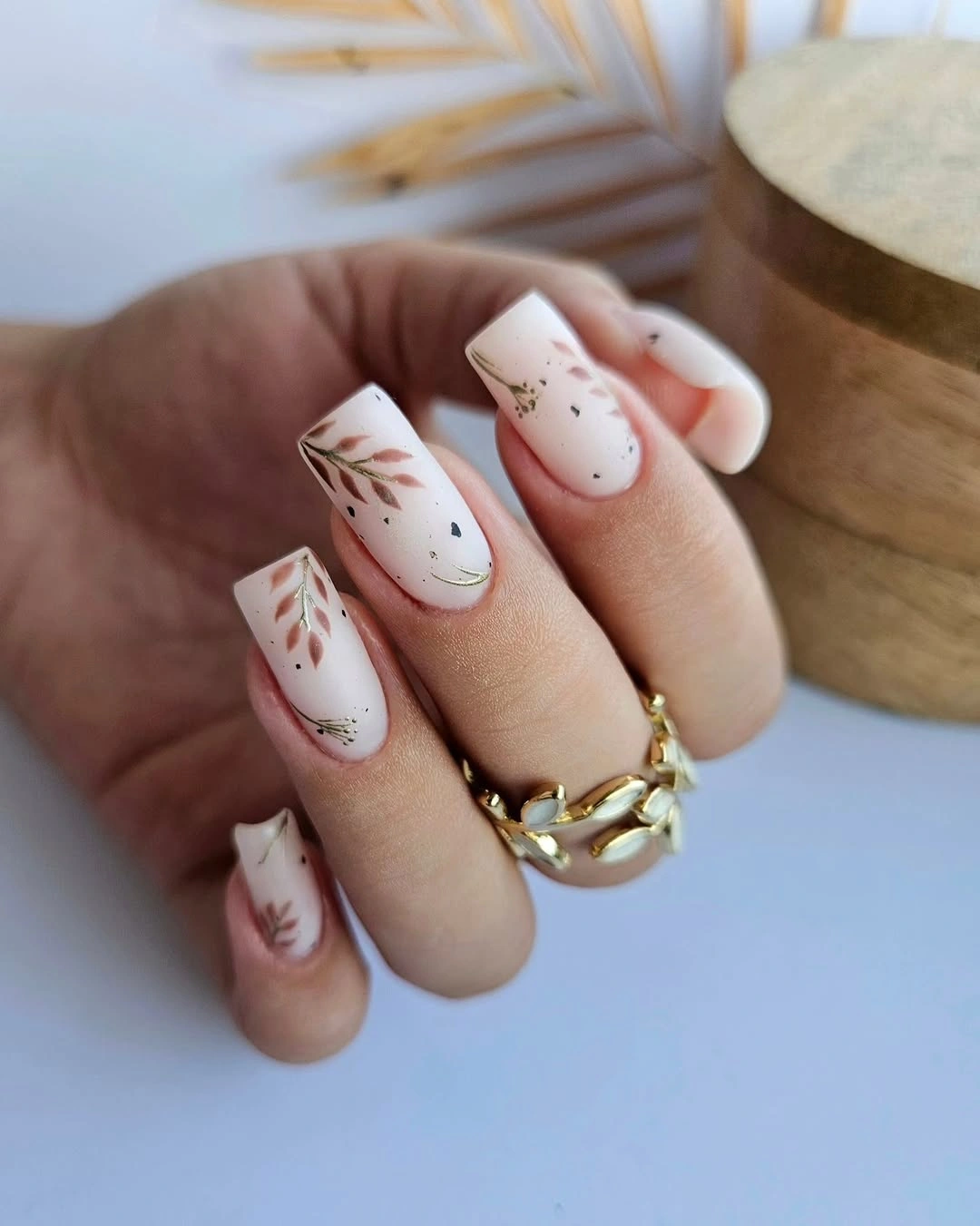
This idea is easy to scale down because the motif already depends on restraint. Keep most nails plain ivory and place one or two branch-like lines near the side or tip, where they can follow the square shape without making the center look crowded. A muted terracotta or taupe line would keep the same autumn feeling if dark brown feels too graphic against the pale base.
The realistic limitation is detail density: very fine marks need a clean surface and enough visible space to stay legible. On a shorter nail, use fewer strokes rather than squeezing the whole branch into a smaller area. The result will still read as seasonal because the warm line and pale background create the contrast, while the reduced scale makes the look easier to wear with any outfit.
Deep chocolate brown in a clean coffin shape
There is no visible art on these long coffin nails, and that simplicity lets the chocolate brown and squared silhouette carry the entire manicure. The dark color looks rich because the surface is even and the free edge is clearly defined, not because it is competing with another shade. A solid set like this can be surprisingly expressive when the shape is deliberate and the tone has enough depth.
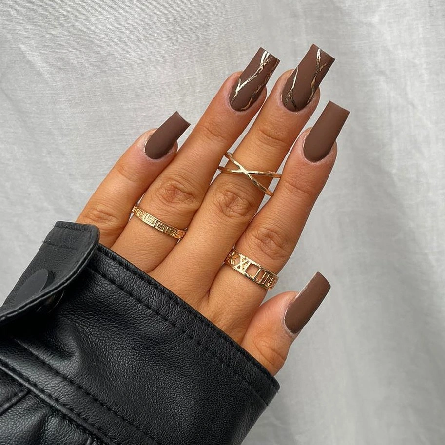
If the length feels high maintenance, keep the same brown on a shorter coffin or soft square. The color will still read as the focal point, but the reduced edge makes everyday wear more forgiving and prevents growth from becoming the first thing you notice. You can also shift toward warm cocoa or reddish brown without losing the quiet, single-color structure.
The appeal here is control rather than decoration. A dark solid creates a strong visual block, so the best adaptation is to change only one variable at a time – length, undertone, or finish – instead of adding random art. The honest tradeoff is that a clean dark surface shows small chips clearly, which means the minimal look rewards tidy upkeep more than a busier pattern might.
Smoky lavender bands on long square nails
These long square nails move through smoky gray, lavender, mauve, and blush with blurred curved bands that vary across the hand. The repeated motion keeps the design connected, while the muted colors soften the structural square shape and stop it from feeling too rigid. Instead of a single focal nail, the manicure builds interest through the way each hazy curve changes direction.
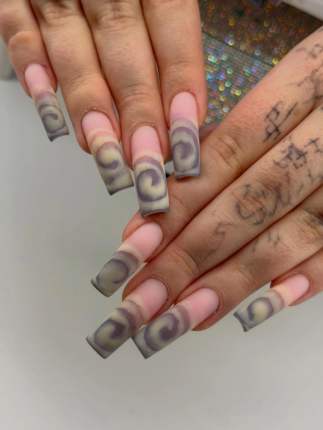
To adapt the look without losing its rhythm, choose two related shades and place the soft bands on only a few nails. A shorter square will make the curves feel more compact, while an almond shape would turn the same movement into something more elongated. The useful decision is keeping the transitions blurred enough that the palette reads as one atmosphere rather than separate stripes.
This design also shows why a muted palette can carry a lot of visual information without needing glitter or sharp linework. The curves provide contrast in shape, and the color changes provide contrast in value, so the eye keeps moving even though the manicure remains quiet. The limitation is that uneven placement is part of the appeal, which means an overly symmetrical redraw could lose the soft, lived-in quality.
Black outline geometry on compact pale nails
The short-to-medium square nails use black side or tip blocks around pale centers, creating a crisp outline without covering every nail in black. One solid dark accent strengthens the contrast, while the pale middle keeps the manicure visually open. It is a graphic look built for a compact shape, because the border remains readable even when there is not much length to work with.
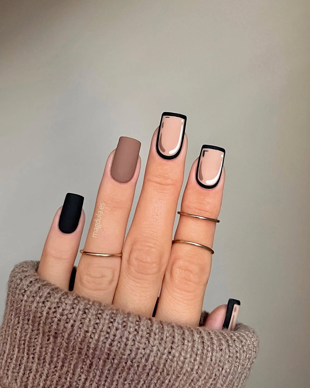
For a softer version, reduce the black border to a thin line and keep the strongest block on one accent nail. A warm nude center would bring the design closer to fall colors, while charcoal would lower the contrast without losing the architectural feeling. The important part is leaving the center light enough that the outline frames the nail instead of becoming the whole design.
The square edge and dark frame create a clear maintenance point: any uneven growth or small chip will interrupt the geometry quickly. That is not a reason to avoid it, just a reason to keep the structure simple and the spacing generous. If you prefer longer wear between changes, use the same black-and-pale relationship with a less exact border so minor shifts do not look like mistakes.
Orange bands sharpened by one silver accent
Warm orange and chocolate brown carry most of this long almond set, but a reflective silver nail changes the temperature of the whole palette. Narrow bands and a bright orange stripe give the warm nails direction, while the cool accent acts like a visual pause rather than another competing pattern. The result feels autumnal through its base colors but lively because the metallic note refuses to blend in.
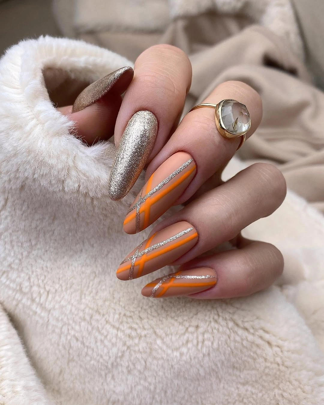
If the silver feels too strong, keep it on one nail and replace the other high-contrast details with a muted brown line. A shorter almond would also reduce the amount of orange surface while keeping the linear movement visible. This is a good place to change one variable at a time: soften the metallic, shorten the shape, or lower the orange saturation, but do not remove every contrast at once.
The manicure works because the warm colors repeat and the silver is isolated. That gives the eye a clear order – orange first, brown second, cool shine last – rather than asking every nail to be the focal point. The practical tradeoff is that reflective surfaces can make small edge wear more noticeable, so a tidy outline matters even when the rest of the design is intentionally expressive.
Coral almond nails with white curved stripes
These medium almond nails use saturated coral as the main statement and place thin white curves along the length of several nails. The lines soften the bright base without making it pale, and their direction reinforces the almond silhouette instead of cutting it into short sections. The warm color feels playful, but the limited palette keeps the manicure from drifting into visual clutter.
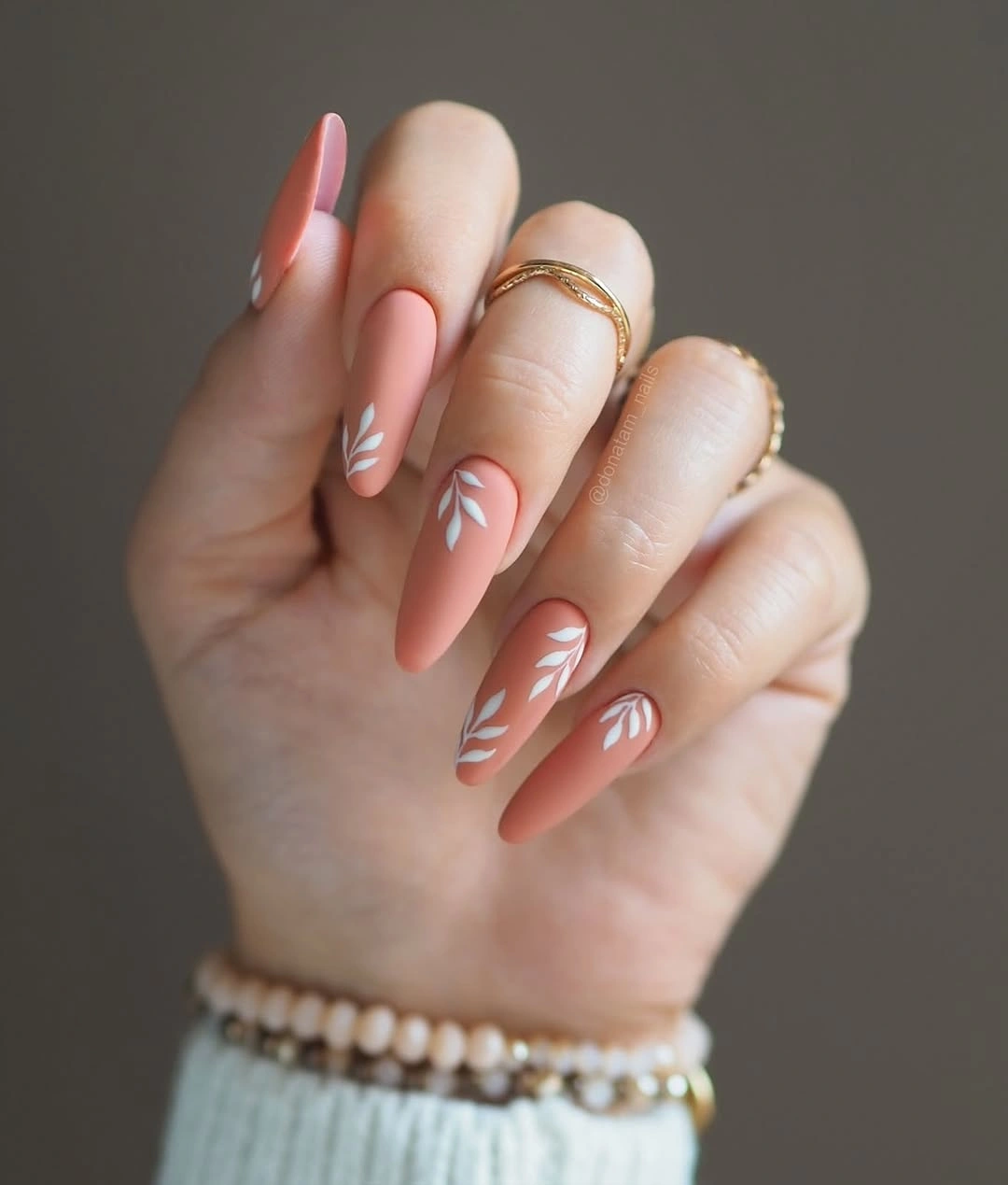
For a lower-contrast fall version, use terracotta, muted coral, or warm cinnamon in place of the vivid base. You can also keep the coral on most nails and repeat one white curve on only two accents, which preserves the sense of movement with less surface detail. The bracelet in the background is incidental; the useful design decision is the relationship between the bright field and the narrow pale line.
The curves are doing more than decorating the nail because they guide the eye toward the point. That makes this a helpful reference for choosing art that supports shape rather than fighting it. The limitation is that a saturated glossy-looking color will draw attention to chips, so a shorter almond or rounded shape may be more forgiving if you prefer a bright look with less edge maintenance.
Black blocks and dotted pale accents
The short square manicure alternates solid black and pale pink, then uses white accent nails with scattered black dots and tiny dark marks. The contrast is immediate, but the dots prevent the solid nails from feeling like isolated blocks by repeating the dark color in a lighter setting. Because the shape is compact, the design feels graphic and tidy rather than oversized.
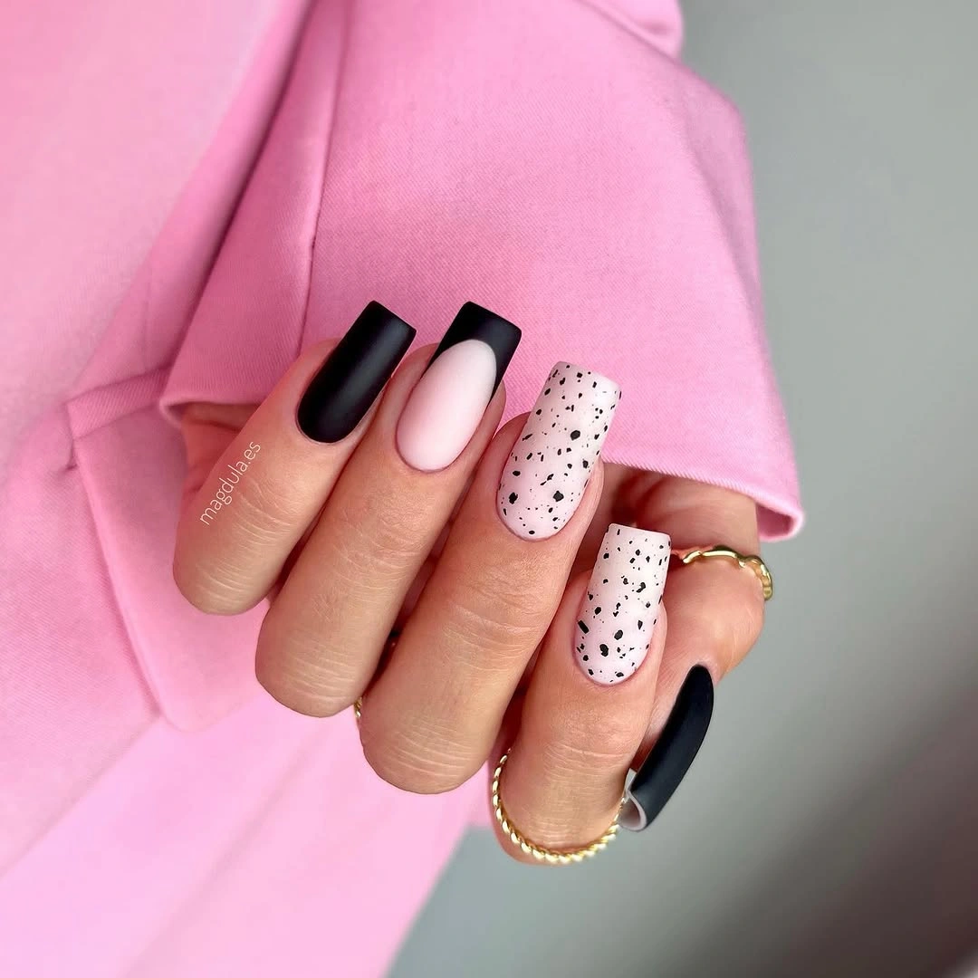
A simple adaptation is to keep the black on three nails, pale pink on one, and place the dotted treatment on a single accent. That gives the pattern more room and makes the overall manicure easier to coordinate with fall colors such as cream, charcoal, or muted rose. Keep the dots uneven and light; perfectly packed rows would change the relaxed rhythm visible here.
The design has a clear balance between solid and patterned surfaces, which is why it does not need glitter or another motif. It also shows the value of repeating one color in two different roles: black is a block on some nails and a small mark on others. The tradeoff is that black edges can look stark as they grow, so a deep espresso substitution can soften the maintenance line.
Mustard zebra curves over a black base
Most of these short rounded nails are black, while two yellow accents carry irregular curved stripes that suggest a zebra-like print. The mustard color is powerful precisely because it appears in a small amount, and the dark base gives it a strong frame. The rounded shape keeps the pattern compact, so the manicure feels more focused than a full animal-print set would.
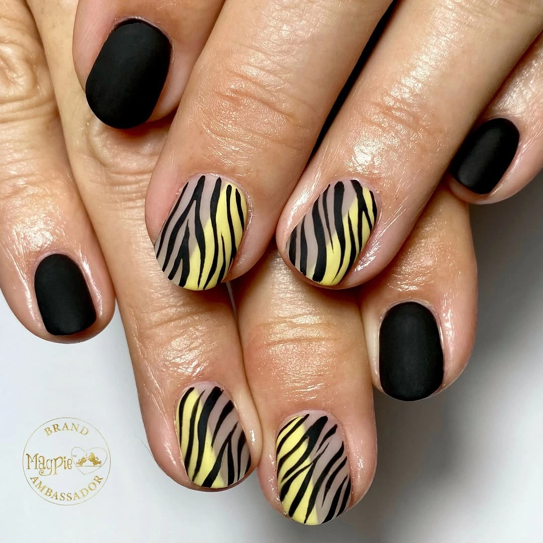
If the contrast feels too sharp, trade black for deep brown or use the mustard pattern on only one accent nail. A shorter rounded shape already suits the idea, so the biggest adjustment is palette rather than length. Keep the stripes curved and uneven, because the organic movement is more interesting than a perfectly repeated graphic grid.
This is a good example of using an accent color to create a seasonal mood without adding leaves, glitter, or multiple motifs. The black supplies the visual weight, the mustard adds warmth, and the irregular marks create the only movement. The honest limitation is that yellow can look louder against dark color as it grows out, so a muted ochre would make the contrast easier to live with; the same balance appears in broader fall nail art when one accent carries the pattern.
Soft pink centers inside black framing
The medium square nails place pale pink in the center and push dark charcoal or black toward the sidewalls and tips. That hazy transition keeps the framing softer than a solid black block, but the sharp square edge still gives the manicure a graphic finish. The design feels balanced because the light center remains the largest uninterrupted area on each nail.
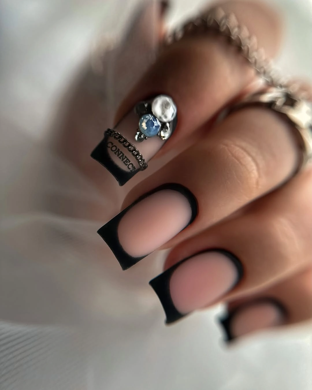
To make the look more wearable, use charcoal instead of the deepest black and keep the dark frame thinner at the sides. A shorter square will still show the light-to-dark relationship, while a rounded edge would make the contrast feel less architectural. The important adaptation is preserving a visible pale center; if the dark area expands too far, the soft gradient effect disappears.
There is a useful color lesson here: contrast can be strong without being harsh when the boundary is softened. That gives the eye a gradual path from pale pink to dark edge, so the manicure reads as one composition rather than separate blocks. Because the outline is precise, the design will show chips clearly, which is the tradeoff for such a clean graphic border.
Dark teal blocks with a reflective cluster
Deep teal does almost all the quiet work in this long coffin manicure, leaving one or two nails for large iridescent-looking reflective details. The low-shine dark field makes the bright cluster a true focal point, and the squared length gives that accent enough room to feel deliberate rather than cramped. The contrast is dramatic, but it is organized around one decision instead of scattered across every nail.
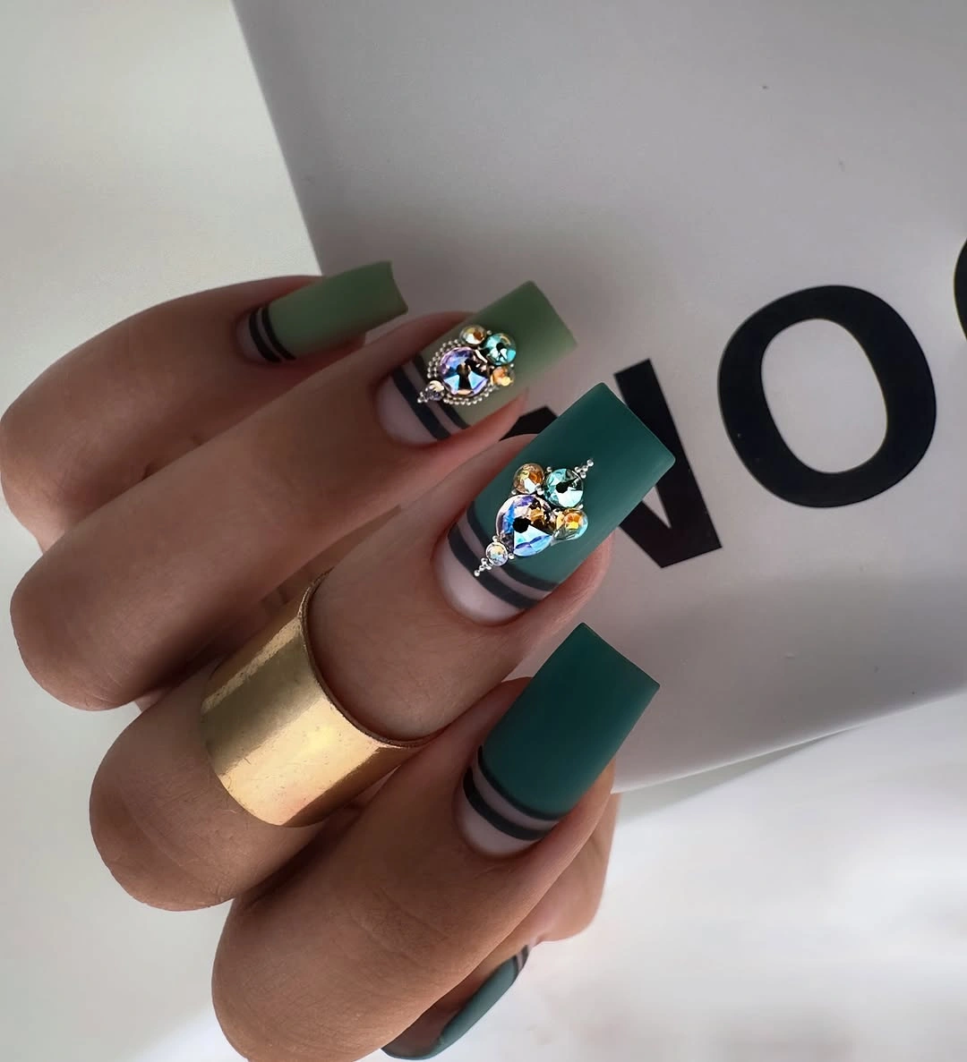
For a practical version, keep the teal on most nails and move the reflective detail to a single shorter accent. You could also replace the large cluster with a small multicolor patch if you prefer less texture and less visual weight. The color relationship matters more than the size: a calm deep base should remain visible around the accent so the focal point has an edge.
This manicure shows why a restrained base can support a more decorative accent without looking confused. Teal supplies repetition, the dark value keeps the palette grounded, and the reflective surface gives the eye one place to land. The honest limitation is that a large accent may catch on daily tasks or feel too noticeable for a conservative setting, so the one-nail version is the easiest compromise.
Red-on-red dots on short rounded nails
These short rounded nails stay within a single red family, using small darker or lighter marks to create a dotted, almost tactile-looking surface on several fingers. The monochrome palette keeps the detail controlled, while the short shape prevents the texture from becoming an oversized statement. It is a strong reminder that contrast can come from value and surface variation rather than a second color.
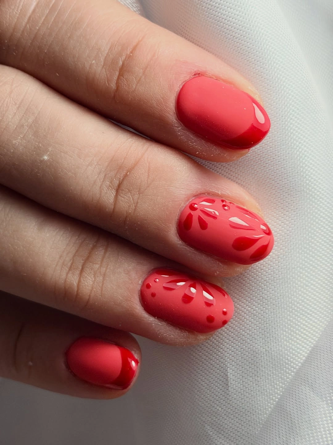
If you want the effect to look quieter, keep the red solids on most nails and place the marks on one or two accents. A deep cranberry or brick base would make the design feel more autumnal without changing its structure. On a very short nail, use fewer marks and leave a clean border so the surface does not lose its neat rounded outline.
The appeal is the close relationship between base and detail: the marks reward a second look, but they do not interrupt the first impression of a clean red manicure. That makes the idea easy to pair with simple fall outfits and accessories. The tradeoff is subtlety, because tone-on-tone texture may disappear at a distance, so choose it when you prefer quiet interest over an obvious graphic pattern.
Purple waves across a matte-looking surface
The vivid purple nails use darker irregular waves rather than a contrasting motif, so the whole set stays in one color family while still feeling animated. Their long pointed shape gives the stripes room to travel vertically, which helps the manicure look elongated instead of chopped into small bands. The result is bright and playful, but the tonal relationship keeps it from becoming visually noisy.
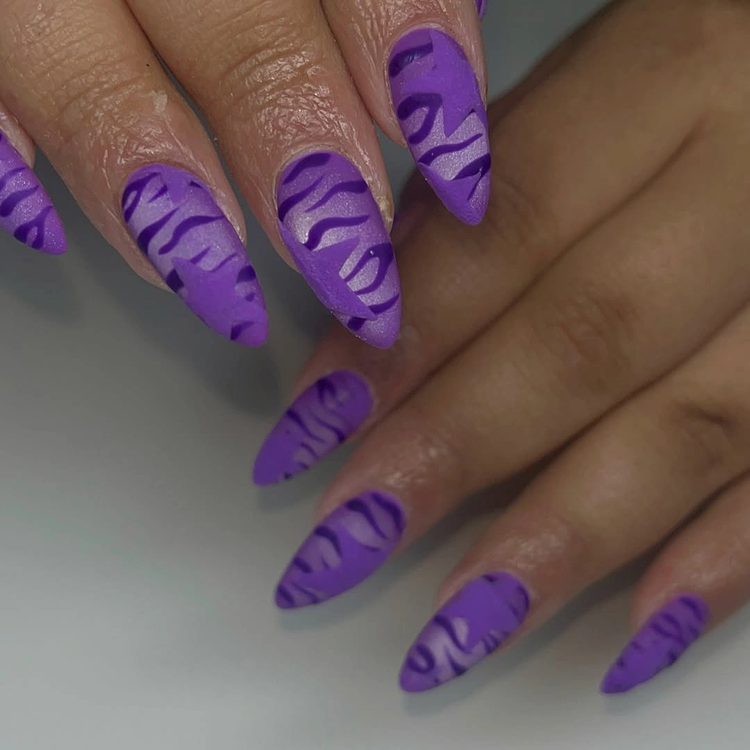
For a softer fall interpretation, move toward plum, aubergine, or muted berry and keep the darker wave on two accent nails. A shorter almond will preserve the directional movement without making the color field so dominant. The most important choice is keeping the wave scale generous; tiny repeated marks would turn this from a flowing design into a busy pattern.
Because the base and lines share a hue, the manicure feels coherent even though the color is saturated. That is a useful way to experiment with a vivid shade: change value before introducing another color, then judge whether the shape still has enough open space. The limitation is that a bright tonal design can show uneven lines easily, so the relaxed wave should look intentionally irregular rather than accidentally messy.
Muted mauve with a quiet scatter of specks
These medium almond nails use a muted mauve-plum base and a fine scatter of pale specks, creating interest without a recognizable motif. The low-contrast marks sit close to the surface visually, so the manicure feels soft and considered rather than sparkly or graphic. The moderate length gives the color enough room to read while keeping the shape easy to wear.
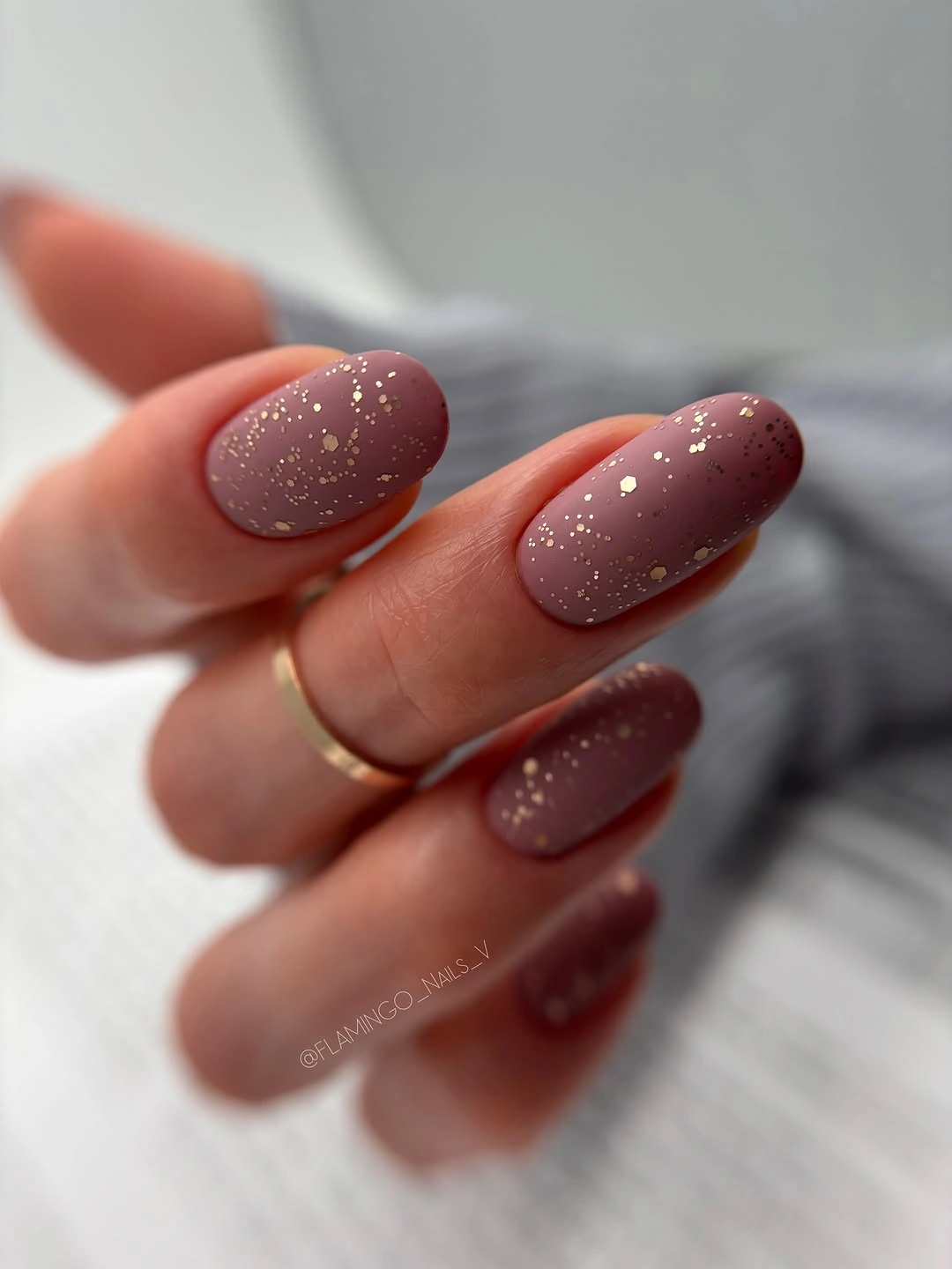
If you want to shift the look toward fall, choose a warmer berry-brown or cocoa-mauve and keep the specks light. On shorter nails, reduce their number rather than making them larger, because the appeal depends on a fine, even scatter. This is a good design to adapt through undertone: the structure stays the same while the base can move warmer or cooler.
The understated surface shows that a manicure does not need obvious art to feel finished. The color carries the mood, the specks break up the solid field, and the almond shape keeps the overall result graceful. The tradeoff is that subtle detail may not photograph as clearly as a high-contrast pattern, so choose it when the real-life effect matters more than an instant, dramatic first impression, much like the quieter choices collected in these fall almond nails.
Teal blocks with pale botanical accents
Solid deep teal nails alternate with pale accents carrying small turquoise floral or leaf-like marks, creating a cool tonal conversation across the hand. The light accents make the tiny motifs legible, while the repeated teal keeps the set from drifting into unrelated colors. The rounded shape softens the dark base and makes the botanical details feel approachable rather than formal.
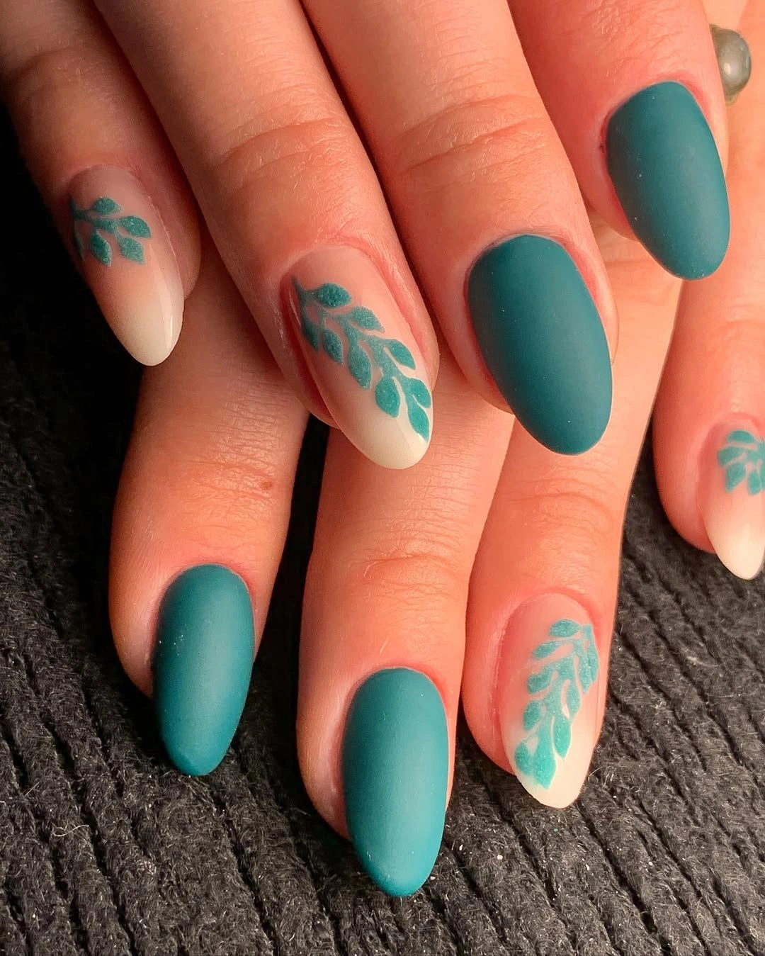
To adapt this design for a warmer fall wardrobe, replace the teal with forest green or muted olive and keep the pale accents unchanged. You can also limit the small motifs to one or two nails, which gives each mark more space and lowers the visual density. The design works best when the accents remain tonal, so a very bright contrasting flower would change its quiet character.
The relationship between block color and delicate detail is the real idea here. Teal supplies the repetition, pale nails supply neutral space, and the small marks connect the two without taking over. The limitation is that tiny botanical lines can disappear if the base colors are too close, so keep enough value difference for the accent to remain readable as the manicure grows out.
Minimal black stems on pale almond nails
These pale blush almond nails use thin black stems and small leaf-like marks near the sides and tips, leaving most of each nail intentionally open. That negative space makes the design feel light even though black is the only strong contrast, and the soft point gives the lines a natural direction. The result suggests autumn through restraint rather than through a literal seasonal picture.
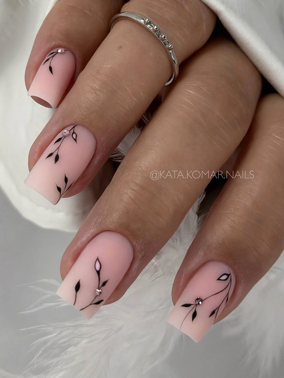
For an even easier version, keep the pale base on every nail and draw the black detail on one accent finger. A warm ivory or pink-beige base can make the contrast gentler, while a shorter almond will keep the open spacing intact. Resist the urge to add more leaves just because the first marks feel small; their impact comes from the blank space around them.
This design is especially useful when you want art that will not compete with clothing, rings, or other details. The pale field acts as a calm background, the black lines supply definition, and the almond shape gives them a graceful path. The honest limitation is scale: if the marks are too fine or too close to the edge, they may fade visually, so fewer stronger lines are often the better choice.
Pink blocks with one dark reflective accent
Most of these long square nails are bright pink, while one dark accent carries a dense reflective-looking panel that changes the balance of the whole hand. The dark nail gives the pale set an anchor, and the square length makes the contrast feel intentionally graphic rather than accidental. The manicure does not need more decoration because the single interruption already creates a clear focal point.
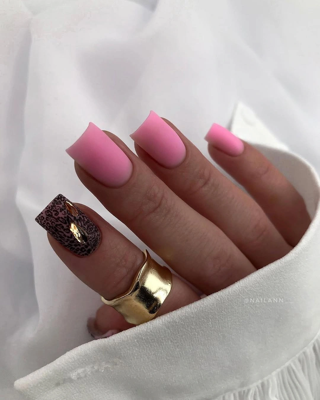
If the contrast feels too high, replace the dark accent with deep brown or charcoal and shorten the square shape. Keeping the reflective detail on one nail is enough; adding it to several would compete with the saturated pink and make the composition harder to read. A softer rose base would also preserve the same light-to-dark relationship with less visual intensity.
The useful lesson is concentration: one accent can change the mood of a set more efficiently than small details scattered everywhere. Pink supplies the repeated field, the dark surface interrupts it, and the long edge reinforces the graphic choice. The tradeoff is that both saturated pink and dark shine can show wear clearly, so this bold design benefits from a tidy outline and deliberate maintenance.
Forest teal with one irregular color patch
Short rounded nails in deep teal create a calm base, then one accent introduces a small irregular patch of turquoise, yellow, and darker color. The bright detail is compact enough to feel like a point of interest rather than a competing pattern, and the dark field keeps the palette grounded. This is a good example of using one unexpected color moment without rebuilding the whole manicure around it.
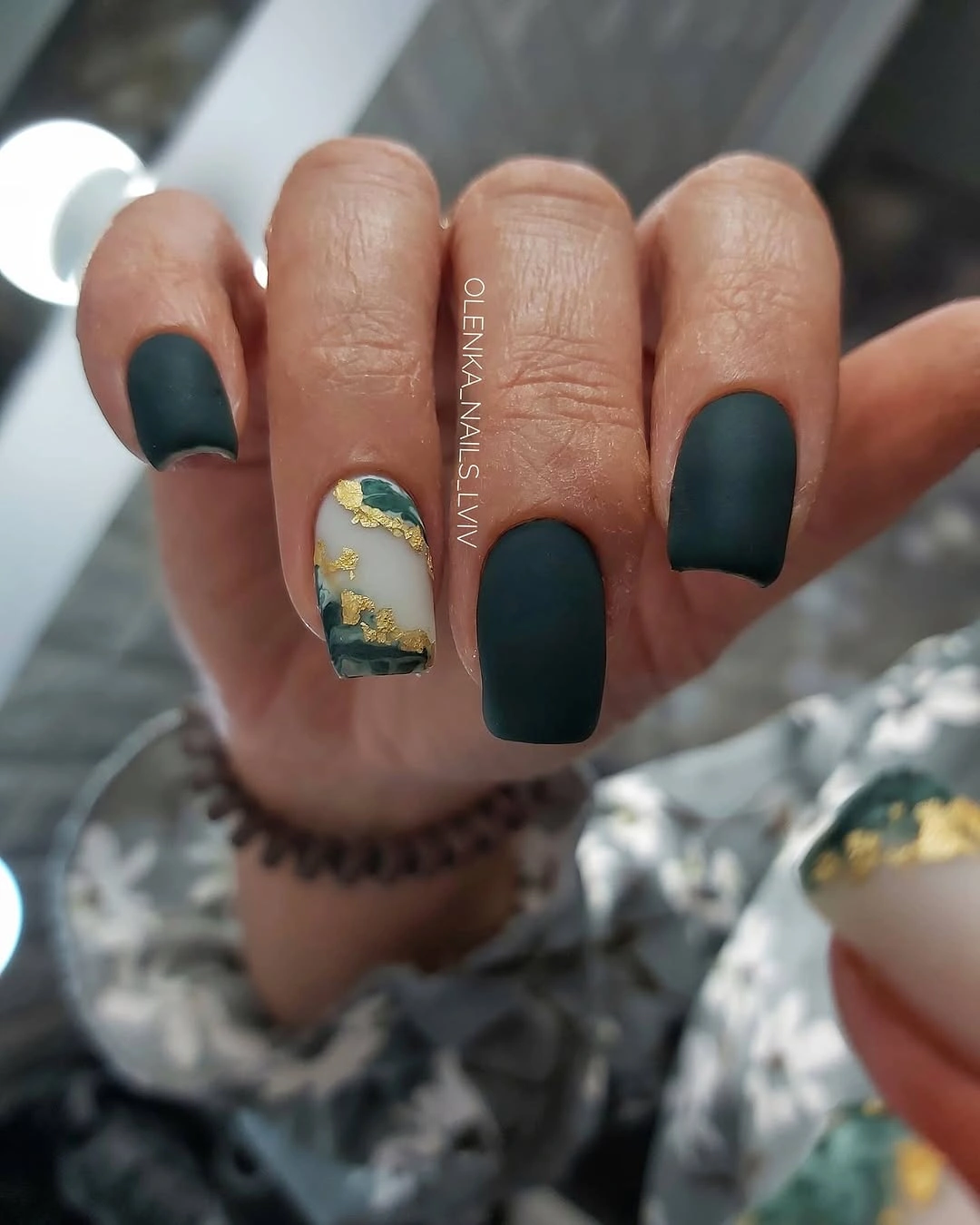
For a simpler version, keep the accent to two colors and place it on the ring finger only. A forest green or dark olive base would maintain the autumn mood, while a short rounded square would give the patch a little more visual stability. The design should retain a dark border around the accent so the bright colors feel contained rather than spilled across the hand.
The small patch works because the rest of the nails repeat one deep tone and stay visually quiet. That creates a clear order: dark base first, color surprise second, then back to the base. The limitation is that an irregular accent can look accidental if its edges are too diffuse, so keep the color relationship intentional even when the shape itself remains organic.
Coral blocks with clean graphic line accents
These short rounded nails use solid coral-red on some fingers and pale accents crossed by thin black and red lines. Repeating the coral inside the linework ties the two surfaces together, so the pale nails feel part of the same set rather than unrelated artwork. The short shape gives the geometry a neat, compact scale and keeps the bright color from becoming overwhelming.
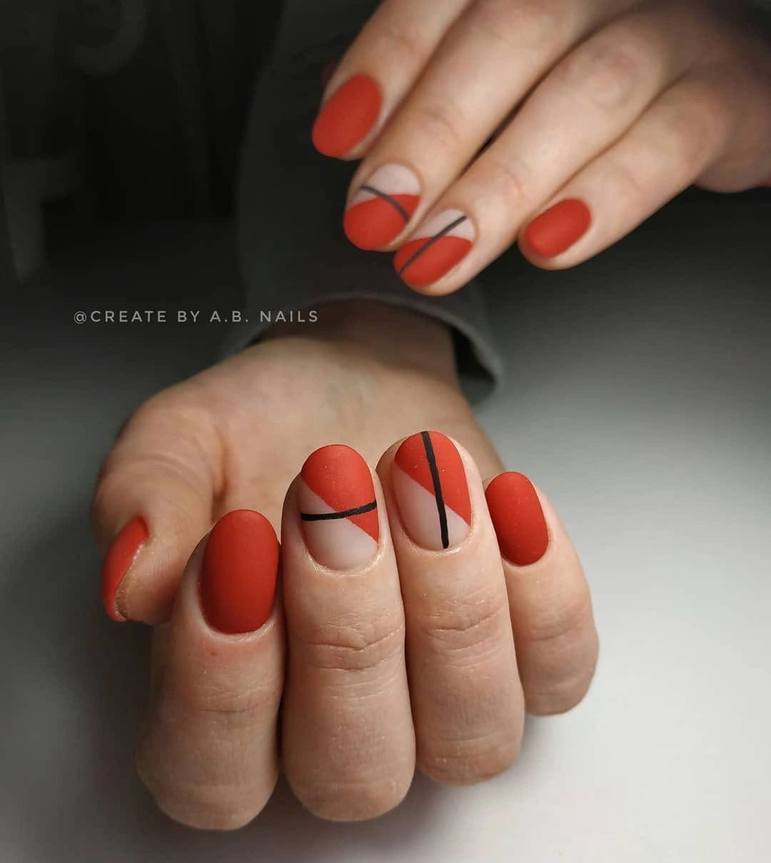
If a full coral set feels too vivid, keep the solid color on two nails and use one coral line over a cream base on the rest. The line should remain thin enough to leave pale space on both sides, because the open background is what makes the geometry look clean. A muted brick or terracotta substitution would also push the palette closer to fall without changing the layout.
This manicure succeeds through repetition rather than complexity. Coral acts as a block and a line, black provides definition, and the pale accent nails create the neutral support that keeps everything legible. The tradeoff is that crisp geometry shows uneven growth, so a less exact curved line can be easier to maintain than a perfectly measured graphic border.
Cobalt blue with a deeper sparkling accent
The saturated cobalt nails are already vivid, but a single deeper blue accent filled with reflective specks gives the set another layer without introducing a new color family. The medium coffin shape supports the strong block of blue, while the darker accent adds depth near the end of the visual sequence. It feels seasonal through richness and contrast, not through an obvious fall motif.
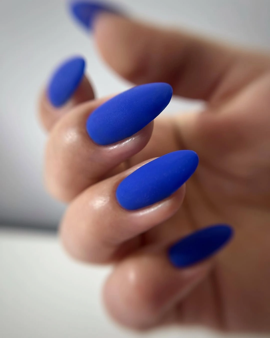
To make the idea more wearable, keep the cobalt on most nails and shift the accent toward navy or muted denim blue. A shorter coffin would reduce the amount of saturated surface, but the same-color relationship should remain: the accent needs to be darker or more reflective, not simply another unrelated shade. That controlled change preserves the manicure’s visual logic.
This is a clean finish because the eye understands the set in one glance and then notices the deeper accent on a second look. The repeated blue provides cohesion, the single sparkle gives emphasis, and the square edge keeps the color block tidy. The honest limitation is that both vivid color and reflective detail can make chips obvious, so the restrained layout does not eliminate the need for edge care.