Trendy nails lose their freshness when the trend is repeated everywhere at the same volume. A detail can feel current for a season and still look personal when the hand has one clear focal point instead of a pile of competing signals. Fall trendy nails 2026 are best approached as an editing problem: decide what deserves attention, then lower the volume around it.
Use the shape as the first filter. A short rounded nail can carry a small mark without needing a dramatic finish, while a longer point already creates movement before color is added. When the silhouette and the accent are doing the same job, keep one of them quiet; that small decision is what makes a trend look wearable rather than copied.
Pastel Swirls Curve Around a Soft Almond
Long almond nails start with a pale nude base and use curved French tips in soft yellow, pink, and blue. The colors change from finger to finger, but the curved placement stays consistent, leaving the center of each nail open. That repeated boundary makes the set feel fresh without relying on a heavy motif, and the almond silhouette gives every pastel line a natural direction toward the tip.
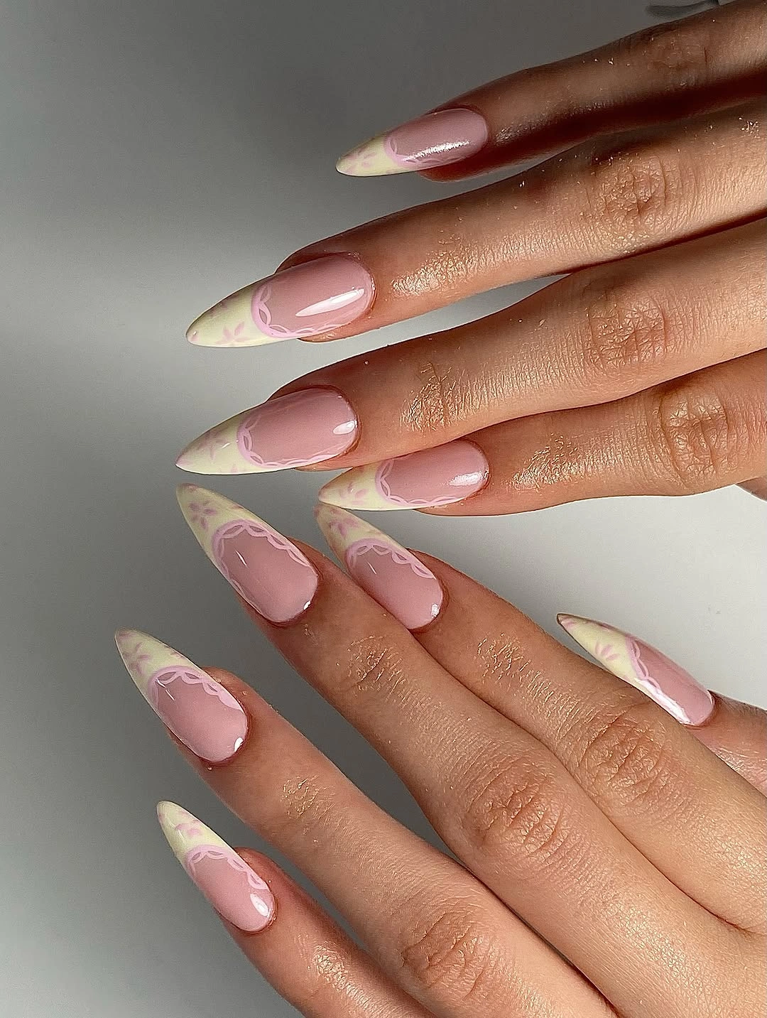
Pastel color can look scattered when each shade takes a different amount of space, so the shared curve is doing more organizational work than the palette. Keep the tips narrow and let the nude base remain visible; that contrast is what makes the three tones look intentional together. A shorter oval can use the same color rotation with thinner arcs, preserving the airy movement while reducing the visual length.
There is also a practical choice hidden inside the softness. Pale French lines show small uneven spots, especially on a long almond where the tip curves sharply, so a medium length can make the manicure easier to keep neat. If one shade feels too sweet for fall, replace only the yellow with a muted gold or caramel while leaving the blue, pink, and curved placement unchanged.
Metallic Geometry Layers Pink and Lilac
Long coffin nails combine translucent pink and lilac surfaces with stacked metallic-looking bands and square geometric accents. The reflective details sit in distinct strips, creating a layered structure that can be read from a distance as a clean vertical arrangement. Soft base colors keep the geometry from becoming severe, while the straight coffin sides give the bands a clear frame.
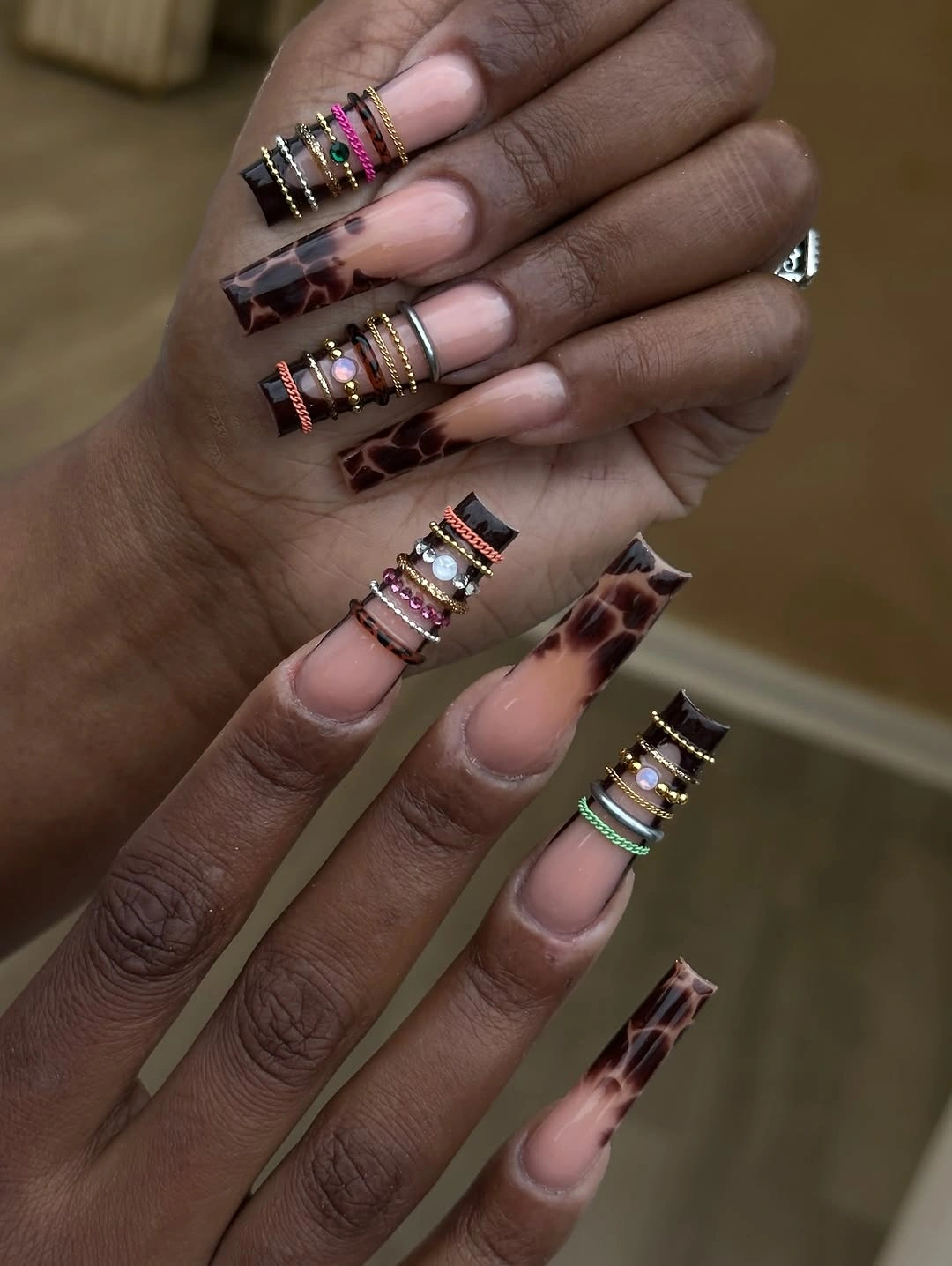
What makes the design feel considered is the spacing between the bands. The metallic-looking pieces do not cover every millimeter, so the pink and lilac remain part of the composition instead of disappearing beneath the decoration. If you adapt the idea to a medium coffin, keep one stacked section on two nails and use a single narrow band elsewhere; the repeated line will be enough to connect the set.
Layered details can catch on fabric or draw attention to small changes at the edge, which is a realistic limit for a very long shape. A shorter length gives the geometry a more stable platform and makes the overall effect easier to pair with rings. Keep the color family close, because adding several bright shades would compete with the reflective bands that already supply the visual complexity.
Colorful Stiletto Accents Find Order in Length
Very long stiletto nails mix orange, olive, white, and purple surfaces with small metallic-looking charms on selected fingers. The palette is intentionally varied, yet the repeated pointed silhouette gives the hand a strong visual spine. Each color can act as its own accent because the length and taper are shared, which stops the set from feeling like unrelated samples placed together.
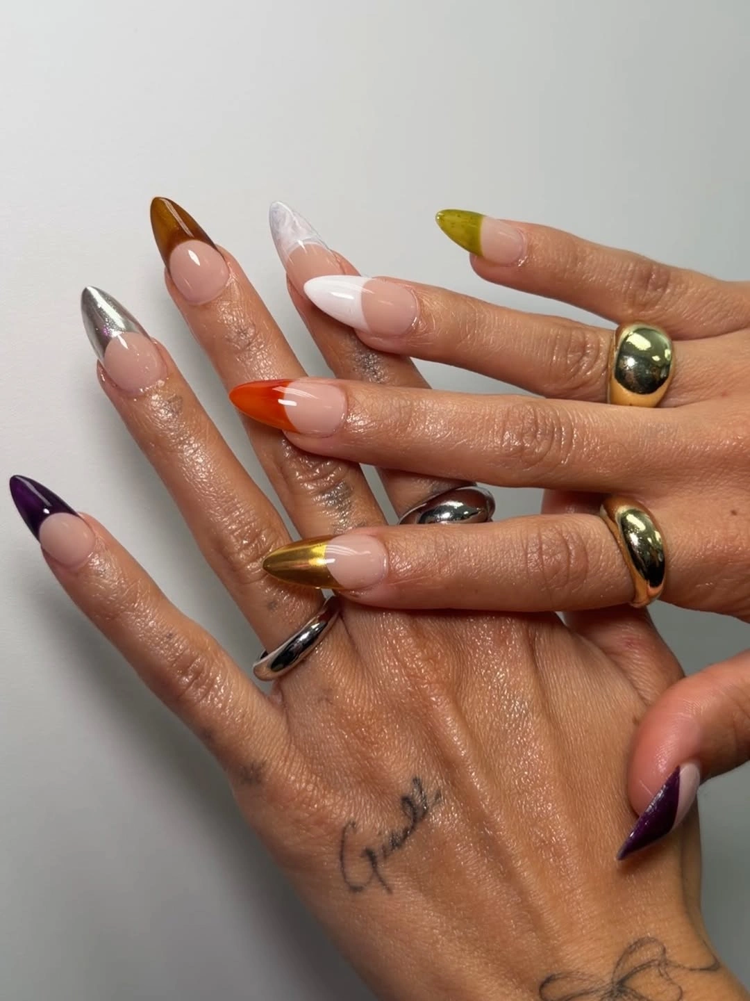
The metallic details work best as pauses between the solid color fields. They are small enough to guide the eye without becoming a second dominant palette, while the orange, olive, white, and purple remain the main story. For a more practical edit, choose two base colors, keep one charm, and move to a shorter almond; you will still have the deliberate contrast but less competition between fingers.
A mixed set benefits from an honest decision about how much variety the hand can carry. Very long points already command attention, so adding a new color on every nail can make outfit pairing more difficult and make small chips look unrelated. If the full version appeals to you, keep the accessories simple; if you prefer an easier background, let one color repeat on three nails and use the remaining shades as controlled accents.
Small Graphics Give Short Nails Personality
Short rounded nails alternate pink, white, black, and lilac with polka dots, curved stripes, and tiny graphic motifs. Each nail has its own small event, but the compact surface keeps the decoration from sprawling. The repeated palette provides enough connection for the set to feel playful rather than random, and the rounded shape softens the contrast between dark marks and pale color.
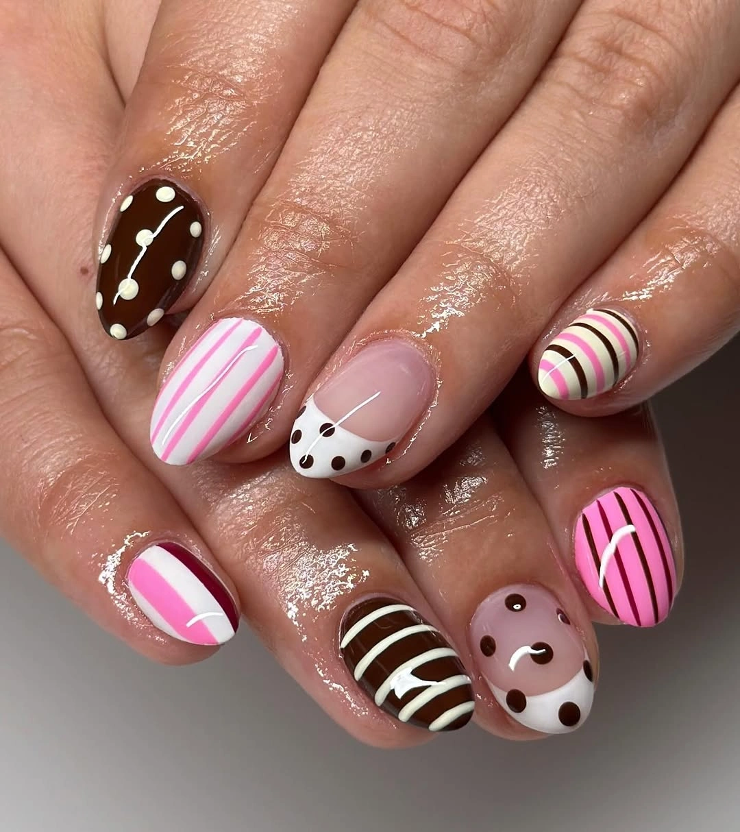
The easiest way to borrow this idea is to choose a small vocabulary of marks, not to copy every motif. One dot nail, one stripe nail, and one animal-like accent can establish the same energy while plain pink or lilac gives the hand room to rest. A compact nail actually helps here because a small graphic reads as a deliberate stamp instead of an unfinished large illustration.
Short length does not remove maintenance, it simply changes what becomes visible. Tiny marks can blur or chip at the front edge, so keep lines bold enough to remain clear and avoid placing the most detailed element where it will meet constant contact. If the palette feels too youthful, swap lilac for a dusty mauve or black for a deep brown while keeping the playful mix of dots, stripes, and negative space.
Gold Edges Warm a Peach Stiletto
Long stiletto nails use a translucent peach base with white and gold French sections, tiny gold bands, and one darker accent nail. The peach keeps the look warm and light, while gold traces the tip and selected side edges like a fine border. That placement gives the pointed silhouette definition without covering the full surface in metallic color.
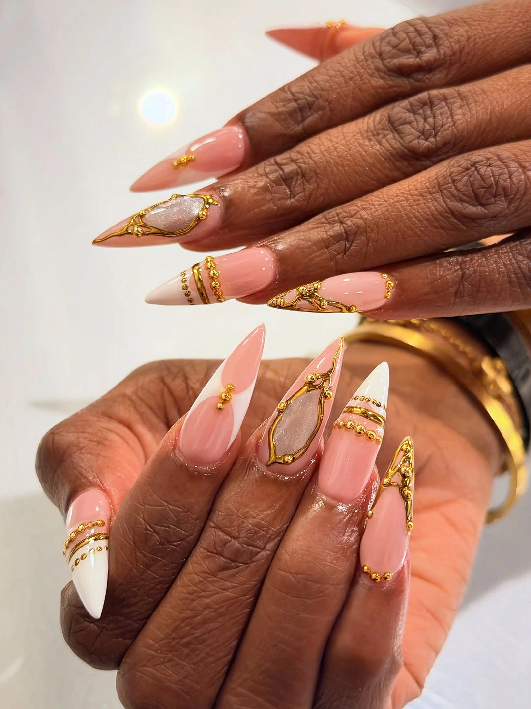
Gold is doing two jobs here: it adds a reflective note, and it visually separates the pale peach from the white. The effect stays refined because the metallic detail is narrow and repeated in a few strategic places rather than scattered. For a medium almond version, keep the gold on two nails and use a plain peach or white French on the others so the contrast remains visible but easier to maintain.
The darker accent nail is useful as a counterweight, yet it should remain isolated if the goal is a light fall manicure. Too many dark additions would change the center of gravity and compete with the gold border. Keep the pointed end even, avoid extending tiny bands into the most exposed corners, and let the warm base remain the first impression rather than treating every accent as equally important.
Black Tips Become Softer With Gold Lines
Long almond nails have sheer nude centers, black curved French tips, and thin gold outlining along parts of the edge. The black creates a strong graphic boundary, while the metallic line adds a narrow flash that keeps the tip from feeling severe. Because the base remains open and pale, the set looks defined without becoming a full dark manicure.
The relationship between line weights is important. Black supplies the main shape and gold stays secondary, so the outline should remain narrow enough that it supports the curve rather than replacing it. A shorter oval is a natural adaptation: the black tip can be slimmer, the gold can appear on only two nails, and the transparent center will still carry the same contrast.
Dark French edges show unevenness as the nail grows, especially when the curve is wide or the almond point is sharp. Choose a length that matches how often you can refresh the edge, and keep rings or other strong accents from crowding the visual boundary. This is one of those styles where a simpler line is more convincing than a complicated one because the clean arc is the actual focal point.
Neon Pink Tips Leave the Nude Base Breathing
Long coffin nails use a nude-pink base and vivid hot-pink tip blocks, with small black-and-white graphic details on selected fingers. The fluorescent color is concentrated at the front, so the neutral body gives the eye a break between the hand and the tip. That division lets the manicure feel bold and current without turning every surface into a bright field.
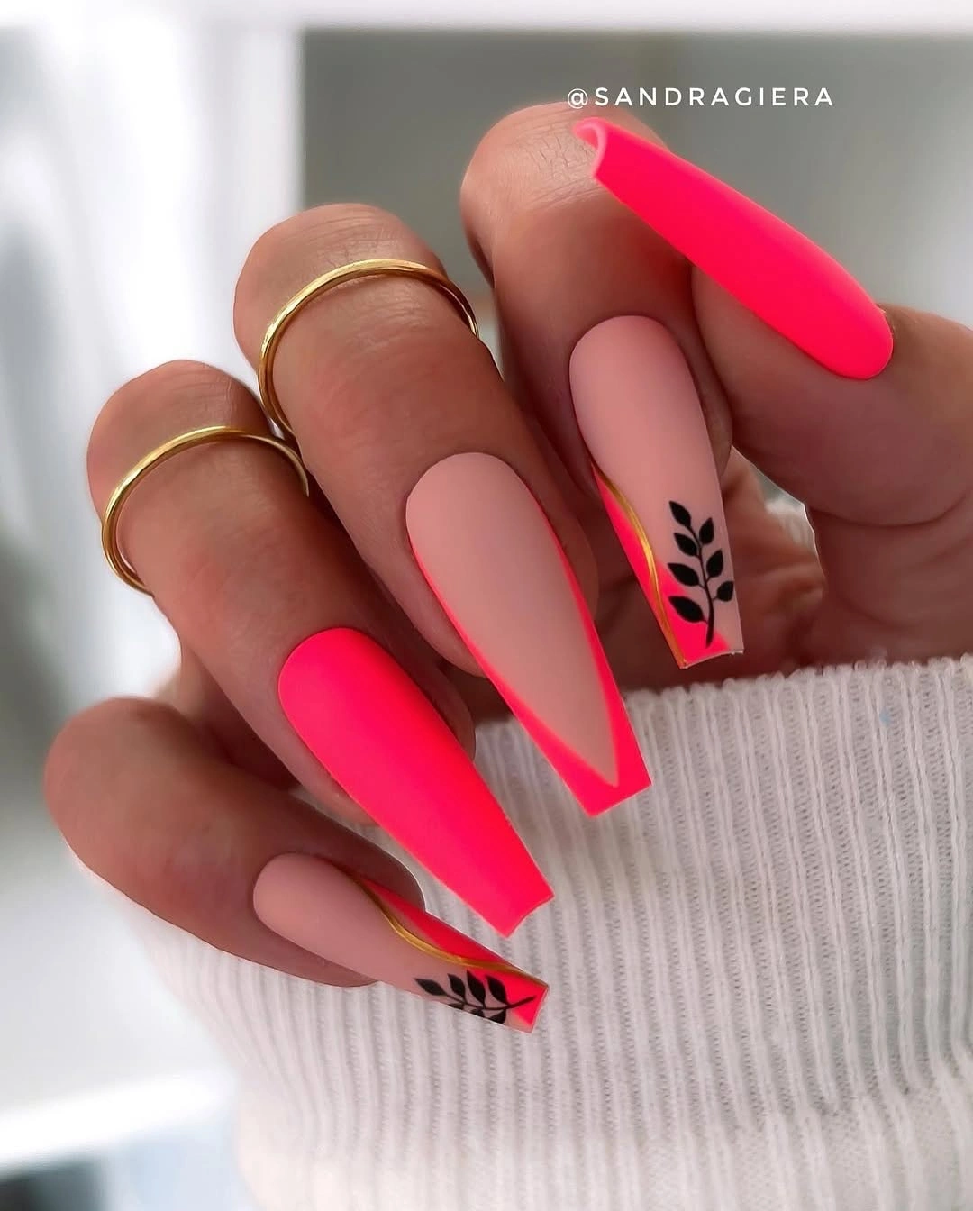
The tip blocks are strong enough to stand alone, which means the tiny graphic marks should remain supportive rather than become a second headline. If you want the idea in a more wearable proportion, keep neon on the index and ring fingers and use a thin hot-pink French on the others. The nude base will continue to connect the set even after the largest accents are reduced.
Hot pink at the free edge is visually demanding because the color exposes chips and any uneven corner. A shorter coffin helps, and a clean block is easier to touch up than a scattered pattern. Keep the black and white details where the tip is widest, then let the corners stay simple; a little empty space will make the fluorescent color look more expensive and less hurried.
One Reflective Accent Changes Glossy Black
Short-to-medium rounded nails are glossy black, with one pale reflective cluster that reads like a small jewel beside the solid set. The dark surface does not need a pattern because its shine already creates variation, while the light accent provides a single clear point of attention. This is a useful way to make a one-color manicure feel designed without losing its clean, low-noise quality.
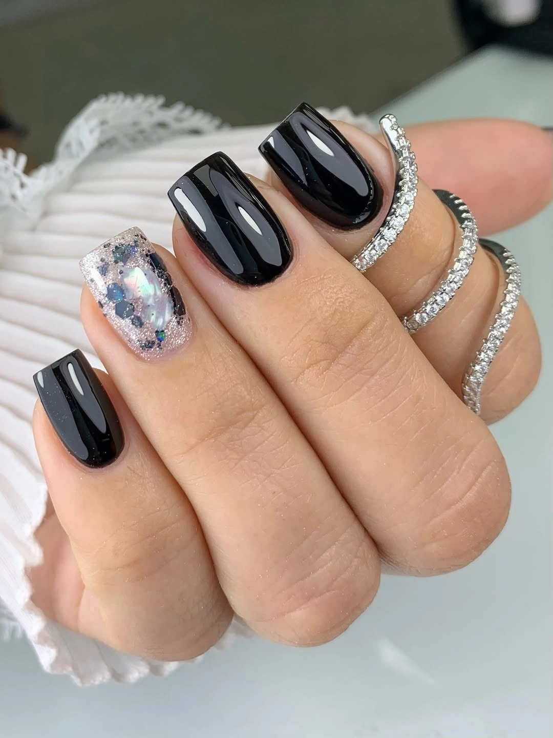
The contrast works through scale as much as color. One light cluster feels special precisely because the other nails remain uninterrupted black, and the rounded shape keeps the dark polish from looking harsh. If you prefer less decoration, place a smaller reflective detail on one hand only; if you want more emphasis, enlarge the accent slightly rather than adding several unrelated motifs.
Short length makes the style practical, but black still makes surface flaws visible under direct light. A smooth finish and tidy cuticle line matter more than adding another shade, especially because the reflective accent already creates a point where the eye will inspect the hand. Keep the silhouette rounded and the accent isolated, and the manicure can sit easily beside both casual knitwear and dressier accessories.
Pale Plaid Finds a Deep Burgundy Anchor
Medium rounded nails use pale nude and blush bases with fine lilac and burgundy plaid lines, while one nail carries a deeper glossy burgundy. The grid is delicate, but the single dark nail gives it a visible anchor. Because burgundy appears inside the lines as well as in the solid accent, the set feels connected even though the pattern is lighter and more detailed than the surrounding surfaces.
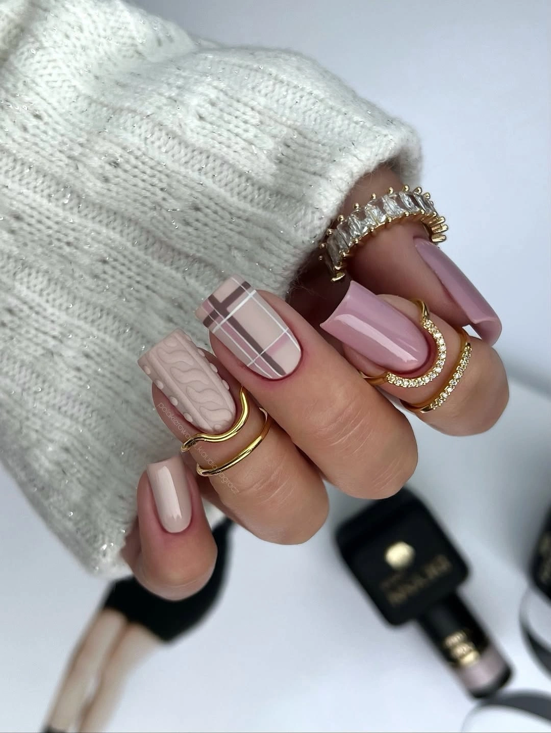
Thin lines need enough space to remain separate, which is why the rounded medium length suits the idea. Keep the plaid on two or three nails and let the rest stay sheer or softly blushed; the accent color will still pull the set together. If you want the grid to feel more autumnal, deepen the burgundy rather than adding orange or brown, since the quiet contrast is what makes the plaid look refined.
There is a maintenance tradeoff in any fine grid. As the nail grows, the lines can look off-center, and chips are more obvious when several colors meet at the tip. A shorter round shape helps, as does limiting the pattern to a few fingers. Let the solid burgundy nail carry the strongest statement, because the plaid should support the hand rather than turn every finger into a separate focal point.
Bright Aqua Lets a Square Shape Look Clean
Medium square nails are painted a vivid aqua or turquoise blue with a smooth glossy surface and little visible decoration. The color is strong enough to carry the manicure on its own, while the short square shape keeps it neat rather than theatrical. There is a useful confidence in that restraint: one saturated shade can feel trend-led when the silhouette and finish are both clear.
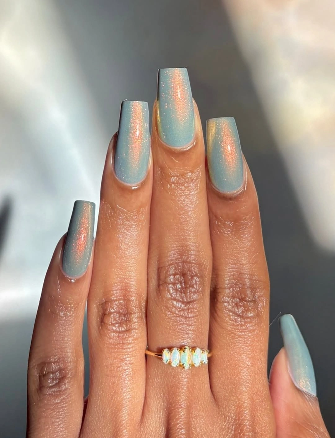
The straight ends make the aqua look more graphic than it would on a very rounded nail, and the shine keeps the surface lively without adding another color. If you want to soften the brightness for fall, pair aqua on two nails with a neutral cream or pale taupe on the rest. The important choice is to keep the aqua visible as a focused accent, not to bury it under competing art.
A single vivid polish is also easy to assess as it wears, so keep the length moderate and the front edge even. That makes touch-ups less conspicuous and gives the color a tidy frame. Compared with busier ideas in fall nail art, this approach is more useful when clothes, jewelry, or a patterned coat already provide enough visual information.
Green Edge Detail Outlines Milky White
Medium oval nails carry a milky white base with thin olive or metallic green edging near the tips and sides. The green line is narrow enough to frame the pale surface without filling it, and the oval shape keeps the outline soft rather than architectural. This is a quiet color idea with a clear detail, which makes it easier to wear than a full green set while still avoiding a plain white manicure.
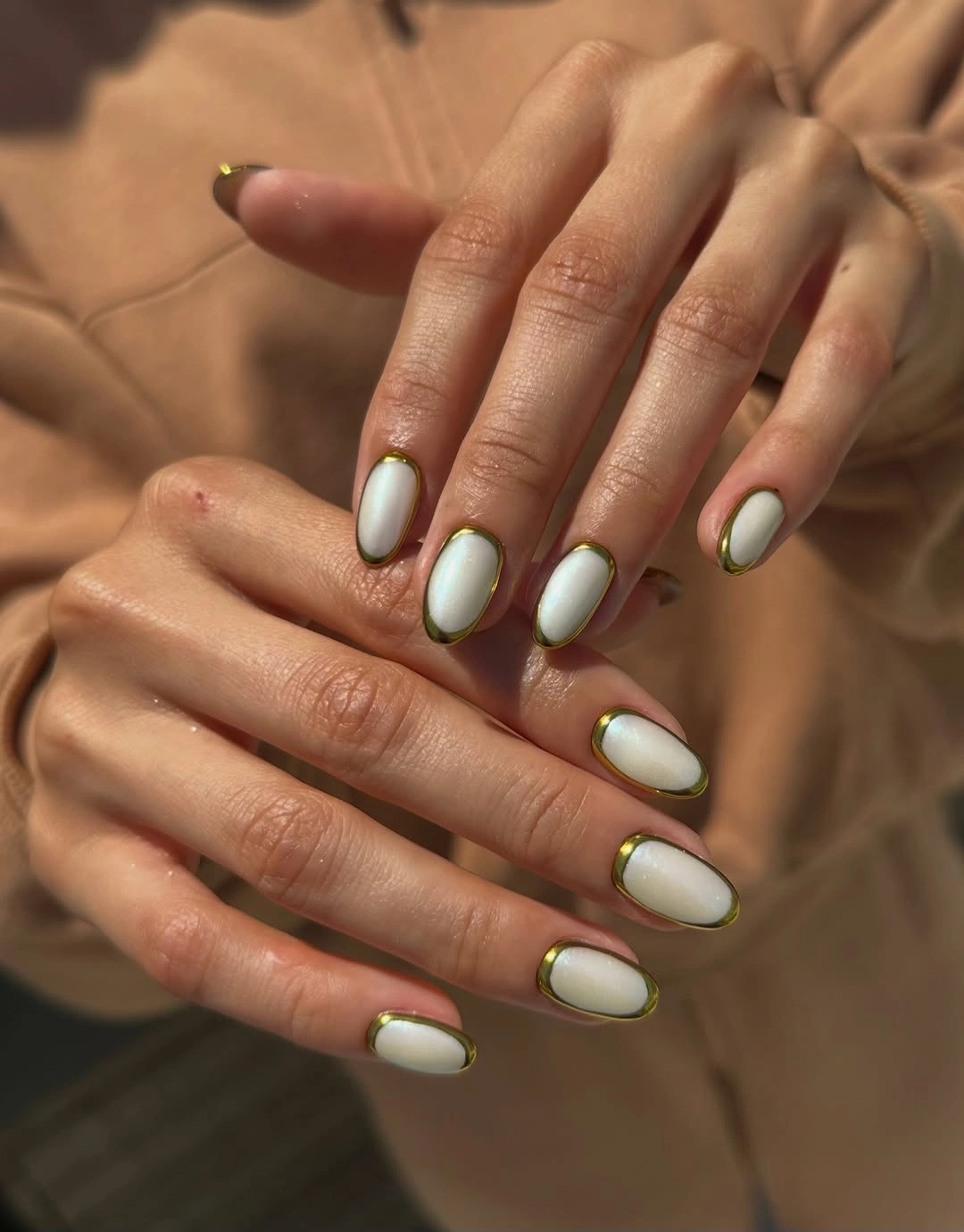
The center of each nail remains the calmest area, so the eye follows the green perimeter before returning to the milky base. That relationship can be adapted with a single green crescent on the big fingers or with alternating edge placement if a full outline feels too precise. Keep the green close to an olive or muted metallic family when you want the look to feel grounded rather than fluorescent.
Edge work rewards a consistent shape, since any change in the oval will alter the line around it. A shorter oval makes the detail easier to redraw and keeps the pale base from showing a distracting gap as it grows. If the green begins to dominate, reduce the width of the line before changing the color; the manicure depends on the idea of a border, not on a large green surface.
Lavender Keeps Tiny Dark Marks Gentle
Short rounded nails show a soft pink-lavender base with tiny dark or metallic marks near selected tips and edges. The small length lets the pale color remain the main event, while the little accents act as punctuation rather than a full pattern. It is a restrained version of nail art that still has enough asymmetry to feel current and personal.
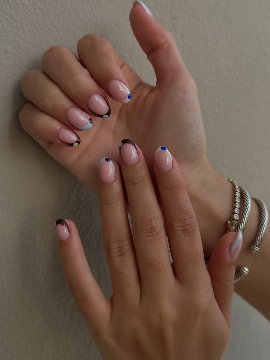
The marks are most effective when they are given room around them. A small dot, line, or edge trace can sharpen the shape, but several tiny details packed together would blur against the pale base and make the manicure look busier than intended. Keep accents on two or three nails and let the remaining fingers use the same lavender surface so the contrast stays measured.
Short nails are practical, but small marks close to the tip can disappear or chip sooner than a solid color. Use a slightly stronger dark value if the accents need to remain visible, and keep the base smooth enough that the eye can distinguish each mark. For a seasonal shift, a dusty mauve base will make the same dark details feel warmer without changing the compact, low-maintenance proportion.
Blue Lavender Chrome Moves With the Light
Long almond nails carry a smooth reflective finish that shifts between icy blue, lavender, and pale pink across the curved surface. There is no heavy motif to interrupt the color movement, so the almond silhouette becomes a continuous reflective plane. The finish feels trend-aware through its changing tone rather than through a printed pattern, which keeps the set visually clean even at a longer length.
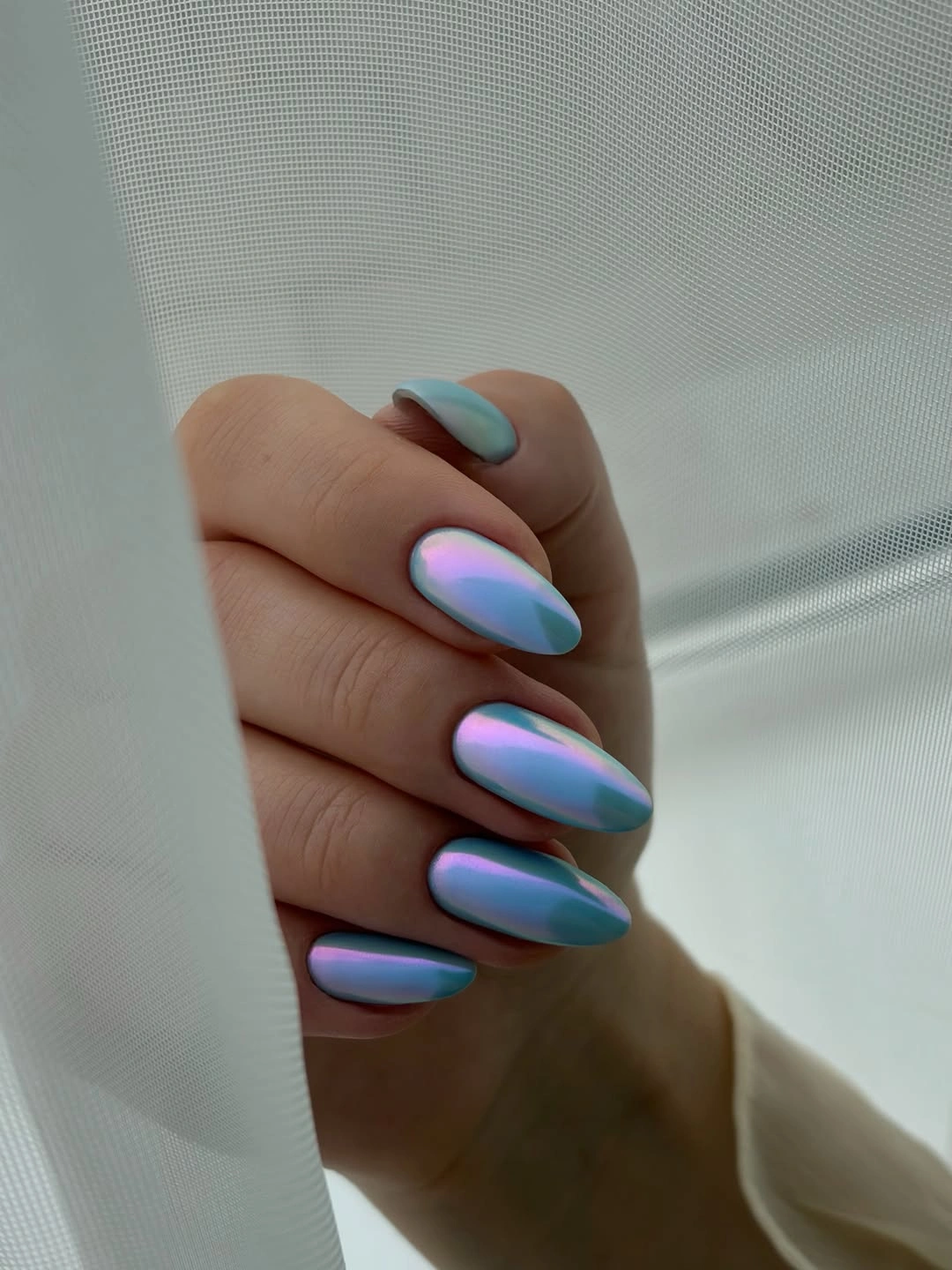
The color change is easiest to appreciate when the nails have room to curve, since the reflective surface creates different highlights across each finger. A medium almond will still show the shift while reducing the leverage and upkeep of a very long point. If you want more definition, strengthen the blue at the tip or keep one nail slightly lighter, but avoid adding line art that would interrupt the smooth transition.
Reflective finishes are sensitive to lighting, so the manicure may look softer indoors and more colorful in direct sun. That is part of the appeal, but it also means the set should be chosen for the mood you want rather than a single screenshot-like moment. Keep clothing and jewelry relatively simple if you want the cool gradient to remain visible, especially around the curved tips.
Neon Green Tips Get a Pink Pause
Long almond nails use bright chartreuse or neon green tip areas with pink edging or inner accents, and one nail carries a small raised flower-like detail. The fluorescent color sits at the front, while the sheer base gives it room to read as an accent instead of a full neon block. Pink makes the green feel playful and connected, but the small flower should remain isolated so the tip palette does not become crowded.
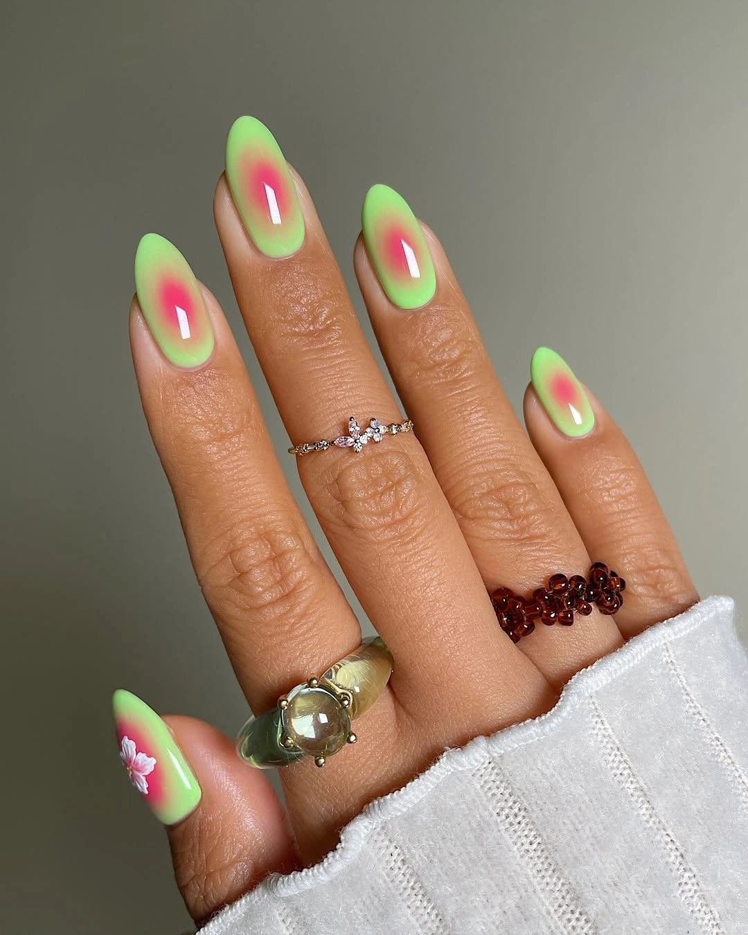
The shape gives the bright color a graceful boundary, which is why the idea feels more edited than a solid fluorescent set. A narrow French edge will preserve the contrast for a shorter nail, and one flower-like accent can still suggest the playful mood without repeating texture on every finger. If the green feels too sharp for your wardrobe, shift it toward chartreuse and keep the pink closer to a soft coral.
Neon shades show wear clearly, especially at the front where the color is concentrated, and raised details can add a snagging risk. Choose the shortest length that still gives the tip room to breathe, then let the base remain quiet. The tradeoff is worthwhile when you want a bright focal point, but it is less useful as a background manicure for a week full of high-contact tasks.
Illustrated Stiletto Tips Make Maximal Art Legible
Very long stiletto nails combine nude, red, blue, black, and orange surfaces with visible character-like graphics and tiger-like striping. The artwork changes from nail to nail, but dark outlines and the repeated pointed silhouette connect the set. This is maximal styling by design: the eye travels between color blocks and small illustrated details rather than settling on one quiet focal point.
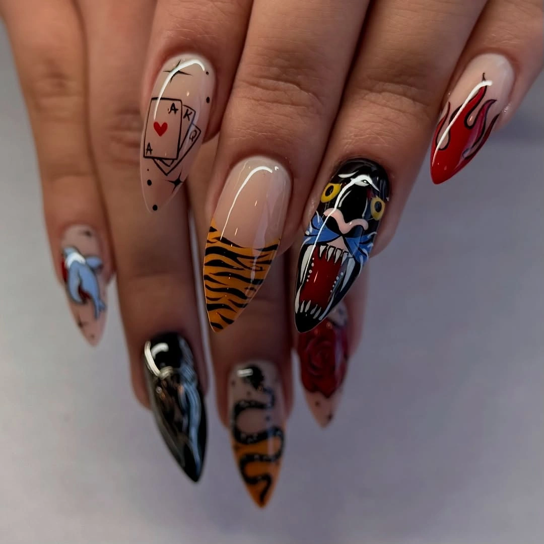
Solid color blocks are what keep the illustrations from collapsing into noise. They give each graphic a boundary and allow the red, blue, orange, and black accents to read as separate decisions. If you want the spirit without the full density, choose one illustrated nail, use one supporting color on two fingers, and leave the remaining nails nude or softly outlined.
Maximal art also needs the most honest maintenance plan because grow-out changes the relationship between the graphic and the pointed shape. A shorter stiletto or almond can make the artwork more durable visually, while simplifying the smallest details will help them stay readable. Keep accessories quieter when wearing the full set; the nails already provide enough pattern and movement to lead the look.
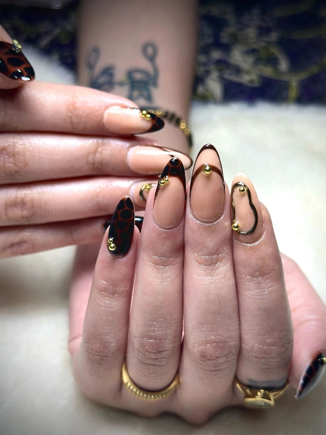
Tortoiseshell Warmth Meets Selective Gold
Long almond nails mix translucent amber, brown, and black tortoiseshell-like swirls with glossy gold-looking accents. The warm layers show through one another, while the metallic details sit on top as small points of focus. Because the palette stays within brown, amber, black, and gold, the design feels rich without relying on a bright contrast or a separate seasonal symbol.
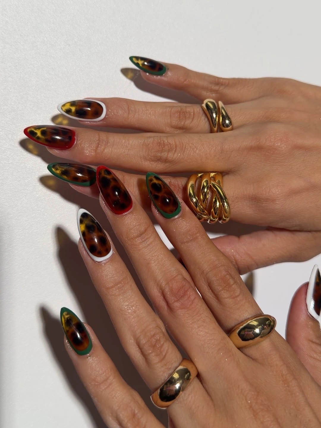
The translucent color variation gives each nail its own movement, so the gold should remain selective. Too many metallic marks would flatten the layered effect and turn the set into a general brown-and-gold manicure. Keep the pattern on three nails, use one gold accent, and let the remaining fingers carry a simpler brown or amber surface if you need a shorter, more wearable interpretation.
Warm translucent designs can be difficult to match exactly between nails, which is not necessarily a flaw here. The useful limitation is to keep the same depth range – pale amber, medium brown, and dark accents – even when the swirl placement changes. A medium almond will make the color easier to maintain and keep the gold detail from becoming the first thing noticed as the nails grow.
Coral to Cream Ombre Softens a Long Almond
Medium-to-long almond nails shift from creamy pale centers to coral and pink ends in a smooth glossy transition. The gradient follows the length rather than cutting across it, which makes the tip feel softly colored and lets the almond shape remain visible. Close warm shades keep the manicure cohesive, while the change in depth supplies enough detail for the set to feel more than a single solid polish.
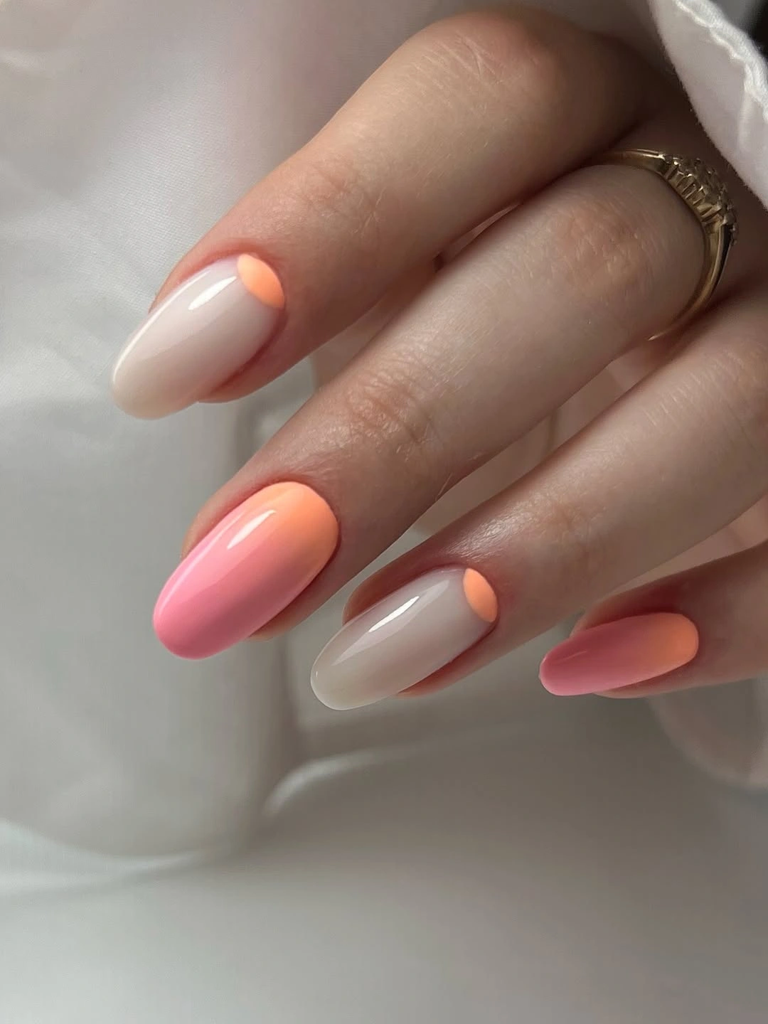
The smooth transition is the main feature, so additional art would only make the surface less clear. A medium oval or almond can preserve the same movement and make the pale grow-out area less noticeable, especially if the coral is concentrated near the front. If you want more fall weight, choose a muted terracotta-coral rather than adding a separate dark nail that would interrupt the gentle fade.
Ombre is forgiving of small color changes but not of a sudden hard line, so the most practical version is one with enough length for the transition to read. Keep the base and tip close in warmth, and let the gloss provide the final polish. This is an easy option when you want a trendy color story that can sit beside neutral clothing without demanding a matching outfit.
Pearly Pink Lets One Glitter Nail Lead
Short-to-medium rounded nails use a soft pearly pink or lilac finish with one more glittery or foil-like accent nail. Most fingers reflect light quietly, while the accent supplies a small burst of texture and stronger sparkle. The set feels finished because the base has its own surface interest; the glitter is an intentional interruption, not a rescue for a flat color.
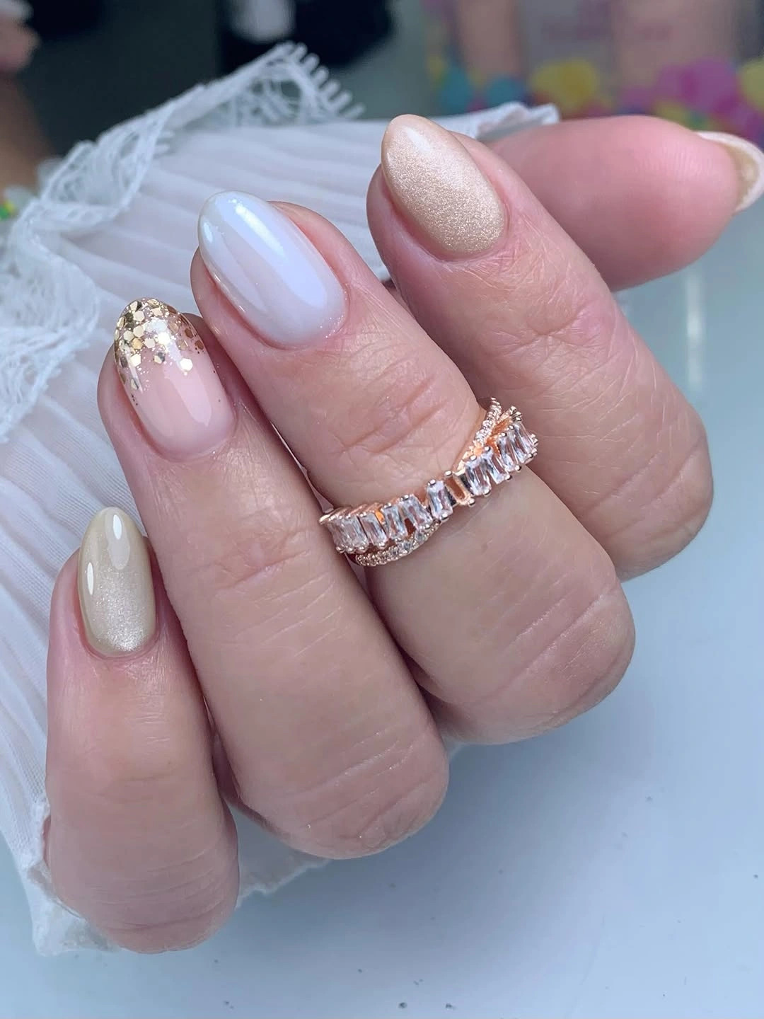
The balance comes from keeping the accent isolated. If every nail carried the same glitter, the soft pearly effect would disappear, but one textured surface gives the eye a place to pause and then return to the calmer fingers. A low-key adaptation can use one accent per hand or replace dense glitter with fine shimmer, keeping the compact rounded shape easy to wear.
Pearl finishes can change considerably under warm and cool lights, so choose the base for its undertone as much as for its sparkle. A pink-lilac surface will feel softer, while a brighter white pearl will look cleaner and more reflective beside the accent. Keep the nail length moderate and the glitter detail smooth at the edge; the idea is subtle contrast, not a textured surface that catches on everything.
Burgundy Solids Frame One Ornate Accent
Medium-to-long coffin nails combine glossy deep burgundy solids with one pale accent filled with bright floral-like and metallic details. The dark nails create a strong frame around the decorated finger, so the accent can be dense without spreading visual noise across the hand. Burgundy also repeats inside the pale design, helping the focal nail feel connected instead of pasted onto a different manicure.
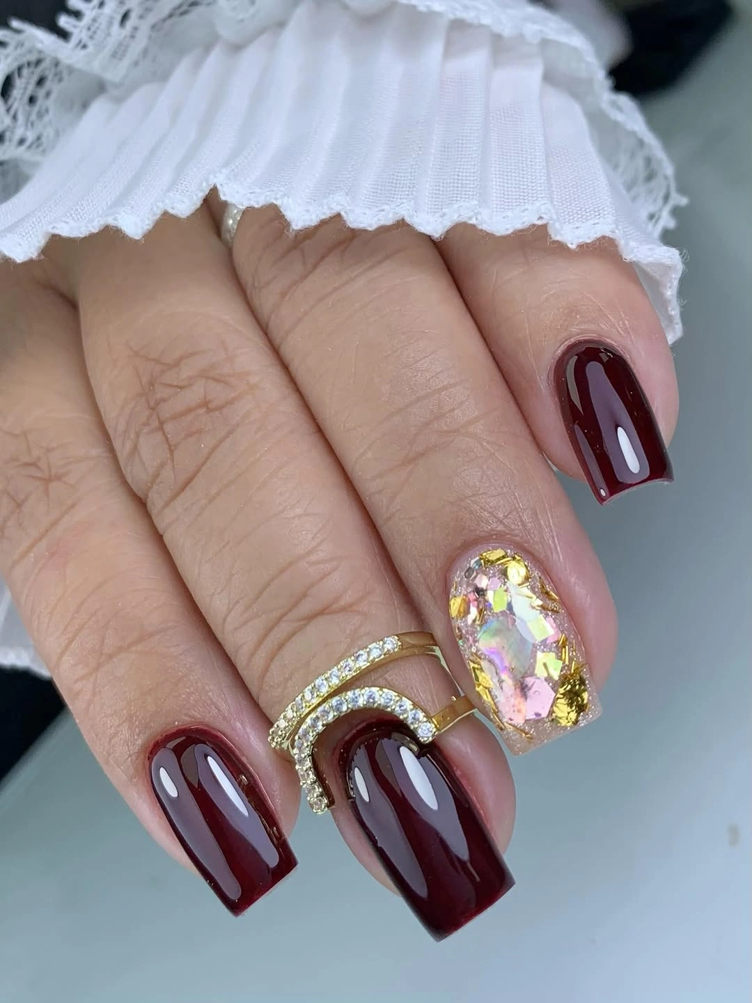
The visual hierarchy is clear: repeated burgundy first, pale decorated accent second, small bright marks third. Preserve that order if you edit the set by reducing the accent to two larger motifs or using a simpler cream base. The dark solids will continue to carry the manicure even when the detailed nail becomes more restrained, which makes this a useful approach for someone who wants art without five busy fingers.
Deep colors look polished when the surface is smooth, but they show chips at the corners, especially on a coffin shape. A shorter length can make the burgundy easier to maintain and give the accent more proportionate weight. Keep rings and other bright accessories considered rather than excessive; the ornate nail already supplies a focal point, and too many competing glints could flatten the hierarchy.
Blue Lavender Pink Fades Keep Almonds Cool
Long almond nails blend pale blue, lavender, and soft pink in a glossy gradient with no heavy motif. The colors meet gradually across curved surfaces, so the manicure has movement without line art, glitter, or visible blocks. The result feels light but not empty because each nail carries a quiet shift in tone that becomes more noticeable as the hand moves.
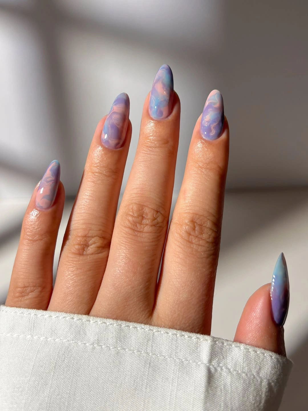
The cool palette is easiest to wear when one shade is allowed to lead. Let blue be strongest near the tip, lavender occupy the center, and pink soften the base, or reverse that order if your skin tone and clothing call for more warmth. A medium almond will preserve the gradient and make the shape less demanding, while a slightly stronger blue edge can help the colors remain visible on a shorter nail.
Gradients depend on light, so the manicure may look more blue in one room and more lilac in another; that variation is expected rather than a flaw. Keep the surface glossy and resist adding a separate motif unless the gradient truly needs help. Compared with the richer burgundy ideas in fall burgundy nails with design, this finish is the calmer choice when you want color interest that still behaves like a neutral background.