Fall square nails 2026 make a clear visual promise: the edge is part of the design, not just the finish. That is why small choices can feel unexpectedly consequential, from the way a line stops near a corner to the amount of open space that remains above it. A confident result comes from letting one precise decision govern the rest of the surface.
Choose the feeling of the free edge before choosing decoration. It may act as a crisp boundary, a soft interruption, or a quiet structural line, but it should not have to carry every idea at once. When the edge has a defined role, color and detail can support it; when it does not, even a small accent can make the shape feel less settled.
Dark Angled Lines Over Reflective Pink
The important move on these long pink square nails is the dark angled edging, not the reflective-looking center. Each narrow plum-black line creates a frame that shifts slightly across the nails, leaving the pink portions open enough to catch light. That contrast gives the manicure direction without covering the entire surface, and the square tips make every angled turn appear particularly deliberate.
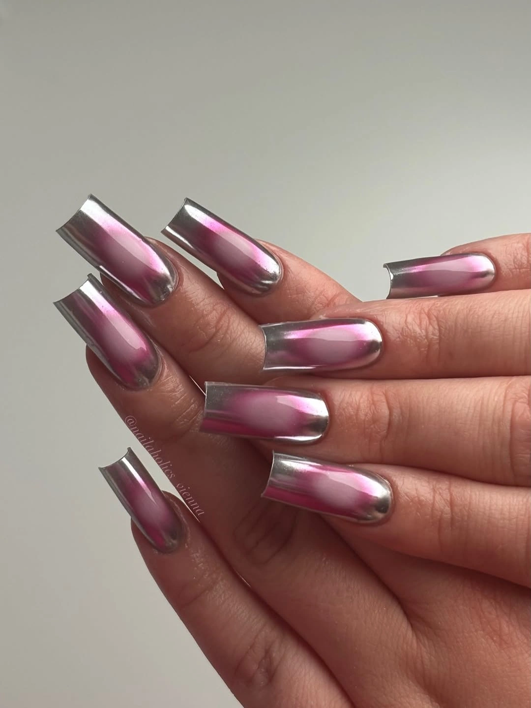
Keeping the dark detail near the outer portion of each nail lets the translucent pink remain the visual field. A shorter square shape could use one slim diagonal line per nail rather than several intersecting strokes, because the point is the edge interruption, not the number of marks. The most effective adaptation would preserve the unequal angles so the set does not become a rigid, repeated grid.
Notice how the dark outline creates separation between similar pink tones without introducing another bright color. That is why the reflective surface feels controlled rather than flashy. If the linework starts to feel too graphic, use deep brown instead of black-plum and move it closer to the tip; the square shape will still provide definition, but the contrast will sit at a lower visual volume.
Burgundy Blocks With Dark Patterned Interruptions
These long burgundy squares use near-black patterned accents as interruptions inside a mostly wine-colored manicure. The deep red remains the visual constant, while the darker nails add a compact change in texture and line. Because the accent stays within the same dark range, the set has depth without the scattered feeling that a third saturated color might introduce on such a prominent straight edge.
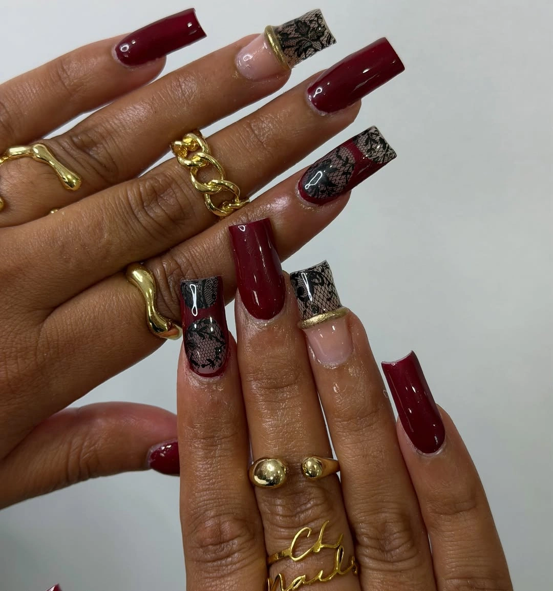
A pattern is more convincing here when it has a limited job: it should break up the burgundy, not replace it. One or two dark accents per hand would preserve the same structure for someone who prefers less contrast. The long square silhouette can carry a deep solid color easily, so the surrounding burgundy nails are not empty space; they are what allow the patterned ones to feel placed rather than random.
Try changing the amount of detail before changing the palette. Removing one patterned nail would make the burgundy read more luxurious in its simplicity, while adding more would shift the design toward a much busier look. The dark accents work because they echo the red’s depth, leaving the straight tips clean enough that the eye can still recognize the consistent shape from a distance.
White Motifs On A Pink Square Canvas
Pale pink square nails support several white patterned tips here, including spotted-looking marks, leaf-like forms, and small raised-looking gold details. The repeat of pink through the center prevents the white designs from drifting into separate themes. On a long length, that open pink space acts like a margin around each motif, so even the more decorative nails remain readable rather than becoming one dense field.
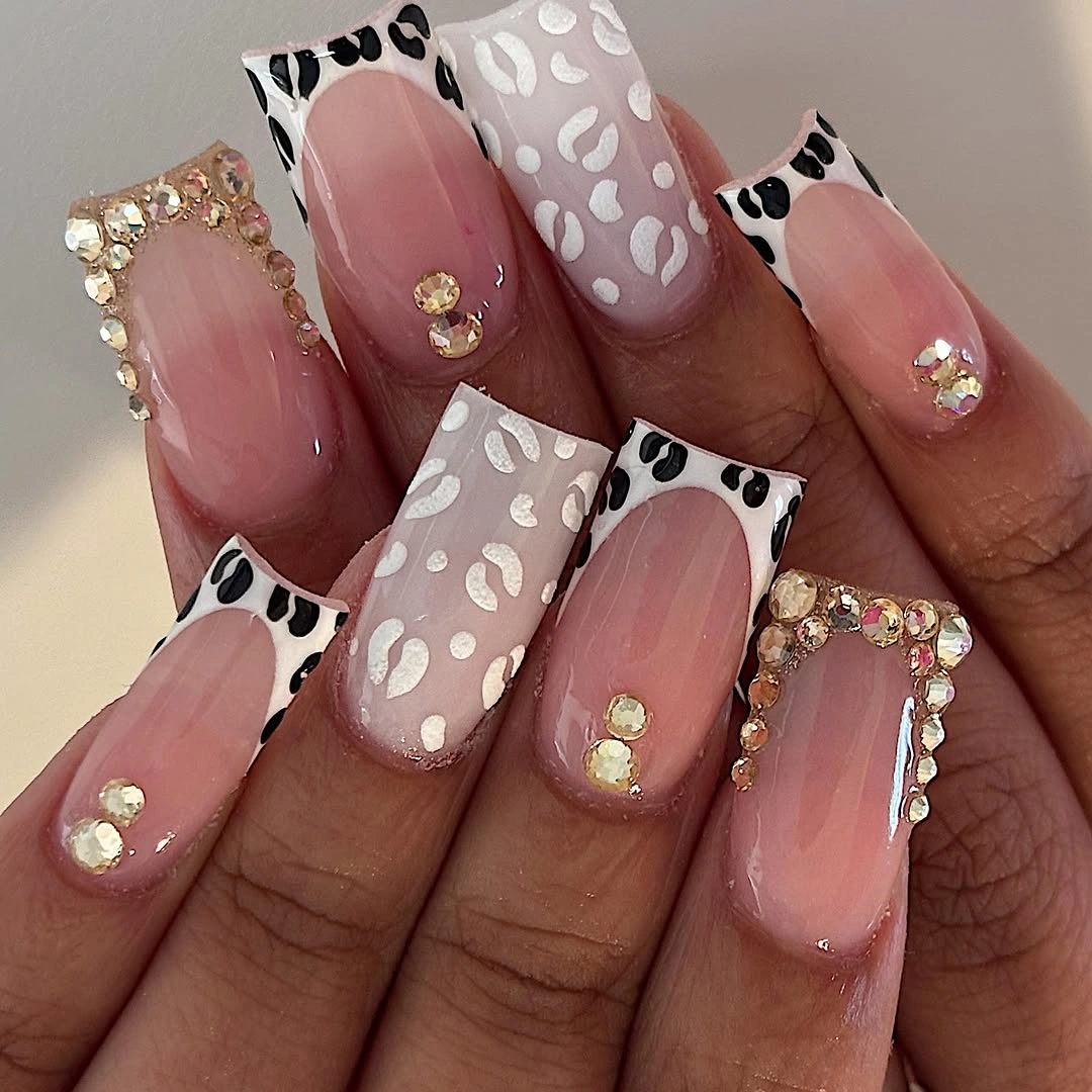
The design would lose clarity if every nail carried a different full-surface pattern. Its rhythm comes from alternating a detailed tip with a quieter pink area, then returning to white on another finger. For a more restrained version, keep just one white motif and one small gold-toned accent, allowing the squared silhouette itself to serve as the repeated visual element across the rest of the hand.
Length is doing practical work here because it creates room for the tips, the small details, and the pink base to coexist. On medium nails, reduce each motif to a single type and avoid stacking it with another border. The eye needs a clean edge around decorative work, especially when the nails already have a straight free edge that naturally makes every small difference look more measured.
Fine Black French Edges On Nude Squares
A narrow black line at the tip is the entire point of this nude square manicure. The dark edging traces the straight free edge without filling it, leaving the pale pink base visible through the center of every nail. That restraint makes the contrast feel tailored, and the medium length keeps the design crisp without relying on the exaggerated scale of a much longer square extension.
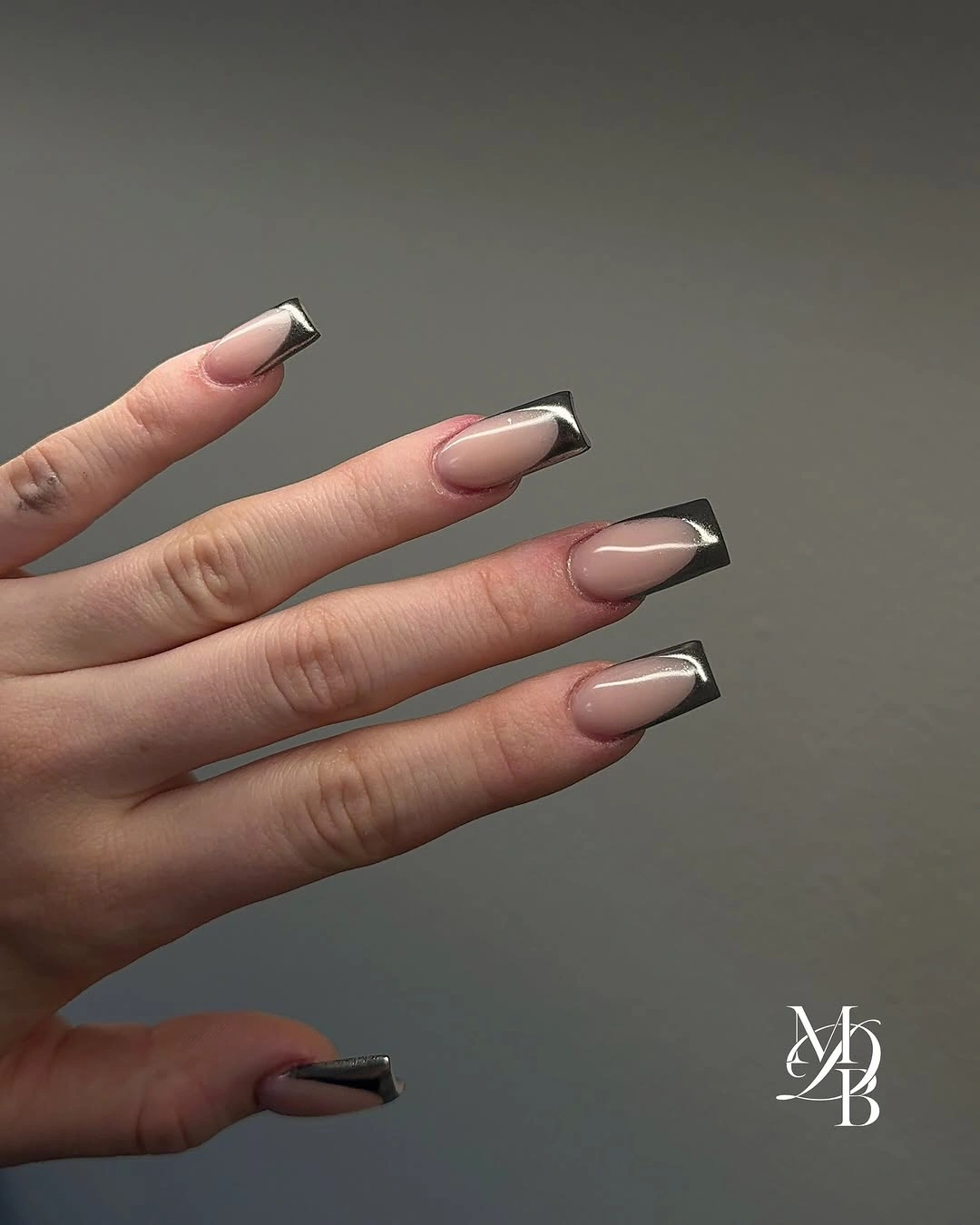
Tip thickness is the decision that matters most with this layout. A fine edge looks light and graphic, while a wider dark band would make the same nails feel heavier and more color-blocked. If you want to borrow the idea for shorter nails, use a soft curve or one tiny corner detail instead, because a full black line can take up a large share of the visible nail plate.
The nude base gives the dark tips their precision, so select a base tone that feels comfortable against your skin rather than treating any beige-pink as interchangeable. Nothing in the set needs an extra accent nail; the repeated black edge already supplies continuity. Keeping the line neat is the honest limitation, since even small variations become noticeable when there is so little else on the surface to distract from them.
Warm Brown Waves Across Square Nails
Warm brown wave-like lines move over translucent nude square nails in this abstract design, turning a straight outline into something softer. The brown appears in different paths rather than identical swirls, but the color stays consistent enough to connect the nails. That controlled variation is what keeps the art from feeling arbitrary: the curves offer movement, while the brown palette keeps the overall impression rooted and calm.
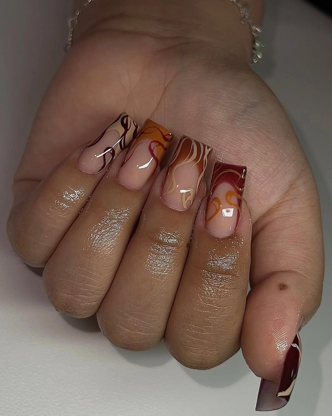
The best feature is the open space around the waves. Each nail has room for a curve to breathe, which makes the pattern feel lighter than a fully filled brown surface. A simpler interpretation could place one brown curve near the tip of two nails and leave the rest plain nude. That edit would keep the softening effect without asking a short square nail to carry several overlapping lines.
Brown suits fall square nails particularly well when it is allowed to act as a line instead of an all-over block. The warm tone has enough presence to define the edge, yet the translucent areas prevent it from becoming visually heavy. If you add another color, it should be a quiet cream or muted tan; a bright accent would interrupt the gentle rhythm that the repeated brown curves have already established.
Gray Blue With A Narrow White Finish
Muted gray-blue gives these medium square nails a cooler base, and the small white French tips provide just enough edge definition to keep the color from appearing flat. The white does not cover the tip broadly; it sits like a slim final stroke along the straight line. That limited contrast allows the soft blue-gray to remain the main color while still giving each nail a clean point of resolution.
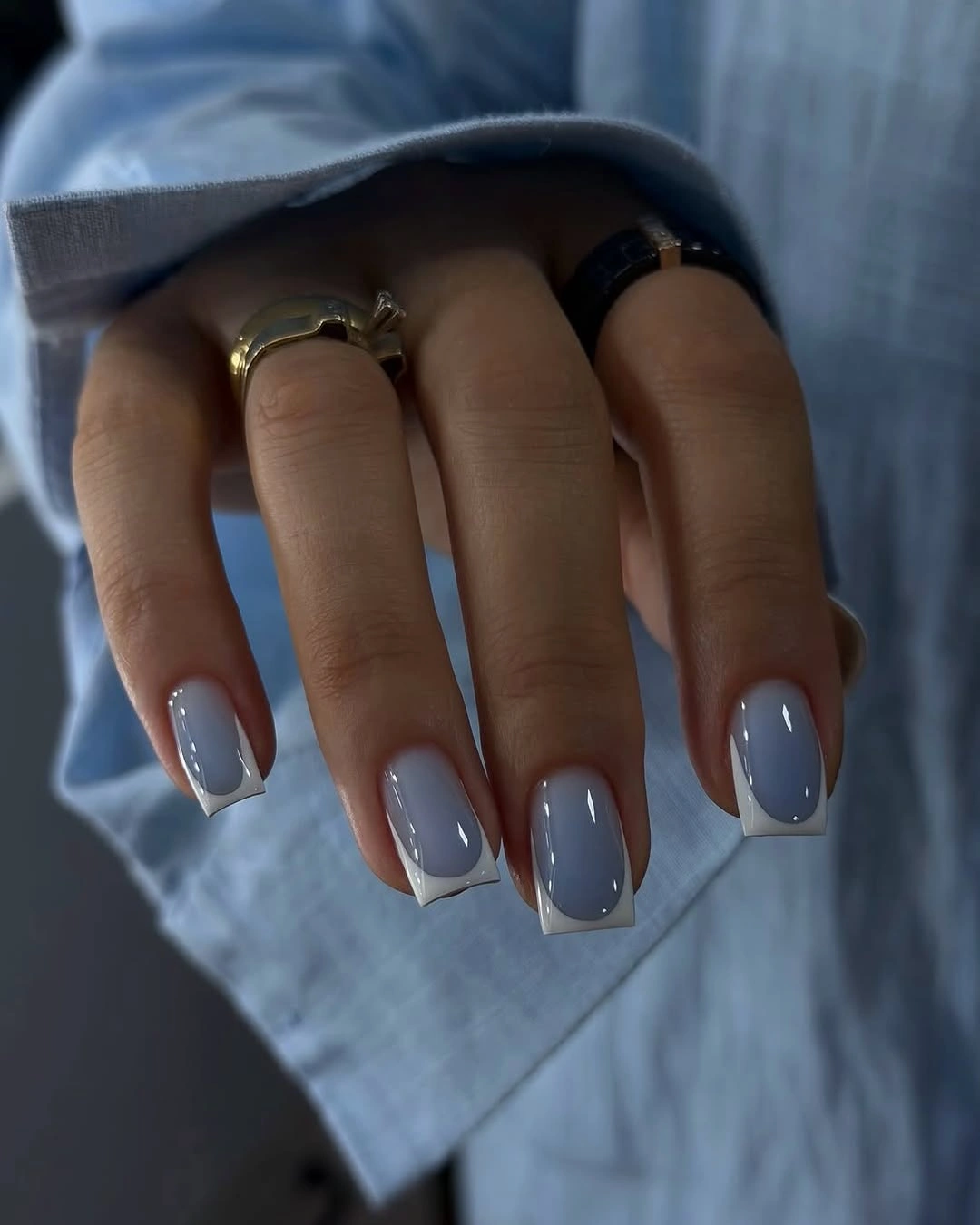
The combination works because the white has a precise, repeated placement and the base color is subdued. A bright blue would make the same white tip more sporty, but this gray-blue version feels gentler and more seasonal. For related undertone choices, compare fall color ideas before deciding how bright the base should be.
Consider this a useful option when a neutral feels too quiet but a deep fall shade feels too heavy. The soft blue gives more personality than beige without requiring artwork, and the white edge adds a controlled detail. Leaving every nail otherwise plain is important: a dotted accent or glitter nail would compete with the fine tip line and dilute the careful contrast that makes the design feel considered.
Chocolate Squares Marked By Small Curves
Dark chocolate brown covers most of these short square nails, while a few fine gold-toned curved outlines interrupt the solid color. The detail is small enough that the rich brown still dominates, which is exactly why the manicure feels composed. Short length gives the lines a compact role; they behave like punctuation along the surface instead of trying to become a large ornamental pattern.
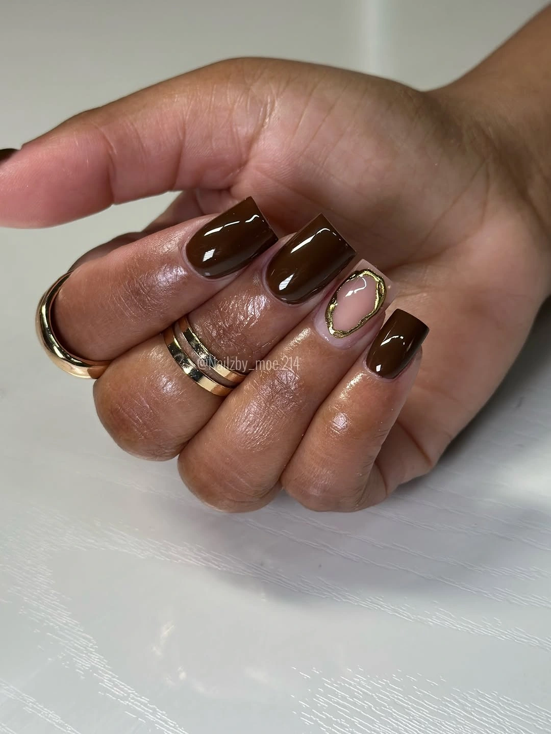
A dark one-color set often needs no accent at all, but a tiny curve can change the mood without making it ornate. Keep such details to one or two nails and let them follow the existing shape rather than crossing the entire nail. For a lower-contrast take, choose a pale beige line over brown instead of a brighter metallic-looking note, especially if rings or other accessories already add shine nearby.
The tradeoff is scale: lines that look refined on a short square nail can quickly become crowded when doubled or stacked. This design succeeds because the brown surface remains broad and uninterrupted around each accent. If the aim is a more graphic version, use a single wider cream curve rather than several small ones, so the detail still respects the limited room offered by the short free edge.
Burgundy And Pink Panels With White Details
Glossy burgundy, translucent pink panels, and small white decorative marks create a layered long square manicure with more than one focal point. The detail does not collapse because burgundy reappears as a dark boundary on different nails, linking the pink areas to the deeper solid color. The white accents remain small, which prevents them from competing with the larger color blocks and keeps the composition readable.
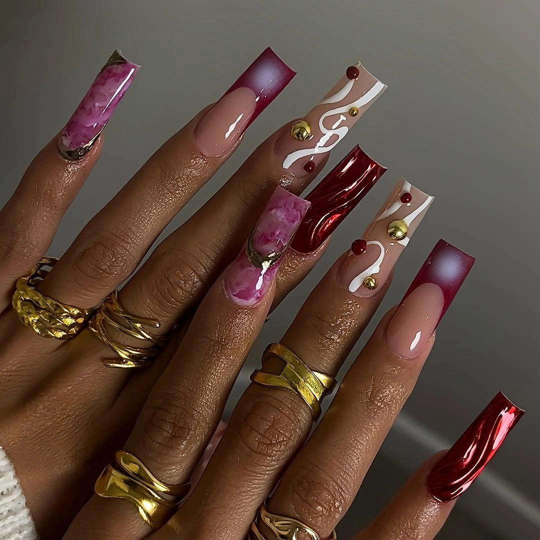
For an adaptation, decide first whether the burgundy block or the pink panel is the part you want to preserve. Keeping both is bold, but the white marks can be omitted with little loss because the dark-and-light color contrast already provides plenty of movement. A medium square nail would benefit from fewer panels, perhaps one burgundy tip and one translucent pink accent, rather than several segmented sections.
The design is strongest where a dark burgundy line visibly repeats near a lighter area. That echo stops the mixed elements from looking borrowed from separate manicures. Avoid introducing a fourth hue, since the existing white, pink, and burgundy each have a clear role: light detail, open base, and concentrated depth. Once those roles are distinct, the square edge can remain clean instead of becoming another place for ornament.
Burgundy Tips With Spotted Accent Blocks
Pale pink square nails receive deep burgundy curved tips, while neighboring white and yellow accent nails use small dark spots. The visible connection is not the exact pattern but the repeated dark marks, which echo the burgundy edge across the set. That repetition gives the varied accents a reason to sit together, even though the yellow and white portions bring a much lighter, more playful contrast.
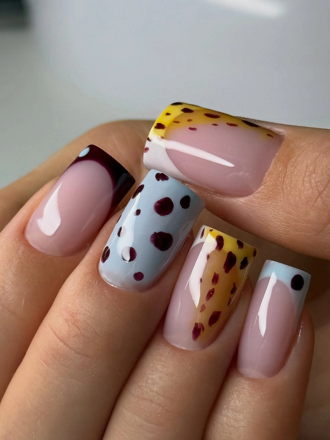
Separate the idea into two possible directions before trying to reproduce it. Burgundy tips alone make a strong fall manicure, while spotted accent blocks make a more playful one; using both produces the fuller version seen here. On a shorter square shape, choose one spotted nail and let the curved burgundy tip appear on the remaining nails, so the base space remains visible and the pattern does not overwhelm the straight edge.
What holds the design together is placement, not a perfect match between the accent colors. The dark marks are small, and the burgundy returns often enough to anchor them. If the yellow feels too bright, replace it with cream or muted tan rather than adding more burgundy; that change keeps the light-dark contrast while allowing the tips to stay the main seasonal note on the hand.
Peach Squares With White Outlined Tips
Peachy nude square nails use white outlines around the tip instead of a solid filled French band, producing a softer boundary against the warm base. One nail includes a pale mesh-like line detail, but it remains secondary because the white edge repeats across the hand. The result depends on the contrast staying light and fine, which keeps the square shape visible without making the manicure look heavy or overly formal.
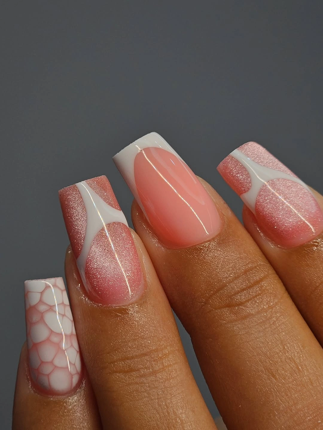
Outlined tips are useful when you want a French effect with more negative space than a conventional wide white edge. The peach base supplies enough warmth that the white feels bright but not harsh. If the additional patterned nail feels unnecessary, remove it and repeat the tip outline on every finger; the design will become more streamlined while retaining the small detail that gives the nude color its structure.
Because the lines are pale, their neatness matters more than their complexity. A wobbly outline would be far more noticeable than a missing accent, so keep the layout simple if precision is uncertain. The subtle contrast makes this a good choice for someone who likes a polished square silhouette but prefers a manicure that stays visually open rather than relying on a dense pattern or bold seasonal shade.
Gray Stripes Over A Black Square Base
Short black square nails carry pale gray curved stripes that create movement across an otherwise severe base. The stripes are not perfectly identical, but their shared direction gives the set a consistent rhythm. Black supplies the weight, gray softens the contrast, and the compact shape stops the design from becoming too dramatic. The pattern reads more like an interruption of the surface than a separate bright motif.
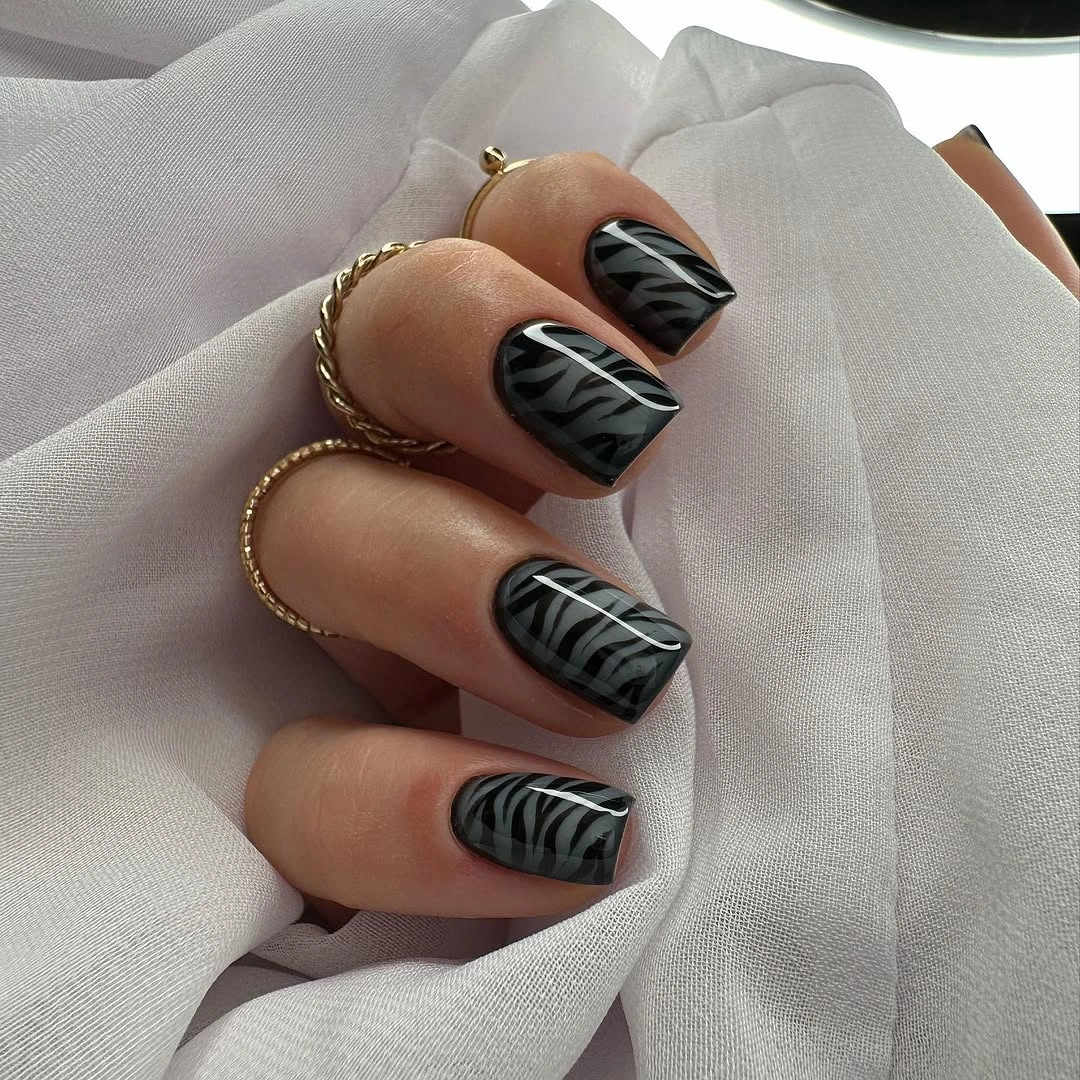
On a short nail, broad stripes are easier to read than many thin ones, so the visible gray marks are doing exactly enough. A more minimal variation could place the stripe pattern on just two black nails and leave the other nails solid. That would maintain the same dark, textured impression while giving the eye longer stretches of uninterrupted black and making the straight shape feel even more direct.
The color relationship is the practical reason this works: gray introduces contrast without the starkness of white. If you choose a warm brown-black base instead, shift the stripes toward taupe or cream so the effect remains connected. Adding metallic accents would pull attention away from the curved pattern, which is already the one small feature changing the balance of these short square nails.
Brown Nails With Bright Retro Arcs
Dark brown square nails become a backdrop for bold blue, orange, and white rounded arcs. The colors are bright, but the repeated curve direction and the consistent brown base keep them from feeling disconnected. Each nail has a small version of the same visual language, which is more effective than giving every finger a different motif. The short square shape makes the arcs feel compact and graphic rather than sprawling.
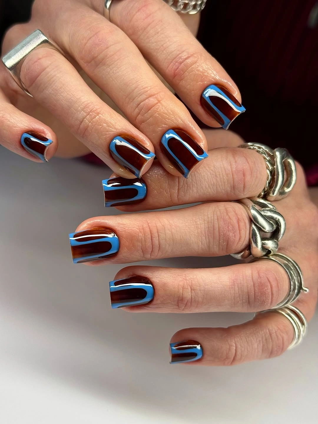
The design can be edited without losing its character by removing one of the bright colors. Brown with blue and cream would feel cooler, while brown with orange and cream would lean warmer, and either choice would preserve the retro arc idea. Keep the lines thick enough to remain visible at short length, because ultra-fine curves may turn into indistinct marks once the nail is seen from normal distance.
What deserves protection is the dark brown background, not every individual arc. That base gives the bright lines a reliable contrast and stops them from floating. If you want a more fall-specific result, favor orange over blue and let it appear only on one or two nails. The existing pattern already has energy, so adding glitter would create a second kind of visual noise with no clear structural role.
Earthy Checks And Deep Brown Blocks
Dark brown, brown checkerboard, a pale yellow block, and small gold-toned outlines appear on short square nails as a deliberately mixed earthy set. The checkerboard acts as the most structured detail, while the plain brown nails create relief around it. That contrast in density is important: the eye can move from a busy surface to a simple one, then back again, without losing the warm brown palette.
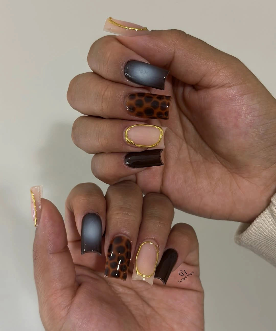
When several motifs are present, reduce repetition rather than adding another color. One checkerboard nail, one pale block, and a few plain brown nails already create enough variation for a short shape. A reader who likes the colors but not the mix could use brown on most fingers and keep a single yellow accent. The central rule is that the structured checkerboard should remain a moment, not become the entire hand.
Fine outlines look most useful when they echo an existing color boundary, not when they sit alone as decoration. Here they add a small glint around otherwise earthy tones, but the brown still defines the manicure. If you remove them, the result will read quieter rather than incomplete. For a more focused feature, see accent nail ideas and keep checked geometry to one finger.
White Squares With Butterfly Color Notes
Opaque white and pale pink provide clean zones for blue and yellow butterfly-like motifs on these long square nails. A slim dark French edge appears on one nail, but it does not compete because the white surfaces give the colorful shapes a clear setting. The small wings read as the focal detail, while the repeated pale base and straight tips keep the rest of the hand orderly and bright.
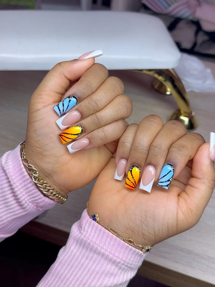
Use the motif sparingly if you want to keep the square silhouette from being overwhelmed. One colorful accent on each hand could carry the same idea, with the remaining nails divided between white and pale pink. The long length makes room for several decorated nails, yet it also makes every added feature more visible, so the simple blocks of white are not filler; they are essential negative space around the color.
The key adjustment is scale. A smaller square nail would need a compact wing-like mark near the tip rather than a full motif across the surface, otherwise the image could lose clarity. Keep the blue and yellow limited to the accents and let the dark edge remain a minor echo only. That hierarchy preserves the lightness that makes the colored details feel carefully placed instead of scattered.
Hot Pink Accents Through Translucent Squares
Translucent pale pink squares receive hot pink rounded shapes and tiny bright dots, creating a contrast between a quiet base and sharply concentrated color. The vivid pink appears in small areas rather than across the entire nail, so it behaves like a graphic signal. The long square outline gives the shapes room to sit apart, which keeps their playful energy from becoming a continuous band of saturated color.
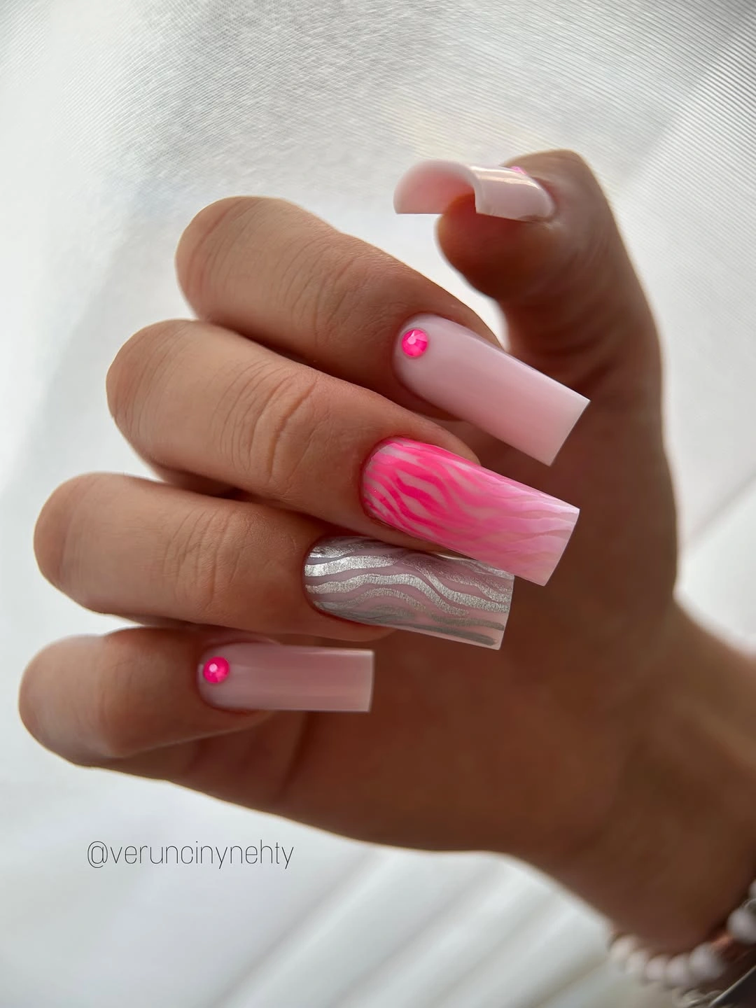
A practical edit would be to choose one bold pink shape and repeat it on only two nails, leaving the other squares translucent. That would preserve the strongest visible decision while lowering the detail density. The small dots are optional because the larger pink forms already create contrast; remove them if you want the straight free edge and open base to have more room to register.
The color is intentionally intense, so everything around it should be calmer. Avoid combining it with another saturated shade, and keep the base pink close to neutral rather than milky white. A softer rose or berry can make the same abstract arrangement more seasonal, but the structure should remain unchanged: a clear pale field, a few placed color shapes, and enough empty surface for the square silhouette to stay visible.
Uniform Cobalt On Long Square Tips
Solid cobalt blue turns these long square nails into a direct color statement with no added pattern to soften it. The saturated pigment makes the straight free edge especially noticeable, because every tip ends in the same bold horizontal line. There is value in that simplicity: rather than dividing attention among accents, the manicure asks the eye to read one color and one strongly defined silhouette from the first glance.
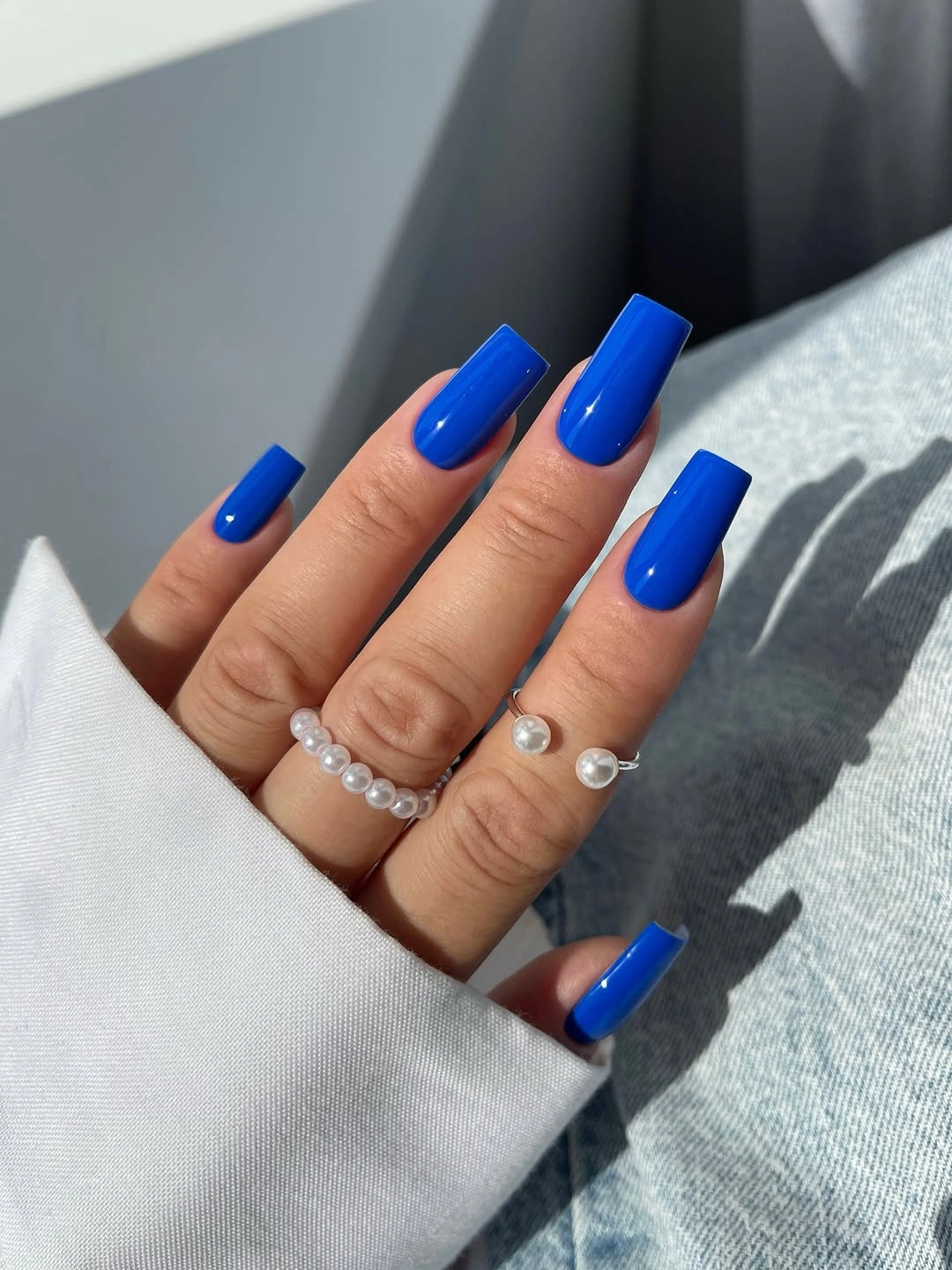
For a bold solid manicure, proportion becomes more important than decoration. Keep the lengths even and the corners aligned, since cobalt gives no camouflage to an irregular shape. A shorter square version could feel more practical while preserving the same color impact, or a muted navy could reduce the intensity without changing the crisp, architectural effect created by the repeated blue blocks.
The absence of accents is not a lack of design; it is the design choice. Adding one glittered finger might work, but it would change the focus from pure color to texture and make the look less exact. Choose this route when you want the nail color to lead every outfit decision, and leave the surface otherwise unbroken so the cobalt can retain the clean visual force it has here.
Green Burgundy Tips With Tiny Color Echoes
Translucent square nails use green and burgundy curves at the tips, while small orange-red floral-like dots echo the palette across a few fingers. The darker tips share a similar depth, allowing the bright small marks to act as brief accents rather than a third full color block. Empty nude space between the tips is what keeps the combination from becoming heavy, especially around the compact square edges.
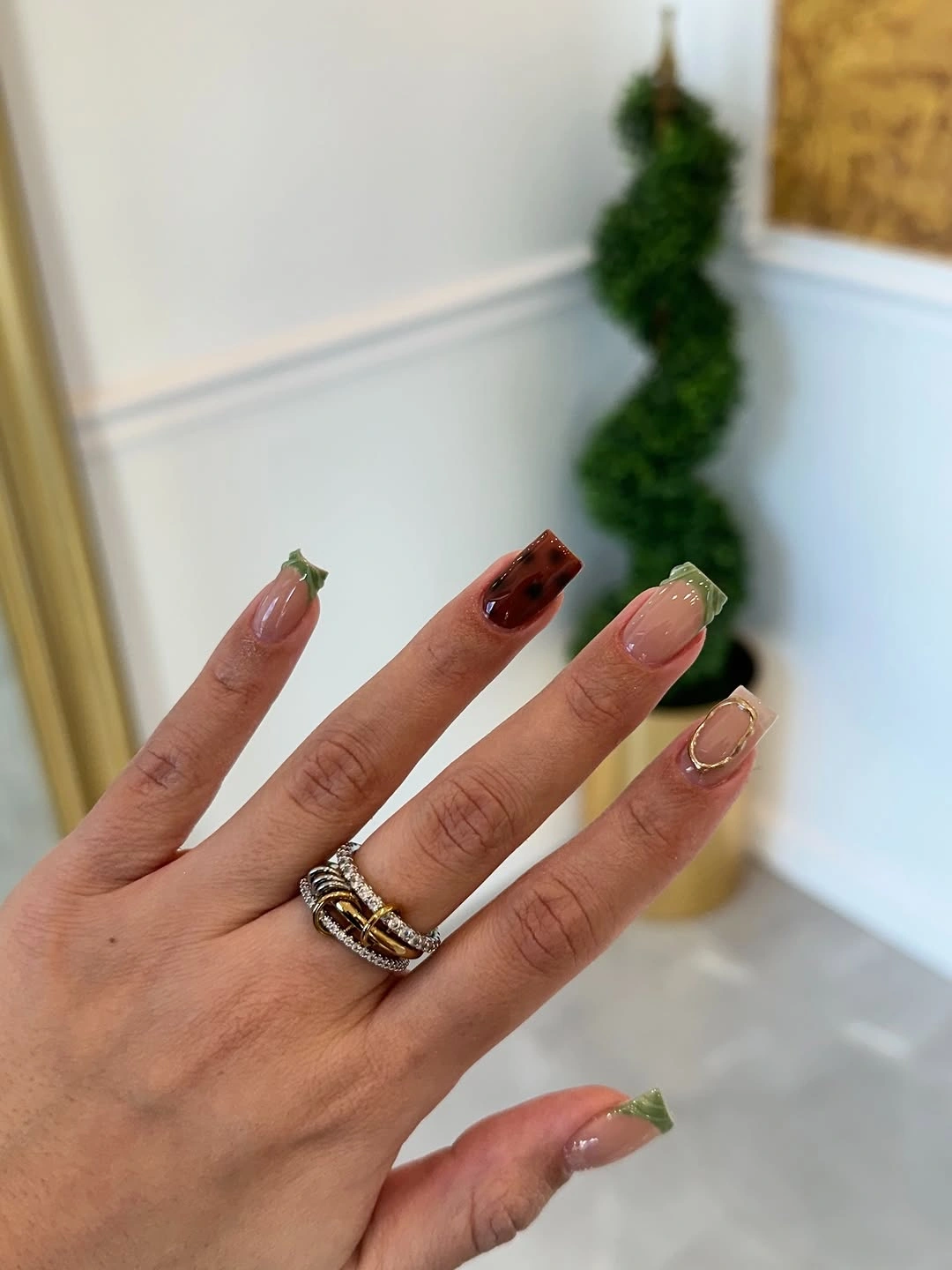
The most useful version of this design would keep the two dark tip colors but remove most of the tiny motifs. Green and burgundy already make a clear fall pairing, and the exposed base gives them enough contrast. On shorter nails, one green tip and one burgundy tip per hand could be more readable than trying to fit both colors and several small marks onto every visible surface.
Small bright accents should remain just that – accents. Their purpose is to link the green and red family, not to become the main visual event. If you prefer a quieter manicure, replace the tiny dots with a single pale cream line near one tip. The square shape will still look intentional because the curved dark edges provide the real rhythm across the hand.
Brown Squares Softened By Pale Arcs
Long brown square nails are mostly solid, with pale nude curved accents appearing on a few fingers to interrupt the dark surface. The arcs are placed where they can soften the straight silhouette without hiding it, creating a contrast between rigid outer edges and gentler interior lines. Brown remains dominant throughout, so the pale details read as deliberate openings in a dark field rather than as a second equal color.
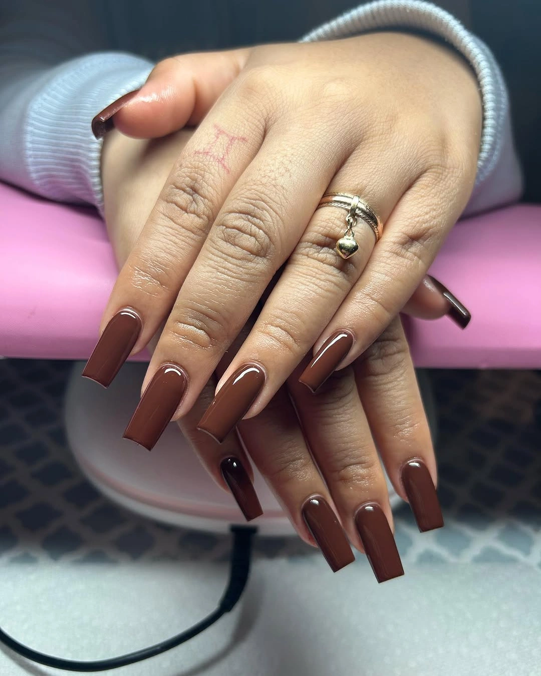
There is no need to repeat the curved detail on every nail. It works because the solid brown nails establish a broad visual base, then the pale arcs arrive as small shifts in rhythm. A medium-length alternative could use a single cream curve near one corner of two nails, preserving the softening effect while respecting the smaller area available on a more practical square shape.
The brown should stay uninterrupted around each pale mark for the contrast to remain clean. Filling the rest of the nail with glitter or tiny motifs would remove the spaciousness that makes the curve noticeable. If the pale line feels too strong, shift it toward a nude that is only slightly lighter than the base; the change will become quieter, but the visual tension between curve and square edge will still be present.
Patterned Dark Tips On A Nude Base
Nude square nails use black and black-and-white patterned tips to bring contrast only to the free edge. The underlying base remains visible across most of the nail, so the dark details read as borders rather than full designs. One spotted-looking accent breaks the repeated tip treatment, but it stays within the same high-contrast family and does not disrupt the tailored quality of the overall square silhouette.
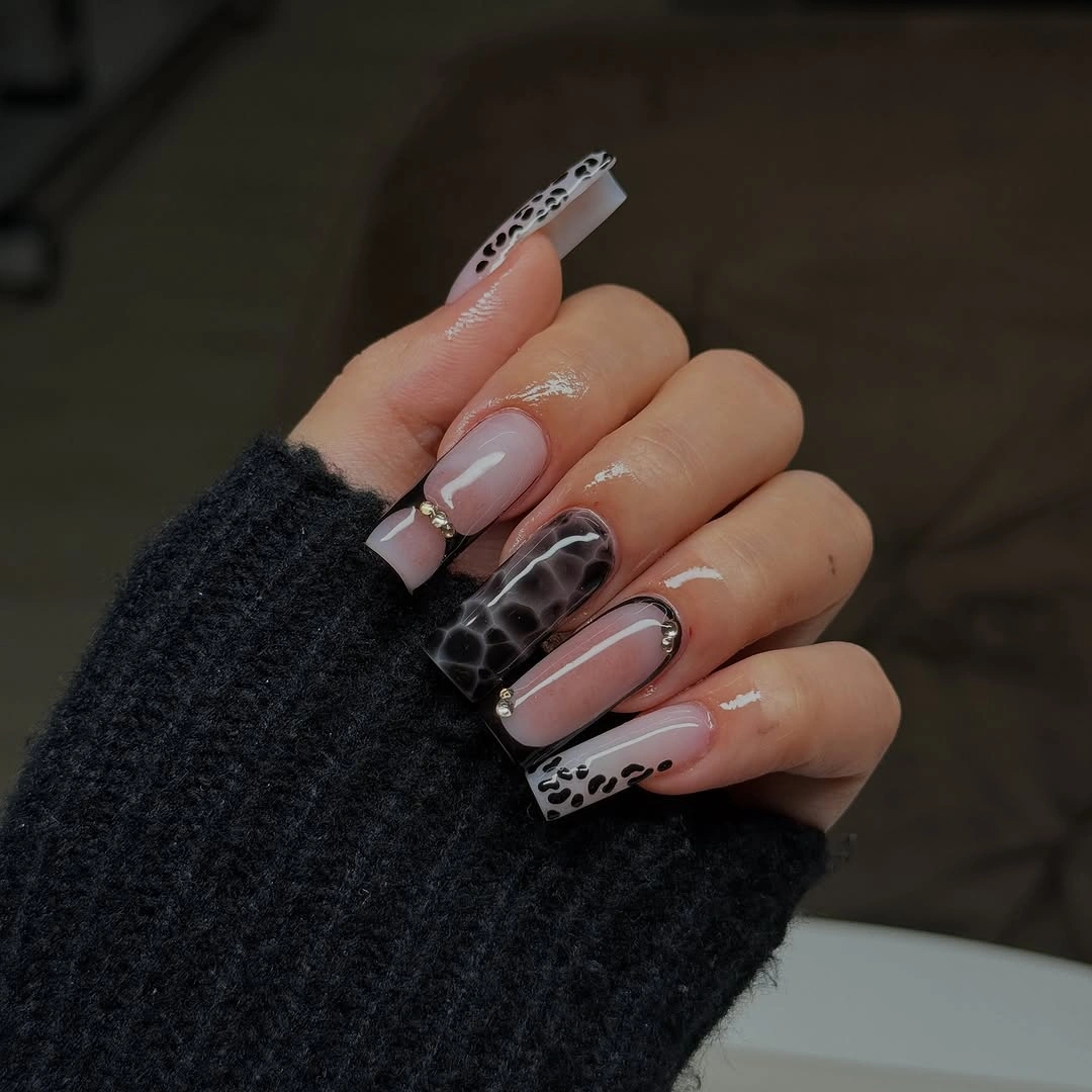
Tip placement is the reason this design stays balanced. The dark pattern begins near the edge, leaving the cuticle area calm and making the manicure easier to pair with many colors in clothing. A pared-back version could use a plain black tip on most fingers and reserve the patterned edge for one accent nail, which would make the contrast feel more controlled while retaining the key detail.
Keep the pattern scale proportional to the nail width. On a narrow or short square tip, larger simple marks will read better than a busy arrangement of tiny spots and lines. The nude base should remain the majority, because it provides the quiet field that makes the dark edge appear precise. Without that negative space, the pattern would take over and the crisp square form would become harder to see.
Dark Brown Pointed Tips For Fall
Warm nude-pink square nails are finished with dark brown pointed French-style tips, giving the straight edge a small directional twist. The brown is concentrated near the free edge, while the pale base keeps each nail open and light. That limited placement creates a fall mood without requiring glitter or art, and the tiny points prevent the dark color from feeling like a flat horizontal stripe.
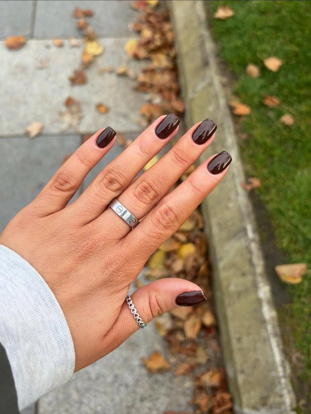
The pointed tip is the feature to protect if you simplify this manicure. It brings movement to the square form, making the border feel more specific than a standard straight French edge. On a shorter length, lower the point and keep it centered; a very tall triangle could make the nail plate look crowded. The base can shift warmer or cooler without changing the useful contrast with brown.
A dark brown tip offers a less stark alternative to black while still giving a nude manicure definition. Keep the brown consistent across the hand, and resist adding a second dark accent color, since the pointed shape already supplies variation. Readers adjusting length can use medium-length nail ideas to keep the nude center broad enough to frame the tip.
White Blocks Beside Bright Pink Art
Opaque white square nails sit beside pale pink nails with bright pink abstract accents, using strong solid blocks to organize a more playful color detail. The white nails are not merely neutral filler; they create a clear pause between the vivid pink marks and make the saturated accents appear sharper. On a long square shape, that contrast gives the manicure a clean structure even though the individual nails are not identical.
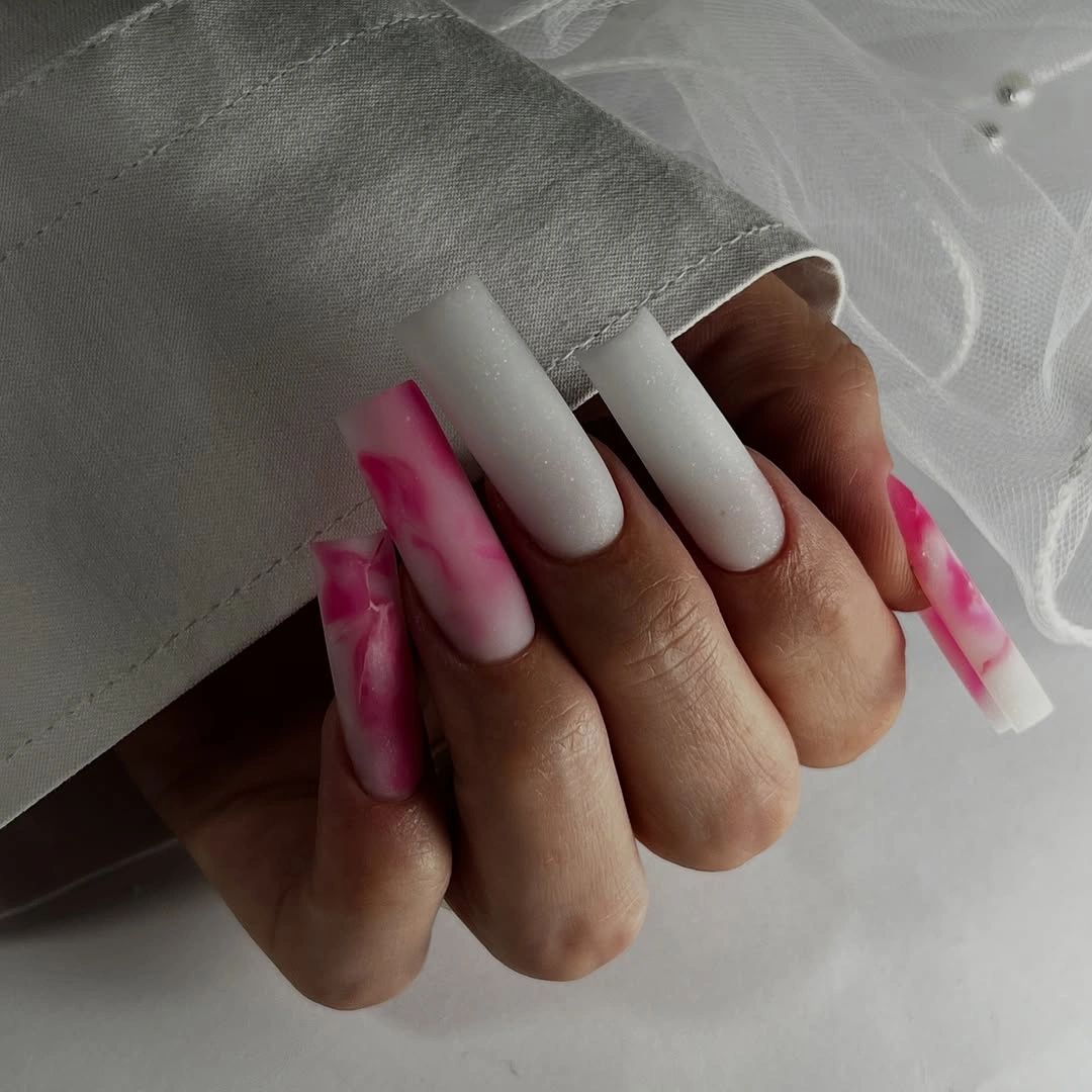
If the two-color split feels too bold, keep the pale pink base on most fingers and use white only on one accent nail per hand. That would still create the visual pause that helps the hot pink art stand out, while making the set easier to wear. The bright details should stay limited to the pink nails so the white continues to serve as a calm, unmistakable block of contrast.
The important relationship is between blank white surface and concentrated pink shape. Adding black outlines or glitter would change that relationship by making every nail compete for emphasis. Leave the white straightforward, let the pale pink carry the abstract marks, and keep the free edges evenly squared. Those boundaries are what make the energetic color feel arranged rather than simply added at random.
Soft Pink Sparkle With White Linear Relief
Translucent pink, opaque white, pale sparkle, and thin white curves share space on these medium square nails without turning into a crowded pastel mix. The fine white lines are placed on only a few nails, while the solid white blocks offer visual relief beside the more reflective-looking surfaces. That alternation of density is what gives the light palette its shape, even before the straight free edge is considered.
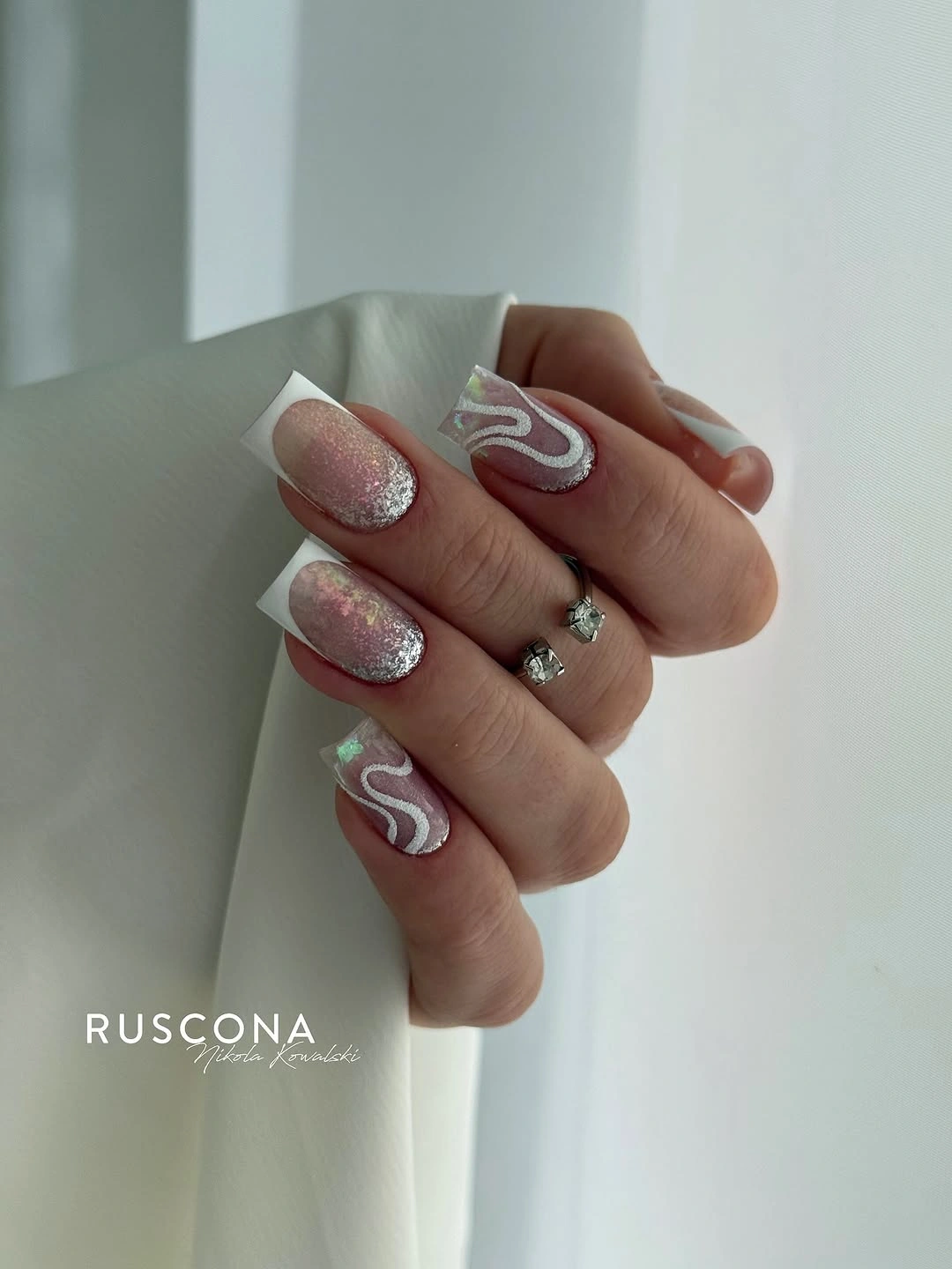
A clean way to adapt this is to choose one surface contrast and one line detail. For example, keep two pale sparkling nails and place a white curve on one pink nail, then leave the rest opaque white or plain pink. The design will still feel layered, but each feature will have more room. Medium square nails benefit from that editing because the pale colors can otherwise merge together.
Do not treat every light nail as an opportunity for another accent. The set feels resolved because the white blocks, pink space, and small curves take turns rather than appearing all at once on the same finger. If you remove the sparkle, the curved lines will become more noticeable; if you remove the lines, the finish contrast becomes the quiet focus. Either route keeps the square form clear.