A flattering nail color is less about finding a magic shade for medium skin and more about controlling contrast. The same blue, brown, or red can look soft, sharp, warm, or distant depending on how much lightness stays visible around it. Start there, because undertone matters, but value and saturation decide whether the manicure blends in or becomes the first thing people notice.
When a color feels almost right, change one variable instead of rebuilding the entire idea. Deepen the shade, mute its brightness, lighten the neighboring nail, or move the accent toward the tip, then check what changed. That small experiment reveals whether the problem is temperature, value, or simply too much of the color in one place, which makes choosing a wearable finish much less mysterious.
Cobalt blue blocks with deeper blue sparkle
These medium coffin nails use saturated cobalt on most fingers and a darker blue accent filled with fine reflective specks. Because both colors belong to the same family, the accent adds depth without making the hand look divided into unrelated sections. The squared edge gives the bright blue a clean block of space, which helps the color stay crisp against medium skin.
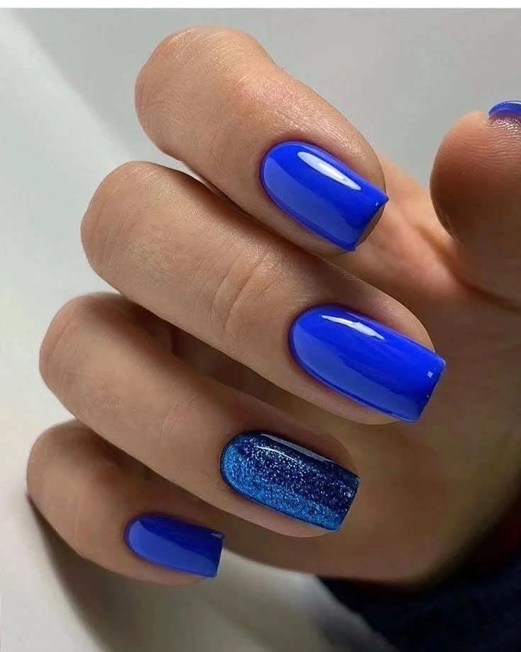
If you want the same contrast to feel softer, move from vivid cobalt to a slightly muted denim or ink blue. Keep the accent darker rather than introducing a warm color, because the point is value contrast within one hue. A shorter coffin would also reduce the amount of saturated surface while preserving the visual clarity that makes this design work.
The manicure is especially instructive for medium skin because it shows how a cool saturated shade can remain clean when the accent repeats its undertone. The dark sparkle gives the eye a resting place, while the surrounding blue keeps the effect cohesive. The practical tradeoff is that both vivid color and reflective detail make edge wear easy to notice, so the simple layout still benefits from tidy upkeep.
Orange tips over a blush pink base
Short square nails with translucent pink centers and vivid orange tips create a bright contrast without covering the whole nail in color. A few tiny yellow and green floral-looking details add warmth, but the large pale areas remain the main visual support. The result works on medium skin because the orange is lively while the pink base prevents it from feeling visually heavy.
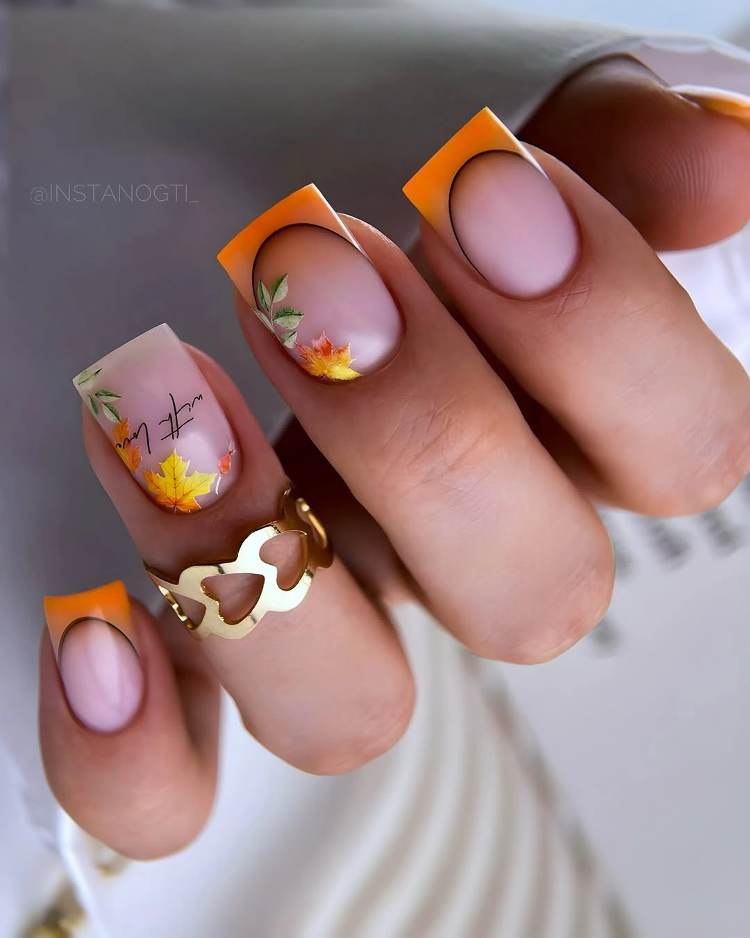
To control the saturation, keep the orange on two or three tips and replace the rest with warm cream or muted apricot. The small botanical marks can stay on one accent nail, where they will have more space and less competition from the bright edge. This changes intensity without changing the useful relationship between pale center and warm tip.
The color lesson is about placement: a vivid shade near the free edge reads differently from the same shade spread across the entire nail. The pink center keeps the manicure open, while the small warm details connect the tip to the rest of the hand. If the design is shortened further, preserve the pale center and reduce the line thickness so the square shape does not look crowded.
Olive blocks with tonal green texture
Solid olive nails alternate with pale green accents covered in small darker marks that create a quiet textured effect. The colors are close enough to feel tonal, but the value difference keeps the accent visible on medium skin instead of blending into one flat field. The square shape supports the block color and gives the tiny marks a tidy boundary.
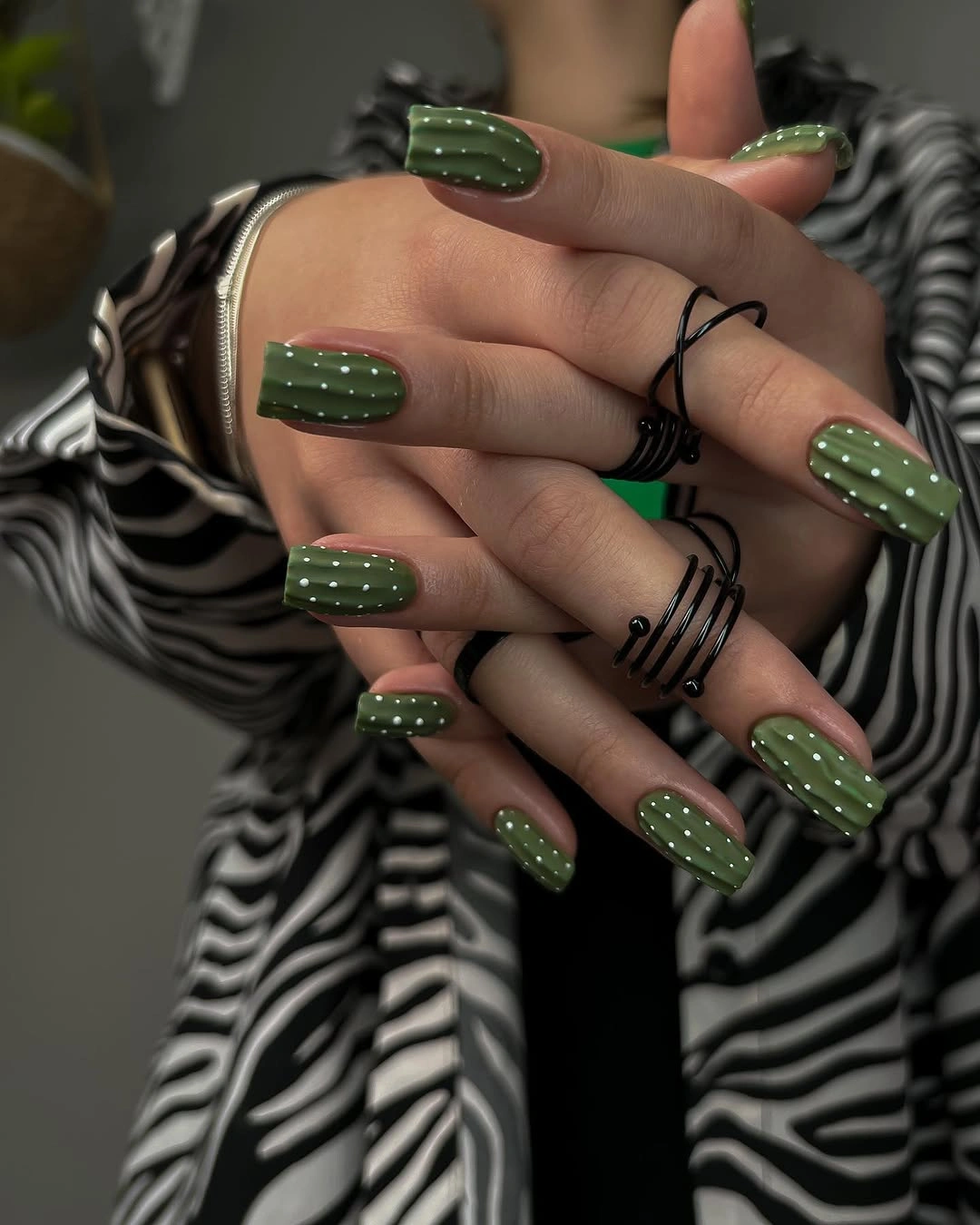
If you want a warmer result, shift the olive toward moss or brown-green while keeping the pale accent near the same lightness. The texture can be limited to one nail, which makes the design more practical and lets the plain olive do most of the work. Avoid increasing the number of marks just to make the accent noticeable; the quiet spacing is part of its appeal.
This set demonstrates that a medium skin tone does not require high contrast in every manicure. A tonal pairing can look intentional when the solid nails repeat the accent color and the texture changes only the surface rhythm. The limitation is that subtle green detail may disappear in low light, so choose a slightly lighter accent if you want the design to remain readable from a distance.
Burgundy solids with one pale gold-detailed accent
Glossy burgundy dominates these medium square nails, while one pale pink accent carries dark curving lines and a small gold-looking detail. The pale nail interrupts the depth of the red without taking away its warmth, and the tiny bright mark gives the eye a precise place to land. On medium skin, the contrast feels rich because the base is dark but not disconnected from the rosy accent.
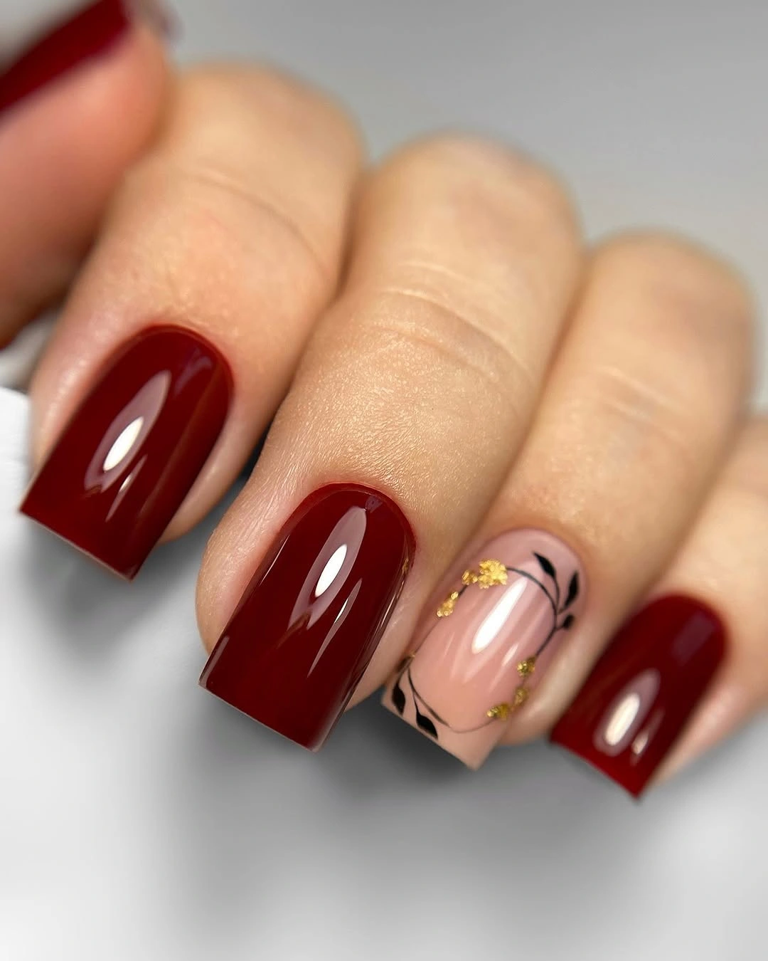
For a quieter version, use the pale base on two nails and keep the gold-looking detail to one small point. If burgundy feels too cool, a warmer brick red will preserve the depth while shifting the temperature. The key is keeping the accent light enough that it acts as a break in the color field rather than another dark layer; that value shift also matters in fall nail designs for all skin tones.
The design works through value first and decoration second. Burgundy provides repetition, pale pink supplies contrast, and the fine lines prevent the accent from feeling empty without filling its surface. A realistic limitation is that a dark glossy-looking base will highlight small chips, so the look is best when the clean red edges are part of the plan rather than an afterthought.
Ivory and burgundy curves on long almond nails
These long almond nails combine pale centers with brown and burgundy curved panels near the edges, creating a layered neutral look that still has depth. The pointed silhouette stretches the curves along the nail, while ivory keeps the darker colors from reading as a full heavy block. It is a strong example of using value contrast and negative space together on medium skin.
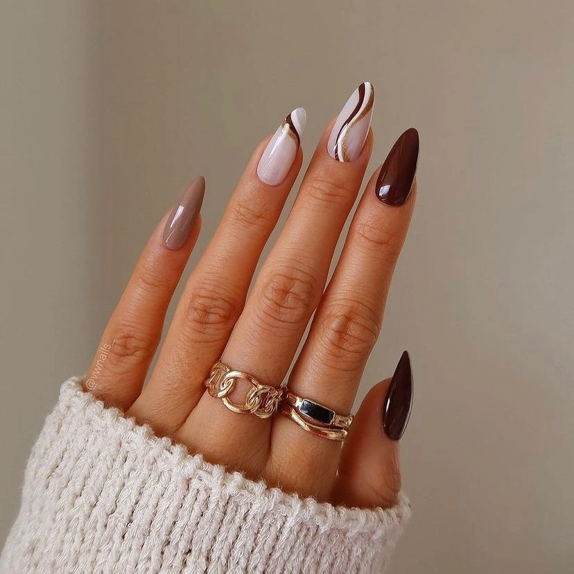
If the length is too dramatic, keep the almond shape medium and simplify the panels to one brown or burgundy curve. A warmer ivory will blend gently with medium skin, while a deeper cocoa edge will make the contrast sharper. Change one variable at a time so the design retains its layered effect instead of becoming a plain two-color tip.
The most useful decision here is the amount of pale space left visible. It gives the dark edges room to look intentional and lets the shape remain the main line of the manicure. The tradeoff is practical: long pointed edges show wear and grow-out more clearly, so readers who want lower upkeep should keep the same color relationship on a shorter almond.
Yellow-orange blocks cooled by lavender linework
Bright yellow-orange solids bring immediate warmth, while pale accent nails carry black and lavender curved marks that introduce a cooler counterpoint. The lavender is small but important: it prevents the palette from becoming one continuous field of heat and gives the pale nails a more complex role. The square shape keeps the vivid blocks compact enough to feel deliberate.
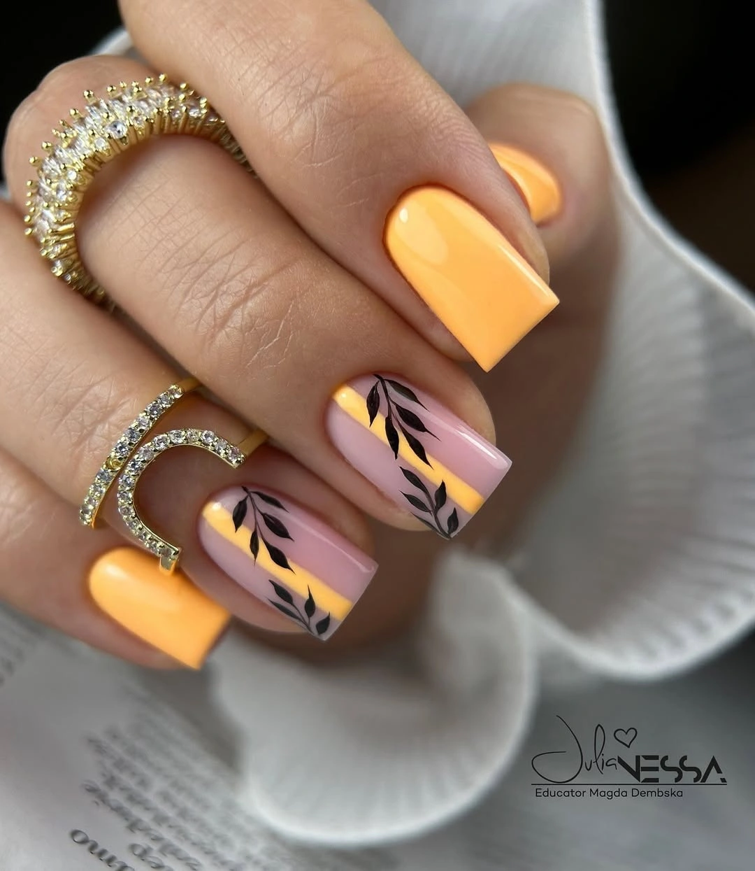
To adapt this idea for everyday wear, replace the bright orange with muted marigold or ochre and keep the cooler linework on one accent. A pale neutral base can remain unchanged, because the open surface is what makes the dark and lavender marks readable. The controlled variation is temperature: soften the warm base without removing the cool counterbalance entirely.
This manicure shows why color temperature should not be reduced to warm versus cool alone. Saturation and placement matter too: the orange is dominant because it occupies solid nails, while lavender stays secondary inside the artwork. The honest limitation is that vivid yellow-orange can pull attention from the whole outfit, so readers wanting a quieter result should lower saturation before reducing detail.
Fine black marks on short pale nails
Short pale nude nails carry tiny black arcs, lines, and leaf-like marks, leaving several fingers almost blank. The high value contrast makes the small details visible, but the large open base keeps the manicure gentle and easy to read on medium skin. Because the shape is compact, the artwork feels like punctuation rather than a full illustration.
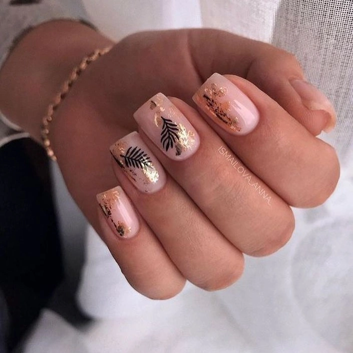
A practical variation is to keep the pale base across the whole hand and place the black marks on only two nails. Warm beige or blush can replace the nude without changing the balance, and a softly rounded square will preserve the compact proportions. Avoid enlarging the marks too much, since the clean negative space is doing as much work as the lines.
This design offers a useful answer for readers who want fall nails that coordinate with medium skin without relying on dark color. The black details create definition, the pale background supplies lightness, and the small scale keeps the contrast from becoming severe. The limitation is visibility: extremely fine art may disappear in low light, so two slightly stronger marks can be more effective than many barely visible ones.
Burgundy and mustard with a tiny warm illustration
Deep burgundy and mustard alternate across these short rounded nails, while one pale accent holds a small orange-red illustrated mark. The warm colors share enough undertone to feel connected, and the pale nail gives the illustration a clear background. The design is seasonal without requiring long length, dense decoration, or a large contrast shift on every finger.
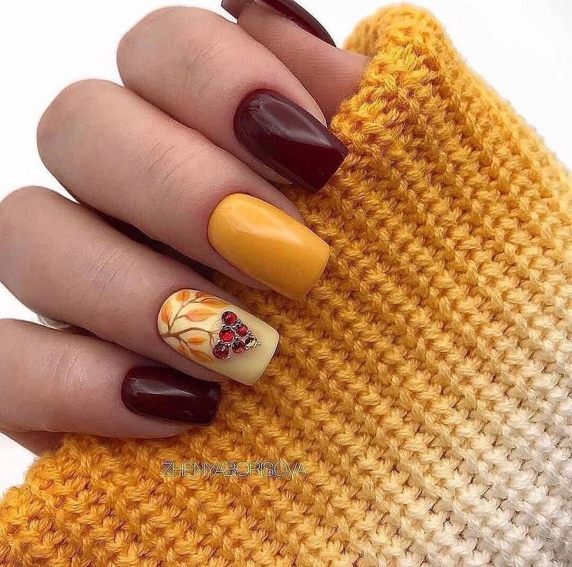
For a more restrained palette, keep burgundy on most nails and use mustard only on one solid accent. The small drawing can remain on a pale nail, where it will not compete with a second bright block. This is a good structure for medium skin because the warmth comes from several related shades rather than one extremely saturated color.
The manicure works through repetition: mustard appears as a solid color and the accent repeats the same warm family in miniature. That makes the little illustration feel anchored instead of decorative for its own sake. The tradeoff is scale, because a very small motif may be hard to read as the nail grows, so the value of the design is its color relationship more than any literal object.
Taupe nails with monochrome curved bands
These short rounded nails use a muted taupe-gray base with repeated black and white curved bands. The palette is quieter than the warm red and orange examples, but the arcs create enough movement to keep the manicure from looking plain. On medium skin, the restrained contrast can feel polished because the gray-taupe sits between light and dark rather than pushing strongly warm or cool.
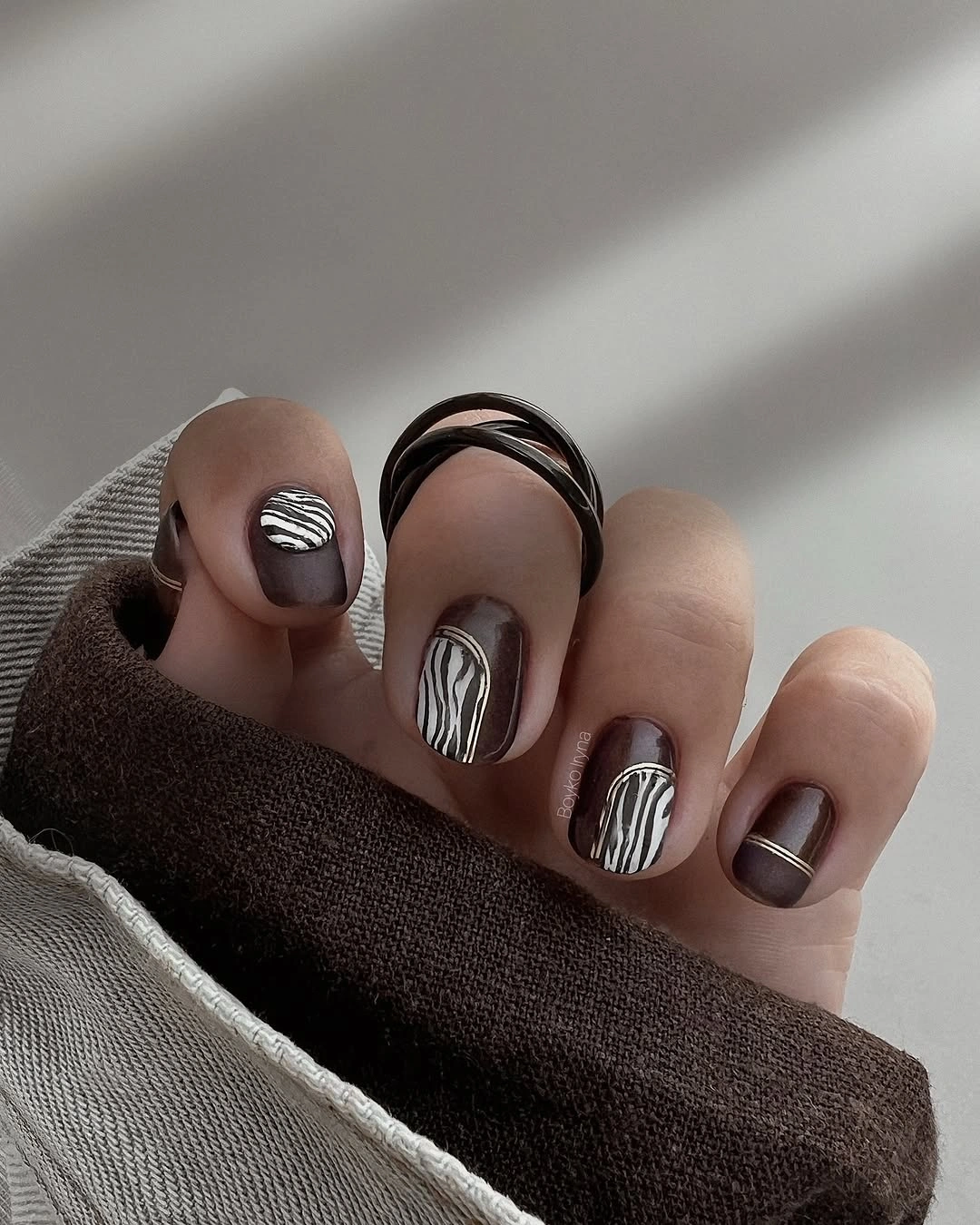
If you want more autumn warmth, shift the base toward mushroom brown or soft cocoa while keeping the black and cream bands. To simplify the pattern, place the curves on three nails and leave the others solid. The important decision is preserving the curved rhythm, because straight stripes would make the compact rounded shape look more rigid.
This design is useful when saturated fall color feels too loud but a completely plain manicure feels unfinished. The muted base lowers intensity, white adds lightness, and black gives the arcs enough definition to stay visible. A realistic limitation is that repeated bands can look uneven as the nails grow, so a less exact curve is easier to maintain than a tightly measured pattern; the same compact logic suits fall square nail designs.
Neon tips with one dark animal-like accent
Long stiletto nails combine hot pink, orange, and yellow panels over pale centers, then add a dark animal-like accent on one nail. The black marks give the fluorescent palette a visual anchor, while the nude base prevents the bright colors from filling the entire hand. It is a high-attention design, and the extreme length makes that choice impossible to miss.
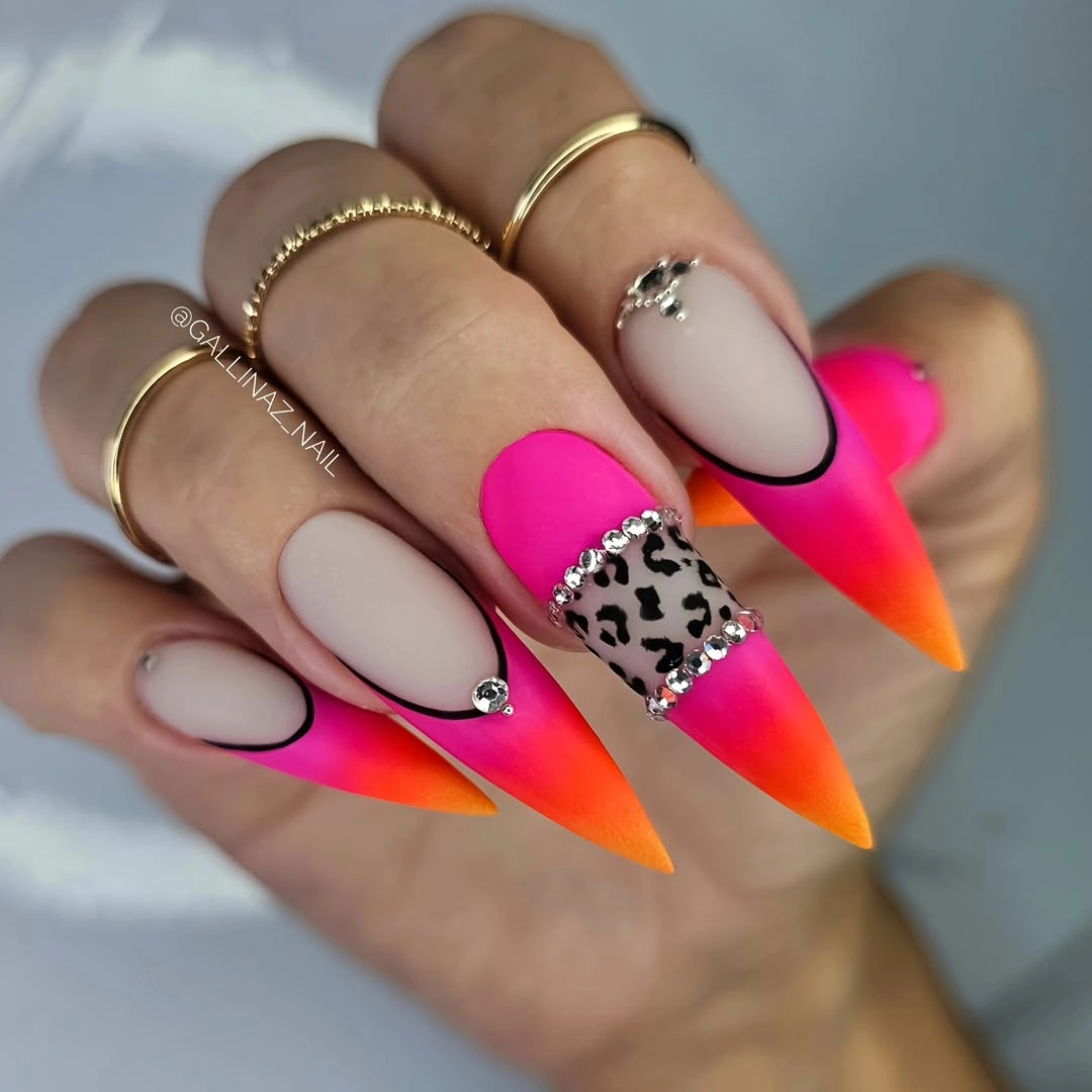
To make the color easier to wear on medium skin, keep the neon on the tips and move the print to a shorter accent nail. You can also replace hot pink with coral or orange with muted pumpkin, lowering saturation while retaining the light center. Do not remove the dark anchor entirely, because it is what gives the bright colors a clear visual boundary.
The manicure demonstrates how contrast can be organized even when the palette is intense. Pale space separates the tip colors, black controls the most decorative accent, and the long points create a strong directional rhythm. The honest tradeoff is upkeep: vivid tips, a sharp silhouette, and a small print each show changes quickly, so this is best for readers who enjoy a statement look and want to compare it with deeper fall nail color ideas for dark skin.
Plum and blush softened by gold flecks
Deep plum alternates with pale pink on these long almond nails, while small gold-looking flecks and dark lines add warmth to the cool pairing. The pale surfaces keep the dark color from becoming too dense, and the gold detail acts as a bridge rather than a new dominant shade. The result is expressive but still controlled because the accent remains small.
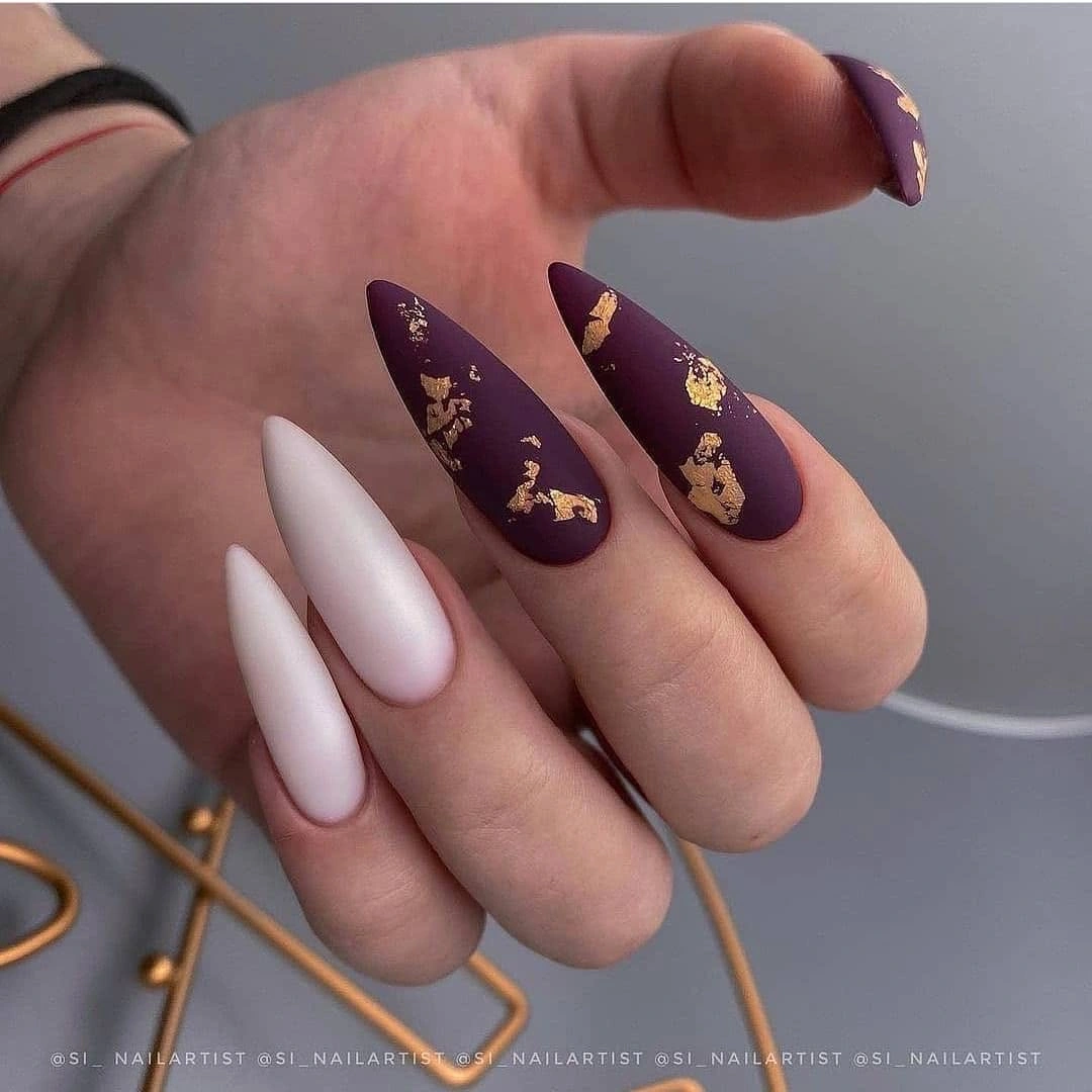
If you want the look to feel more neutral on medium skin, replace plum with cocoa or muted aubergine and keep the pale pink unchanged. Use the flecks on one or two nails instead of spreading them across every accent, especially if the length is shorter. The color relationship matters more than the exact metallic effect: warm detail should connect the cool base to the soft pale field.
This is a useful lesson in temperature balance. Plum supplies depth, pink creates lightness, and the tiny warm marks prevent the composition from leaning entirely cool. The limitation is that small reflective details may not show clearly from a distance, so readers wanting a stronger effect can use one concentrated accent rather than adding more flecks everywhere.
Matte black with red-orange abstract accents
Short square nails are mostly black or charcoal, while accent nails carry red-orange curving lines over the dark surface. The low-shine-looking field gives the warm marks a place to stand out, and the compact shape keeps the abstract design from spreading too far. It is a dark fall direction that still has color movement, not just a single black block.
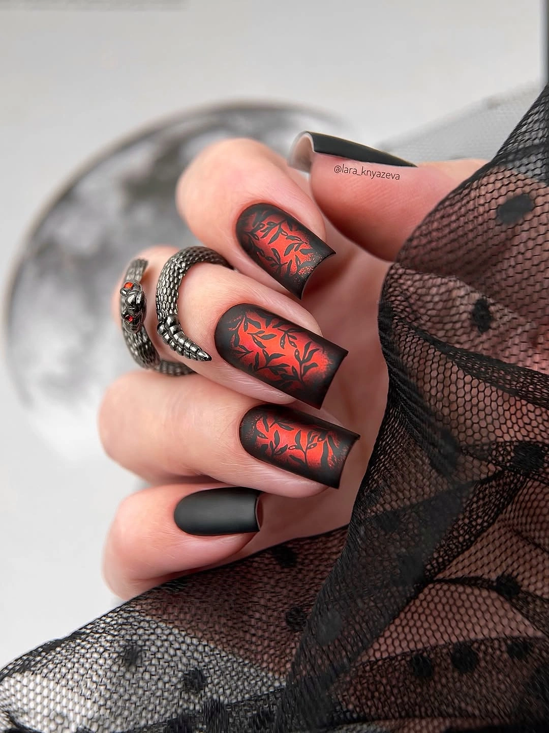
For a softer version, use deep brown instead of black or move the red-orange marks onto a pale nude accent. If the nails are very short, keep one clean curve rather than several overlapping strokes. The design is strongest when the warm color remains a deliberate interruption, so adding more marks can make the contrast feel less controlled.
The visual order is easy to follow: dark base first, warm line second, shape third. That makes the manicure appropriate for readers who want an autumn palette but dislike literal leaves or glitter. The tradeoff is that black can make any uneven line or chip obvious, so a charcoal substitution may offer a similar depth with a little more forgiveness.
Translucent pink with layered warm botanicals
These medium coffin nails use a translucent pink foundation and layer red, orange, and brown botanical-looking details over it. The pale base prevents the warm colors from becoming a solid block, but the number of small elements makes the design noticeably more decorative than the minimal line-art examples. On medium skin, the transparency leaves light around the details, which helps the set stay balanced despite its density.
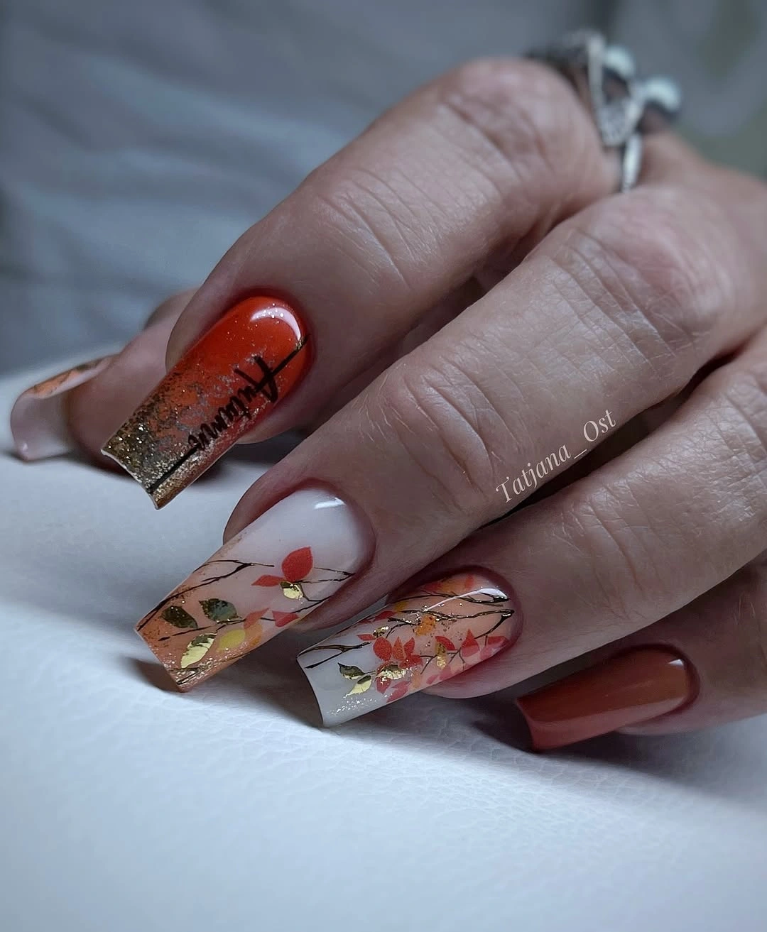
For an easier adaptation, keep the transparent-looking base on two accent nails and use plain coral, brown, or nude on the rest. The warm details can be clustered near the tip rather than distributed across the whole surface, giving the eye one area to read. This reduces upkeep and visual competition without losing the connection between pale space and fall color.
The design works because the base and decoration have different jobs. Pink supplies open space, the warm marks provide seasonal emphasis, and the square length gives the clusters room to breathe. The honest limitation is density: detailed accents may look beautiful at close range but feel busy in daily styling, so simplifying the number of elements is a better repair than merely changing their colors.
Red tips with cream botanical accents
Glossy red nails alternate with cream accents carrying small red, brown, and gold-looking botanical marks. The strong red repeats across the hand, while the pale nails create a light break where the seasonal detail can remain visible. This is a more separated composition than a densely layered set, which makes the warm contrast easier to understand on medium skin.
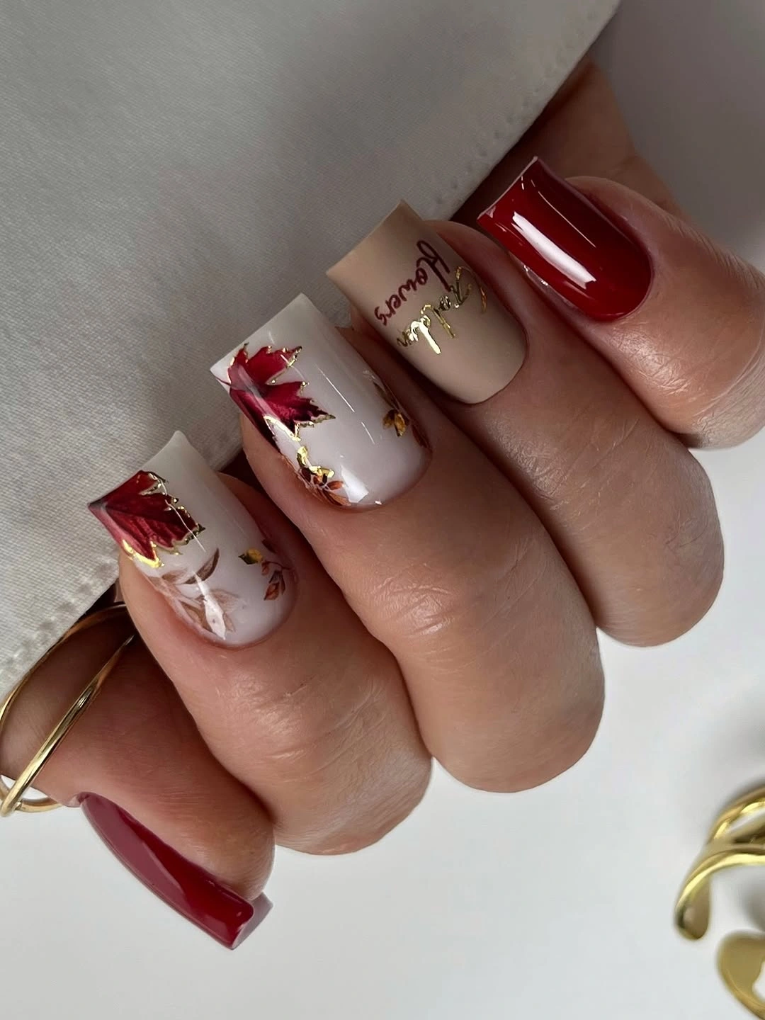
If the red feels too dominant, change only the base to brick or muted cranberry and keep the cream accents. One decorated nail is enough when the solid color already supplies the main statement. Keep the marks near the edge or center with open space around them, because crowding the pale surface would remove the clean contrast that makes the set wearable.
The color relationship is straightforward but effective: red provides saturation, cream provides value contrast, and small warm marks repeat the base without becoming another large block. That gives the manicure a clear focal order and lets it work with both light and dark clothing. The limitation is that glossy-looking red shows wear, so a careful edge matters more than adding extra art.
Brown curves edged by a bright border
Long square nails combine ivory centers with broad brown curves and thin sparkling or reflective borders. The dark shape creates immediate contrast against the pale base, while the bright outline separates the two values and keeps the design from looking muddy. The square length gives the curves room to sweep, making this one of the most graphic neutral options in the set.
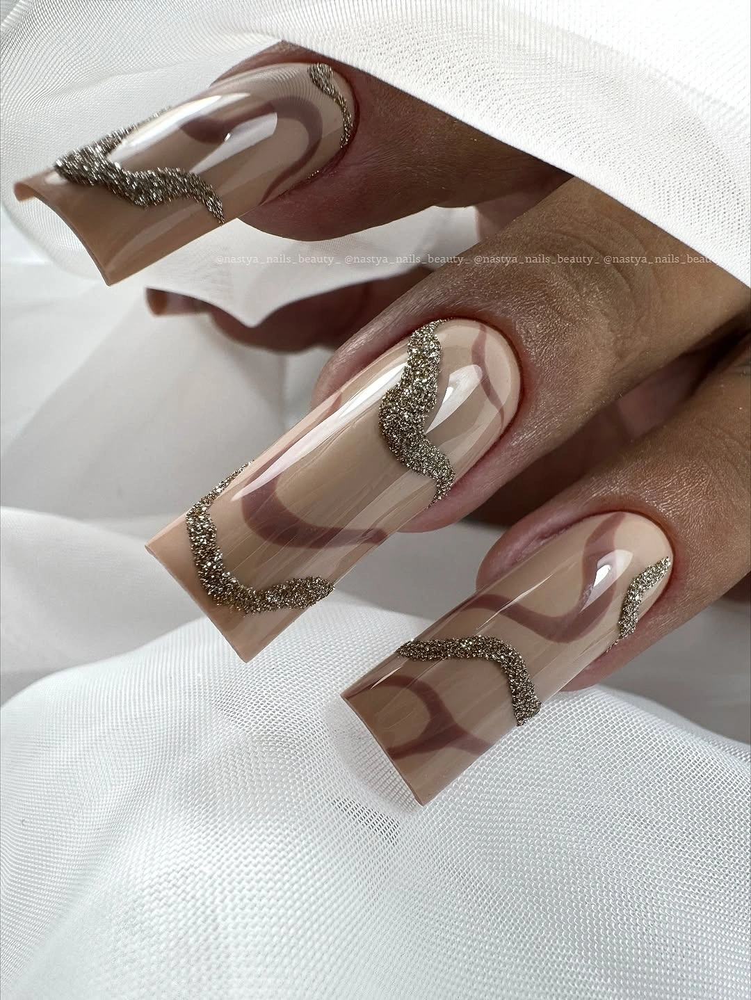
For a more wearable medium-skin version, shorten the nail and keep one broad curve on each accent rather than outlining every panel. Taupe or cocoa can replace the deepest brown, while a small bright line preserves the edge definition. The goal is not to remove contrast but to reduce the amount of dark and reflective surface competing at once.
This manicure uses value, shape, and a narrow border in a very deliberate order. Ivory gives the eye space, brown supplies the main graphic gesture, and the bright edge acts like punctuation. The tradeoff is upkeep: long square edges and reflective outlines make changes visible, so the design is best when the wearer likes a precise, high-contrast finish.
Tiny editorial marks on a creamy base
Short rounded-square nails carry miniature black and gray marks over pale cream and pink, with no readable text that can be safely identified. The small scale makes negative space the main design tool, while the neutral base keeps the marks from looking too severe on medium skin. Rather than relying on a strong seasonal color, the manicure creates personality through tiny contrast.
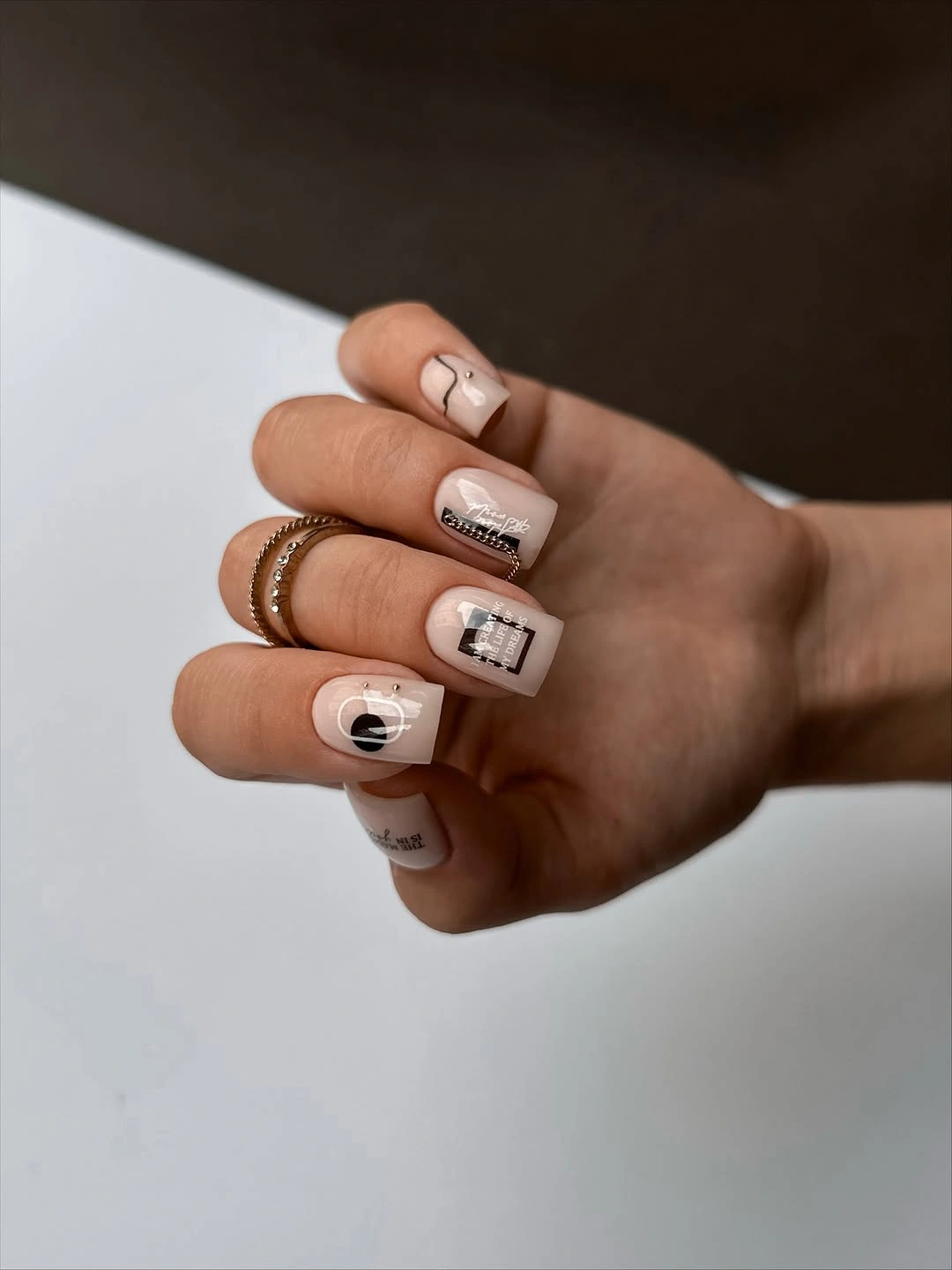
If you want the idea to read more clearly, repeat one simple mark on two nails instead of filling every accent with tiny details. A warm beige base would keep the palette grounded, and a slightly longer square would give the marks more room without making the manicure dramatic. Avoid inventing lettering or symbols; the strength is the visual scale, not a literal message.
This is a good option when the rest of the look already includes jewelry, texture, or a strong outfit. Cream supplies quiet support, the small marks create a personal-looking point of contrast, and the compact shape keeps everything approachable. The limitation is distance: tiny details may disappear in a quick glance, so choose this direction for subtlety rather than instant impact.
Emerald solids with amber patterned accents
Deep emerald nails alternate with amber-brown patterned accents that resemble tortoiseshell, creating a strong warm-cool balance. The green is the dominant color, but the amber panels keep it from feeling flat by introducing a related depth in a different visual form. The almond shape stretches both colors and helps the set look rich rather than blocky.
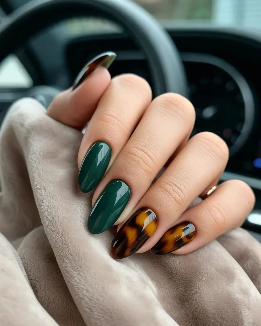
For a softer result, trade emerald for forest or muted olive and keep the amber accents glossy-looking and contained. One patterned nail can be enough if the base color is strong, especially on a shorter almond. The relationship to preserve is not the exact pattern but the warm accent acting as a bridge to the cool green.
This combination works well for medium skin because it uses depth rather than relying only on brightness. Emerald supplies saturated cool color, amber adds warmth, and the pattern creates surface variation without requiring many separate motifs. The honest limitation is that a busy patterned accent may compete with jewelry or clothing, so plain green on more nails is the easiest way to keep the set grounded.
Deep red with compact botanical accents
Short square nails alternate deep red with cream accents carrying small orange, yellow, and green botanical-looking details. The dark red gives the pale nails a clear frame, but the short length keeps the warm illustrations proportional instead of making them feel oversized. The result is seasonal through color and small detail, with enough empty surface to remain wearable.
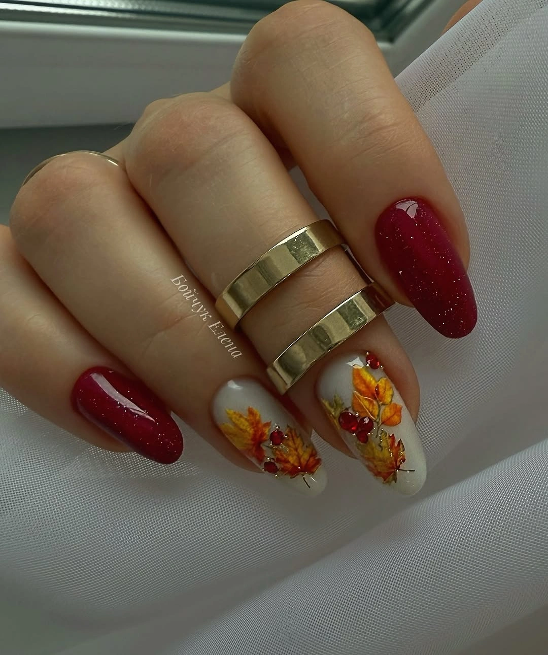
To make the palette calmer, use brick red instead of the deepest tone and leave the green detail on one accent nail. A warm cream base will blend gently with medium skin, while the small marks can stay near the center where they are easy to see. Do not enlarge the artwork too much; the compact scale is what keeps the set from becoming busy.
The manicure balances saturation and lightness rather than adding several dark colors. Red repeats as the strong base, cream supplies visual rest, and the small warm details connect the two surfaces. The tradeoff is that the most delicate marks may fade as the nails grow, so repeating one slightly stronger accent can be more useful than adding many tiny ones.
Coral gradients from nude to vivid tips
These medium-to-long square nails move from pale nude near the base into bright coral, peach, and orange at the tips. The transition softens the vivid color, but the saturation still makes the manicure the center of attention. On medium skin, the pale starting point keeps the warm finish from looking like a solid block while the square edge gives the gradient a clear frame.
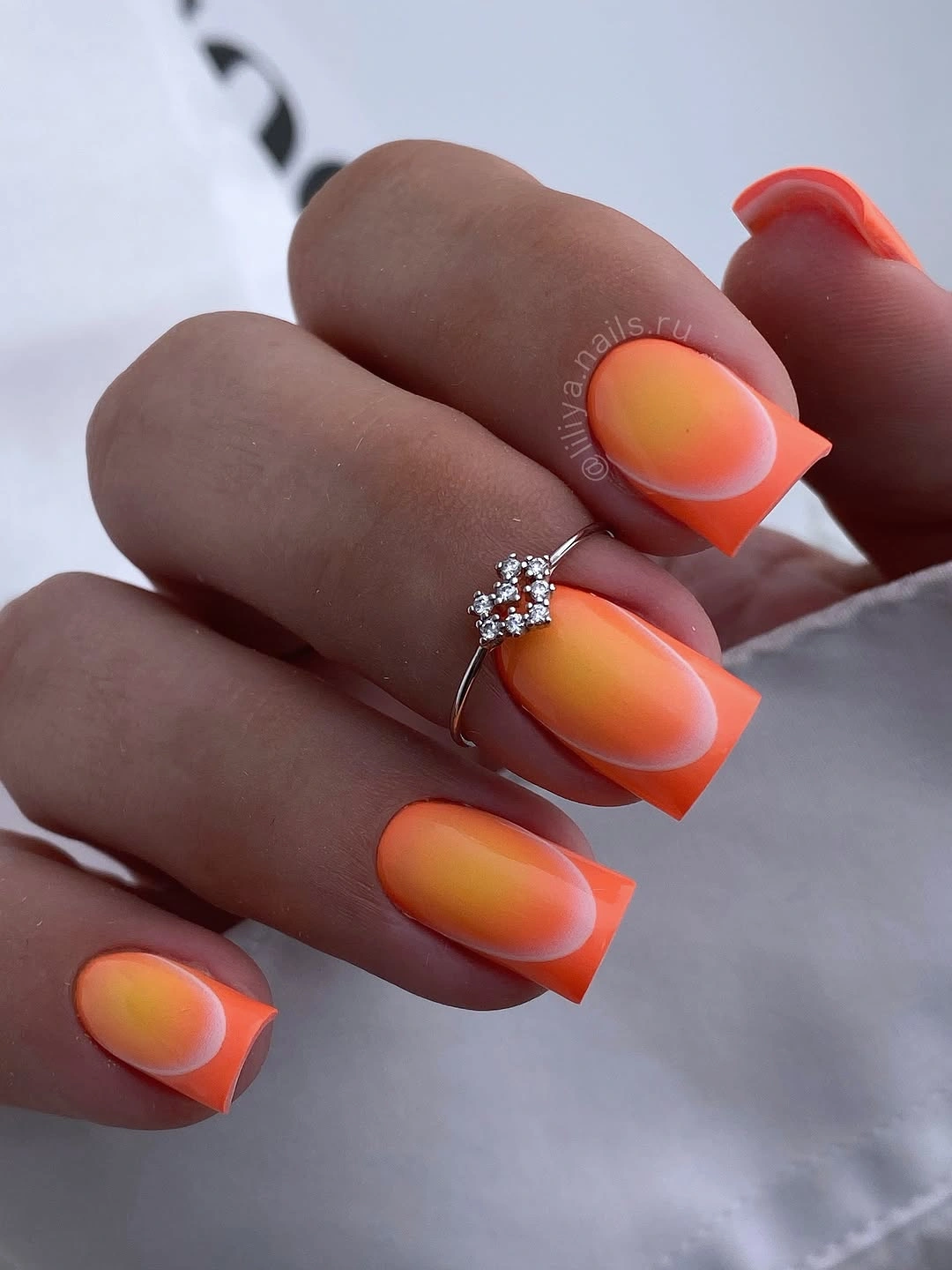
If the color feels too loud, use muted terracotta or shorten the colored area so more nude remains visible. A rounded square would soften the geometry, while keeping the gradient across only two accents would make the set easier to coordinate. The principle is to change saturation or coverage, not both at once, so the gradual transition remains legible.
This design is useful for understanding how value can guide a bright shade toward the skin instead of placing it abruptly at the base. Nude supplies a quiet starting point, coral creates warmth, and the tip carries the strongest saturation. The limitation is that any uneven transition will show on a large surface, so a simpler two-tone fade may be more practical than many tiny color steps.
Neutral blocks in camel, charcoal, and peach
Medium almond nails use a pale base with crisp charcoal, camel, and muted peach panels, creating a calm color-blocked composition. The light base keeps the darker blocks from feeling heavy, while the almond shape gives the geometry a long, tidy direction. For medium skin, the palette is useful because it offers both warmth and depth without relying on one extremely saturated shade.
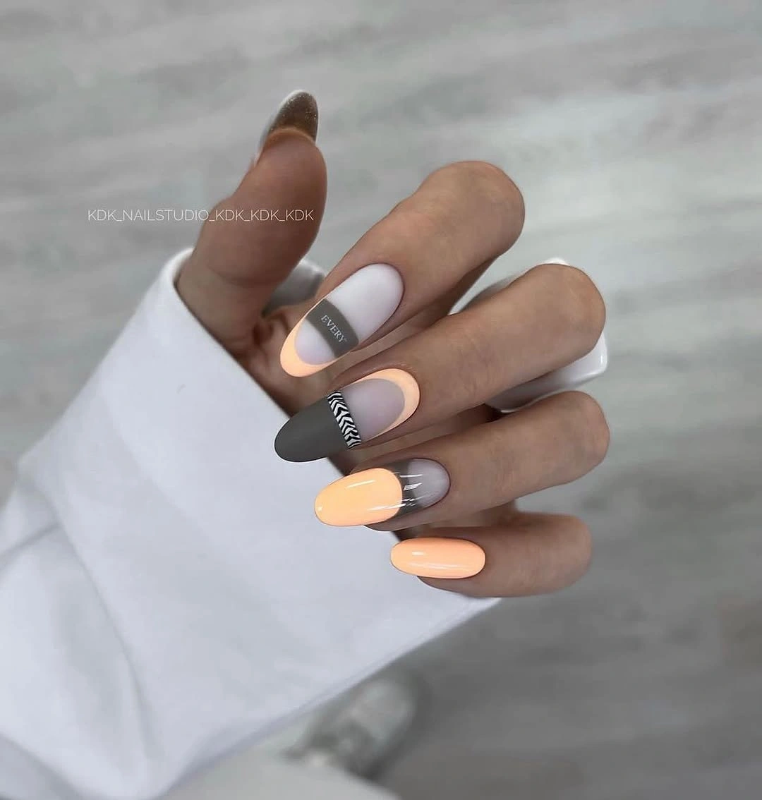
To tailor the balance, replace peach with soft terracotta for more warmth or replace charcoal with deep brown for a gentler edge. Keep the blocks separated and let the pale base remain visible, since crowding the surface would make the neutral palette look dense. A shorter almond would preserve the same color logic with less emphasis on length.
The manicure shows that neutral does not have to mean plain. Camel supplies warmth, charcoal adds value contrast, peach keeps the set lively, and the pale base gives each block room to read. The tradeoff is precision: clean boundaries are important to the look, so a slightly softer curved division may be easier to maintain than a perfectly sharp geometric edge.
Pale stilettos with one silver sparkle nail
Long stiletto nails use a pale pink base and tiny black botanical lines, then place concentrated silver sparkle on one accent. The delicate marks keep most of the set light, while the reflective nail gives the dramatic length a clear focal point. Against medium skin, the pale base creates a soft field and the dark line provides just enough definition to prevent it from disappearing.
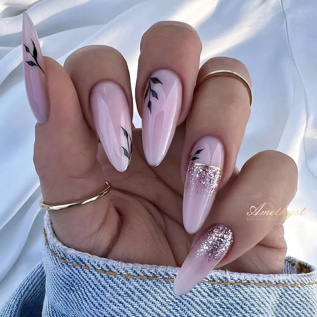
If the stiletto length is not practical, use a medium almond and keep the glitter accent on one finger. A warm pink-beige base can make the look more natural, while slightly stronger black marks will remain visible on the shorter surface. The structure is easiest to preserve when the sparkle stays concentrated instead of spreading across every pale nail.
The color relationship is intentionally quiet: pale base first, fine dark detail second, bright accent last. That order lets the silver feel special rather than competing with the artwork, and it also makes the design easy to edit for a less formal setting. The limitation is that long pointed nails and concentrated sparkle both attract attention, so this is not the lowest-maintenance option even though the palette is delicate.
Blush pink geometry with black and gold lines
Medium square blush nails use dark outlined panels, tiny gold-looking details, and occasional warm brown marks. The pale base keeps the geometry light, while black provides the structure that makes each boundary visible. Gold acts as a small punctuation mark rather than a dominant surface, which gives the design polish without making it overly reflective.
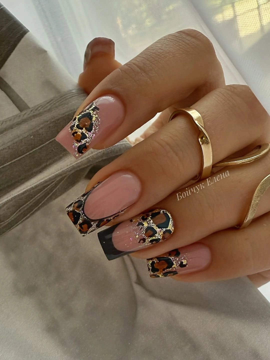
For an easier adaptation, keep the black outlines on two accent nails and use plain blush or warm nude elsewhere. Brown can replace black if you want the contrast to sit more gently against medium skin, while one small bright detail is enough to preserve the focal point. The important variable is line weight; too much dark fill would change the airy geometry into a heavy block.
This manicure works by assigning separate jobs to value and temperature. Blush supplies the light field, black outlines the form, and the warm bright marks add a small shift that keeps the palette from feeling flat. The tradeoff is that precise outlines can reveal growth quickly, so a slightly curved or broken line may offer the same idea with more forgiving upkeep.
Milky nude nails with miniature warm accents
Short-to-medium square nails use a milky nude base and tiny orange, red, and brown floral or leaf-like details, leaving much of each nail open. The warm marks are small enough to add seasonal color without covering the surface, and the moderate length keeps the idea approachable on medium skin. A spotted ring in the foreground is incidental, so the manicure’s balance comes from pale space and miniature detail.
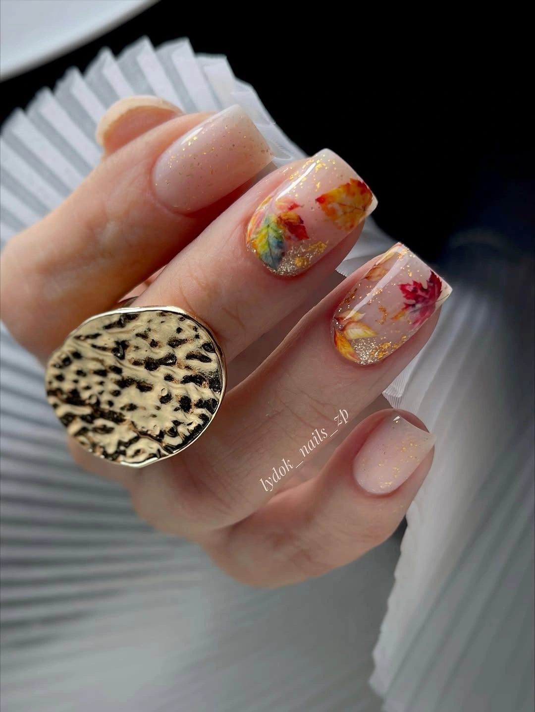
To make this design even calmer, place the warm details on two nails and keep the rest plain milky nude. A sheer peach or warm beige could shift the undertone without changing the visual scale, and a soft square would preserve the clean edge. Resist adding larger motifs simply because the tiny marks feel delicate; their value is the quiet color interruption.
This is a gentle finishing point because it uses the least color coverage while still offering a clear autumn cue. Nude supplies the neutral support, orange and red bring warmth, and brown adds definition without a sharp black contrast. The limitation is visibility as the manicure grows, so one slightly stronger accent can be more useful than many details that disappear into the base.