Fall nails for fair skin tones often look most balanced when softness comes from the spacing of color, not simply from choosing the palest available shade. A deep burgundy can feel graceful beside a light hand when a nude interval, a cream edge, or a narrow line interrupts it. The most convincing autumn manicures let contrast remain visible while giving every darker note a lighter surface that keeps it from overwhelming the whole hand.
Before choosing art, decide whether you want the eye to settle on a curve, a tip, or a reflective finish. Pale bases benefit from a little warmth and a controlled dark accent, while vivid shades need enough quiet space to stay polished. Delicate details work best when their scale follows the nail length; no amount of ornament makes a design feel lighter if the individual marks have nowhere to breathe.
Botanical Lines Against Taupe and Burgundy
Long almond nails combine taupe and burgundy with fine black-and-white botanical-style line accents, creating softness through drawn detail rather than through a pale palette alone. The darker solids sit beside narrow light markings, so the design has depth without closing in on the hand. That exchange is especially flattering when the surrounding skin is fair because the lighter linework keeps the rich colors visually lifted.
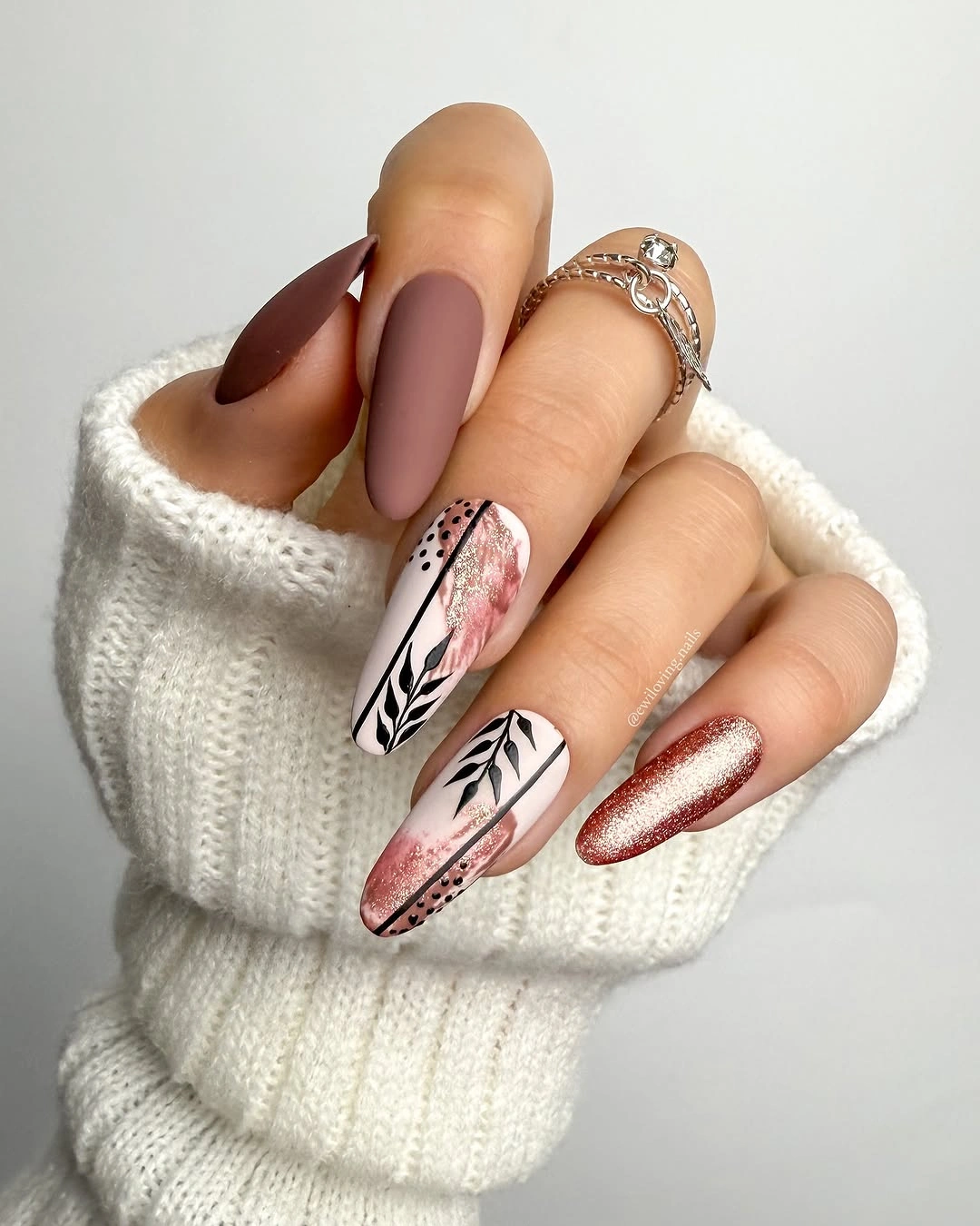
A shorter adaptation can keep one burgundy nail, one taupe nail, and a single botanical accent over a nude base. Place the narrow marks where there is clear background around them instead of layering them over every dark nail. The linework does not need to be intricate to be effective; one small branch-like direction can preserve the airy quality far better than many tightly packed strokes.
The charm lies in the contrast of a soft taupe field with a wine-dark interruption. Burgundy brings autumn weight, while the pale accents stop it from becoming too formal or severe. If you prefer quieter ornament, remove the black outline and retain a few white marks only. The result will be less graphic, yet it will still carry the same sense of controlled delicacy.
Orange Tips Through a Brown Nude Palette
Nude, dark brown, and soft pink create a calm base for orange French-tip accents on medium almond nails. The orange appears near the edge rather than over the entire surface, which gives it a warm flash without making the set feel loud. Gold rings and the narrow tip placement reinforce the vertical length, allowing the colors to read as a composed autumn combination rather than separate statements.
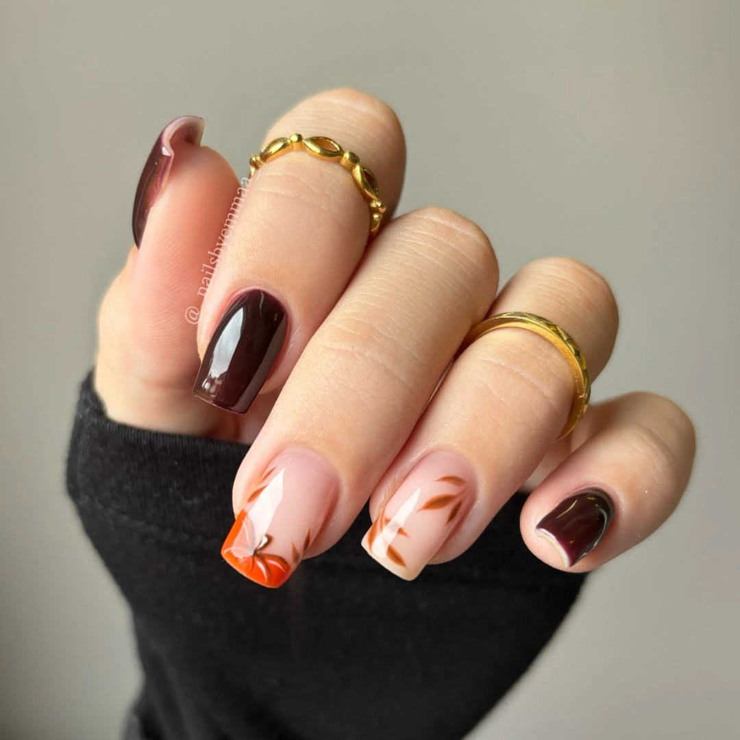
Keep the orange to one or two tips if your preference is more muted, then let a brown solid nail provide the deeper note. An almond shape is helpful because a curved tip follows its outline naturally, but a short oval can use the same color in a small side sweep. Leave the nude base visible near the cuticle for a softer transition and a less obvious grow-out line.
Orange becomes more refined when it is framed by chocolate instead of pure black. The brown makes the warm tip feel connected to fall, while the pink prevents the palette from becoming too heavy on fair skin. There is a practical limit to how many colors should appear in a small tip design; choose one bright edge and one dark solid before adding any additional pattern or metallic detail.
Bright Orange With Gentle Red Contrast
Long almond nails use orange, red, pale nude, and a warm beige accent to create a bright but still seasonal rhythm. The strongest colors are separated by light areas, which keeps them from competing at the same visual volume. A textured-looking beige accent changes the surface reading without introducing another full pigment, making the palette feel more layered than a simple orange-and-red pairing.
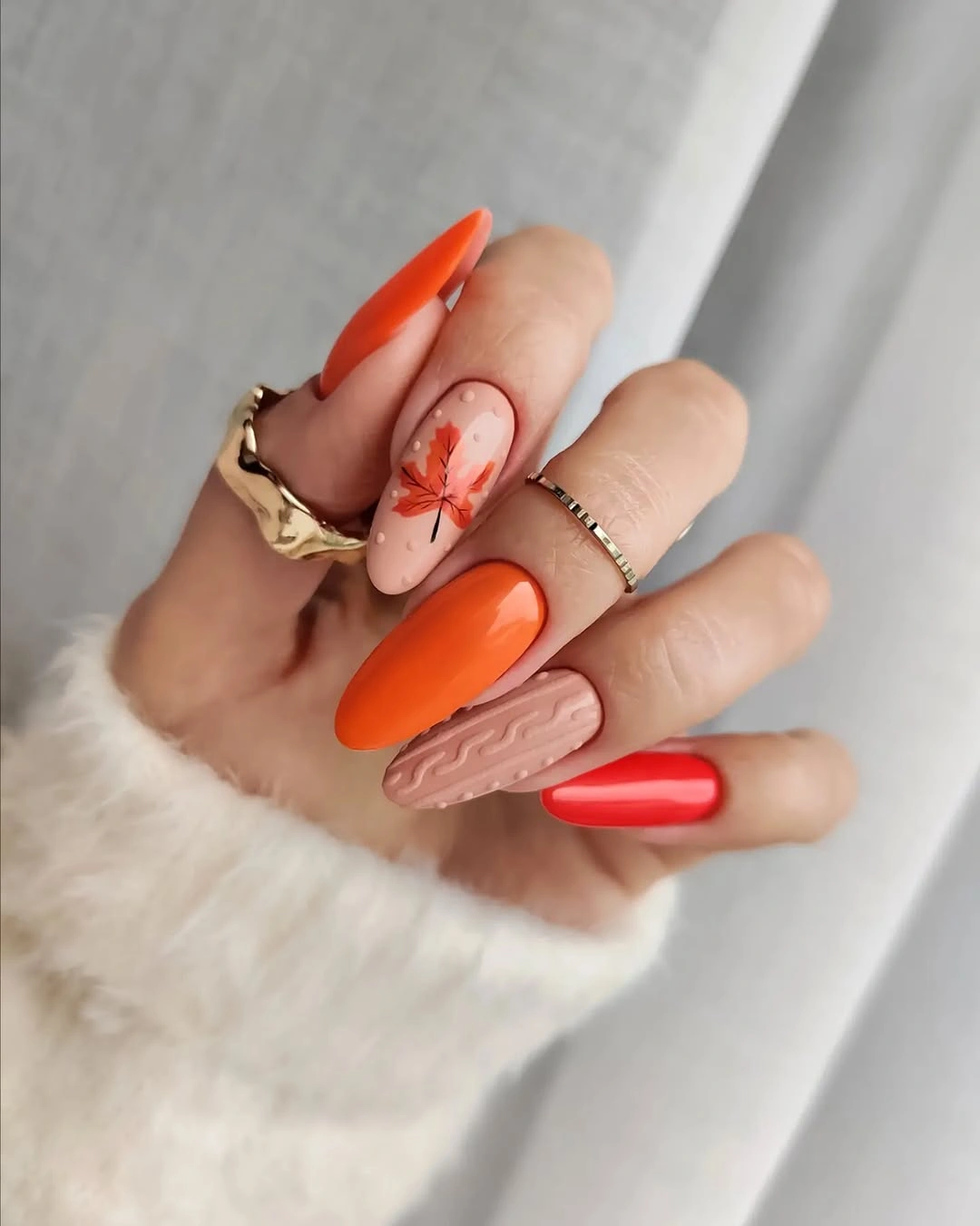
For a smaller canvas, choose either orange or red as the main statement and let the other shade appear only as a tip or slim diagonal. The pale nude is doing important work here because it gives the warm colors a clean border and makes their saturation easier to wear. If texture is not your preference, a plain caramel accent preserves the same warmth with a simpler finish.
Fair skin does not require cool colors to look balanced; it simply benefits from clear value changes. The pale base keeps the red from looking too dense, and the orange provides a more open, sunlit contrast. A full hand of bright warm tones would feel more forceful, whereas this arrangement stays light because the deepest and brightest notes are interrupted by neutral space.
Dark Burgundy in a Short Square
Short squared nails painted a very dark burgundy have an understated elegance that comes from their clean outline and glossy surface. The flat edge gives the color a modern, compact shape, while the reflection keeps the deep pigment from reading as a flat near-black. On fair skin, that small highlight is useful because it creates separation between the nail and the hand without needing an accent color.
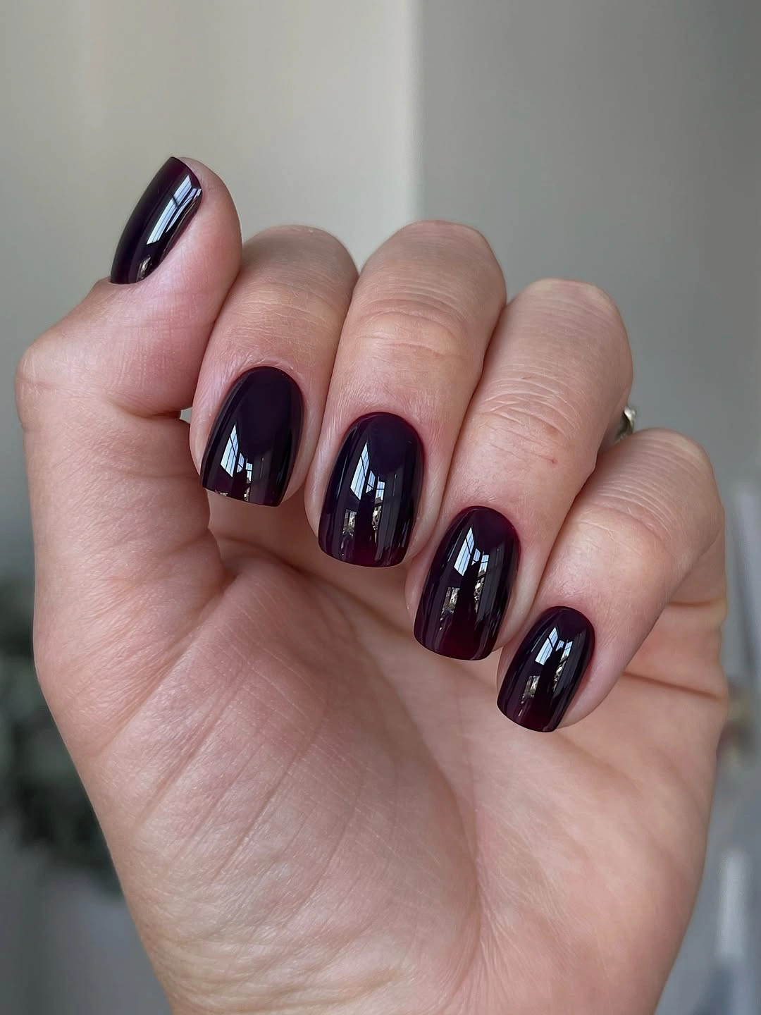
A slightly softer version could use a red-brown wine shade instead of the deepest burgundy, particularly if you want the color to stay visible in evening light. Fall nails for fair skin tone offer a useful comparison when choosing how much depth to keep around a compact outline. Since every nail carries the same shade, small changes in the corners become more noticeable than they would in a mixed design.
The value of this look is its restraint. Burgundy has enough autumn presence to stand alone, and the square shape keeps the result from becoming overly romantic. A rounded edge would make it gentler, while a sharper corner would heighten the graphic effect. Choose the version that matches your usual jewelry and clothing, because a one-color manicure becomes a quiet but consistent accessory.
Soft Olive With Diagonal Light Green
Muted olive and pale yellow-green are arranged diagonally across short nails, producing a gentle contrast that feels fresher than a single deep green. The two tones are related enough to remain calm, yet the lighter segment catches the eye and keeps the shape from looking heavy. That diagonal movement also adds a little length to a compact nail without relying on a traditional French edge.
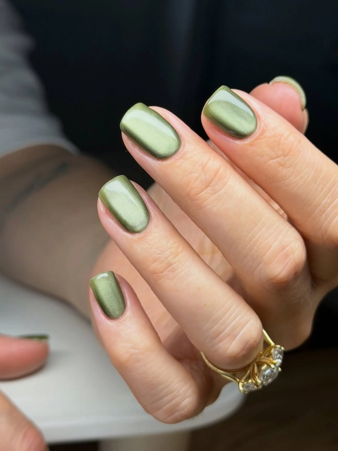
To soften the contrast further, choose a creamier light green and keep the olive on only the outer half of each nail. A diagonal split needs a clear direction, so repeat the angle on several nails rather than changing it everywhere. If you are growing out a shorter manicure, begin the lighter portion slightly above the cuticle area to preserve a more relaxed transition as length returns.
The palette works because the olive gives the pale green a grounded companion. On very fair skin, a full hand of yellow-green could feel too sharp, but the deeper olive adds depth without introducing black. This option is best for someone who enjoys color but wants a lower-contrast alternative to bright orange or red. The simple placement is what keeps it airy and wearable.
Champagne Sheen on a Rounded Nail
Soft champagne-gold on short rounded nails creates luminosity through a gentle sheen rather than through a bold metallic block. The surface looks warm and light, with the curved shape allowing the reflection to move naturally from one side to the other. That combination can brighten fair skin without the starkness of silver, especially when the tone leans creamy instead of icy.
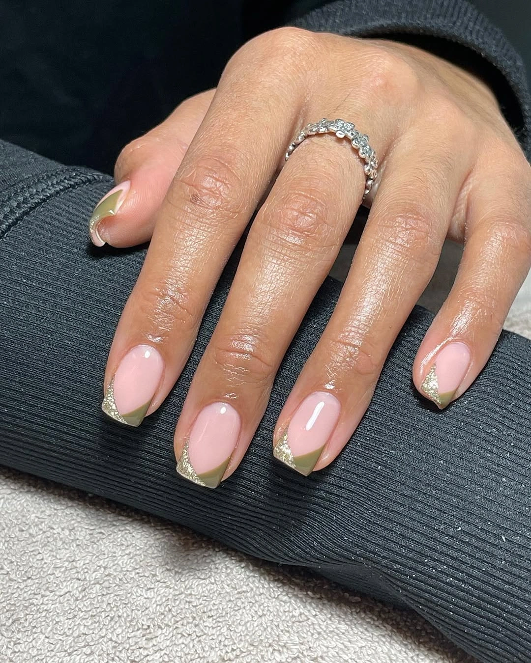
A subtler variation would use a beige base with only a fine pearly glow, which keeps the same light-catching idea but makes it easier to pair with everyday outfits. Rounded nails are useful for this finish because they make the reflection look continuous. If your nails are squared, keep the corners softly filed so the warm sheen does not turn abruptly at the edges.
The important distinction is between a quiet surface and heavy glitter. Fine reflection adds a delicate lift, while large particles would pull the manicure toward a more festive direction. Champagne can function almost like a neutral, but it remains warmer than cream and more visible than beige. That makes it a good bridge for a fall wardrobe that includes camel, brown, berry, or soft pink.
Pale Pink With Graphic Zebra Curves
Long almond nails use pale pink, black, white, and green with zebra-like marks and curved graphic accents that feel playful without losing their polish. The pale base gives the darker details room, while the green adds an unexpected earthy note among the high-contrast lines. Each accent has a different scale, which makes the manicure feel composed rather than copied from one nail to the next.
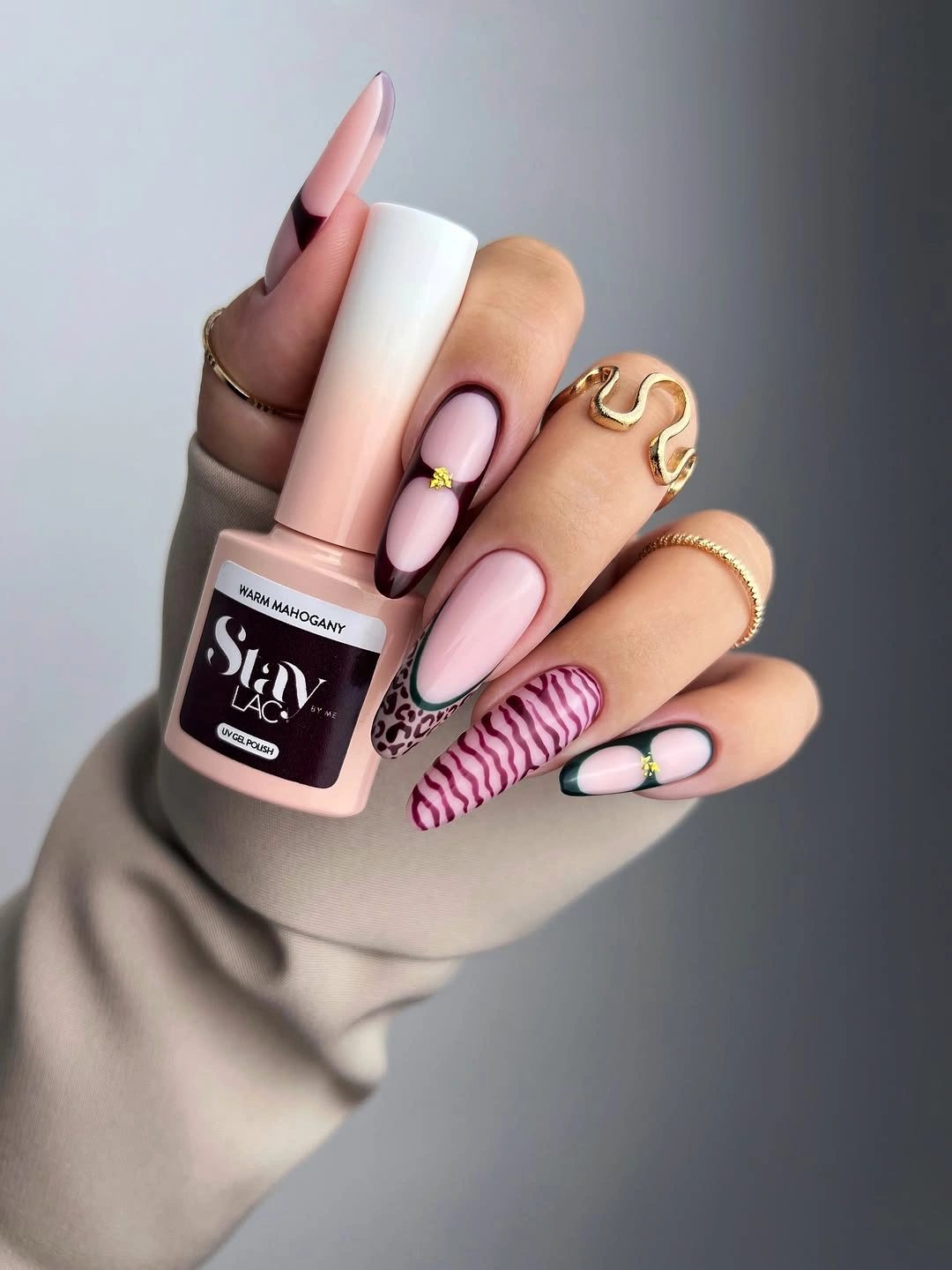
A simplified version could place the black-and-white pattern on one nail and reserve green for a single small curve. Keep the remaining nails pale pink so the graphic treatment has a clear setting and the almond silhouette remains visible. On a shorter nail, broad zebra-like strokes will read better than many fine stripes, particularly if the design needs to stay recognizable at arm’s length.
Softness here comes from the pink background, not from reducing the contrast. Black and white make the lines crisp, while green prevents the palette from drifting into a purely monochrome pattern. If you remove the green, the look will feel more classic and sharper. Leaving it in gives the set a fall-oriented note, but it should stay a small accent so the linework remains the main feature.
Black, Gold, and Deep Red Points
Long pointed nails pair black, warm gold, and dark red in a format that relies on strong separation between each color. Gold appears as a bright interruption, while the red supplies depth and black sharpens the silhouette. The pointed shape gives these compact color zones a clear direction, so even the bold contrast feels arranged rather than simply dramatic.
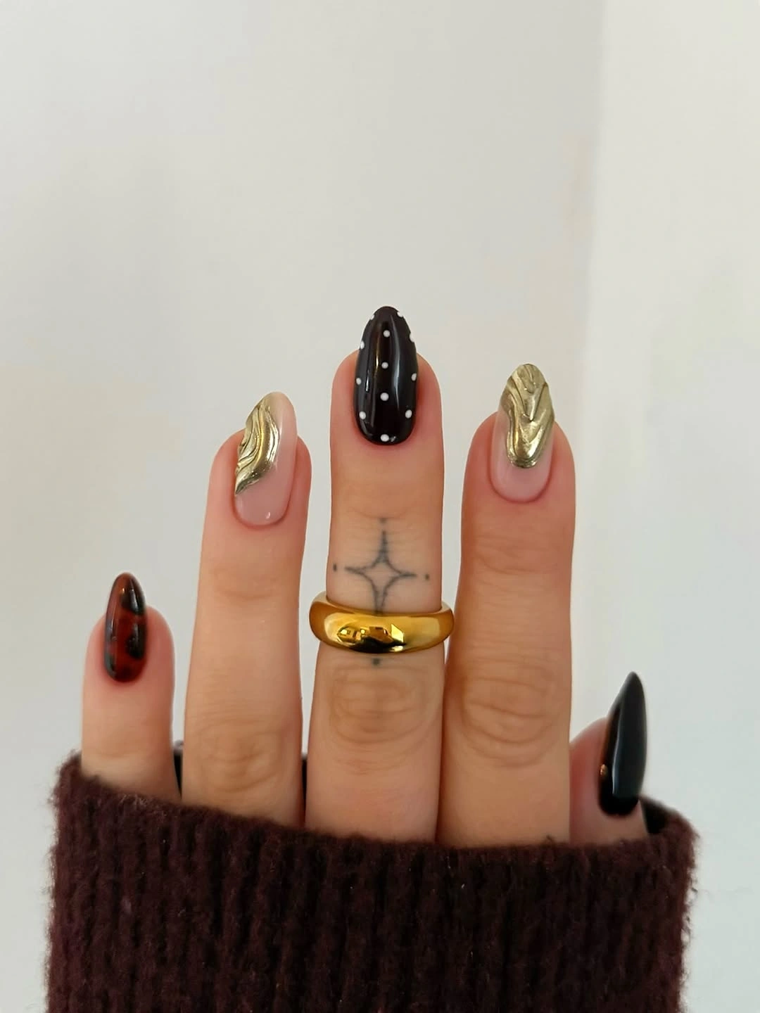
For a less intense version, keep dark red as the dominant color and use gold on only one small accent nail. Black can then become a fine edge or a single tip instead of a repeated full surface. Reducing the number of dark areas is especially helpful on fair skin, where a large black field can become the entire visual focus rather than one part of the palette.
The design succeeds because the gold sits between two deep tones and prevents them from merging visually. A softer metallic-looking beige would lower the contrast, while a brighter yellow gold makes the set more assertive. Consider the length before choosing all three colors: on a short nail, the same palette needs larger simpler panels or it can lose the elegant clarity created by the pointed outline.
Copper Glow Beside Blush Nude
Blush nude and coppery brown alternate on short rounded nails, with the reflective-looking copper creating the strongest point of attention. The warm metallic surface looks fuller beside the quiet nude than it would in a hand made entirely of shimmer. Because the shapes are short and rounded, the contrast remains soft, giving the color pairing a polished warmth that does not feel overly dressed up.
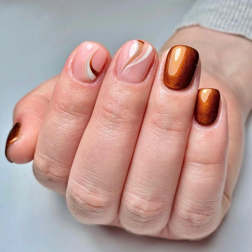
Use copper on two nails and a creamy blush on the rest if you want the light-catching effect to feel more restrained. A fine shimmer works better than a rough glitter for this scale, since the reflective surface should follow the nail curve instead of breaking it into separate points. Keep the nude warm enough that it does not look gray beside the brownish copper.
Copper is useful for fair skin because it introduces autumn warmth without the full depth of burgundy. It can still look heavy if it appears on every nail, which is why the blush intervals matter so much. Fall red nail ideas make a helpful reference when deciding whether to deepen the accent toward espresso or keep it closer to rose-brown.
Mauve Florals With Dark Fine Outlines
Mauve pink provides the soft field for black floral-like outlines on long almond nails, allowing the drawn marks to look delicate rather than severe. The darker linework is concentrated instead of repeated uniformly, which keeps the eye moving through the manicure. On fair skin, the muted mauve has enough warmth to remain flattering while still allowing the black accents to stay visibly clean.
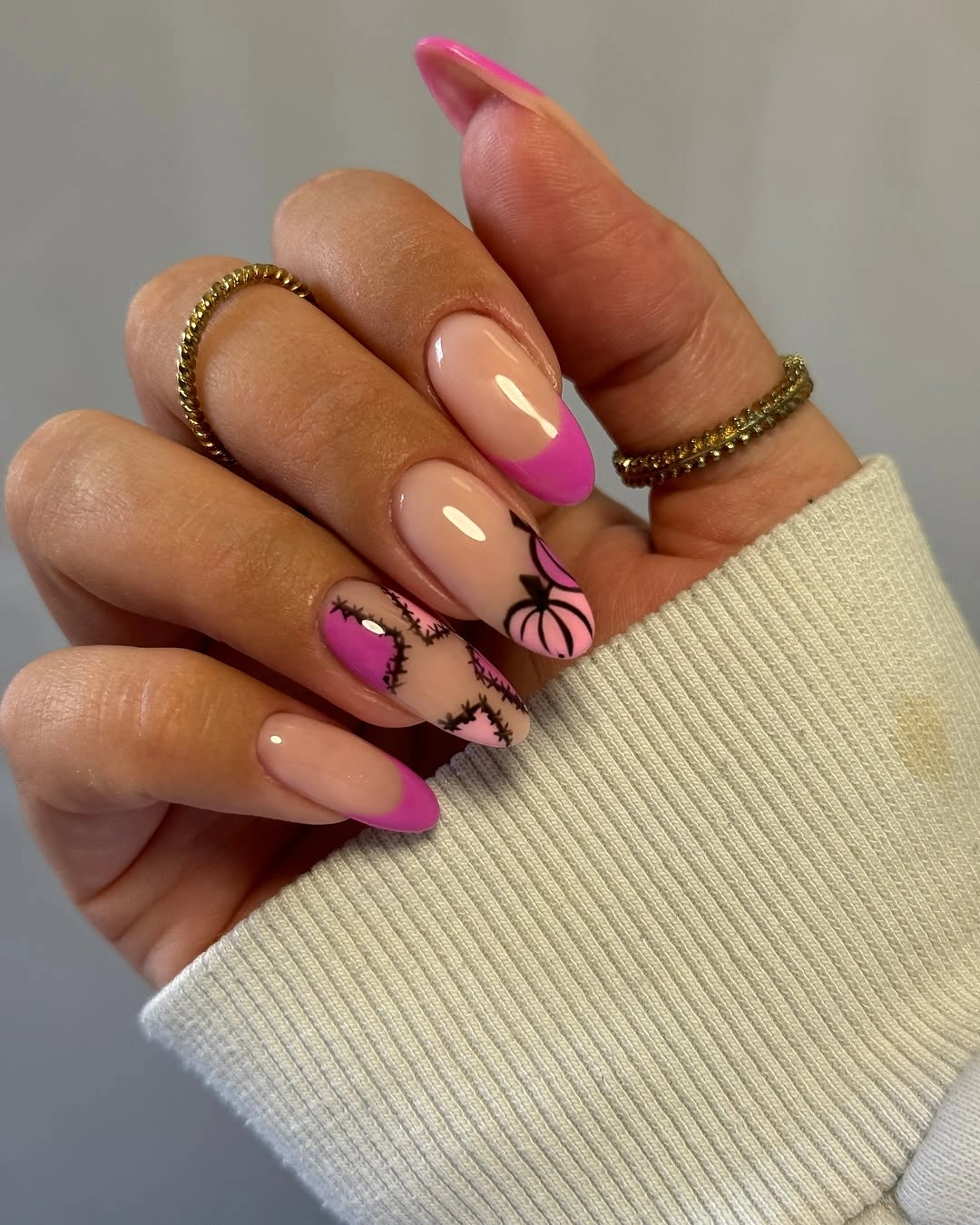
If you prefer a quieter version, place the outline art on a single nail and let the others remain mauve or dusty rose. The almond shape supports a vertical stem or petal-like curve naturally, but it is worth leaving space near the sidewalls so the design does not feel cramped. Fine black detail needs a pale enough ground to remain crisp, so avoid making the base too dark.
The visual balance depends on restraint: a small dark outline can give a soft color real definition, whereas many outlines would turn the manicure more graphic than romantic. A brown line would soften the result further, while black preserves the clarity of the drawing. Keep the flowers or leaf-like marks irregular in placement so the design feels observed and airy instead of printed in identical positions.
Angular Black and Green French Edges
Nude bases with black and deep green angular French-style tips use clean geometry to make medium nails look longer and more intentional. The two dark colors sit at the edge rather than occupying the full surface, so the hand keeps a light overall reading. Green takes some severity out of the black, creating a fall palette that feels sharper than neutral but less stark than a full monochrome design.
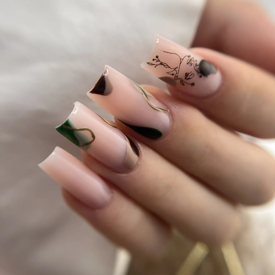
Choose one dark color per hand if you want the angular tip to feel simpler, or alternate black and green for a little more movement. The tip should follow a clear diagonal or corner rather than becoming a deep block, especially on a short nail. Keeping the diagonal consistent across several fingers provides the crisp edge placement without making the dark colors look like solid blocks.
The benefit of this approach is that dark color remains concentrated at the far end of the nail, away from the cuticle and much of the skin. That placement makes the contrast easier for fair tones to carry. A cream line between nude and black would soften the transition, while the green already performs that role more subtly. Keep the angles consistent enough that the design reads as one visual language.
Tiny Speckles Over a Clean Nude
Short rounded nude nails with tiny dark speckles prove that a small detail can change a plain base without taking over its softness. The marks are scattered with plenty of bare space around them, so the manicure keeps its light, close-to-natural quality. This is an especially useful fall direction for fair skin when bold brown, green, or red feels too much but a completely plain nude feels unfinished.
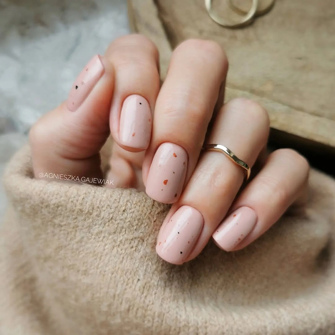
Keep the speckles sparse and varied in size; evenly spaced dots can quickly look more decorative than intended. A warmer nude will make the tiny marks look gentler, while a pale beige will make them more graphic. The short shape supports this treatment because the detail is not trying to create length, only to bring a little texture and visual interest to an otherwise quiet surface.
The restraint is the point. Adding a French tip, a metallic line, or several accent colors would change the character from subtle texture to a fuller design. If you want a little more depth, choose a muted mushroom base rather than multiplying the dots. The manicure stays polished because the small marks remain an interruption, not a pattern that demands attention from every angle.
White Squares With a Brown Marble Accent
Opaque white and dark brown create strong blocks on long squared nails, while a marbled brown-and-white accent interrupts the clean solids with a more fluid surface. The square shape makes the contrast feel architectural, and the bright white keeps the richer brown from becoming too heavy beside fair skin. One patterned nail is enough to connect the colors without weakening their clear separation.
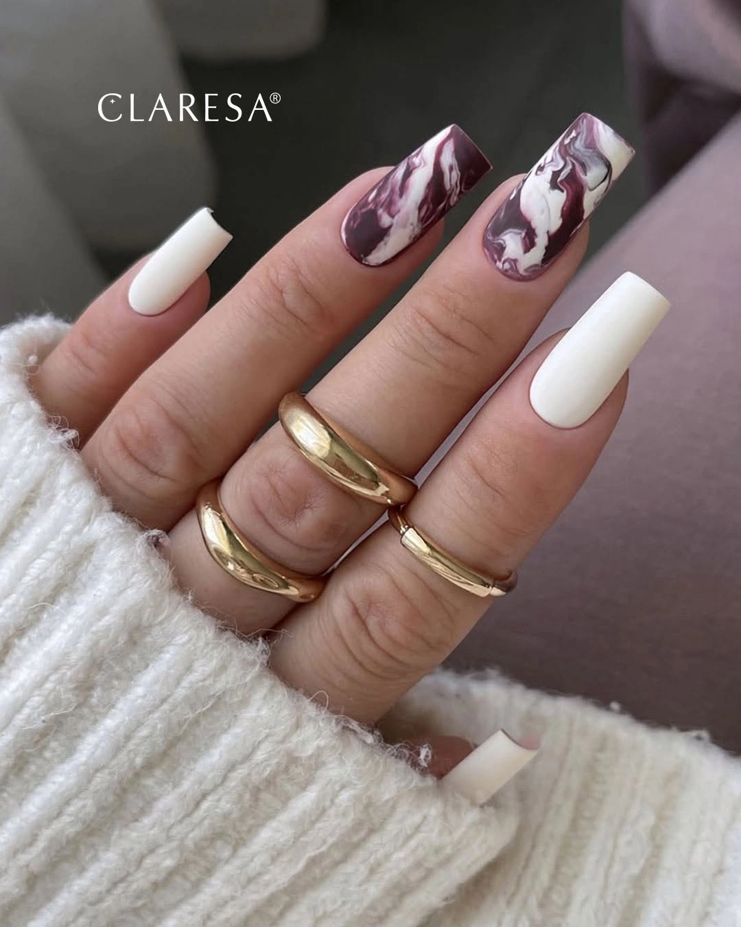
A softer alternative could use cream instead of bright white and a medium cocoa instead of the deepest brown. Keep the marble-like detail on one nail so its irregular movement remains special rather than competing with itself. Fall nail designs for all skin tones can help compare the value contrast before you reduce the number of colors around a square edge.
White is doing more than adding brightness here; it creates visual space around the brown and makes the marbled accent readable. A paler base will always raise the contrast, so consider a warmer cream if pure white feels too stark against your complexion. The tradeoff is maintenance at the tip, where a bright solid edge can show wear sooner than a darker brown or a mixed pattern.
Directional Red and Orange Almond Tips
Orange, red, wine, and white appear on long almond nails through narrow graphic marks and directional tips rather than broad full-color coverage. The pointed oval shape gives each line a natural route, letting the brighter colors move along the nail instead of sitting in one static block. White breaks up the warmth at key points, which keeps the palette from looking overly dense or too close in value.
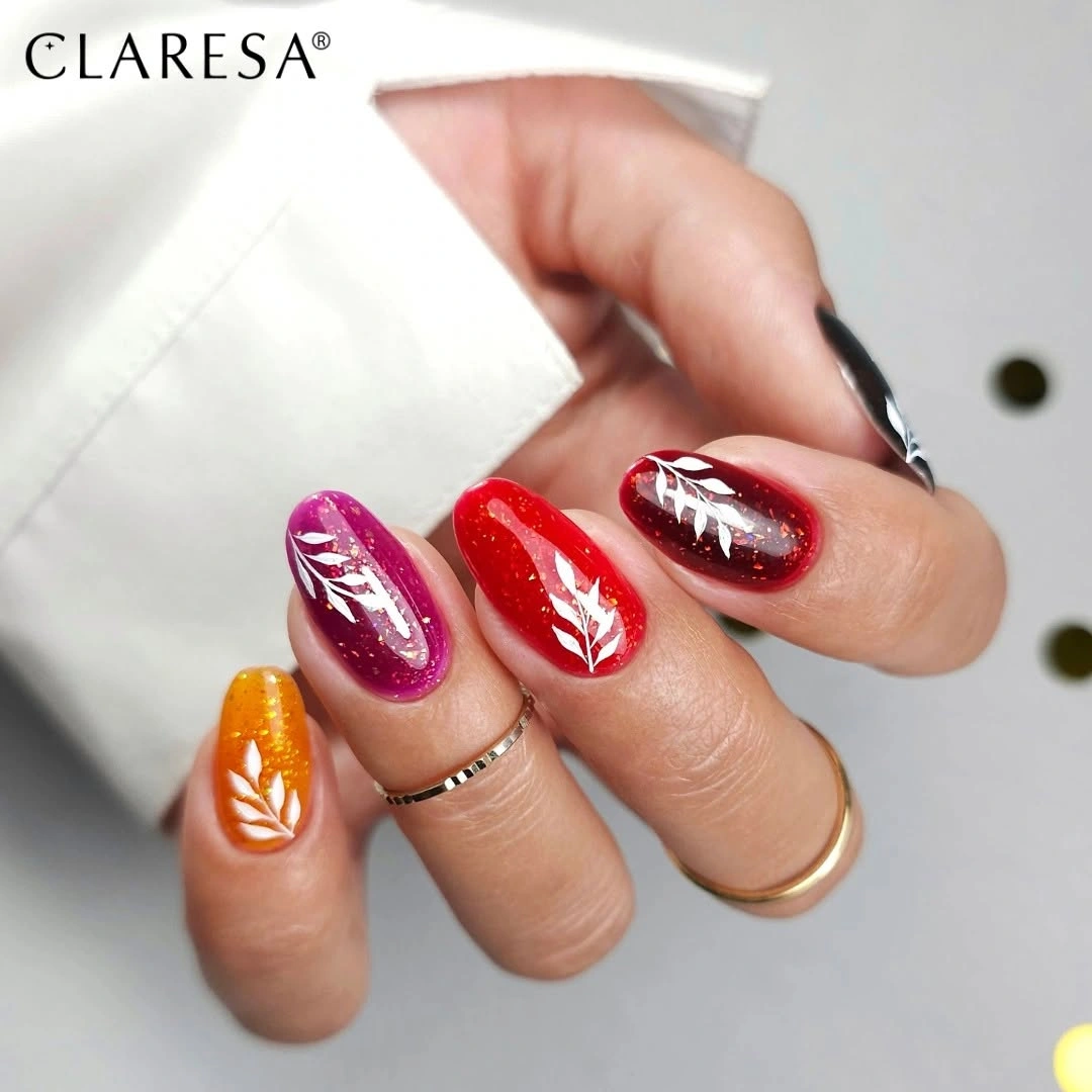
For a more wearable version, choose red and orange as the main pair, then use white only as a slim divider. Avoid adding a third warm shade if the nails are short; clear directional placement is more important than a long color list. A small diagonal at the tip can preserve the energy of the design while leaving the majority of the nail nude and visually calm.
The airy quality comes from movement and space rather than from pale color alone. Red and orange can sit close together without becoming muddy when a crisp white interval separates them. If you prefer a deeper fall mood, let wine replace orange on one finger. Keeping the direction of the tips related across the hand will make the mixed colors feel intentional instead of scattered.
Red, Navy, and Pink Graphic Florals
Long almond nails combine red, navy, pale pink, and white floral-like graphic details in a palette that is bold but still balanced by a soft base. Navy brings a cooler depth to the warm reds, while the pink areas provide a pause between the stronger fields. The decorative marks are placed as accents, which means the colors remain the first impression and the small graphics become a second look.
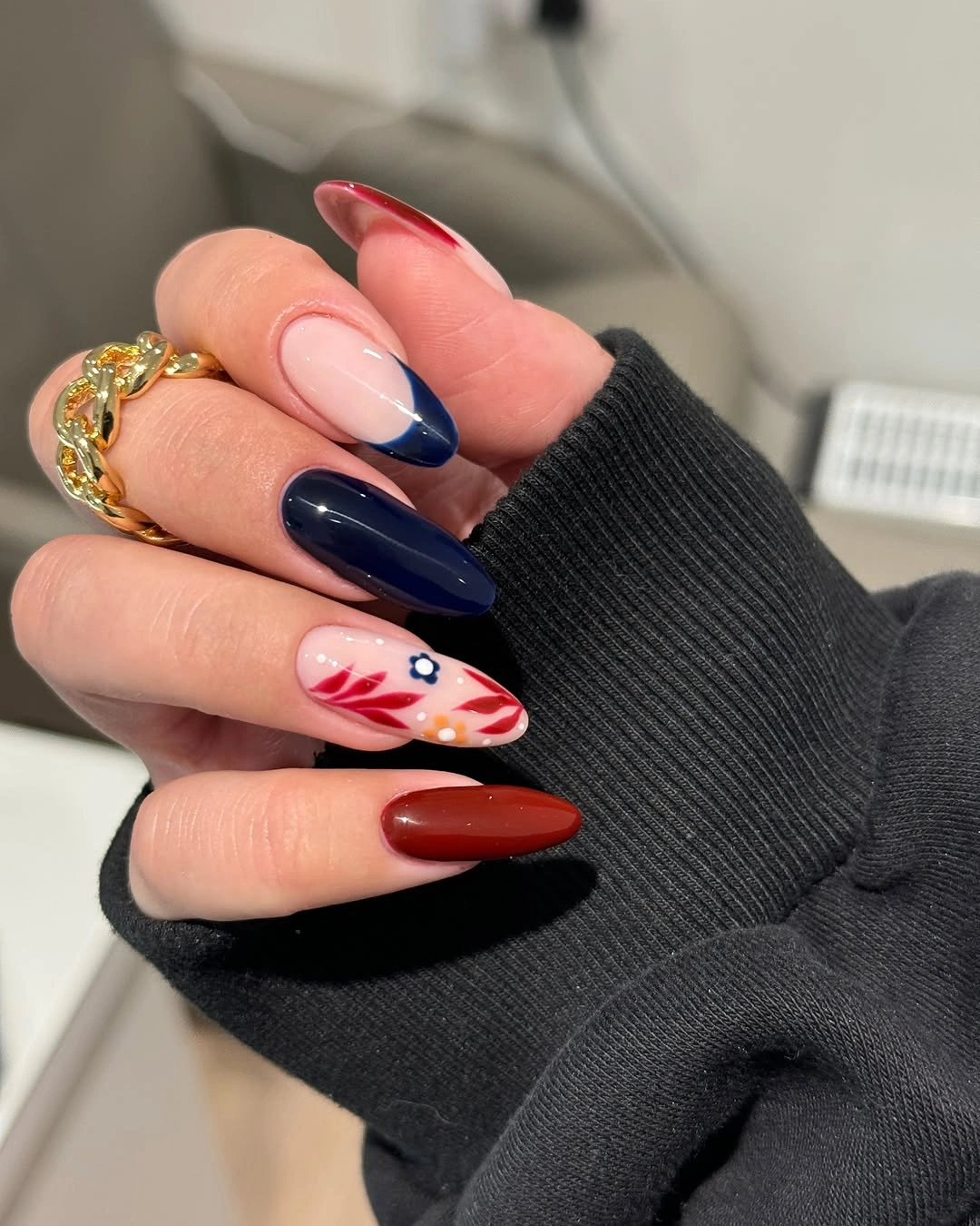
To reduce the visual weight, use navy on one nail only and keep red as the more consistent dark color. Pale pink is helpful for preserving a softer connection to fair skin, especially when white marks are present. On a shorter length, choose one flower-like element or a single curved line rather than several miniature details, since the color contrast already gives the manicure plenty of energy.
The interesting tension is between warm red and cool navy, moderated by a pale pink ground. Removing navy would make the design more straightforwardly warm, while keeping it introduces a sharper editorial note. White details should remain limited, or they can start to compete with the pink for brightness. The most polished version lets one dark shade lead and the other support the composition.
Flame-Like Curves in Brown and Orange
Short almond nails use dark brown, cream, orange, and black in flowing flame-like curves that make a compact shape feel animated. The cream areas act as open space, while the brown and black give the warm orange a clear outline. Because the curves travel in different directions, the design feels lively without requiring every nail to carry the same amount of pigment.
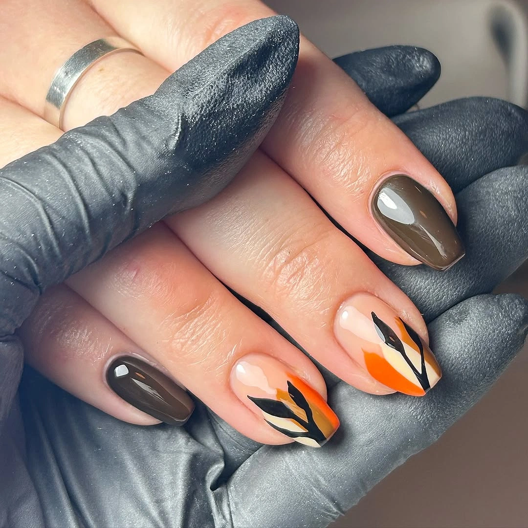
A simpler version can use brown and orange only, with one cream nail to prevent the palette from closing in. Keep the curves wide and distinct rather than adding many narrow waves, especially if the nails are short. The form should follow the length of the nail enough to create movement, but it does not need to repeat exactly from finger to finger to remain cohesive.
Dark brown is gentler than black against fair skin, so it is a useful anchor when orange is already bright. The black line adds crispness here, but it can be removed if you want a softer, more blended interpretation. The tradeoff is complexity: each extra curve adds visual activity, so allow at least one nail to stay mostly solid and give the rest of the design room to breathe.
Caramel Nails With a Pearly Reflection
Soft caramel brown on medium squared nails has a pearly reflective surface that gives the neutral more dimension than a flat cream finish. The color is warm but not overly dark, making it a comfortable seasonal option for fair skin when deep espresso feels too heavy. The square silhouette adds polish, while the reflected light softens the otherwise clean, simple color application.
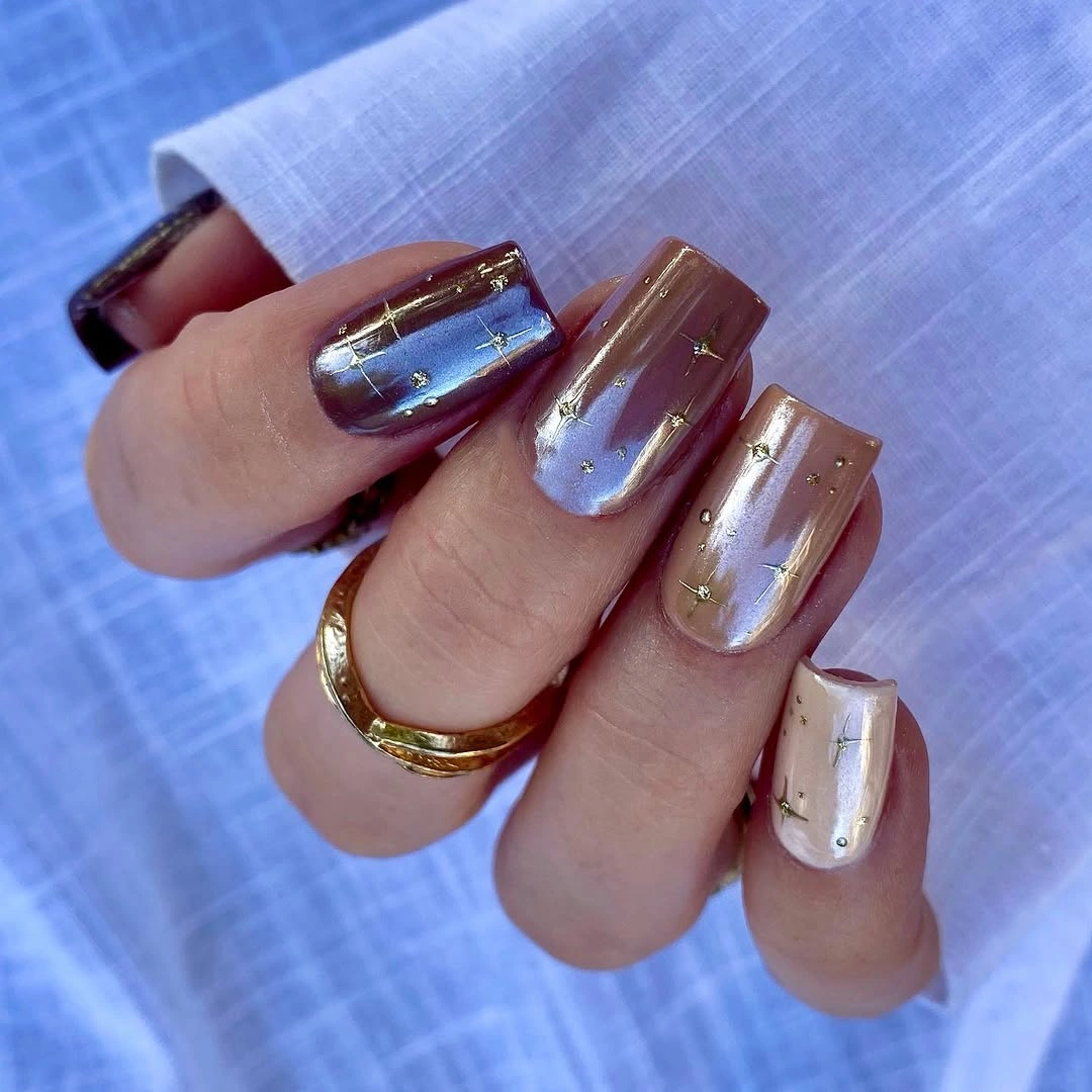
A shorter square with gently rounded corners can keep the same effect while feeling less formal. Choose a caramel that has enough depth to separate from your natural skin tone, then let the sheen provide the variation instead of adding art. If you wear a lot of cool metal jewelry, a slightly rosier brown can help the manicure sit more naturally beside it without losing its autumn warmth.
This kind of finish works best when it looks like light moving across color, not like a separate glitter layer. The pearly reflection keeps caramel from becoming plain, yet it remains easier to style than a high-contrast pattern. A lighter beige would feel more understated; a darker toffee would create more definition. The middle tone shown here makes the warmth visible while maintaining a gentle overall impression.
Mauve Brown and Cream in Smooth Shine
Long squared nails alternate mauve-brown and creamy white with a smooth reflective finish, creating a clean contrast that feels polished rather than stark. The mauve influence keeps the brown soft, while the cream brightens the hand and gives the dark color a clear companion. This is a useful palette for fair skin because neither shade is aggressively saturated, yet the difference in value remains visible at a glance.
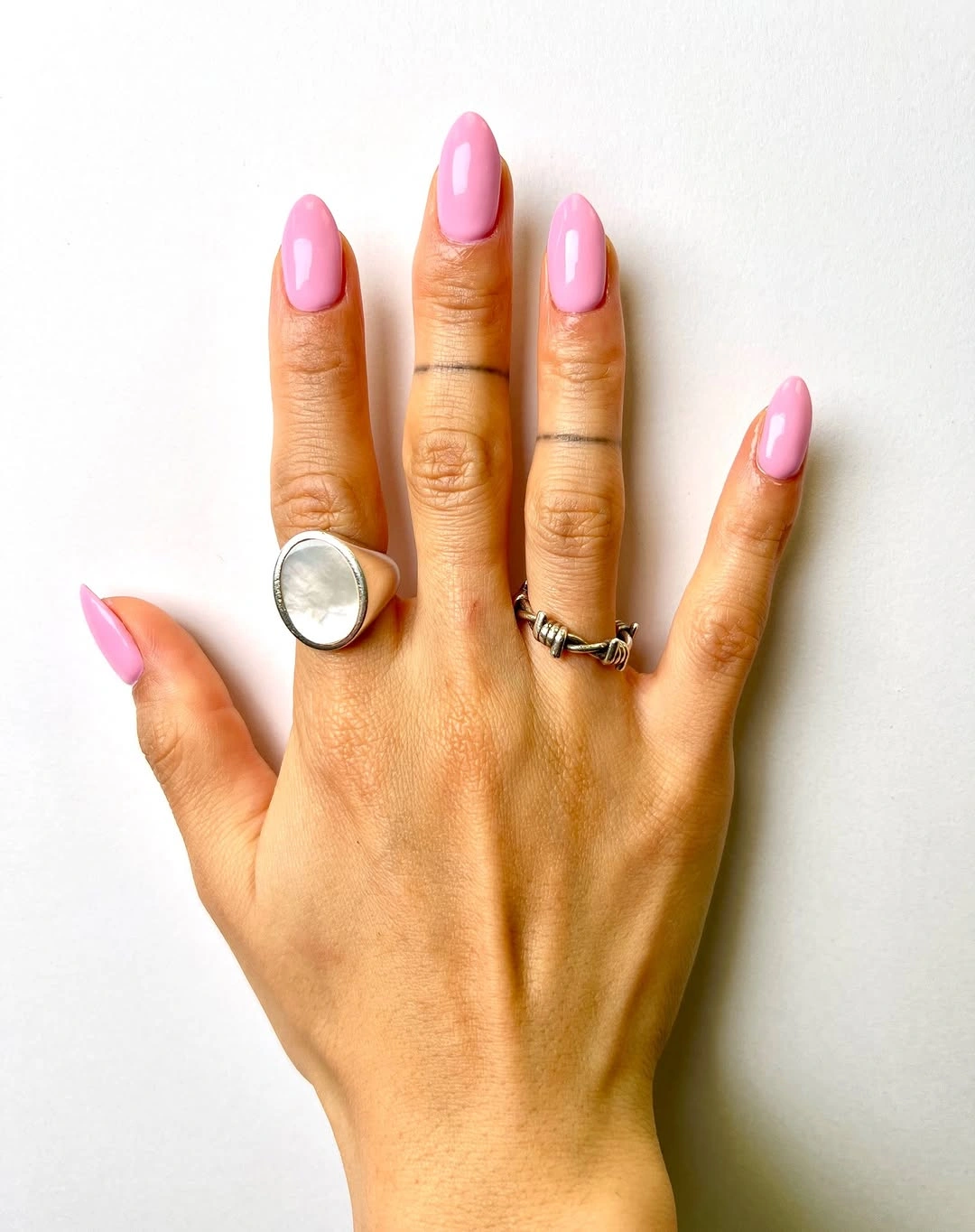
For a less contrasting version, replace the cream with a pale blush or a mushroom beige. Keep the mauve-brown on the nails you want to emphasize and use the light shade as a visual interval rather than as an equal half of the set. The long square edge makes the blocks look deliberate, so a short version can use fewer color changes and still preserve the same quiet geometry.
The smooth finish is what ties the color pair together. A matte brown beside glossy cream would create a more editorial, textural result, while matching shine makes the alternation look continuous. Consider adding one fine line only if you need more detail; the palette already has enough contrast. Its appeal comes from the calm exchange between depth and lightness, not from decorative overload.
Bubblegum Pink on a Medium Almond
Bright bubblegum pink on medium almond nails is a clear color statement, softened by the curved shape and glossy finish. The pink is vivid, but the smooth outline keeps it from looking childish or overly sharp against fair skin. Without a competing accent, the eye notices the way the shade follows the nail length, giving the manicure a simple, cheerful lift in an otherwise autumn-focused palette.
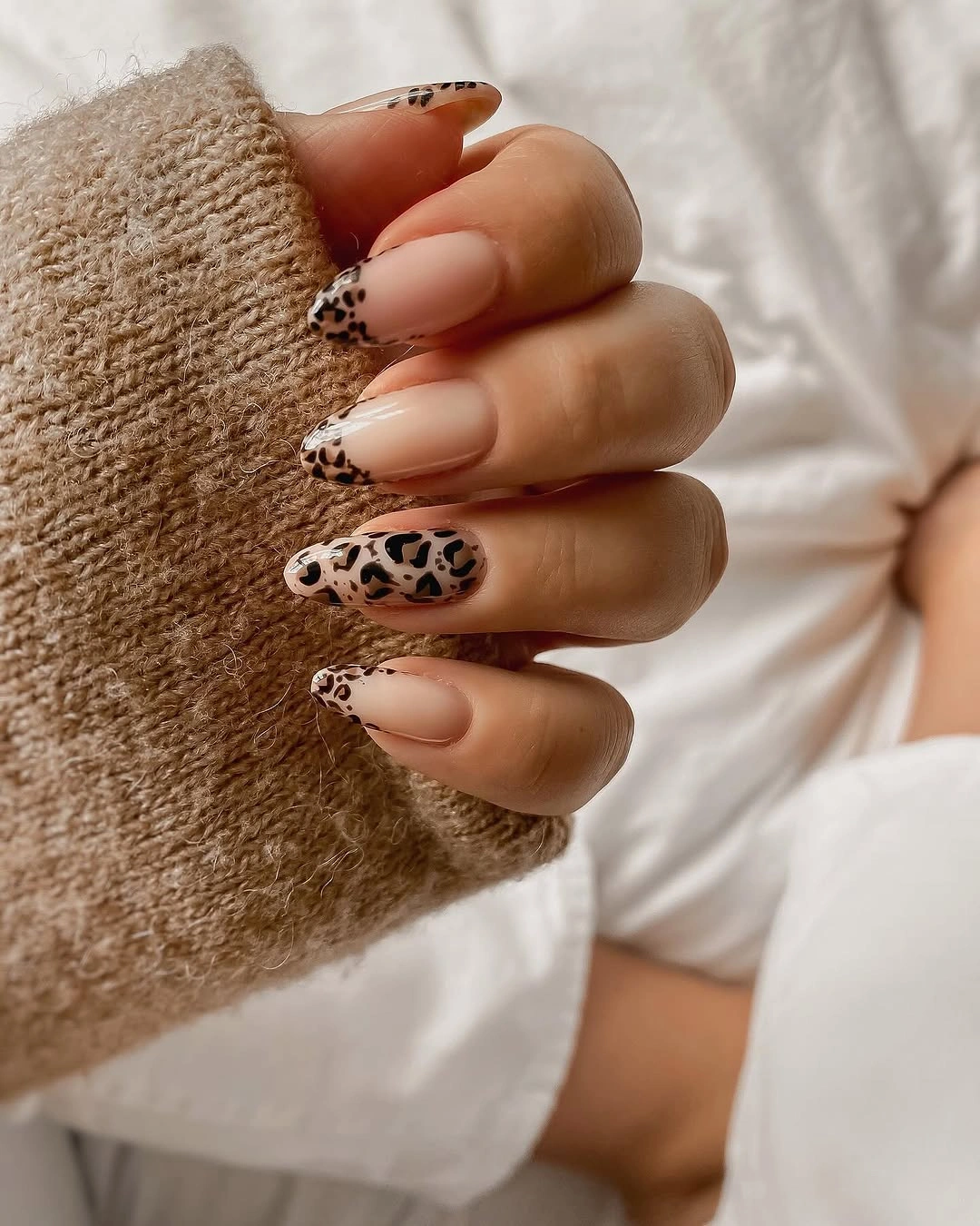
To make the color feel more seasonal, pair it with brown, navy, or soft gray clothing rather than adding darker art directly onto the nail. A shorter almond or oval will keep the brightness relaxed, while a longer pointed shape makes the same pink feel more dramatic. The finish should stay even because solid bright color reveals uneven edges more quickly than a patterned surface would.
Pink is not an obvious fall choice, which is exactly why a single vivid version can feel fresh among burgundy and olive. The lack of ornament allows the color to remain uncomplicated and flattering. If bubblegum feels too bright, move toward raspberry or muted rose. The key is choosing a pink with enough saturation to stay distinct from the skin, then letting its clean glossy surface do the rest.
Raspberry Pink With a Rounded Finish
Rich raspberry pink on medium rounded nails brings more depth than a pale pink while keeping a clear, softened edge around the hand. The color has enough red in it to feel connected to autumn berries, but the glossy finish and oval outline prevent it from becoming as heavy as burgundy. On fair skin, that middle depth creates contrast without making the manicure the only dark element in view.
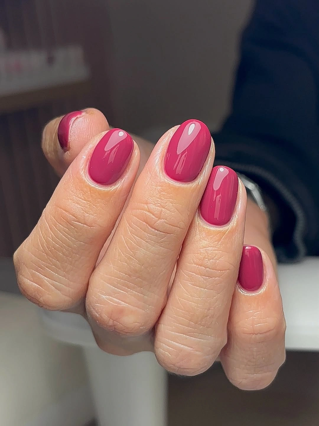
A muted berry version is ideal if you want the same warmth with less brightness. Keep the nails short to medium and the curve consistent, because a berry solid looks most polished when its silhouette is uncomplicated. If you need an accent, a single tiny gold-toned dot near the base is gentler than a full pattern and will not distract from the color’s smooth, rounded character.
Raspberry sits between cheerful pink and classic red, which makes it an adaptable choice for someone who wants a little color without a graphic layout. It becomes cooler beside silver jewelry and warmer beside gold, so it can move easily through different looks. The limitation is visibility of wear near the tip, but a uniformly glossy surface helps the shade continue to look fresh between touch-ups.
Black, Orange, and Pink Pointed Motifs
Long pointed nails mix black, orange, and pale pink with small black-and-white graphic motifs, creating a sharper version of a soft-base manicure. The pale pink gives the darker shapes a clear background, while orange adds a warm note that prevents black from taking over. The pointed tips reinforce the graphic tension, making the varied motifs feel purposeful even when their placement differs between nails.
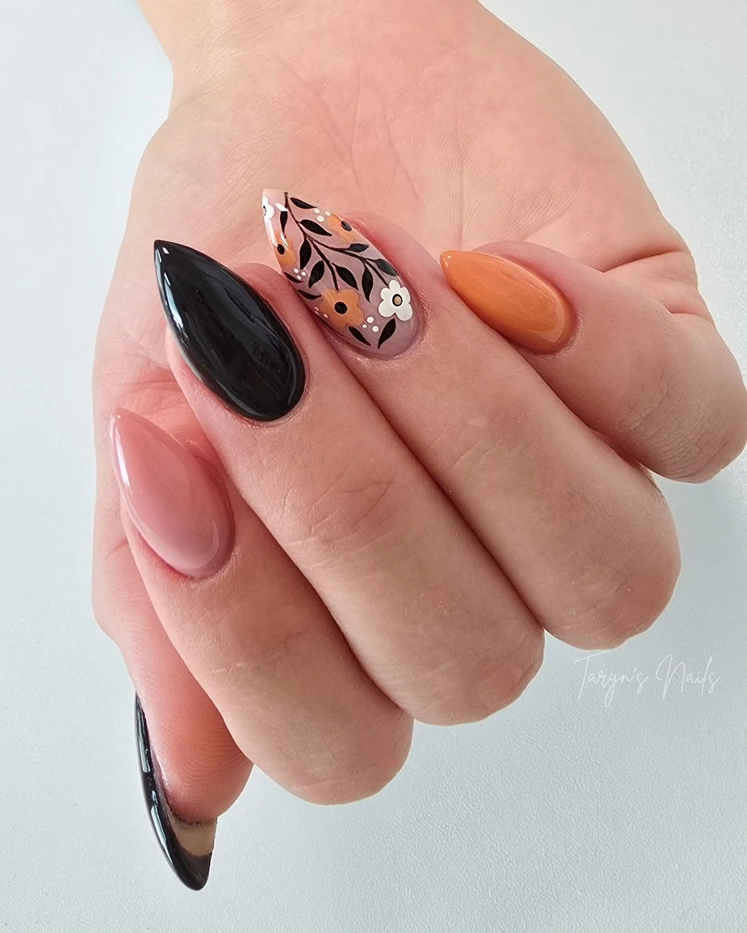
For a simplified reading, choose pale pink as the base and place one black graphic motif on a single nail, then use orange only at a tip. The contrast will remain clear without asking every finger to carry a different illustration. On shorter nails, bold shapes are more successful than tiny motifs because the black-and-white details need enough area to stay recognizable and clean.
What keeps the look balanced is the ratio of light pink to dark pigment. Black gives the design edge, orange supplies warmth, and the pale ground keeps both colors from pressing too hard against fair skin. If you remove the orange, the result becomes cooler and more severe. Keeping it in a small area preserves the fall connection while leaving the graphic motifs as the real focal point.
Leopard Accent Between White and Brown
White, brown, black, and pale pink appear on medium almond nails with a leopard-like patterned accent that brings the main texture to the set. The surrounding solids remain light enough that the irregular marks do not feel crowded. This is a softer way to use animal-inspired patterning because the accent is integrated with pale pink and white rather than surrounded only by dark brown or black.
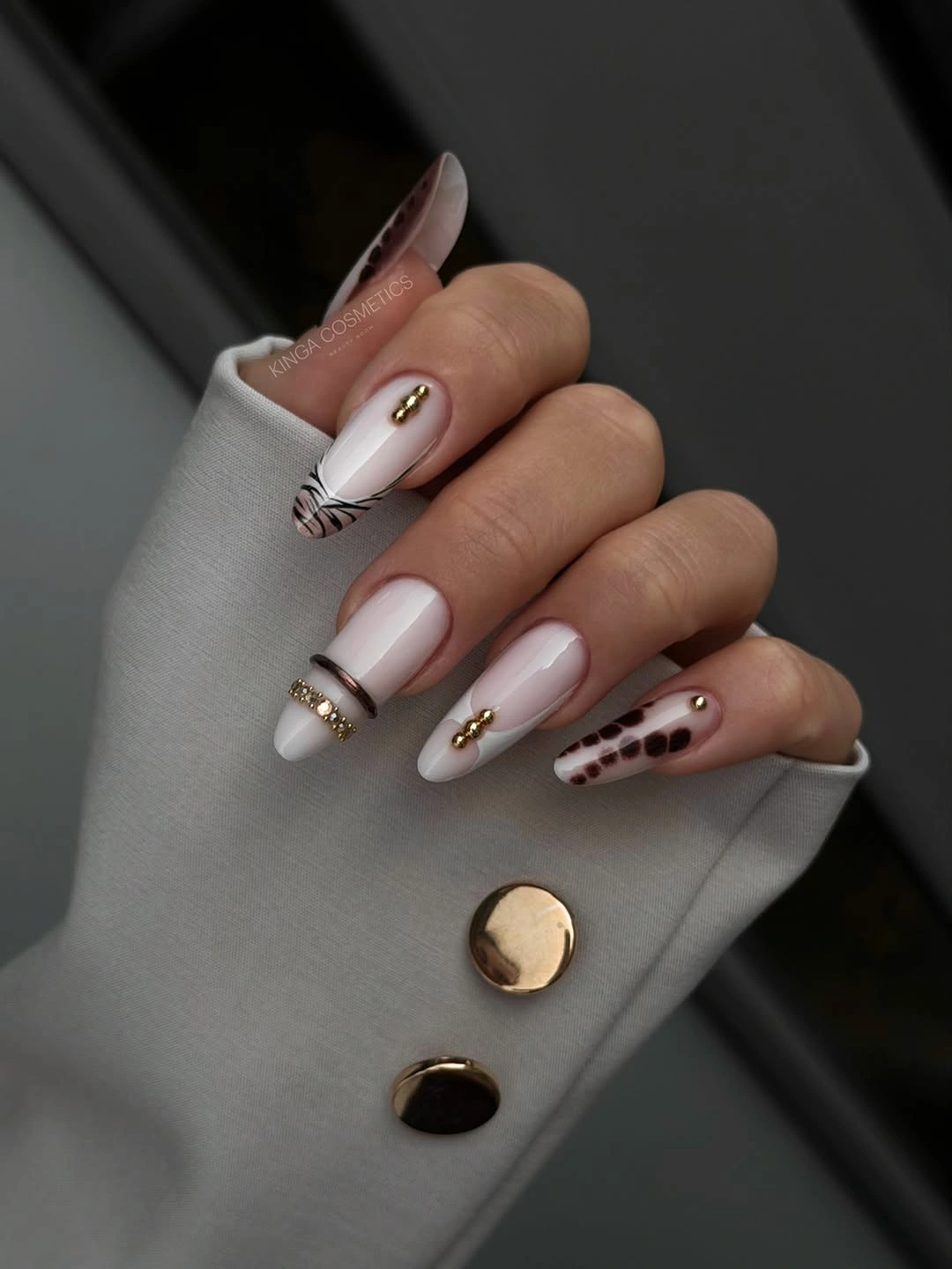
Keep the patterned nail to one finger if you want the manicure to stay especially delicate. A warm white or pale pink base will make the brown and black marks feel less harsh than they would over a stark bright white. Short fall almond nail ideas offer a useful comparison for keeping the pattern soft when the length is reduced.
The reason the pattern works is that it has a quiet frame: pale pink reduces the jump between white and brown, and the solids leave the accent room to remain special. Repeating the same marks over every nail would make the look much busier. Keep the texture as a concentrated detail, then let the color arrangement provide the softer, more wearable part of the manicure.