Fall nails for brown skin tone are not solved by finding the darkest shade. A color can look rich in isolation and still lose its shape on the hand if its value sits too close to the skin, while a lighter base can make a small edge or line feel sharper. The useful question is not whether a manicure is bold enough, but where the eye is meant to land and what space lets that decision breathe.
A practical choice starts with the surface you want to keep visible. If the strongest detail sits at the edge, leave the center calm enough for the shape to read; if the color itself carries the mood, avoid adding decoration that competes with it. That simple test makes a manicure feel intentional before you decide whether it belongs to an ordinary day or a more dressed-up moment.
Leopard edges keep a pale center open
Long pointed nails use a sheer blush center and push the strongest contrast to the tips, where black outlines contain brown and black leopard spots. That placement matters because the pale middle visually interrupts the pattern and keeps the sharp silhouette from becoming one dense block of print, while the warm brown marks remain connected to the fall palette.
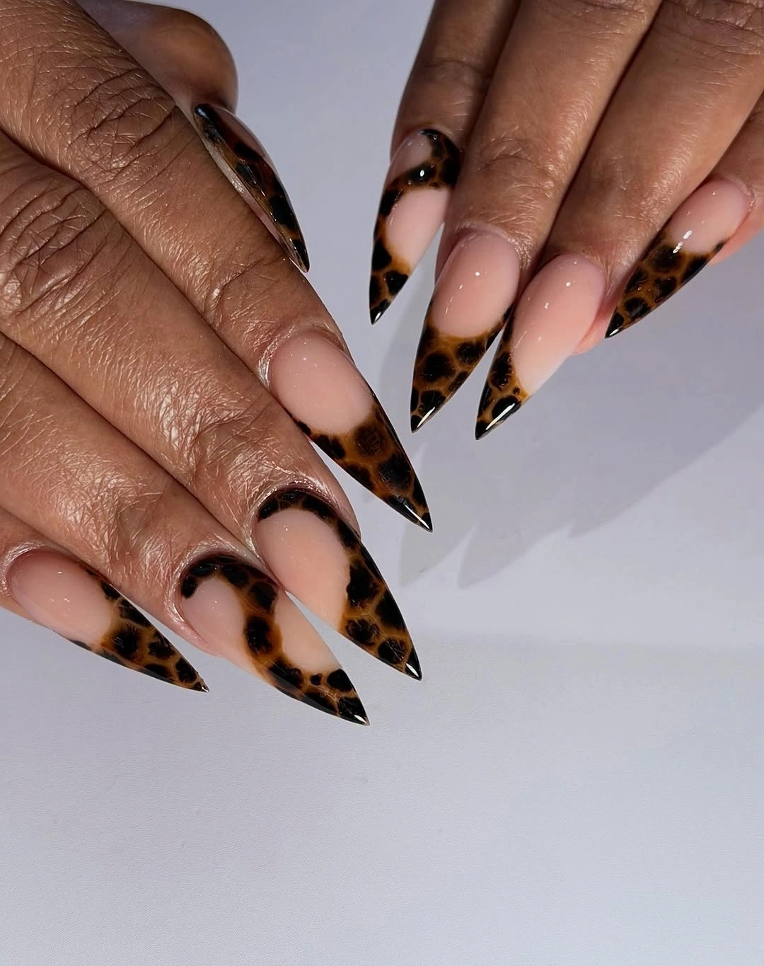
The animal pattern works here as a border rather than a full surface because its scale follows the free edge and leaves the nail bed visually calm. If you want the same relationship on a shorter almond shape, reduce the spots and keep the black edge thin; the manicure will lose some drama, but the contrast between open center and printed tip will stay legible.
With a pointed length, upkeep becomes part of the design decision because an uneven tip changes the rhythm of every printed edge. A softer almond gives more practical room for daily movement, while keeping the pale base and a few brown marks preserves the idea. The result is a strong fall accent that does not require dark color from cuticle to tip.
Small brown flowers soften blush almond nails
Short almond nails begin with a quiet blush base and place tiny brown, berry, and dark floral marks near selected tips. The restrained scale lets the light color remain the first impression, while the little clusters add a seasonal note without forcing every finger into the same decorative density or making the compact shape look crowded.
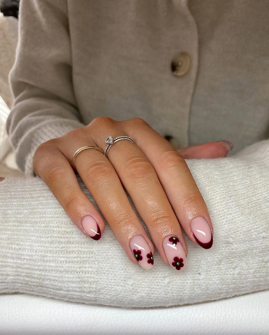
What makes the set convincing is the amount of negative space around each mark. The flowers read as deliberate punctuation rather than a continuous pattern, so this is an easy direction to adapt when you want fall nails colors for dark skin with a lighter visual value; keep two or three nails nearly plain and let the darkest dots repeat across the hand.
A short almond outline also makes the design less dependent on length, although small details need enough room to remain clean as the nail grows. Choose one warm brown and one muted berry instead of adding several colors, and move the motifs slightly higher if the tips are very short. The manicure keeps its gentle contrast when the accents stay small and the base stays visible.
Tortoiseshell tips give nude squares a warm edge
Long square nails pair a transparent blush base with irregular brown tortoiseshell panels across the tips, then add tiny gold glints to a few fingers. The squared edge gives the mottled pattern a firm boundary, while the clear center stops the warm print from swallowing the shape and lets the design sit closer to a French structure than to full animal coverage.
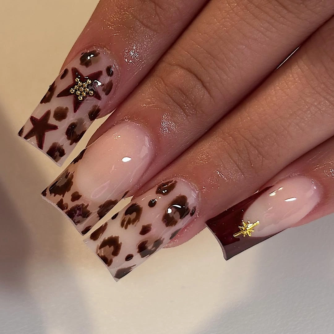
The color relationship is strongest when the tortoiseshell remains varied but not overly dark, because small amber and brown shifts create depth without turning the tip into a flat stripe. On a shorter nail, use one uneven tortoise panel or a narrow tip rather than trying to reproduce every patch; the eye will still read the warm mottled edge against the pale base.
Gold works best as a minor connector here, not as a second focal point. Keep it close to one corner or one accent finger if you want an everyday version, and watch the square length because a very long free edge can make the pattern feel heavier during grow-out. The useful takeaway is the balance between a structured edge, a transparent center, and only a little sparkle.
Coral almond nails rely on graphic contrast
Saturated coral-pink fills the long almond shape, while black and white curved edge work gives the set a sharper frame. The base carries enough color to stand alone, so the dark outline does not need to cover much surface; it simply clarifies the perimeter and adds bright white interruptions that keep the warm shade lively rather than visually flat.
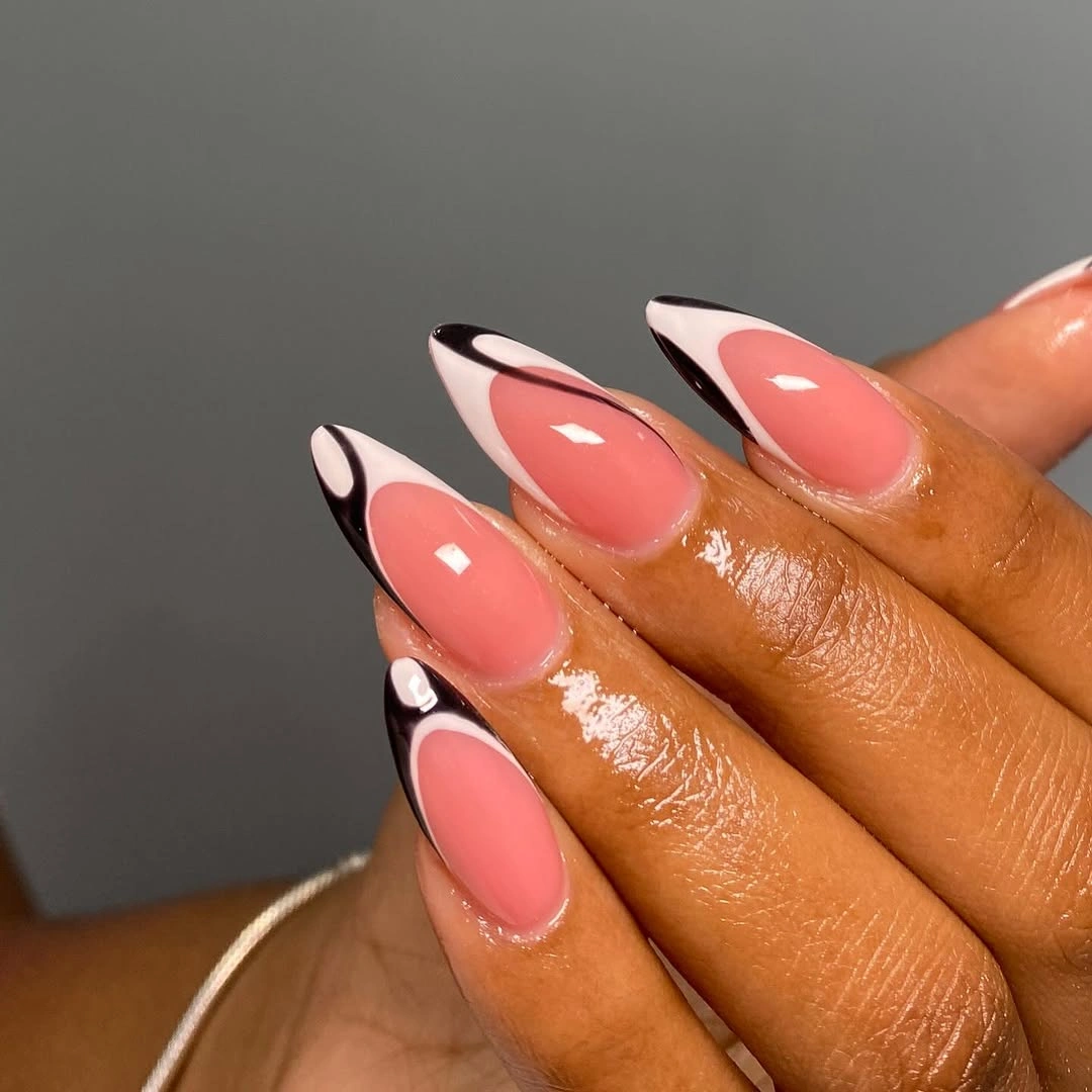
The design succeeds because its colors have different jobs: coral supplies warmth, black defines the shape, and white creates small points of relief. A shorter almond can keep the same hierarchy by using one black side curve and a single white highlight on each hand, which preserves the contrast without asking a smaller nail to hold several graphic elements.
Strong color is easier to wear when the shape is consistent, since an uneven almond can make the saturated base look accidental. If the length feels impractical, shorten the point slightly before changing the palette; the coral and black relationship remains the main idea. For another direction, compare it with the quieter balance in brown fall nails, where depth comes from tonal neutrals instead of bright coral.
One decorated accent steadies taupe neutrals
Long almond nails move through glossy taupe and deep brown, then reserve a pale accent nail for a small floral and gold detail. That distribution makes the decorated finger easy to find without forcing the whole manicure into one motif, and the neutral surfaces create enough quiet value for the tiny warm accent to remain readable beside rings and skin.
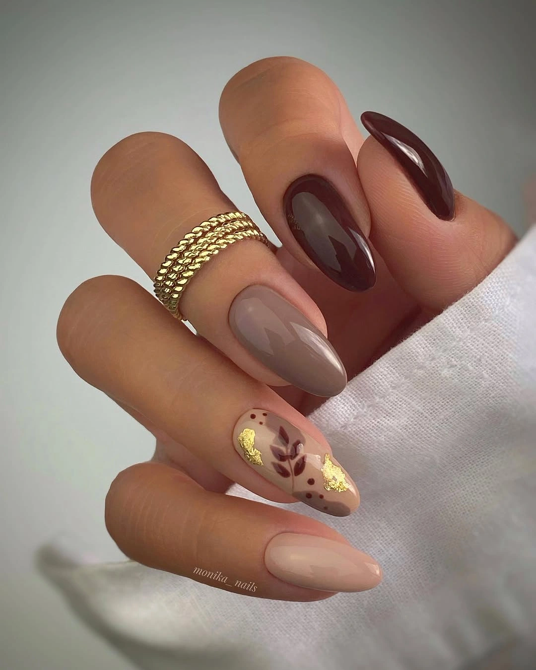
A mixed neutral set can become muddy when every nail has a different brown, so the limited palette is doing useful work. Keep the taupe close in value and let the deeper brown supply contrast, then repeat only one gold note on the accent; the result feels considered because the decorative detail has a clear visual home rather than competing across the hand.
The same structure adapts well to a medium almond or soft square because it does not depend on a long tip. Choose a small floral mark that can remain recognizable at the available length, and leave the remaining nails smooth if you want easier maintenance. This is a practical way to make a fall color story feel personal while preserving the quiet balance between solid color and one point of detail.
Glossy red lets the almond silhouette lead
Every visible nail is a saturated glossy red, and the long almond-to-stiletto contour supplies the variation that decoration would otherwise provide. The uniform surface makes the point look intentional, while the reflective finish keeps the color dimensional and gives the warm red enough presence to read clearly against brown skin without extra motifs.
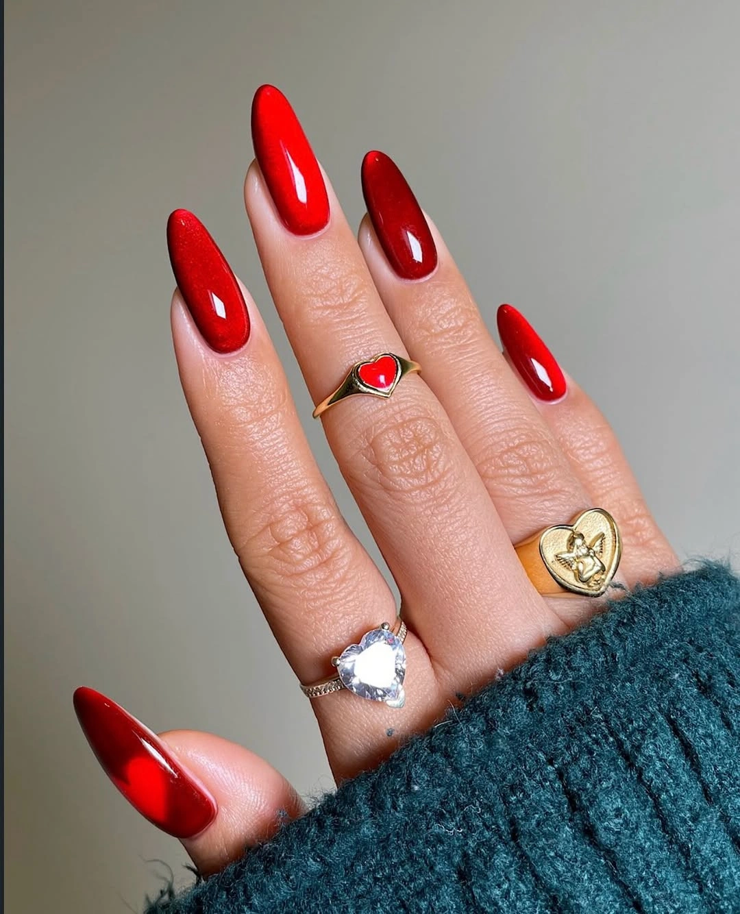
A single-color manicure asks more from its shape because there are no patterns to distract from an uneven edge. If a very sharp point would interfere with daily tasks, shorten it slightly and keep the almond curve; changing the length is less disruptive than replacing the red, which is the visual anchor and the reason the set feels so direct.
Red can also become less intense without losing its role by moving toward a deeper wine or a slightly muted brick value, but make that change deliberately rather than adding several unrelated accents. A smooth surface and consistent length will keep the color looking polished as it grows, so the maintenance thought is simple: the fewer elements present, the more the outline and finish matter.
Olive, cream, and tortoise share one earthy rhythm
Olive green, pale cream stripes, and a dark tortoise accent appear beside translucent nude nails, with small gold marks linking the different surfaces. The design has variety, but its palette stays coherent because every accent sits within an earthy range; olive supplies depth, cream supplies light, and tortoise carries the warm pattern without needing another loud color.
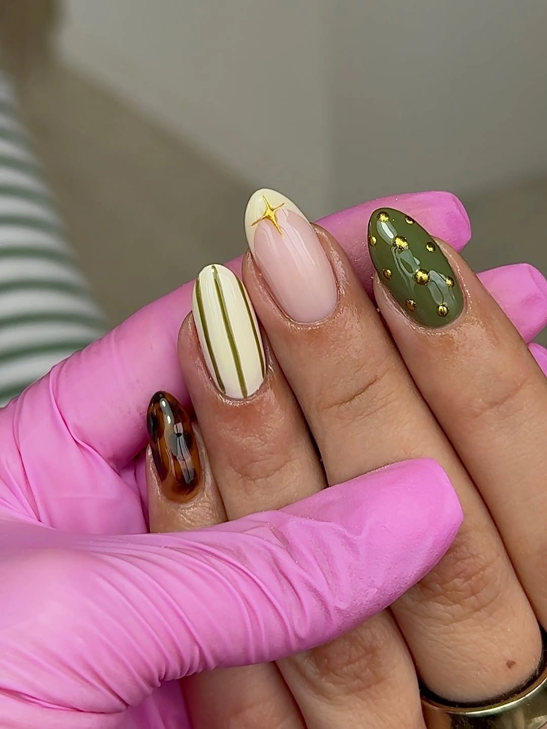
The arrangement works through repetition rather than matching motifs. Gold returns as a small point, while the deeper brown reappears in the tortoise nail and the lighter stripe gives the eye a pause. For a shorter set, keep olive on two nails, use one cream stripe, and remove the extra pattern; changing one variable at a time will preserve the balance instead of flattening it into plain color.
Several motifs can feel busy when they are all equally strong, so decide which finger should carry the first glance before adding detail. Here, the olive nail can remain the focal surface and the cream stripe can act as relief. A neat cuticle line and moderate length will help the mixed palette stay readable, especially if you want the design to move easily from early fall outfits to darker seasonal layers.
Espresso almond nails make depth the main detail
Long almond nails use one deep espresso-brown color with a glossy finish, making value and silhouette more important than motif. The reflective highlights travel across each curved surface and show where the shape narrows, so the set gains rhythm from light moving over the color rather than from contrasting art placed on top.
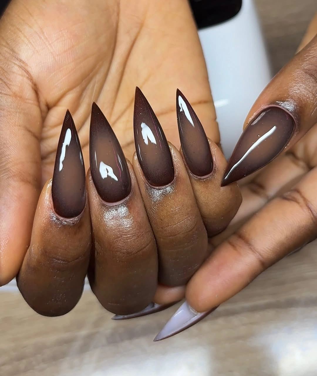
This kind of dark neutral can look rich instead of flat when the surface remains smooth and the length is consistent. A medium almond will be easier to maintain and still keep the same visual thesis, while a soft square will make the brown feel more graphic; either adjustment changes the silhouette but not the useful relationship between depth and shine.
If you want a small variation, add one sheer brown nail with a fine gold line instead of introducing a new bright shade. That gives the eye a pause without weakening the color story. The surrounding styling can remain simple because the manicure already carries enough weight, and the main maintenance check is whether the glossy surface still looks even as the nail grows.
Sparse dots make a nude base feel autumnal
Short nude nails use scattered pink, brown, and darker dots on selected fingers, leaving large areas of the base open. The marks are small enough to feel playful rather than graphic, and their irregular spacing keeps the manicure from looking like a rigid grid while still adding a warm fall reference to a light base.
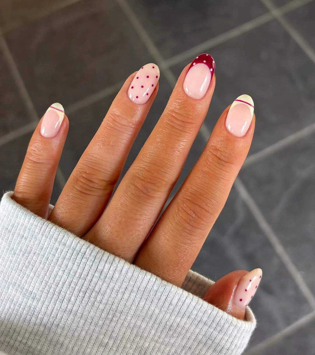
Negative space is the reason this palette stays light: the dots do not need to cover the nail to create contrast. Keep the largest marks near the tip and use one smaller dot closer to the center so the eye moves without losing the short shape. If the nails are very compact, repeat only two colors and let the base do more of the visual work.
The design is also forgiving because a tiny shift in placement does not break the overall pattern. That makes it useful when you want seasonal color but do not want a high-maintenance illustration, although the dots should stay crisp and separated rather than merging during wear. A clear or softly glossy finish will keep the light base and small marks visually distinct.
Textured accents turn a mixed palette tactile
Orange, lilac-pink, muted brown-gray, and pale raised surfaces share the set, so the visual contrast comes from both color and texture. The sculptural ridges on the pale nails immediately attract attention, while the flatter orange and muted nails give the eye a place to rest and keep the maximalist mix from becoming one continuous block.
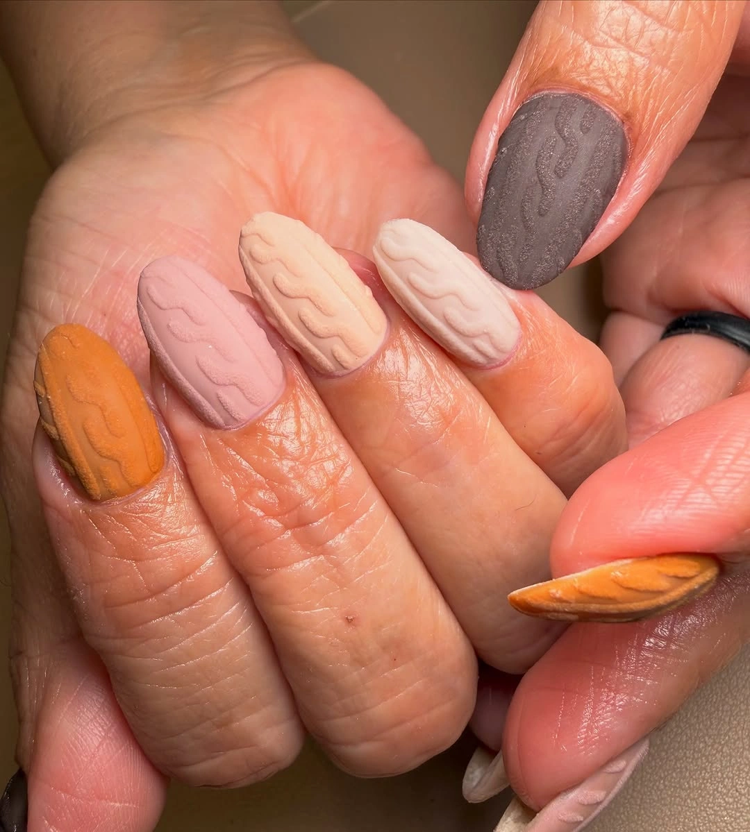
Texture changes how much color a nail appears to carry because raised lines catch light and create shadow. Keep that effect on one or two accents if you want a practical adaptation, then repeat one flat shade across the remaining fingers. Orange will still act as the warm seasonal signal, while lilac can soften the transition between the brighter color and the neutral relief.
A high-detail surface also has a realistic upkeep tradeoff: edges and ridges draw attention as they wear, so a shorter length and limited texture can make the idea easier to live with. The design is strongest when the tactile nail remains the focal point and the other colors support it, rather than when every finger tries to display a separate technique or finish.
Contour lines give muted neutrals a graphic finish
Muted nude and brown bases are crossed by thin black and white curved lines that build small geometric panels through negative space. The line work follows the nail edges instead of filling the center, which lets the soft palette stay visible and gives a short-to-medium shape a clean graphic direction without relying on a loud color block.
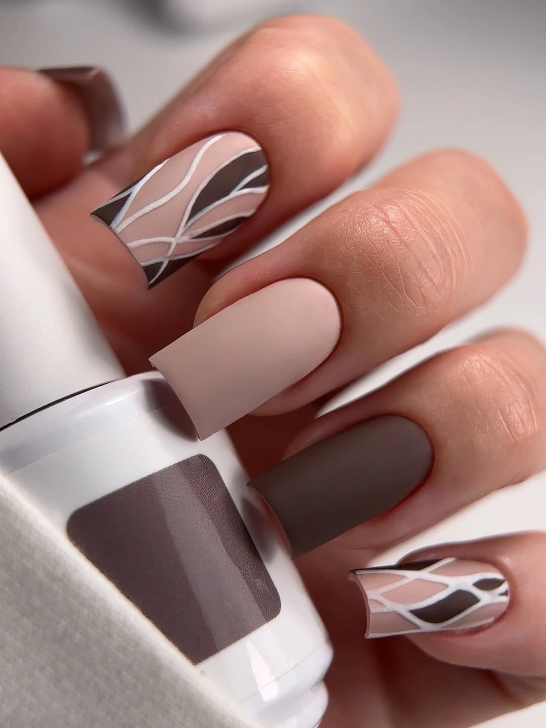
The contrast works because the dark outlines are narrow enough to define rather than dominate. Use the strongest panel on one or two nails and repeat a simpler curve elsewhere, especially if the available length is short; the eye will still recognize the pattern language as long as the line weight and palette remain related.
Precision matters more here than the number of accents, so a slightly longer smooth surface may be easier for maintaining clean curves than a very short nail. You can also swap brown for a warmer taupe while keeping the black and white lines, which changes the value gently and leaves the original idea intact. The useful focus is the conversation between quiet base and deliberate outline.
Mauve and brown let narrow gold accents glow
Soft mauve and chocolate-brown nails are joined by narrow reflective gold curves and small gold-toned elements, creating contrast without turning the set metallic from edge to edge. The muted bases absorb most of the visual attention, so each gold detail functions like a placed highlight that warms the palette and makes the almond shape feel more dimensional.
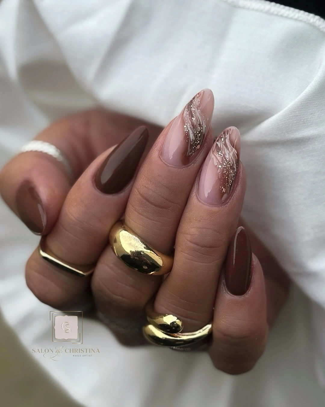
Gold is most effective when it stays narrow because a full metallic nail would change the balance and compete with the mauve and brown. Keep one curve close to the tip or side, then let the deeper brown repeat on another finger so the accent feels connected rather than isolated. This controlled placement also makes the design easier to adapt to a medium almond.
For everyday wear, the simplest version is mauve across most nails, one chocolate accent, and a single gold line. That keeps the color relationship visible even if the smallest details are reduced, while the smooth finish continues to reflect light. A good maintenance check is whether the gold remains an accent; if it begins to dominate, the set has lost the quiet contrast that makes it appealing.
Checkerboard and flowers balance one another
Soft nude almond nails combine warm brown checkerboard tips with small orange-brown flower marks, creating a deliberate meeting of geometry and organic detail. The checkerboard gives the set a firm rhythm, while the flowers interrupt that regularity and stop the pattern from feeling too strict against the light base.
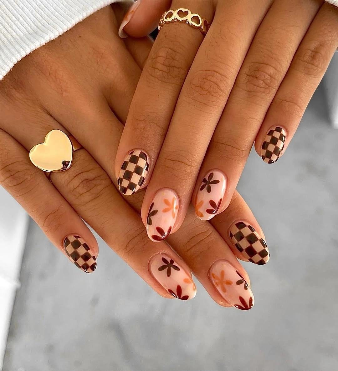
The palette remains easy to read because both motifs share warm brown and peach-leaning tones. Keep the checkerboard on two accent fingers and place one small flower on a plain nude nail if you are working with less surface area; a simplified rhythm will look clearer than shrinking every square and petal until they blur.
Almond length supports the combination by giving the tips enough width for the checks, but a shorter oval can carry the same idea with larger blocks and fewer flowers. The honest tradeoff is detail time: the design is visually rich, yet its success depends on spacing. Preserve the light base and the difference between regular checks and loose petals, because that contrast is the point.
Turquoise makes black and white pattern feel cooler
Very long pointed nails place bright turquoise beside black-and-white irregular print and blue jewel-like details, so the saturated color becomes the first focal point. The neutral patterned nails provide visual relief between turquoise accents, while the long point gives every color a narrow, high-impact surface instead of a broad block.
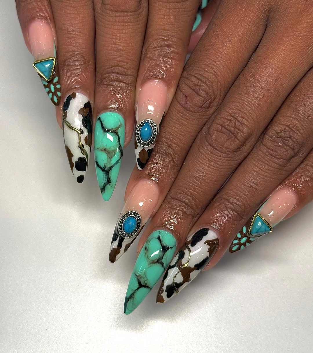
This combination works through temperature as much as contrast: turquoise reads cool and clear, while the black-and-white sections keep it from being surrounded by competing color. For a more wearable adaptation, limit turquoise to two nails, use one patterned accent, and keep the rest pale; that keeps the focal placement without requiring the original length or decoration density.
Long pointed shapes make bold color memorable but can be demanding in daily use, and detailed accents become harder to keep balanced as the tip changes. A medium almond will soften the statement while preserving the blue-green contrast, so adjust the shape before discarding the palette. The set is most convincing when turquoise remains the hero and every other element gives it room.
Pale almond nails sharpen animal-like dark tips
Long pale almond nails end in thin black tips with irregular dark patches on selected fingers, letting a light base carry a small amount of high-contrast pattern. The center remains open and soft, while the dark edge follows the tapered silhouette and makes the point look more defined without requiring a full black manicure.
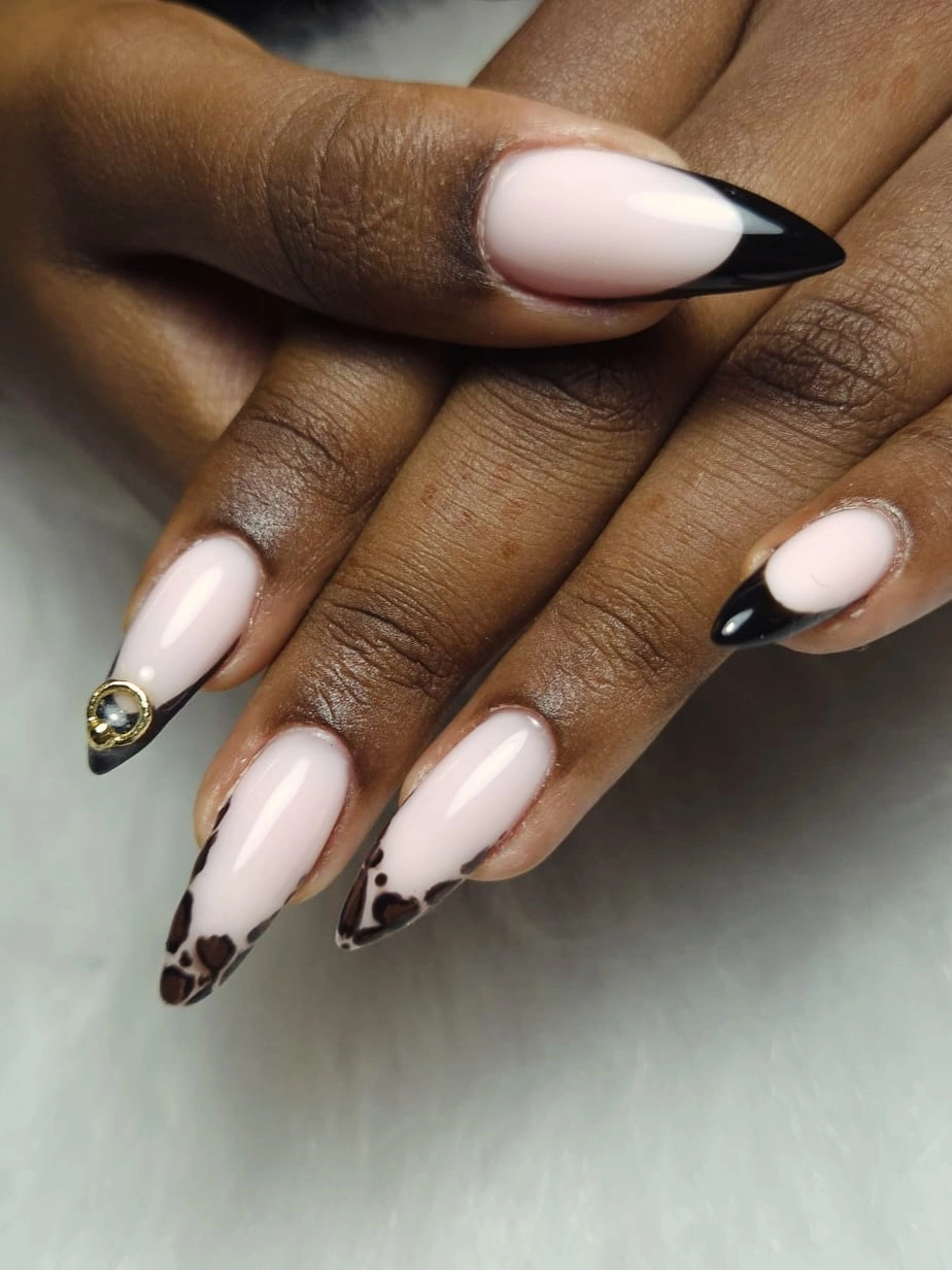
The pattern reads best when the patches are uneven but not oversized, because a very large mark would pull the eye away from the clean base. Use a simple black edge on shorter nails and add the irregular patch to one accent finger if you want an understated version. The visual connection comes from repeating dark perimeter detail, not from filling every nail equally.
A pale base also makes grow-out less immediately noticeable than a solid dark color, although the sharp tip still needs a consistent outline to keep the look polished. You can warm the base slightly toward pink or beige without changing the structure, then let the black edge remain the fixed variable. That gives the manicure a seasonal graphic note while keeping its center calm.
Cobalt arcs add a cool counterpoint to nude
Mostly nude almond nails use bright cobalt blue along the sides and tips, with one fuller blue accent that strengthens the contrast. Because the color sits around the perimeter, the pale center continues to lengthen the nail visually while the saturated blue creates a crisp outline and a cool counterpoint to the warmth of brown skin.
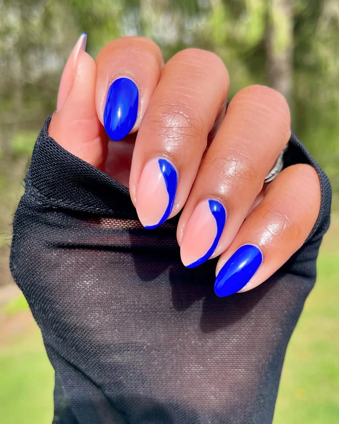
Placement keeps the blue from becoming overwhelming: the eye sees the arc first, then returns to the open center. On a shorter shape, use one cobalt curve per nail and keep the full blue surface on one finger, or reverse that balance if you want the accent to be quieter. The key is to change the amount of blue, not to add a third competing shade.
Vivid blue can move beyond a summer association when it is paired with a clean nude base and a controlled line. A medium almond or short oval will make the look more practical while preserving the perimeter contrast, but a very thin edge may disappear if the nail is too short. Keep enough width for the blue to remain visible and the relationship will stay intentional.
Olive framing brings gold foil into focus
Long pale pink nails are bordered by olive-green framing, scattered gold foil, and a tiny star-like mark, giving the soft base an earthy structure. The olive line clarifies the edge without covering the center, while the foil adds irregular light that feels connected to the warm palette rather than pasted on as a separate glitter effect.
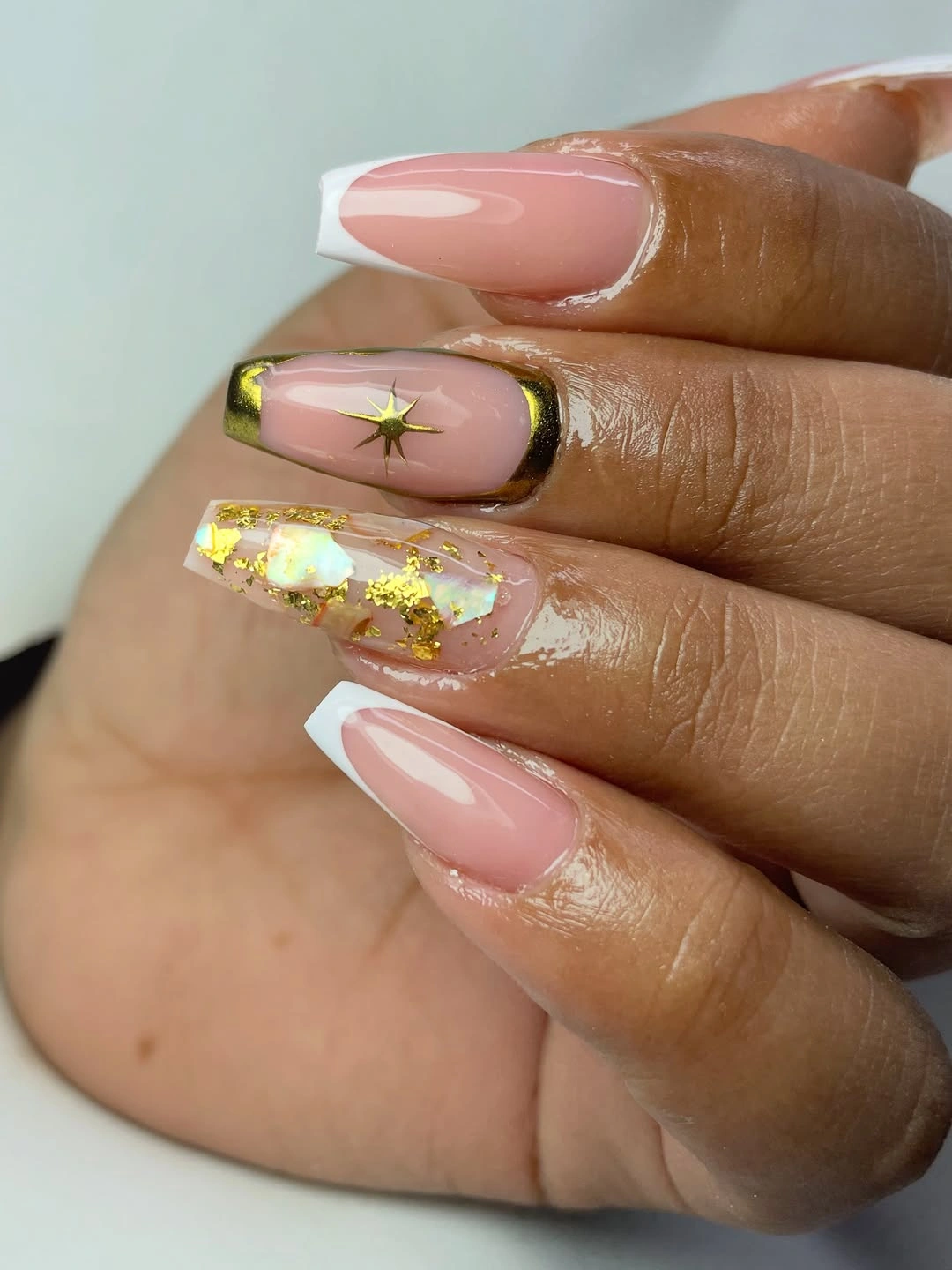
The design works because the three elements have distinct roles: pink supplies openness, olive supplies definition, and gold supplies small points of reflection. If you need a simpler version, keep the olive on one side instead of all around the nail and concentrate foil near one tip; the base will remain light while the color relationship still reads clearly.
Gold details can become visually noisy when they spread across every finger, especially beside rings, so leave some nails with only the pale base. A medium almond will give the border enough room without the practical weight of a very long point. Preserve the contrast between the quiet pink center and the earthy edge, because that is what makes the palette feel fall-ready.
Thin brown outlines make nude shine dimensional
Sheer nude almond nails use thin brown outlines and small gold highlights around their tapered tips, creating a layered French effect without hiding the translucent base. The brown line supplies structure, the gold catches light, and the open center keeps the design visually narrow even though the nails are long and carefully shaped.
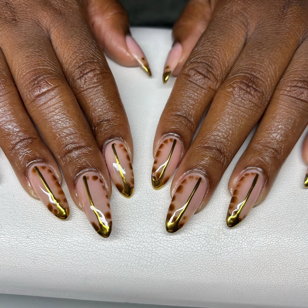
A double edge works when the lines follow the same contour and remain visibly separated; if they crowd together, the tip can look heavy. Shorter almond nails can keep one brown outline and reserve gold for a single accent, which preserves the clean contrast while reducing the precision required for multiple fine borders.
The soft base also gives you room to adjust the warmth without rebuilding the whole design. A rosy nude, beige nude, or sheer neutral will all change the mood slightly, but the brown outline should remain the darkest element so the shape stays clear. For another approach to seasonal color, autumn nails color can guide a warmer base while the narrow edge keeps the result controlled.
Copper shimmer carries the entire square set
Medium square nails are covered in one warm copper-bronze metallic shade, so the finish and shape replace the need for a motif. The reflective surface shifts with the light and gives the compact square edge enough presence, while the warm value sits naturally within a fall palette and keeps the manicure visibly connected to brown skin.
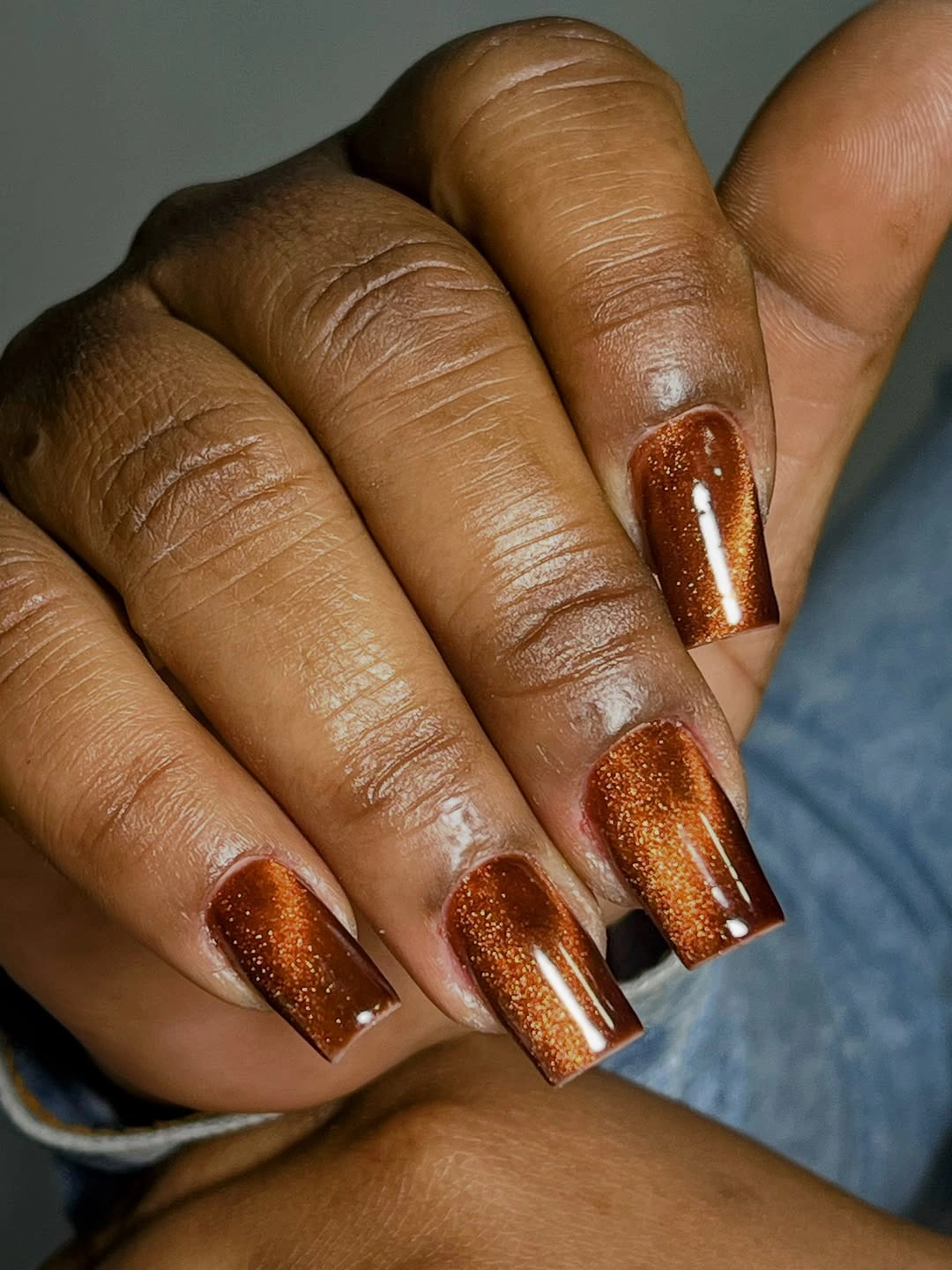
Uniform color becomes interesting when its surface has movement, and the copper shimmer supplies that movement without creating visual clutter. A soft square or shorter square will make the set easier to wear while preserving the same finish; avoid adding several accents unless the metallic color needs a quieter nail to create contrast.
The maintenance requirement is straightforward but visible: chips or dull patches interrupt the reflective field more quickly than they would on a busy pattern. Keeping the length moderate and the surface even will protect the clean editorial effect, and a deeper bronze or muted copper can be chosen if a brighter metallic feels too strong. Let the warmth and shine remain the final word.
Gold flakes and flowers lighten pale pink squares
Pale pink nails use white tips, tiny floral marks, and scattered gold flakes across a long square shape, combining several details without losing the light base. The pink and white layers keep the design airy, while the gold and small flowers create warm points of attention that stop the manicure from looking plain or overly delicate.
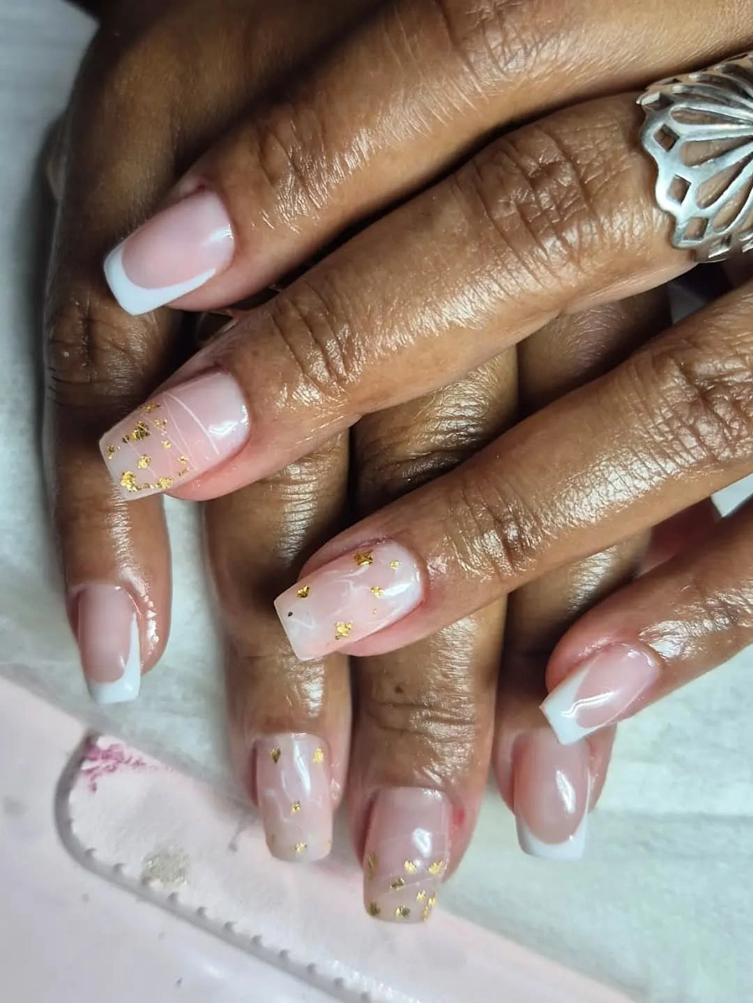
The set stays balanced because the embellishment is dispersed rather than packed into one dense panel. A decorated accent nail can carry the flowers and foil while the remaining fingers use a clean white edge, which makes the adaptation easier and gives the eye a calmer rhythm. The warm gold is enough to connect the pale palette to fall without introducing a darker color block.
Long square nails provide room for the details, but their corners can make the design feel heavier as they grow out, so a medium square is a useful compromise. Keep the floral marks small and the flakes sparse; adding more would blur the distinction between the white tip and the pink base. The best version preserves lightness first and decoration second.
Leopard dots stay compact on rounded nude nails
Short rounded nude nails carry small black, tan, and brown leopard spots with tiny metallic dots on selected accents, keeping the animal pattern close to the surface instead of stretching it across a long tip. The compact shape makes each mark readable as a small cluster, while the light base gives the pattern space to breathe and keeps the hand visually soft.
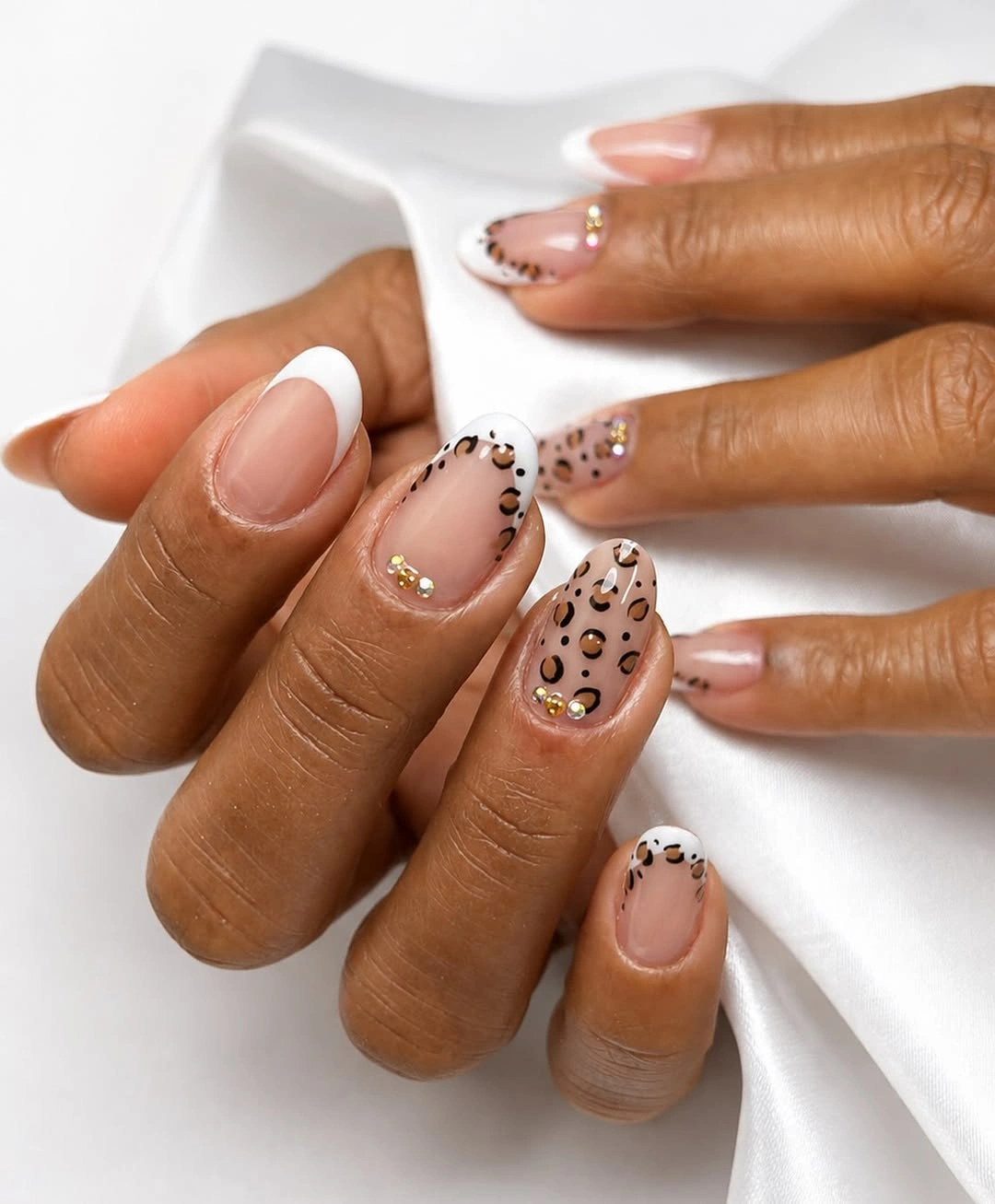
Scale is the main decision here: large spots would overpower the short nail, but a mix of tiny dark outlines and warmer centers creates enough contrast without needing many colors. If you want an even cleaner result, move the spots to the tips or two accent fingers and repeat the metallic dot only once. The design will still signal fall through its warm neutral range and animal-inspired rhythm.
This is one of the more practical ways to wear a patterned manicure because rounded short nails do not depend on dramatic length for their character. Keep the nude base close to the skin and let the darkest marks remain separated as the manicure grows, since merged dots can turn a light pattern into a heavy patch. The quiet base, not the number of spots, is what keeps the finish wearable.