Long nails rarely look wrong because of one shade. They go wrong when length, shine, and decoration all ask to be noticed at once, leaving the hand without a quiet edge. Fall long nails 2026 are easier to choose when you treat the manicure as a matter of visual weight: decide what should feel bold, then give everything else enough space to support it.
Before committing to a dramatic length, look at the point where your eye naturally stops: a sharp tip, a clean border, or a single reflective interruption can all do that job. Keep the strongest decision in one place and let the rest of the surface remain calm; the result will feel more intentional and will also be easier to live with as the free edge grows.
Cream Swirls Keep Pointed Neutrals Light
Long stiletto nails begin with a sheer blush-nude base, then use creamy waves that travel across the surface instead of filling it with a dense pattern. Small warm metallic-looking accents gather near the pointed tips, so the eye follows the nail from quiet center to decorated edge. That direction matters: the manicure feels detailed, yet the pale base still has enough space to make the length look deliberate rather than overloaded.
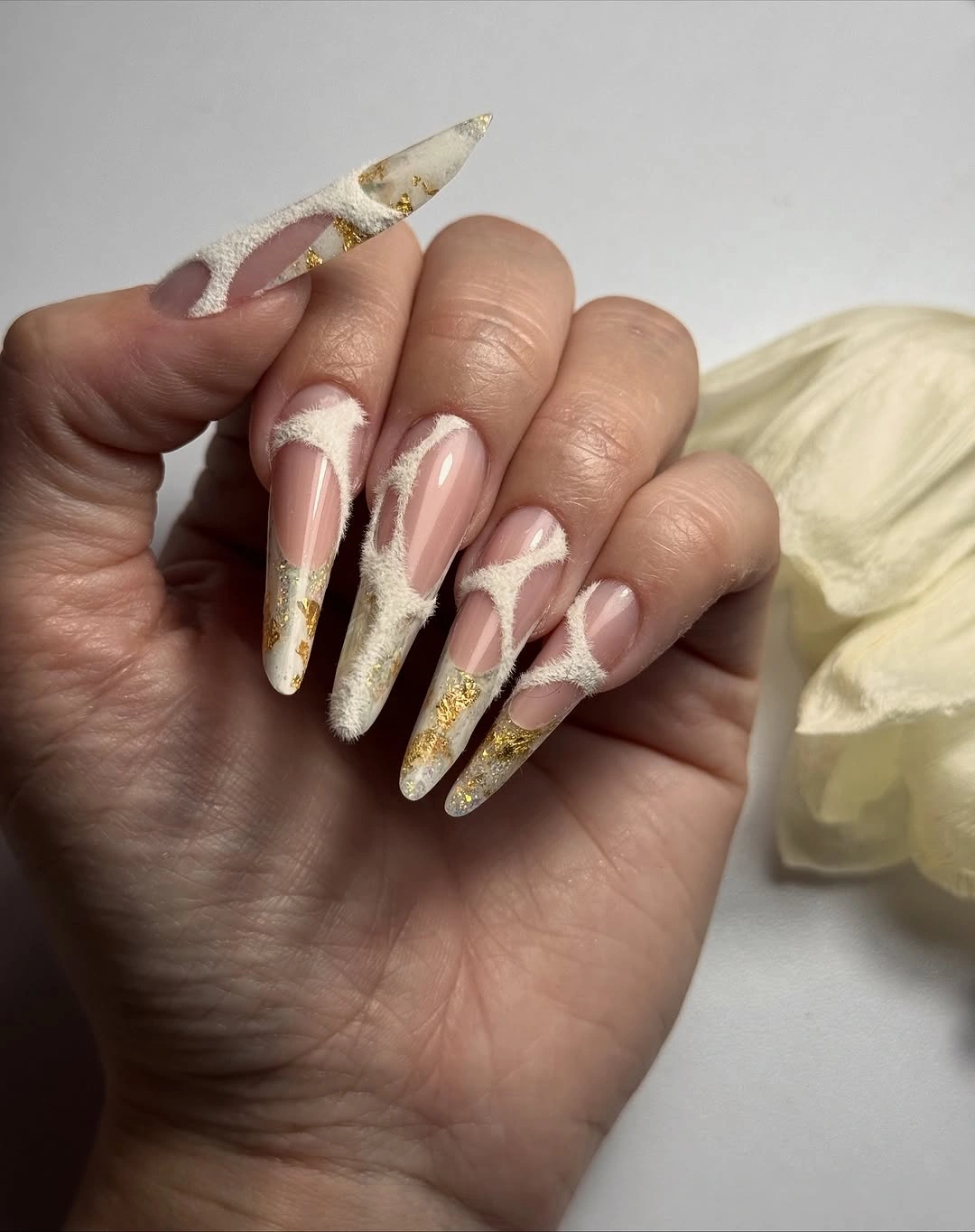
The design works because the curved lines echo the taper without copying it exactly, creating a gentle counter-movement against the sharp silhouette. The warm metallic detail also keeps the neutral palette from becoming flat, but it remains small enough that the manicure does not turn into a full glitter surface. For a softer everyday reading, keep the swirls on the index and ring fingers and let the other nails use the same nude base with only a narrow cream edge.
That adaptation changes the maintenance conversation as much as the visual one. A long point shows chips and uneven tips quickly, so a medium almond can preserve the warm palette while making the curve easier to live with between appointments. I would also keep the metallic accents close to the free edge rather than spreading them toward the cuticle, because the open center is what gives this idea its airy fall character.
Glossy Red Makes the Coffin Shape Enough
Here the manicure does not need a motif to announce itself. Long squared coffin nails are covered in one saturated glossy red, and the even surface lets the straight sides and crisp ends become the visible structure. That simplicity is useful in a fall palette because a deep or bright red can already carry strong seasonal associations; adding more art would risk competing with the color instead of sharpening it.
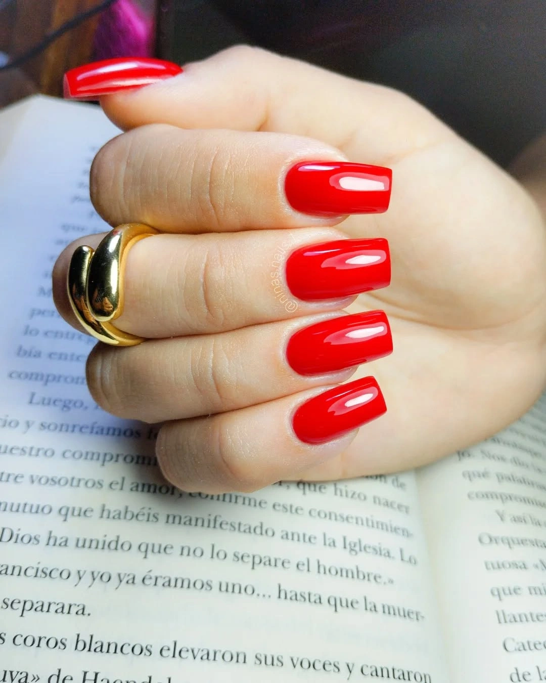
The square end gives the red a graphic quality that would soften on a rounder silhouette, while the shine keeps the single color from looking heavy. There is no need to invent a second shade when the contrast between smooth reflection and straight geometry is doing enough work. If you like the idea of a one-color manicure but want less visual intensity, use a medium coffin and choose a red that is slightly softened by a warm or brown undertone.
Solid color is often the easiest place to be honest about upkeep. Red polish makes small chips visible, and the straight edge shows changes in length more clearly than a rounded tip, so even filing matters. Keeping the sidewalls clean, the ends even, and the length moderate will make this manicure look intentional for longer than trying to disguise wear with extra glitter or busy line work.
Powder Blue Breaks Up Milky Square Nails
Long square nails alternate milky ivory with powder blue, creating a cool contrast that stays gentle rather than icy. A few nails add small blue glitter or curved pale details, but the main decision is the relationship between the two quiet base colors. The result has enough variation for a long set to feel considered while still leaving broad, uncluttered surfaces that suit soft fall clothing and pale accessories.
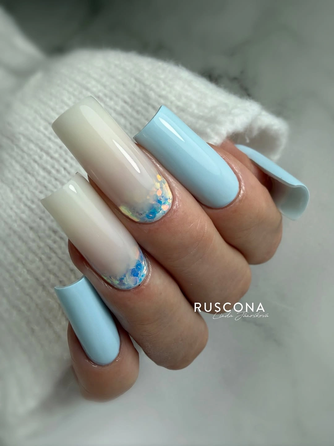
The mix holds together because the blue is repeated as a supporting note instead of appearing as a single surprise. Glitter is most effective where it is used as a small bridge between the ivory and blue, especially near a tip or side, since a full glitter nail would change the balance and pull attention away from the color pairing. On a shorter square, keep the ivory as the anchor, place blue on two nails, and use one glitter accent to preserve the same rhythm.
Long square nails can feel broad when every surface is equally opaque, so leaving some nails quieter is a practical proportion choice, not just an aesthetic one. The pale palette also makes edge cleanliness important because any unevenness stands out against the milky base. If the shape needs to be reduced, trim the length before removing the cool contrast; the blue-and-ivory relationship is the part that gives the idea its identity.
Curved Pink Detail Gives the Length Direction
This long pink manicure uses a glossy rosy base and brighter curved ridges or painted waves near the ends, making the tip area the main point of movement. The lines travel with the nail rather than cutting across it in a rigid band, so the eye continues toward the tapered edge. A dark graphic background increases the apparent contrast, but the manicure itself stays focused on the relationship between pink surface and directional curve.
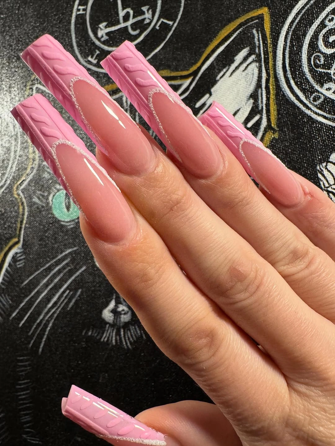
The reason the design feels dimensional is that the brighter detail is narrow and directional; it changes how light and color move without hiding the rosy foundation. That gives you a useful editing rule if the full length feels too much: preserve the curve, reduce the number of lines, and leave a generous area of pink around it. A medium coffin or almond can carry one accent curve per hand while still looking connected to the original idea.
Raised-looking or tightly painted tip details also bring a realistic tradeoff. They can catch attention at the edge and make small chips or uneven growth more noticeable, especially on very long nails. Keep the most precise curve on the nails that naturally draw attention, then simplify the remaining fingers; repetition is helpful here, but exact duplication is not required for the set to feel balanced.
Pastel French Tips Turn Color Into a Sequence
Long almond nails begin with a translucent pink base and finish with separate pastel tips in blue, yellow, lavender, and white. Because the French placement repeats, the changing colors feel like a sequence rather than a collection of unrelated accents. The small dark marks visible on a few nails add punctuation, but the open base and almond curve remain more important than any single tiny detail.
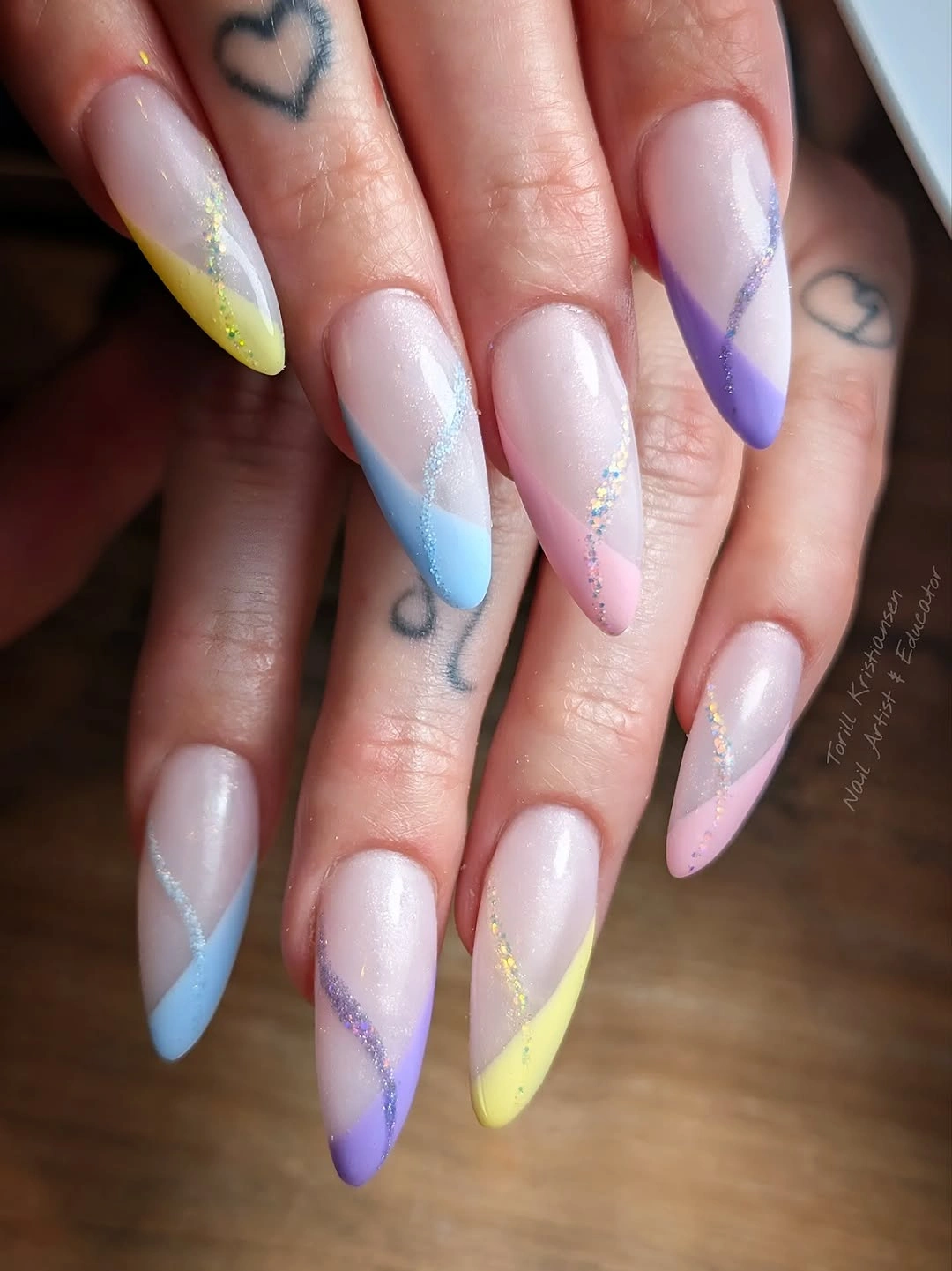
The design works by giving every color the same job: each one occupies the tip and leaves the center light. That repeated boundary is what makes several pastels wearable together, and it is the same principle behind a well-edited fall French nails look, where placement can do more organizing than a shared shade. For a quieter version, choose two cool pastels and one warm accent while keeping the tip curve consistent.
Pastel tips are forgiving in mood but not always in proportion. On a very long almond, a wide tip can shorten the visual length and make the nail look divided, so a slimmer color band will preserve the elegant taper. If the free edge is shorter, slightly wider tips can help the color remain visible; the useful adjustment is to change width with length rather than forcing the same band everywhere.
Floral White Tips Frame a Rosy Point
These very long tapered nails combine a rosy pink surface with white French tips, small floral motifs, and dark dot-like accents placed on selected fingers. The white edge frames the point first, while the flowers interrupt the pink only where the eye needs a pause. It is decorative, but the set avoids becoming a continuous pattern because most of each nail remains a clear rosy field.
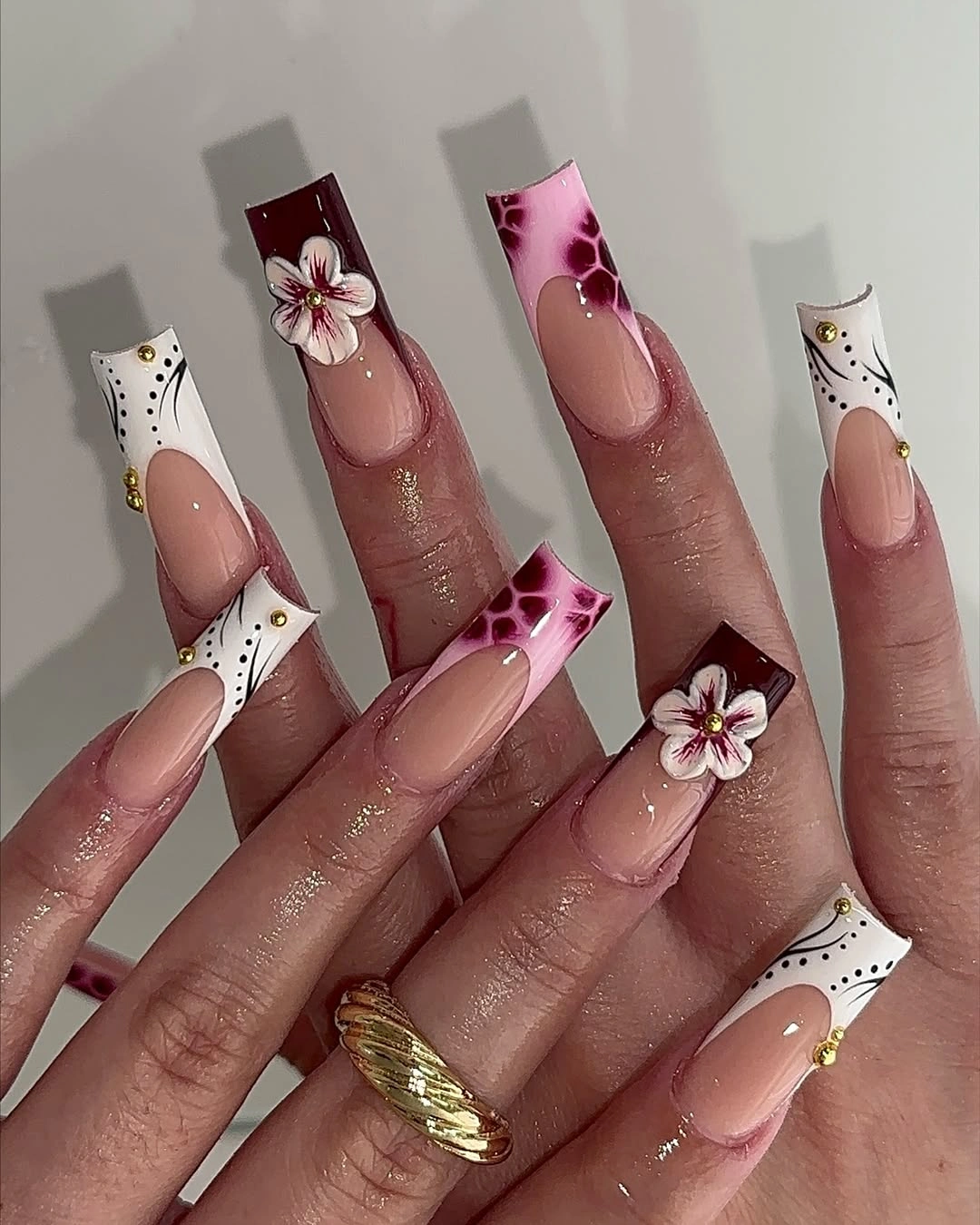
The spacing is what keeps the manicure readable. A flower near a pale tip can look delicate, while the same motif repeated densely across the whole nail would compete with the pointed shape and make the set feel shorter. Keep the strongest floral detail on two nails, repeat only the white edge elsewhere, and use the dark dots sparingly so they act as small anchors rather than a second pattern.
Very long tapered nails already require attention at the point, so decoration should not make every finger equally demanding. A medium almond version can keep the floral idea while giving the hand a wider margin for daily movement and easier visual cleanup. The white tip also offers a practical fallback: if the flowers are removed, the underlying pink-and-white relationship still reads as a complete manicure rather than a stripped-down compromise.
Reflective Rainbow Ends Stay Organized by Placement
Long coffin nails use a soft pink base and reflective multicolor blocks concentrated at the tips, shifting through blue, yellow, green, and violet. The changing surfaces are bright, but they do not cover the full nail, so the pink center creates a visual pause between the hand and the color. That placement is the quiet rule holding the set together: the hues may change, but their territory does not.
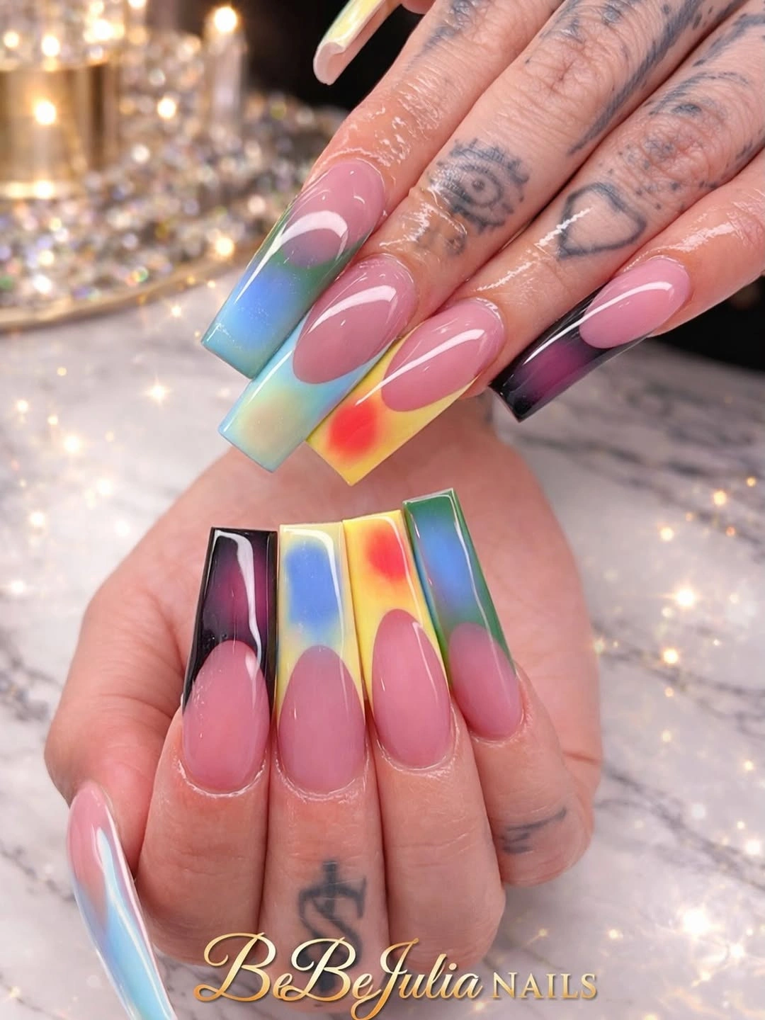
When a finish catches light this strongly, the cleanest composition usually comes from limiting where it can happen. Here, the tips become a repeated focal zone while the pink body gives the reflective blocks something calm to sit against. If the full rainbow feels too loud, keep the color shift on the two middle fingers and use a single reflective shade on the remaining tips, preserving the same placement logic.
Reflective details can also expose uneven length because every tip catches light along its edge. A medium coffin reduces the amount of surface that needs to stay perfectly aligned without removing the central idea. I would avoid adding unrelated dark art to this palette; the color changes already provide enough contrast, and extra marks could interrupt the clear transition from pink base to luminous end.
Thin Black Edges Give Sheer Almonds Precision
Long almond nails have a translucent nude-pink base with narrow black curved tips and a few small dark edge accents. The base remains visibly light, so the black reads as a precise outline instead of a block of color. That contrast makes the almond contour easy to notice and gives a simple palette a sharper, more editorial mood without covering the whole nail in dark polish.
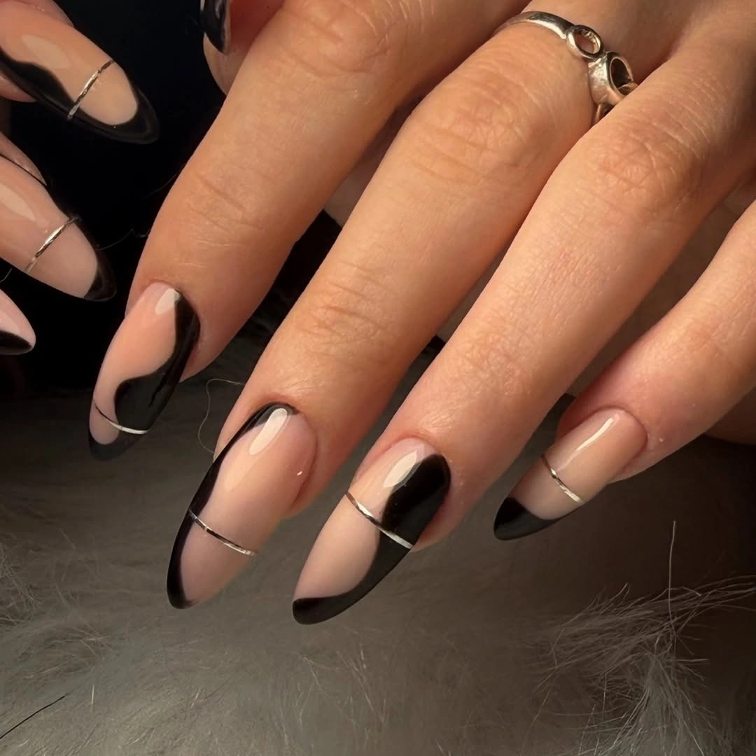
Line weight is the key decision here. A thick black band would flatten the taper and make the nail feel shorter, while a fine arc follows the curve and leaves the surface breathing. The same idea can work on an oval shape with a slightly softened arc, especially if you want the visual discipline of a dark French edge without committing to the full length visible in the reference.
Because the base is sheer-looking, placement near the cuticle and sidewalls will be easy to notice as the manicure grows. That is a realistic limitation, not a reason to avoid the design; it simply favors a clean initial line and a length that fits your schedule. Keep the black accents consistent in scale, then let small differences between fingers preserve a hand-painted feel instead of chasing mechanical perfection.
Ribbed Neon Tips Concentrate the Drama
Very long square nails begin with a sheer base and end in vivid blue, purple, green, and orange zones with visible ribbed or raised-looking horizontal texture. The color is bold, but the texture is even bolder because it changes how each tip catches light. Keeping that dimensional information at the ends prevents the full length from becoming one uninterrupted wall of neon and gives the eye a clear boundary to follow.
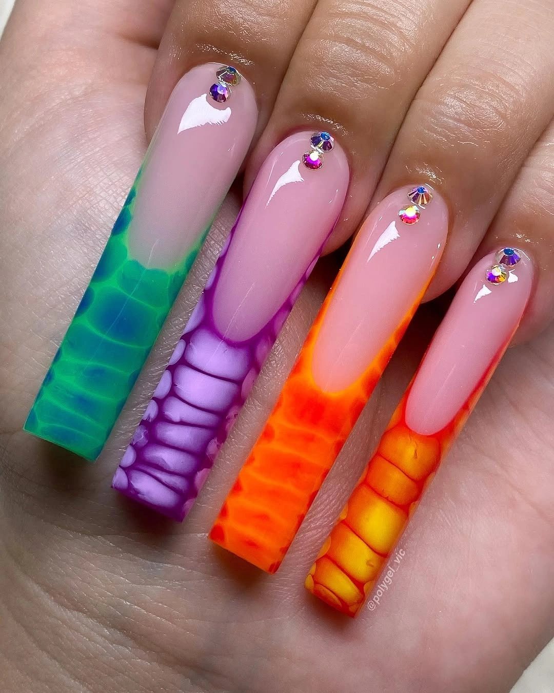
The tip placement does practical work as well as visual work. It allows the sheer base to remain a quiet bridge while the neon colors and horizontal bands take turns at the front, so several strong hues can coexist without merging. If you want a more wearable adaptation, keep one neon color, use the ribbed detail on two nails, and leave the others with a smooth bright French edge.
Texture and length together can create a demanding set, particularly around corners and clothing. A shorter square will make the ribbed pattern easier to maintain and reduce the leverage at the free edge, while keeping the color at the tip preserves the visual thesis. I would treat the orange, green, blue, and purple as a palette to edit rather than a checklist; two or three tones can create the same energy with less crowding.
Small Stones Let Pale Pink Stay in Charge
Long coffin nails use a glossy pale pink base with small bright stones placed close to the cuticle on several fingers. The surface is otherwise clean, so each accent reads as a point of light rather than a glitter layer. That restraint suits the long shape: the length is already visible, and the stones add a small interruption without hiding the soft color that makes the manicure feel calm.
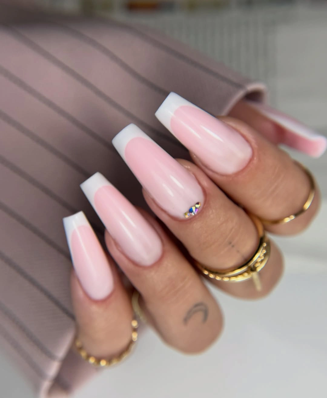
The repeated placement near the base creates a gentle rhythm, but it also keeps the tips clear and visually light. If you want the idea to look less ornate, move the accents to two nails or use one stone per hand, leaving the same pale pink on the rest. The important part is not the number of stones; it is the relationship between a large quiet surface and a small repeated glint.
Detail near the cuticle is easy to notice when it shifts, so this design rewards an even starting line and a realistic maintenance plan. A shorter coffin makes the overall set more practical without changing the calm palette, and the stones can remain tiny enough that they do not fight with rings or sleeves. Let the pink remain the first thing seen, because once the embellishment becomes the headline, the balance changes.
Spotted Tips Make Pink Stilettos Playful
Long stiletto nails mix a pink base with white-and-black spotted tips, plus a few pink-centered accents that keep the animal-like pattern tied to the rest of the hand. The spots gather near the sharp ends, so the pink body remains clearly visible and the tapered silhouette does not disappear beneath the print. This creates a lively fall manicure without asking every nail to carry an equally dense surface.
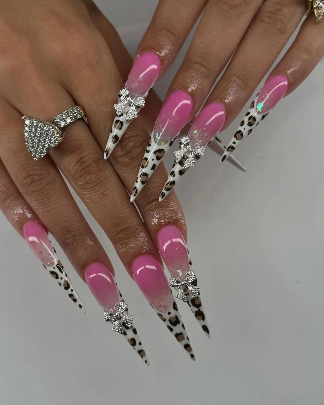
The contrast works because the irregular black shapes interrupt the smooth pink field, while the white around them keeps the tip from looking too dark. You can edit the set by keeping the spotted pattern on two or three nails and using a plain pink tip on the others; that preserves the animal-print idea but gives the hand more visual rest. The pointed outline still supplies drama even after the pattern is reduced.
Spots are visually forgiving in one sense, since they do not need to match exactly, but their placement still affects balance. Keep larger marks away from the narrowest point if they begin to make the tip look blunt, and use the pink accent as a bridge between the patterned and solid nails. A medium stiletto or almond also makes the pattern less vulnerable to edge wear while keeping the playful contrast intact.
Warm Chrome Turns Brown and Red Into Jewelry
Long coffin nails combine warm brown and deep red reflective surfaces, glittery red sections, and one small butterfly-like charm that acts as a focal point. The darker palette gives the shine a jewel-like depth, while the isolated charm keeps the mixed finishes from becoming a flat field of sparkle. Brown supports the red here by softening its brightness without making the manicure lose its strong, polished presence.
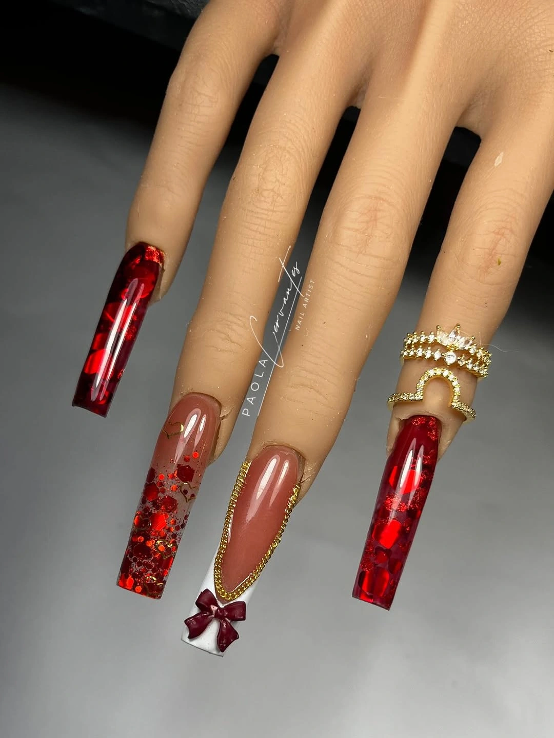
The set works best when the warm colors remain in conversation. A reflective red accent can be repeated on two nails, a brown surface can anchor the others, and the tiny charm can stay alone so the eye knows where to pause. If you want a less elaborate version, choose one reflective shade, keep the warm brown on the remaining nails, and let the contrast between surfaces replace extra decoration.
Long coffin edges make reflective finishes look impressive, but they also make alignment and chips more visible. A medium length will reduce that pressure and keep the warm palette easy to wear with fall neutrals. I would not add cool blue or bright white here unless there is a clear reason; the depth comes from the red-brown relationship, and unrelated contrast could weaken the rich, cohesive mood.
Mint Transparency Leaves Room for Gold Flecks
Long clear or sheer square nails show mint and pale aqua details with scattered gold leaf-like flecks and soft nude areas. The transparent sections are as important as the colors because they prevent the cool mint from becoming a heavy block. Gold appears in small irregular marks, so it reads as a warm glint inside a light composition rather than as a full metallic overlay.
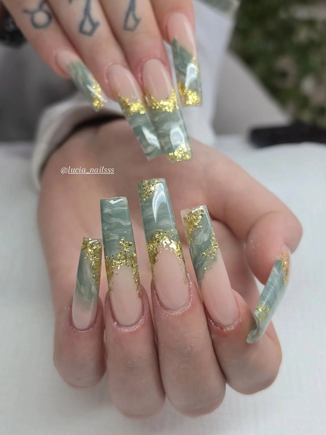
The design feels airy because the colors do not fight for the same space. Mint provides the cool statement, nude areas soften the transition, and gold connects the two with a warmer note that catches attention only when the hand moves. On a shorter square, keep one mint panel and a few gold flecks on an accent nail, then let the rest of the set return to a clear or pale base.
Transparent-looking surfaces can make growth and small imperfections more noticeable, especially when the design reaches a long square edge. That favors a length you can maintain consistently and a simple distribution of details rather than an attempt to replicate every fleck. Preserve the open space first; if the set needs to be simplified, remove a color or a metallic mark before covering the transparent base.
Matte Mauve Lets the Point Speak
Long sharply tapered nails are covered in one muted mauve-purple tone with a soft matte appearance. There is no visible art competing with the silhouette, so the shape and finish become the entire visual argument. That can feel more intentional than a busy design when the point already creates a strong line from the hand to the tip and the color has enough depth to stand on its own.
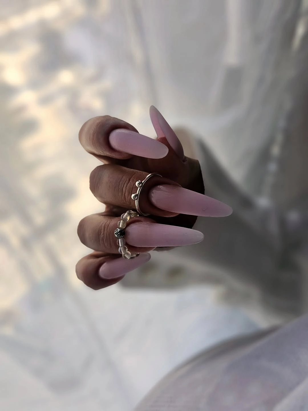
Matte changes the way the color behaves by absorbing the bright reflections that would make a glossy surface look more active. The result is quieter and more graphic, which helps the mauve read as a fall shade without relying on seasonal symbols or extra decoration. If the length feels impractical, a medium almond will soften the point while keeping the same relationship between muted color and low-shine finish.
A single matte shade also makes the quality of the outline easy to judge. Any uneven corner or inconsistent tip becomes part of the visible design, so clean filing matters more than adding another layer of art. Keep the color uniform, leave enough space around rings and sleeves for the shape to remain the focal point, and let the simplicity be the maintenance advantage rather than an invitation to overdecorate.
Scattered Shimmer Keeps Blush Almonds Soft
Long almond nails use a translucent pale pink base with fine light specks and soft white or pink decorative patches scattered across the surface. The shimmer is dispersed instead of packed, allowing the blush tone to stay visible beneath it. That makes the set feel delicate even at a long length, because the reflective detail appears as a haze of light rather than a dense glitter wall.
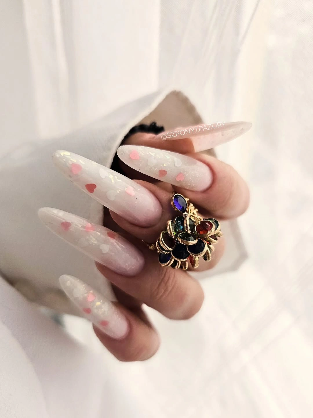
The almond silhouette reinforces the gentle mood by giving the pale color a smooth, continuous curve. White patches work best when they remain light and irregular, while the shimmer supplies just enough variation to keep the surface from looking flat. A shorter almond can place the sparkle toward the tips and leave the center open, which keeps the same airy effect while reducing the amount of detail exposed to daily wear.
Soft finishes can be harder to judge under different lighting, so think about contrast rather than chasing a specific level of shine. If the manicure disappears against pale clothes, a slightly stronger pink base or one brighter accent nail can help without changing the overall direction. The tradeoff is simple: the more translucent and delicate the set becomes, the more important consistent length and clean edges will be.
Dark Chocolate Finds Depth in Tiny Glints
Medium-to-long almond nails appear deep chocolate brown, nearly black in shadow, with fine reflective flecks that show when the light shifts. From a distance the manicure reads as one rich dark shade; closer in, the small glints keep the surface from looking flat. That two-level effect gives the color enough interest for fall while avoiding the visual weight of a full glitter finish.
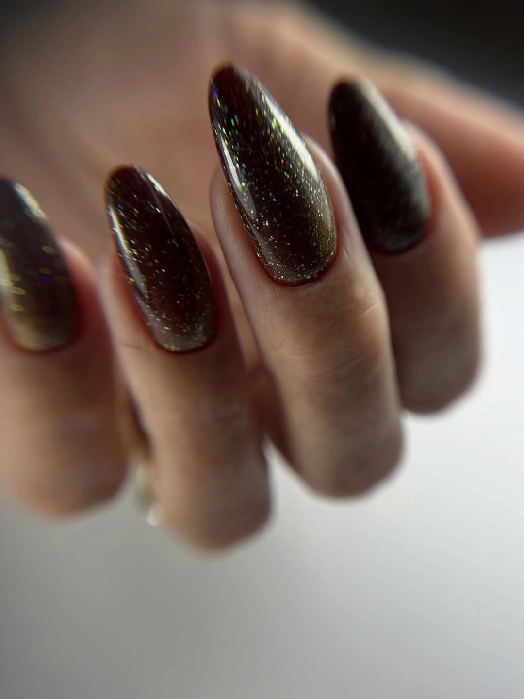
The warm undertone matters because it keeps the darkness from becoming stark. A smooth almond curve also softens the density of the shade, letting the eye read the hand as a continuous shape rather than a row of hard blocks. For a simpler adaptation, use the dark chocolate on every nail and reserve the reflective flecks for two fingers, where they can catch light without changing the main impression.
Dark polish is honest about chips and regrowth, especially when the base is close to black. A medium almond is a practical compromise: it keeps enough length for the color to feel elegant but reduces the chance that a damaged point becomes the first thing noticed. Keep the finish consistent and resist adding a bright contrast unless the goal is to move away from the quiet, moody character that makes this idea work.
Graphic Tips Give Pink Coffins a Strong Hierarchy
Very long coffin nails have a pink base with black and hot pink graphic tip blocks, white line details, and small pattern marks on selected fingers. The pink body remains the largest field, so the darker and brighter tip art reads as an organized frame rather than a full-surface collage. That hierarchy is especially important on a long square shape, where too many equal accents can make the ends look crowded and visually shorter.
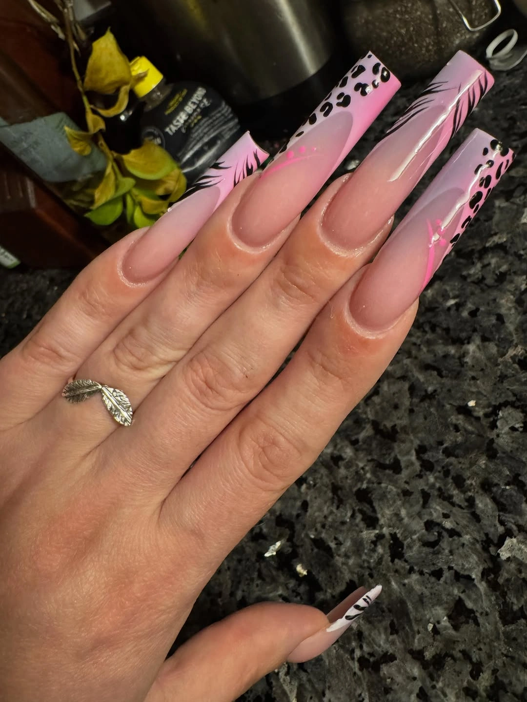
The design has three clear layers: the rosy base first, the black and hot pink tip shapes second, and the tiny white or patterned marks last. Preserving that order helps when adapting it; simplify the small marks before removing the main tip contrast. A shorter coffin can use a clean black-and-hot-pink French edge, allowing the palette to stay bold while the surface becomes easier to maintain.
Graphic art at the free edge will show wear quickly because corners receive the most contact. Keep the strongest black boundary where the tip is widest and avoid extending tiny details all the way into the narrow corners. If the design starts feeling too loud beside jewelry or patterned clothing, remove one accent color rather than shortening every nail; the pink-and-black relationship can carry the look by itself.
Gold Curves Link Burgundy and Nude
Long nails combine dusty rose, burgundy, and nude panels with fine gold curves and small dark line details. The colors move from pale to deep within a warm family, so the mixed set feels intentional even though each nail is not identical. Gold acts as a visual bridge, crossing the changes in depth with a thin line instead of filling the surface with another large block.
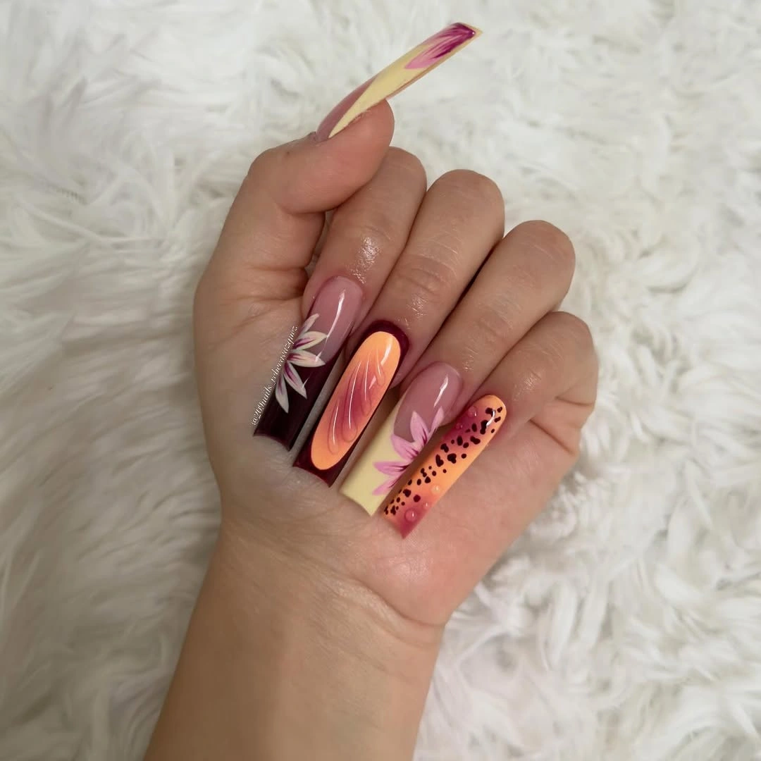
The strongest part of the idea is the restraint of the line work. A gold curve can direct attention across a nude panel or soften the transition into burgundy, while a dark mark can provide just enough contrast to keep the design legible. If you want a shorter set, place burgundy on two nails, use nude as the anchor, and repeat one gold curve rather than trying to preserve every mixed panel.
Warm mixed manicures are easy to overcomplicate because several shades already feel decorative. Let the darkest burgundy be the anchor and keep the gold thin enough that it does not become the dominant finish. This is also a useful place to compare the line-based approach with fall nail art that uses larger motifs: the quieter curves will usually be easier to pair with clothes and easier to edit as the shape grows.
White Waves Make Orange Feel Graphic
Very long coffin nails are saturated orange with white wavy lines and small white star motifs spread across the surface. Orange remains the dominant field, while the repeated curves create movement and the stars provide pauses inside the pattern. The design is energetic because every nail participates, but its visual language is still clear: one bright base, one light line, and a small recurring symbol.
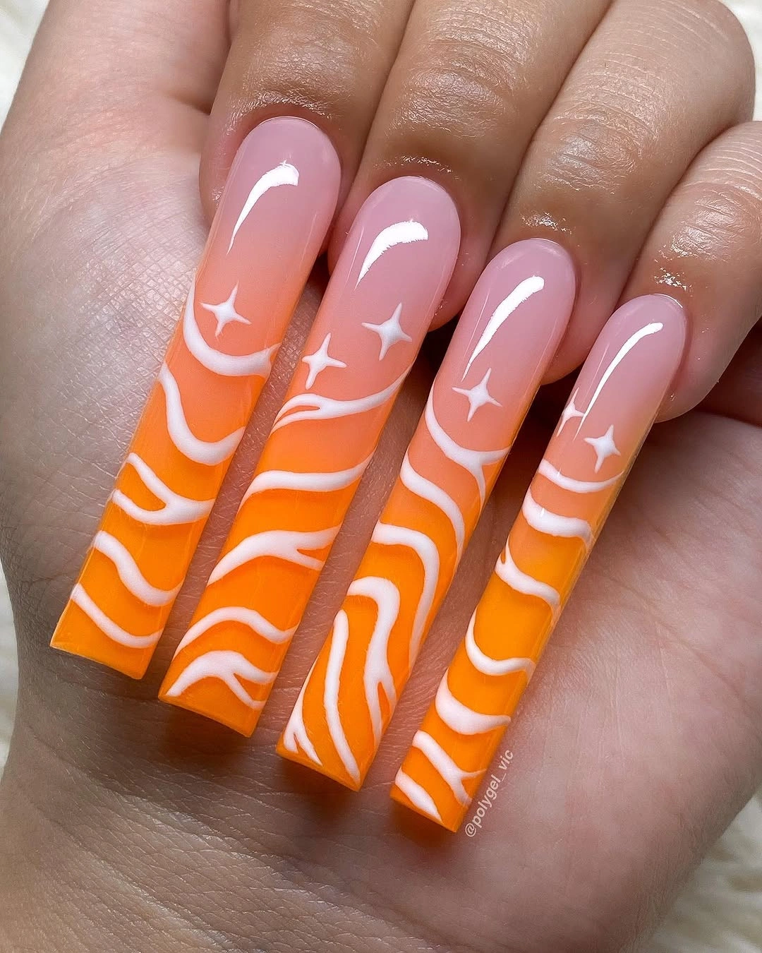
The wavy lines work because they vary slightly while keeping a similar direction, which prevents the nails from looking mechanically copied or visually disconnected. Stars are best treated as punctuation rather than a second dense pattern; if there are too many, the orange surface loses its clarity. On a shorter length, keep the waves on two accent nails and use a plain orange or narrow white edge elsewhere to retain the graphic mood with less crowding.
This is a high-maintenance visual at the free edge because the saturated base and white details make chips easy to notice. A shorter square will reduce the amount of exposed art, and a simpler two-color edit will make repair less obvious. The honest tradeoff is part of its appeal: choose it when you want the manicure to be the focal point, not when you need a background that disappears beneath every outfit.
Black French Edges Hold Bright Corner Blocks
Long squared nails use a nude base with black French edges and small lime, yellow, orange, or pink blocks near the corners. The black outline supplies a stable frame, allowing the bright accents to remain compact and legible instead of drifting into a multicolor blur. Nude space keeps the set from becoming fully opaque, while the squared silhouette makes the color placement look crisp and architectural.
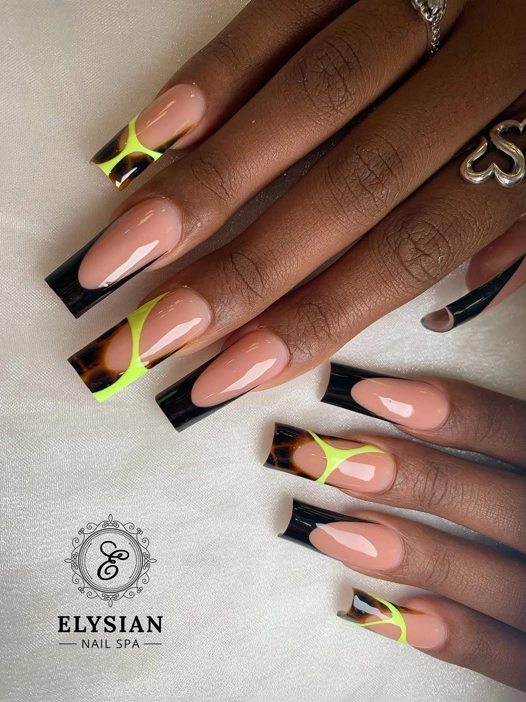
The color blocks work because each one has a defined territory and the black edge repeats across the hand. You do not need every bright shade on every nail; keeping black tips consistent and reserving the lime or yellow for two middle fingers can make the design more wearable without losing its contrast. This is a strong example of how a dark boundary can organize several small accents.
Corner details deserve an honest maintenance note because they sit where the nail shape changes direction. Keep the blocks slightly inside the most exposed edge and file the square ends evenly so the graphic frame does not break apart. If you prefer less contrast, exchange the black for a deep brown while keeping the nude base and bright corner placement; the structure will remain, but the overall effect will feel warmer.
Pearl Shine Softens a Blush Almond Outline
Long almond nails show a translucent blush base with a pearly reflective finish and soft white edges. The glow changes as the hand moves, while the pale edge reinforces the curve and keeps the silhouette visible against a light background. There is no heavy motif to compete with the finish, so the manicure feels polished through surface and proportion rather than through a pileup of decoration.
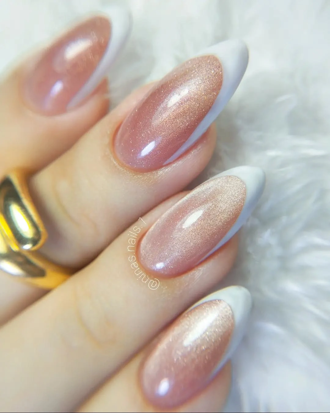
The pearl effect supplies enough movement to make a single pale palette interesting, but the white edge stops it from becoming visually vague. That makes the idea useful when you want a luminous neutral with more presence than flat pink and less intensity than chrome. On a medium almond, keep the edge narrow and let the reflective base remain the main feature; widening the border could make the nail look divided.
Light finishes can reveal uneven edges because reflections travel along every curve. Choose a length that allows consistent filing, and keep the color close to the natural mood of the base if you want a forgiving grow-out. The payoff is a manicure that can sit beside rings and soft knits without fighting them, while still giving the hand a distinct reflective detail.
Pink Loop Lines Keep Peach Squares Open
Short-to-medium square nails use a sheer peachy base and thin hot-pink curved lines that loop across the surface. The peach field remains visible between each line, so the manicure feels graphic without turning into a dense maze. Compact length helps the loops look intentional: there is enough room for movement, but not so much surface that the pattern needs to be repeated endlessly.
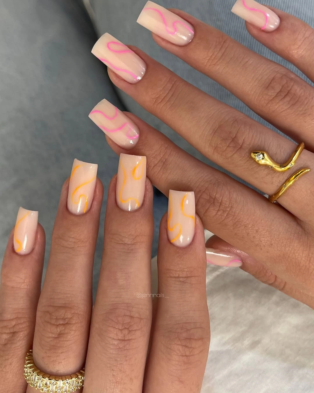
The open line work is what gives this design its flexibility. A narrow loop can echo the square edge, soften it, or create a small focal area without adding another finish or motif. If you move to a longer nail, reduce the number of curves or keep them near the center; stretching the same small loops across a larger surface can make the manicure look underplanned.
Peach and hot pink are close enough in warmth to feel friendly, but the bright line still needs room to remain crisp. Keep the base light, avoid stacking too many loops on one nail, and let one or two fingers carry the strongest curve. For more fall contrast, a muted terracotta line can replace the hot pink while preserving the open rhythm and the practical short-square proportion.