Fall dip nails 2026 can feel surprising even when the overall choice stays restrained. The decision that matters is not whether a manicure is simple or detailed, but whether its most noticeable feature has enough room around it to register. When every nail asks for the same attention, the hand can look busy long before it feels expressive.
Begin with the kind of presence you want at a normal distance, then use close-up detail only where it changes the balance. Shape, spacing, and the proportion of plain surface all influence whether a design feels wearable after the first exciting glance. A good edit is often the one that leaves a little visual silence instead of filling every available edge.
Rust Florals With One Sparkling Counterpoint
Rust orange gives this almond set its warm center, while pale pink and white keep the palette from becoming too dense. The floral-like marks are gathered on the white nails instead of scattered everywhere, and one deeply sparkling nail adds a focused flash. That placement makes the different finishes read as a conversation rather than a row of unrelated ideas, especially against the rounded point of the shape.
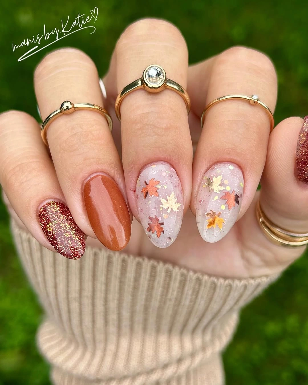
A similar warm-color approach works best when the solid rust appears more often than the detailed nails. The white area gives the pattern room to register, so it would be easy to simplify the look by using one floral accent and one glitter accent rather than repeating both. For more palette direction, compare how deep and soft shades share space in fall color ideas.
Because the noticeable detail sits on a few nails, the set still has a clear line when the hand moves. Keep the patterned portions small enough that the warm orange remains the first color the eye catches. Someone drawn to a calmer version could swap the glittered nail for a plain deep brown, preserving the autumn weight while making the overall finish less reflective.
Cobalt Almonds Framed By Sheer Motif Nails
Cobalt blue takes a decidedly graphic role here, appearing on several long almond nails with a smooth, uninterrupted surface. The translucent pink accent nails soften that intensity and hold small blue eye-shaped motifs, which keeps the symbols visually contained. The contrast succeeds because the blue is echoed in the accents rather than introduced as a completely separate story on each finger.
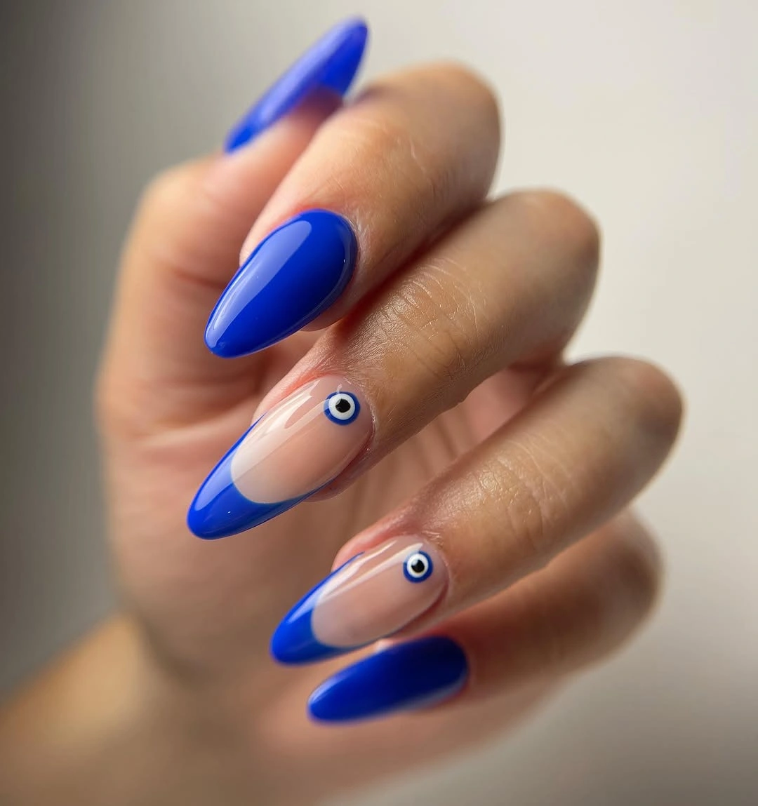
Longer nails give the dark blue enough room to stay clean beside the small motif work. On a shorter length, one sheer accent with a single symbol would be more legible than trying to repeat the pattern across several narrow tips. The palette also benefits from the nude-pink space, which prevents the blue from reading as a solid block across the whole hand.
The strongest choice is the division of labor: bold color carries the energy, while the translucent nails provide the detail. Keep any replacement motif equally compact and centered so it does not fight the pointed silhouette. If blue feels too stark for daily wear, a muted ink or dark teal could retain the same high-contrast structure with a quieter seasonal temperature.
Muted Sage Alternation On Short Almond Nails
Muted sage and pale nude alternate across short almond nails with almost no added decoration, making the color rhythm the main feature. The soft green is neither overly dark nor neon, so it sits comfortably next to the beige-pink base. Short length helps the two colors feel considered and practical, because each nail reads as one clean block rather than a small canvas crowded with art.
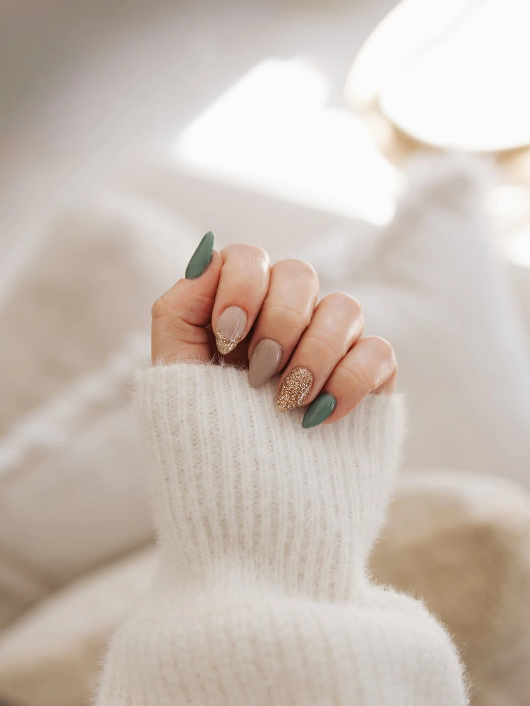
Alternating shades is useful when you want a visible change without relying on patterns that may feel fussy after a few days. Here, the green acts as the focal shade while the nude gives the hand open space between each cool note. Replacing sage with dusty olive, gray-blue, or mushroom brown would keep the restrained effect as long as the second color stays close to neutral.
There is a quiet advantage to keeping every surface plain: the almond outline remains easy to see from every angle. That makes this approach a good reference for someone who likes fall dip nails ideas short enough for everyday tasks but still wants something more intentional than a single color. Avoid adding glitter to every green nail, since the low-key contrast is doing most of the work already.
Soft Pink With Reflective Center Notes
This pink set shifts its interest through surface rather than through a dramatic color jump. Most nails stay in the same pale family, while a pair of reflective lilac-pink nails and a pair of sparkling accents create small changes in light. The short squoval shape keeps the finish playful instead of theatrical, because the repeated base shade holds the different textures together.
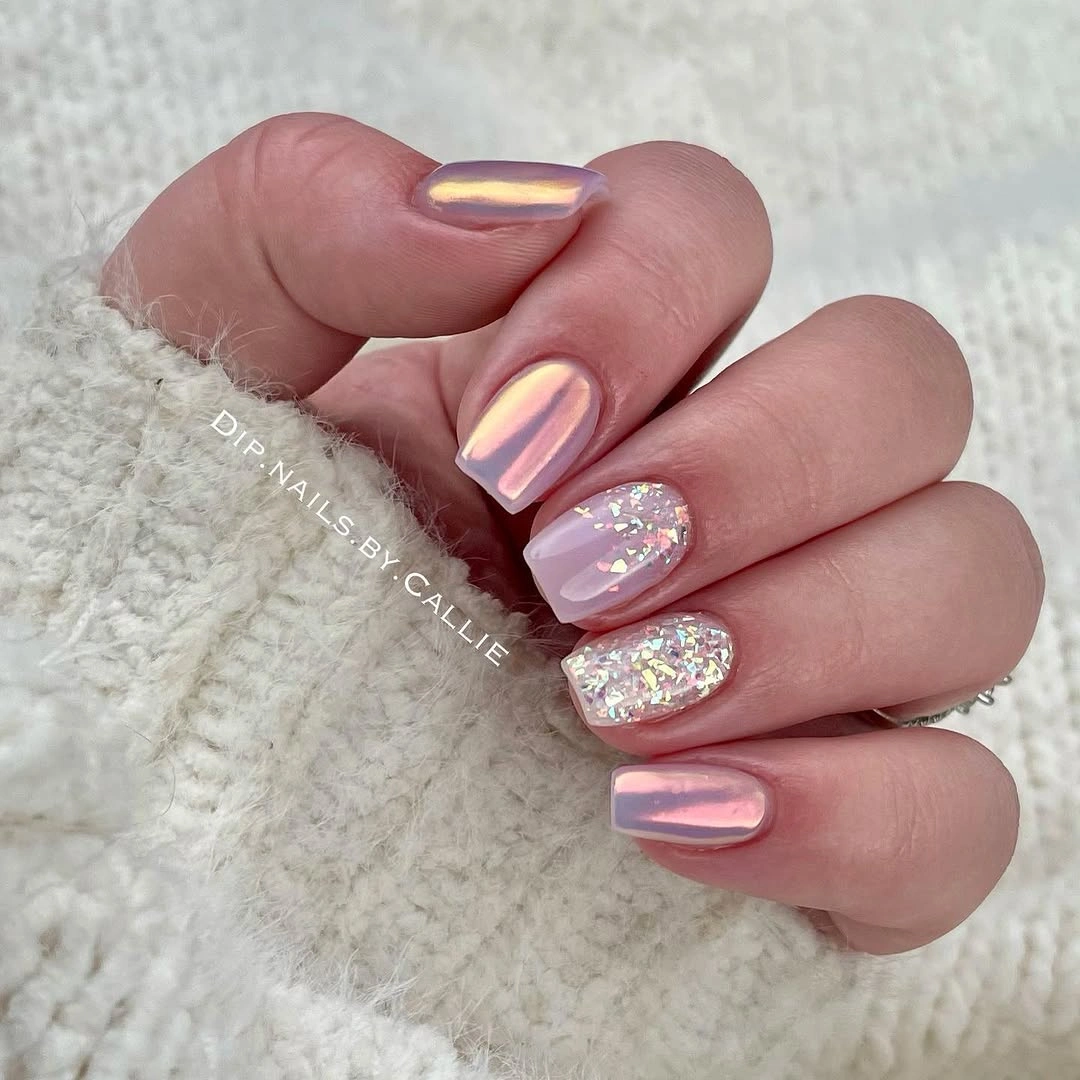
Using one color family is what allows the reflective-looking nails to stand apart without making the manicure feel fragmented. The sparkle sits beside plain pink rather than beside another busy pattern, so the bright spots remain easy to read. If a highly polished surface is not your preference, keep only one reflective accent and let the remaining nails use a creamy pink with a similar undertone.
Pay attention to the density of the accents rather than just their count. A compact short nail can carry shine, but the surrounding nails need some visual quiet or the set can lose its soft mood. The effect would also translate nicely to a medium length, where a single center-finger accent can create the same light-catching pause with even less detail.
Teal Glitter And Blue Floral Accents
Deep teal provides the anchor for this long almond manicure, while black-green sparkle and blue floral-like accents bring in the more decorative notes. The design avoids placing every feature on the same nail: the glittered fingers offer texture, and the blue nails carry the small gold-toned details. Separating those jobs is why the rich palette still has a readable order from fingertip to fingertip.
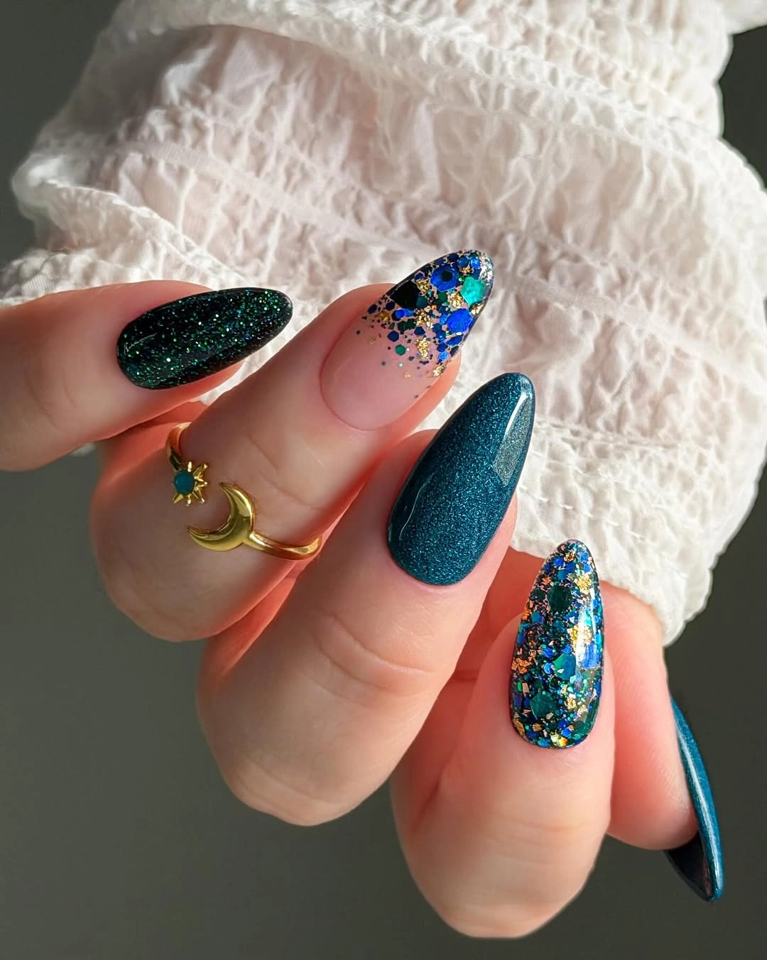
The pointed length gives the teal, floral art, and dense glitter enough room to remain distinct. A shorter adaptation would be stronger if it chose either the blue floral accent or the dark sparkle, not both, because the two finishes already provide plenty of contrast. See more ways to keep one standout finger useful in accent nail ideas.
What makes the manicure feel intentional is the repeat of cool blue-green tones across different finishes. Keep the gold-toned touches small and limited so they stay like punctuation instead of becoming another full pattern. This is a full-impact option for a long shape, but the color logic can become much more wearable by reducing the number of accent nails rather than changing the palette entirely.
Forest Green Balanced With Dark Sparkle
Glossy forest green appears as the majority color here, with dark glittered almond nails inserted as a deep reflective contrast. The mix has a natural fall depth without needing an obvious motif, and the solid green remains visible enough to keep the hand from becoming all texture. Rings and denim create a casual setting, but the manicure itself stays centered on that strong green-versus-sparkle balance.
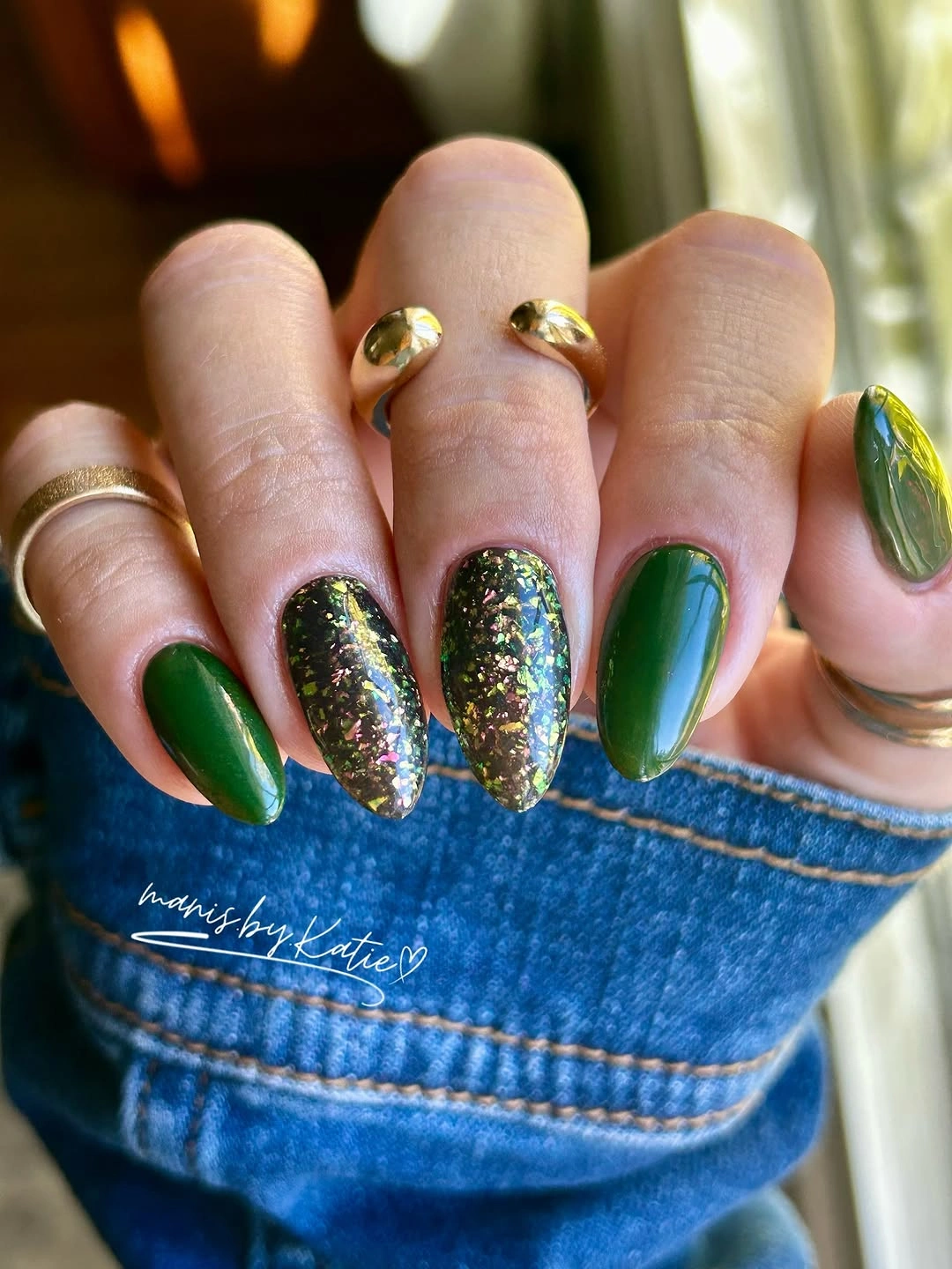
When a sparkle accent is nearly as dark as the solid polish, it changes the surface without breaking the palette. That is useful for anyone who wants variation but does not want a bright secondary shade. Keep the plain green on more nails than the glitter, especially if the length is long, because the solid color supplies the calm structure behind the more reflective finish.
The tradeoff is that a densely sparkling edge can call attention to any visible growth or wear sooner than a flat solid color. Reserving it for one or two fingers is a sensible way to keep the mood while making maintenance feel less demanding. The long almond outline already contributes enough drama, so no additional artwork is necessary for the color pairing to feel complete.
Violet Squares With A Glittered Twin
Bright violet is allowed to be the headline on these long square nails, then repeated in a more sparkling form on alternating fingers. Because both finishes stay close in color, the change reads as texture rather than a new palette. The straight free edge gives each purple block a crisp, almost graphic presence, making the manicure noticeably bolder than a soft almond version in the same shade.
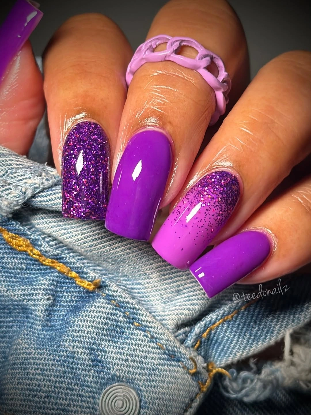
One saturated color can feel festive without losing direction when the contrast comes from surface instead of extra hues. The solid nails provide a clear resting point between glittered ones, which is important on this length. If you prefer a smaller visual statement, use violet on shorter square nails and place the sparkle on a single ring finger, leaving the rest of the set uninterrupted.
The polished effect comes from staying committed to violet rather than adding another accent color for variety. Keep the glittered nails separated so their texture does not merge into one continuous band across the hand. That small spacing decision lets the long square shape remain visible and keeps the design from looking like it is trying to deliver every possible fall detail at once.
Chocolate Emerald And Fine Dark Glitter
Chocolate brown, dark emerald, and fine sparkle appear on long almond nails as distinct blocks of color, not as a blended gradient. The brown warms the cool green, while the glittered nails act like a shadowy bridge between them. Each color is strong enough to be seen separately, yet the deep values keep the combination grounded rather than bright or playful in a summer direction.
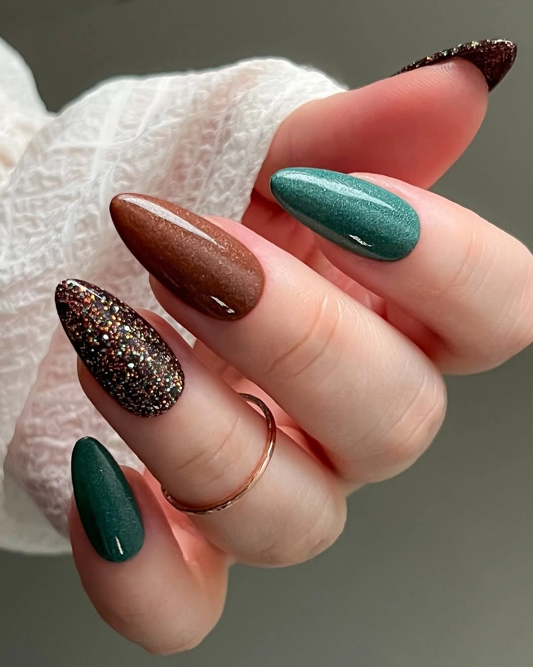
Spacing matters more than ornament in a palette like this. A brown nail beside green creates contrast, while the glittered nail gives the eye a visual pause before the next solid color arrives. Someone working with a shorter length could simplify the formula to two solids and one dark accent, because the colors themselves already deliver the seasonal interest without needing extra art.
The long taper makes the shades appear even more concentrated toward the tips, which adds a dressier mood. If that feels too dramatic, keep the same dark brown and switch emerald to muted sage, or choose a shorter rounded shape. The essential idea is not the exact shades but the way warm, cool, and reflective surfaces are kept separate enough to stay legible.
Nude Almonds With Narrow Green Tips
Soft nude nails receive a slim muted-green curve at the tips, creating a French-inspired effect that feels lighter than a fully filled green edge. The long almond shape gives the small color line a graceful path, and the exposed nude center keeps the manicure airy. Nothing else competes with that curve, which is why the green feels like a deliberate seasonal hint rather than a full color commitment.
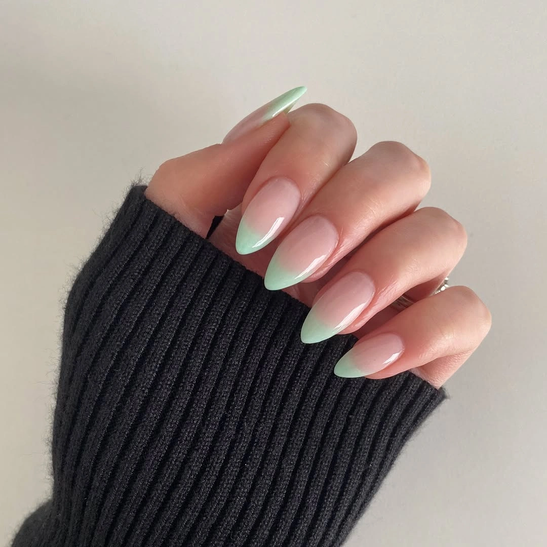
A narrow tip is especially appealing when you like a green accent but want the hand to remain mostly neutral. The line can be widened slightly for a shorter nail, yet it should still follow the natural arc rather than becoming a thick band. For shape-specific ideas that preserve that sense of proportion, browse medium-length nail ideas.
Precision is the honest limitation here: uneven tip thickness would be more obvious than it would be in a mixed-color manicure. Keeping the base shade close to your preferred nude makes the green line easier to wear and keeps attention on the curve. A soft brown, wine, or gray-blue tip could use exactly the same layout when green is not the color you reach for most often.
Caramel Almonds Beside Brown Sparkle
Caramel orange brings warmth to this almond set, while dark brown glitter nails supply the contrast that keeps the color from reading too sweet. The plain orange surfaces are glossy-looking and clear, so the sparkly nails have a contained role rather than taking over the manicure. Against denim and gold rings, the combination feels autumnal because the orange and brown are related but not identical in depth.
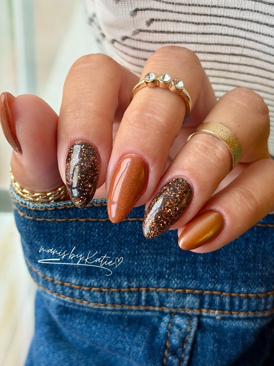
The orange remains the visual lead because it appears on more nails and has a smoother, brighter surface. That ratio is useful when combining a favorite color with a more dramatic texture: let the color occupy the larger areas, then use sparkle as a narrow contrast. A person who prefers less shine could replace the dark glitter with a solid espresso brown and retain the same warm seasonal relationship.
Long almond nails make the caramel shade look particularly fluid, but the idea does not depend on length. On short nails, two caramel nails and one brown accent on each hand can still create the same useful rhythm. Resist adding a third color unless it has a clear job, since the orange-brown pairing already carries warmth, shadow, and enough variation on its own.
Pink Nails With Graphic Black White Accents
Pale pink keeps this short manicure soft even though several nails introduce bold black-and-white details. Checkerboard squares, a curved graphic, and tiny dotted elements each have their own small area, so the patterns feel playful rather than visually continuous. The choice to leave other nails plain matters here: it gives the sharp contrast somewhere to land and lets the rounded short shape stay visible.
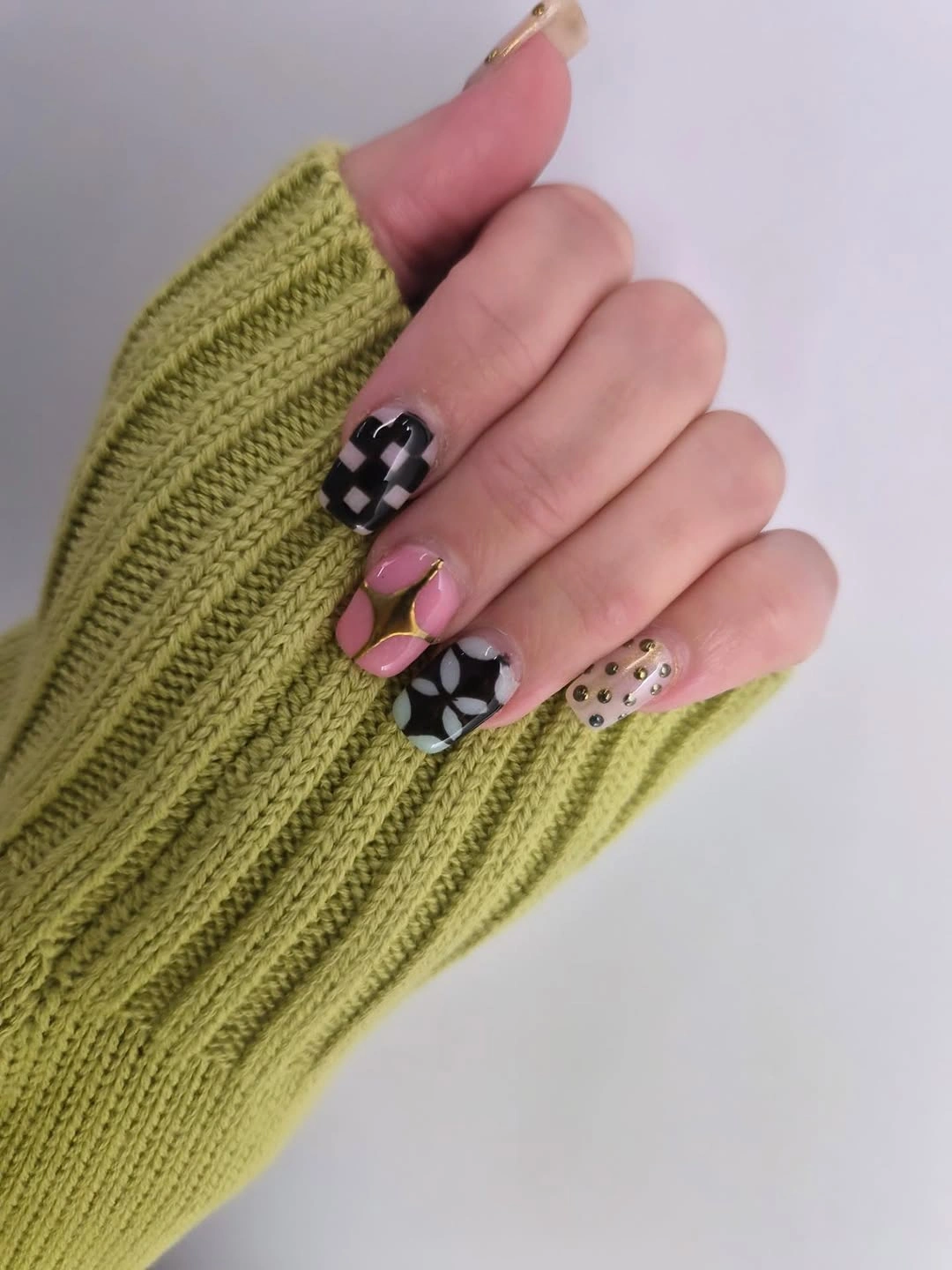
Graphic accents are most successful on a gentle base when their scale matches the length of the nail. A single checkerboard finger would be enough for someone who likes the idea but not the busy mix, while a tiny black dot near the tip could echo the contrast elsewhere. The pink base is doing real work by keeping all those small designs from becoming too stark against the skin.
Consider whether you want the pattern to be the first thing people notice or simply a close-up surprise. This version makes the art prominent through high contrast, so it suits a reader who enjoys a little extra detail without changing the underlying pink palette. For a more subdued fall direction, replace black with deep brown and keep the same limited placement on one or two nails.
Patterned Tips Over A Soft Pink Base
Soft pink almond nails become much more animated when black, green, and spotted-looking details stay close to the tips. The base remains open through the center of each nail, which lets the varied patterns read as borders instead of full-surface art. Even the small floral-like accent feels connected because the darker outlines repeat across the set and keep the different tip treatments from drifting apart.
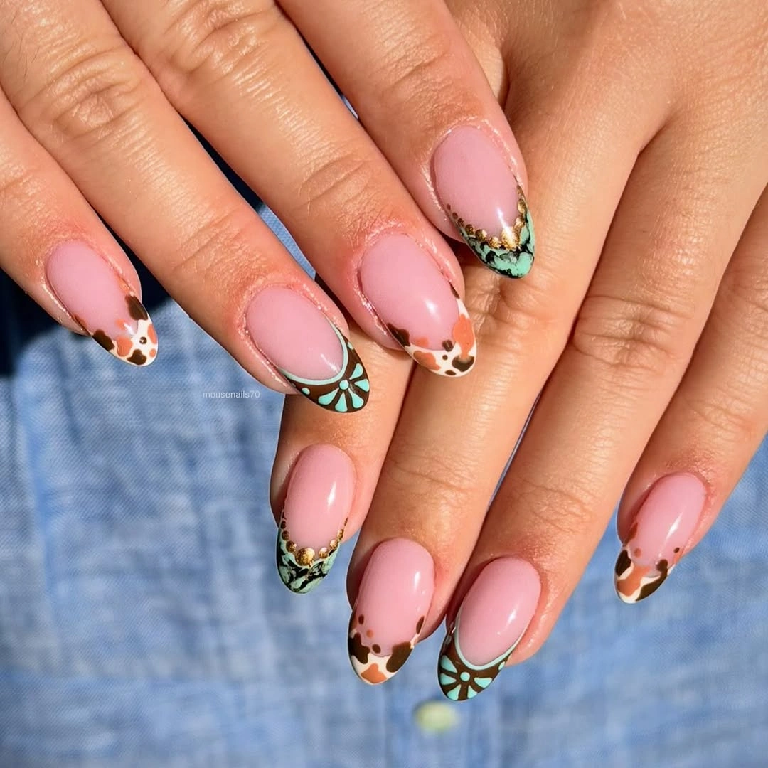
This kind of tip-focused design has room for experimentation because the pink foundation remains predictable from nail to nail. If several motifs feel too busy, choose one border pattern and repeat it on alternating fingers, then leave the rest as plain pink. The almond outline helps the details taper naturally, but a shorter version should use a broader, simpler border so the pattern does not become muddled.
The appeal is in the contrast between soft color and deliberately uneven-looking detail, not in piling every motif onto one hand. Keep the darker elements concentrated near the free edge and avoid extending them down toward the cuticle. That preserves the negative space which makes the design feel airy, even with green and black doing more visual work than a neutral manicure usually asks of them.
Deep Burgundy In A Single Glossy Field
Uniform deep burgundy turns these medium almond nails into a study in color and contour. With no accent nail or pattern competing for attention, the rounded point and even coverage become the design. The shade reads dark enough for fall without appearing black, and the glossy-looking surface catches light just enough to keep the manicure from becoming visually flat in close view.
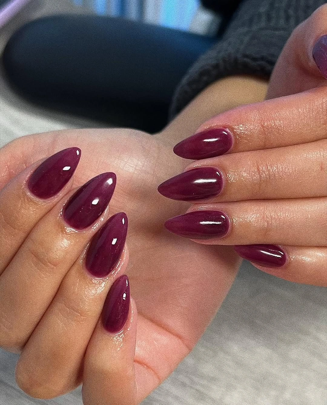
A solid burgundy works when you want the confidence of a darker manicure without the upkeep of multiple tiny details. Choosing a slightly warmer wine or a cooler plum can change the mood while preserving the same clean idea. The medium almond shape is a useful balance here because it gives the rich color presence but avoids the full drama that a much longer point might create.
The honest tradeoff is that a dark uninterrupted shade makes the cuticle area and any new growth more noticeable over time. That does not make it impractical, but it is worth considering if you prefer a softer transition between appointments. The lack of decoration is also its strength: nothing distracts from the burgundy, so the silhouette needs to remain even for the result to feel polished.
Yellow And Purple With A Small Floral Echo
Pale yellow and saturated purple make an unexpected pair on these long pointed nails, and the small purple floral-like detail helps them feel related rather than randomly alternated. One purple nail has a more textured-looking surface, while the yellow nails give the brighter color room to breathe. The difference in value is high, but the repeated purple accent creates a thread that keeps the two shades visually connected.
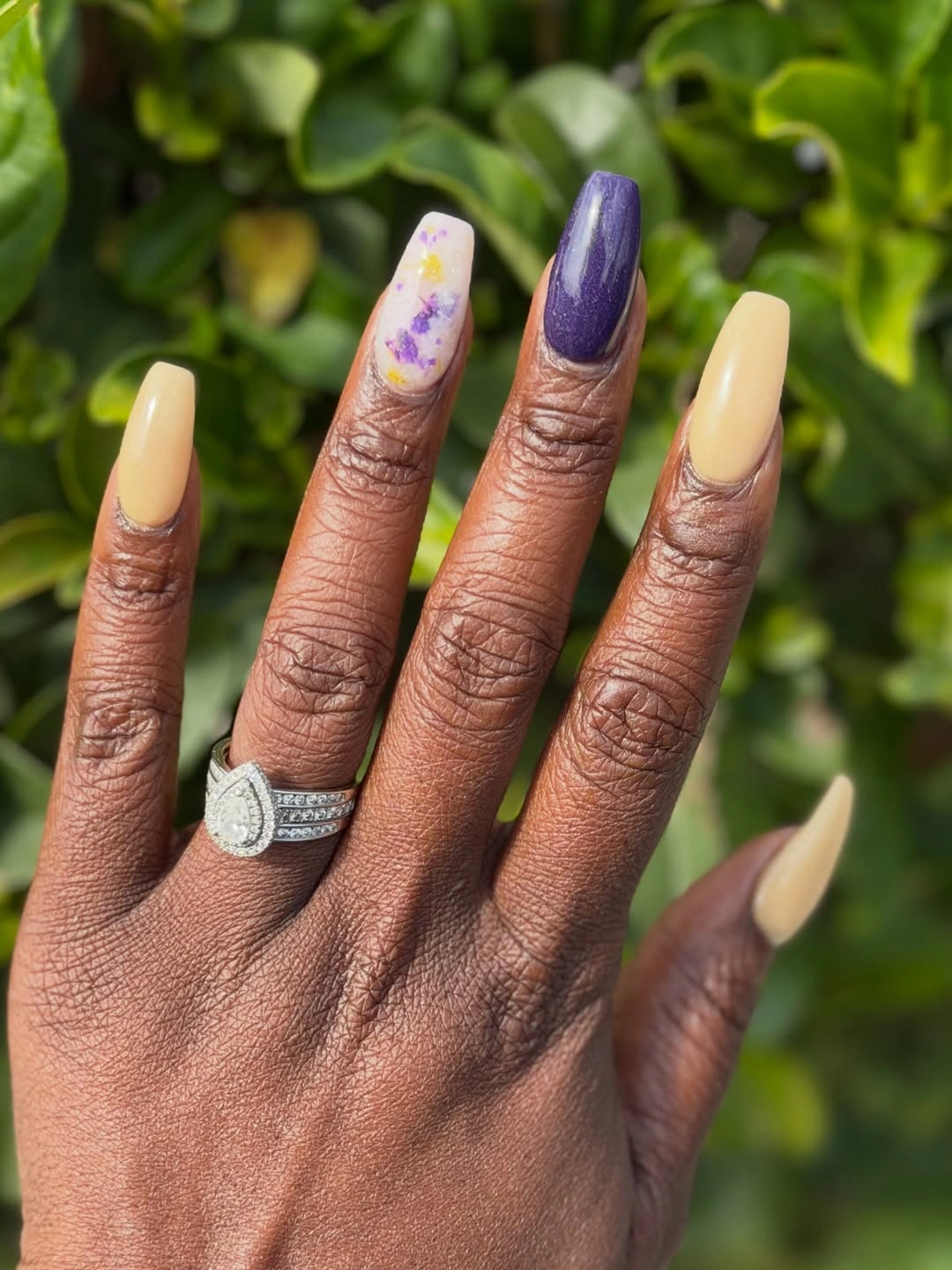
Strong opposites need a simple plan, and this set uses repetition rather than more colors to establish one. A simplified version could keep pale yellow as the base and use purple only for one accent plus a small tip detail, which would hold onto the energy with less decorative pressure. The long almond silhouette supports the boldness, because every color has enough uninterrupted space to register clearly.
Think of the tiny purple accent as a linking note, not as a reason to cover every yellow nail with art. That restraint is what allows the yellow to remain fresh and the purple to remain dramatic. If the pairing feels too bright for your wardrobe, a butter yellow with muted eggplant or a dusty lavender would keep the same contrast at a lower volume.
Nude Almonds With Midnight Blue Sparkle
Neutral brown-nude nails alternate with dark blue glitter accents, creating a useful contrast between soft everyday color and a more evening-facing surface. The nude nails keep the long almond silhouette approachable, while the deep sparkle acts as a narrow focal point on neighboring fingers. Because the glitter is not placed everywhere, it reads like a deliberate change in texture instead of an all-over dramatic finish.
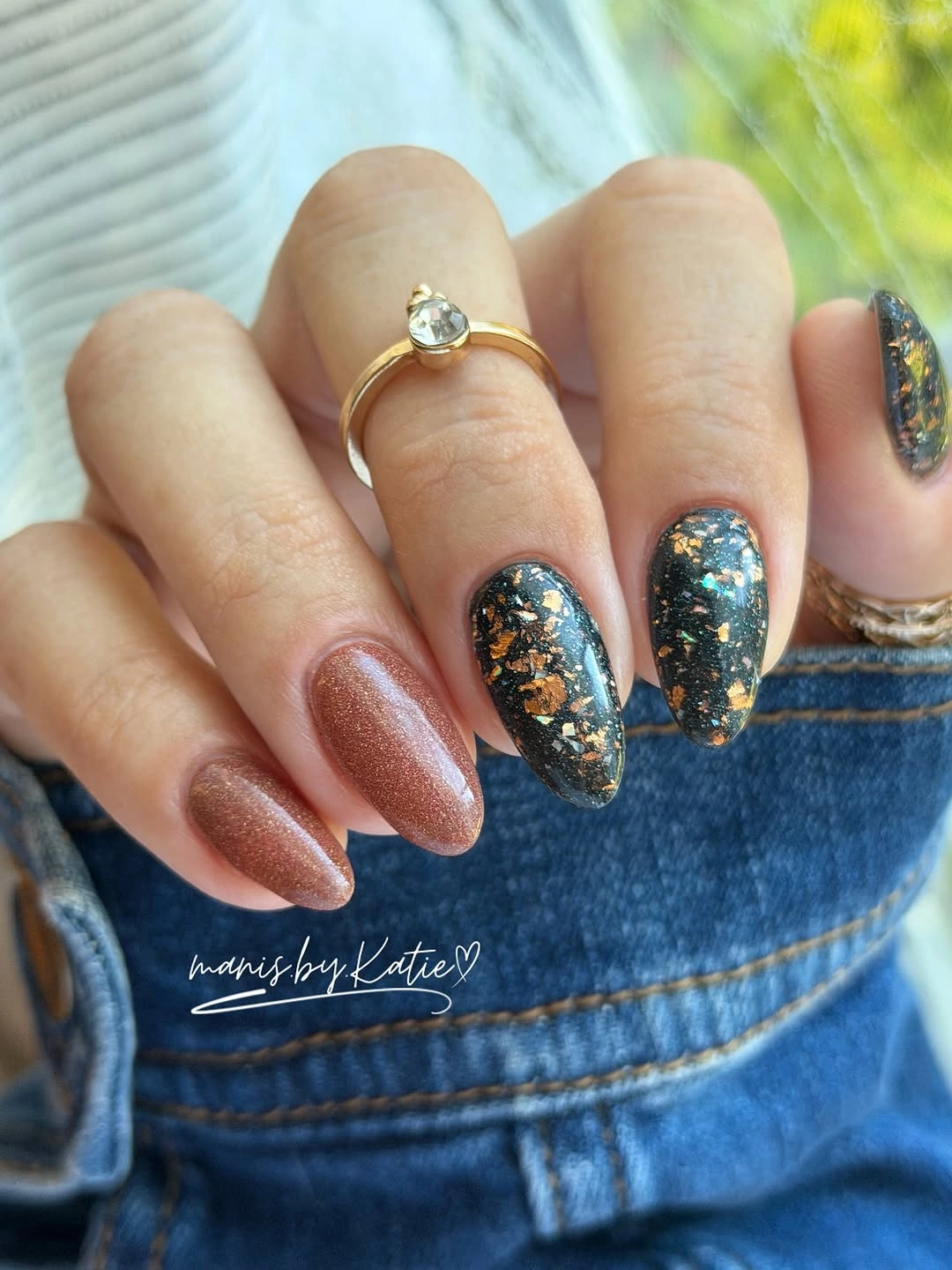
The key practical decision is whether you want the dark blue to appear as a full nail or only a tip. Full accent nails create the strongest contrast, as they do here, but one blue edge would be easier to blend into a lower-maintenance neutral set. Keeping the nude warm rather than pink also makes the blue feel moodier and more suited to fall than to a bright summer palette.
There is enough shine in the blue accents that additional crystals, lines, or floral details would have little to add. Let the clean nude nails carry the spaces between the dramatic points, and make sure the dark color appears on separated fingers. That alternating placement prevents the sparkle from forming a heavy cluster and keeps the overall hand balanced from both sides.
Pale Blush Almonds With Quiet Proportion
These pale blush almond nails rely almost entirely on their even shape and soft color, which is why they feel composed rather than plain. The shade sits close to the natural range of the hand without disappearing into it, and the moderate point gives each finger a gentle lengthening effect. There is no accent demanding attention, so the viewer notices the consistent curve, surface, and proportion first.
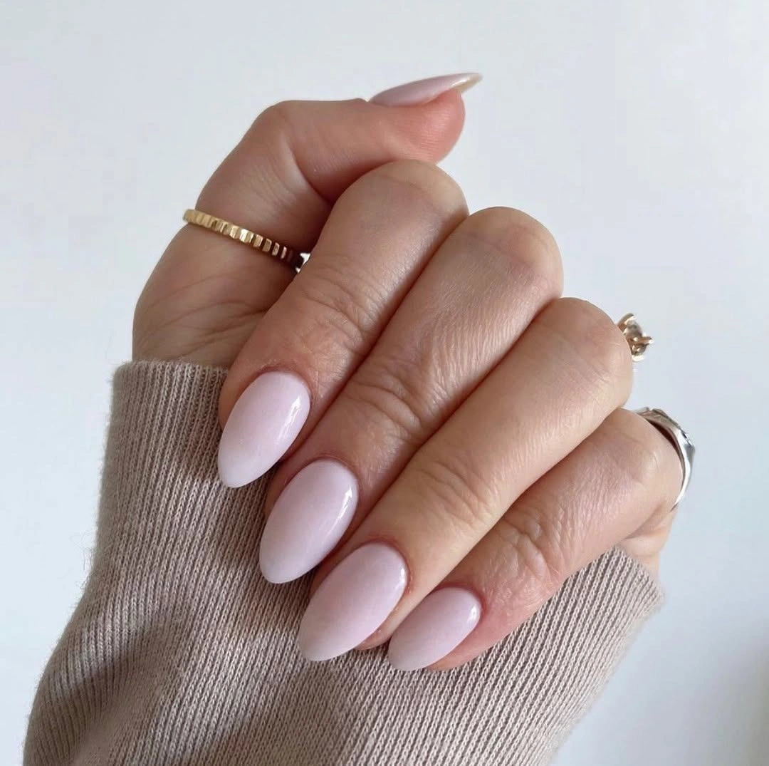
For a minimal manicure, undertone is the real styling tool. A blush that is slightly too cool or too warm can change the feeling more than a small design would, so test it against the skin before assuming one pale pink will work the same way for everyone. The clean outline makes this an easy reference for anyone who prefers polish that supports an outfit rather than becoming its main focal point.
The appeal of this approach is that it does not need a seasonal motif to feel considered. A soft brown-beige, muted rose, or milky cream could follow the same formula and still suit fall. Keep the length consistent, because on a solid pale manicure uneven tips become more visible than they would in a design with sparkle, patterns, or several distracting colors.
Maximal Color Panels With Dark Outlines
Black, yellow, pink, green, and red appear in sharply separated panels across long pointed nails, with dark outlines and looped decorative-looking shapes holding the many colors together. Each nail carries a different composition, so the design depends on the shared use of contrast rather than on matching artwork. The dark edging is essential because it keeps the bright tones readable instead of letting them blur together at this length.
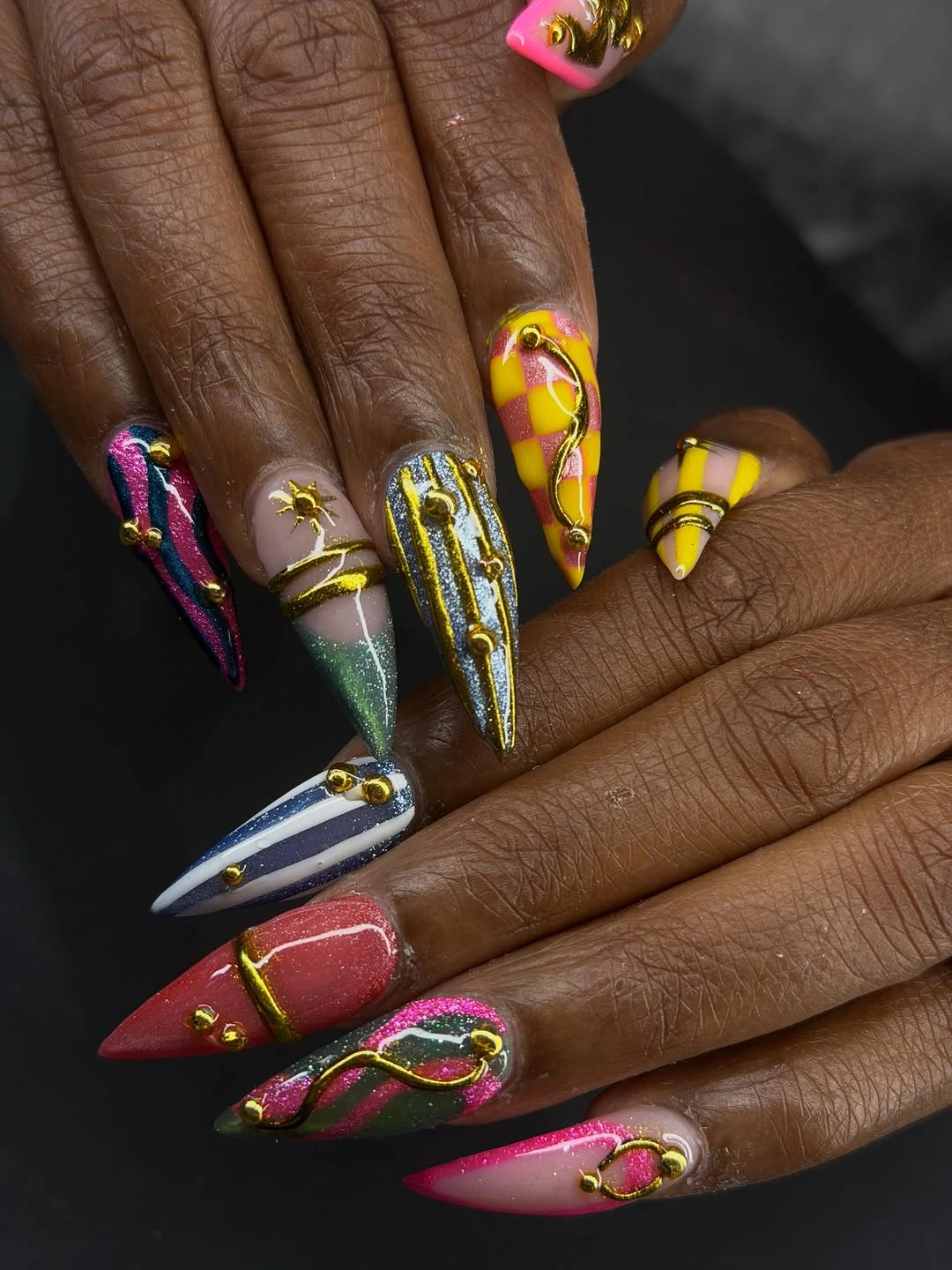
There is no need to reproduce every feature to borrow the idea successfully. Choose two or three colors, keep one dark outline color, and reserve the most elaborate detail for a single accent nail. That edit would retain the graphic energy while making the look easier to coordinate and less likely to feel crowded once you see it alongside jewelry, sleeves, and everyday objects.
The long pointed shape is part of the visual effect, since it gives each panel an extended vertical route. On a shorter nail, a compact color-block tip or one outlined stripe would communicate the same direction more clearly. The goal is not maximal detail for its own sake; it is creating enough separation that every bright element has a reason for being there.
Burgundy Paired With Pale Silver-Pink Sparkle
Deep burgundy and pale silver-pink sparkle take turns across these almond nails, producing a contrast that is more luminous than the brown-and-glitter combinations earlier in the palette. The dark wine color supplies weight, while the light-reflecting accents lift the hand without introducing a competing bright hue. Alternation keeps both finishes visible, making the set look balanced even though their depth is very different.
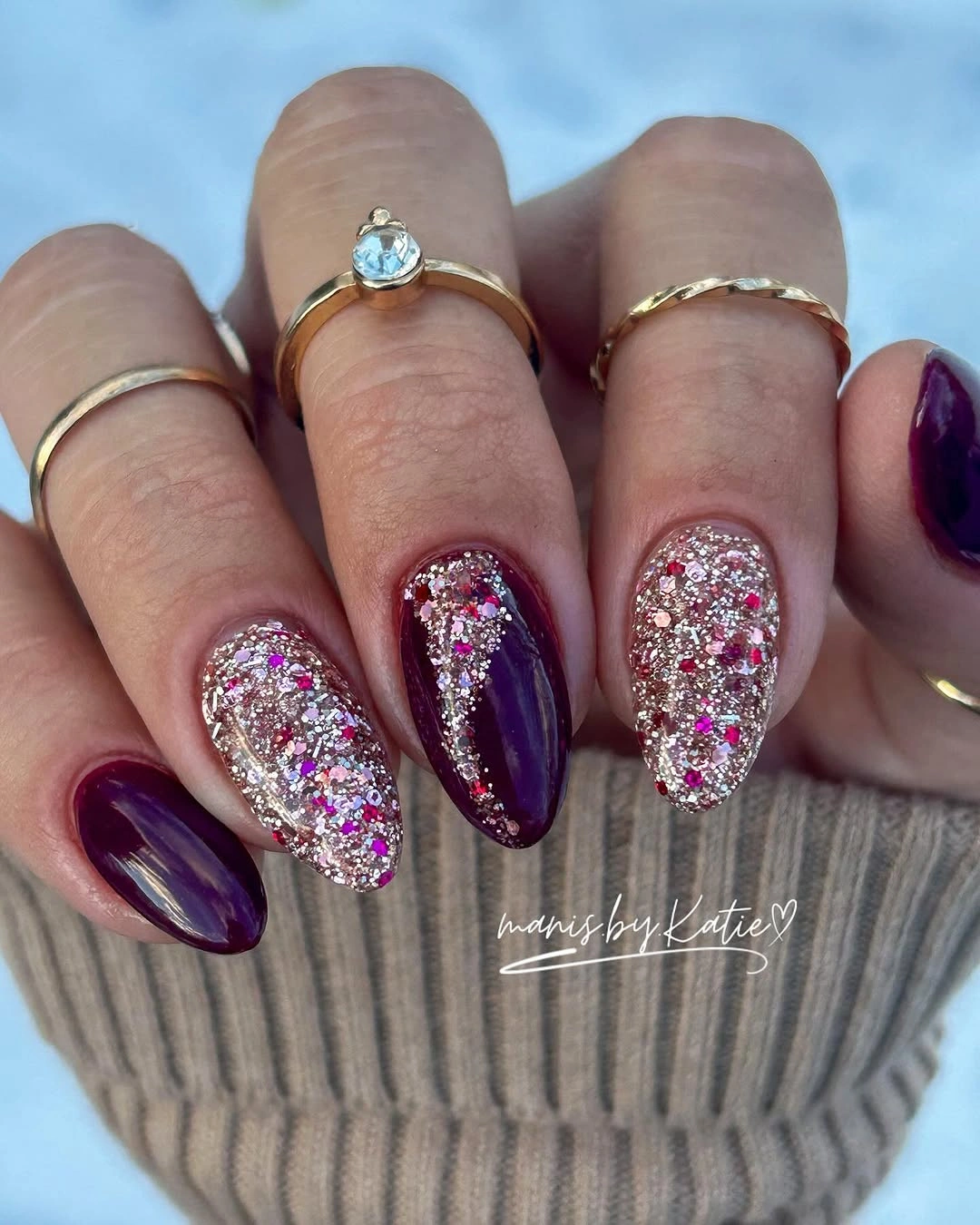
Use this pairing when you want a dark fall nail color but do not want the whole manicure to read as heavy. The lighter accents can be placed on the center fingers for a more concentrated flash, or reduced to one finger if a more restrained effect is preferred. Burgundy still needs to appear as the majority color so the sparkling finish feels like a contrast, not the new base.
At close range, the visual interest comes from the difference in surface as much as from color. Keep the surrounding nails free of linework or tiny motifs, because those details would compete with the reflective accents. The combination works best when the burgundy remains smooth and uninterrupted, allowing the light nails to serve as precise bright breaks rather than a source of visual clutter.
Violet Pink Gradients With Glittered Anchors
Bright violet glitter, magenta-to-purple gradient nails, and a darker sparkling accent create a manicure that moves between blended color and concentrated shine. The long pointed shape lets the gradients stretch visibly from one tone into another, while the solid glitter nails provide firm stops between them. That combination gives the set energy without making every finger rely on the same finish or color transition.
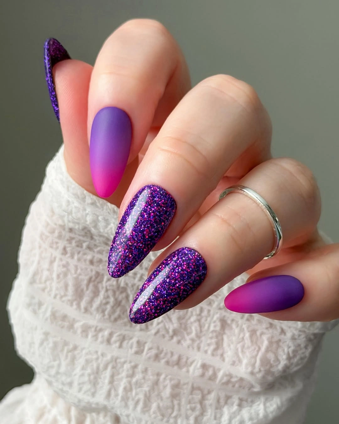
Gradients need enough uninterrupted length to read clearly, so a shorter adaptation should use just two blended colors and a single sparkling accent. The violet and pink family already has plenty of contrast, which means additional art would only compete with the transition. Keep the glittered nails in a related dark purple so the eye moves smoothly between the fade and the more concentrated color.
The strongest quality here is the balance between movement and stillness. The faded nails feel fluid, while the deep glittered ones give the hand a stable visual base. If you prefer less brightness, soften the magenta toward dusty rose but maintain a darker purple anchor; otherwise the gradient may lose the depth that makes it look purposeful on such a long silhouette.
Lavender With A Single Delicate Sparkle Detail
Lavender remains consistent across these long almond nails, with one lighter translucent-looking nail carrying tiny scattered sparkle. The design is restrained compared with the brighter purple mixes, yet it still avoids becoming completely uniform because the small accent shifts the way light lands across the hand. The white lace sleeve reinforces the soft presentation, but the manicure itself is defined by lavender and subtle variation.
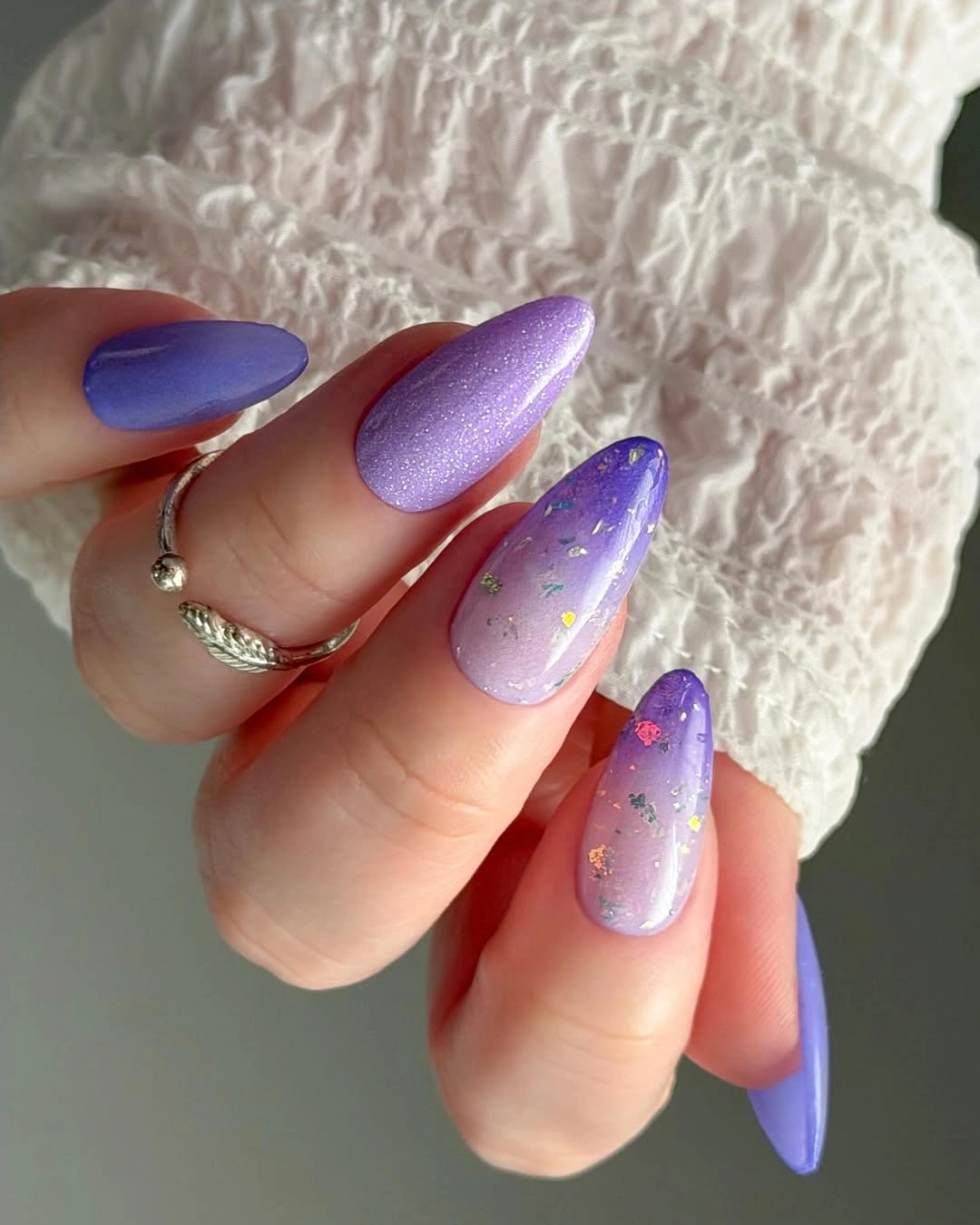
One detailed nail is often enough when the base color has a clear presence, and lavender benefits from that restraint. A person who does not enjoy sparkle could use a single milky-lavender accent instead, keeping the color variation while losing the reflective points. The long shape makes the soft purple feel elegant, but the same idea could be translated to medium almond nails with an even smaller accent.
The small scattered detail should remain sparse, because its charm comes from being noticed after the overall lavender color. Dense decoration would change the mood from soft to busy and remove the useful contrast between the plain nails and the one special surface. Keep the rest of the set smooth and consistent so the subtle accent can do its quiet job without competing with another motif.
Simple Pale Pink On A Gentle Almond Shape
Pale pink and a medium almond outline create a clean ending point for a fall manicure that does not rely on a seasonal motif. The color is light but not stark, and the gentle point gives the fingers a more elongated line without the sharpness of a stiletto shape. With no glitter or art in the way, the consistent shade makes proportion and even length the central visual decisions.
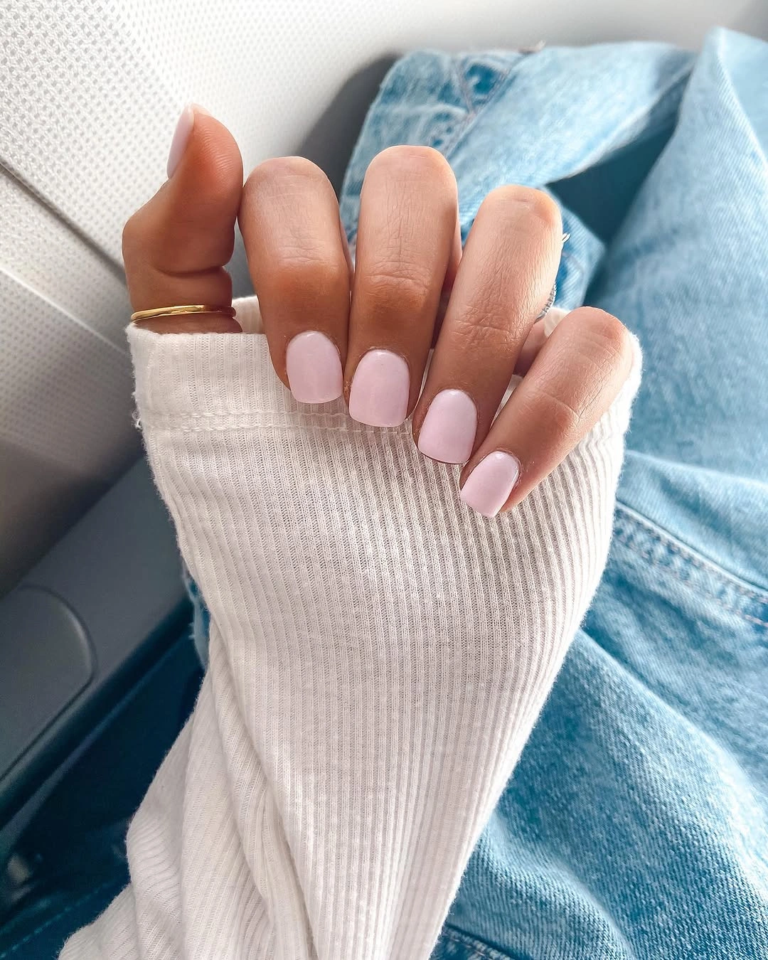
This kind of simple pink works particularly well when you want the freedom to wear different colors in clothing or jewelry without planning around the manicure. The best adjustment is usually undertone: a rosier pink, a beige-pink, or a touch of mauve can make the same outline feel more personal while preserving its minimal character. Extra details are optional, not necessary for the result to look finished.
Keep the free edges shaped consistently, since there is no pattern to distract from small differences in length. The soft shade also makes this a useful reset after a run of bolder fall dip nails designs, when a quieter color can still feel polished and intentional. Its strength is not surprise; it is the calm confidence of letting color, shape, and clean spacing speak for themselves.