There is a particular moment before a workday when a coffee, a laptop, and a favorite sweater all compete for attention, and the manicure has to fit into that picture without looking overplanned. I notice the strongest office looks often rely on one deep shade or one narrow dark edge, then leave enough quiet space for the hands to feel natural. A small choice can carry the mood farther than a full pattern.
If you are comparing fall nail designs for office 2026, start with your real level of visibility: do you want color that reads across a meeting table, or detail that rewards a closer look? From there, choose the shape and finish that suit your routine, then edit the accents. A plain tip, one patterned finger, or a single metallic note can make the idea yours without asking your workplace to change its rules.
Deep dark solids with one amber accent
Long almond nails carry a deep burgundy and black-brown palette, while one warm amber nail breaks the dark group. The glossy surface makes the rich colors look smooth and deliberate, and the simple silhouette keeps the set from leaning into theatrical nail art. That single warm accent is doing the balancing work, giving the dark manicure a point of contrast without weakening its office-ready confidence.
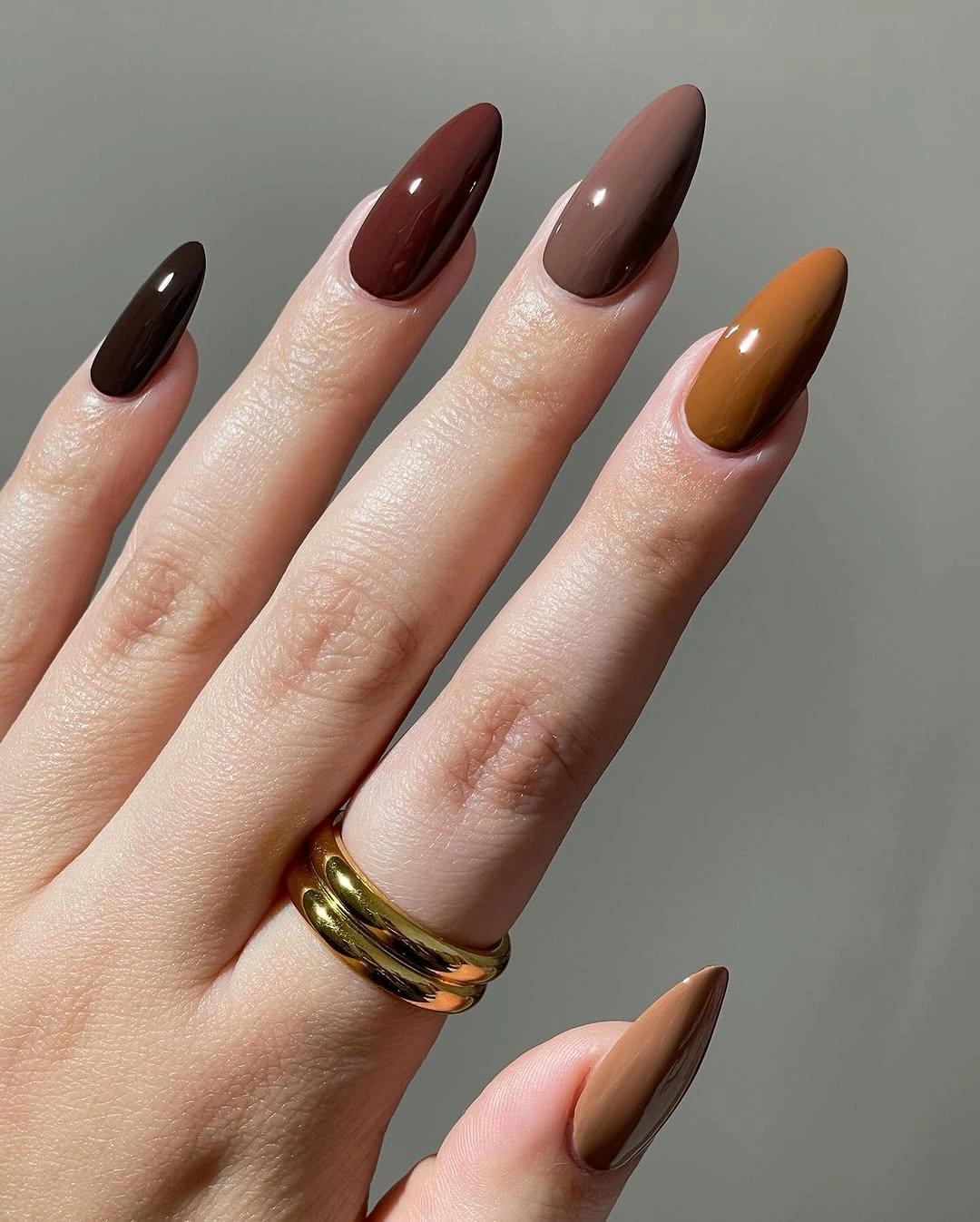
For a quieter appointment, use the deepest shade across four nails and repeat the amber only on the thumb or ring finger. A medium almond will keep the color visible while feeling more practical, and a soft squoval will make the same palette a little less dramatic. If your clothes already feature wine tones, let the amber act as the small shift that keeps everything from blending together.
Dark solids are clean because there is nowhere for extra decoration to hide, but that also means edge wear will be obvious. The glossy finish catches light and can make the set feel more evening-led beside equally shiny jewelry. Choose this when you want the manicure to make a clear statement, and keep the rest of the look simple enough for the dark color to remain the focus.
Muted olive green with a soft neutral balance
Muted olive covers the long almond nails here, with a warmer pale accent appearing near the thumb. The matte surface lowers the intensity of the green and gives it a calmer, more tactile feeling than a reflective finish would. That is what makes the color suitable for an office wardrobe: it has personality, but the shade stays close enough to a neutral family to avoid looking flashy.
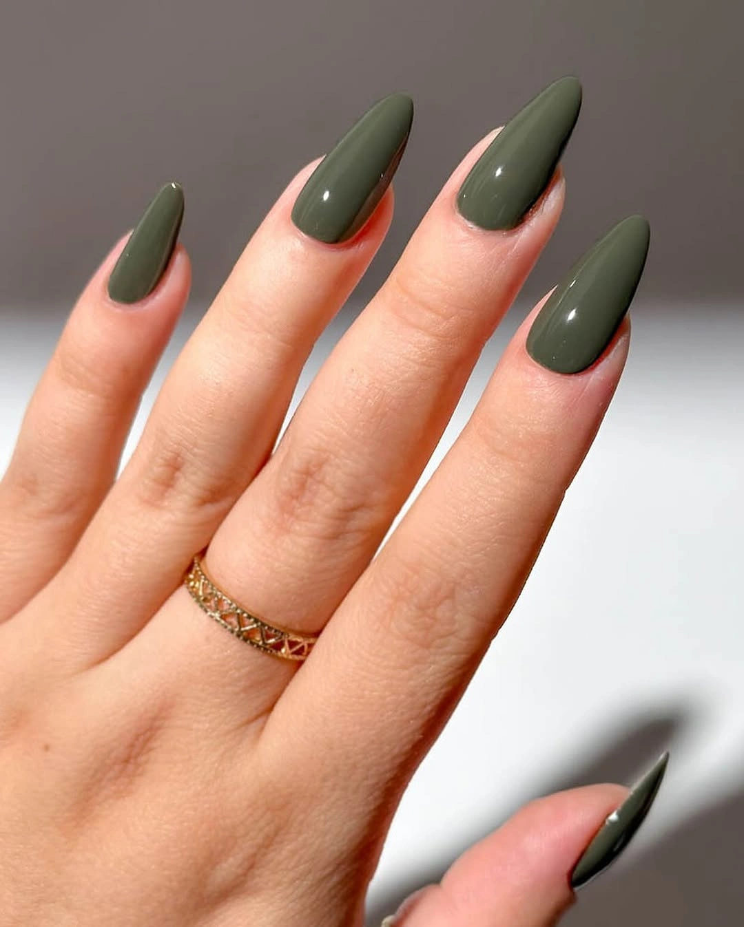
Keep the olive matte if you want the most restrained version, or add one glossy accent nail to bring a little light into the set. A shorter almond will still show the color clearly, and a soft square can make the olive feel more structured. I would keep the accent quiet rather than introducing another bright shade, because the muted green already has a strong identity.
Matte color can look beautifully deep in some light and flatter in others, so the surrounding texture matters. A knit sleeve, brushed metal jewelry, or a cream shirt can give the surface more contrast without adding nail art. If you need a manicure that reads instantly from a distance, a glossy olive or slightly wider tip may be easier to see than this softly muted version.
Gold loops and stars on a white French
A blush nude base and clean white tips create the familiar foundation, but thin gold loops and tiny star-like marks shift the manicure into a more personal direction. The accents sit close to the tip or cuticle instead of covering the whole nail, and the medium square shape gives each small detail a stable frame. The result feels decorated, yet it still leaves plenty of open pink space.
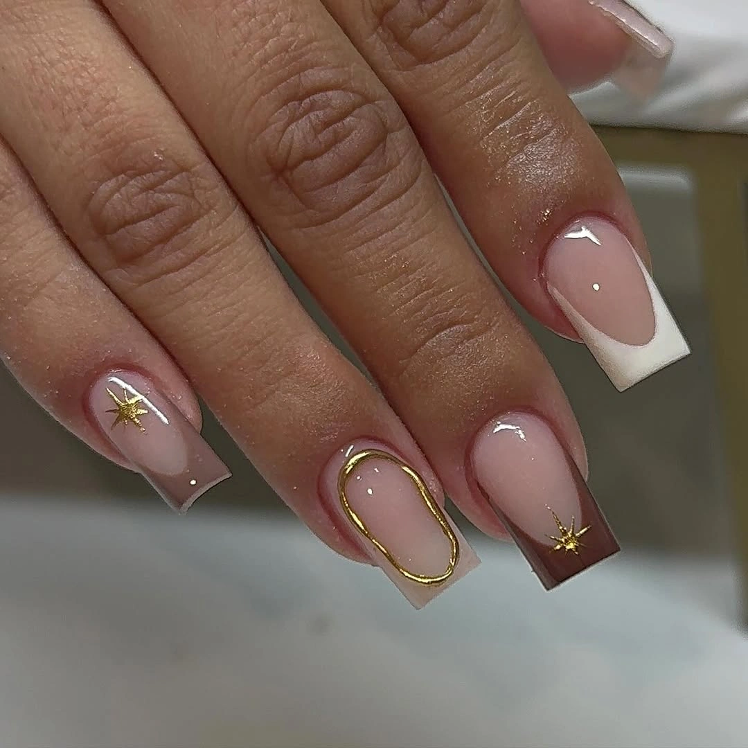
If your office favors restraint, keep the gold loop on one accent nail and use plain white tips elsewhere. A shorter squoval will handle the French edge easily, while a slightly deeper blush base can make the white and gold more visible on the hand. The key is to keep the lines fine and separated so the tiny details read as jewelry-like marks rather than a crowded border.
Small metallic accents are subtle, but they depend on enough surface area and careful spacing. Too many stars can shift the mood from polished to decorative, while no gold at all removes the feature that makes the set special. This is a useful compromise for someone who wants a little shine at work without wearing a full chrome finish or a high-contrast pattern.
Dusty rose nails with tonal floral branches
Dusty rose covers the almond nails in a matte-looking finish, while darker berry or wine lines form loose branches, leaves, and tiny dots. The pattern stays close to the base color, so the manicure reads as texture and rhythm before it reads as a loud floral. That tonal choice is what makes the design feel office-friendly even though every nail carries some visible detail.
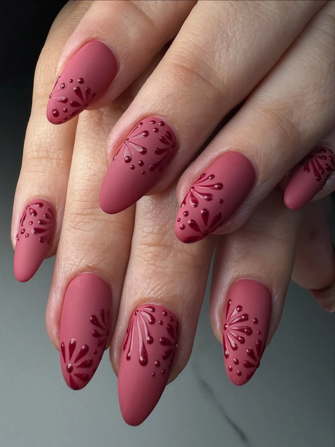
Place the branches on two nails and leave the others solid if you need the quietest version. A warmer rose will make the fall connection clearer, while a mauvier base will keep the design cooler and more understated. On a shorter almond, simplify the branch into one curved stem and a few dots so the pattern has room to breathe.
The matte surface can make the tonal marks disappear under flat lighting, which is a realistic limitation rather than a flaw. A glossy finish would sharpen the contrast but also change the calm mood. Choose this design when you like details that reveal themselves up close, and avoid adding bright jewelry or another strong print if you want the tonal relationship to stay visible.
Navy tips with abstract pale curves
Pale pink almond nails are edged with navy, then decorated with white and black curves that move like loose leaves or ribbons. The dark blue is concentrated at the free edge, leaving the center open and keeping the pattern from becoming a full-cover design. It feels more expressive than a plain French, but the limited palette gives the manicure a clear visual order.
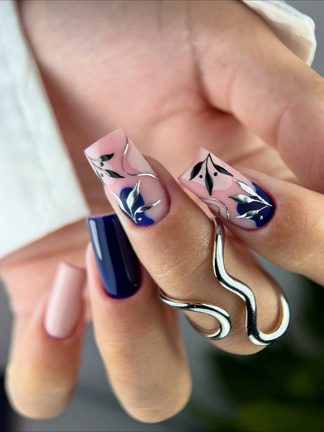
For a more conservative office adaptation, keep the navy French on every nail and move the abstract detail to one ring finger. A soft oval will make the curves feel gentler, while a crisp almond will emphasize the pointed direction of the tips. You can also switch black to a softer brown if the contrast needs to sit more quietly beside neutral clothing.
The decorative curves are the first thing to edit if the manicure feels too expressive for your work setting. Navy alone is easier to wear across meetings and errands, while the abstract lines add personality at close range. Keep some pale space between the marks and the tip, because the design works through contrast between open base, dark edge, and light linework.
Neutral squares with one leopard accent
Short square nails alternate black, nude, cream, and a small leopard-style accent. The pattern appears in a limited area rather than covering every finger, so the manicure feels edited even though one nail brings a more playful note. Its strength is the scale: the animal detail is enough to change the mood without becoming the first thing someone notices across a desk.
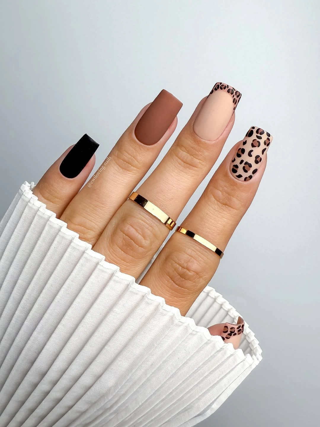
Keep the leopard on the ring finger and use the black solid on the thumb if you want the clearest version of the idea. A soft squoval will make the short shape feel less graphic, while a cream base can replace the nude if you want more contrast around the pattern. Resist adding another motif, because the small accent already supplies the visual surprise.
The black nail will remain the strongest focal point, which is helpful when you want a clear design but less helpful if you prefer everything to blend. The short length makes the set practical, yet the leopard mark still adds a casual note that may suit creative offices better than very formal settings. This is a manicure to adapt by changing scale before changing its color story.
Reflective copper on a clean almond
Reflective copper-orange fills the medium almond nails, with one warmer accent shifting the color slightly. There are no added motifs, so the finish becomes the design and the almond silhouette keeps the shine from feeling bulky. The warm metallic tone has enough depth for fall, while the simple shape keeps the manicure easy to understand in a professional setting.
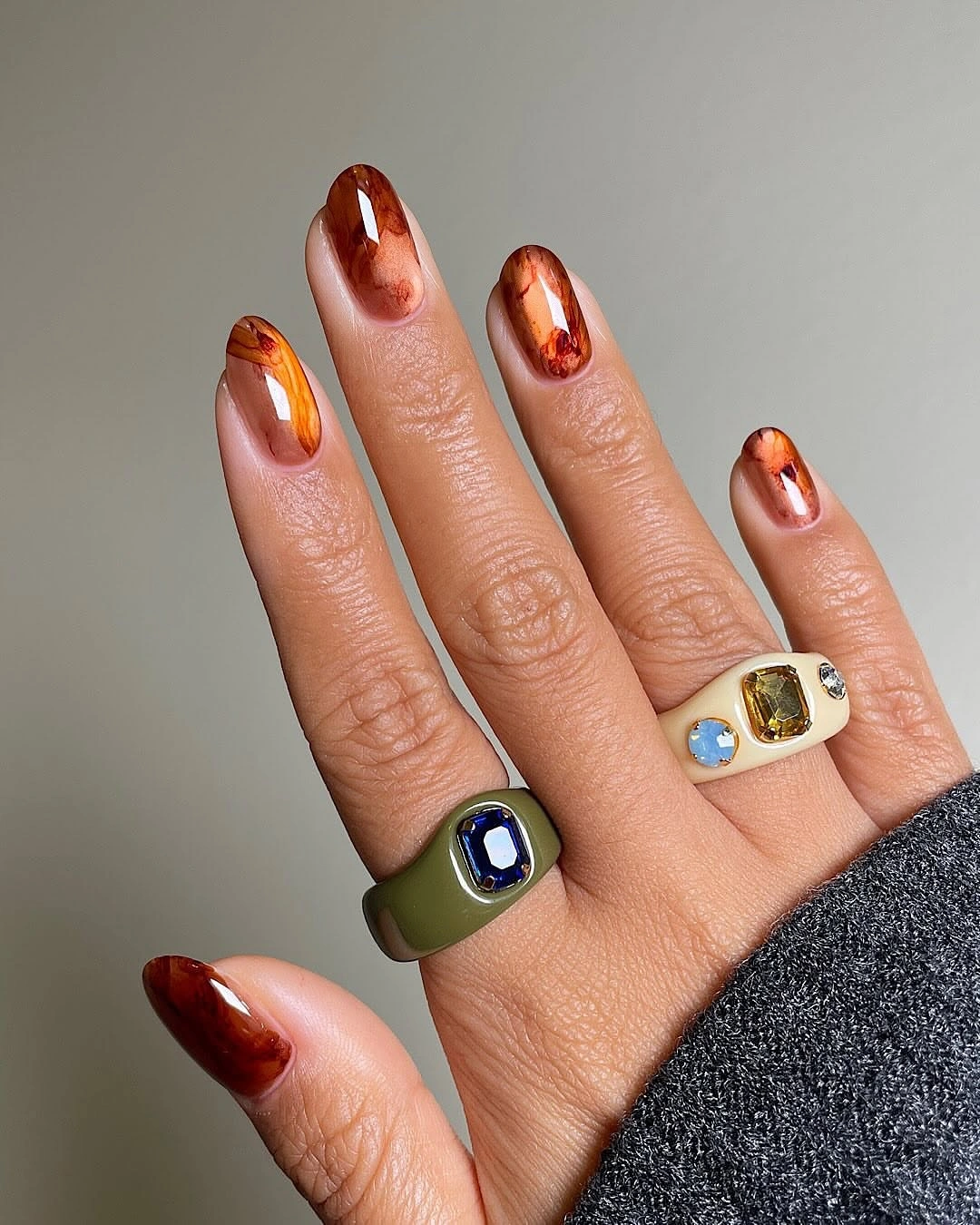
Use the copper on two accent nails and a muted warm brown on the others when full shine feels too strong for your day. A shorter almond will keep the reflective color practical, and a soft square will give it a more architectural office mood. If you want the same idea with less light, a satin copper can echo the palette without reflecting as sharply.
Metallic color reads differently under fluorescent office light, sunlight, and evening lamps, so it may feel more dramatic at some times than others. The lack of pattern is an advantage when pairing it with tailored clothes, but bold rings can compete with the finish. Choose one source of shine and let the copper carry the rest of the look.
Minimal pink nails with tiny metallic marks
Soft pink nails stay mostly plain here, with tiny gold-toned curves, dots, or floral marks appearing on selected fingers. The short oval or almond shape keeps the hand looking natural, and the pale base makes the little accents feel almost like jewelry rather than nail art. This is office design through proportion: the manicure is present, but it does not demand constant attention.
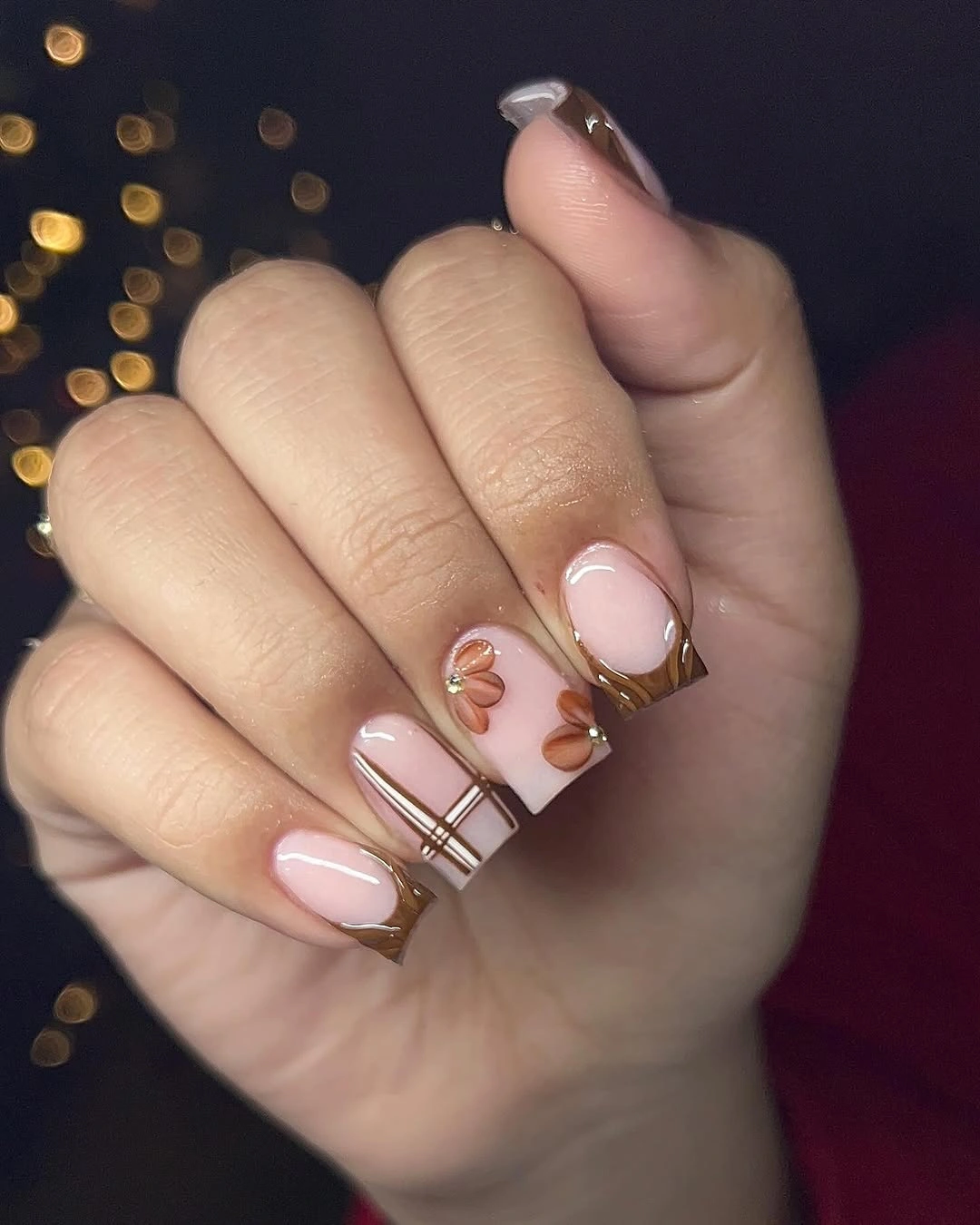
Repeat one small mark on the ring finger if you want a more intentional appointment brief, or keep the accents asymmetrical for a quieter result. A slightly warmer pink will make the manicure feel more autumnal without adding color contrast. The compact shape is already practical, so I would avoid lengthening it just to create room for more decoration.
Subtle details can disappear from a distance, and that is part of their appeal. If you want coworkers to notice the design immediately, choose a larger curve or a single contrasting accent instead of adding many tiny marks. This set suits someone who wants a polished hand for everyday work and enjoys the fact that the detail reveals itself only when the hand moves closer.
Turquoise with small botanical accents
Turquoise supplies the main color across the medium almond nails, while selected fingers add pale blue and white botanical shapes. The solid turquoise nails give the pattern accents a clear anchor, and the cool palette feels fresh without relying on sparkle or dense coverage. Even with the outdoor setting, the manicure reads as a deliberate color study rather than a seasonal costume.
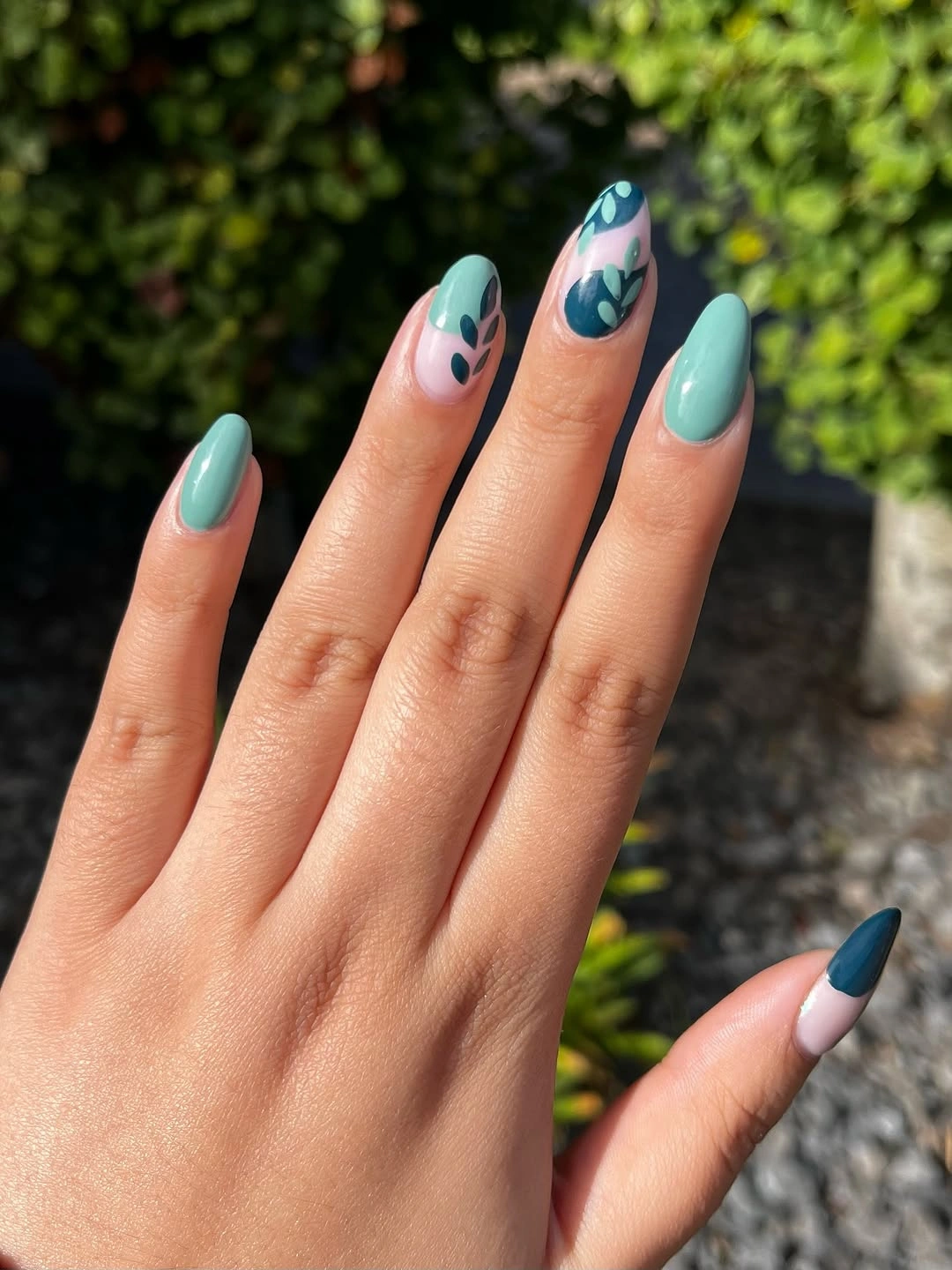
Use turquoise on three nails and place the botanical pattern on the ring fingers when the full set feels too noticeable for work. A softer teal can make the design easier to pair with beige, gray, and denim, while a deeper blue-green will feel more autumnal. Keep the shapes simple on a shorter almond so the pale leaves remain recognizable.
Bright blue-green is less neutral than olive, brown, or burgundy, so clothing has a larger role in whether the manicure feels office-ready. Its advantage is that it can wake up a restrained wardrobe without adding many motifs. If your outfits already carry saturated colors, reduce the pattern first and let the turquoise act as the single clear accent.
Short red French tips with a clean curve
Short oval nails use a sheer pink base and even deep red tips, making the manicure instantly familiar but still seasonal. The compact shape keeps the red from reading as a full statement color, and the narrow band gives the hand a tidy outline. It is a useful reminder that office nails do not need an unusual motif when the color placement is already well judged.
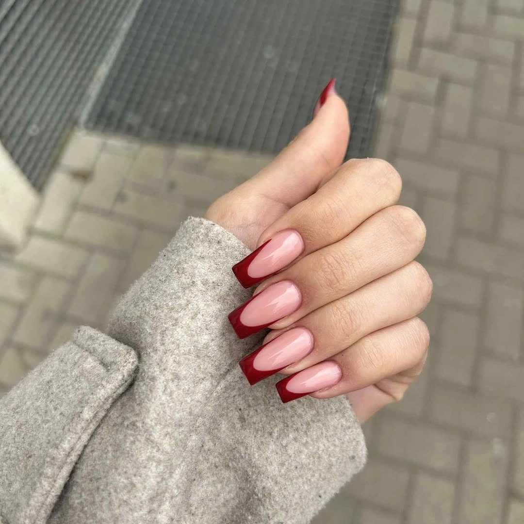
Choose wine red for a quieter fall version, or keep a brighter red when you want the smallest possible flash of color. A short squoval will make the edge more graphic, while an oval softens it. Ask for the curve to follow the nail rather than widening toward the sides, because the clean proportion is what keeps the design polished.
The simplicity makes this one of the easier sets to maintain, although the red edge will still show if the curve becomes uneven. It pairs well with office clothes because it adds color without adding visual clutter. If you later decide you want more detail, place one tiny accent on the ring finger instead of changing every tip into a new pattern.
Dark chocolate in a glossy solid finish
Every visible nail is painted a smooth dark chocolate brown, and the medium square shape gives the color a strong, graphic frame. Because there are no accents, the finish and shade are easy to evaluate: the brown feels deep, but it is softer than pure black and warmer beside cream, camel, or denim. This is a confident office choice built from one clear decision.
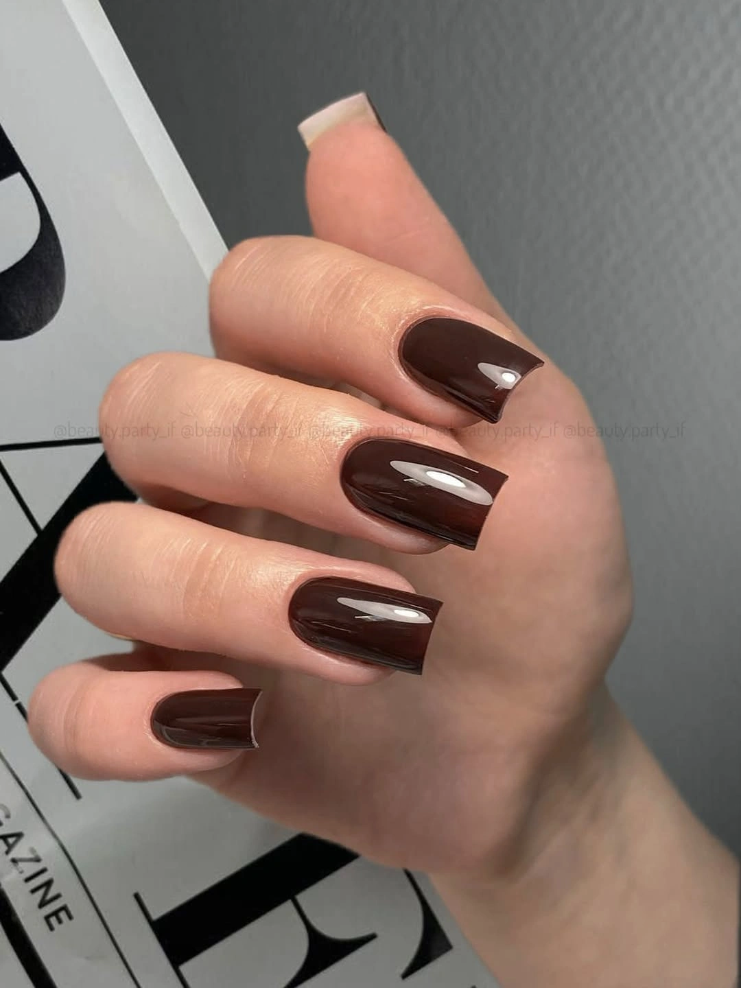
Use a shorter squoval if you want the dark color to feel less sharp, or add one nude accent nail when an all-brown set seems too uniform. A satin finish will lower the shine and make the shade more understated, while a glossy surface keeps it crisp. The best adaptation is usually a change in shape or finish, not another motif.
Solid dark color exposes edge wear, so the simplicity is both the benefit and the limitation. It is easy to pair with patterned clothing because nothing competes with the outfit, but it may look more formal than a pale neutral. Choose it when you want the manicure to feel grounded and decisive, then keep rings or bracelets from crowding the same visual space.
Navy blocks with pale abstract accents
Some medium almond nails are solid navy, while others use blush pink as a base for pale blue and white abstract curves. Repeating navy gives the mixed design an anchor, so the lighter accents feel like planned interruptions rather than separate ideas. The almond length keeps the look elegant, but the color contrast gives it enough personality to move beyond a basic French.
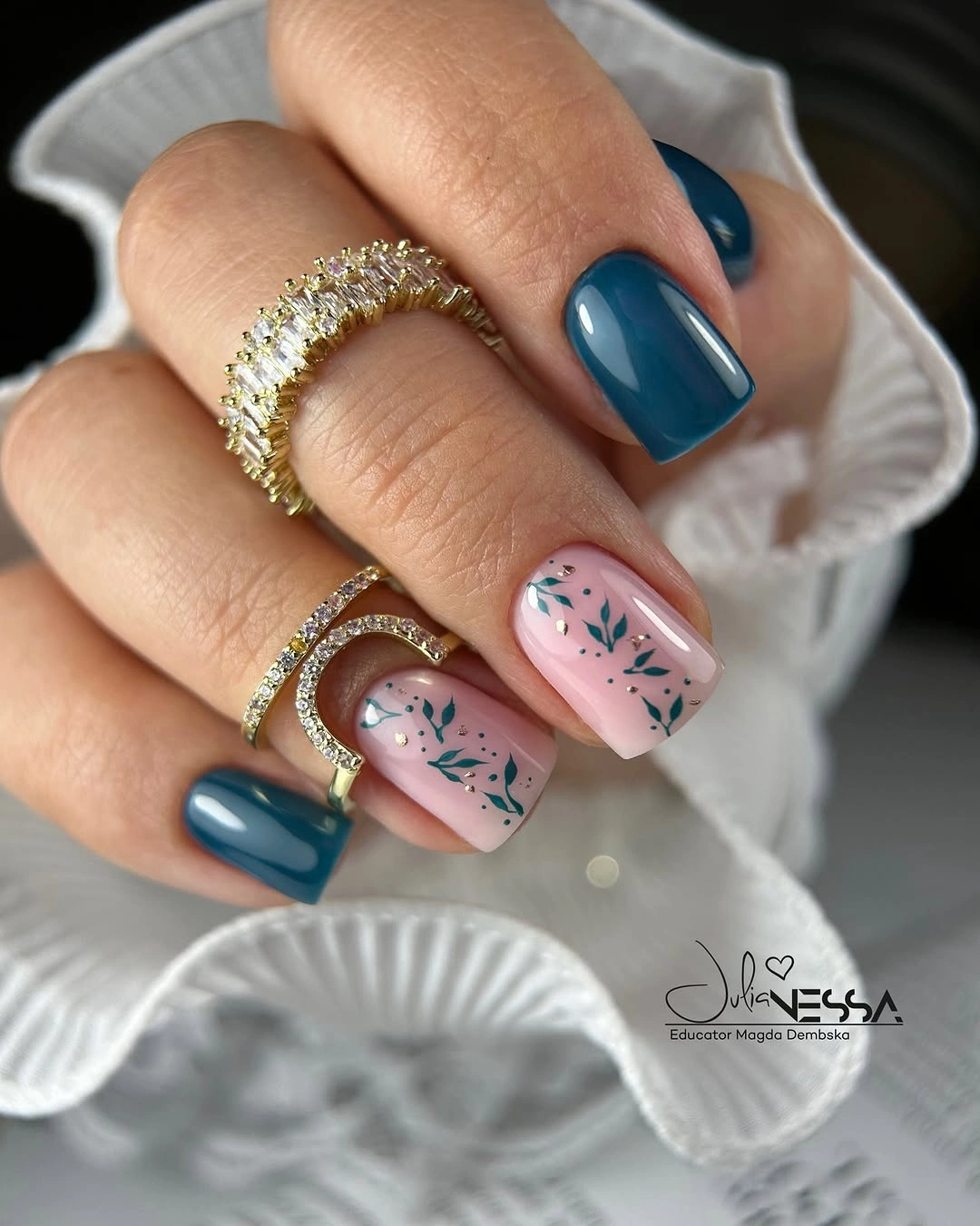
For a stricter workplace, keep navy on three nails and use one pale accent with only a few blue lines. A shorter almond will make the navy feel more compact, and a dusty blue can soften the contrast if pure navy feels too stark. Let the abstract pattern stay irregular rather than forcing every nail into the same shape; variation is part of its appeal.
The manicure is more expressive than a single shade, but it remains composed because the colors repeat. If the pale accents become too numerous, the base loses its quiet center and the set begins to feel busy. Edit by removing motifs, not by adding a third color, because the navy, blush, and pale blue already provide enough range for the office setting.
Peach and coral accents on a short almond
Short almond nails begin with a pale peach or pink base, then add coral curves that resemble small petals, swirls, or abstract blossoms. The warm colors sit close together, so the manicure feels cheerful without looking neon, and the compact length keeps the decoration contained. It offers a softer alternative to dark office shades when fall clothing already brings enough brown or black.
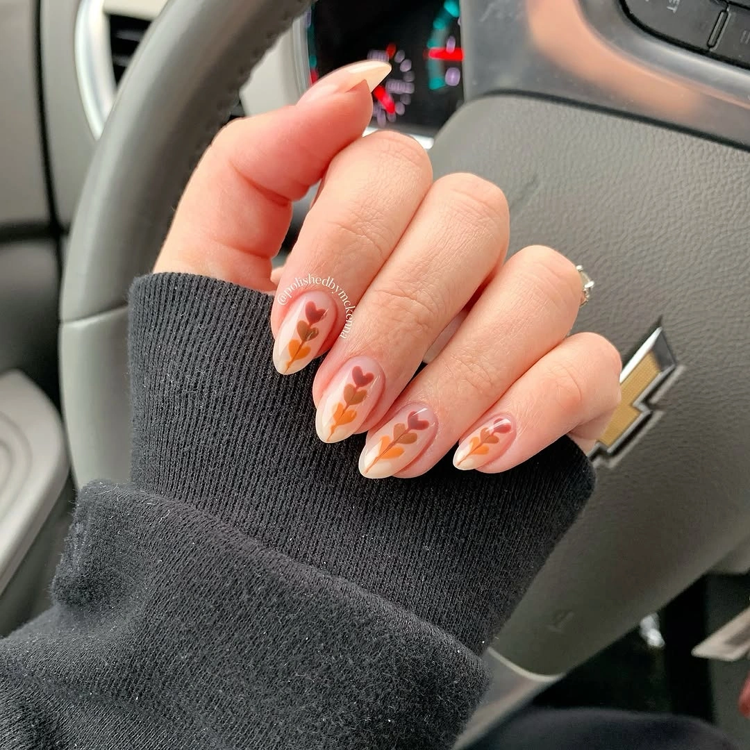
Repeat coral on two nails and leave the remaining base mostly sheer when you want the design to feel more formal. You can also deepen the peach slightly for a warmer seasonal effect, but keeping the accents small matters more than choosing a darker shade. A short oval will make the curves feel gentler if the almond point does not suit your hands.
The warm floral impression reads more casual than a plain brown French, which may be perfect for a creative workplace and less useful for a strict dress code. The pale space keeps it from becoming dense, so do not cover the whole nail just to make the color easier to notice. Let the coral appear as punctuation around an otherwise quiet hand.
Copper rose shine with a tiny bead accent
Long almond nails are covered in a uniform copper-rose metallic, while one finger adds a tiny warm bead or dot detail. The repeated shade gives the manicure a streamlined appearance, and the small accent is enough to break the mirror-like consistency without introducing a second palette. The result feels polished and intentional, but the simple surface keeps it suitable for work.
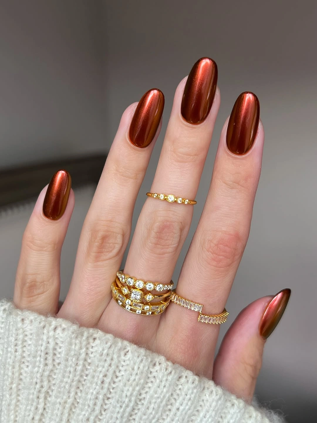
Shorten the almond if you want the shine to feel more daytime-friendly, and keep the accent finger plain when jewelry already supplies enough detail. A satin copper will soften the reflection, while a deep rose-brown can make the color more clearly seasonal. There is no need to add linework; the uniform finish is the strongest part of the idea.
Reflective color can become the focal point quickly, especially under bright office lights or beside gold rings. That makes it less neutral than a cream or matte brown, even though the design has no pattern. Choose it when you want a clean statement, then let your clothes and accessories stay quiet enough for the copper surface to look deliberate rather than competitive.
Tonal berry color with a soft gradient
Long almond nails move through deep red, plum, and berry tones with a softly blended transition. Instead of a hard pattern, the manicure relies on neighboring colors that fade into one another, so the result feels rich without looking busy. The elongated silhouette gives each tone room to shift, and the glossy finish makes the depth visible when the hand moves.
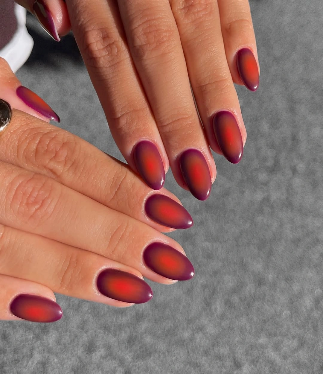
Use two related shades on a medium almond if the full gradient feels too dramatic for the office. Deep red and plum create a focused pair, while a softer berry can sit between them as a bridge. You can also place the darkest color near the tip to make the manicure more graphic, but keep the blend smooth so it does not resemble separate blocks.
A gradient is less predictable than solid nails because the transition depends on light and placement. That softness is attractive, yet it may not satisfy someone who wants a crisp, easily described design. The rich palette works well with cream, gray, and denim, while equally intense clothing may compete with the color shift and make the whole look feel heavier.
Sage and blush with restrained graphic marks
Sage green and blush pink alternate across a rounded medium shape, with black dots, outlines, and tiny white marks adding structure. The colors are gentle, but the small graphics stop the manicure from becoming sugary or flat. Because the marks repeat only in selected places, the hand keeps a relaxed rhythm that can work in an office while still showing personal taste.
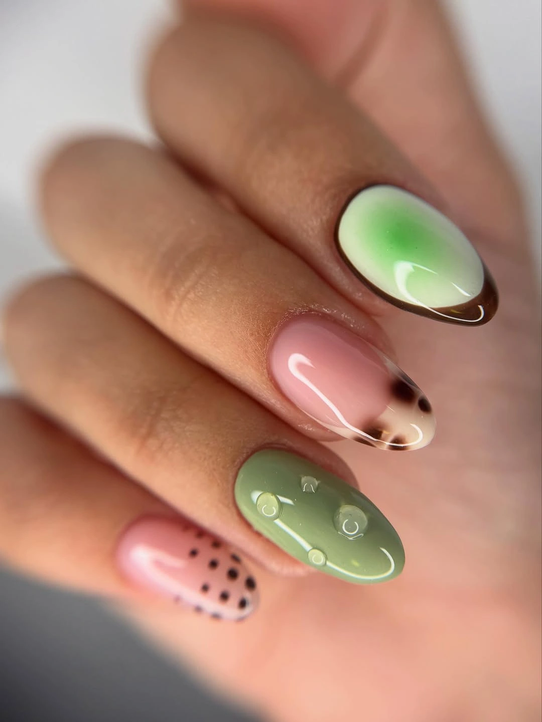
Use sage on three nails and reserve the dotted blush accent for one finger when you want the cleanest version. A slightly deeper sage can tie the set to fall clothes, while keeping the blush pale preserves the contrast. If the rounded shape feels too soft, a short squoval will make the same palette look more organized and graphic.
The mix is approachable, but several small marks can make it busier than expected when repeated across every nail. That is why limiting the accents improves the office balance without removing the personality. The glossy surface also helps the pale colors read clearly, although it will make the dark dots more noticeable as the manicure grows out.
Clean navy French on a practical oval
A pale pink base and crisp navy edge are enough to define this medium oval manicure. The shape is compact, the color contrast is clear, and there are no extra motifs to compete with the line. It is one of the easiest designs here to imagine at a real appointment because the idea depends on proportion and a repeated edge rather than complicated decoration.
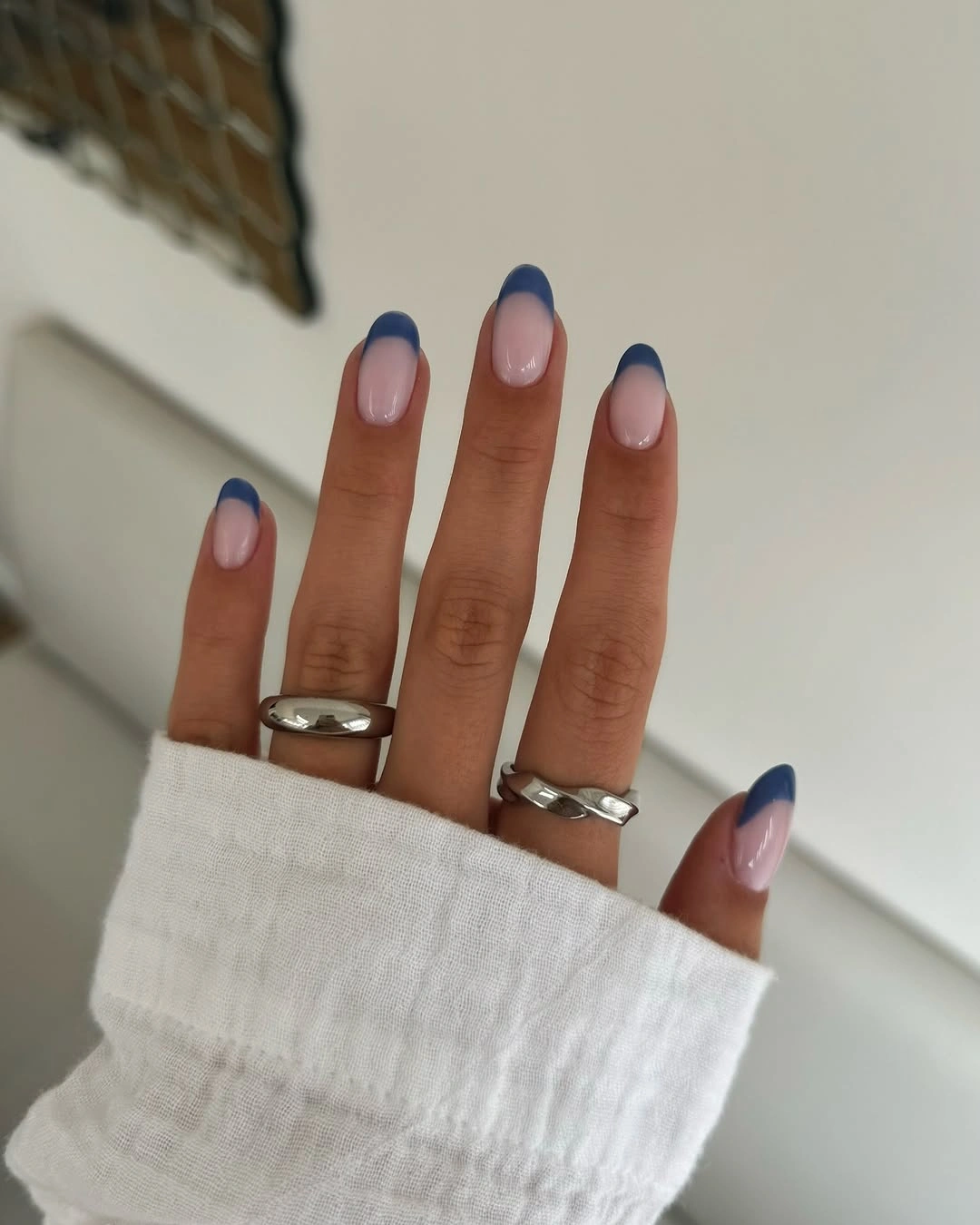
Ask for a narrow navy line when you want the set to disappear into a work wardrobe, or widen the tip slightly for a stronger graphic finish. A soft brown can replace the navy if your clothes lean warm. The oval shape will keep the edge gentle, while a short square will make it look more deliberate and architectural.
The clean line is practical but not invisible: any difference in curve will be easy to compare across the hand. That is the main maintenance thought, and it is also why the design feels so polished when the edges match. If you want an accent, add one tiny dot or a contrasting ring rather than introducing a second full motif.
Berry chrome on a long almond shape
Reflective plum, magenta, and deep berry tones move across the long almond nails, with the color family doing all of the decorative work. The surface catches light in a way that makes the same shade look deeper or brighter as the hand turns, while the pointed silhouette keeps the finish looking sleek. It is a statement manicure built from color rather than pattern.
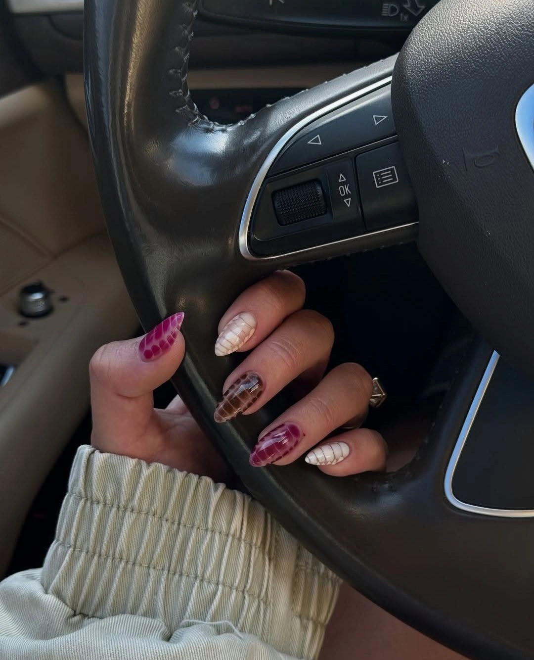
Choose one berry shade on a shorter almond when you want the shine to fit more easily into an office routine. A muted plum will feel calmer than bright magenta, and a satin finish will reduce the mirror effect without removing the depth. Keep any added accents minimal, because a metallic surface already creates movement when the hands are working.
This finish is less neutral than cream, brown, or pale pink, so it will announce itself in a formal setting. That can be useful for an office-to-evening transition, while someone seeking a quiet everyday manicure may prefer the same colors without the reflective surface. Watch the balance with jewelry and avoid stacking several high-shine pieces beside the nails.
Brown French tips with small coral details
A pale nude base meets chocolate-brown tips, while selected nails add small coral or warm floral marks. The square shape keeps the edge crisp, and the tiny warm accents soften the dark brown without breaking the office palette. It is a useful middle ground: more distinctive than a plain brown French, but less busy than a full patterned set.
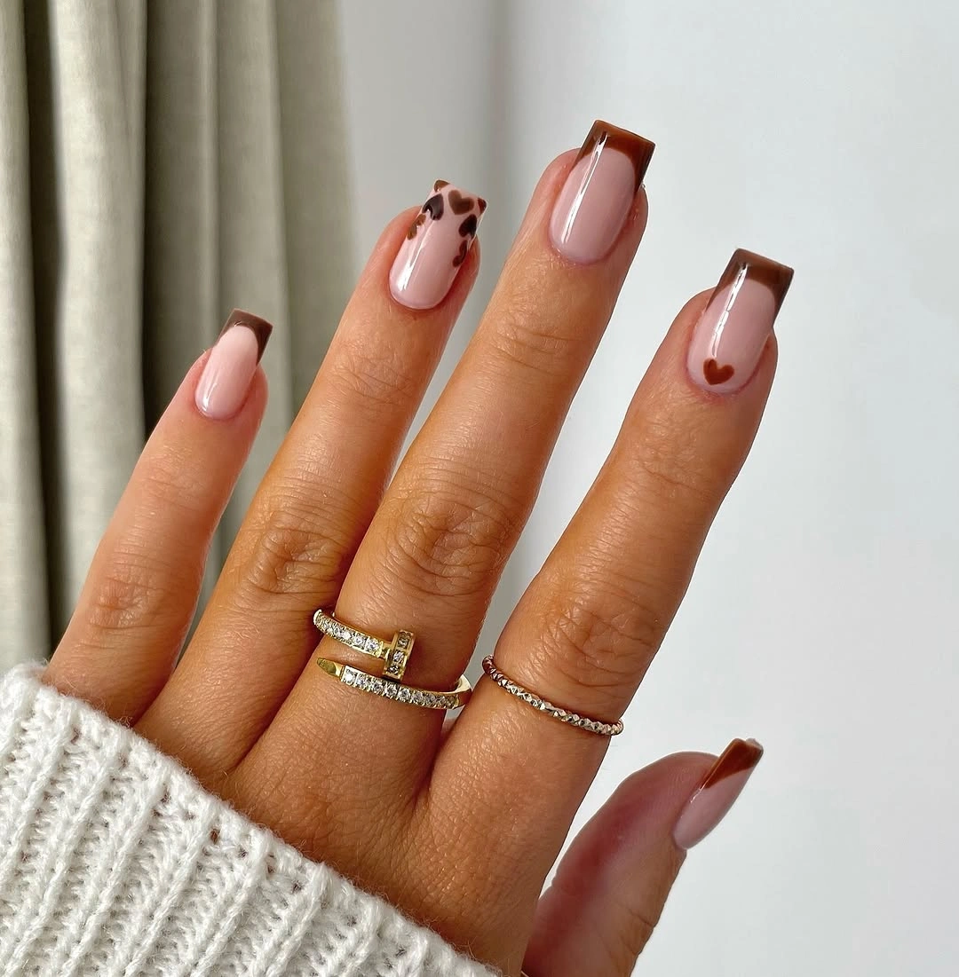
Keep the brown edge on every nail and place one coral mark on the ring finger if you need to edit the design. A deeper nude base can make the contrast gentler, while a cream base will make the brown look sharper. The accent should stay small enough that the French tip remains the first decision people read.
Removing the floral detail makes the manicure noticeably more formal without changing its structure, so it is an easy design to adjust for different work settings. The brown tip is still more visible than a nude edge, and the square corners need to stay even. Choose this if you like a little warmth and pattern but want a clear fallback to simplicity.
Pastel tips with one tortoiseshell accent
Pale mint and pink French edges create a light, clean base, then one warm tortoiseshell-style nail adds a deeper accent. The repeated pale foundation keeps the mixed palette connected, while the brown pattern gives the manicure a point of contrast that prevents it from feeling too sweet. The medium almond shape helps the pastel tips stay elegant rather than childish.
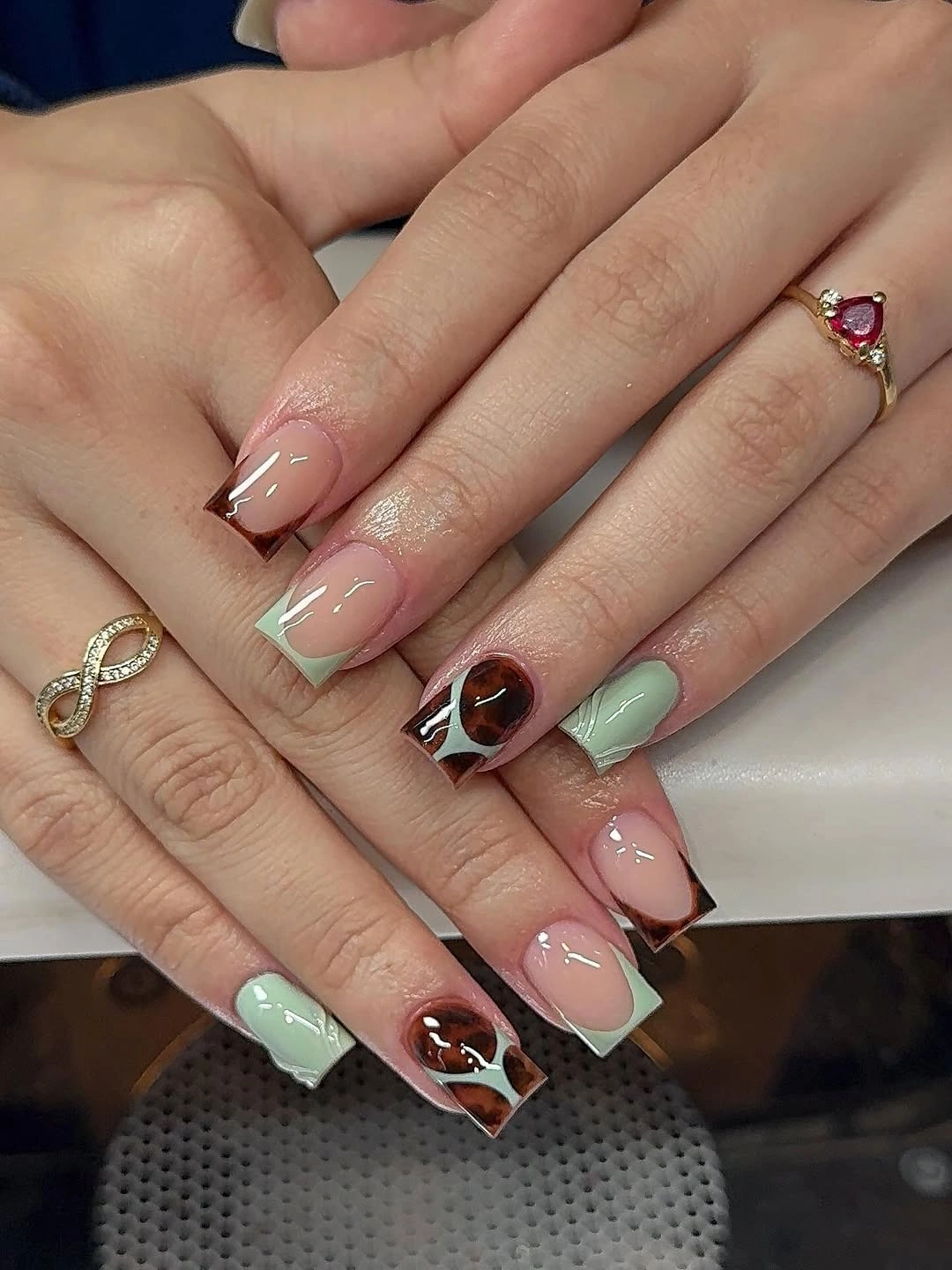
Use only mint and pink tips for the quietest office version, then add the patterned accent when you want more personality. A shorter almond will make the pastels practical, while a soft oval will soften the contrast between the pale colors and brown. Keep the tortoiseshell confined to one nail so it reads as a considered note instead of a competing palette.
The accent pattern changes the mood from minimal to playful, so it is the first element to remove if the set feels too busy beside a printed outfit. Pastel edges can also look faint under some lighting, which makes a clean shape important. This design works best when the hand has one warm focal point and plenty of pale space around it.