A single detail can decide whether a manicure feels considered or crowded. Fall nail art ideas become stronger when one mark has enough space and enough relationship to the hand to feel intentional, while the same mark becomes noise when it has nowhere to settle. That is the quiet tension behind polished nail art: the design has to give the eye something to notice without demanding attention from every surface at once. Restraint is not emptiness; it is proof that each visible choice has a reason.
A practical test is to ask whether the smallest detail earns its place. Look at the manicure from a normal distance, then move closer and check whether the mark still supports the overall balance instead of taking it hostage. Keep the feature that remains clear in both views and remove the one that only works as a close-up surprise. This simple test helps a design stay readable, wearable, and personal without turning the decision into a search for more decoration.
Black and Copper Brushwork on Soft Squares
Irregular black, cream, and copper-orange strokes cover short-to-medium square nails, but the important detail is the space left between the strokes. The marks do not repeat as identical flames or stripes; they shift in width and direction, making the surface look hand-painted. A glossy finish ties the variations together, while the pale gaps stop the warm palette from becoming a solid dark block.
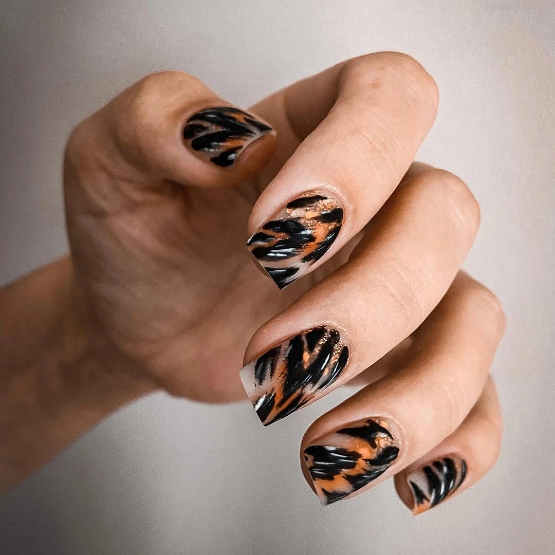
Keep the brushwork uneven if you adapt it, because perfect symmetry would remove the visual energy that comes from the changing edges. Two accent nails in copper and black can carry the idea while the remaining fingers stay nude or cream. A shorter square would make the color areas appear larger, so reduce the number of strokes rather than forcing every little line into the smaller space.
This design works for someone who wants an autumn reference without drawing leaves, pumpkins, or other literal symbols. Its practical strength is the moderate length, but the glossy surface will show chips along the square corners, especially if the copper sections are concentrated near the tips. Keep the surrounding outfit quiet and let the irregular brush rhythm remain the most noticeable decision.
Gold Foil and Autumn Collage Panels
Sheer nude-pink almond nails carry several small decisions at once: gold foil fragments, thin metallic lines, warm rust and tan blocks, and one accent with tiny lettering-like marks. The base stays visible between the elements, so the detail feels placed rather than pasted across the whole surface. The strongest panel is not necessarily the busiest one; it is the one where the warm blocks, gold, and pale space meet cleanly.
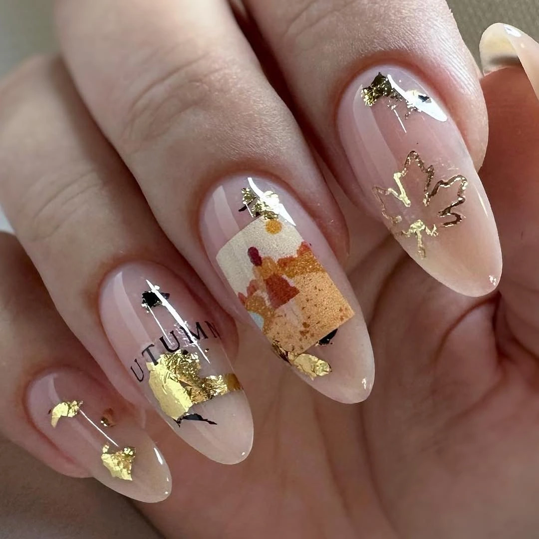
To preserve the balance, choose one collage nail and let the other accents use only foil or a single line. The almond shape gives the panel a narrow vertical frame, which makes the fragments feel like small editorial cutouts. If the lettering becomes too literal, replace it with an open black mark and keep the same scale, since the visual effect comes from a tiny concentrated interruption rather than readable text.
Sheer pink is doing quiet structural work here: it softens the rust and gold and provides a natural pause between detailed fingers. That makes the set easier to style with cream, denim, or warm brown, although the foil and small pieces may need more attention than a solid finish. A shorter almond will still support the collage, but the number of elements should drop with the available surface.
Monochrome Curves on Long Square Tips
Long square nails alternate glossy white, black, and pale bases with narrow black curved lines. The most consequential detail is the open space around each curve: the lines are allowed to bend and stop instead of filling the nail with a complete pattern. That restraint gives the monochrome set a measured rhythm, and the straight tips keep the graphic blocks from drifting into a soft or romantic mood.
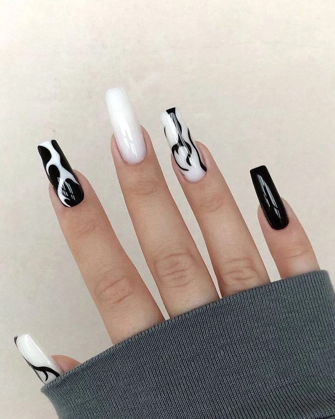
If you shorten the shape, preserve the widest white area and keep the line work on only two accent nails. The black solids will appear heavier on a small canvas, so a pale base can act as relief between them. One flowing curve is enough to link the accents; adding several parallel lines would change the design from precise to busy and erase the quiet contrast that makes it readable.
This is a good fit for a wardrobe built around black, white, gray, or denim because the manicure already has a clear graphic language. Long square tips give it an editorial silhouette but can be less forgiving in daily use, while white polish makes small edge wear visible. A medium soft square keeps the same monochrome structure and lets the details feel less severe.
Glossy Red with One Leaf Accent
Most nails are a saturated glossy red, while one pale accent carries small orange and yellow botanical shapes. The detail that changes the balance is the ratio: the red remains the dominant field, and the autumn art appears as a concentrated interruption. Because the accent base is light, the tiny warm marks stay legible instead of disappearing into the strong red around them.
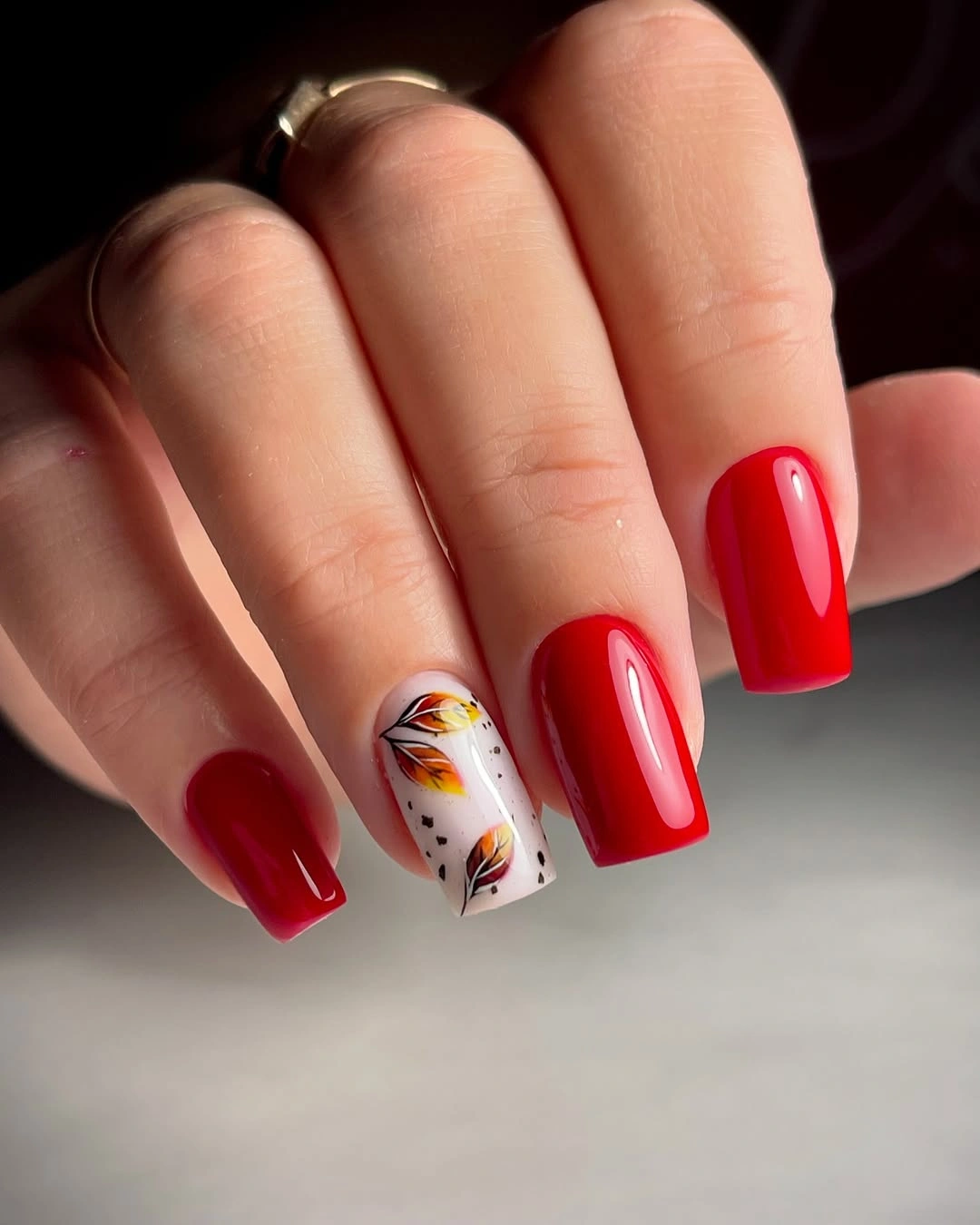
Use the solid red as the anchor and keep the leaf or floral marks small enough to read as a cluster rather than a full illustration. A second accent can work if it repeats the same colors, but a different motif would make the set feel less deliberate. The medium square shape is practical for the design, though the straight red tips will make chips easy to notice as they develop.
This formula is useful when the reader wants seasonal nail art but does not want every nail to carry a drawing. A deeper cranberry red will move the look toward a darker fall mood, while bright red keeps it crisp and high contrast. Simple jewelry and a neutral background will support the accent; adding more shine or pattern elsewhere would compete with the single pale panel.
Delicate Botanical Sprigs on Short Nails
Short rounded-square nails use a pale blush base with small black botanical sprigs placed on only a few fingers. The marks are thin and widely spaced, so the design reads as a quiet gesture rather than a repeating border. The short shape is part of the appeal: the small motifs sit close to the hand, and the glossy surface keeps the pale base looking neat beside the soft knit and pearl styling.
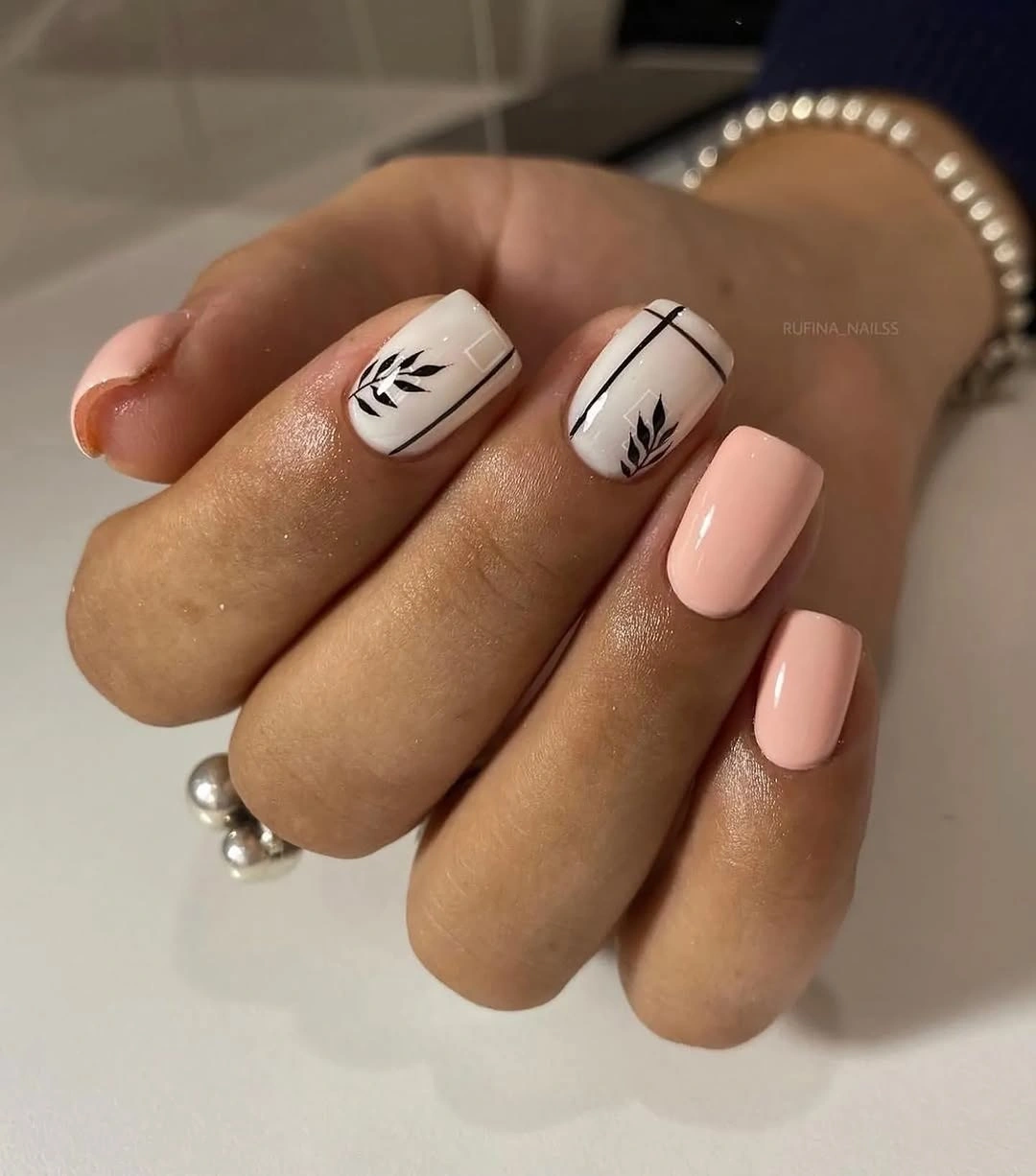
Keep one sprig on each hand if you want the cleanest version, or move the accents to the ring fingers for an even clearer focal point. Transparent pink can replace the blush base, but the black marks should remain simple because extra detail will quickly overwhelm a short nail. A softly rounded square is more forgiving than a sharp corner and supports the small scale of the motif.
The design works with pearls, neutral knits, denim, and everyday clothing because the contrast is restrained. Its limitation is not wearability but resolution: a very fine line may lose definition as the nail grows or if the finish becomes cloudy. Keep the background color calm, and let the small black sprig be the only strong mark so the manicure retains its gentle fall character.
Dots and Hearts in a Pale Grid
Short square nails carry a pale glossy base with black dots and small black hearts. The important feature is the regular spacing around the hearts, which gives the tiny marks a graphic rhythm instead of making them look scattered. The compact shape supports that order, and the dark background behind the hand makes the light base appear cleaner and the symbols easier to read.
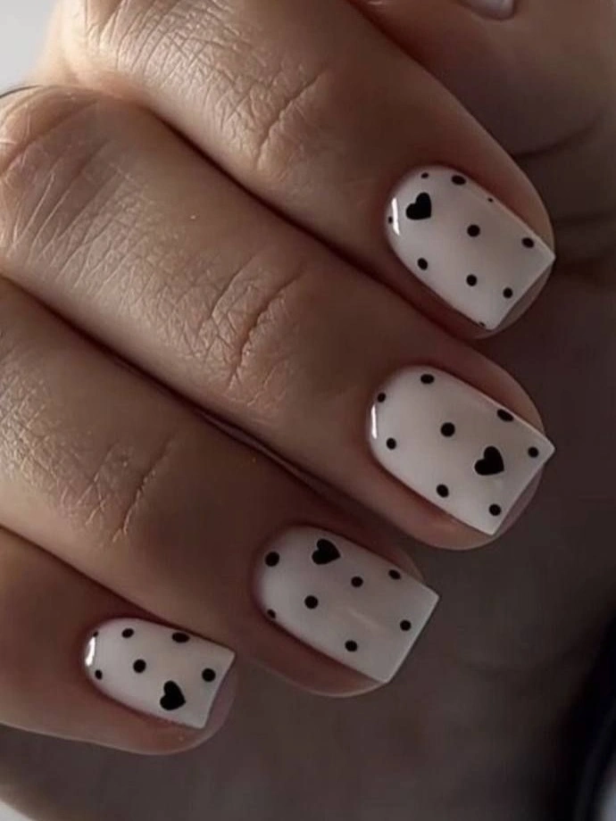
Use the dots as the supporting pattern and let the hearts act as occasional focal points. If the design is adapted to even shorter nails, remove a few dots rather than shrinking every mark until the spacing disappears. A deep brown can soften the contrast, while black keeps the shapes crisp; the key is to keep the base visible around each mark. For another compact pattern comparison, see these polka dot nail ideas and focus on how spacing changes the mood.
This is playful without needing a long canvas, which makes it practical for readers who want a small seasonal detail. The tradeoff is that uneven placement will show because the pattern relies on rhythm rather than complex drawing. A glossy top keeps the marks clear, but adding glitter or another accent color would weaken the simple black-and-pale relationship that makes the tiny hearts work.
Turquoise Botanicals with a Cool Shift
Bright turquoise solids alternate with white nails carrying black and turquoise botanical lines. The smallest consequential detail is the repeated accent color: the same turquoise that fills several nails returns inside the leaf drawings, so the cool palette feels connected instead of random. The short-to-medium square shape contains the brightness and gives the white accents a firm frame.
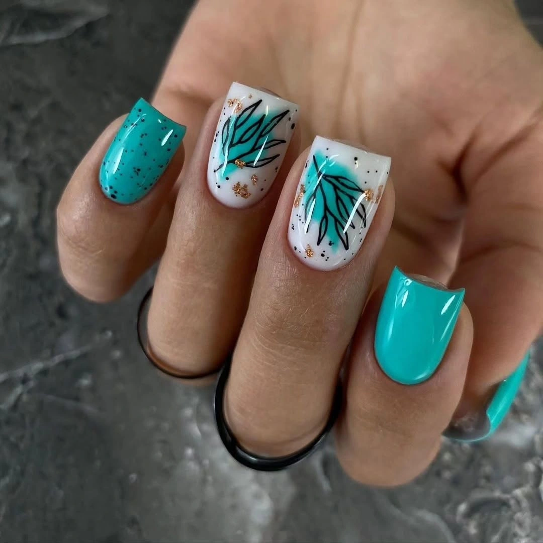
This design can move toward autumn by changing one variable at a time. Rust, olive, or muted teal can replace turquoise while the white base and black lines remain, allowing the structure to survive the palette shift. If you keep the vivid color, use it on two or three nails and leave the others white; that ratio gives the bright tone room to stand out without taking over the hand.
The manicure is a useful reminder that seasonal nail art does not have to rely on brown or orange. Its practical strength is the moderate length, although vivid turquoise creates a strong color commitment that may coordinate less easily than a muted shade. A broader nail color reference can help compare that saturated choice with a softer family before you commit. Keep the botanical drawings simple and the background neutral, because extra accessories could pull attention away from the deliberate cool contrast.
Cloudy Blue Panels with Silver Arcs
Medium square nails combine a translucent pink base with milky blue-white sections and thin silver-gray curves. The curves are not borders around a finished illustration; they float through the pale panels and leave space around themselves. That placement makes the manicure feel airy and abstract, while the squared tips add enough structure to keep the soft color from looking unfinished.
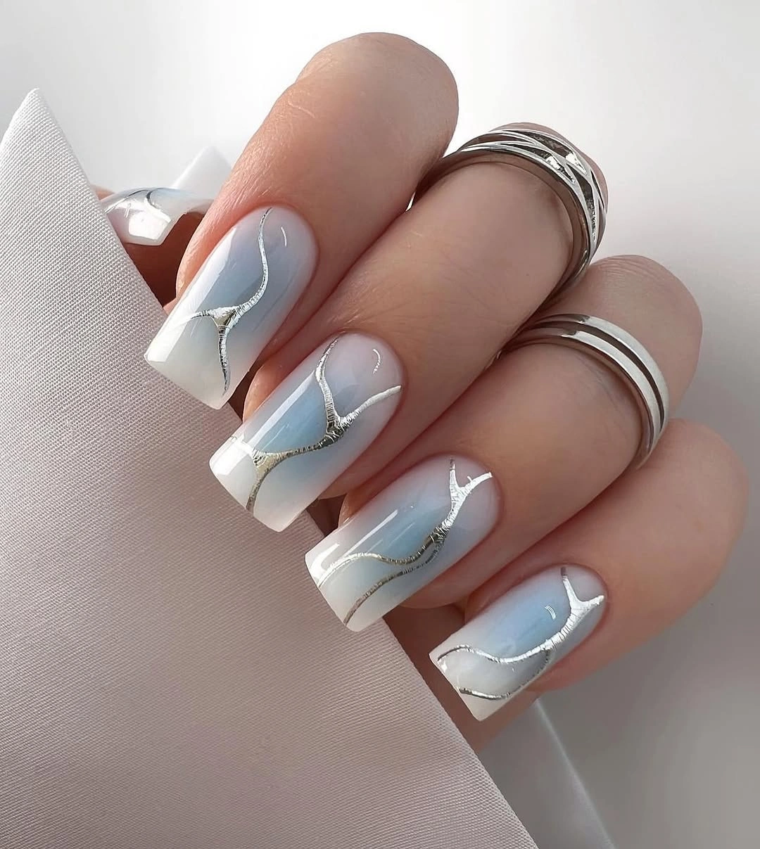
Preserve the open pale area if you shorten the shape, because the negative space is what prevents the blue panels from becoming heavy. Two cloudy accents can carry the design while the remaining nails stay translucent pink or white. Muted gold can replace silver for a warmer version, but the line should stay narrow so the gentle color relationship remains more important than the metallic detail.
This direction suits readers who want a cool, light manicure that still has visible structure. The medium square shape is practical enough for daily wear, although a sharp straight tip can feel harder than the soft palette suggests. A softened square will keep the same lines and panels while reducing that edge, and a simple wardrobe will let the gray curves remain visible instead of blending into competing patterns.
Black Botanical Print on Pale Pink
Long square nails use a pale pink or cream base for a dense black botanical print, with small yellow and tan shapes breaking through the dark marks. The critical detail is the relationship between print density and base color: the pattern is busy, but the pale ground keeps it from becoming one solid black field. The warm accents also guide the eye through the repeated leaves and branches.
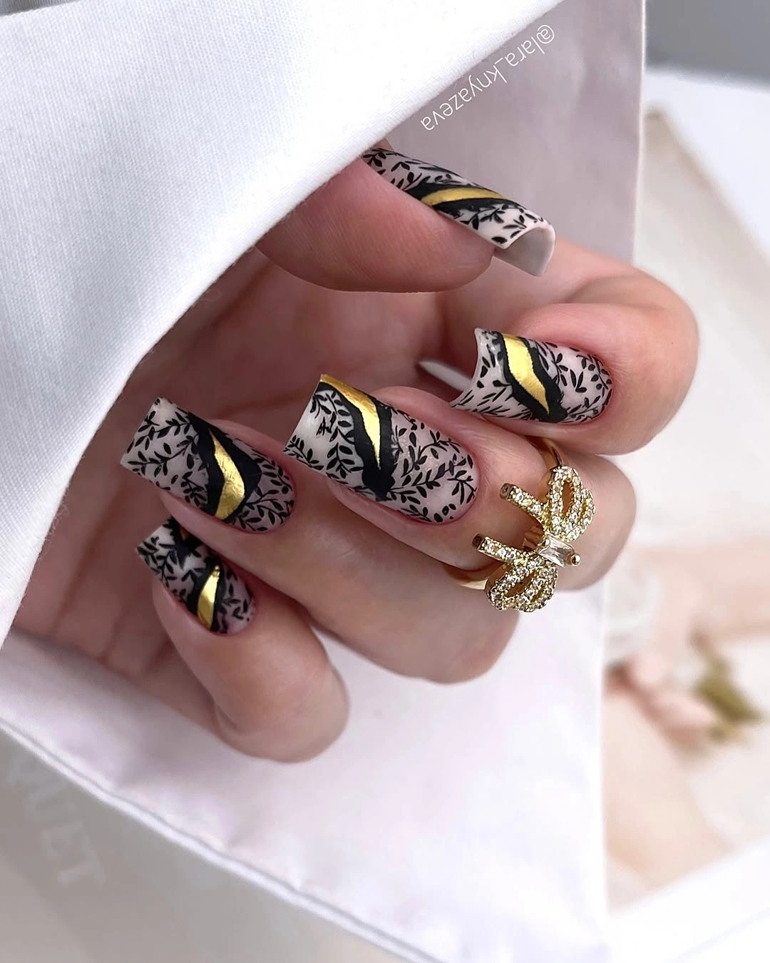
On a shorter shape, keep the black print on two or three accent nails and let the rest remain pale. That preserves the pattern’s identity while giving the hand wider visual pauses. Rust can replace yellow for a deeper autumn note, but keep the warm accent small; if it becomes a second dominant color, the black botanical structure will lose its role as the primary rhythm.
The long square canvas makes the full print readable and gives the look a clear editorial presence. It also makes the manicure more demanding: tip wear is visible, and dense line work needs clean edges to avoid looking blurred. Pair it with simple cream or black clothing, or soften the contrast with a medium square if the pattern needs to move from statement styling toward everyday use.
Flowing Stripes with Small Gold Fragments
Medium square nude nails carry black and gray flowing stripes, with tiny gold foil fragments placed beside the lines. The most useful detail is the irregular stripe width: the bands bend and change rather than repeating as a strict animal print. Nude space remains visible around them, and that breathing room keeps the graphic accents from overpowering the moderate shape.
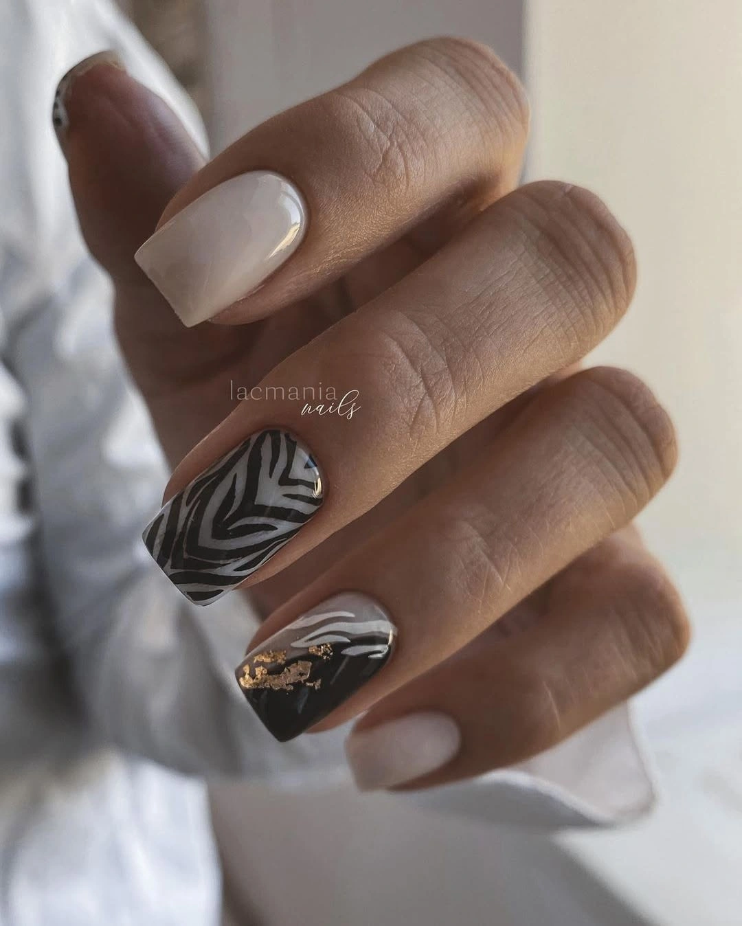
Keep the gold small and let the stripes remain the first thing the eye reads. One striped accent plus nude solids is enough for a quieter adaptation, while a cooler silver fragment can replace gold without changing the layout. If the square is shortened, reduce the number of bands rather than tightening them; open spacing is what allows the pattern to feel fluid instead of compressed.
This design works well with white, gray, black, or soft beige clothing because the palette is graphic but not loud. The medium length is manageable, although dark stripes at the tips can show wear more clearly than the nude base. A single accent nail can solve that issue while preserving the visual lesson: variation in line direction creates movement even when the palette stays limited.
Orange French Tips with Tiny Leaves
Short square nails place bold orange at the tips of a pale pink base, then add tiny yellow and green leaf-like marks on one or two accents. The French edge is the largest seasonal decision, while the leaves supply a smaller secondary cue. Because the base remains translucent and the tips are straight, the color feels fresh and clean rather than like full orange coverage.
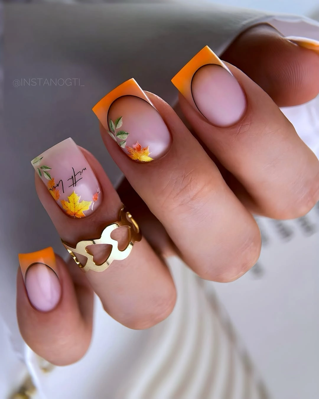
Keep the orange edge thin if you want the design to remain understated, or widen it slightly for a stronger color block on the same shape. One leaf accent per hand is enough because the tip already carries the seasonal message. Burnt sienna can replace bright orange for a deeper effect, but the pale base should stay open so the grow-out line remains less noticeable.
This is a practical choice for someone who wants seasonal color in a precise, limited placement. The short square silhouette is easy to live with, although the straight French edge will show small chips clearly. Neutral knits, denim, or gold jewelry will support the warmth, while a busy print could make the tiny leaves disappear into the styling rather than letting them act as the intended detail.
Dual Red and Black French Lines
Pale medium square nails use both black and red along the tips, with one mostly black accent providing a stronger anchor. The important feature is that the two colors remain as narrow lines rather than filling the whole nail. That leaves the translucent base visible and creates a clean graphic split, while the gray knit setting gives the red a cozy seasonal context.
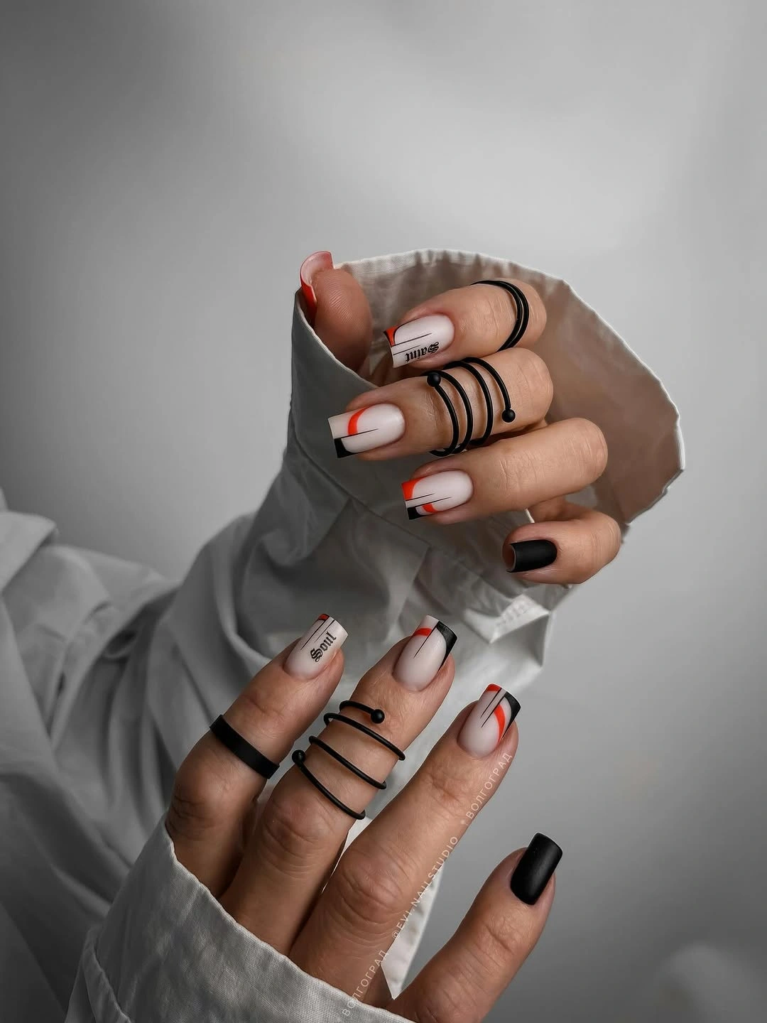
Preserve the order of the lines when adapting the set, because changing the thickness can make one color dominate. Burgundy can replace bright red for a quieter fall direction, and the black accent can remain on the ring finger so the hand still has a focal point. A shorter soft square will keep the dual edge readable, but the lines should be simplified rather than stacked too tightly.
This design suits readers who prefer clear geometry over hand-painted motifs. It is easier to coordinate than a full print, but the narrow tips need clean spacing and may show growth or corner wear sooner than a solid nude. Keep the rest of the styling simple and let the pale base create the relief; adding metallic foil would introduce another line that the composition does not need.
Neon Leopard in Pink and Lime
Long almond nails alternate neon pink, lime yellow, and black leopard marks, then add one bold leaf-like accent in the same high-energy palette. The decisive detail is saturation: the pattern is familiar, but the fluorescent colors make it playful and deliberately unexpected. The long almond shape gives each color block room to breathe, preventing the bright marks from collapsing into a small, unreadable cluster.
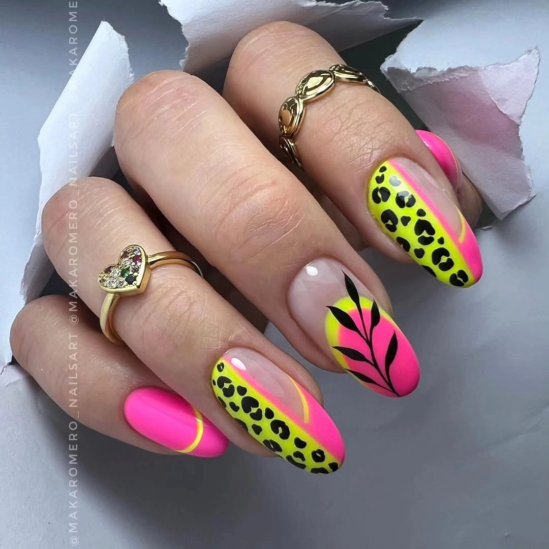
If you want a quieter version, change the color temperature before changing the motif. Olive, rust, and muted pink can replace the neon tones while the leopard spots remain, or lime can be limited to one accent nail and the rest kept pink. Shortening the almond will make the bright blocks appear broader, so use fewer spots and keep the strongest leaf detail on one finger.
This is the most assertive direction for readers who want seasonal nail art to feel energetic rather than cozy. It asks for simple clothing and accessories because the manicure already contains multiple saturated points, and the long shape adds to the statement. The limitation is coordination, not technique: if the styling around it is equally bright, the individual spots and color relationships will be difficult to distinguish.
Burgundy Solids with Pale Leaf Accents
Long almond nails alternate glossy burgundy solids with pale accent nails carrying orange, yellow, and green botanical marks. The strongest detail is the change in density: the burgundy fingers are visually heavy and simple, while the light accents are detailed but airy. That contrast gives the hand a clear rhythm and keeps the warm colors from blending into one repeated block.
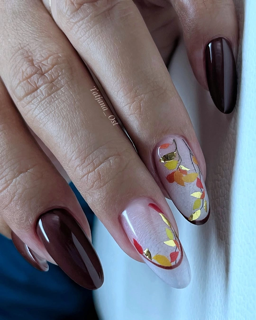
Keep at least two burgundy nails plain when adapting the set, because the solid color is what gives the small leaves their stage. A cream base will sharpen the orange and yellow, while a medium almond will soften the dramatic length. If you want less contrast, use a translucent rose base on the accents, but do not add extra motifs; the alternation already provides the structure.
This design is easier to style than a full print because the eye can move between dark solids and pale detail. It suits black, cream, denim, or muted blue, and the long almond gives the botanical marks a graceful vertical path. The practical tradeoff is the length: a shorter almond will be more comfortable, but it should retain the same two-part rhythm of deep color and light art.
Berry Glitter with Pressed-Looking Flowers
Medium oval nails use a deep berry-red shimmer on most fingers, while pale accents carry small orange floral arrangements. The glitter is the first detail the eye notices, but the flowers explain why the color feels seasonal rather than simply festive. Rounded tips soften the red, and the pale accents create a clean pause so the tiny botanical forms can be read individually.
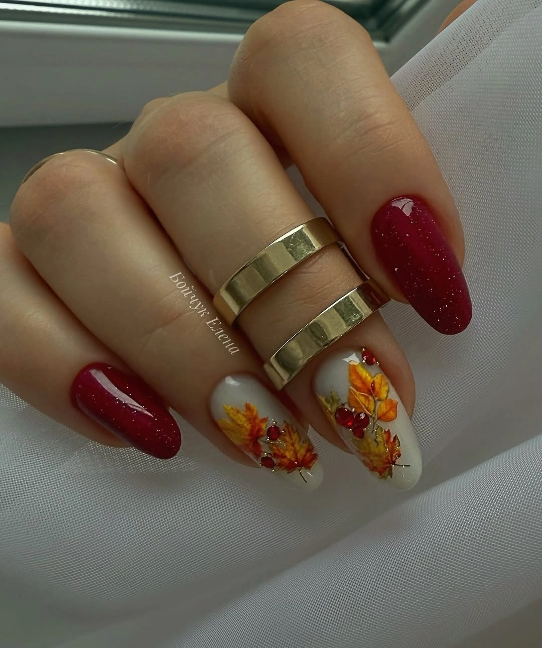
Let the berry shimmer occupy most of the hand and keep the flowers concentrated on one or two nails. That ratio prevents the accents from competing with the reflective red, while a matte berry finish could make the palette quieter if shimmer feels too dressy. A shorter oval will keep the rounded softness, but the flowers should remain simple enough that their warm color does not become a blur.
This is a good option for a reader who wants a clear autumn signal with a little sparkle. The medium oval is approachable, although textured or raised-looking floral pieces may need more care than flat paint. Pair it with cream, burgundy, or warm gold, and avoid adding another glitter accessory near the hand; the manicure already has one bright surface and one botanical focal point.
Red and White Waves on Pale Almonds
Long almond nails use a nude-pink base with red and white curved accents that travel along the tips like flowing waves. The defining detail is the direction of the lines: they follow the tapered edge and leave most of the base open, creating movement without covering the nail. The pale ground keeps the red graphic rather than heavy, while the white adds a clean break between the curves.
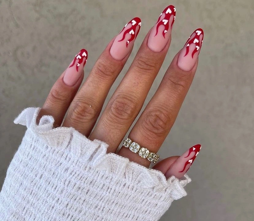
Keep the curves broad enough to read and let them change slightly from nail to nail. A single wavy accent with nude solids is a practical adaptation, and rust or cranberry can replace the bright red for a deeper fall palette. Medium almond tips will make the design easier to handle, but the line should still follow the edge; a random placement would remove the sense of flow.
This look suits someone who likes graphic art more than literal leaves or prints. The long silhouette gives the waves their strongest movement, yet the exposed tip can make red wear noticeable and may limit practical tasks. Simple white clothing or dark denim will support the contrast, while extra jewelry should stay quiet so the curved lines remain the small detail carrying the entire design.
Botanical Silhouettes on Short Nude Squares
Short square nails use a pale nude base with tiny black leaves and curved stems placed as separate silhouettes. The marks are simpler than full line drawings, and that distinction matters because the motifs remain readable at the compact length. Denim in the setting adds a casual note, while the glossy surface keeps the nude base from looking unfinished around the small dark shapes.
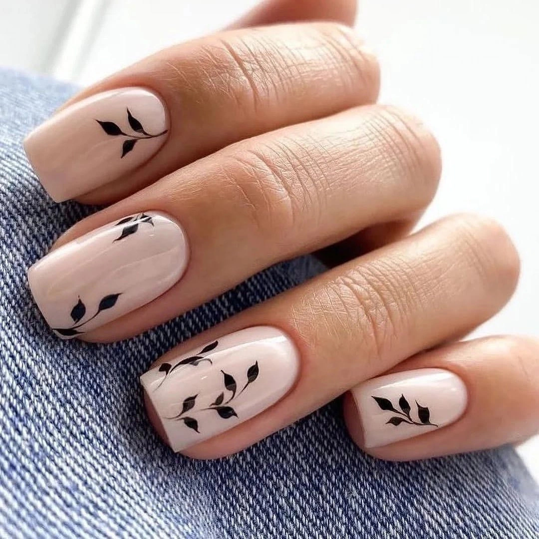
Use one silhouette per accent nail and allow the rest to stay plain. Deep brown can soften the contrast, but black gives the leaves their clean edge; changing both the color and the motif at once would make the design lose its quiet clarity. A short rounded square is enough canvas for the shapes, and the small scale means there is no need to add dots, foil, or another pattern.
This is an easy everyday direction for readers who want a seasonal reference that does not announce itself loudly. It works with denim, cream, gray, and knitwear, and the short shape minimizes practical limits. The only real caution is proportion: if the silhouettes become too large or numerous, the pale base will no longer act as relief and the manicure will feel more crowded than the original idea.
Jewel-Tone Solids with Black Leaves
Medium nails mix deep navy, bright berry, and pale bases, then place thin black botanical outlines on selected fingers. The small detail that organizes the set is the shared dark line weight: black appears both as a drawing and as visual depth inside the jewel-tone solids. That link keeps the colors from reading as unrelated choices, while the pale accents give the hand a necessary pause.
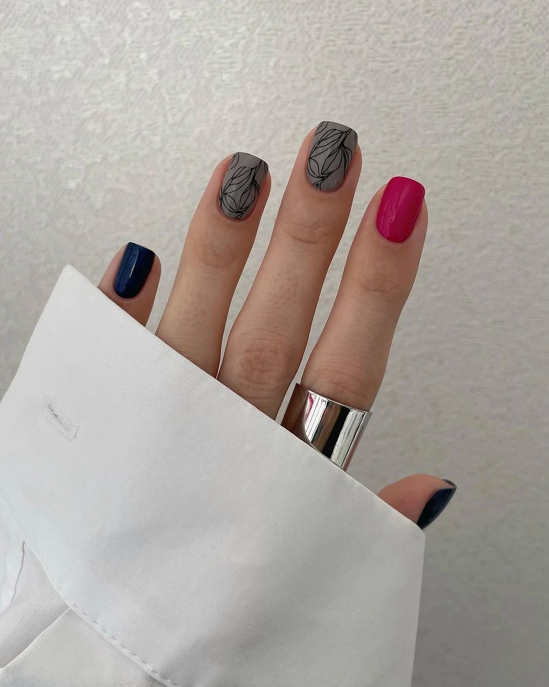
To adjust the palette, change one solid color at a time. Navy can become forest green, berry can become rust, or the pale base can shift toward cream, but keeping the black outlines preserves the relationship between the fingers. Medium length is enough for the line art; a shorter version should use fewer leaves and let the solid colors occupy more space so the accents do not become cramped.
This direction works for someone who prefers cooler jewel tones to traditional browns. It coordinates with black, white, denim, or muted gray, and the mix feels expressive without relying on raised texture. The tradeoff is visual competition: several saturated colors already create emphasis, so jewelry and clothing should stay simple if the black botanical accents are meant to remain visible rather than dissolve into the overall palette.
Purple Panels with White Loops
Medium oval nails place purple and mauve panels inside translucent nude bases, then draw white looping curves over the colored sections. The loops are open shapes rather than filled symbols, and that negative space is what keeps the design soft. The rounded tip supports the curves, while the limited purple palette gives the manicure a clear cool focus without needing extra texture or decoration.
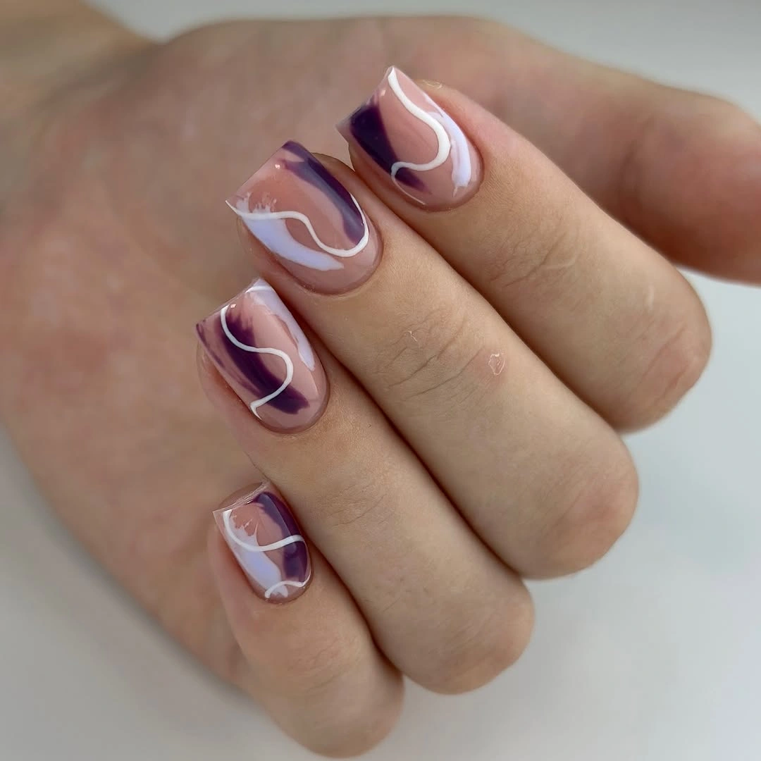
Keep the nude base visible when adapting this idea, especially if the shape becomes shorter. One purple panel per hand can carry the design, while the white lines should remain light enough to show the underlying color. A warmer rust or burgundy replacement would move the look toward autumn, but the open loop structure should stay the same so the design does not become a filled graphic block.
This is useful for readers who want modern abstract art rather than botanical or animal motifs. The medium oval length is approachable, and the pale base can make grow-out less abrupt, though thin white lines need clean edges to keep their shape. Pair it with neutral clothing and let the purple supply the color; adding another accent tone would make the simple looped rhythm harder to read.
Black Lines on a White Square Canvas
Long square nails use bright white as a clean canvas for black botanical shapes, flowing stripes, and a few small gold marks. The most consequential detail is the high value contrast: every line is immediately visible, so the pattern does not need heavy fill to make an impression. Different motifs appear across the fingers, but the limited black-white-and-gold palette keeps the set connected.
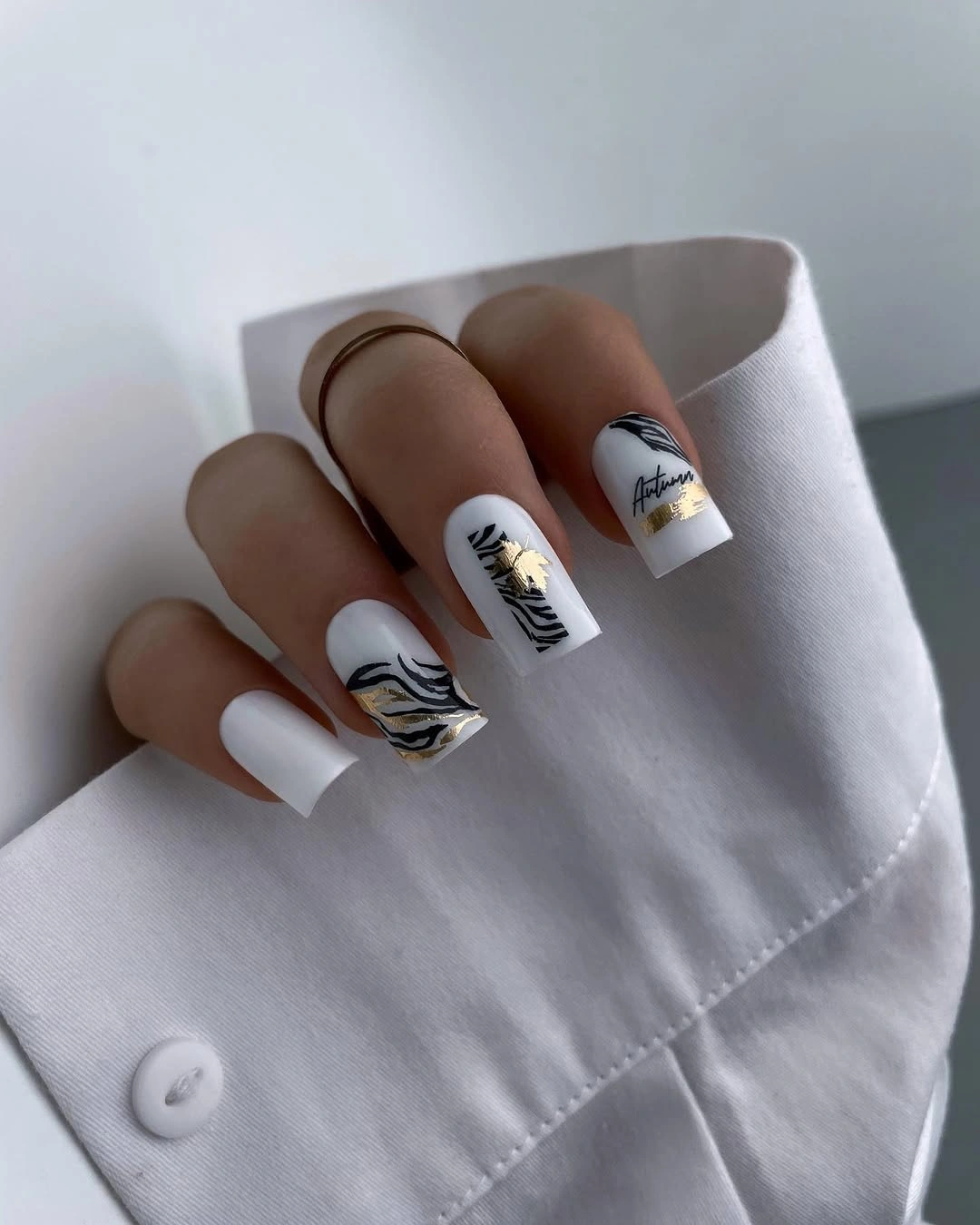
When simplifying the design, keep one botanical line and one flowing mark rather than repeating every motif. Off-white can soften the contrast, while a shorter soft square will reduce the poster-like scale of the long tips. Gold should remain a small warmth cue; if it becomes a broad metallic panel, it will compete with the black lines that currently create the clearest rhythm.
This manicure has a strong editorial quality and pairs easily with black, white, denim, or tailored neutrals. The long square shape gives the drawings room but also makes white polish and sharp corners vulnerable to visible wear. A medium square keeps the same contrast with less practical pressure, and a plain sleeve or simple ring will let the line work remain precise around the hand.
Orange Anchor with Transparent Florals
Long square nails alternate one bright orange solid with transparent or pale panels carrying orange, yellow, and green floral marks. The orange anchor is the detail that prevents the layered accents from becoming visually weightless, while the transparent panels keep the warm colors from turning into dense blocks. Thin borders around some sections give the composition a clear edge without closing every shape.
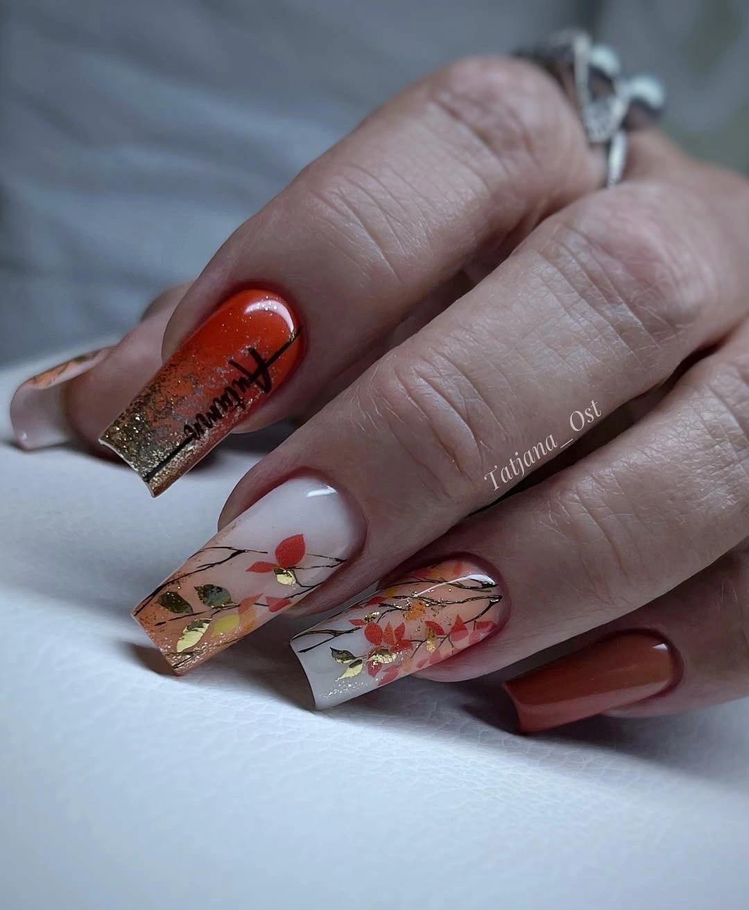
Keep the orange on one or two nails and use the transparent floral panel as the main accent. A medium square would make the design easier to wear, but the warm marks should remain vertical enough to follow the available space. If the colors are softened toward rust and mustard, the base can stay pale and the composition will still read as layered rather than flat.
This is a good fit for readers who want autumn color with a little translucency and visible pacing. The long square canvas supports the panels, but the mix of solid orange and delicate details can look crowded if every finger becomes equally busy. Use a neutral sleeve, simple jewelry, and a limited number of warm shades so the eye can move from the anchor nail to the floral panel and back.
Leopard Spots on a Warm Beige Base
Medium almond nails finish with black and brown leopard spots over a warm beige base. The pattern repeats across the hand, yet each spot changes in size and shape, which keeps the print from looking mechanically stamped. The moderate almond silhouette gives the markings enough room to breathe, while the beige ground lowers the contrast compared with a bright white base.
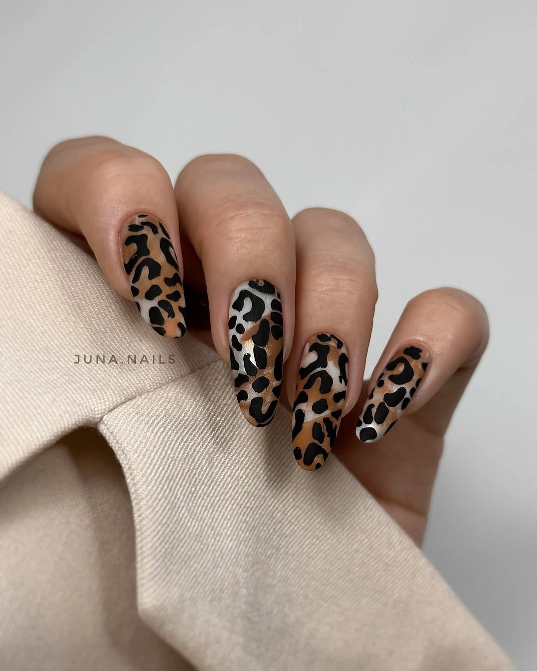
For a selective version, place leopard on two or three nails and keep the rest in beige or warm brown. Rust can replace the brown spots for a more autumnal variation, but the black marks should remain irregular so the pattern retains its natural rhythm. A shorter oval would soften the shape, while a longer almond would make the repeated print feel more assertive and accessory-like.
This is a recognizable design that can be adjusted without losing its identity. It works with beige, denim, black, cream, and simple gold, and the medium length keeps a full print from becoming too dramatic. The limitation is density: if the spots are too small or too numerous, they merge into noise, so keep visible spaces between clusters and let the warm base remain part of the pattern.